文章目錄
- 一、RadioButton簡介
- 二、RadioButton的基本用法
- 1. 創建基本的RadioButton
- 2. 分組管理
- 3. 設置默認選中
- 三、RadioButton的重要屬性和事件
- 1. 關鍵屬性
- 2. 主要事件
- 3. 事件處理流程
- 4. 監聽選中狀態變化
- 四、數據綁定與RadioButton
- 1. 基本數據綁定
- 2. 數據綁定流程
- 3. 使用枚舉綁定
- 五、自定義RadioButton樣式
- 1. 基本樣式設置
- 2. 自定義模板
- 3. 創建圖像按鈕
- 六、常見應用場景及示例
- 1. 應用場景流程圖
- 2. 選項卡式界面
- 3. 問卷調查表單
- 4. 與其他控件組合使用
- 七、MVVM模式中的RadioButton
- 八、性能優化和最佳實踐
- 1. 性能考慮
- 2. 可訪問性
- 3. 常見問題及解決方案
- 九、總結
- 十、相關資源
可以根據Github拉取示例程序運行
GitHub程序演示地址(點擊直達)
也可以在本文資源中下載
一、RadioButton簡介
RadioButton(單選按鈕)是WPF中常用的UI控件之一,用于在一組選項中選擇唯一的一個選項。與CheckBox不同,同一組內的RadioButton具有互斥性,即同一時間只能有一個按鈕被選中。RadioButton主要應用于需要用戶從預定義的多個選項中選擇一個的場景。
RadioButton控件繼承自ToggleButton類,從而獲得了可切換狀態的特性。但與ToggleButton不同,它實現了組內互斥的行為,確保同一組內只有一個RadioButton可以被選中。
二、RadioButton的基本用法
1. 創建基本的RadioButton
以下是創建基本RadioButton的XAML代碼:
<RadioButton Content="選項1" Margin="5"/>
<RadioButton Content="選項2" Margin="5"/>
<RadioButton Content="選項3" Margin="5"/>
若要在代碼中創建RadioButton:
// 創建RadioButton控件
RadioButton radioButton = new RadioButton();
radioButton.Content = "選項1";
radioButton.Margin = new Thickness(5);
2. 分組管理
RadioButton的核心特性是通過GroupName屬性進行分組。同一個GroupName的RadioButton只能有一個處于選中狀態:
<StackPanel><!-- 第一組 --><RadioButton GroupName="Group1" Content="選項1" Margin="5"/><RadioButton GroupName="Group1" Content="選項2" Margin="5"/><RadioButton GroupName="Group1" Content="選項3" Margin="5"/><!-- 第二組 --><RadioButton GroupName="Group2" Content="選擇A" Margin="5"/><RadioButton GroupName="Group2" Content="選擇B" Margin="5"/>
</StackPanel>
如果不設置GroupName,RadioButton的分組將基于其邏輯父級元素進行。例如,放在同一個StackPanel中的RadioButton(不指定GroupName)將自動成為一個組。
3. 設置默認選中
通過IsChecked屬性設置RadioButton的默認選中狀態:
<RadioButton GroupName="Group1" Content="選項1" IsChecked="True" Margin="5"/>
<RadioButton GroupName="Group1" Content="選項2" Margin="5"/>
<RadioButton GroupName="Group1" Content="選項3" Margin="5"/>
三、RadioButton的重要屬性和事件
1. 關鍵屬性
2. 主要事件
3. 事件處理流程
4. 監聽選中狀態變化
public MainWindow()
{InitializeComponent();// 方法1:單獨處理Checked事件myRadioButton.Checked += (sender, e) => {// 處理選中事件MessageBox.Show("RadioButton被選中");};// 方法2:使用Click事件統一處理狀態變化myRadioButton.Click += (sender, e) => {RadioButton rb = sender as RadioButton;if (rb.IsChecked == true){// 處理選中狀態}};
}
四、數據綁定與RadioButton
1. 基本數據綁定
將RadioButton的IsChecked屬性綁定到視圖模型中的布爾屬性:
<RadioButton Content="男" IsChecked="{Binding IsMale}"/>
<RadioButton Content="女" IsChecked="{Binding IsFemale}"/>
public class PersonViewModel : INotifyPropertyChanged
{private bool _isMale;public bool IsMale{get { return _isMale; }set { _isMale = value;OnPropertyChanged(nameof(IsMale));// 更新互斥屬性if (value) IsFemale = false;}}private bool _isFemale;public bool IsFemale{get { return _isFemale; }set { _isFemale = value; OnPropertyChanged(nameof(IsFemale));// 更新互斥屬性if (value) IsMale = false;}}// INotifyPropertyChanged 實現public event PropertyChangedEventHandler PropertyChanged;protected void OnPropertyChanged(string propertyName){PropertyChanged?.Invoke(this, new PropertyChangedEventArgs(propertyName));}
}
2. 數據綁定流程
3. 使用枚舉綁定
更常見和推薦的做法是使用枚舉進行綁定:
// 枚舉定義
public enum Gender
{Male,Female
}// 視圖模型
public class PersonViewModel : INotifyPropertyChanged
{private Gender _gender;public Gender Gender{get { return _gender; }set { _gender = value;OnPropertyChanged(nameof(Gender));}}// INotifyPropertyChanged 實現public event PropertyChangedEventHandler PropertyChanged;protected void OnPropertyChanged(string propertyName){PropertyChanged?.Invoke(this, new PropertyChangedEventArgs(propertyName));}
}
<RadioButton Content="男" IsChecked="{Binding Gender, Converter={StaticResource EnumToBoolConverter}, ConverterParameter={x:Static local:Gender.Male}}"/>
<RadioButton Content="女" IsChecked="{Binding Gender, Converter={StaticResource EnumToBoolConverter}, ConverterParameter={x:Static local:Gender.Female}}"/>
枚舉到布爾值的轉換器:
public class EnumToBoolConverter : IValueConverter
{public object Convert(object value, Type targetType, object parameter, CultureInfo culture){// 檢查值和參數if (value == null || parameter == null) return false;// 獲取枚舉值string enumValue = value.ToString();string targetValue = parameter.ToString();// 比較并返回結果return enumValue.Equals(targetValue);}public object ConvertBack(object value, Type targetType, object parameter, CultureInfo culture){// 如果選中,則返回對應的枚舉值if (value is bool && (bool)value){if (parameter != null){return Enum.Parse(targetType, parameter.ToString());}}// 默認返回return Binding.DoNothing;}
}
五、自定義RadioButton樣式
1. 基本樣式設置
<RadioButton Content="自定義樣式" Margin="5"><RadioButton.Style><Style TargetType="RadioButton"><Setter Property="Foreground" Value="Navy"/><Setter Property="FontWeight" Value="Bold"/><Setter Property="Padding" Value="5"/><Style.Triggers><Trigger Property="IsChecked" Value="True"><Setter Property="Foreground" Value="Red"/></Trigger><Trigger Property="IsMouseOver" Value="True"><Setter Property="Foreground" Value="Green"/></Trigger></Style.Triggers></Style></RadioButton.Style>
</RadioButton>
2. 自定義模板
通過修改ControlTemplate可以完全改變RadioButton的外觀:
<RadioButton Content="自定義模板" Margin="10"><RadioButton.Template><ControlTemplate TargetType="RadioButton"><Border x:Name="border" BorderBrush="Gray" BorderThickness="1" CornerRadius="8"Background="LightGray"Padding="5"><Grid><Grid.ColumnDefinitions><ColumnDefinition Width="Auto"/><ColumnDefinition Width="*"/></Grid.ColumnDefinitions><!-- 自定義單選按鈕外觀 --><Grid Width="16" Height="16" Margin="0,0,5,0" VerticalAlignment="Center"><Ellipse x:Name="outerEllipse" Fill="White"Stroke="DarkGray"StrokeThickness="1"/><Ellipse x:Name="innerEllipse" Width="8" Height="8" Fill="Blue" Visibility="Collapsed"/></Grid><!-- 內容 --><ContentPresenter Grid.Column="1" VerticalAlignment="Center"HorizontalAlignment="Left"/></Grid></Border><!-- 視覺狀態管理 --><ControlTemplate.Triggers><Trigger Property="IsChecked" Value="True"><Setter TargetName="innerEllipse" Property="Visibility" Value="Visible"/><Setter TargetName="outerEllipse" Property="Stroke" Value="Blue"/></Trigger><Trigger Property="IsMouseOver" Value="True"><Setter TargetName="border" Property="Background" Value="#FFE8E8E8"/></Trigger><Trigger Property="IsPressed" Value="True"><Setter TargetName="border" Property="Background" Value="#FFDDDDDD"/></Trigger><Trigger Property="IsEnabled" Value="False"><Setter TargetName="border" Property="Opacity" Value="0.5"/><Setter TargetName="outerEllipse" Property="Stroke" Value="#FFAAAAAA"/><Setter TargetName="innerEllipse" Property="Fill" Value="#FFAAAAAA"/></Trigger></ControlTemplate.Triggers></ControlTemplate></RadioButton.Template>
</RadioButton>
3. 創建圖像按鈕
<RadioButton GroupName="ImageButtons" Margin="5"><RadioButton.Template><ControlTemplate TargetType="RadioButton"><Border x:Name="border" BorderThickness="2" BorderBrush="Transparent"CornerRadius="4"><Grid><Image Source="/Assets/icon.png" Width="32" Height="32"/><Border x:Name="selectionIndicator" Background="#3000BFFF" Opacity="0" CornerRadius="4"/></Grid></Border><ControlTemplate.Triggers><Trigger Property="IsChecked" Value="True"><Setter TargetName="border" Property="BorderBrush" Value="#FF00BFFF"/><Setter TargetName="selectionIndicator" Property="Opacity" Value="1"/></Trigger><Trigger Property="IsMouseOver" Value="True"><Setter TargetName="selectionIndicator" Property="Opacity" Value="0.5"/></Trigger></ControlTemplate.Triggers></ControlTemplate></RadioButton.Template>
</RadioButton>
六、常見應用場景及示例
1. 應用場景流程圖
2. 選項卡式界面
<Grid><Grid.RowDefinitions><RowDefinition Height="Auto"/><RowDefinition Height="*"/></Grid.RowDefinitions><!-- 選項卡欄 --><StackPanel Orientation="Horizontal" Background="#F0F0F0"><RadioButton x:Name="tabHome" Content="首頁" IsChecked="True" Style="{StaticResource TabRadioButtonStyle}"/><RadioButton x:Name="tabSettings" Content="設置" Style="{StaticResource TabRadioButtonStyle}"/><RadioButton x:Name="tabHelp" Content="幫助" Style="{StaticResource TabRadioButtonStyle}"/></StackPanel><!-- 內容區域 --><Grid Grid.Row="1"><ContentControl><ContentControl.Style><Style TargetType="ContentControl"><Style.Triggers><DataTrigger Binding="{Binding IsChecked, ElementName=tabHome}" Value="True"><Setter Property="Content" Value="{StaticResource HomeContent}"/></DataTrigger><DataTrigger Binding="{Binding IsChecked, ElementName=tabSettings}" Value="True"><Setter Property="Content" Value="{StaticResource SettingsContent}"/></DataTrigger><DataTrigger Binding="{Binding IsChecked, ElementName=tabHelp}" Value="True"><Setter Property="Content" Value="{StaticResource HelpContent}"/></DataTrigger></Style.Triggers></Style></ContentControl.Style></ContentControl></Grid>
</Grid>
選項卡按鈕樣式:
<Style x:Key="TabRadioButtonStyle" TargetType="RadioButton"><Setter Property="Template"><Setter.Value><ControlTemplate TargetType="RadioButton"><Border x:Name="border" BorderThickness="0,0,0,3" BorderBrush="Transparent"Padding="15,10"><ContentPresenter HorizontalAlignment="Center" VerticalAlignment="Center"/></Border><ControlTemplate.Triggers><Trigger Property="IsChecked" Value="True"><Setter TargetName="border" Property="BorderBrush" Value="#FF0078D7"/><Setter TargetName="border" Property="Background" Value="White"/></Trigger><Trigger Property="IsMouseOver" Value="True"><Setter TargetName="border" Property="Background" Value="#FFEEEEEE"/></Trigger></ControlTemplate.Triggers></ControlTemplate></Setter.Value></Setter>
</Style>
3. 問卷調查表單
<StackPanel><TextBlock Text="您最喜歡哪種編程語言?" FontWeight="Bold" Margin="0,20,0,10"/><RadioButton x:Name="rbCSharp" Content="C#" GroupName="ProgrammingLanguage" Margin="5"/><RadioButton x:Name="rbJava" Content="Java" GroupName="ProgrammingLanguage" Margin="5"/><RadioButton x:Name="rbPython" Content="Python" GroupName="ProgrammingLanguage" Margin="5"/><RadioButton x:Name="rbCpp" Content="C++" GroupName="ProgrammingLanguage" Margin="5"/><RadioButton x:Name="rbOther" Content="其他" GroupName="ProgrammingLanguage" Margin="5"/><!-- 條件顯示文本框 --><TextBox Margin="25,5,5,5" Visibility="{Binding IsChecked, ElementName=rbOther, Converter={StaticResource BooleanToVisibilityConverter}}"Placeholder="請指定其他語言"/>
</StackPanel>
4. 與其他控件組合使用
RadioButton與TextBlock組合:
<RadioButton GroupName="Options" Margin="5"><StackPanel Orientation="Vertical"><TextBlock Text="標準配送" FontWeight="Bold"/><TextBlock Text="3-5個工作日送達" Foreground="Gray" FontSize="11"/></StackPanel>
</RadioButton><RadioButton GroupName="Options" Margin="5"><StackPanel Orientation="Vertical"><TextBlock Text="加急配送" FontWeight="Bold"/><TextBlock Text="1-2個工作日送達(額外收費)" Foreground="Gray" FontSize="11"/></StackPanel>
</RadioButton>
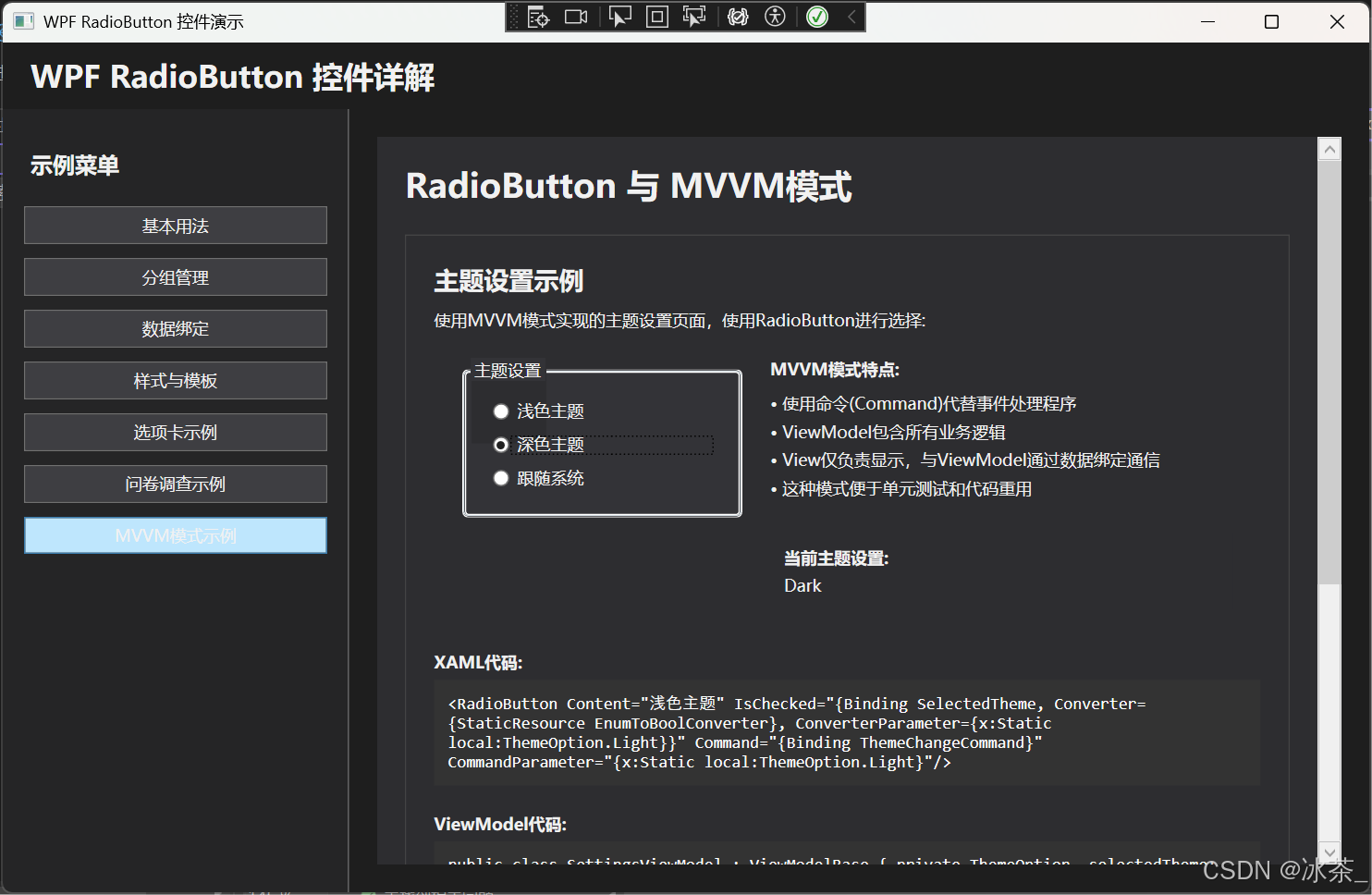
七、MVVM模式中的RadioButton
在MVVM模式中,RadioButton通常綁定到ViewModel中的屬性:
public class SettingsViewModel : INotifyPropertyChanged
{// 定義主題選項枚舉public enum ThemeOption{Light,Dark,System}private ThemeOption _selectedTheme;public ThemeOption SelectedTheme{get { return _selectedTheme; }set { if (_selectedTheme != value){_selectedTheme = value;OnPropertyChanged(nameof(SelectedTheme));// 應用主題變更ApplyThemeChange(value);}}}private void ApplyThemeChange(ThemeOption theme){// 實現主題變更邏輯}// 實現INotifyPropertyChangedpublic event PropertyChangedEventHandler PropertyChanged;protected void OnPropertyChanged(string propertyName){PropertyChanged?.Invoke(this, new PropertyChangedEventArgs(propertyName));}
}
XAML中使用命令綁定:
<StackPanel><TextBlock Text="主題設置" FontWeight="Bold" Margin="0,0,0,10"/><RadioButton Content="淺色主題" IsChecked="{Binding SelectedTheme, Converter={StaticResource EnumToBoolConverter}, ConverterParameter={x:Static local:SettingsViewModel+ThemeOption.Light}}"Command="{Binding ThemeChangeCommand}"CommandParameter="{x:Static local:SettingsViewModel+ThemeOption.Light}"/><RadioButton Content="深色主題" IsChecked="{Binding SelectedTheme, Converter={StaticResource EnumToBoolConverter}, ConverterParameter={x:Static local:SettingsViewModel+ThemeOption.Dark}}"Command="{Binding ThemeChangeCommand}"CommandParameter="{x:Static local:SettingsViewModel+ThemeOption.Dark}"/><RadioButton Content="跟隨系統" IsChecked="{Binding SelectedTheme, Converter={StaticResource EnumToBoolConverter}, ConverterParameter={x:Static local:SettingsViewModel+ThemeOption.System}}"Command="{Binding ThemeChangeCommand}"CommandParameter="{x:Static local:SettingsViewModel+ThemeOption.System}"/>
</StackPanel>
八、性能優化和最佳實踐
1. 性能考慮
- 避免過多的觸發器:在自定義樣式中,盡量減少觸發器的數量和復雜性。
- 共享資源:將樣式和模板定義為資源,以便在多個RadioButton之間共享。
- 適當使用虛擬化:在包含大量RadioButton的容器(如ItemsControl)中,啟用虛擬化以提高性能。
2. 可訪問性
為了提高應用程序的可訪問性,確保:
- 為RadioButton提供有意義的Content內容
- 使用合適的顏色對比度
- 考慮鍵盤導航支持
3. 常見問題及解決方案
九、總結
RadioButton作為WPF中重要的用戶輸入控件,具有以下特點:
- 互斥性:同一組內的RadioButton具有互斥性,用戶只能選擇其中一個。
- 靈活性:通過GroupName屬性可以輕松創建多個分組。
- 可自定義:通過樣式和模板可以完全改變其外觀。
- 數據綁定:可以與MVVM模式無縫配合,支持多種綁定方式。
在實際應用中,RadioButton多用于有限選項的單選場景,如性別選擇、問卷調查、配置設置等。通過合理的設計和樣式定制,可以極大地提升用戶體驗。
十、相關資源
- 微軟官方文檔:RadioButton Class
- WPF RadioButton樣式和模板
- WPF數據綁定詳解
)
---- RGB/YUV 顏色格式)


)
![mysql 配置文件中的[client]、[mysqld]、[mysqldump]和[mysql]區塊的作用區別](http://pic.xiahunao.cn/mysql 配置文件中的[client]、[mysqld]、[mysqldump]和[mysql]區塊的作用區別)

2025年第二十二屆五一數學建模競賽(五一杯/五一賽)解題思路|完整代碼論文集合)


