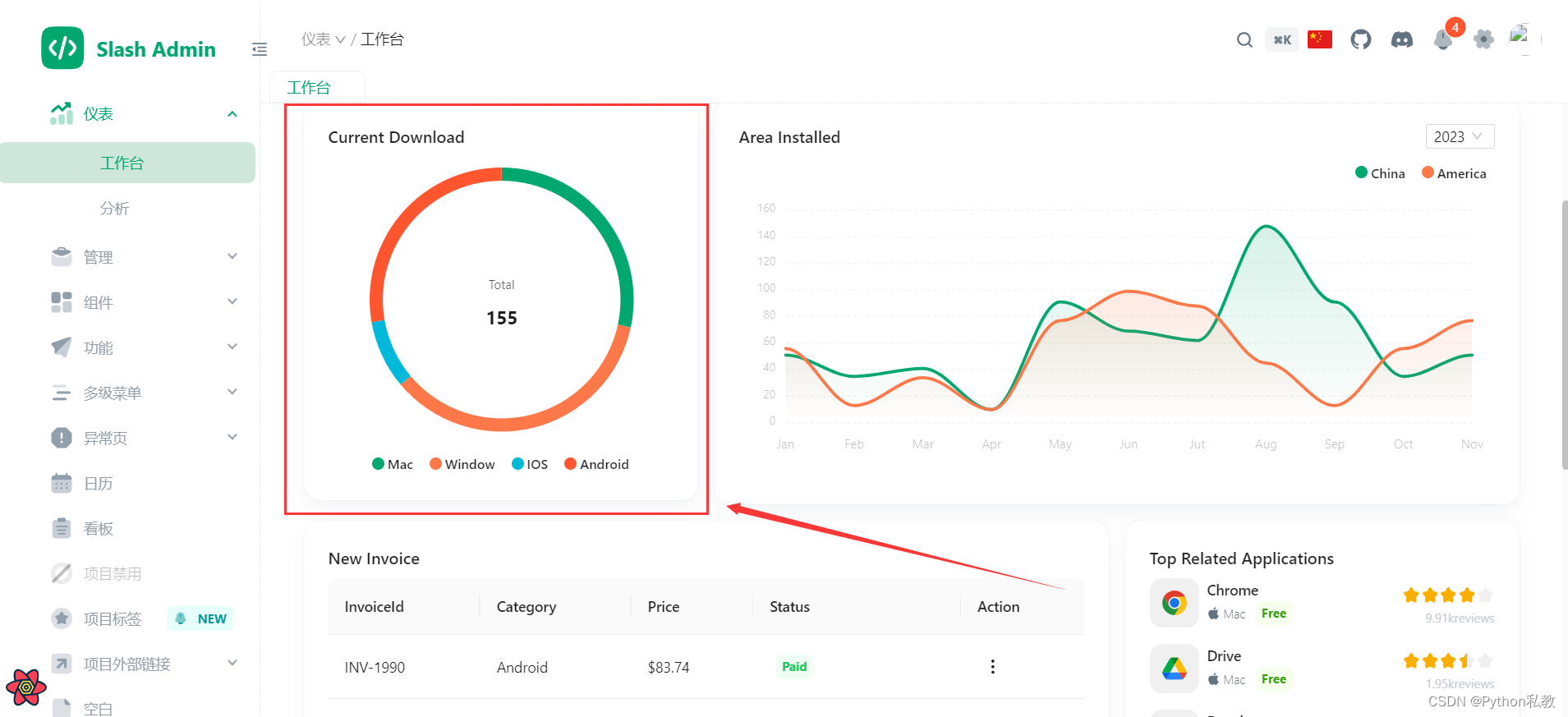
目前,工作臺界面的上半部分已經基本梳理完畢了。

接下來,我們看看這個環形圖卡片是怎么實現的?
具體代碼如下:
{/*圖表卡片*/}
<Row gutter={[16, 16]} className="mt-4" justify="center">{/*環形圖表卡片*/}<Col span={24} md={12} lg={8}><CurrentDownload /></Col>{/*折線圖表卡片*/}<Col span={24} md={12} lg={16}><AreaDownload /></Col>
</Row>
這里的Row和Col都是從antd這個樣式庫進行導入的:
import { Col, Row, Space } from 'antd';
采用的是一行兩列的布局,而且是響應式的。
我們在這篇文章中主要分析環形圖表卡片是怎么實現的:
<CurrentDownload />
我們追蹤一下代碼,關于代碼我已經配了詳細的中文注釋,大家看代碼的時候配合注釋看應該會稍微好點:
import { Typography } from 'antd';import Card from '@/components/card';
import Chart from '@/components/chart/chart';
import useChart from '@/components/chart/useChart';// 環形圖表卡片:當前下載量
export default function CurrentDownload() {return (// 這是一個自定義的卡片:import Card from '@/components/card';<Card className="flex-col">{/*標題*/}<header className="self-start"><Typography.Title level={5}>當前下載量</Typography.Title></header>{/*主體:核心圖表*/}<main><ChartDonut /></main></Card>);
}// 用的是一個假數據
const labels = ['Mac', 'Window', 'IOS', 'Android']
const series = [44, 55, 13, 43]// 環形圖表
function ChartDonut() {// 屬性配置const chartOptions = useChart({labels: labels,stroke: {show: false,},legend: {position: 'bottom',horizontalAlign: 'center',},tooltip: {fillSeriesColor: false,},chart: {width: 240,},plotOptions: {pie: {donut: {size: '90%',labels: {total: {fontSize: '12px',},value: {fontSize: '18px',fontWeight: 700,},},},},},});// 圖表,這里用的是Apex Chart進行最終渲染return <Chart type="donut" series={series} options={chartOptions} height={360} />;
}
在這個代碼中,有個自定義的Card組件,這個我們之前沒有詳細的分析,那么這次我們追蹤一下代碼,看看,Card這個組件是如何實現的。
import { CSSProperties, ReactNode } from 'react';import { useSettings } from '@/store/settingStore';
import { useThemeToken } from '@/theme/hooks';import { ThemeMode } from '#/enum';// 卡片組件的屬性
type Props = {children?: ReactNode; // 子元素,支持JSXclassName?: string; // 類名style?: CSSProperties; // 自定義樣式
};// 自定義的卡片組件
export default function Card({ children, ...other }: Props) {// 獲取背景顏色const { colorBgContainer } = useThemeToken();// 獲取主題模式const { themeMode } = useSettings();// 計算陰影const boxShadow: { [key in ThemeMode]: string } = {light: 'rgba(145, 158, 171, 0.2) 0px 0px 2px 0px, rgba(145, 158, 171, 0.12) 0px 12px 24px -4px',dark: 'rgba(0, 0, 0, 0.2) 0px 0px 2px 0px, rgba(0, 0, 0, 0.12) 0px 12px 24px -4px',};// 組件核心元素和樣式,JSXreturn (<divstyle={{backgroundColor: colorBgContainer,backgroundImage: 'none',boxShadow: boxShadow[themeMode],transition: `box-shadow 300ms cubic-bezier(0.4, 0, 0.2, 1) 0ms`,borderRadius: '16px',padding: '24px',overflow: 'hidden',position: 'relative',display: 'flex',alignItems: 'center',}}{...other}>{children}</div>);
}
這個自定義的卡片實現了根據主題模式動態切換樣式的效果。背景顏色,陰影也是動態計算出來的。
最終的效果如下:
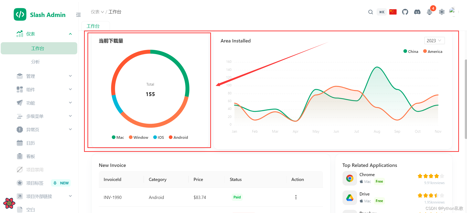
這里有個問題,就是這個環形圖有四種屬性,但是看上去只有兩種顏色,不太好區分,那么能不能自定義顏色呢?
這個留給大家去做吧,這個筆記暫時就到這里。
創作不易,麻煩大家給個打賞,或者點贊和收藏,感謝!


)
![[音視頻]ffmepg常用命令](http://pic.xiahunao.cn/[音視頻]ffmepg常用命令)


