文章目錄
- 前言
- 一、環境配置
- 二、實現步驟
- 三、示例完整代碼
- 四、注意事項
- 總結
前言
最近在進行QML的學習,發現一個比較有意思的交互設計:抽屜式側邊欄菜單,出于開發實戰需求,最終實現了一個支持手勢拖拽、彈性動畫、蒙層效果和??智能懸停檢測??的抽屜菜單,下面將我的示例內容進行展示,以便大家學習,如有錯誤之處,歡迎大家批評指正。
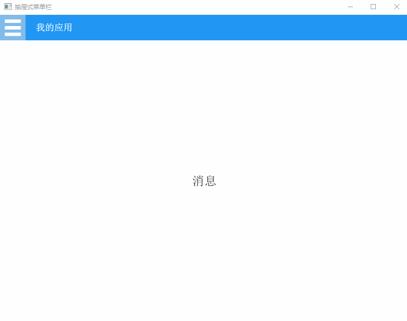
項目效果
提示:以下是本篇文章正文內容,下面案例可供參考
一、環境配置
我的示例使用的是Qt5.14版本,需要確保包含 ??Qt Quick Controls 2?? 模塊(安裝時勾選Qt Quick Controls 2組件),需要在項目的.pro文件中添加:
QT += qml quick quickcontrols2
這里有詳細的Qt安裝和QML項目的創建步驟:Qt Creator的安裝和Qml項目的創建
這里有QML的基礎教程:QML快速入門(Quick Starter)
二、實現步驟
1、基礎框架搭建
//通過ApplicationWindow創建主窗口
ApplicationWindow {id: mainWindowvisible: truewidth: 800height: 600title: "抽屜式菜單欄"......
}
2、頂部工具欄設計
//頂部工具欄
header: ToolBar {height: 50background: Rectangle {color: "#2196F3"   //藍色背景}......//這里實現了漢堡菜單按鈕,通過MouseArea檢測懸停狀態,并配合Timer實現??智能延時關閉??功能(詳細代碼見下文)......
}
3、抽屜菜單核心實現
//主內容區域
Item {id: mainContentanchors.fill: parent......//使用x坐標控制菜單位置,通過狀態機(States)切換展開/收起狀態,添加平滑動畫過渡效果(詳細代碼見下文)......
}
4、高級交互功能
//邊緣滑動手勢檢測,鼠標點擊左側區域后向右移動可以拉出菜單,雙擊也能展開菜單
MouseArea {id: drawerDragAreaanchors.left: parent.leftwidth: 20   //手勢檢測區域寬度height: parent.heightpropagateComposedEvents: true//拖拽起始位置的全局X坐標property real globalStartX: 0//鼠標按下事件處理onPressed: {globalStartX = mapToGlobal(mouseX, 0).xif(isDrawerOpen){mouse.accepted = false}}//位置變化事件處理onPositionChanged: {if (pressed) {//滑動距離超過25px時切換狀態let currentGlobalX = mapToGlobal(mouseX, 0).xlet delta = currentGlobalX - globalStartXif (Math.abs(delta) > 10) {mainWindow.isDrawerOpen = delta > 0}}}//添加雙擊切換onDoubleClicked: isDrawerOpen = !isDrawerOpen
}
三、示例完整代碼
1.main.qml
import QtQuick 2.14
import QtQuick.Controls 2.14ApplicationWindow {id: mainWindowvisible: truewidth: 800height: 600title: "抽屜式菜單欄"//當前選中的菜單項文本property string selectedMenuItem: "請選擇菜單項"//是否正在與菜單欄交互property bool isMenuActive: false//菜單欄是否展開property bool isDrawerOpen: false//菜單欄寬度property int drawerWidth: 200//根據窗口寬度自動調整菜單欄寬度Component.onCompleted: {drawerWidth = Qt.binding(() => Math.min(200, mainWindow.width * 0.8))}//頂部工具欄header: ToolBar {height: 50background: Rectangle {color: "#2196F3"   //藍色背景}Row {spacing: 20anchors.fill: parent//菜單入口按鈕ToolButton {id: menuButtonhoverEnabled: true   //啟用懸停檢測?//是否懸停在按鈕上property bool buttonHovered: false//按鈕內容contentItem: Text {text: "?"color: "white"font.pixelSize: 38}//鼠標交互MouseArea {anchors.fill: parenthoverEnabled: true//鼠標進入時展開菜單欄并修改懸停狀態onEntered: {isDrawerOpen = truemenuButton.buttonHovered = true}//鼠標離開時重置狀態并啟動關閉計時器onExited: {menuButton.buttonHovered = falseif (!mainWindow.isMenuActive) {timer.restart()}}}//點擊切換菜單欄狀態//onClicked: isDrawerOpen = !isDrawerOpen//自動關閉菜單欄定時器Timer {id: timerinterval: 300   //延時300ms關閉onTriggered: {//雙重驗證是否滿足關閉條件(未懸停在此按鈕及菜單欄中)if (!mainWindow.isMenuActive && !menuButton.buttonHovered) {isDrawerOpen = false}}}}//應用標題Label {text: "我的應用"color: "white"font.bold: truefont.pixelSize: 18anchors.verticalCenter: parent.verticalCenter}}}//主內容區域Item {id: mainContentanchors.fill: parent//中央文本顯示Text {id: contentTextanchors.centerIn: parenttext: mainWindow.selectedMenuItemfont.pixelSize: 24color: "#333333"}//遮罩層(展開菜單欄后出現)Rectangle {id: overlayanchors.fill: parentcolor: "#80000000"   //半透明黑色遮罩opacity: isDrawerOpen ? 1 : 0visible: opacity > 0enabled: visible//鼠標點擊關閉菜單欄MouseArea {anchors.fill: parentonClicked: isDrawerOpen = false}//創建平滑的透明度漸變效果Behavior on opacity {NumberAnimation {duration: 200easing.type: Easing.OutQuad}}}//抽屜菜單欄容器Rectangle {id: drawerwidth: drawerWidthheight: parent.heightx: -drawerWidth  // 初始隱藏位置color: "#ffffff"//菜單欄懸停檢測(注意這個需要放在ListView之前,否則動畫效果異常)MouseArea {anchors.fill: parenthoverEnabled: truepropagateComposedEvents: true   //允許事件繼續傳遞onEntered: mainWindow.isMenuActive = true//鼠標離開時重置狀態并啟動關閉計時器onExited: {mainWindow.isMenuActive = falsetimer.restart()}}//抽屜菜單列表ListView {anchors.fill: parentmodel: menuItems//菜單項模板delegate: ItemDelegate {id: menuItemwidth: drawerWidthheight: 50hoverEnabled: true//鼠標交互,處理懸停狀態MouseArea {anchors.fill: parenthoverEnabled: truepropagateComposedEvents: true//設置為false,允許事件傳遞給ItemDelegate,不攔截點擊事件onPressed: mouse.accepted = falseonEntered: mainWindow.isMenuActive = true//鼠標離開時重置狀態并啟動關閉計時器onExited: {//確保鼠標完全離開才更新狀態if(!containsMouse) {mainWindow.isMenuActive = falsetimer.restart()}}}//背景樣式background: Rectangle {color: menuItem.hovered ? "#2196F3" : "transparent"opacity: menuItem.hovered ? 0.6 : 0.3Behavior on color {ColorAnimation {duration: 150easing.type: Easing.OutCubic}}}//菜單項內容布局contentItem: Row {spacing: 10leftPadding: 10//圖標Image {source: model.iconwidth: 24height: 24anchors.verticalCenter: parent.verticalCenter}//文本Text {text: model.titlecolor: "#444444"font.pixelSize: 16anchors.verticalCenter: parent.verticalCenter}}//點擊事件處理onClicked: {console.log("切換到:", model.title)mainWindow.selectedMenuItem = model.title   //更新顯示文本isDrawerOpen = false   //點擊后自動關閉抽屜}}}//抽屜動畫狀態states: State {name: "opened"when: isDrawerOpenPropertyChanges {target: drawerx: 0}}//創建平滑緩動效果transitions: Transition {NumberAnimation {property: "x"duration: 300easing.type: Easing.InOutQuad}}}}//菜單項數據模型ListModel {id: menuItemsListElement { title: "首頁"; icon: "qrc:/icons/home.png" }ListElement { title: "消息"; icon: "qrc:/icons/message.png" }ListElement { title: "設置"; icon: "qrc:/icons/settings.png" }ListElement { title: "個人中心"; icon: "qrc:/icons/profile.png" }}//邊緣滑動手勢檢測MouseArea {id: drawerDragAreaanchors.left: parent.leftwidth: 20   //手勢檢測區域寬度height: parent.heightpropagateComposedEvents: true//拖拽起始位置的全局X坐標property real globalStartX: 0//鼠標按下事件處理onPressed: {globalStartX = mapToGlobal(mouseX, 0).xif(isDrawerOpen){mouse.accepted = false}}//位置變化事件處理onPositionChanged: {if (pressed) {//滑動距離超過25px時切換狀態let currentGlobalX = mapToGlobal(mouseX, 0).xlet delta = currentGlobalX - globalStartXif (Math.abs(delta) > 10) {mainWindow.isDrawerOpen = delta > 0}}}//添加雙擊切換onDoubleClicked: isDrawerOpen = !isDrawerOpen}
}
四、注意事項
1、資源路徑問題
其中菜單項數據模型中可以看到有圖標資源,需要確保圖標資源正確添加到.qrc文件,否則會顯示為空白,在項目的源文件目錄下添加了一個icons文件夾,其中有使用到的圖片資源:
2、事件沖突處理??
在代碼中可以看到設置mouse.accepted = false,允許事件傳遞,避免阻斷按鈕點擊事件
總結
這個示例中不僅實現了基礎的抽屜菜單,還加入了??手勢交互??、??智能懸停檢測等功能。可以看到QML的聲明式語法讓我們可以用少量代碼實現復雜的動態效果,本文中實現這個示例也是比較簡單的,要實現更復雜的功能還是需要不斷的學習哦~
hello:
共同學習,共同進步,如果還有相關問題,可在評論區留言進行討論。
參考文章:
Qt Creator的安裝和Qml項目的創建
QML快速入門(Quick Starter)

 A. Boboniu Chats with Du)

:創建內觀時裝備偏移問題)


)

)
)
)


