上一章講了Fiori開發中的 Responsiveness(響應式設計)。
SAP學習筆記 - 開發30 - 前端Fiori開發 Responsiveness(響應式設計)-CSDN博客
本章繼續學習Fiori 開發中的知識。
目錄
1,Device Adaptation(設備自適應)
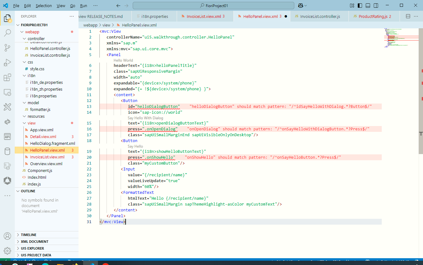
1),HelloPanel.view.xml
2),Component.js
3),運行看效果
4),Detail.view.xml
5),Detail.controller.js?
6),運行看效果
下面是詳細內容。
1,Device Adaptation(設備自適應)
SAPUI5 SDK - Demo Kit
先來看一下具體改了什么文件,達到了什么效果。?
簡單來說就是實現折疊一部分組件,以節約空間。
1),HelloPanel.view.xml
<mvc:ViewcontrollerName="ui5.walkthrough.controller.HelloPanel"xmlns="sap.m"xmlns:mvc="sap.ui.core.mvc"><PanelheaderText="{i18n>helloPanelTitle}"class="sapUiResponsiveMargin"width="auto"expandable="{device>/system/phone}"expanded="{= !${device>/system/phone} }"><content><Buttonid="helloDialogButton"icon="sap-icon://world"text="{i18n>openDialogButtonText}"press=".onOpenDialog"class="sapUiSmallMarginEnd sapUiVisibleOnlyOnDesktop"/><Buttontext="{i18n>showHelloButtonText}"press=".onShowHello"class="myCustomButton"/><Inputvalue="{/recipient/name}"valueLiveUpdate="true"width="60%"/><FormattedTexthtmlText="Hello {/recipient/name}"class="sapUiSmallMargin sapThemeHighlight-asColor myCustomText"/></content></Panel>
</mvc:View>
在Panel 組件里面,用下面屬性來啟動自適應:
- expandable="{device>/system/phone}" =》在設備為 phone 的時候,會啟用折疊
- expanded="{= !${device>/system/phone} }"> =》該狀態指明該部分是否已經處于折疊狀態
-?sapUiVisibleOnlyOnDesktop =》該CSS 樣式用于只顯示于Desktop 模式下
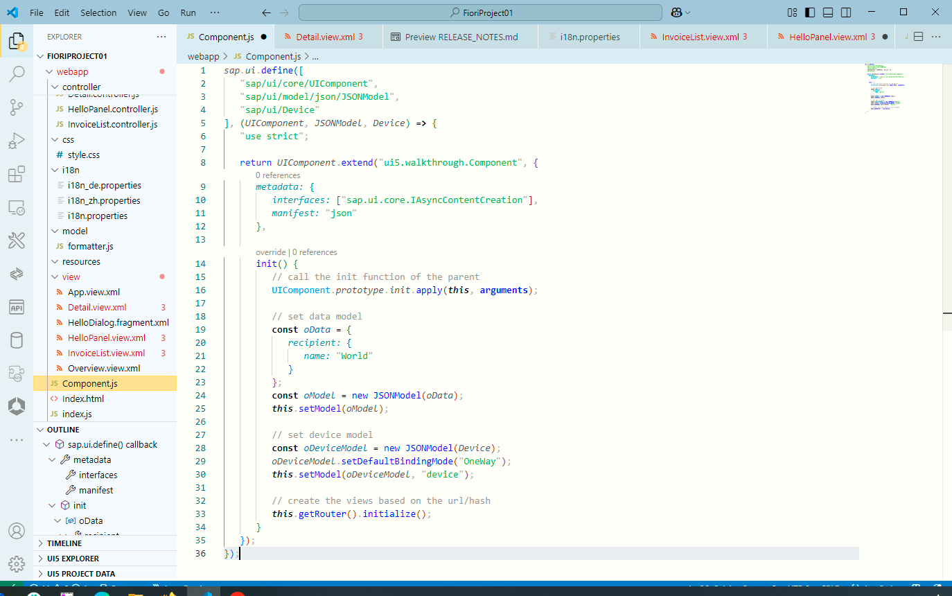
2),Component.js
sap.ui.define(["sap/ui/core/UIComponent","sap/ui/model/json/JSONModel","sap/ui/Device"
], (UIComponent, JSONModel, Device) => {"use strict";return UIComponent.extend("ui5.walkthrough.Component", {metadata: {interfaces: ["sap.ui.core.IAsyncContentCreation"],manifest: "json"},init() {// call the init function of the parentUIComponent.prototype.init.apply(this, arguments);// set data modelconst oData = {recipient: {name: "World"}};const oModel = new JSONModel(oData);this.setModel(oModel);// set device modelconst oDeviceModel = new JSONModel(Device);oDeviceModel.setDefaultBindingMode("OneWay");this.setModel(oDeviceModel, "device");// create the views based on the url/hashthis.getRouter().initialize();}});
});
- 指定Device Model為單向模式(默認是雙向綁定)?
const oDeviceModel = new JSONModel(Device);
oDeviceModel.setDefaultBindingMode("OneWay");
this.setModel(oDeviceModel, "device");
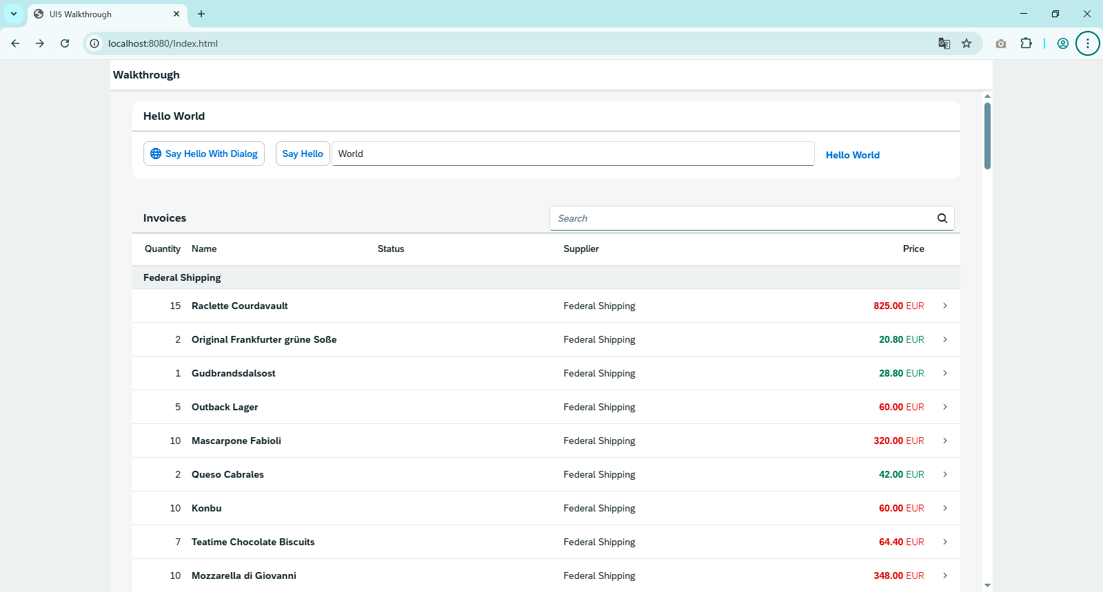
3),運行看效果
其實就是指定一部分對象作為折疊對象,然后引入Device模塊,之后SAP Fiori就全幫你干了。
好像沒啥變化哈~
因為這是Desktop 中顯示,咱們給調成 phone 模式顯示
按 F12,然后調成 phone 模式
這樣就會顯示折疊
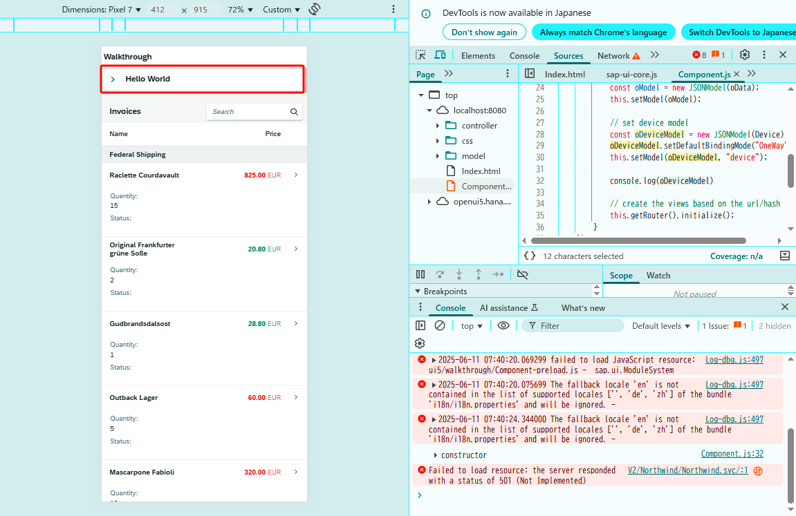
點一下可以展開折疊或再次折疊?
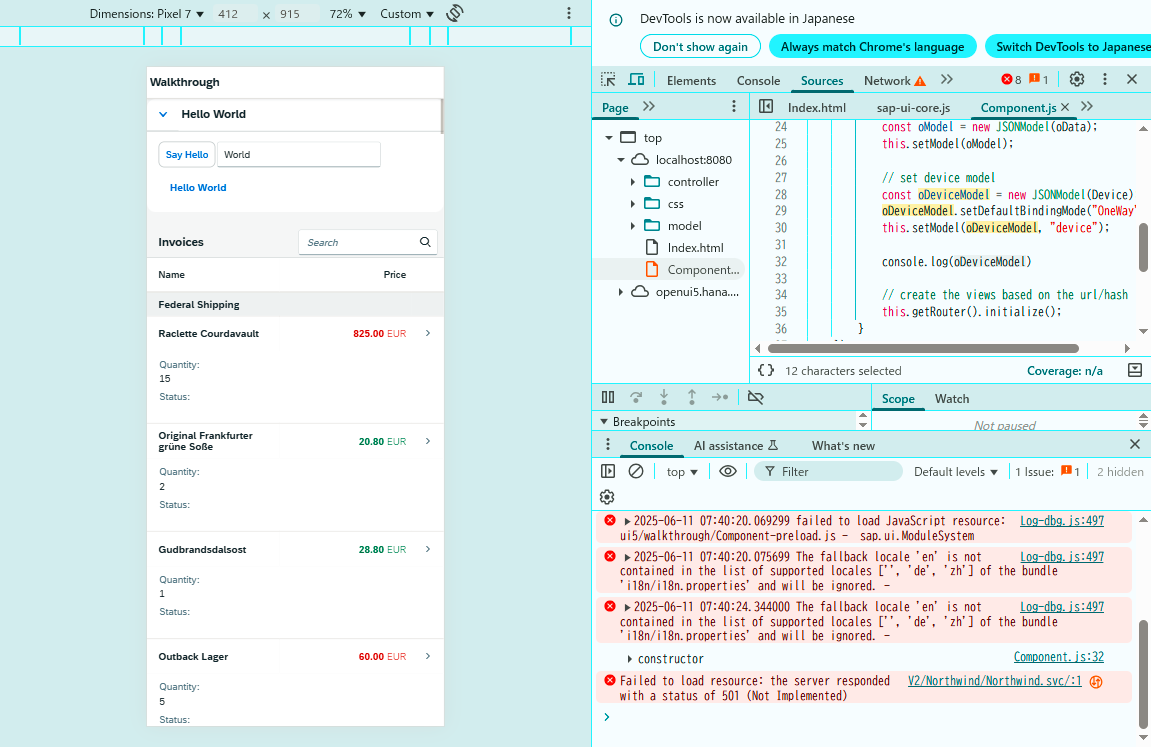
上面在列表上搞了個折疊,當是phone模式的時候,會自適應為折疊。
下面看看在明細畫面也做下優化。
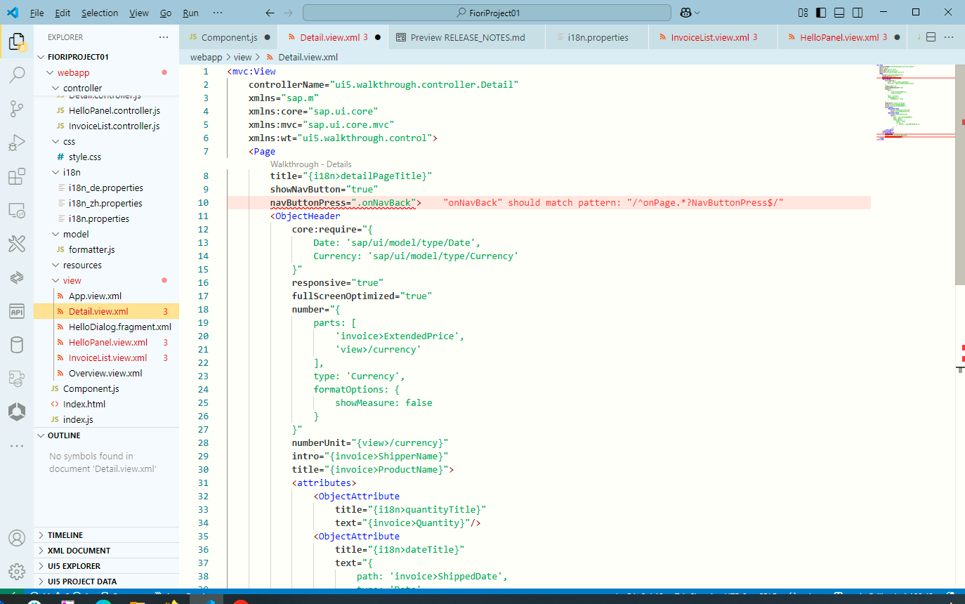
4),Detail.view.xml
<mvc:ViewcontrollerName="ui5.walkthrough.controller.Detail"xmlns="sap.m"xmlns:core="sap.ui.core"xmlns:mvc="sap.ui.core.mvc"xmlns:wt="ui5.walkthrough.control"><Pagetitle="{i18n>detailPageTitle}"showNavButton="true"navButtonPress=".onNavBack"><ObjectHeadercore:require="{Date: 'sap/ui/model/type/Date',Currency: 'sap/ui/model/type/Currency'}"responsive="true"fullScreenOptimized="true"number="{parts: ['invoice>ExtendedPrice','view>/currency'],type: 'Currency',formatOptions: {showMeasure: false}}"numberUnit="{view>/currency}"intro="{invoice>ShipperName}"title="{invoice>ProductName}"><attributes><ObjectAttributetitle="{i18n>quantityTitle}"text="{invoice>Quantity}"/><ObjectAttributetitle="{i18n>dateTitle}"text="{path: 'invoice>ShippedDate',type: 'Date',formatOptions: {style: 'long',source: {pattern: 'yyyy-MM-ddTHH:mm:ss'}}}"/></attributes></ObjectHeader><wt:ProductRatingid="rating"class="sapUiSmallMarginBeginEnd"change=".onRatingChange"/></Page>
</mvc:View>
- 通過兩句就是啟動 ObjectHeader 組件的自適應模式
responsive="true"
fullScreenOptimized="true"
- 那么自適應對象是誰呢?就是這個 <attributes> 部分。
? 和上面在 HelloPanel.view.xml 作用在 panel 組件上,用的是不同的屬性。
<attributes>
? ? <ObjectAttribute
? ? ? ? title="{i18n>quantityTitle}"
? ? ? ? text="{invoice>Quantity}"/>
? ? <ObjectAttribute
? ? ? ? title="{i18n>dateTitle}"
? ? ? ? text="{
? ? ? ? ? ? path: 'invoice>ShippedDate',
? ? ? ? ? ? type: 'Date',
? ? ? ? ? ? formatOptions: {
? ? ? ? ? ? ? ? style: 'long',
? ? ? ? ? ? ? ? source: {
? ? ? ? ? ? ? ? ? ? pattern: 'yyyy-MM-ddTHH:mm:ss'
? ? ? ? ? ? ? ? }
? ? ? ? ? ? }
? ? ? ? }"/>
</attributes>
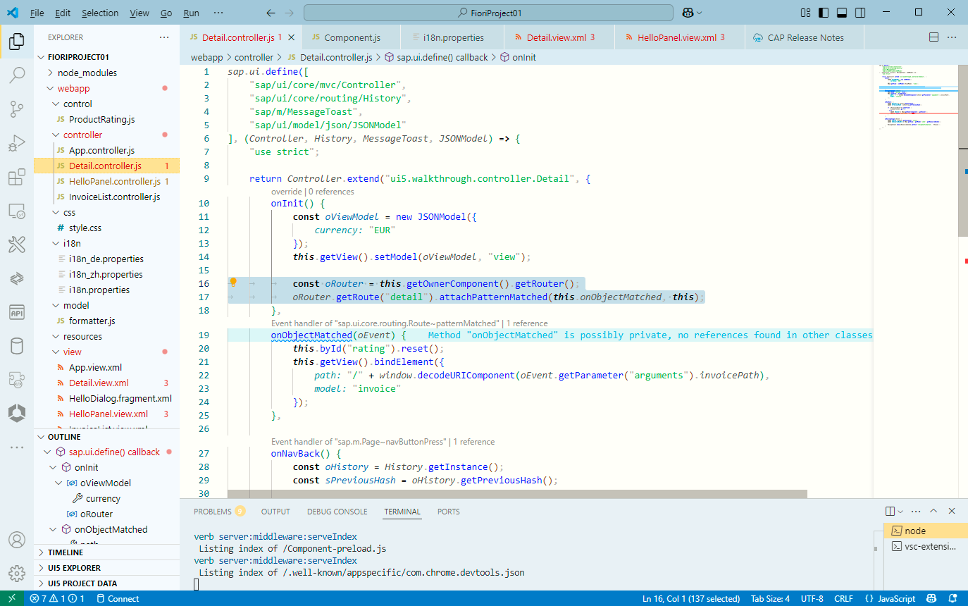
5),Detail.controller.js?
sap.ui.define(["sap/ui/core/mvc/Controller","sap/ui/core/routing/History","sap/m/MessageToast","sap/ui/model/json/JSONModel"
], (Controller, History, MessageToast, JSONModel) => {"use strict";return Controller.extend("ui5.walkthrough.controller.Detail", {onInit() {const oViewModel = new JSONModel({currency: "EUR"});this.getView().setModel(oViewModel, "view");const oRouter = this.getOwnerComponent().getRouter();oRouter.getRoute("detail").attachPatternMatched(this.onObjectMatched, this);},…});
});
這里沒啥,就是為了在詳細頁面加幾個字段,比如這個Currency,所以加的Model而已
6),運行看效果
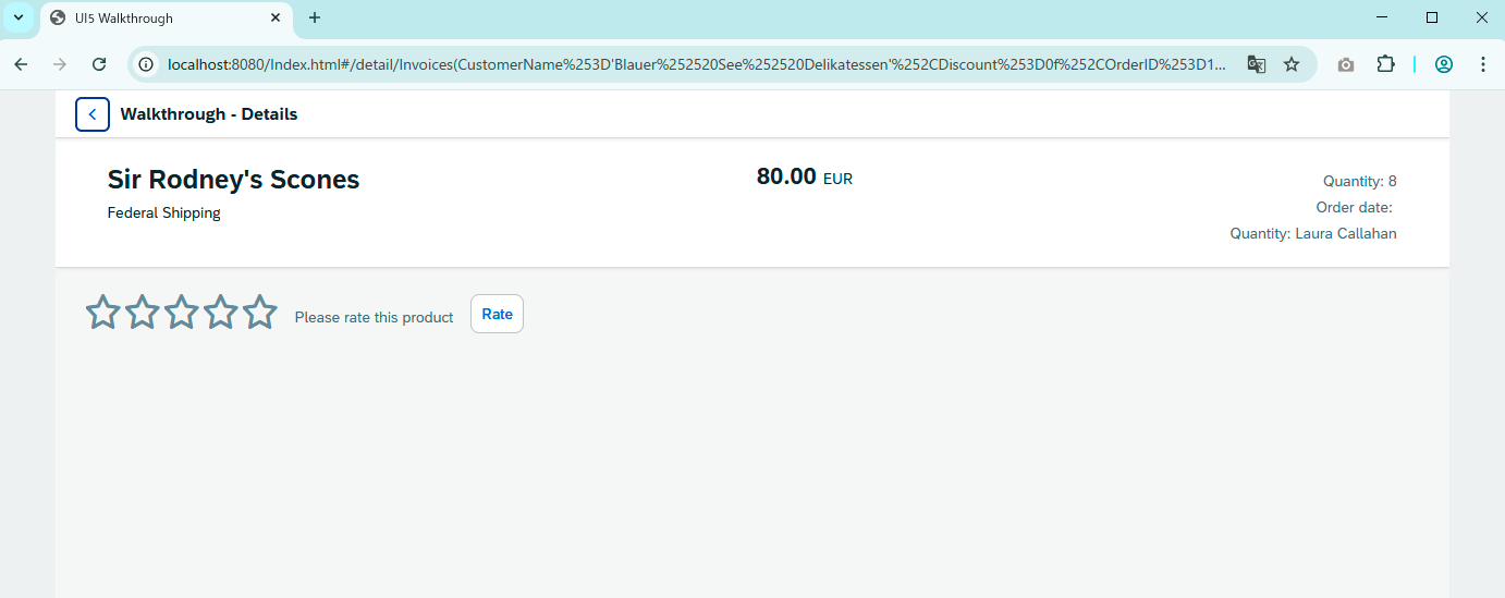
點任意一條明細,顯示下面畫面
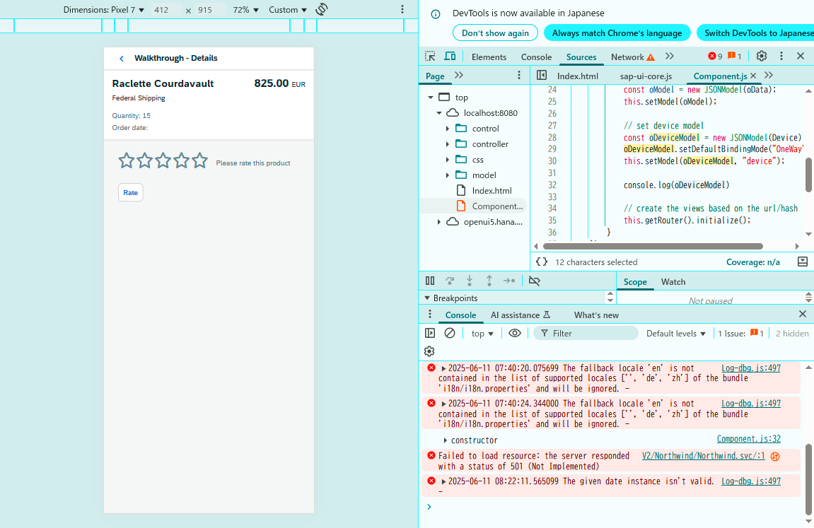
哦,我這個用的Remote Data,Order Date 在Meta Data 里沒暴漏出來。
我再加一個字段,然后再看看。
默認Destop Web 是這樣的:有幾個字段是靠右的
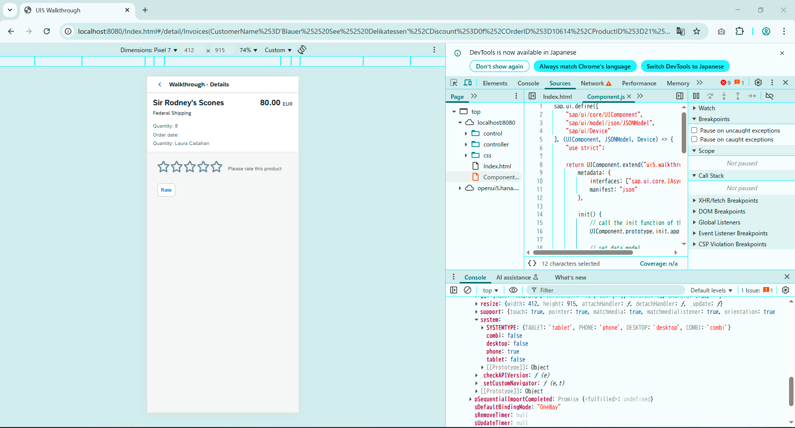
調成 phone 模式之后,就變成這樣的
其實就是適應手機屏幕尺寸,把一些字段給調在下面表示了?
官方資料里提供的是這兩種方式,在實際開發當中還是挺常用的。
其他的肯定還有,官方暫時沒提供Sample,以后有Sample再說。
以上就是本篇的全部內容。
更多SAP顧問業務知識請點擊下面目錄鏈接或東京老樹根的博客主頁
https://blog.csdn.net/shi_ly/category_12216766.html
東京老樹根-CSDN博客
)
(二十一)——unordered_set和unordered_map)


)

read函數)


:可解釋性)


