基于鴻蒙應用分層架構的ArkUI組件封裝實踐
在鴻蒙應用開發中,合理利用 ArkUI 組件進行封裝,可以實現代碼復用,提升開發效率。本文將結合鴻蒙應用分層架構的特點,詳細探討幾個典型的 ArkUI 組件封裝場景及其實現方案。
華為鴻蒙應用分層架構概覽
鴻蒙應用架構分層:將應用劃分為產品定制層、基礎特性層和公共能力層,可以降低層間的依賴性,從而提升代碼的可維護性。通過分層架構設計進一步明確了每層的職責和層間的交互機制,為開發者呈現了一個清晰且結構化的開發框架,通過封裝可復用的組件,為上層業務邏輯提供支持。
一、公用組件封裝
在應用開發中,不同業務場景常需要相同功能和樣式的 ArkUI 組件,例如統一的登錄按鈕或彈窗按鈕。以 Button 組件為例,封裝統一的樣式和邏輯后,可提供給不同業務團隊使用。
封裝方案探討
傳統方法是通過自定義組件,并將通用邏輯抽取封裝。但此方法存在一些問題,如使用方式與系統組件不一致、自定義組件入參過大、不利于后期維護。
為解決這些問題,ArkTS 提供了 attributeModifier 屬性方法。通過自定義 Class 類實現 AttributeModifier 接口,可對系統組件屬性進行擴展。
實現方案對比
方案一:適用于組合多個系統組件的場景。提供方創建自定義組件并導出,同時接受外部傳入的 AttributeModifier 類實例。
方案二:適用于單一類型組件的場景。提供方直接創建 AttributeModifier 接口實現類,并導出供使用方調用。
二、分層架構介紹和實現
產品定制層
產品定制層的各個子目錄會被編譯成一個Entry類型的HAP,作為應用的主入口。該層面向多種設備,集成相應功能和特性。產品定制層劃分為多個功能模塊,每個模塊針對特定設備或使用場景設計,并根據產品需求進行功能和交互的定制開發。在產品定制層,開發者可以從不同設備對應的應用UX設計和功能兩個維度,結合具體的業務場景,選擇一次編譯生成相同或者不同的HAP(或其組合)。通過使用定制多目標構建產物的定制功能,可以將應用所對應的HAP編譯成各自的.app文件,用于上架到應用市場。
基礎特性層
在基礎特性層中,功能模塊根據部署需求被分為兩類。對于需要通過Ability承載的功能,可以設計為Feature類型的HAP,而對于不需要通過Ability承載的功能,根據是否需要實現按需加載,可以選擇設計為HAR模塊或者HSP模塊,編譯后對應HAR包或者HSP包。
公共能力層
公共能力層的各子目錄將編譯成HAR包,僅產品定制層和基礎特性層可依賴,不允許反向依賴。該層提取模塊化公共基礎能力,為上層提供標準接口和協議,提高復用率和開發效率。
應用分層架構實現
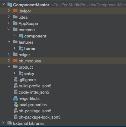
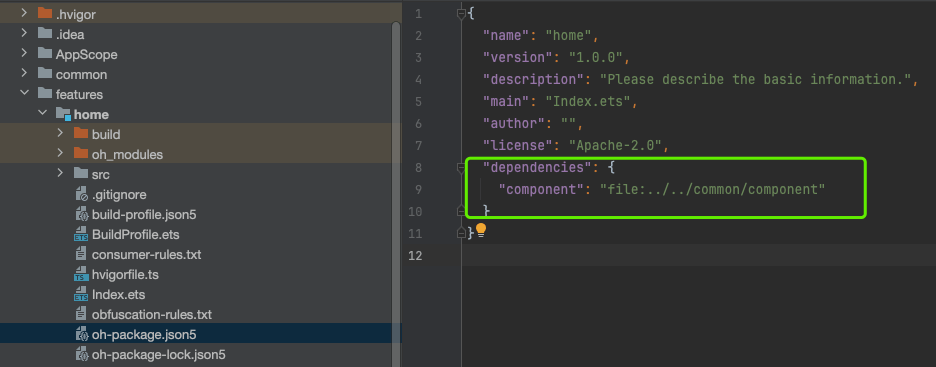
此次我們的組件封裝就是在common文件中的compontHAR靜態共享包中,需要將自定義組件在HAR的index.ets中導出組件,在使用方的oh-package.json5文件中引入
三、公用組件封裝
基礎組件封裝
場景描述
在應用開發過程中,不同的業務場景可能需要使用相同功能或樣式的ArkUI組件。例如,登錄頁面登錄按鈕和購物頁面結算按鈕可能樣式相同。該場景常用方法是抽取相同樣式的邏輯部分,并將其封裝成一個自定義組件到公共組件庫中。在業務場景開發時,統一從公共組件庫獲取封裝好的公用組件。
ArkTS為每個系統組件提供了attributeModifier屬性方法。該方法將組件屬性設置分離到系統提供的AttributeModifier接口實現類實例中,通過自定義Class類實現AttributeModifier接口對系統組件屬性進行擴展.
使用wrapBuilder方法有以下限制:
wrapBuilder方法只支持傳入全局@Builder方法。
wrapBuilder方法返回的WrappedBuilder對象的builder屬性方法只能在struct內部使用。
/*** @FileName : BaseButtonAttributeModifier* @Author : kirk.wang* @Time : 2025/5/16 10:23* @Description : 基礎組件Button封裝*/
//創建AttributeModifier接口的實現類
export class BaseButtonAttributeModifier implements AttributeModifier<ButtonAttribute> {// 私有定義Button組件特有屬性private _buttonType: ButtonType = ButtonType.Normal;private _enabled: boolean = false;// 實現組件的普通狀態下的樣式方法,系統還提供了hover狀態和其他狀態下的樣式方法applyNormalAttribute(instance: ButtonAttribute): void {instance.type(this._buttonType).stateEffect(true).fontSize(16).height(48).enabled(this._enabled)}// 鏈式配置方法type(buttonType: ButtonType): BaseButtonAttributeModifier {this._buttonType = buttonType;return this;}enabled(enabled: boolean): BaseButtonAttributeModifier {this._enabled = enabled;return this;}
}
使用方創建提供方的AttributeModifier實現類實例,并作為系統組件attributeModifier屬性方法的參數傳入。
/*** @FileName : GQButton* @Author : kirk.wang* @Time : 2025/5/16 15:35* @Description : 自定義Button組件*/
// src/main/ets/pages/CommonComponent.ets
import { BaseButtonAttributeModifier } from "./BaseButtonAttributeModifier";//提供方自定義組件并導出
@Component
export struct GQButton {@Prop text: string = '';// 接受外部傳入的AttributeModifier類實例@Prop modifier: BaseButtonAttributeModifier;build() {Button(this.text)// 將入參的AttributeModifier類實例與系統組件綁定.attributeModifier(this.modifier).fontSize(20).width(200).height(50)}
}
通過以上方案,使組件封裝更靈活,也保持了與系統組件一致的使用方式。
組合組件封裝
在實際應用開發中,會有需要抽取復用的組件為多個系統組件的組合是情況,比如新聞APP,新聞列表的item就需要經常被使用,就需要封裝一個。
封裝自定義組件MediaCard并導出:
/*** @FileName : MediaCard* @Author : kirk.wang* @Time : 2025/5/16 15:05* @Description : 復合組件封裝-圖片文本組件*/
@Component
export struct MediaCard {@Prop imageSrc: PixelMap | ResourceStr | DrawableDescriptor;@Prop title: string;@Prop content: string;@Prop imageModifier: AttributeModifier<ImageAttribute>;@Prop titleModifier: AttributeModifier<TextAttribute>;@Prop contentModifier: AttributeModifier<TextAttribute>;build() {Column({ space: 8 }) {Image(this.imageSrc).attributeModifier(this.imageModifier)Text(this.title).attributeModifier(this.titleModifier)Text(this.content).attributeModifier(this.contentModifier)}.padding(12).backgroundColor(Color.White).borderRadius(8)}
}export class ImageModifier implements AttributeModifier<ImageAttribute> {// 實現 AttributeModifier 接口private imageWidth: Length = 0;private imageHeight: Length = 0;constructor(width: Length, height: Length) {this.imageWidth = width;this.imageHeight = height;}width(width: Length) {this.imageWidth = width;return this;}height(height: Length) {this.imageHeight = height;return this;}applyNormalAttribute(instance: ImageAttribute): void {instance.width(this.imageWidth);instance.height(this.imageHeight);instance.borderRadius($r('app.float.padding_borderRadius'))}
}export class TextModifier {private _fontSize: number | string | Resource| null = 14;constructor(fontSize?: number | string | Resource) {if(fontSize!==null){this._fontSize = fontSize!;}}fontSize(fontSize: number | string | Resource): TextModifier {this._fontSize= fontSize;return this;}applyNormalAttribute(instance: TextAttribute): void {instance.fontSize(this._fontSize);}
}
導出自定義組件:
export { MediaCard,TextModifier,ImageModifier } from './src/main/ets/components/MediaCard';
使用:
import {BaseButtonAttributeModifier,GQButton,MediaCard,ImageModifier,TextModifier,DialogUtils,factoryMap
} from "component";
@Component
export struct HomePage {build() {NavDestination() {MediaCard({imageModifier: this.imagesAttribute,titleModifier: this.titleAttribute,contentModifier: this.contentAttribute,imageSrc: $r('app.media.icon_header'),title: 'title',content: 'content'})
}
```ets
### 自定義彈窗封裝1. 使用方通過全局 @Builder 封裝彈窗結構,定義彈窗的內容和樣式。
2. 提供方通過 UIContext 獲取 PromptAction 對象,封裝彈窗工具類。
3. 提供方創建打開和關閉彈窗的接口,使用方通過調用這些接口實現彈窗的顯示和隱藏。以下是彈窗工具類實現代碼:```ets
// 提供方封裝的彈窗工具類
/*** @FileName : DialogUtils* @Author : kirk.wang* @Time : 2025/5/16 16:25* @Description : 封裝彈窗的工具類*/
import { ComponentContent, promptAction } from '@kit.ArkUI';
export class DialogUtils{private static dialog:DialogUtils;private data:PopViewModel[] = new Array<PopViewModel>;static getInstance(): DialogUtils {if (!DialogUtils.dialog) {DialogUtils.dialog = new DialogUtils();}return DialogUtils.dialog;}//通過openCustomDialog創建打開彈窗的showDialog函數。static showDialog<T extends object>(type: PopViewShowType, contentView: WrappedBuilder<[T]>, args: T,options?: promptAction.BaseDialogOptions):void {let uiContext = AppStorage.get<UIContext>('uiContext');if (uiContext) {// The promptAction object was obtained.let prompt = uiContext.getPromptAction();let componentContent = new ComponentContent(uiContext, contentView, args);let customOptions: promptAction.BaseDialogOptions = {alignment: options?.alignment || DialogAlignment.Bottom};// Open pop-ups using openCustomDialogprompt.openCustomDialog(componentContent, customOptions);let data = DialogUtils.getInstance().data;let info: PopViewModel = {com: componentContent,popType: type};data[0] = info;}}
//通過closeCustomDialog創建關閉彈窗的closeDialog函數static closeDialog(popType:PopViewShowType):void{let context = AppStorage.get<UIContext>('uiContext');if(context){let prompt = context.getPromptAction();let sameTypeList = DialogUtils.getInstance().data.filter((model) => {return model.popType === popType;})let info = sameTypeList[sameTypeList.length - 1];if (info.com) {DialogUtils.getInstance().data = DialogUtils.getInstance().data.filter((model) => {return model.com !== info.com;})prompt.closeCustomDialog(info.com);}}}static showPopView<T extends object>(contentView: WrappedBuilder<[T]>, args: T,options?: promptAction.BaseDialogOptions):void {DialogUtils.showDialog(PopViewShowType.OPEN, contentView, args, options);}static closePopView():void {DialogUtils.closeDialog(PopViewShowType.OPEN);}
}
interface PopViewModel {com: ComponentContent<object>;popType: PopViewShowType;
}export enum PopViewShowType {OPEN
}
//使用DialogUtils.showPopView<Object>(wrapBuilder(buildDialogView), new Object(),{ alignment: DialogAlignment.Center });
//構建buildDialogView
@Builder
export function buildDialogView(_obj: Object) {Column({ space: 16 }) {Text($r('app.string.tips')).fontSize(16).fontWeight(FontWeight.Bold)Text($r('app.string.content')).fontSize(16)Row() {Button($r('app.string.cancel')).fontColor(Color.Blue).backgroundColor(Color.White).margin({ right: 10 }).width('42%').onClick(() => {DialogUtils.closePopView();})Button($r('app.string.confirm')).width('42%').onClick(() => {DialogUtils.closePopView();})}.justifyContent(FlexAlign.Center).width(328)}.padding(18).justifyContent(FlexAlign.Center).alignItems(HorizontalAlign.Center).backgroundColor(Color.White).borderRadius($r('app.float.border_radius'))
}
彈窗組件的封裝更加簡潔高效,使用方可以快速實現自定義彈窗。
三、組件工廠類封裝
當需要為不同的業務需求提供多種組件時,組件工廠類封裝是一種有效的解決方案。
實現流程優化
在組件工廠實現方,通過全局 @Builder 方法封裝需要工廠化的組件。
將封裝好的 @Builder 方法使用 wrapBuilder 函數包裹,并存入 Map 結構中,其中 key 為組件名,value 為 WrappedBuilder 對象。
在使用方,通過組件工廠的 key 值獲取對應的 WrappedBuilder 對象,并在 build 方法中調用其 builder 屬性方法獲取組件。
以選擇月份的組件為例,項目種有多個地方需要選擇月份,那么以下是組件工程封裝的實現代碼:
// 組件工廠實現方
/*** @FileName : FactoryMap* @Author : kirk.wang* @Time : 2025/5/18 00:50* @Description :月份選擇組件*/
let mothList = ["1","2","3","4","5","6","7","8","9","10","11","12"];
@Builder
function monthRadio() {Text($r('app.string.month')).width('100%').fontColor($r('sys.color.mask_secondary'))List(){ForEach(mothList, (item: string, index: number) => {ListItem(){Row() {Radio({ value: `${index}`, group: 'radioGroup' })Text(`${item}月`)}.width('100%')}});}}// 創建組件工廠的集合
let factoryMap: Map<string, object> = new Map();//把需要的工廠存儲在組件工廠中的組件。
factoryMap.set('monthRadio', wrapBuilder(monthRadio));// Export assembly factory
export { factoryMap };//使用 HomePage.ets
import { factoryMap} from "component";@Component
export struct HomePage {monthRadio: WrappedBuilder<[]> = factoryMap.get('monthRadio') as WrappedBuilder<[]>;build() {NavDestination() {this.monthRadio.builder();}
}
四、總結與展望
在鴻蒙應用分層架構下進行 ArkUI 組件封裝,可以提高開發效率和代碼復用率。通過合理利用 ArkTS 提供的 attributeModifier 屬性方法、PromptAction 對象以及組件工廠模式,可以實現靈活、高效的組件封裝。未來,隨著鴻蒙應用生態的發展,組件封裝技術將不斷完善。開發者們可以探索更多創新的封裝方式,為鴻蒙應用開發提供更強大的支持。
四、Demo代碼倉
https://gitcode.com/kirkWang/componentMaster


與大語言模型(LLM))


)


:三層架構)