目標:
中間自適應,兩邊定寬,并且三欄布局在一行展示。
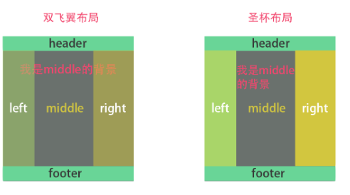
圣杯布局
實現方法:
通過float搭建布局+margin使三列布局到一行上+relative相對定位調整位置;
給外部容器添加padding,通過相對定位調整左右兩列的位置。
<div id="header">#header</div><div id="container"><div id="center" class="column">#center</div><div id="left" class="column">#left</div><div id="right" class="column">#right</div></div>
<div id="footer">#footer</div>
#header, #footer {background: rgba(29, 27, 27, 0.726);text-align: center;height: 60px;line-height: 60px;clear: both;
}
#container{padding: 0 200px;overflow: hidden;/*形成BFC撐開文檔*/
}
.column{height: 200px;float: left;position: relative;
}
#center{width: 100%;background-color: tomato;
}
#left{width: 200px;margin-left: -100%; /* 把left移動到和center同一行并且左邊對齊 */left: -200px; /* 再向左移動到main的padding區域,就不會擋住center了 */background-color: aqua;
}
#right{width: 200px;margin-left: -200px; /* 把right移動到和center同一行并且右邊對齊 */right: -200px; /* 向右移動到右邊的padding區域*/background-color: wheat;
}
圣杯布局效果
雙飛翼布局
實現方法:
通過float+margin,不使用相對定位;
在中間層外面套一層div,加上margin將 center內容 擠到中間
<div id="header">#header</div><div id="container"><div id="center" class="column"><div id="center-content">#center</div></div><div id="left" class="column">#left</div><div id="right" class="column">#right</div>
</div><div id="footer">#footer</div>
#header, #footer {background: rgba(29, 27, 27, 0.726);text-align: center;height: 60px;line-height: 60px;clear: both;
}
.column{height: 200px;float: left;
}
#center{width: 100%;background-color: tomato;
}
#center-content{margin: 0 200px;
}
#left{width: 200px;margin-left: -100%; /* 作用和圣杯一樣 */background-color: aqua;}
#right {width: 200px;margin-left: -200px; /* 作用和圣杯一樣 */background-color: wheat;
}
雙飛翼布局
兩者本質區別


![[Java][Leetcode middle] 121. 買賣股票的最佳時機](http://pic.xiahunao.cn/[Java][Leetcode middle] 121. 買賣股票的最佳時機)


