IRegionManager?和IContainerExtension
IRegionManager?是 Prism 框架中用于管理 UI 區域(Regions)的核心接口,它實現了模塊化應用中視圖(Views)的動態加載、導航和生命周期管理。
IContainerExtension?是依賴注入(DI)容器的抽象接口,而?Resolve<T>()?方法用于從容器中解析指定類型的實例
public class u1: UserControl
{IRegionManager _regionManager;IContainerExtension _container;public u1(IContainerExtension container, IRegionManager regionManager){_regionManager = regionManager;_container = container;//從容器中解析ListView類型的實例。如果ListView已注冊為單例,則返回單例實例;否則返回新實例ListView ListView11 =_container.Resolve<ListView>();//獲取中心顯示區域IRegion region= _regionManager.Regions["ContentRegion"];//為中心顯示區域添加視圖(ListView11),并為視圖分配一個名稱“ListView1”region.Add(ListView11 , "ListView1");//將指定視圖(ListView11)設置為區域(region)中的活動視圖region.Activate(ListView11);}}
u1的xaml中有:
<ContentControl Grid.Column="1" prism:RegionManager.RegionName="ContentRegion" />
......
<dx:DXTabItem Header="名稱">
? ? ? ?<local:ListView/>//將?ListView?視圖嵌入到?DXTabItem?中,作為選項卡頁的內容。</dx:DXTabItem>
其中ListView是自定義的另一個用戶控件。
在 Prism 框架中,結合第三方控件庫(如 DevExpress 的?DXTabItem)時,可以通過 XAML 直接定義視圖(如?ListView)并將其嵌入到選項卡控件中。
region.Activate(view)?方法用于將指定視圖(view)設置為區域(IRegion)中的活動視圖。
單選框的動態綁定
? <StackPanel Margin="20">
? ? ? ? ? ? <TextBlock Text="組合單選框" FontWeight="Bold"/>
? ? ? ? ? ? <DockPanel x:Name="GroupRadioButton">
? ? ? ? ? ? ? ? <StackPanel DockPanel.Dock="Left">
? ? ? ? ? ? ? ? ? ? <ItemsControl ItemsSource="{Binding RadioButtons}">
? ? ? ? ? ? ? ? ? ? ? ? <ItemsControl.ItemTemplate>
? ? ? ? ? ? ? ? ? ? ? ? ? ? <DataTemplate>
? ? ? ? ? ? ? ? ? ? ? ? ? ? ? ? <RadioButton Content="{Binding SecurityId}"?
? ? ? ? ? ? ? ? ? ? ? ? ? ? ? ? ? ? ?IsChecked="{Binding IsSelected, Mode=TwoWay}"
? ? ? ? ? ? ? ? ? ? ? ? ? ? ? ? ? ? ?GroupName="RadioButtons"
? ? ? ? ? ? ? ? ? ? ? ? ? ? ? ? ? ? ?Command="{Binding DataContext.RadioCheckCommand,?
? ? ? ? ? ? ? ? ? ? ? ? ? ? ? ? ? ? ?RelativeSource={RelativeSource AncestorType=Window}}"
? ? ? ? ? ? ? ? ? ? ? ? ? ? ? ? ? ? ?CommandParameter="{Binding}">
? ? ? ? ? ? ? ? ? ? ? ? ? ? ? ? </RadioButton>
? ? ? ? ? ? ? ? ? ? ? ? ? ? </DataTemplate>
? ? ? ? ? ? ? ? ? ? ? ? </ItemsControl.ItemTemplate>
? ? ? ? ? ? ? ? ? ? </ItemsControl>
? ? ? ? ? ? ? ? </StackPanel>? ? ? ? ? ? ? ? <StackPanel DockPanel.Dock="Right"?
? ? ? ? ? ? ? ? ? ? Orientation="Horizontal"?
? ? ? ? ? ? ? ? ? ? HorizontalAlignment="Center"?
? ? ? ? ? ? ? ? ? ? VerticalAlignment="Center">
? ? ? ? ? ? ? ? ? ? <TextBlock Text="{Binding SelectedRadioButton.SecurityId, StringFormat='結果:{0}'}" />
? ? ? ? ? ? ? ? </StackPanel>
? ? ? ? ? ? </DockPanel>
? ? ? ? </StackPanel>
using Prism.Commands;
using Prism.Mvvm;
using StrategyClient.Models;
using System;
using System.Collections.Generic;
using System.Collections.ObjectModel;
using System.Linq;
using System.Text;
using System.Threading.Tasks;
using System.Windows.Data;namespace StrategyClient.ViewModels
{class SellStrategyViewModel : BindableBase{/// <summary>/// 當前選擇的單選框/// </summary>private ConfigAccount _selectedRadioButton;/// <summary>/// 當前選擇的單選框/// </summary>public ConfigAccount SelectedRadioButton{get => _selectedRadioButton;set => SetProperty(ref _selectedRadioButton, value);}/// <summary>/// 需要顯示的一組單選框的信息鏈表/// </summary>public ObservableCollection<ConfigAccount> RadioButtons { get; } = new ObservableCollection<ConfigAccount>();/// <summary>/// 綁定命令觸發(單選框選擇改變時)/// </summary>public DelegateCommand<ConfigAccount> RadioCheckCommand { get; }public SellStrategyViewModel(){// 初始化單選框選項RadioButtons.Add(new ConfigAccount { SecurityId = "選項1", IsSelected = false });RadioButtons.Add(new ConfigAccount { SecurityId = "選項2", IsSelected = false });RadioButtons.Add(new ConfigAccount { SecurityId = "選項3", IsSelected = false });// 設置默認選中項if (RadioButtons.Count > 0){RadioButtons[0].IsSelected = true;SelectedRadioButton = RadioButtons[0];}// 注冊命令RadioCheckCommand = new DelegateCommand<ConfigAccount>(OnRadioChecked);}private void OnRadioChecked(ConfigAccount item){// 更新選中項foreach (var radioButton in RadioButtons){radioButton.IsSelected = radioButton == item;}SelectedRadioButton = item;}}
}
檢查UI綁定路徑
xmlns:diagnostics="clr-namespace:System.Diagnostics;assembly=WindowsBase"
......
<CheckBox IsChecked="{Binding IsSelectedV, Mode=TwoWay, diagnostics:PresentationTraceSources.TraceLevel=High}"
HorizontalAlignment="Center"
VerticalAlignment="Center"/>
如果直接綁定到?
IsSelectedV?屬性不起作用,可以嘗試使用?CellValue?綁定:<CheckBox IsChecked="{Binding RowData.Row.IsSelectedV, Mode=TwoWay}"/>在這種情況下,
RowData.Row?通常是指當前行的數據對象。
實現彈窗功能:
?//App中注冊對話框
containerRegistry.RegisterDialog<View, ViewModel>();
// 顯示彈窗
void ShowDialog(string name, IDialogParameters parameters, Action<IDialogResult> callback);
?
// 顯示模態彈窗(阻塞式)
void Show(string name, IDialogParameters parameters, Action<IDialogResult> callback);
?主視圖的ViewModel:
public ObservableCollection<string> Items
{
? ? ? ? ? ? get;
? ? ? ? ? ? set;
?} = new ObservableCollection<string>();? ? ? ?/// <summary>
? ? ? ? /// 按鈕按下彈窗
? ? ? ? /// </summary>
? ? ? ? private void Button_Click()
? ? ? ? {
? ? ? ? ? ? //傳遞參數
? ? ? ? ? ? var parameters = new DialogParameters
? ? ? ? ? ? ? ? {
? ? ? ? ? ? ? ? ? ? { "DataList", Items }
? ? ? ? ? ? ? ? };????????????????//View:視圖名,parameters:要傳遞的參數
? ? ? ? ? ? _dialogService.ShowDialog("View", parameters, (IDialogResult result) =>
? ? ? ? ? ? {//彈窗關閉后回調函數
? ? ? ? ? ? ? ? // 從結果中獲取數據鏈表
? ? ? ? ? ? ? ? if (result.Parameters.TryGetValue<ObservableCollection<string>>("DataList", out var dataList))
? ? ? ? ? ? ? ? {
? ? ? ? ? ? ? ? ? ? Items = dataList;
? ? ? ? ? ? ? ? }
? ? ? ? ? ? });? ? ? ? }
?// 定義彈窗事件
public class ShowDialogEvent : PubSubEvent<DialogParameters> { }// 發布彈窗請求
var parameters = new DialogParameters { { "message", "保存成功!" } };
_eventAggregator.GetEvent<ShowDialogEvent>().Publish(parameters);
?
// 彈窗服務訂閱事件并顯示彈窗
_eventAggregator.GetEvent<ShowDialogEvent>()
? ? .Subscribe(ShowDialog, ThreadOption.UIThread);
private void ShowDialog(DialogParameters parameters)
{
? ? _dialogService.ShowDialog("MessageDialog", parameters);
}
View視圖的ViewModel
class ViewModel : BindableBase, IDialogAware
{
public ObservableCollection<string> Items
{
? ? ? ? ? ?get => _items;
? ? ? ? ? ? set => SetProperty(ref _items, value);
?}?/// <summary>
? ? ? ? /// 對話框事件,傳遞對話框的結果
? ? ? ? /// </summary>
? ? ? ? public event Action<IDialogResult> RequestClose;
? ? ? ? /// <summary>
? ? ? ? /// 關閉對話框時傳遞參數
? ? ? ? /// </summary>
? ? ? ? public event Action<IDialogParameters> RequestClosed;? // 對話框標題
? ? ? ? public string Title => "彈窗標題";? /// <summary>
? ? ? ? /// 允許關閉對話框
? ? ? ? /// </summary>
? ? ? ? /// <returns></returns>
? ? ? ? public bool CanCloseDialog()
? ? ? ? {
? ? ? ? ? ? return true;
? ? ? ? }? ? ? ? /// <summary>
? ? ? ? /// 關閉對話框時
? ? ? ? /// </summary>
? ? ? ? public void OnDialogClosed()
? ? ? ? {
? ? ? ? ? ? var resultParameters = new DialogParameters
? ? ? ? ? ? {
? ? ? ? ? ? ? ? { "DataList", Items }
? ? ? ? ? ? };
? ? ? ? ? ? // 觸發請求關閉事件
? ? ? ? ? ? RequestClosed?.Invoke(resultParameters);
? ? ? ? }? ? ? ? /// <summary>
? ? ? ? /// 打開對話框時
? ? ? ? /// </summary>
? ? ? ? /// <param name="parameters"></param>
? ? ? ? public void OnDialogOpened(IDialogParameters parameters)
? ? ? ? {
? ? ? ? ? ? if (parameters.TryGetValue<ObservableCollection<SellStrategyModel>>("DataList", out var initialName))
? ? ? ? ? ? {
? ? ? ? ? ? ? ? Items = initialName;
? ? ? ? ? ? }
? ? ? ? }}
單選框:
<DockPanel x:Name="GroupRadioButton">
? ? ? ? ? ? ? ? ? ? <ItemsControl ItemsSource="{Binding RadioButtons}">
? ? ? ? ? ? ? ? ? ? ? ? <ItemsControl.ItemsPanel>
? ? ? ? ? ? ? ? ? ? ? ? ? ? <ItemsPanelTemplate>
? ? ? ? ? ? ? ? ? ? ? ? ? ? ? ? <WrapPanel Orientation="Horizontal"/>
? ? ? ? ? ? ? ? ? ? ? ? ? ? </ItemsPanelTemplate>
? ? ? ? ? ? ? ? ? ? ? ? </ItemsControl.ItemsPanel>
? ? ? ? ? ? ? ? ? ? ? ? <ItemsControl.ItemTemplate>
? ? ? ? ? ? ? ? ? ? ? ? ? ? <DataTemplate>
? ? ? ? ? ? ? ? ? ? ? ? ? ? ? ? <RadioButton Content="{Binding Id}"?
? ? ? ? ? ? ? ? ? ? ? ? ? ? ? ? ? ? ?IsChecked="{Binding IsSelected, Mode=TwoWay}"
? ? ? ? ? ? ? ? ? ? ? ? ? ? ? ? ? ? ?GroupName="RadioButtons"
? ? ? ? ? ? ? ? ? ? ? ? ? ? ? ? ? ? ?Command="{Binding DataContext.RadioCheckCommand,?
? ? ? ? ? ? ? ? ? ? ? ? ? ? ? ? ? ? ?RelativeSource={RelativeSource AncestorType=Window}}"
? ? ? ? ? ? ? ? ? ? ? ? ? ? ? ? ? ? ?CommandParameter="{Binding}">
? ? ? ? ? ? ? ? ? ? ? ? ? ? ? ? </RadioButton>
? ? ? ? ? ? ? ? ? ? ? ? ? ? </DataTemplate>
? ? ? ? ? ? ? ? ? ? ? ? </ItemsControl.ItemTemplate>
? ? ? ? ? ? ? ? ? ? </ItemsControl>
? ? ? ? ? ? ? ? </DockPanel>
viewModel
?/// <summary>
? ? ? ? /// 當前選擇的單選框
? ? ? ? /// </summary>
? ? ? ? private ConfigAccount _selectedRadioButton;
? ? ? ? /// <summary>
? ? ? ? /// 當前選擇的單選框
? ? ? ? /// </summary>
? ? ? ? public ConfigAccount SelectedRadioButton
? ? ? ? {
? ? ? ? ? ? get => _selectedRadioButton;
? ? ? ? ? ? set => SetProperty(ref _selectedRadioButton, value);
? ? ? ? }?/// <summary>
? ? ? ? /// 需要顯示的一組單選框的信息鏈表
? ? ? ? /// </summary>
? ? ? ? public ObservableCollection<ConfigAccount> RadioButtons { get; } = new ObservableCollection<ConfigAccount>();
? ? ? ? /// <summary>
? ? ? ? /// 綁定命令觸發(單選框選擇改變時)
? ? ? ? /// </summary>
? ? ? ? public DelegateCommand<ConfigAccount> RadioCheckCommand { get; }?????????public ViewModel()
? ? ? ? {
? ? ? ? ? ? AddSecurityStrategy();
? ? ? ? ? ? // 設置默認選中項
? ? ? ? ? ? if (RadioButtons.Count > 0)
? ? ? ? ? ? {
? ? ? ? ? ? ? ? RadioButtons[0].IsSelected = true;
? ? ? ? ? ? ? ? SelectedRadioButton = RadioButtons[0];
? ? ? ? ? ? }
? ? ? ? ? ? RadioCheckCommand = new DelegateCommand<ConfigAccount>(OnRadioChecked);
? ? ? ? }?/// <summary>
? ? ? ? /// 單選框按鈕選擇時觸發
? ? ? ? /// </summary>
? ? ? ? /// <param name="item">選擇的單選框對象</param>
? ? ? ? private void OnRadioChecked(ConfigAccount item)
? ? ? ? {
? ? ? ? ? ? // 更新選中項
? ? ? ? ? ? //foreach (var radioButton in RadioButtons)
? ? ? ? ? ? //{
? ? ? ? ? ? // ? ?radioButton.IsSelected = radioButton == item;
? ? ? ? ? ? //}
? ? ? ? ? ? SelectedRadioButton = item;
? ? ? ? }? ? ? ? /// <summary>
? ? ? ? /// 添加需要顯示的單選框按鈕
? ? ? ? /// </summary>
? ? ? ? private void AddSecurityStrategy()
? ? ? ? {
? ? ? ? ? ? string[] addStrategys = System.Configuration.ConfigurationManager.AppSettings["SellStrategy"].ToString().Split('|');
? ? ? ? ? ? foreach (string addStrategy in addStrategys)
? ? ? ? ? ? {
? ? ? ? ? ? ? ? RadioButtons.Add(new ConfigAccount() { IsSelected = false, SecurityId = addStrategy });
? ? ? ? ? ? }
? ? ? ? }
?
動態加載不同模塊的 UI
方法一:
1.注冊區域
確保?"MainContent"?區域已通過?IRegionManager?注冊(通常在 XAML 中聲明或代碼中動態添加):
_regionManager.Regions.Add("MainContent", new Region());
或者
<!-- 或在 XAML 中聲明區域 --> <ContentControl prism:RegionManager.RegionName="MainContent" />
2.App.xaml.cs
?//MainView:要加載的視圖的名稱,MainView1:起的名字
containerRegistry.RegisterForNavigation<MainWindowView, MainWindowViewModel>("MainView1");
或
//MainView:要加載的視圖的名稱,沒起名字
registry.RegisterForNavigation<MainWindowView, MainWindowViewModel>();
3.點擊按鈕時實現ViewModel:
//起名字了這里傳入起的名字
_regionManager.RequestNavigate("MainContent", "MainView1");
//沒起名字,這里傳入類名
_regionManager.RequestNavigate("MainContent", "MainWindowView");
//傳遞參數:
var parameters = new NavigationParameters();
parameters.Add("orderId", 123);
_regionManager.RequestNavigate("MainRegion", "OrderDetailView", parameters);
方法二:
1.注冊區域
確保?"MainContent"?區域已通過?IRegionManager?注冊(通常在 XAML 中聲明或代碼中動態添加):
_regionManager.Regions.Add("MainContent", new Region());
或者
<!-- 或在 XAML 中聲明區域 --> <ContentControl prism:RegionManager.RegionName="MainContent" />
2.在模塊初始化時注冊視圖到指定區域:
void MainWindow_Loaded(object sender, RoutedEventArgs e)
? ? ? ? {//開始的時候MainContent會顯示loading視圖
? ? ? ? ? ? _regionManager.RegisterViewWithRegion("MainContent", typeof(loading));
? ? ? ? }
3.點擊按鈕時實現ViewModel:
? ?_regionManager.RequestNavigate("MainContent", "loading");
獲取UI界面實例的view Model,調用對應的函數
方法一:
? // 獲取目標區域
IRegion contentRegion = _regionManager.Regions["MainContent"];
// 獲取當前激活的視圖
object activeView = contentRegion.ActiveViews.FirstOrDefault();
?// 獲取視圖的 DataContext(即 ViewModel)
var viewModel = activeView.GetType().GetProperty("DataContext")?.GetValue(activeView) as DownLoadViewModel;
?//調用視圖方法改變UI內文字
viewModel?.testc();
方法二:
//注冊為單例
registry.RegisterSingleton<DownLoadViewModel>();
// 直接解析 ViewModel 實例
var viewMode2 = _container.Resolve<DownLoadViewModel>();
viewMode2?.testc();
注冊服務
| 方法 | 用途 | 生命周期控制 |
|---|---|---|
RegisterForNavigation<TView>() | 注冊視圖到導航系統,自動綁定 ViewModel(通過命名約定) | 默認瞬態(每次導航創建新實例) |
RegisterSingleton<T>() | 注冊類型為單例,全局唯一實例 | 單例 |
RegisterForNavigation<TView, TViewModel>() | 顯式指定視圖和 ViewModel 的綁定關系 | 可自定義(結合其他注冊方法) |
Register<TInterface, TImplementation>() | 注冊接口到具體實現 | 默認瞬態 |
RegisterInstance<T>(T instance) | 注冊已創建的實例為單例 | 單例 |
//舉例
registry.RegisterForNavigation<DownLoadView, DownLoadViewModel>("DownLoad1");
registry.RegisterForNavigation<MainWindowView, MainWindowViewModel>();
?registry.RegisterSingleton<DownLoadViewModel>();
?registry.RegisterForNavigation<DownLoadView>("downLoad");
registry.RegisterForNavigation<loading>();
containerRegistry.Register<IDownLoadService, DownLoadService>();
var downloadService = new DownLoadService(); containerRegistry.RegisterInstance<IDownLoadService>(downloadService);
管理區域和視圖:
| 方法 | 用途 | 特點 |
|---|---|---|
RegisterViewWithRegion | 靜態注冊視圖到區域,自動加載 | 適用于固定視圖,初始化時自動加載 |
RequestNavigate | 動態導航到視圖,支持參數和回調 | 適用于按需加載的視圖,支持導航邏輯 |
IRegion.Add?/?IRegion.Remove | 手動添加或移除視圖 | 適用于精細控制視圖的顯示/隱藏 |
IRegion.Activate?/?IRegion.Deactivate | 激活或停用視圖 | 適用于切換視圖的可見性 |
IRegion.NavigationService | 通過導航服務實現復雜導航邏輯 | 適用于需要自定義導航流程的場景 |
//舉例
protected override void OnInitialized(IContainerProvider containerProvider)
{
var regionManager = containerProvider.Resolve<IRegionManager>();
// 將 OrderListView 注冊到 MainRegion,視圖會在區域初始化時自動加載 regionManager.RegisterViewWithRegion("MainRegion", typeof(OrderListView));
}
?_regionManager.RequestNavigate("MainContent", "loading");
var region = _regionManager.Regions["MainRegion"];var view = _container.Resolve<OrderListView>();
region.Add(view); region.Activate(view); // 激活視圖
var region = _regionManager.Regions["MainRegion"];var view = region.Views.FirstOrDefault(v => v is OrderListView); if (view != null)
{ region.Remove(view); }
var region = _regionManager.Regions["MainRegion"];var view = region.Views.FirstOrDefault(v => v is OrderListView); if (view != null)
{
region.Activate(view); // 激活視圖
// region.Deactivate(view); // 停用視圖
}
INavigationAware:
INavigationAware?是 Prism 框架中用于處理導航生命周期事件的核心接口。它允許 ViewModel 在導航過程中響應以下三個關鍵事件:
- 導航到當前視圖時(
OnNavigatedTo) - 從當前視圖導航離開時(
OnNavigatedFrom) - 導航確認階段(
IsNavigationTarget,用于決定是否復用現有 ViewModel 實例)
通過實現?INavigationAware,可以精細控制 ViewModel 在導航過程中的行為,例如初始化數據、清理資源或決定是否復用實例。
INavigationAware?是 Prism 中管理導航生命周期的核心接口。- 通過實現?
IsNavigationTarget、OnNavigatedTo?和?OnNavigatedFrom,可以精細控制 ViewModel 在導航過程中的行為。 - 適用于需要初始化數據、清理資源或決定是否復用實例的場景。
- 合理使用導航參數(
NavigationParameters)可以傳遞上下文數據。
區域上下文?
是一種用于在區域(IRegion)和其宿主控件(如?ContentControl、ItemsControl?等)之間傳遞上下文數據的機制。它允許開發者在區域中共享數據,而無需直接依賴視圖或視圖模型,從而提升代碼的解耦性和靈活性。
// 獲取區域并設置上下文 var region = _regionManager.Regions["MainRegion"]; region.Context = new?AppContext?{ UserId = "123", Role = "Admin" };//AppContext:自定義Mode
App.config用法
App.config代碼:
<?xml version="1.0" encoding="utf-8" ?>
<configuration>
? ? <startup>?
? ? ? ? <supportedRuntime version="v4.0" sku=".NETFramework,Version=v4.7.2" />
? ? </startup>
??
? <appSettings>
? ? <add key="keyName" value="valueName"/>
? ? <add key="keyName2" value="valueName2"/>
? ? <add key="keyName3" value="valueName3"/>
? </appSettings>
</configuration>
??string settingValue = ?? ??? ???System.Configuration.ConfigurationManager.AppSettings["keyName"];
TemplateBinding 和Binding 的區別
TemplateBinding:- 用途:專門用于控件模板(如
ControlTemplate或DataTemplate)中,用于將模板中的屬性綁定到模板化控件(即應用該模板的控件)的對應屬性。 - 上下文:只能在控件模板內部使用,用于模板和模板化控件之間的屬性綁定。
- 用途:專門用于控件模板(如
Binding:- 用途:是一種通用的數據綁定機制,用于在XAML中建立任何兩個屬性之間的綁定關系,無論是控件與控件之間、控件與數據源之間,還是其他任何對象屬性之間的綁定。
- 上下文:可以在XAML的任何地方使用,不局限于控件模板。
<ControlTemplate TargetType="Button">
? ? <Border Background="{TemplateBinding Background}"?
? ? ? ? ? ? BorderBrush="{TemplateBinding BorderBrush}"?
? ? ? ? ? ? BorderThickness="{TemplateBinding BorderThickness}">
? ? ? ? <ContentPresenter HorizontalAlignment="Center" VerticalAlignment="Center"/>
? ? </Border>
</ControlTemplate>
<TextBox Text="{Binding UserName, Mode=TwoWay, UpdateSourceTrigger=PropertyChanged}"/>
ControlTemplate
ControlTemplate?是 WPF 和 UWP 等 XAML 框架中的核心概念,用于定義控件的視覺結構和交互行為。它允許開發者自定義控件的外觀,而不必修改控件的底層邏輯。
一個典型的?ControlTemplate?包含以下關鍵部分:
- 觸發器(Triggers):用于響應控件狀態變化(如鼠標懸停、按下等),動態修改控件的外觀。
- 內容呈現器(ContentPresenter):用于顯示控件的內容(如按鈕的文本或圖像)。
- 控件部件(Parts):模板中定義的命名元素,控件邏輯可以通過?
TemplateBinding?或?GetTemplateChild?方法訪問這些部件。 - 綁定(Bindings):通過?
TemplateBinding?將模板中的屬性綁定到模板化控件的屬性,實現動態數據驅動。
? <Style x:Key="CardButtonStyle" TargetType="Button">
?<Setter Property="Template">
? ? ? ? ? ? ? ? <Setter.Value><ControlTemplate TargetType="Button">
? ? ? ? ? ? ? ? <Border x:Name="border"
? ? ? ? ? ? ? ? ? ? ? ? Background="{TemplateBinding Background}"
? ? ? ? ? ? ? ? ? ? ? ? BorderBrush="{TemplateBinding BorderBrush}"
? ? ? ? ? ? ? ? ? ? ? ? BorderThickness="{TemplateBinding BorderThickness}"
? ? ? ? ? ? ? ? ? ? ? ? CornerRadius="10"
? ? ? ? ? ? ? ? ? ? ? ? Padding="5">//定義了按鈕的外觀,包括背景色、邊框、圓角和內邊距
? ? ? ? ? ? ? ? ? ? <ContentPresenter HorizontalAlignment="Center" VerticalAlignment="Center"/>//用于顯示按鈕的內容
? ? ? ? ? ? ? ? </Border>
? ? ? ? ? ? ? ? <ControlTemplate.Triggers>//當鼠標懸停在按鈕上時(
IsMouseOver=True),將?Border?的背景色設置為?LightBlue。? ? ? ? ? ? ? ? ? ? <Trigger Property="IsMouseOver" Value="True">
? ? ? ? ? ? ? ? ? ? ? ? <Setter TargetName="border" Property="Background" Value="LightBlue"/>
? ? ? ? ? ? ? ? ? ? </Trigger>//當按鈕被按下時(
IsPressed=True),將?Border?的背景色設置為?DarkBlue。
? ? ? ? ? ? ? ? ? ? <Trigger Property="IsPressed" Value="True">
? ? ? ? ? ? ? ? ? ? ? ? <Setter TargetName="border" Property="Background" Value="DarkBlue"/>
? ? ? ? ? ? ? ? ? ? </Trigger>
? ? ? ? ? ? ? ? </ControlTemplate.Triggers>
? ? ? ? ? ? </ControlTemplate></Setter.Value>
? ? ? ? ? ? </Setter></Style>
或者將ControlTemplate定義在在控件中:
<Button Content="按鈕控件"? Width="300" Height="80" Margin="5" >
? ? <Button.Template>
? ? ? ? <ControlTemplate TargetType="Button">
? ? ? ? ? ? <Border Background="Transparent" CornerRadius="5" BorderThickness="1" BorderBrush="#C9CCD5">
? ? ? ? ? ? ? ? <ContentPresenter ?HorizontalAlignment="Center" VerticalAlignment="Center"/>
? ? ? ? ? ? </Border>
? ? ? ? </ControlTemplate>
? ? </Button.Template>
</Button>
查看控件的默認模板:
在設計界面中用鼠標單擊Button按鈕右鍵-編輯模板-編輯副本。
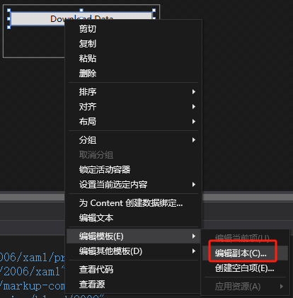
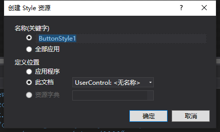
會自動出現:
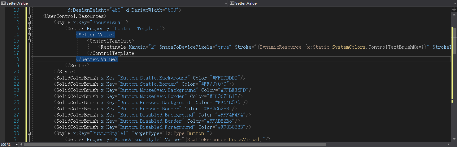
觸發器
<ControlTemplate.Triggers>
????????????????<Trigger Property="IsMouseOver" Value="True">
????????????????????<Setter Property="Content" Value="MouseOver" TargetName="contentPresenter"/>
????????????????</Trigger>
????????????????<Trigger Property="IsMouseOver" Value="False">
????????????????????<Setter Property="Content" Value="將ControlTemplate定義在在控件中" TargetName="contentPresenter"/>
????????????????</Trigger>
????????????</ControlTemplate.Triggers>
在Triggers集合中增加了兩個Trigger 對象,條件是當鼠標移上去或鼠標移開的時候,更改了Button的Content屬性。
ControlTemplate 與 DataTemplate 的區別
ControlTemplate:- 用于定義控件的外觀和交互行為。
- 適用于自定義控件或修改現有控件的外觀。
DataTemplate:- 用于定義數據的可視化方式。
- 適用于將數據綁定到控件(如?
ListBoxItem、ComboBoxItem)并自定義其顯示方式。
ContentPresenter?
ContentPresenter?是 WPF 和 UWP 等 XAML 框架中的一個核心控件,用于在控件模板(如?ControlTemplate?或?DataTemplate)中動態呈現內容。它的主要作用是承載并顯示被模板化的控件的內容,同時支持內容與模板的綁定和動態更新。
核心作用
- 內容占位符:在控件模板中作為內容的占位符,確保內容能夠正確顯示。
- 支持內容綁定:自動綁定到被模板化控件的?
Content?或?ContentTemplate?屬性,實現動態內容展示。 - 繼承樣式和屬性:自動繼承模板中定義的樣式(如?
Foreground、FontFamily)和布局屬性(如?HorizontalAlignment、VerticalAlignment)。 - 觸發器支持:與樣式觸發器(
Triggers)配合,響應內容狀態變化(如?IsMouseOver、IsEnabled)并動態調整外觀。
關鍵屬性:
HorizontalAlignment="Center"?和?VerticalAlignment="Center":確保內容在按鈕中居中顯示。RecognizesAccessKey="True":支持訪問鍵(如?&Save?中的?&?符號)
<Button Content="按鈕控件"? Width="300" Height="80" Margin="5" >
? ? <Button.Template>
? ? ? ? <ControlTemplate TargetType="Button">
? ? ? ? ? ? <Border Background="Transparent" CornerRadius="5" BorderThickness="1" BorderBrush="#C9CCD5">
? ? ? ? ? ? ? ? <ContentPresenter ?HorizontalAlignment="Center" VerticalAlignment="Center"/>
? ? ? ? ? ? </Border>
? ? ? ? </ControlTemplate>
? ? </Button.Template>
</Button>
常見問題
- 內容不顯示:
- 檢查是否在模板中正確放置了?
ContentPresenter。 - 確保模板化控件的?
Content?或?ContentTemplate?已正確設置。
- 檢查是否在模板中正確放置了?
- 樣式不繼承:
- 確保?
ContentPresenter?的屬性(如?Foreground)未被模板中的其他控件覆蓋。 - 使用?
TemplateBinding?綁定樣式屬性。
- 確保?
DataTemplate?
DataTemplate?是 WPF 和 UWP 等 XAML 框架中用于定義數據可視化方式的模板。它允許開發者指定如何將數據對象(如業務模型、集合項等)呈現為 UI 元素(如文本、圖像、按鈕等)。通過?DataTemplate,開發者可以將數據與 UI 分離,實現數據的靈活展示和復用。
一個典型的?DataTemplate?包含以下關鍵部分:
- 綁定(Bindings):用于將數據對象的屬性綁定到 UI 元素的屬性。
- 控件組合:通過組合多個 XAML 控件(如?
TextBlock、Image、Button)來定義數據的可視化結構。 - 觸發器(Triggers):可選,用于響應數據狀態變化,動態修改 UI 元素的外觀。
- 數據類型指定:通過?
DataType?屬性指定模板適用的數據類型。
虛擬化:對于大型數據集合,啟用虛擬化(如?VirtualizingStackPanel)可以顯著提高性能。
<ListBox ItemsSource="{Binding People}" VirtualizingStackPanel.IsVirtualizing="True"> <!-- 模板內容 --> </ListBox>
<!-- 定義 Person 類 -->
<Window.Resources>
? ? <x:Type x:Key="PersonType" Type="local:Person"/>
? ??
? ? <!-- 定義 DataTemplate? ?使用?DataType?屬性指定模板適用于?Person?類型。-->
? ? <DataTemplate DataType="{x:Type local:Person}">
? ? ? ? <StackPanel Orientation="Horizontal" Margin="5">
? ? ? ? ? ? <TextBlock Text="{Binding Name}" FontWeight="Bold" Margin="0,0,10,0"/>
? ? ? ? ? ? <TextBlock Text="{Binding Age, StringFormat=Age: {0}}"/>
? ? ? ? </StackPanel>
? ? </DataTemplate>
</Window.Resources>
?
<!-- 使用 DataTemplate 的 ListBox -->
<ListBox ItemsSource="{Binding People}">
? ? <!-- 無需顯式指定 ItemTemplate,因為已經定義了隱式 DataTemplate -->
- 由于?
DataTemplate?定義了?DataType,當?ListBox?的?ItemsSource?包含?Person?對象時,XAML 會自動應用該模板,無需顯式指定?ItemTemplate。</ListBox>
如果需要為特定控件或場景顯式指定?DataTemplate,可以使用?ItemTemplate、ContentTemplate?等屬性
<ListBox ItemsSource="{Binding People}">
? ? <ListBox.ItemTemplate>
? ? ? ? <DataTemplate>
? ? ? ? ? ? <!-- 模板內容 -->
? ? ? ? </DataTemplate>
? ? </ListBox.ItemTemplate>
</ListBox>
數據觸發器(DataTriggers):
<DataTemplate DataType="{x:Type local:Person}">
? ? <StackPanel Orientation="Horizontal">
? ? ? ? <TextBlock Text="{Binding Name}"/>
? ? ? ? <TextBlock Text="{Binding Age}">
? ? ? ? ? ? <TextBlock.Style>
? ? ? ? ? ? ? ? <Style TargetType="TextBlock">
? ? ? ? ? ? ? ? ? ? <Style.Triggers>
? ? ? ? ? ? ? ? ? ? ? ? <DataTrigger Binding="{Binding Age}" Value="18">
? ? ? ? ? ? ? ? ? ? ? ? ? ? <Setter Property="Foreground" Value="Red"/>
? ? ? ? ? ? ? ? ? ? ? ? </DataTrigger>
? ? ? ? ? ? ? ? ? ? </Style.Triggers>
? ? ? ? ? ? ? ? </Style>
? ? ? ? ? ? </TextBlock.Style>
? ? ? ? </TextBlock>
? ? </StackPanel>
</DataTemplate>
ItemsPanelTemplate
ItemsPanelTemplate?是 WPF 和 UWP 等 XAML 框架中的一個關鍵組件,用于定義?集合控件(如?ListBox、ListView、ComboBox、ItemsControl?等)中項目的布局容器。它允許開發者自定義項目的排列方式,
核心作用
- 自定義布局容器:決定集合控件中項目的容器類型(如?
StackPanel、WrapPanel、Grid?等)。 - 動態調整布局:根據業務需求靈活切換布局方式,無需修改數據綁定邏輯。
- 支持復雜布局:實現如網格、虛擬化滾動等高級布局需求。
關鍵特性
- 布局容器定義:指定?
ItemsControl?的?ItemsPanel?屬性所使用的模板。 - 與?
ItemTemplate?分離:ItemsPanelTemplate?負責布局容器,ItemTemplate?負責單個項目的外觀。 - 支持虛擬化:與?
VirtualizingStackPanel?配合,優化大數據量時的性能。
<ItemsControl.ItemsPanel>
? ? <ItemsPanelTemplate>
? ? ? ? <WrapPanel/>
? ? </ItemsPanelTemplate>
</ItemsControl.ItemsPanel>
<ListBox.ItemContainerStyle>
? ? <Style TargetType="ListBoxItem">
? ? ? ? <Setter Property="Template">
? ? ? ? ? ? <Setter.Value>
? ? ? ? ? ? ? ? <ControlTemplate TargetType="ListBoxItem">
? ? ? ? ? ? ? ? ? ? <ContentPresenter/>
? ? ? ? ? ? ? ? </ControlTemplate>
? ? ? ? ? ? </Setter.Value>
? ? ? ? </Setter>
? ? </Style>
</ListBox.ItemContainerStyle>
?<!-- 使用 ItemsPanelTemplate 將 ListBox 的項目布局為網格 -->
? ? ? ? <ListBox Width="400" Height="300">
? ? ? ? ? ? <ListBox.ItemsPanel>
? ? ? ? ? ? ? ? <ItemsPanelTemplate>
? ? ? ? ? ? ? ? ? ? <!-- 使用 UniformGrid 作為布局容器,自動排列為網格 -->
? ? ? ? ? ? ? ? ? ? <UniformGrid Columns="3" Rows="2"/>
? ? ? ? ? ? ? ? </ItemsPanelTemplate>
? ? ? ? ? ? </ListBox.ItemsPanel>
? ? ? ? ? ? <ListBox.ItemTemplate>
? ? ? ? ? ? ? ? <DataTemplate>
? ? ? ? ? ? ? ? ? ? <Border BorderBrush="LightGray" BorderThickness="1" Margin="5" Padding="10">
? ? ? ? ? ? ? ? ? ? ? ? <TextBlock Text="{Binding}" HorizontalAlignment="Center" VerticalAlignment="Center"/>
? ? ? ? ? ? ? ? ? ? </Border>
? ? ? ? ? ? ? ? </DataTemplate>
? ? ? ? ? ? </ListBox.ItemTemplate>
? ? ? ? ? ? <!-- 示例數據 -->
? ? ? ? ? ? <sys:String xmlns:sys="clr-namespace:System;assembly=mscorlib">Item 1</sys:String>
? ? ? ? ? ? <sys:String xmlns:sys="clr-namespace:System;assembly=mscorlib">Item 2</sys:String>
? ? ? ? </ListBox>
ItemsPanelTemplate?的定義:- 使用?
<UniformGrid Columns="3" Rows="2"/>?作為布局容器,將項目排列為 3 列 2 行的網格。 UniformGrid?會自動平均分配空間給每個項目。
- 使用?
ItemTemplate?的定義:- 使用?
DataTemplate?定義每個項目的外觀(如邊框、文本對齊方式)。
- 使用?
ItemTemplate?與?ItemsPanelTemplate?的區別
ItemTemplate:- 定義單個項目的視覺外觀(如文本、圖像、按鈕)。
- 影響項目的樣式和內容。
ItemsPanelTemplate:- 定義項目的布局容器(如?
StackPanel、Grid)。 - 影響項目的排列方式。
- 定義項目的布局容器(如?
| 維度 | ItemTemplate | ItemsPanelTemplate |
|---|---|---|
| 職責 | 定義單個項目的視覺外觀 | 定義所有項目的布局容器 |
| 作用范圍 | 單個項目 | 所有項目 |
| 典型內容 | TextBlock、Image、Button?等 | StackPanel、WrapPanel、Grid?等 |
| 數據綁定 | 通過?{Binding}?綁定到數據屬性 | 不涉及數據綁定 |
| 性能影響 | 輕量級,通常不影響性能 | 布局復雜度可能影響性能 |
<ListBox ItemsSource="{Binding Users}">
? ? <ListBox.ItemsPanel>
? ? ? ? <ItemsPanelTemplate>
? ? ? ? ? ? <WrapPanel Orientation="Horizontal"/>
? ? ? ? </ItemsPanelTemplate>
? ? </ListBox.ItemsPanel>
</ListBox>
Setter?
<Style TargetType="Button">
? ? <Setter Property="Foreground" Value="Red"/>
? ? <Setter Property="Background" Value="LightGray"/>
? ? <Setter Property="BorderThickness" Value="1"/>
? ? <Setter Property="Padding" Value="10,5"/>
? ? <Setter Property="Template">
? ? ? ? <Setter.Value>
? ? ? ? ? ? <ControlTemplate TargetType="Button">
? ? ? ? ? ? ? ? <Border Background="{TemplateBinding Background}"
? ? ? ? ? ? ? ? ? ? ? ? BorderBrush="Black"
? ? ? ? ? ? ? ? ? ? ? ? BorderThickness="{TemplateBinding BorderThickness}"
? ? ? ? ? ? ? ? ? ? ? ? CornerRadius="5">
? ? ? ? ? ? ? ? ? ? <ContentPresenter HorizontalAlignment="Center" VerticalAlignment="Center"/>
? ? ? ? ? ? ? ? </Border>
? ? ? ? ? ? </ControlTemplate>
? ? ? ? </Setter.Value>
? ? </Setter>
</Style>
Style?定義:TargetType="Button":表示該樣式適用于所有?Button?控件。
Setter?元素:<Setter Property="Foreground" Value="Red"/>:將按鈕的文本顏色設置為紅色。<Setter Property="Background" Value="LightGray"/>:將按鈕的背景色設置為淺灰色。<Setter Property="BorderThickness" Value="1"/>:設置按鈕的邊框厚度為 1。<Setter Property="Padding" Value="10,5"/>:設置按鈕的內邊距為 10(水平)和 5(垂直)。
ControlTemplate:- 自定義按鈕的視覺結構,使用?
Border?和?ContentPresenter?實現圓角按鈕。
- 自定義按鈕的視覺結構,使用?
綁定表達式:
Value?可以是一個綁定表達式,動態設置屬性值。
<Setter Property="Foreground" Value="{Binding TextColor}"/>
條件設置:
- 結合?
Trigger?或?DataTrigger,根據條件動態修改屬性值。
<Style.Triggers>
? ? <Trigger Property="IsMouseOver" Value="True">
? ? ? ? <Setter Property="Foreground" Value="DarkRed"/>
? ? </Trigger>
</Style.Triggers>
作用域:
Setter?只在定義的?Style?或?ControlTemplate?范圍內生效。
優先級:
如果多個?Setter?嘗試設置同一屬性,后定義的?Setter?會覆蓋先前的值。
Style?
Style?的作用
- 統一外觀:通過?
Style,可以為控件定義統一的外觀(如背景色、字體、邊框等)。 - 復用性:命名的樣式(通過?
x:Key?定義)可以在多個控件中重復使用。 - 動態修改:可以通過?
Trigger?或?DataTrigger?動態修改樣式。
x:Key?屬性
- 命名樣式:
x:Key?為樣式指定一個唯一的名稱,使其可以在 XAML 中被引用。 - 復用方式:通過?
StaticResource?或?DynamicResource?引用命名樣式。
<Window.Resources>
? ? ? ? <!-- 定義 CardButtonStyle 樣式 -->
? ? ? ? <Style x:Key="CardButtonStyle" TargetType="Button">
? ? ? ? ? ? <Setter Property="Background" Value="White"/>
? ? ? ? ? ? <Setter Property="Template">
? ? ? ? ? ? ? ? <Setter.Value>
? ? ? ? ? ? ? ? ? ? <ControlTemplate TargetType="Button">
? ? ? ? ? ? ? ? ? ? ? ? <Border Background="{TemplateBinding Background}"
? ? ? ? ? ? ? ? ? ? ? ? ? ? ? ? BorderBrush="{TemplateBinding BorderBrush}"
? ? ? ? ? ? ? ? ? ? ? ? ? ? ? ? BorderThickness="{TemplateBinding BorderThickness}"
? ? ? ? ? ? ? ? ? ? ? ? ? ? ? ? CornerRadius="5"
? ? ? ? ? ? ? ? ? ? ? ? ? ? ? ? Padding="{TemplateBinding Padding}">
? ? ? ? ? ? ? ? ? ? ? ? ? ? <ContentPresenter HorizontalAlignment="Center" VerticalAlignment="Center"/>
? ? ? ? ? ? ? ? ? ? ? ? </Border>
? ? ? ? ? ? ? ? ? ? </ControlTemplate>
? ? ? ? ? ? ? ? </Setter.Value>
? ? ? ? ? ? </Setter>
? ? ? ? ? ? <Style.Triggers>
? ? ? ? ? ? ? ? <!-- 鼠標懸停時的效果 -->
? ? ? ? ? ? ? ? <Trigger Property="IsMouseOver" Value="True">
? ? ? ? ? ? ? ? ? ? <Setter Property="Background" Value="LightBlue"/>
? ? ? ? ? ? ? ? ? ? <Setter Property="Foreground" Value="DarkBlue"/>
? ? ? ? ? ? ? ? </Trigger>
? ? ? ? ? ? ? ? <!-- 按鈕按下時的效果 -->
? ? ? ? ? ? ? ? <Trigger Property="IsPressed" Value="True">
? ? ? ? ? ? ? ? ? ? <Setter Property="Background" Value="DarkBlue"/>
? ? ? ? ? ? ? ? ? ? <Setter Property="Foreground" Value="White"/>
? ? ? ? ? ? ? ? </Trigger>
? ? ? ? ? ? </Style.Triggers>
? ? ? ? </Style>
? ? </Window.Resources>
?
? ? <Grid>
? ? ? ? <!-- 使用 CardButtonStyle 樣式的按鈕 -->
? ? ? ? <Button Content="Card Button 1" Style="{StaticResource CardButtonStyle}" Width="120" Height="60"/>
? ? ? ? <Button Content="Card Button 2" Style="{StaticResource CardButtonStyle}" Width="120" Height="60" HorizontalAlignment="Right"/>
? ? </Grid>
通過?Style="{StaticResource CardButtonStyle}"?將樣式應用于按鈕控件。
動態資源:
如果需要動態切換樣式,可以使用?DynamicResource:
<Button Content="Dynamic Style" Style="{DynamicResource CardButtonStyle}"/>
全局樣式:
如果不指定?x:Key,而是指定?TargetType,樣式將應用于所有指定類型的控件:
<Style TargetType="Button">
? ? <!-- 樣式定義 -->
</Style>
Trigger觸發器
Trigger?是 WPF 和 UWP 等 XAML 框架中的核心機制,用于動態改變控件的樣式或行為,而無需編寫代碼。通過?Trigger,開發者可以根據控件的屬性值、事件或數據狀態自動調整控件的外觀(如顏色、大小、可見性等)或觸發動畫。
核心作用
- 狀態響應:根據控件的狀態(如鼠標懸停、選中、禁用)自動改變樣式。
- 數據驅動:根據數據綁定屬性的值動態調整 UI。
- 減少代碼:通過 XAML 聲明式地實現交互邏輯,避免后臺代碼。
關鍵特性
- 條件判斷:通過?
Condition?定義觸發條件。 - Setter 集合:通過?
Setter?定義觸發時的樣式更改。 - 嵌套支持:
Trigger?可以嵌套在?Style、ControlTemplate?或?DataTemplate?中。
| Trigger 類型 | 作用 | 適用場景 |
|---|---|---|
PropertyTrigger | 根據控件的屬性值變化觸發樣式更改。 | 例如:按鈕在鼠標懸停時改變背景色。 |
EventTrigger | 根據控件的事件(如?Loaded、Click)觸發動畫或樣式更改。 | 例如:頁面加載時播放動畫。 |
DataTrigger | 根據數據綁定屬性的值觸發樣式更改。 | 例如:根據數據狀態(如?IsSelected)改變項目樣式。 |
MultiTrigger | 根據多個條件的組合觸發樣式更改。 | 例如:同時滿足?IsMouseOver?和?IsEnabled?時改變樣式。 |
MultiDataTrigger | 根據多個數據綁定屬性的組合觸發樣式更改。 | 例如:根據多個數據狀態(如?IsAdmin?和?IsLoggedIn)改變界面。 |
<Button Content="Hover Me" Width="100" Height="30">
? ? <Button.Style>
? ? ? ? <Style TargetType="Button">
? ? ? ? ? ? <Setter Property="Background" Value="LightGray"/>
? ? ? ? ? ? <Style.Triggers>
? ? ? ? ? ? ? ? <!-- 鼠標懸停時改變背景色 -->
? ? ? ? ? ? ? ? <Trigger Property="IsMouseOver" Value="True">
? ? ? ? ? ? ? ? ? ? <Setter Property="Background" Value="LightBlue"/>
? ? ? ? ? ? ? ? ? ? <Setter Property="Foreground" Value="White"/>
? ? ? ? ? ? ? ? </Trigger>
? ? ? ? ? ? </Style.Triggers>
? ? ? ? </Style>
? ? </Button.Style>
</Button>
DataTrigger(根據數據狀態改變樣式)
<ListBox ItemsSource="{Binding Users}">
? ? <ListBox.ItemTemplate>
? ? ? ? <DataTemplate>
? ? ? ? ? ? <Border BorderBrush="LightGray" BorderThickness="1" Margin="5" Padding="10">
? ? ? ? ? ? ? ? <Border.Style>
? ? ? ? ? ? ? ? ? ? <Style TargetType="Border">
? ? ? ? ? ? ? ? ? ? ? ? <Setter Property="Background" Value="White"/>
? ? ? ? ? ? ? ? ? ? ? ? <Style.Triggers>
? ? ? ? ? ? ? ? ? ? ? ? ? ? <!-- 如果 IsSelected 為 True,則改變背景色 -->
? ? ? ? ? ? ? ? ? ? ? ? ? ? <DataTrigger Binding="{Binding IsSelected}" Value="True">
? ? ? ? ? ? ? ? ? ? ? ? ? ? ? ? <Setter Property="Background" Value="LightBlue"/>
? ? ? ? ? ? ? ? ? ? ? ? ? ? </DataTrigger>
? ? ? ? ? ? ? ? ? ? ? ? </Style.Triggers>
? ? ? ? ? ? ? ? ? ? </Style>
? ? ? ? ? ? ? ? </Border.Style>
? ? ? ? ? ? ? ? <TextBlock Text="{Binding Name}"/>
? ? ? ? ? ? </Border>
? ? ? ? </DataTemplate>
? ? </ListBox.ItemTemplate>
</ListBox>
ConcurrentHashMap發送)


 緒論)

)


詳解,解決使用 || 時因類型轉換帶來的問題)

使用Docker安裝Redis)
