文章目錄
- 前言
- 一、實現原理
- 二、series ——type: "pictorialBar" 簡介
- 2.1 常用屬性
- 三、代碼實戰
- 3.1 封裝一個echarts通用組件 echarts.vue
- 3.2 首先實現一個基礎柱狀圖
- 3.3 添加上下2個橢圓面
- 3.4 進階封裝一個可復用的3D圓形柱狀圖組件
- 總結
前言
在前端開發的數據可視化場景中,ECharts 是一個強大且靈活的工具,它能創建各種復雜而美觀的圖表。本文將詳細闡述如何利用 ECharts實現3D圓形柱狀圖,并封裝一個可復用的組件。
一、實現原理
3D圓形柱狀圖實現原理很簡單,可以看成普通的柱狀圖+上下兩個圓面組合合成。模擬人眼斜俯視視角,上下兩個面呈現橢圓形,再把普通柱狀圖調成一定透明度使得底部圓面也能被看到,從而把簡單2D平面呈現出一定3D效果。
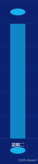
如上圖所示上下2個獨立圓面往普通柱狀圖靠,調到合適位置變成如下效果:
上下兩個橢圓形可通過 echarts ——series—— type: “pictorialBar” 自定義圖形實現
二、series ——type: “pictorialBar” 簡介
type: “pictorialBar” 是 ECharts 中的一種特殊柱狀圖類型,它允許使用自定義圖形(如圖片、形狀)來代替傳統的柱狀條,為數據可視化增添更多創意和靈活性。
type: "pictorialBar"也被叫作象形柱圖。它首先是個柱狀圖,但是柱狀圖的柱子并不顯示。這些柱子我們稱為『基準柱(reference bar)』,根據基準柱來定位和顯示各種象形圖形(包括圖片)。
每個象形圖形根據基準柱的定位,是通過 symbolPosition、symbolOffset 來調整其于基準柱的相對位置。
2.1 常用屬性
-
symbol 圖形類型,默認圓形
可選值 ‘circle’(圓形), ‘rect’(直角長方形), ‘roundRect’(圓角長方形), ‘triangle’(三角形), ‘diamond’(菱形), ‘pin’(漏斗), ‘arrow’(箭頭), ‘none’(無)
-
symbolSize 圖形的大小,默認值 [‘100%’, ‘100%’]
可以用數組分開表示寬和高,例如 [20, 10] 表示標記寬為20,高為10,也可以設置成諸如 10 這樣單一的數字,表示 [10, 10]。
可以設置成絕對值(如 10),也可以設置成百分比(如 ‘120%’、[‘55%’, 23])。
- symbolPosition 圖形的定位位置
可選擇 start’:圖形邊緣與柱子開始的地方內切,‘end’:圖形邊緣與柱子結束的地方內切。‘center’:圖形在柱子里居中。
-
symbolOffset 圖形相對于原本位置的偏移,默認[0, 0]
-
data 系列中的數據內容數組。數組項通常為具體的數據項。
更多屬性可以查閱官方文檔
本例需求通過上面幾個屬性我們就能構建一個橢圓形面
例如:
{type: "pictorialBar",symbolSize: [50, 22],//50x22尺寸symbolOffset: [0, -8],//向上偏移8pxsymbolPosition:'end',//位于頂部}
三、代碼實戰
以vue3為代碼為示例
3.1 封裝一個echarts通用組件 echarts.vue
echarts.vue
<template><div class="echarts-box"><div ref="echartRef" class="charts" ></div></div>
</template>
<script setup>
import { ref, onMounted, onBeforeUnmount, watch, nextTick, markRaw } from 'vue';
import * as echarts from 'echarts';
const props = defineProps({// 圖表配置data: {type: Object,default: () => {},},
});
const echartRef = ref();let dom = null;//設置圖表配置
const setOptions = (options) => {//清除畫布dom && dom.clear();//重新渲染dom && dom.setOption(options);
};watch(() => props.data,(val) => {nextTick(() => {//默認關閉動畫setOptions({animation: false,...val});});},{ deep: true, immediate: true }
);
const emits= defineEmits(['click'])
onMounted(() => {//初始化dom = markRaw(echarts.init(echartRef.value));//點擊事件dom.on('click',  (param)=> {emits('click',param)} )
});
onBeforeUnmount(() => {//離開銷毀echarts.dispose(dom);dom = null;
});defineExpose({setOptions,
});
</script>
<style lang="scss" scoped>
.echarts-box {width: 100%;height: 100%;box-sizing: border-box;
}.charts {width: 100%;height: 100%;
}
</style>
上述代碼封裝了一個echarts通用組件,只需傳入data圖表配置數據就會重新渲染,需要注意的是組件默認繼承父元素的寬高(100%),所以父元素需要設置尺寸。
3.2 首先實現一個基礎柱狀圖
demo.vue
<template><div class="container"><div class="echarts-view"><Echarts :data="data" /></div></div>
</template>
<script setup>
import Echarts from "./echarts.vue";
import { ref } from "vue";const data = ref({//位置grid: {left: "5%",right: "5%",bottom: "10%",top: "15%",},//提示框tooltip: {},//圖例legend: {show: true,right: "5%",textStyle: {color: "#fff",fontSize: 14,},},//x軸xAxis: {type: "category",//坐標軸軸線axisLine: {show: true,lineStyle: {color: "rgba(0, 176, 255,0.3)",},},//刻度axisTick: {show: false,},//分割線splitLine: {show: false,},// x軸文字axisLabel: {color: "#D8E6FF",fontSize: 14,margin: 15,},data: ["星期一","星期二","星期三","星期四","星期五","星期六","星期日",],},//y軸yAxis: {name: "單位:元", //單位文字nameTextStyle: {//單位樣式color: "#BCD0F4",nameLocation: "start",fontSize: 14,},nameGap: 40, //單位與y軸距離type: "value",//分割線splitLine: {show: true,lineStyle: {color: "rgba(0, 176, 255, 0.2)",type: "dashed",},},//坐標軸軸線axisLine: {show: false,},//刻度數值文字樣式axisLabel: {color: "#BCD0F4",fontSize: 14,},},//數據series: [//中間柱狀圖{type: "bar",barWidth: 50, //柱子寬度itemStyle: {//柱子樣式color: {//漸變顏色type: "linear",x: 0,y: 0,x2: 0,y2: 1,colorStops: [{ offset: 0, color: "#00B7FF" },{ offset: 1, color: "rgba(34,68,172,0.3)" },],},},name: "收入",data: [200, 500, 300, 250, 360, 700, 556],},],
});
</script>
<style scoped>
.container {width: 100%;height: 100%;display: flex;flex-direction: column;justify-content: center;background-color: #0a2270;align-items: center;
}
.echarts-view {height: 700px;width: 1200px;
}
</style>
運行效果:
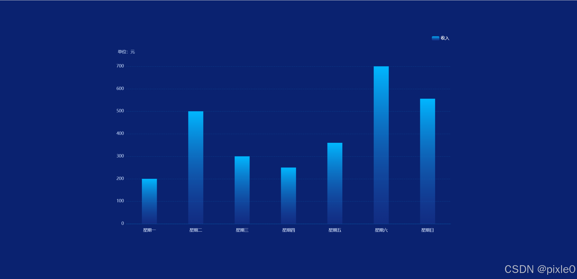
上述代碼渲染一個最基礎的柱狀圖
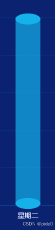
3.3 添加上下2個橢圓面
新增如下代碼
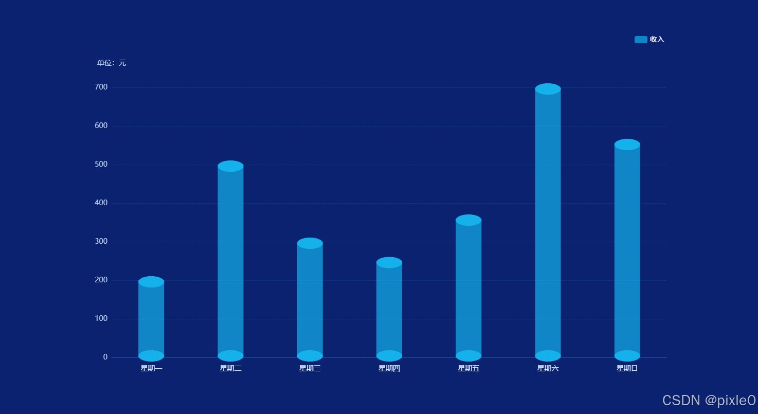
//數據series:[//中間柱狀圖............//頂部圓面{type: "pictorialBar",symbolSize: [50, 22],symbolOffset: [0, -8],symbolPosition: "end",z: 12,//層級itemStyle: {color:'#21F3FF',},name: "收入",data: [200, 500, 300, 250, 360, 700, 556],},//底部圓面{type: "pictorialBar",symbolSize: [50, 22],symbolOffset: [0, 8],z: 12,//層級itemStyle: {color: 'rgba(31,97,234,0.4)',},name: "收入",data: [200, 500, 300, 250, 360, 700, 556],}]
運行效果:
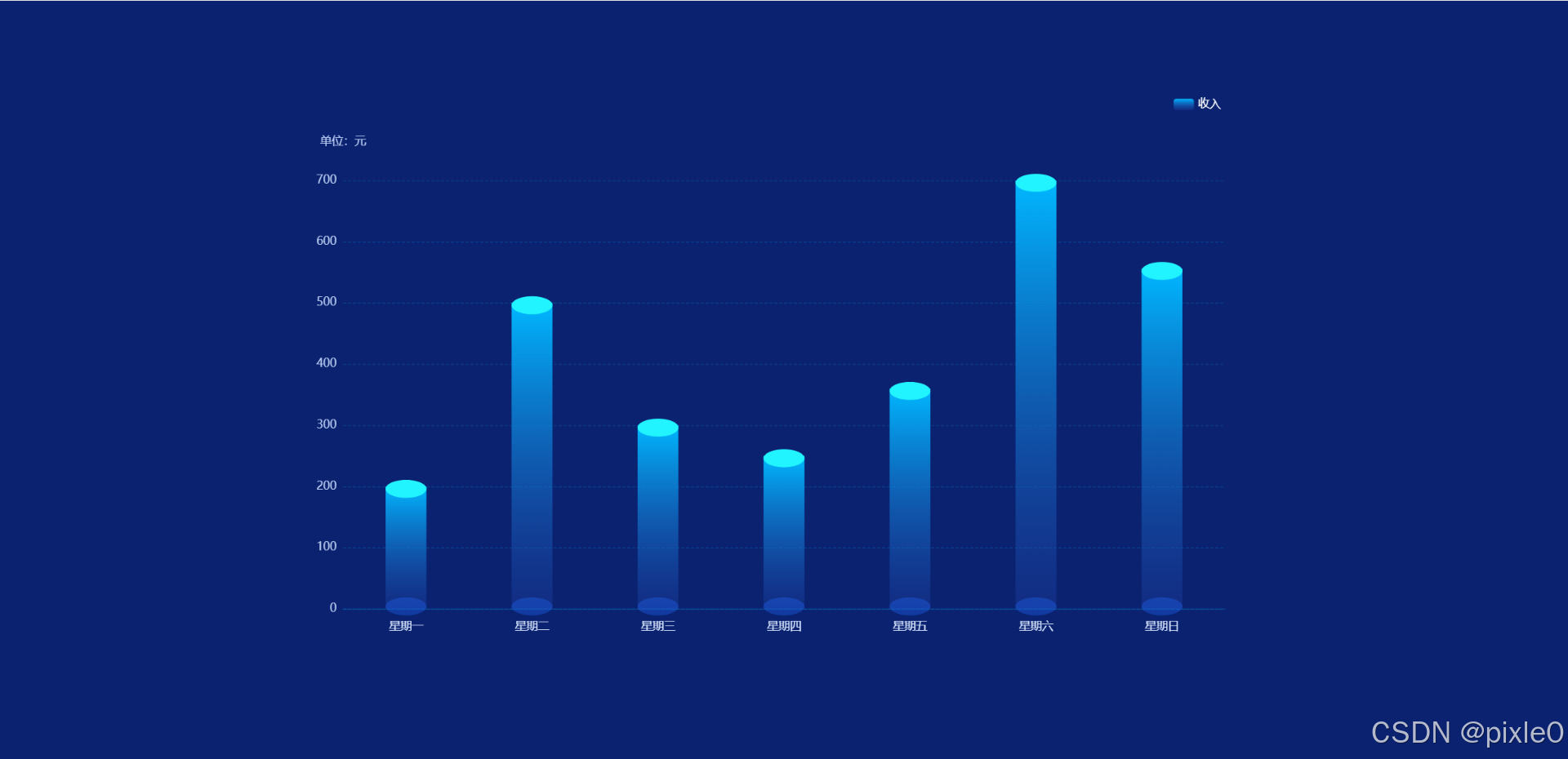
上述代碼通過象形柱狀圖自定義2個橢圓面,其中一個橢圓面通過symbolPosition: "end"設置為頂部顯示另一個默認顯示在底部,并通過symbolOffset調整橢圓面位置偏移量使得與基礎柱狀圖融合為一體。
3.4 進階封裝一個可復用的3D圓形柱狀圖組件
bar-3d.vue
<!-- 3D柱狀圖 -->
<template><div class="bar-wrap"><Echarts :data="data" /></div>
</template><script setup>
import Echarts from "../components/echarts.vue";
import { computed } from "vue";
const props = defineProps({
//位置grid: {type: Object,default: () => ({left: "5%",right: "5%",bottom: "10%",top: "15%",}),},//圖例legend:{type: Object,default: () => {},},//數據series: {type: Object,default: () => {},},//x軸配置xAxis: {type: Array,default: () => {},},//y軸配置yAxis: {type: Object,default: () => {},},//單位unit: {type: String,default: "",},//上下圓面顏色pictorialBarColor: {type: Array,default: () => ["#21F3FF", "rgba(31,97,234,0.4)"],},
});//echarts配置
const data = computed(() => {let { name, data } = props.series;//series配置處理let seriesData = [//中間柱狀圖{type: "bar",barWidth: 50, //柱子寬度itemStyle: {//柱子樣式color: {//漸變顏色type: "linear",x: 0,y: 0,x2: 0,y2: 1,colorStops: [{ offset: 0, color: "#00B7FF" },{ offset: 1, color: "rgba(34,68,172,0.3)" },],},},...props.series,},//頂部圓面{type: "pictorialBar",symbolSize: [50, 22],symbolOffset: [0, -8],symbolPosition:'end',z: 12,itemStyle: {color: props.pictorialBarColor[0],},name,data: data.map((item) => {return {value: item,itemStyle: {opacity: item > 0 ? 1 : 0, //值為0時隱藏},};}),},//底部圓面{type: "pictorialBar",symbolSize: [50, 22],symbolOffset: [0, 8],z: 12,itemStyle: {color: props.pictorialBarColor[1],},name,data: data.map((item) => {return {value: item,itemStyle: {opacity: item > 0 ? 1 : 0,},};}),},];return {grid: props.grid,tooltip: {},legend: {show: true,right: "5%",textStyle: {color: "#fff",fontSize: 14,},...props.legend},//x軸xAxis: {type: "category",axisLine: {show: true,lineStyle: {color: "rgba(0, 176, 255,0.3)",},},axisTick: {show: false,},splitLine: {show: false,},// x軸文字axisLabel: {color: "#D8E6FF",fontSize: 14,margin: 15,},data: props.xAxis,},//y軸yAxis: {name: props.unit ? `單位:${props.unit}` : "", //單位文字nameTextStyle: {//單位樣式color: "#BCD0F4",nameLocation: "start",fontSize: 14,},nameGap: 40, //單位與y軸距離type: "value",splitLine: {show: true,lineStyle: {color: "rgba(0, 176, 255, 0.2)",type: "dashed",},},axisLine: {show: false,},//刻度數值樣式axisLabel: {color: "#BCD0F4",fontSize: 14,},...props.yAxis,},series: seriesData,};
});
</script>
<style scoped lang="scss">
.bar-wrap {width: 100%;height: 100%;
}
</style>
上述代碼封裝了一個3D圓形柱狀圖組件,預設了默認樣式,同時也暴露了x軸、y軸、圖例、圓形柱狀圖顏色等配置屬性可根據需求自定義進行樣式覆蓋。
頁面調用:
demo.vue
<template><div class="container"><div class="echarts-view"><Bar3D unit="元" :xAxis="xAxisData" :series="seriesData" /></div></div>
</template>
<script setup>
import Bar3D from "./components/bar-3d.vue";
import { ref } from "vue";//x軸標簽
const xAxisData = ref(["星期一","星期二","星期三","星期四","星期五","星期六","星期日",
]);//數據
const seriesData = ref({name: "收入",data: [200, 500, 300, 250, 360, 700, 556],
});</script>
<style scoped>
.container {width: 100%;height: 100%;display: flex;flex-direction: column;justify-content: center;background-color: #0a2270;align-items: center;
}
.echarts-view {height: 700px;width: 1200px;
}
</style>
運行效果:
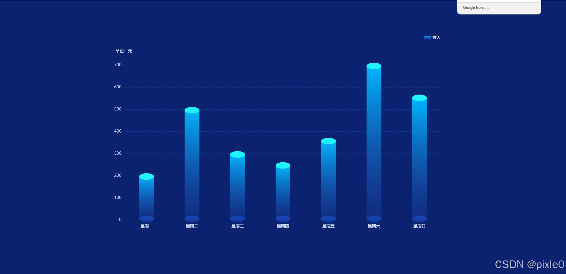
默認漸變色樣式
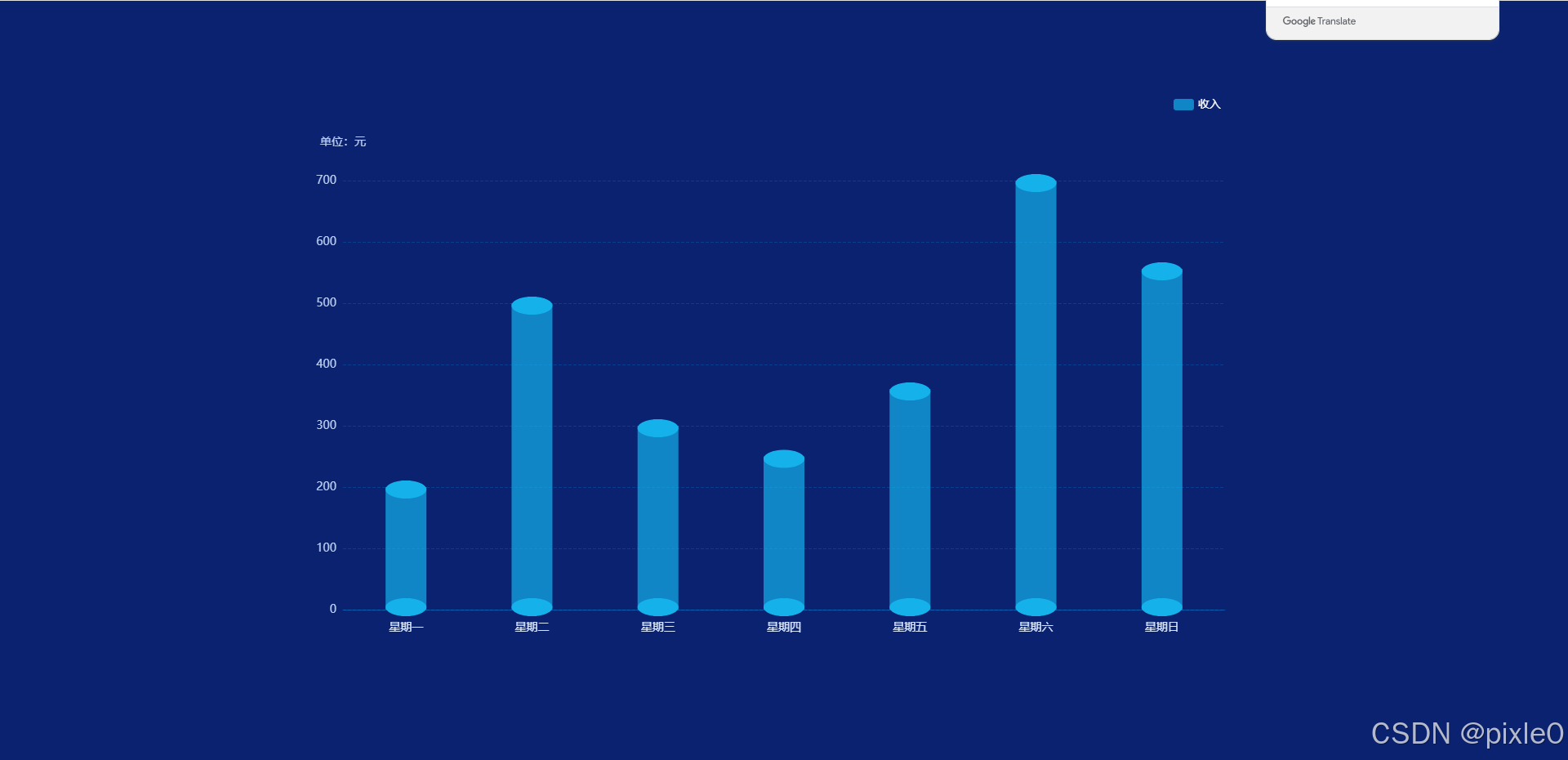
修改圓柱配色
<template><div class="container"><div class="echarts-view"><Bar3D unit="元" :xAxis="xAxisData" :series="seriesData" :pictorialBarColor="pictorialBarColor"/></div></div>
</template>
<script setup>
import Bar3D from "./bar-3d.vue";
import { ref } from "vue";//x軸標簽
const xAxisData = ref(["星期一","星期二","星期三","星期四","星期五","星期六","星期日",
]);//數據
const seriesData = ref({name: "收入",data: [200, 500, 300, 250, 360, 700, 556],//柱狀圖顏色itemStyle: {color: "#14b1eb",opacity: 0.7,},
});//上下圓面顏色
const pictorialBarColor=ref(['#14b1eb','#14b1eb'])</script>
<style scoped>
.container {width: 100%;height: 100%;display: flex;flex-direction: column;justify-content: center;background-color: #0a2270;align-items: center;
}
.echarts-view {height: 700px;width: 1200px;
}
</style>
運行效果:
總結
通過組合使用 type: bar 和 type: “pictorialBar”,我們成功實現了 3D 圓形柱狀圖。同時,了解了 type: “pictorialBar” 的簡單使用,它為我們在數據可視化方面提供了更多的創意和可能性。你可以根據實際需求,進一步調整圖表的樣式和配置,創造出更加美觀和實用的可視化效果。
實際開發中可根據使用場景進階封裝,例如在echarts中加入對屏幕尺寸變化監聽改變圖表尺寸以達到不同分辨率響應式效果以及空數據的顯示優化,使得組件更加健壯。


—— 進程的描述與控制)


:C 語言頭文件詳解)


---java版)

 環境安裝)
)
)
`:優雅處理復雜數據存儲)

