目錄
- 一、基本概述
- 二、屬性說明
- 三、常用布局
- 3.1 橫向布局
- 3.2 縱向布局
- 3.3 更多布局
- 3.3.1 縱向布局-自動寬度
- 3.3.2 縱向布局-固定寬度
- 3.3.3 橫向布局-自動寬度
- 3.3.4 橫向布局-居中
- 3.3.5 橫向布局-居右
- 3.3.6 橫向布局-平均分布
- 3.3.7 橫向布局-兩端對齊
- 3.3.8 橫向布局-自動填充
- 3.3.9 橫向布局-換行展示
- 3.3.10 橫向布局-垂直分布
一、基本概述
view是一個視圖容器,本身不顯示任何可視化元素。用途都是為了包裹其他真正顯示的組件。它類似于傳統html中的div,用于包裹各種元素內容。
二、屬性說明
| 屬性名 | 類型 | 默認值 | 說明 |
|---|---|---|---|
| hover-class | String | none | 指定按下去的樣式類。當 hover-class=“none” 時,沒有點擊態效果 |
| hover-stop-propagation | Boolean | false | 指定是否阻止本節點的祖先節點出現點擊態,App、H5、支付寶小程序、百度小程序不支持(支付寶小程序、百度小程序文檔中都有此屬性,實測未支持) |
| hover-start-time | Number | 50 | 按住后多久出現點擊態,單位毫秒 |
| hover-stay-time | Number | 400 | 手指松開后點擊態保留時間,單位毫秒 |
實例代碼
<view class="box-container" hover-class="box-container-hover" hover-start-time="100" hover-stay-time="1000">視圖容器</view>
.box-container {width: 200px;height: 200px;background-color: orange;text-align: center;line-height: 200px;
}
.box-container-hover {background-color: blue;
}
三、常用布局
Flex是Flexible Box的縮寫,意為“彈性布局”,用來為盒狀模型提供最大的靈活性。當設置display: flex后,繼續給view等容器組件設置flex-direction:row或column,就可以在該容器內按行或列排布子組件。uni-app推薦使用flex布局。因為flex布局有利于跨更多平臺,尤其是采用原生渲染的平臺。
3.1 橫向布局
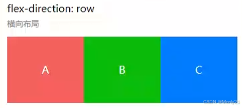
<view class="uni-flex uni-row"><view class="flex-item uni-bg-red">A</view><view class="flex-item uni-bg-green">B</view><view class="flex-item uni-bg-blue">C</view>
</view>
.uni-flex {display: flex;
}
.uni-row {flex-direction: row;
}
.flex-item {width: 33.3%;height: 100px;text-align: center;line-height: 100px;
}
.uni-bg-red{background:#F76260; color:#FFF;
}
.uni-bg-green{background:#09BB07; color:#FFF;
}
.uni-bg-blue{background:#007AFF; color:#FFF;
}
3.2 縱向布局
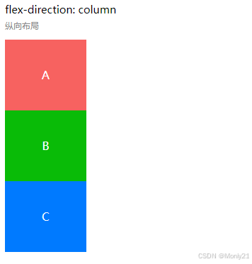
<view class="uni-flex uni-column"><view class="flex-item flex-item-V uni-bg-red">A</view><view class="flex-item flex-item-V uni-bg-green">B</view><view class="flex-item flex-item-V uni-bg-blue">C</view>
</view>
.uni-flex {display: flex;
}
.uni-column {flex-direction: column;
}
.flex-item {width: 33.3%;height: 100px;text-align: center;line-height: 100px;
}
.uni-bg-red{background:#F76260; color:#FFF;
}
.uni-bg-green{background:#09BB07; color:#FFF;
}
.uni-bg-blue{background:#007AFF; color:#FFF;
}
3.3 更多布局
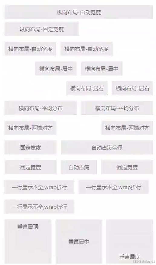
3.3.1 縱向布局-自動寬度
<view class="text">縱向布局-自動寬度</view>
.text {margin: 7px 5px;padding: 0 10px;background-color: #ebebeb;height: 35px;line-height: 35px;text-align: center;color: #777;font-size: 13px;
}
3.3.2 縱向布局-固定寬度
<view class="text" style="width: 300rpx;">縱向布局-固定寬度</view>
.text {margin: 7px 5px;padding: 0 10px;background-color: #ebebeb;height: 35px;line-height: 35px;text-align: center;color: #777;font-size: 13px;
}
3.3.3 橫向布局-自動寬度
<view class="uni-flex uni-row"><view class="text">橫向布局-自動寬度</view><view class="text">橫向布局-自動寬度</view>
</view>
.uni-flex {display: flex;
}
.uni-row {flex-direction: row;
}
.text {margin: 7px 5px;padding: 0 10px;background-color: #ebebeb;height: 35px;line-height: 35px;text-align: center;color: #777;font-size: 13px;
}
3.3.4 橫向布局-居中
<view class="uni-flex uni-row uni-center"><view class="text">橫向布局-居中</view><view class="text">橫向布局-居中</view>
</view>
.uni-flex {display: flex;
}
.uni-row {flex-direction: row;
}
.uni-center {-webkit-justify-content: center;justify-content: center;
}
.text {margin: 7px 5px;padding: 0 10px;background-color: #ebebeb;height: 35px;line-height: 35px;text-align: center;color: #777;font-size: 13px;
}
3.3.5 橫向布局-居右
<view class="uni-flex uni-row uni-right"><view class="text">橫向布局-居右</view><view class="text">橫向布局-居右</view>
</view>
.uni-flex {display: flex;
}
.uni-row {flex-direction: row;
}
.uni-right {-webkit-justify-content: flex-end;justify-content: flex-end;
}
.text {margin: 7px 5px;padding: 0 10px;background-color: #ebebeb;height: 35px;line-height: 35px;text-align: center;color: #777;font-size: 13px;
}
3.3.6 橫向布局-平均分布
<view class="uni-flex uni-row"><view class="text uni-aver">橫向布局-平均分布</view><view class="text uni-aver">橫向布局-平均分布</view>
</view>
.uni-flex {display: flex;
}
.uni-row {flex-direction: row;
}
.uni-aver {-webkit-flex: 1;flex: 1;
}
.text {margin: 7px 5px;padding: 0 10px;background-color: #ebebeb;height: 35px;line-height: 35px;text-align: center;color: #777;font-size: 13px;
}
3.3.7 橫向布局-兩端對齊
<view class="uni-flex uni-row .uni-between"><view class="text">橫向布局-兩端對齊</view><view class="text">橫向布局-兩端對齊</view>
</view>
.uni-flex {display: flex;
}
.uni-row {flex-direction: row;
}
.uni-between {-webkit-justify-content: space-between;justify-content: space-between;
}
.text {margin: 7px 5px;padding: 0 10px;background-color: #ebebeb;height: 35px;line-height: 35px;text-align: center;color: #777;font-size: 13px;
}
3.3.8 橫向布局-自動填充
<view class="uni-flex uni-row"><view class="text" style="width: 200rpx;">固定寬度</view><view class="text uni-fill">自動占滿余量</view>
</view><view class="uni-flex uni-row"><view class="text" style="width: 200rpx;">固定寬度</view><view class="text uni-fill">自動占滿</view><view class="text" style="width: 200rpx;">固定寬度</view>
</view>
.uni-flex {display: flex;
}
.uni-row {flex-direction: row;
}
.uni-fill {-webkit-flex: 1;flex: 1;
}
.text {margin: 7px 5px;padding: 0 10px;background-color: #ebebeb;height: 35px;line-height: 35px;text-align: center;color: #777;font-size: 13px;
}
3.3.9 橫向布局-換行展示
<view class="uni-flex uni-row uni-wrap"><view class="text" style="width: 280rpx;">一行顯示不全,wrap折行</view><view class="text" style="width: 280rpx;">一行顯示不全,wrap折行</view><view class="text" style="width: 280rpx;">一行顯示不全,wrap折行</view>
</view>
.uni-flex {display: flex;
}
.uni-row {flex-direction: row;
}
.uni-wrap {-webkit-flex-wrap: wrap;flex-wrap: wrap;
}
.text {margin: 7px 5px;padding: 0 10px;background-color: #ebebeb;height: 35px;line-height: 35px;text-align: center;color: #777;font-size: 13px;
}
3.3.10 橫向布局-垂直分布
<view class="uni-flex uni-row"><view class="text uni-flex uni-vertical uni-vertical-top"><text>垂直居頂</text></view><view class="text uni-flex uni-vertical uni-vertical-center"><text>垂直居中</text></view><view class="text uni-flex uni-vertical uni-vertical-end"><text>垂直居底</text></view>
</view>
.uni-flex {display: flex;
}
.uni-row {flex-direction: row;
}
.uni-vertical {-webkit-flex: 1;flex: 1;height: 200rpx;-webkit-justify-content: center;justify-content: center;
}
.uni-vertical-top {-webkit-align-items: flex-start;align-items: flex-start;
}
.uni-vertical-center {-webkit-align-items: center;align-items: center;
}
.uni-vertical-end {-webkit-align-items: flex-end;align-items: flex-end;
}
.text {margin: 7px 5px;padding: 0 10px;background-color: #ebebeb;height: 35px;line-height: 35px;text-align: center;color: #777;font-size: 13px;
}
華為 2026 屆校招實習-硬件技術工程師-硬件通用/單板開發—機試題—(共14套)(每套四十題))


)


)


:描述UI)
2.3 預訓練自己的模型)