文章目錄
- 1.相對定位 relative
- 2.絕對定位 absolute
- 3.固定定位
- 4.display 轉換元素
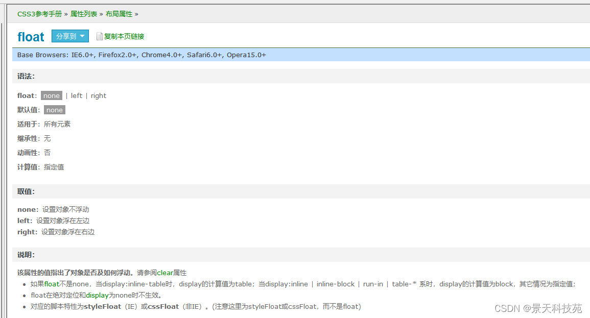
- 5.float浮動
- 6.float產生內容塌陷問題
- 7.overflow
CSS樣式學習寶典,關注點贊加收藏,防止迷路哦
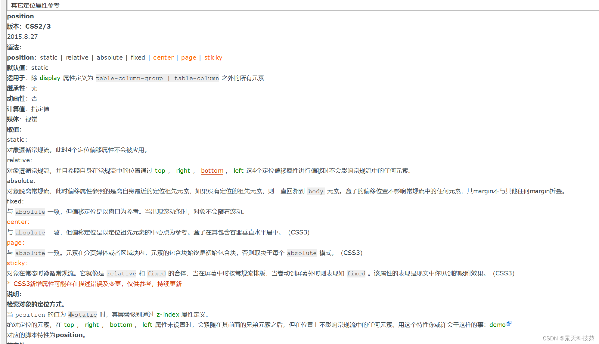
在CSS中關于定位的內容是:position:relative | absolute | static | fixed。static 沒有特別的設定,遵循基本的定位規定,不能通過z-index進行層次分級。在文本流中,任何一個元素都被文本流所限制了自身的位置,但是通過CSS我們依然使得這些元素可以改變自己的位置,我們可以通過float來讓元素浮動,我們也可以通過margin來讓元素產生位置移動。
1.相對定位 relative
定位的種類,默認是static
<!DOCTYPE html>
<html lang="en">
<head><meta charset="UTF-8"><meta name="viewport" content="width=device-width, initial-scale=1.0"><title>定位:相對定位 relative</title><style>.gg{width:200px;height:200px;border:solid 1px red;}.c1{background:violet;}.c2{background:tan;position:relative;top:10px;left:100px;z-index:2;}.c3{background:blue;}.c4{background:green;}</style>
</head>
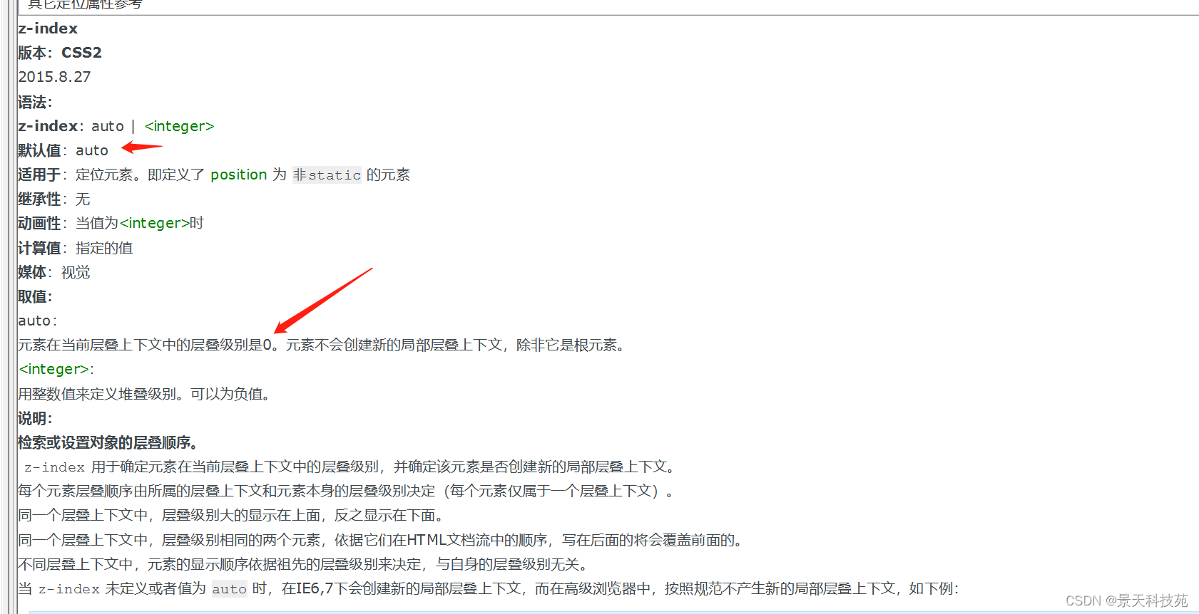
<body><!-- 相對定位: 參考點是他自己本身,相對于原始的位置進行定位,本身原始位置指的是盒子設置好后,默認在瀏覽器的位置;如果添加了定位:無論是添加(相對,絕對,固定)屬性,添加之后會增加額外的其他屬性:z-index 控制層疊關系: 值越大越在上層,值越小越在下層同一個層疊上下文中,層疊級別相同的兩個元素,依據它們在HTML文檔流中的順序,寫在后面的將會覆蓋前面的。 不同層疊上下文中,元素的顯示順序依據祖先的層疊級別來決定,與自身的層疊級別無關。 lefttoprightbottom z-indexz-index 控制層疊關系: 值越大越在上層,值越小越在下層,默認是0
        --><div class="c1 gg"></div><div class="c2 gg"></div><div class="c3 gg"></div><div class="c4 gg"></div></body>
</html>
2.絕對定位 absolute
<!DOCTYPE html>
<html lang="en">
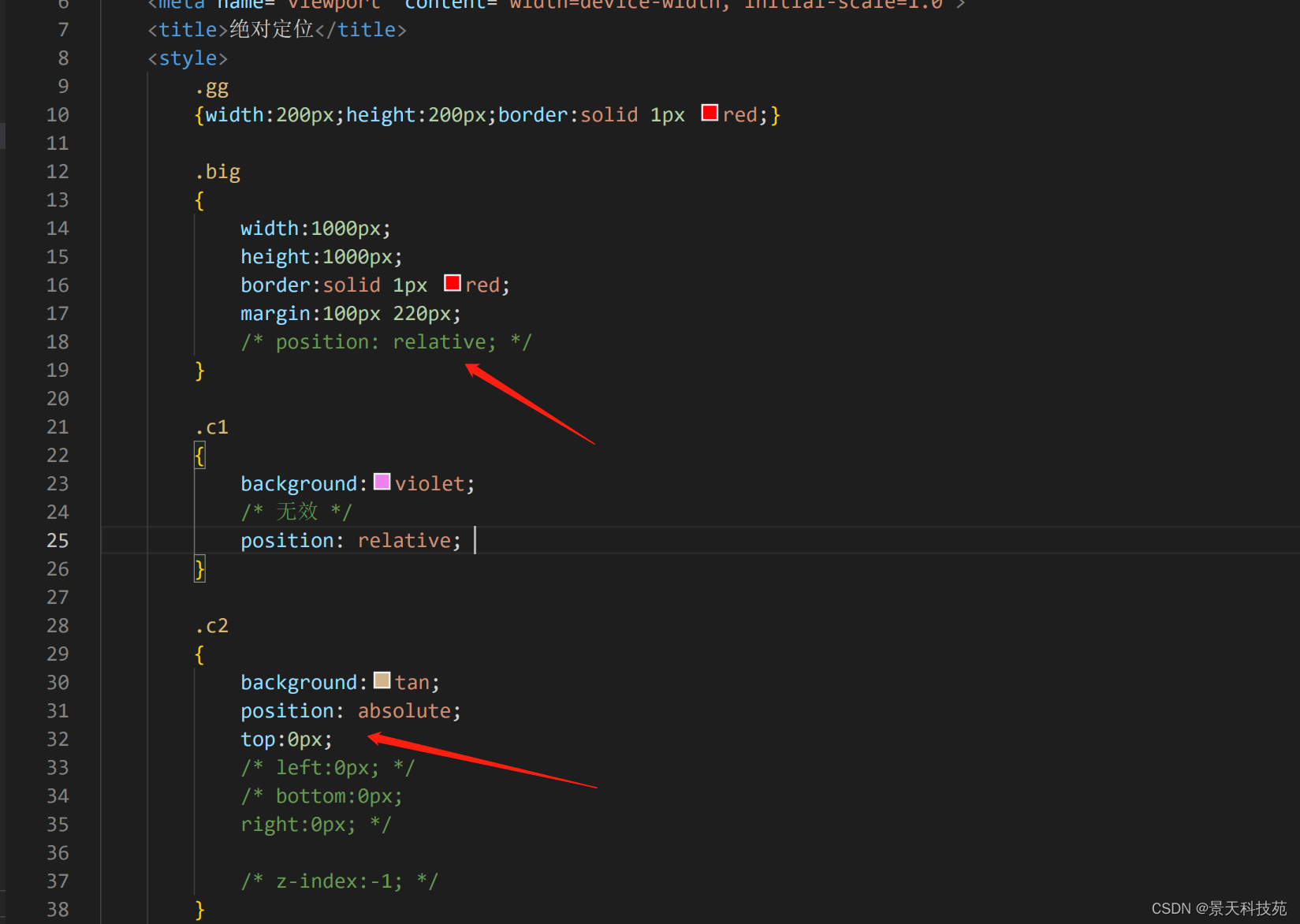
<head><meta charset="UTF-8"><meta name="viewport" content="width=device-width, initial-scale=1.0"><title>定位:絕對定位 absolute</title><style>.gg{width:200px;height:200px;border:solid 1px red;}.big{width:1000px;height:1000px;border:solid 1px red;margin:100px 220px;}.c1{background:violet;/* 無效 */position: relative; }.c2{background:tan;position: absolute;top:0px;left:0px;/* bottom:0px;right:0px; *//* z-index:-1; */}.c3{background:blue;}.c4{background:green;}</style>
</head>
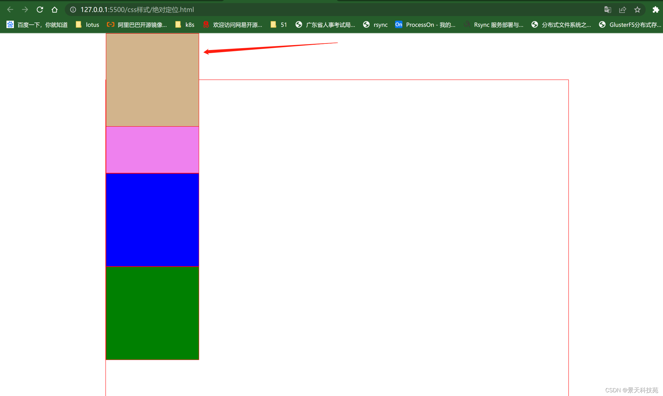
<body><!-- 絕對定位:參考點默認參考的是body 效果:脫離文檔流,后面的內容自動補位使用:絕對定位會參照父級的相對定位進行移動,如果父級中沒有relative,相對于body進行定位;(1)把想要的父級元素變成relative(2)把要定位的元素變成 absolute--><div class="big"><div class="c1 gg"></div><div class="c2 gg"></div><div class="c3 gg"></div><div class="c4 gg"></div></div></body>
</html>
父級沒有relative,設置了absolute的元素會相對body進行定位
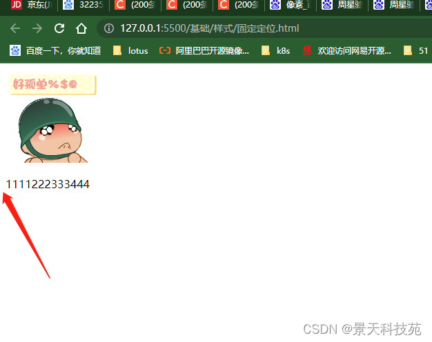
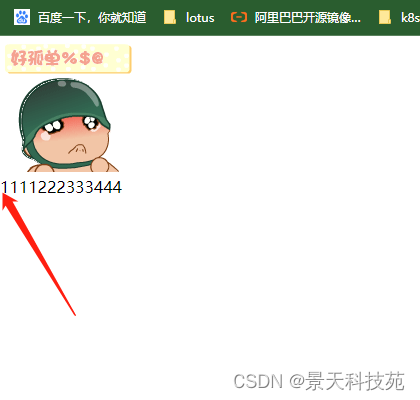
3.固定定位
fixed固定頁面,滑動頁面該位置不動
<!DOCTYPE html>
<html lang="en">
<head><meta charset="UTF-8"><meta name="viewport" content="width=device-width, initial-scale=1.0"><title>定位:固定定位 fixed</title><style>/* *號代表通配選擇符,代表所有標簽,默認標簽中含有默認的間距,要在一開始的時候全部去掉; */
默認標簽離左邊欄有間距
*{margin:0px;padding:0px;}
加上* 所有通配符設置間距為0,離左邊欄不再有間距
body
{height:2000px;}
.c1
{width:500px;height: 600px;border:solid 1px red;background-color: green;position: fixed;/* 相對于左上角定點進行定位 */left:50%;margin-left:-250px;top:50%;margin-top:-300px;
}
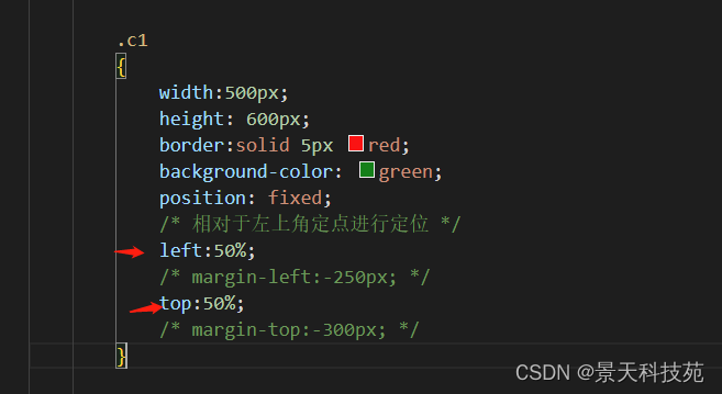
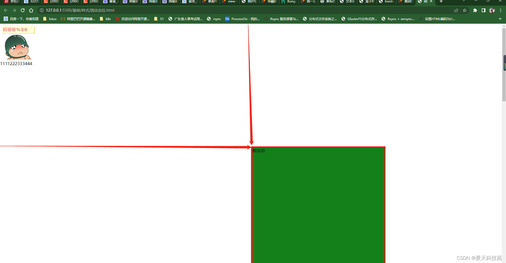
把多移動的移回來
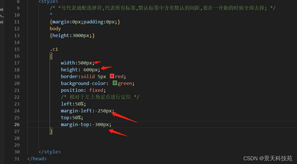
然后才能居中
過度屬性/* <' transition-property '>: 檢索或設置對象中的參與過渡的屬性 <' transition-duration '>: 檢索或設置對象過渡的持續時間 <' transition-timing-function '>: 檢索或設置對象中過渡的動畫類型 <' transition-delay '>: 檢索或設置對象延遲過渡的時間 */img{position:fixed;bottom:20px;left:-100px; transition: all 1s ease 0.1s; }img:hover{left:0px;background-color: red;}</style>
</head>
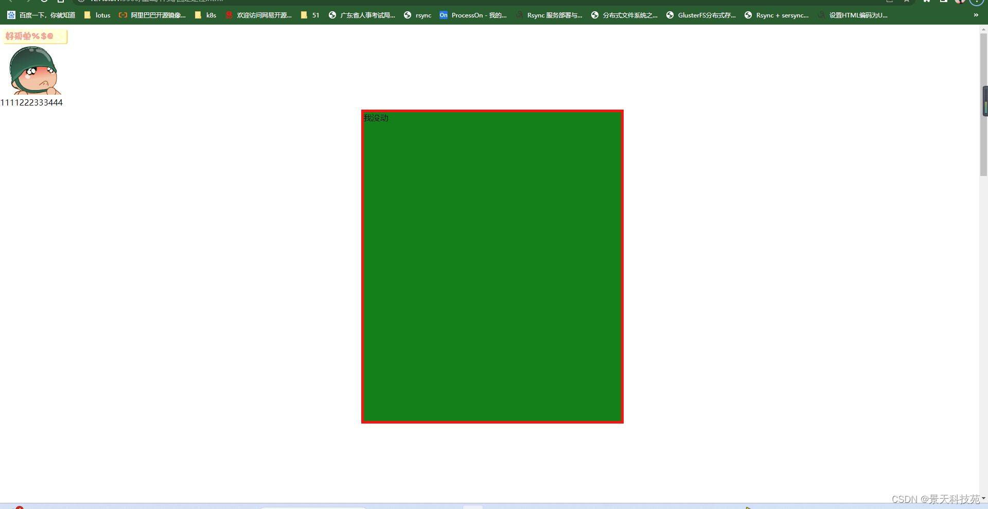
<body><img src="images/xiao.jpg"/><div class="c1">我沒動</div><p>1111222333444</p></body>
</html>
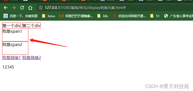
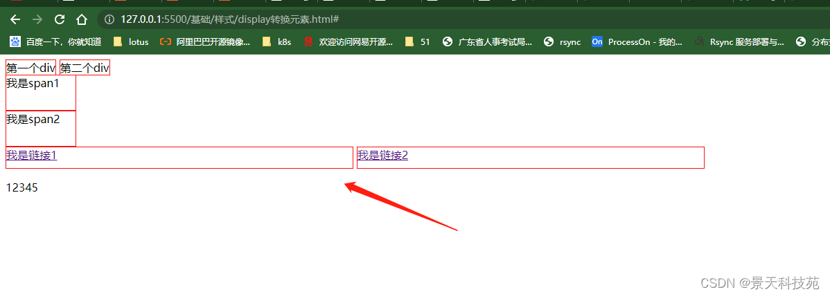
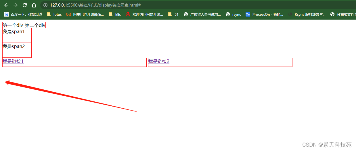
4.display 轉換元素
行內,塊狀,行內塊狀元素之間的轉換
使用語法:
display : 要轉換的元素類型(block inline inline-block)
<!DOCTYPE html>
<html lang="en">
<head><meta charset="UTF-8"><meta name="viewport" content="width=device-width, initial-scale=1.0"><title>display 轉換元素</title><style>div/* display:inline; 轉換成行內元素 */{display:inline;border:solid 1px red;width:1000px;height:20px;}
將塊狀元素設置成行內元素后,設置的高和寬已失效
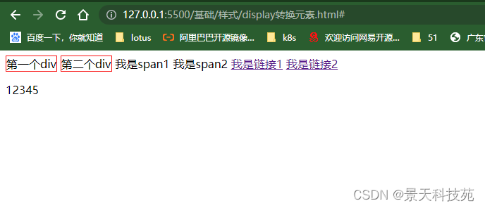
        span/* display:block; 轉換成塊狀元素 */{display:block;width:100px;height:50px;border:solid 1px red;}
行內元素轉換成塊狀元素后,可以設置高和寬,并且獨占一行
        a/* display:inline-block; 轉換成行內塊狀元素 */{display:inline-block;width:500px;height:30px;border:solid 1px red;}
行內元素轉換成行內塊狀元素,可以設置高和寬
        p/* display:none 隱藏元素 */{display:none;}
p元素隱藏了
    </style></head>
<body><!-- 元素的分類:塊狀元素 : block行內元素 : inline行內塊狀元素  : inline-block--><div>第一個div</div><div>第二個div</div><span>我是span1</span><span>我是span2</span><a href="#">我是鏈接1</a><a href="#">我是鏈接2</a><p>12345</p>
</body>
</html>
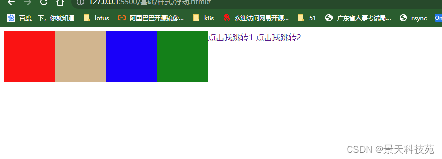
5.float浮動
<!DOCTYPE html>
<html lang="en">
<head><meta charset="UTF-8"><meta name="viewport" content="width=device-width, initial-scale=1.0"><title>float 浮動</title><style>.content{width:700px;clear:both;}.content .c1{background: red;width:100px;height:100px;float:left;}.content .c2{background: tan;width:100px;height:100px;float:left;}.content .c3{background:blue;width:100px;height:100px;float:left;}.content .c4{background:green;width:100px;height:100px;float:left;}div默認是從上到下,垂直排列,使用float之后,從左向右橫向排列
是設置了float下面的元素脫離文檔流,壓在了設置float元素的下面
.content2
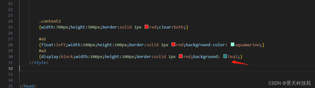
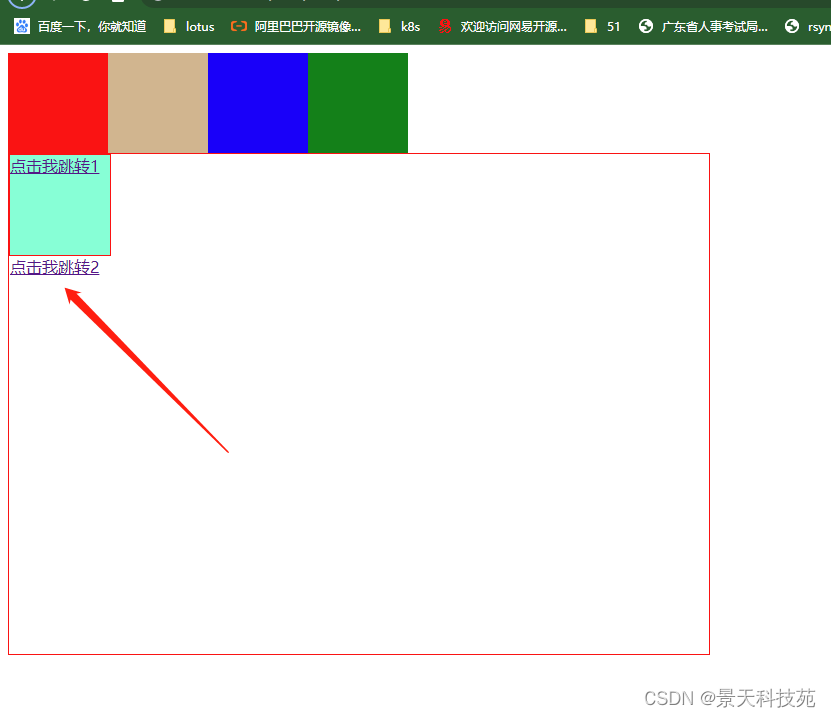
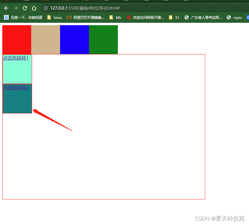
{width:700px;height:500px;border:solid 1px red;clear:both;}#a1
{float:left;width:100px;height:100px;border:solid 1px red;}
#a2
{display:block;width:100px;height:100px;border:solid 1px red;background: teal;clear: both;}
不加clear:both,a2設置的屬性沒顯示出來
加了clear:both。顯示正常
    </style>
</head>
<body><!-- # ###塊狀元素浮動:float:left  向左浮動  ,元素脫離原始文檔流,后面的內容自動補齊;float:right 向右浮動  ,元素脫離原始文檔流,后面的內容自動補齊;目的: 讓塊狀元素在一排顯示 clear:both; 清除兩邊的浮動  在不需要浮動的地方加--><div class="content"><div class="c1"></div><div class="c2"></div><div class="c3"></div><div class="c4"></div></div><!-- # ###行內元素浮動:如果對行內元素進行浮動:默認會把行內元素升級成行內塊狀元素,可以設置寬和高 消除浮動產生的影響:clear:both;--><div class="content2"><a href="#" id="a1">點擊我跳轉1</a><a href="#" id="a2">點擊我跳轉2</a></div>
</body>
</html>
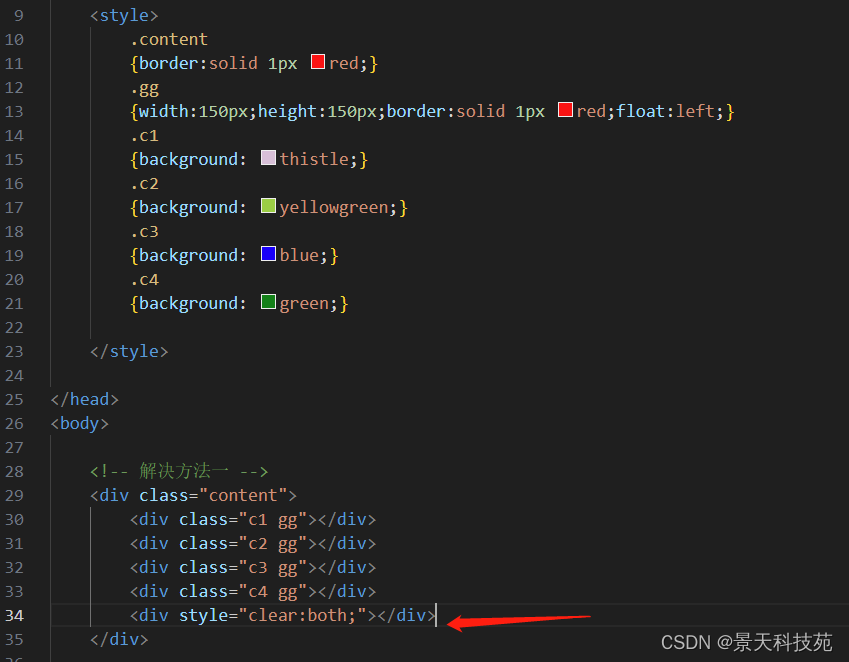
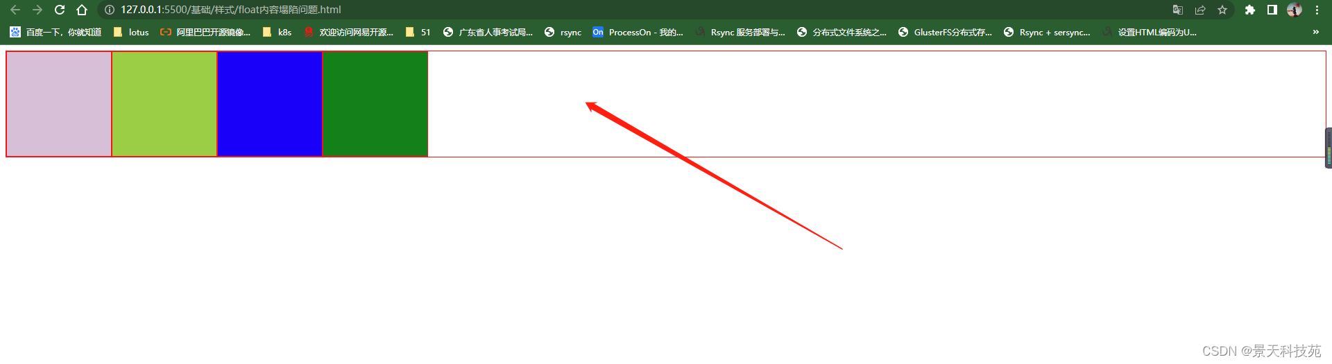
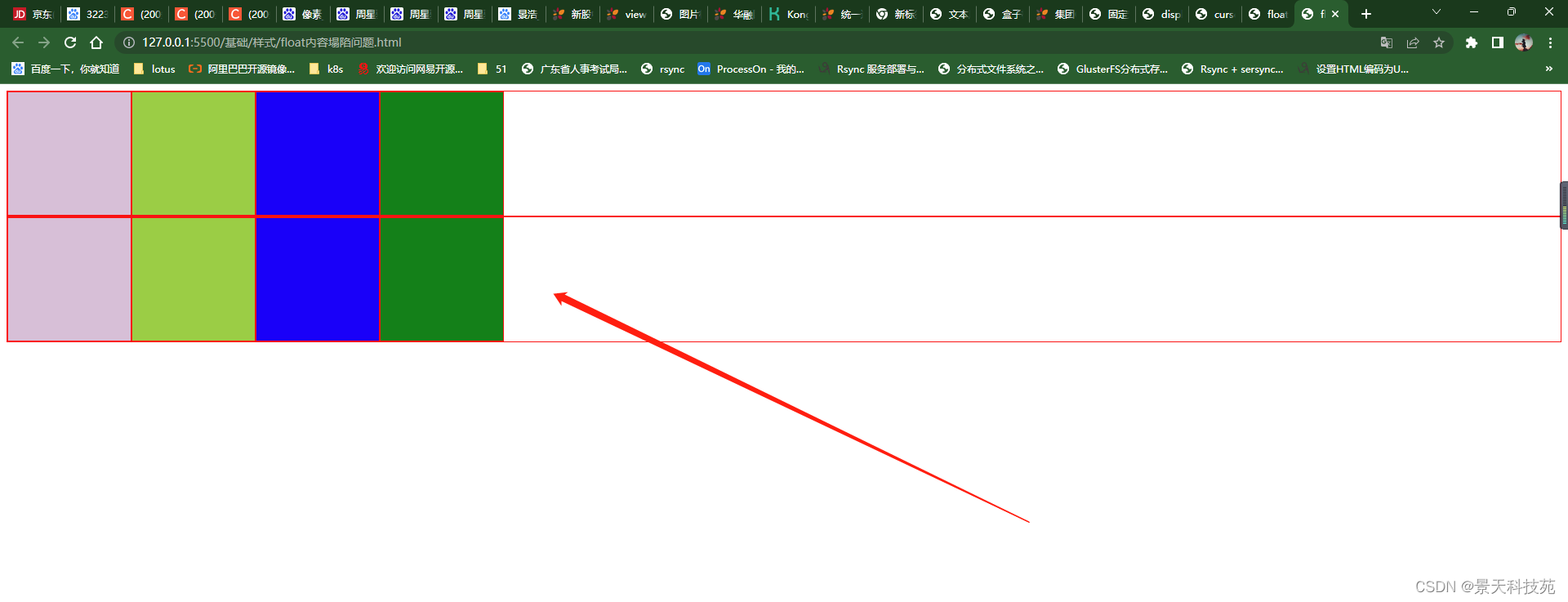
6.float產生內容塌陷問題
<!DOCTYPE html>
<html lang="en">
<head><meta charset="UTF-8"><meta name="viewport" content="width=device-width, initial-scale=1.0"><title>float 會產生內容塌陷問題</title><style>.content{border:solid 1px red;}.gg{width:150px;height:150px;border:solid 1px red;float:left;}.c1{background: thistle;}.c2{background: yellowgreen;}.c3{background: blue;}.c4{background: green;}
大div里面幾個小div浮動,導致大盒子沒撐開
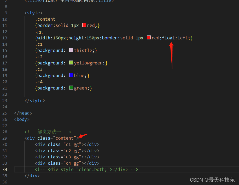
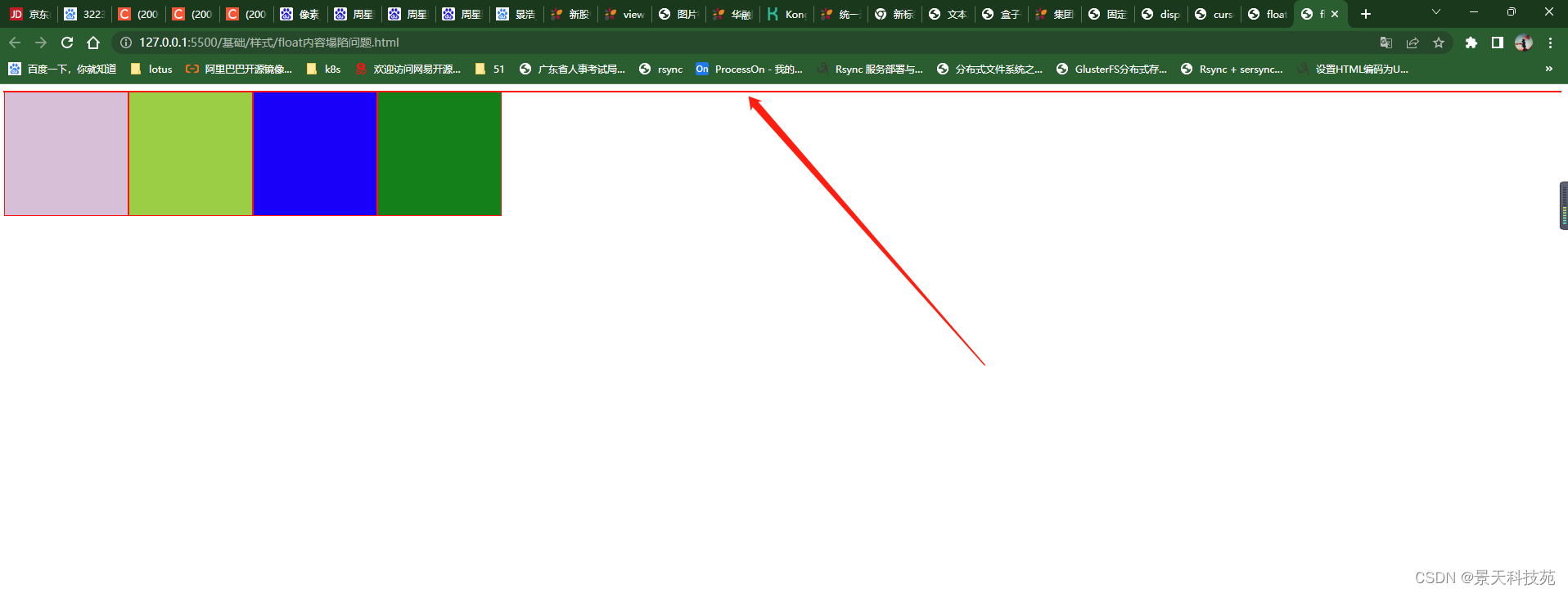
解決辦法一:在html里面解決
在小div里面增加一個div 只設置style clear:both
.content2
{border:solid 1px red;}
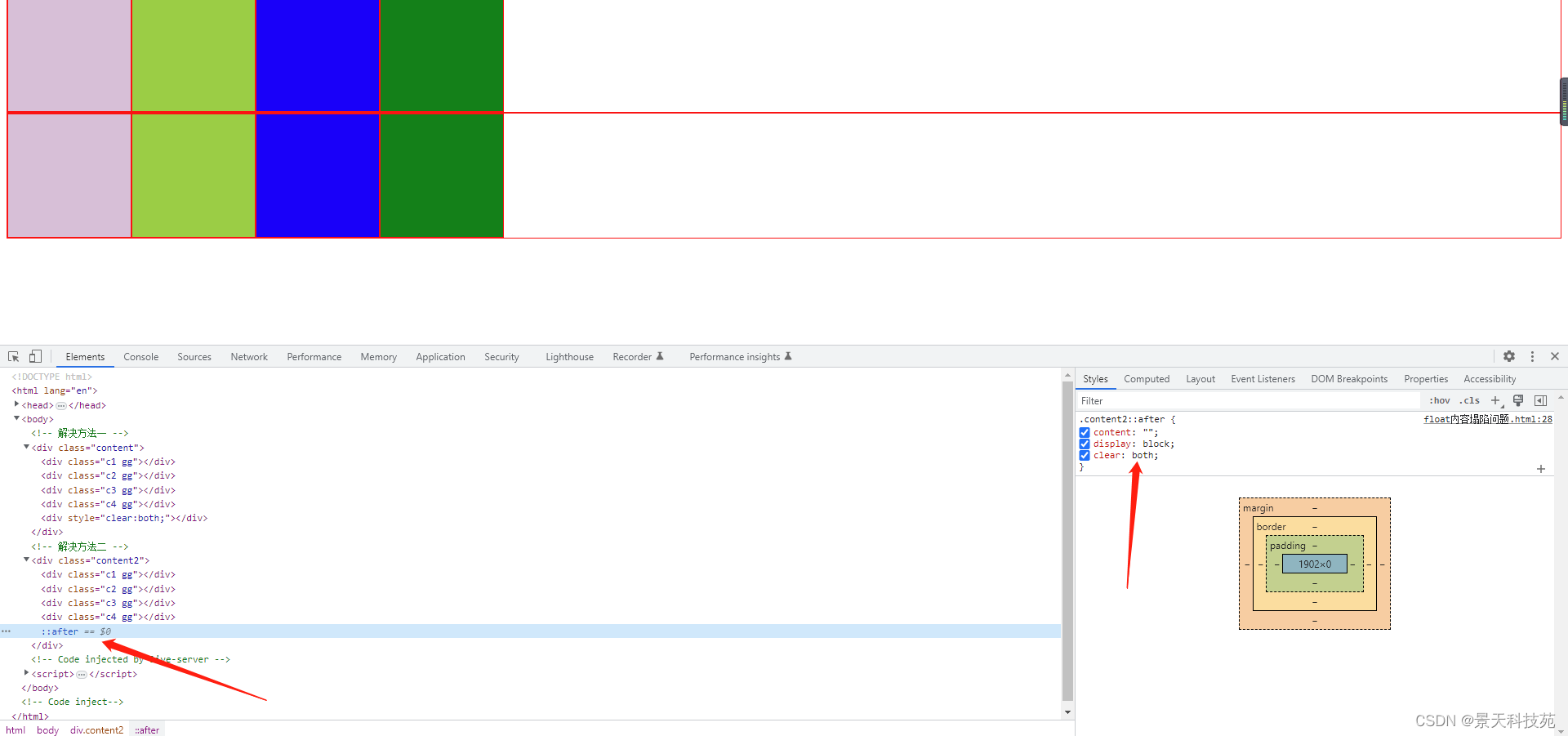
.content2::after
{content:"";display:block;clear:both;
}
解決方法二:在CSS里面通過偽對象來解決
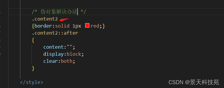
    </style>
</head>
<body><!-- 解決方法一 --><div class="content"><div class="c1 gg"></div><div class="c2 gg"></div><div class="c3 gg"></div><div class="c4 gg"></div><div style="clear:both;"></div></div><!-- 解決方法二 --><div class="content2"><div class="c1 gg"></div><div class="c2 gg"></div><div class="c3 gg"></div><div class="c4 gg"></div></div>
</body>
</html>
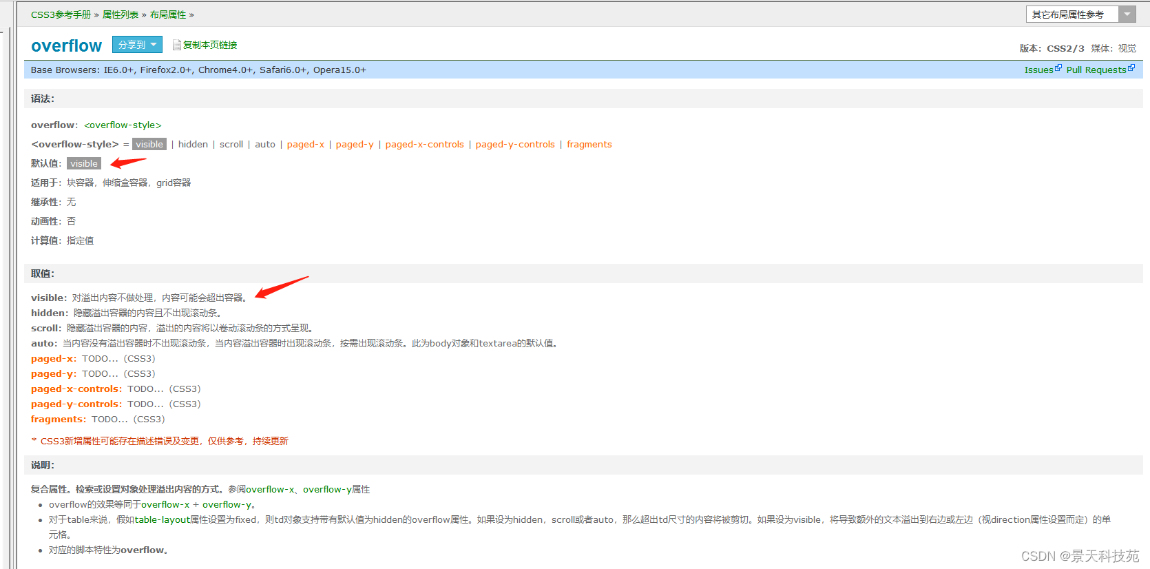
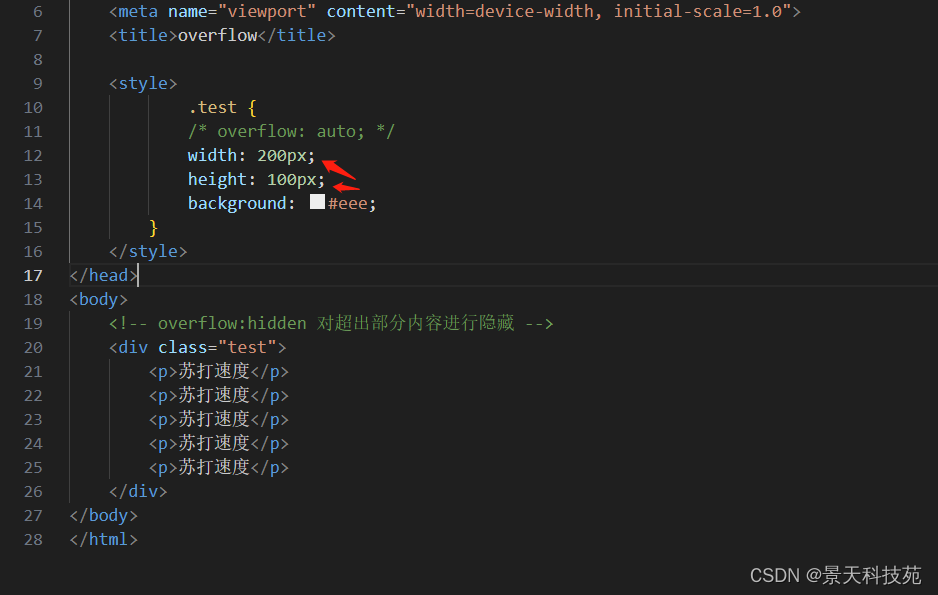
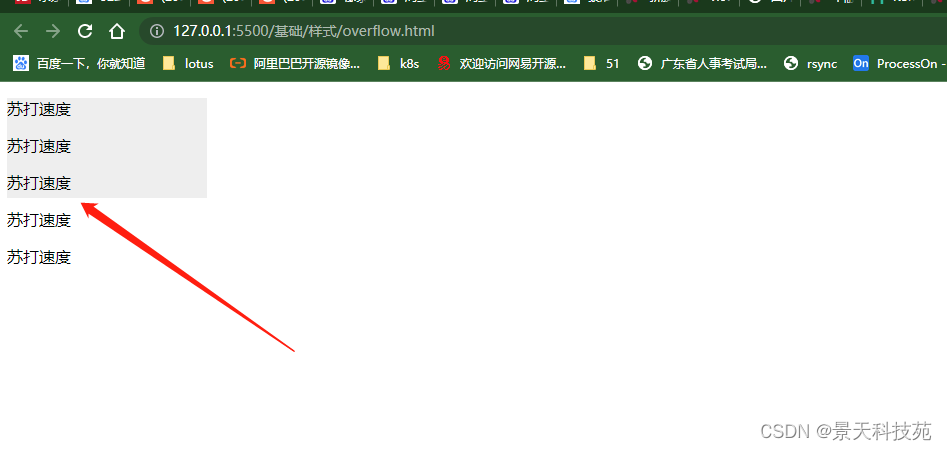
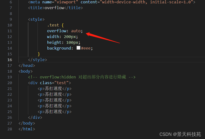
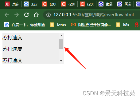
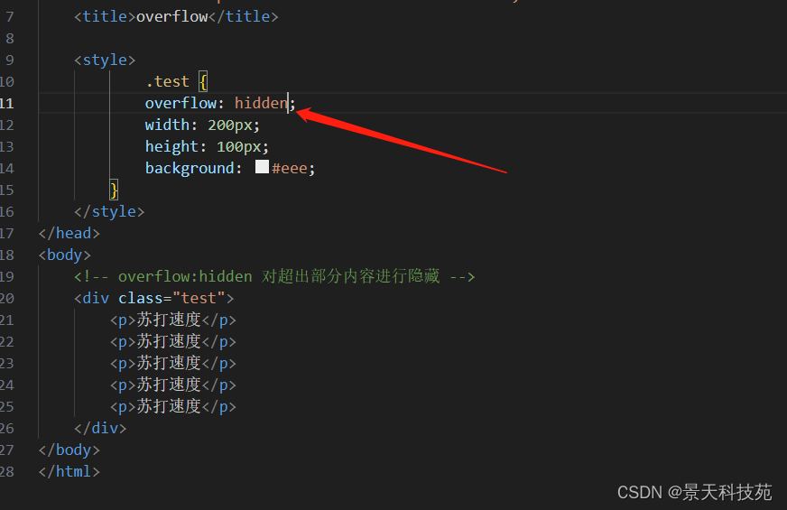
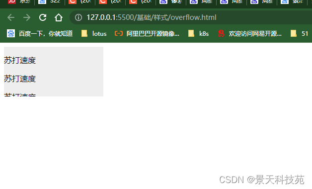
7.overflow
對超出部分內容的處理
<!DOCTYPE html>
<html><head><meta charset="utf-8" /><style>.test {overflow: hidden;width: 200px;height: 100px;background: #eee;}</style></head><body><!-- overflow:hidden 對超出部分內容進行隱藏 --><div class="test"><p>蘇打速度</p><p>蘇打速度</p><p>蘇打速度</p><p>蘇打速度</p><p>蘇打速度</p></div></body>
</html>
對于超過邊界的內容,默認是visible 對超出邊框的內容不做處理,顯示出來。這樣很不美觀
對超出的內容可以設置隱藏,或者滾動條顯示auto:當內容沒有溢出容器時不出現滾動條,當內容溢出容器時出現滾動條,按需出現滾動條。此為body對象和textarea的默認值。
hidden:隱藏溢出的內容


![[vue error] TypeError: Components is not a function](http://pic.xiahunao.cn/[vue error] TypeError: Components is not a function)


:界面設計全面掃盲,得供應鏈者得天下)


SpringCloud系列——openfeign的高級特性實戰內容介紹)


