在窄屏模式下(移動端或pda),提示框的寬度太寬,會出現顯示不完全的問題。 應當如何修改 ElementUI 的樣式呢?
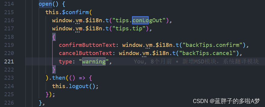
open() {this.$confirm(window.vm.$i18n.t("tips.conLogOut"),window.vm.$i18n.t("tips.tip"),{confirmButtonText: window.vm.$i18n.t("backTips.confirm"),cancelButtonText: window.vm.$i18n.t("backTips.cancel"),type: "warning",}).then(() => {this.logout();});},
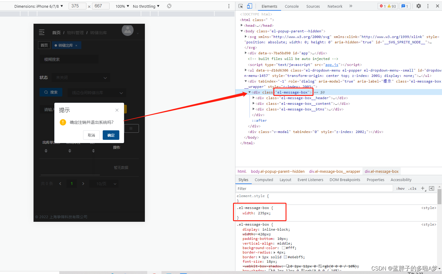
 <style scoped>.el-message-box {width: 235px;
}
</style>
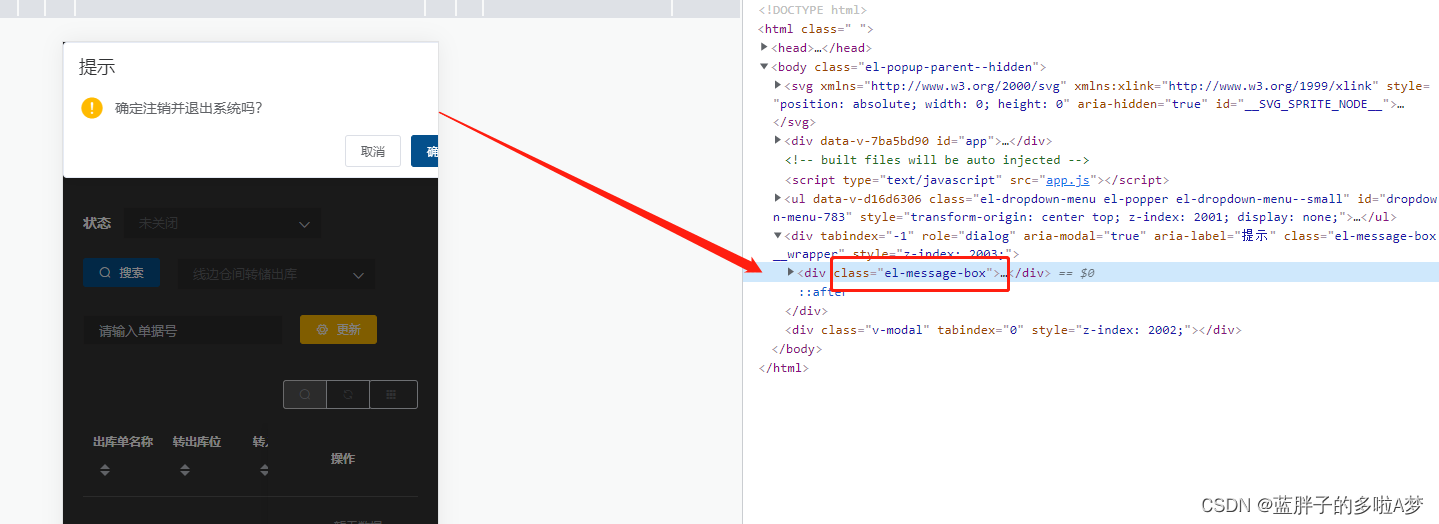
此時在scoped的style中寫是無效的,因為ElementUI組件不可以給樣式添加scoped,因此必須去掉scoped;但是去掉scoped后不滿足單組件的CSS。
解決方案
1、附加在沒有scoped的style中
<style scoped>...
</style>
<style>....el-message-box {width: 235px;}
</style>
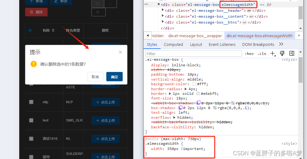
2、給消息提示框加類名(薦)
更加推薦這個messageBox添加一個類名,比較好用并且不會影響到其他頁面的彈框樣式。
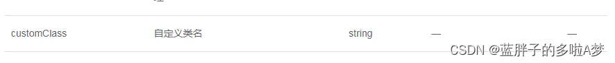
this.$confirm('確認注銷嗎?', '提示', {customClass: 'elmessageWidth'
}).then(() => {this.$message({message: '已成功注銷',type: 'success'})
}).catch(() => {  })
<style scoped>...
</style>
<style>.elmessageWidth {width: 350px;}
</style>
或者直接important
@media (max-width: 730px) {.elmessageWidth{width: 350px !important;}}

數據預處理)


)

(DNA序列修正、無盡的石頭))
-個人筆記)


