I am an avid Youtube user and love watching videos on it in my free time. I decided to do some exploratory data analysis on the youtube videos streamed in the US. I found the dataset on the Kaggle on this link
我是YouTube的狂熱用戶,喜歡在業余時間觀看視頻。 我決定對在美國播放的youtube視頻進行一些探索性數據分析。 我在此鏈接的Kaggle上找到了數據集
I downloaded the csv file ‘USvidoes.csv’ and the json file ‘US_category_id.json’ among all the geography-wise datasets available. I have used Jupyter notebook for the purpose of this analysis.
我在所有可用的地理區域數據集中下載了csv文件“ USvidoes.csv”和json文件“ US_category_id.json”。 我已使用Jupyter筆記本進行此分析。
讓我們開始吧! (Let's get started!)
Loading the necessary libraries
加載必要的庫
import pandas as pdimport numpy as npimport seaborn as snsimport matplotlib.pyplot as pltimport osfrom subprocess import check_outputfrom wordcloud import WordCloud, STOPWORDSimport stringimport re import nltkfrom nltk.corpus import stopwordsfrom nltk import pos_tagfrom nltk.stem.wordnet import WordNetLemmatizer from nltk.tokenize import word_tokenizefrom nltk.tokenize import TweetTokenizerI created a dataframe by the name ‘df_you’ which will be used throughout the course of the analysis.
我創建了一個名為“ df_you”的數據框,該數據框將在整個分析過程中使用。
df_you = pd.read_csv(r"...\Projects\US Youtube - Python\USvideos.csv")The foremost step is to understand the length, breadth and the bandwidth of the data.
最重要的步驟是了解數據的長度,寬度和帶寬。
print(df_you.shape)
print(df_you.nunique())
There seems to be around 40949 observations and 16 variables in the dataset. The next step would be to clean the data if necessary. I checked if there are any null values which need to be removed or manipulated.
數據集中似乎有大約40949個觀測值和16個變量。 下一步將是在必要時清除數據。 我檢查了是否有任何需要刪除或處理的空值。
df_you.info()
We see that there are total 16 columns with no null values in any of them. Good for us :) Let us now get a sense of data by viewing the top few rows.
我們看到總共有16列,其中任何一列都沒有空值。 對我們有用:)現在讓我們通過查看前幾行來獲得數據感。
df_you.head(n=5)Now comes the exciting part of visualizations! To visualize the data in the variables such as ‘likes’, ‘dislikes’, ‘views’ and ‘comment count’, I first normalize the data using log distribution. Normalization of the data is essential to ensure that these variables are scaled appropriately without letting one dominant variable skew the final result.
現在是可視化令人興奮的部分! 為了可視化“喜歡”,“喜歡”,“觀看”和“評論計數”等變量中的數據,我首先使用對數分布對數據進行規范化。 數據的規范化對于確保適當縮放這些變量而不會讓一個主要變量偏向最終結果至關重要。
df_you['likes_log'] = np.log(df_you['likes']+1)
df_you['views_log'] = np.log(df_you['views'] +1)
df_you['dislikes_log'] = np.log(df_you['dislikes'] +1)
df_you['comment_count_log'] = np.log(df_you['comment_count']+1)
Let us now plot these!
現在讓我們繪制這些!
plt.figure(figsize = (12,6))
plt.subplot(221)
g1 = sns.distplot(df_you['likes_log'], color = 'green')
g1.set_title("LIKES LOG DISTRIBUTION", fontsize = 16)
plt.subplot(222)
g2 = sns.distplot(df_you['views_log'])
g2.set_title("VIEWS LOG DISTRIBUTION", fontsize = 16)
plt.subplot(223)
g3 = sns.distplot(df_you['dislikes_log'], color = 'r')
g3.set_title("DISLIKES LOG DISTRIBUTION", fontsize=16)
plt.subplot(224)
g4 = sns.distplot(df_you['comment_count_log'])
g4.set_title("COMMENT COUNT LOG DISTRIBUTION", fontsize=16)
plt.subplots_adjust(wspace = 0.2, hspace = 0.4, top = 0.9)
plt.show()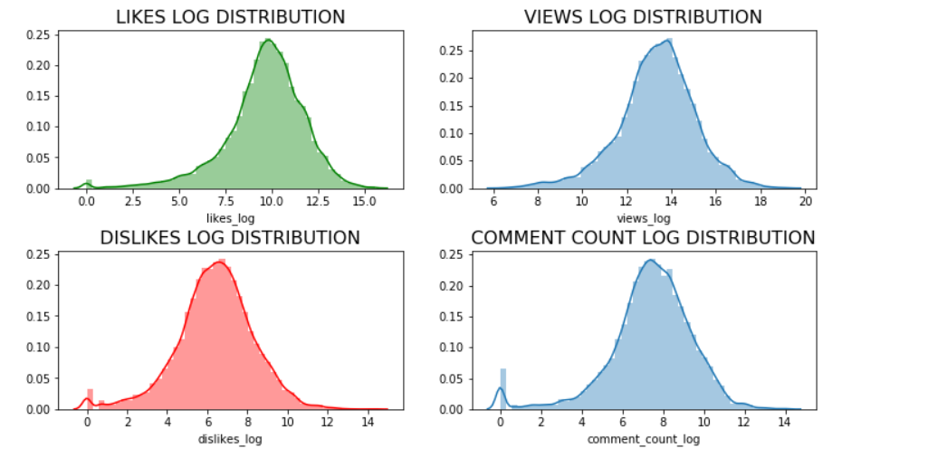
Let us now find out the unique category ids present in our dataset to assign appropriate category names in our dataframe.
現在讓我們找出數據集中存在的唯一類別ID,以便在數據框中分配適當的類別名稱。
np.unique(df_you["category_id"])
We see there are 16 unique categories. Let us assign the names to these categories using the information in the json file ‘US_category_id.json’ which we previously downloaded.
我們看到有16個獨特的類別。 讓我們使用先前下載的json文件“ US_category_id.json”中的信息將名稱分配給這些類別。
df_you['category_name'] = np.nan
df_you.loc[(df_you["category_id"]== 1),"category_name"] = 'Film and Animation'
df_you.loc[(df_you["category_id"] == 2), "category_name"] = 'Cars and Vehicles'
df_you.loc[(df_you["category_id"] == 10), "category_name"] = 'Music'
df_you.loc[(df_you["category_id"] == 15), "category_name"] = 'Pet and Animals'
df_you.loc[(df_you["category_id"] == 17), "category_name"] = 'Sports'
df_you.loc[(df_you["category_id"] == 19), "category_name"] = 'Travel and Events'
df_you.loc[(df_you["category_id"] == 20), "category_name"] = 'Gaming'
df_you.loc[(df_you["category_id"] == 22), "category_name"] = 'People and Blogs'
df_you.loc[(df_you["category_id"] == 23), "category_name"] = 'Comedy'
df_you.loc[(df_you["category_id"] == 24), "category_name"] = 'Entertainment'
df_you.loc[(df_you["category_id"] == 25), "category_name"] = 'News and Politics'
df_you.loc[(df_you["category_id"] == 26), "category_name"] = 'How to and Style'
df_you.loc[(df_you["category_id"] == 27), "category_name"] = 'Education'
df_you.loc[(df_you["category_id"] == 28), "category_name"] = 'Science and Technology'
df_you.loc[(df_you["category_id"] == 29), "category_name"] = 'Non-profits and Activism'
df_you.loc[(df_you["category_id"] == 43), "category_name"] = 'Shows'
Let us now plot these to identify the popular video categories!
現在,讓我們對它們進行標繪,以識別受歡迎的視頻類別!
plt.figure(figsize = (14,10))
g = sns.countplot('category_name', data = df_you, palette="Set1", order = df_you['category_name'].value_counts().index)
g.set_xticklabels(g.get_xticklabels(),rotation=45, ha="right")
g.set_title("Count of the Video Categories", fontsize=15)
g.set_xlabel("", fontsize=12)
g.set_ylabel("Count", fontsize=12)
plt.subplots_adjust(wspace = 0.9, hspace = 0.9, top = 0.9)
plt.show()
We see that the top — 5 viewed categories are ‘Entertainment’, ‘Music’, ‘How to and Style’, ‘Comedy’ and ‘People and Blogs’. So if you are thinking of starting your own youtube channel, you better think about these categories first!
我們看到排名前5位的類別是“娛樂”,“音樂”,“操作方法和樣式”,“喜劇”和“人與博客”。 因此,如果您想建立自己的YouTube頻道,最好先考慮這些類別!
Let us now see how views, likes, dislikes and comments fare across categories using boxplots.
現在,讓我們看看使用箱線圖,視圖,喜歡,不喜歡和評論在不同類別中的表現如何。
plt.figure(figsize = (14,10))
g = sns.boxplot(x = 'category_name', y = 'views_log', data = df_you, palette="winter_r")
g.set_xticklabels(g.get_xticklabels(),rotation=45, ha="right")
g.set_title("Views across different categories", fontsize=15)
g.set_xlabel("", fontsize=12)
g.set_ylabel("Views(log)", fontsize=12)
plt.subplots_adjust(wspace = 0.9, hspace = 0.9, top = 0.9)
plt.show()
plt.figure(figsize = (14,10))
g = sns.boxplot(x = 'category_name', y = 'likes_log', data = df_you, palette="spring_r")
g.set_xticklabels(g.get_xticklabels(),rotation=45, ha="right")
g.set_title("Likes across different categories", fontsize=15)
g.set_xlabel("", fontsize=12)
g.set_ylabel("Likes(log)", fontsize=12)
plt.subplots_adjust(wspace = 0.9, hspace = 0.9, top = 0.9)
plt.show()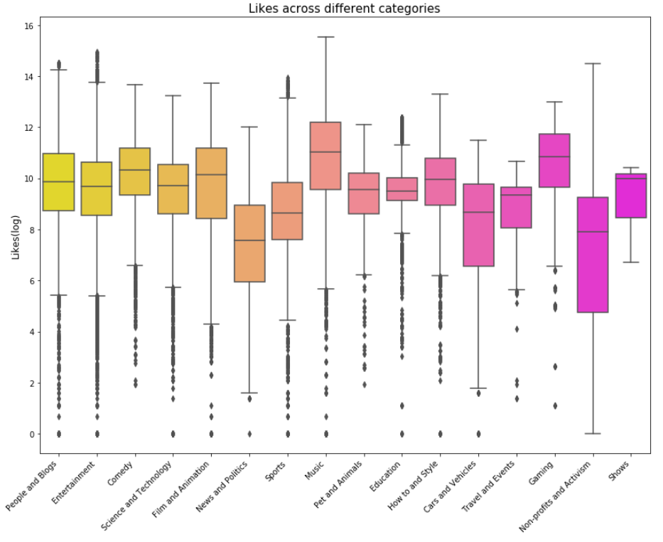
plt.figure(figsize = (14,10))
g = sns.boxplot(x = 'category_name', y = 'dislikes_log', data = df_you, palette="summer_r")
g.set_xticklabels(g.get_xticklabels(),rotation=45, ha="right")
g.set_title("Dislikes across different categories", fontsize=15)
g.set_xlabel("", fontsize=12)
g.set_ylabel("Dislikes(log)", fontsize=12)
plt.subplots_adjust(wspace = 0.9, hspace = 0.9, top = 0.9)
plt.show()
plt.figure(figsize = (14,10))
g = sns.boxplot(x = 'category_name', y = 'comment_count_log', data = df_you, palette="plasma")
g.set_xticklabels(g.get_xticklabels(),rotation=45, ha="right")
g.set_title("Comments count across different categories", fontsize=15)
g.set_xlabel("", fontsize=12)
g.set_ylabel("Comment_count(log)", fontsize=12)
plt.subplots_adjust(wspace = 0.9, hspace = 0.9, top = 0.9)
plt.show()
Next I calculated engagement measures such as like rate, dislike rate and comment rate.
接下來,我計算了參與度,例如喜歡率,不喜歡率和評論率。
df_you['like_rate'] = df_you['likes']/df_you['views']
df_you['dislike_rate'] = df_you['dislikes']/df_you['views']
df_you['comment_rate'] = df_you['comment_count']/df_you['views']
Building correlation matrix using a heatmap for engagement measures.
使用熱圖來建立參與度度量的相關矩陣。
plt.figure(figsize = (10,8))
sns.heatmap(df_you[['like_rate', 'dislike_rate', 'comment_rate']].corr(), annot=True)
plt.show()
From the above heatmap, it can be seen that if a viewer likes a particular video, there is a 43% chance that he/she will comment on it as opposed to 28% chance of commenting if the viewer dislikes the video. This is a good insight which means if viewers like any videos, they are more likely to comment on them to show their appreciation/feedback.
從上面的熱圖可以看出,如果觀眾喜歡某個視頻,則有43%的機會對其發表評論,而如果觀眾不喜歡該視頻,則有28%的評論機會。 這是一個很好的見解,這意味著如果觀眾喜歡任何視頻,他們就更有可能對它們發表評論以表示贊賞/反饋。
Next, I try to analyse the word count , unique word count, punctuation count and average length of the words in the ‘Title’ and ‘Tags’ columns
接下來,我嘗試在“標題”和“標簽”列中分析字數 , 唯一字數,標點符號和字的平均長度
#Word count
df_you['count_word']=df_you['title'].apply(lambda x: len(str(x).split()))
df_you['count_word_tags']=df_you['tags'].apply(lambda x: len(str(x).split()))#Unique word count
df_you['count_unique_word'] = df_you['title'].apply(lambda x: len(set(str(x).split())))
df_you['count_unique_word_tags'] = df_you['tags'].apply(lambda x: len(set(str(x).split())))#Punctutation count
df_you['count_punctuation'] = df_you['title'].apply(lambda x: len([c for c in str(x) if c in string.punctuation]))
df_you['count_punctuation_tags'] = df_you['tags'].apply(lambda x: len([c for c in str(x) if c in string.punctuation]))#Average length of the words
df_you['mean_word_len'] = df_you['title'].apply(lambda x : np.mean([len(x) for x in str(x).split()]))
df_you['mean_word_len_tags'] = df_you['tags'].apply(lambda x: np.mean([len(x) for x in str(x).split()]))
Plotting these…
繪制這些…
plt.figure(figsize = (12,18))
plt.subplot(421)
g1 = sns.distplot(df_you['count_word'],
                 hist = False, label = 'Text')
g1 = sns.distplot(df_you['count_word_tags'],
                 hist = False, label = 'Tags')
g1.set_title('Word count distribution', fontsize = 14)
g1.set(xlabel='Word Count')
plt.subplot(422)
g2 = sns.distplot(df_you['count_unique_word'],
                 hist = False, label = 'Text')
g2 = sns.distplot(df_you['count_unique_word_tags'],
                 hist = False, label = 'Tags')
g2.set_title('Unique word count distribution', fontsize = 14)
g2.set(xlabel='Unique Word Count')
plt.subplot(423)
g3 = sns.distplot(df_you['count_punctuation'],
                 hist = False, label = 'Text')
g3 = sns.distplot(df_you['count_punctuation_tags'],
                 hist = False, label = 'Tags')
g3.set_title('Punctuation count distribution', fontsize =14)
g3.set(xlabel='Punctuation Count')
plt.subplot(424)
g4 = sns.distplot(df_you['mean_word_len'],
                 hist = False, label = 'Text')
g4 = sns.distplot(df_you['mean_word_len_tags'],
                 hist = False, label = 'Tags')
g4.set_title('Average word length distribution', fontsize = 14)
g4.set(xlabel = 'Average Word Length')
plt.subplots_adjust(wspace = 0.2, hspace = 0.4, top = 0.9)
plt.legend()
plt.show()
Let us now visualize the word cloud for Title of the videos, Description of the videos and videos Tags. This way we can discover which words are popular in the title, description and tags. Creating a word cloud is a popular way to find out trending words on the blogsphere.
現在讓我們可視化視頻標題,視頻描述和視頻標簽的詞云。 通過這種方式,我們可以發現標題,描述和標簽中流行的單詞。 創建詞云是在Blogsphere上查找流行詞的一種流行方法。
Word Cloud for Title of the videos
視頻標題的詞云
plt.figure(figsize = (20,20))
stopwords = set(STOPWORDS)
wordcloud = WordCloud(
                      background_color = 'black',
                      stopwords=stopwords,
                      max_words = 1000,
                      max_font_size = 120,
                      random_state = 42
                    ).generate(str(df_you['title']))#Plotting the word cloud
plt.imshow(wordcloud)
plt.title("WORD CLOUD for Titles", fontsize = 20)
plt.axis('off')
plt.show()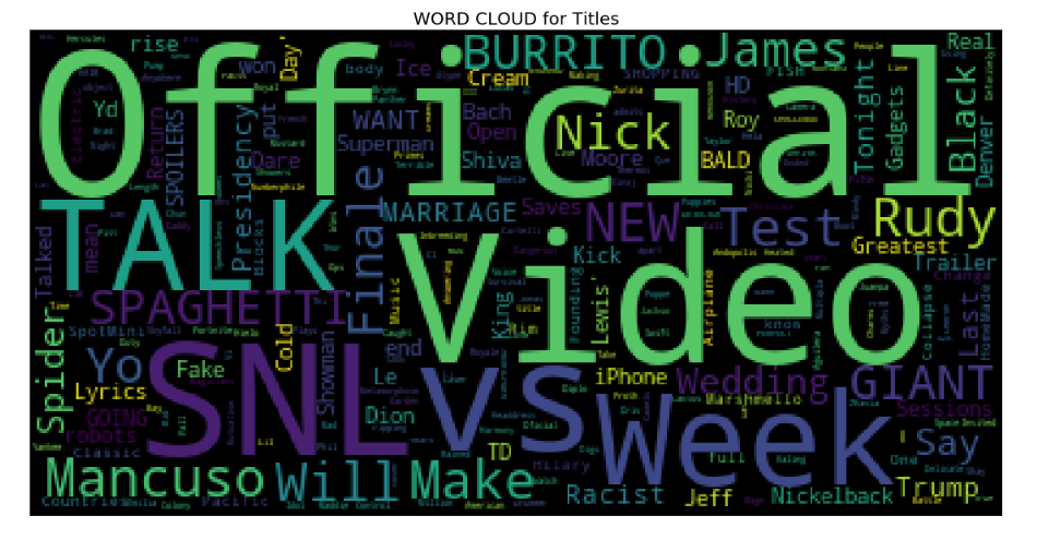
From the above word cloud, it is apparent that most popularly used title words are ‘Official’, ‘Video’, ‘Talk’, ‘SNL’, ‘VS’, and ‘Week’ among others.
從上面的詞云中可以看出,最常用的標題詞是“ Official”,“ Video”,“ Talk”,“ SNL”,“ VS”和“ Week”等。
2. Word cloud for Title Description
2.標題說明的詞云
plt.figure(figsize = (20,20))
stopwords = set(STOPWORDS)
wordcloud = WordCloud(
                      background_color = 'black',
                      stopwords = stopwords,
                      max_words = 1000,
                      max_font_size = 120,
                      random_state = 42
                    ).generate(str(df_you['description']))
plt.imshow(wordcloud)
plt.title('WORD CLOUD for Title Description', fontsize = 20)
plt.axis('off')
plt.show()
I found that the most popular words for description of videos are ‘https’, ‘video’, ‘new’, ‘watch’ among others.
我發現最受歡迎的視頻描述詞是“ https”,“ video”,“ new”,“ watch”等。
3. Word Cloud for Tags
3.標簽的詞云
plt.figure(figsize = (20,20))
stopwords = set(STOPWORDS)
wordcloud = WordCloud(
                      background_color = 'black',
                      stopwords = stopwords,
                      max_words = 1000,
                      max_font_size = 120,
                      random_state = 42
                    ).generate(str(df_you['tags']))
plt.imshow(wordcloud)
plt.title('WORD CLOUD for Tags', fontsize = 20)
plt.axis('off')
plt.show()
Popular tags seem to be ‘SNL’, ‘TED’, ‘new’, ‘Season’, ‘week’, ‘Cream’, ‘youtube’ From the word cloud analysis, it looks like there are a lot of Saturday Night Live fans on the youtube out there!
熱門標簽似乎是'SNL','TED','new','Season','week','Cream','youtube'。從詞云分析來看,似乎有很多Saturday Night Live粉絲在YouTube上!
I used the word cloud library for the very first time and it yielded pretty and useful visuals! If you are interested in knowing more about this library and how to use it then you must absolutely check this out
我第一次使用詞云庫,它產生了漂亮而有用的視覺效果! 如果您有興趣了解有關此庫以及如何使用它的更多信息,則必須完全檢查一下
This analysis is hosted on my Github page here.
此分析托管在我的Github頁面上。
Thanks for reading!
謝謝閱讀!
翻譯自: https://towardsdatascience.com/visualizing-youtube-videos-using-seaborn-and-wordcloud-in-python-b24247f70228
本文來自互聯網用戶投稿,該文觀點僅代表作者本人,不代表本站立場。本站僅提供信息存儲空間服務,不擁有所有權,不承擔相關法律責任。 如若轉載,請注明出處:http://www.pswp.cn/news/390930.shtml 繁體地址,請注明出處:http://hk.pswp.cn/news/390930.shtml 英文地址,請注明出處:http://en.pswp.cn/news/390930.shtml
如若內容造成侵權/違法違規/事實不符,請聯系多彩編程網進行投訴反饋email:809451989@qq.com,一經查實,立即刪除!相關文章
![Win下更新pip出現OSError:[WinError17]與PerrmissionError:[WinError5]及解決](http://pic.xiahunao.cn/Win下更新pip出現OSError:[WinError17]與PerrmissionError:[WinError5]及解決)
Win下更新pip出現OSError:[WinError17]與PerrmissionError:[WinError5]及解決

老生常談:抽象工廠模式

ogc是一個非營利性組織_非營利組織的軟件資源

數據結構入門最佳書籍_最佳數據科學書籍

?)
在Java里面怎么樣在靜態方法中調用getClass()?


多重插補 均值插補_Feature Engineering Part-1均值/中位數插補。
將域概念嵌入代碼中)
域 嵌入圖像顯示不出來_如何(以及為什么)將域概念嵌入代碼中

linux 查看用戶上次修改密碼的日期

spring里面 @Controller和@RestController注解的區別


客戶行為模型 r語言建模_客戶行為建模:匯總統計的問題

linux bash命令_Ultimate Linux命令行指南-Full Bash教程

【知識科普】解讀閃電/雷電網絡,零基礎秒懂!

spring框架里面applicationContext.xml 和spring-servlet.xml 的區別
)
Alpha 沖刺 (5/10)

多維空間可視化_使用GeoPandas進行空間可視化

蠻力寫算法_蠻力算法解釋
