Seaborn is a data visualization library built on top of matplotlib and closely integrated with pandas data structures in Python. Visualization is the central part of Seaborn which helps in exploration and understanding of data.
Seaborn是建立在matplotlib之上的數據可視化庫,并與Python中的pandas數據結構緊密集成。 可視化是Seaborn的核心部分,有助于探索和理解數據。
One has to be familiar with Numpy and Matplotlib and Pandas to learn about Seaborn.
必須熟悉Numpy和 Matplotlib和Pandas了解Seaborn。
Seaborn offers the following functionalities:
Seaborn提供以下功能:
- Dataset oriented API to determine the relationship between variables. 面向數據集的API確定變量之間的關系。
- Automatic estimation and plotting of linear regression plots. 自動估計和繪制線性回歸圖。
- It supports high-level abstractions for multi-plot grids. 它支持多圖網格的高級抽象。
- Visualizing univariate and bivariate distribution. 可視化單變量和雙變量分布。
These are only some of the functionalities offered by Seaborn, there are many more of them, and we can explore all of them here.
這些只是Seaborn提供的功能中的一部分,還有更多功能,我們可以在這里進行探索。
To initialize the Seaborn library, the command used is:
要初始化Seaborn庫,使用的命令是:
import seaborn as snsUsing Seaborn we can plot wide varieties of plots like:
使用Seaborn,我們可以繪制各種各樣的地塊,例如:
- Distribution Plots 分布圖
- Pie Chart & Bar Chart 餅圖和條形圖
- Scatter Plots 散點圖
- Pair Plots 對圖
- Heat maps 熱圖
For this entirety of the article, we are using the dataset of Google Playstore downloaded from Kaggle.
在本文的全文中,我們使用從Kaggle下載的Google Playstore數據集。
1.分布圖 (1. Distribution Plots)
We can compare the distribution plot in Seaborn to histograms in Matplotlib. They both offer pretty similar functionalities. Instead of frequency plots in the histogram, here we’ll plot an approximate probability density across the y-axis.
我們可以將Seaborn中的分布圖與Matplotlib中的直方圖進行比較。 它們都提供了非常相似的功能。 代替直方圖中的頻率圖,這里我們將在y軸上繪制近似的概率密度。
We will be using sns.distplot() in the code to plot distribution graphs.
我們將在代碼中使用sns.distplot()繪制分布圖。
Before going further, first, let’s access our dataset,
首先,讓我們先訪問數據集,
The dataset looks like this,
數據集看起來像這樣,
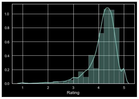
Now, let’s see how distribution plot looks like if we plot for ‘Rating’ column from the above dataset,
現在,讓我們看看如果從上述數據集中為“評級”列作圖,分布圖將是什么樣子,
The Distribution Plot looks like this for Rating’s column,
“評分”列的“分布圖”如下所示:
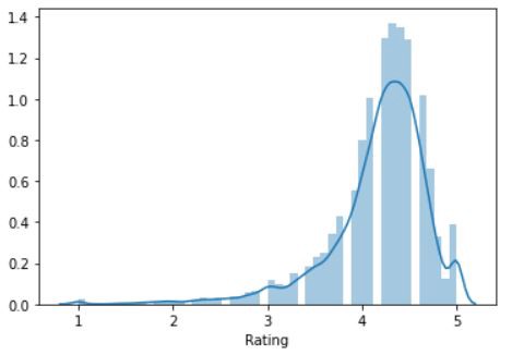
Here, the curve(KDE) that appears drawn over the distribution graph is the approximate probability density curve.
在此,分布圖上繪制的曲線( KDE )是近似概率密度曲線。
Similar to the histograms in the matplotlib, in distribution too, we can change the number of bins and make the graph more understandable.
與matplotlib中的直方圖類似,在分布上,我們也可以更改bin的數量并使圖更易于理解。
We just have to add the number of bins in the code,
我們只需要在代碼中添加垃圾箱的數量,
#Change the number of bins
sns.distplot(inp1.Rating, bins=20, kde = False)
plt.show()
Now, the graph looks like this,
現在,圖看起來像這樣,
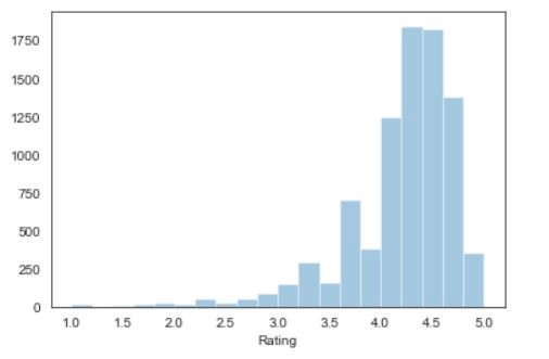
In the above graph, there is no probability density curve. To remove the curve, we just have to write ‘kde = False’ in the code.
上圖中沒有概率密度曲線。 要刪除曲線,我們只需要在代碼中編寫“ kde = False”即可 。
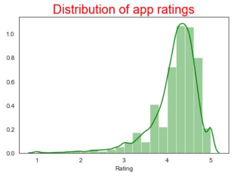
We can also provide the title and color of the bins similar to matplotlib to the distribution plots. Let’s see the code for that,
我們還可以向分布圖提供類似于matplotlib的垃圾箱的標題和顏色。 讓我們看一下代碼
The distribution graph, for the same column rating, looks like this:
對于相同的列等級,分布圖如下所示:
Styling the Seaborn graphs
樣式化Seaborn圖
One of the biggest advantages of using Seaborn is, it offers a wide range of default styling options to our graphs.
使用Seaborn的最大優勢之一是,它為我們的圖形提供了多種默認樣式選項。
These are the default styles offered by Seaborn.
這些是Seaborn提供的默認樣式。
'Solarize_Light2',
 '_classic_test_patch',
 'bmh',
 'classic',
 'dark_background',
 'fast',
 'fivethirtyeight',
 'ggplot',
 'grayscale',
 'seaborn',
 'seaborn-bright',
 'seaborn-colorblind',
 'seaborn-dark',
 'seaborn-dark-palette',
 'seaborn-darkgrid',
 'seaborn-deep',
 'seaborn-muted',
 'seaborn-notebook',
 'seaborn-paper',
 'seaborn-pastel',
 'seaborn-poster',
 'seaborn-talk',
 'seaborn-ticks',
 'seaborn-white',
 'seaborn-whitegrid',
 'tableau-colorblind10'
We just have to write one line of code to incorporate these styles into our graph.
我們只需要編寫一行代碼即可將這些樣式合并到我們的圖形中。
After applying the dark background to our graph, the distribution plot looks like this,
將深色背景應用于圖表后,分布圖如下所示,
2.餅圖和條形圖 (2. Pie Chart & Bar Chart)
Pie Chart is generally used to analyze the data on how a numeric variable changes across different categories.
餅圖通常用于分析有關數字變量如何在不同類別中變化的數據。
In the dataset we are using, we’ll analyze how the top 4 categories in the Content Rating column is performing.
在我們使用的數據集中,我們將分析“內容分級”列中排名前4位的類別的效果。
First, we’ll do some data cleaning/mining to the Content rating column and check what are the categories in there.
首先,我們將對“內容分級”列進行一些數據清理/挖掘,并檢查其中的類別。
Now, the categories list will be,
現在,類別列表將是
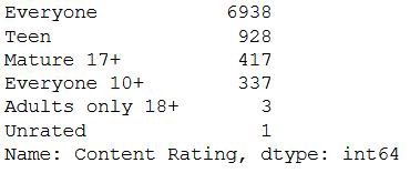
As per the above output, since the count of “Adults only 18+” and “Unrated” are significantly less compared to the others, we’ll drop those categories from the Content Rating and update the dataset.
根據上面的輸出,由于“僅18歲以上成人”和“未分級”的計數與其他數據相比要少得多,因此我們將從“內容分級”中刪除這些類別并更新數據集。
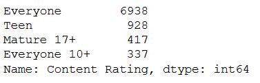
The categories present in the “Content Rating” column after updating the sheet are,
更新工作表后,“內容分級”列中顯示的類別為:
Now, let’s plot Pie Chart for the categories present in the Content Rating column.
現在,讓我們為“內容分級”列中存在的類別繪制餅圖。
The Pie Chart for the above code looks like the following,
上面代碼的餅圖如下所示,
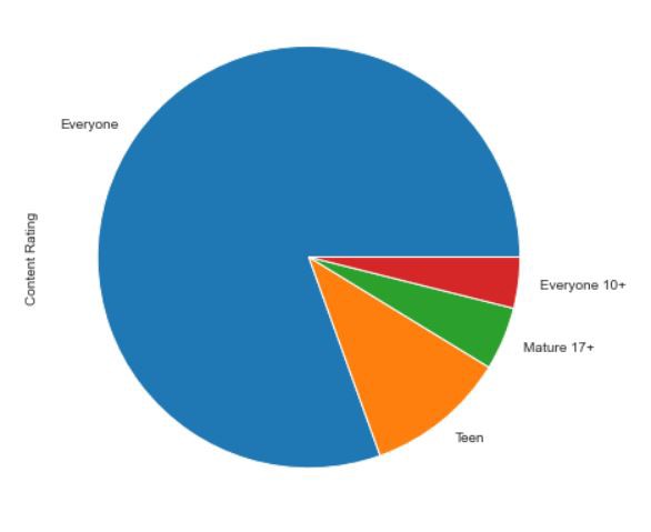
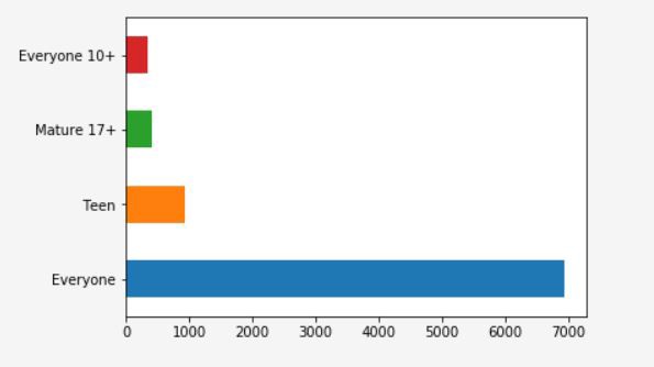
From the above Pie diagram, we cannot correctly infer whether “Everyone 10+” and “Mature 17+”. It is very difficult to assess the difference between those two categories when their values are somewhat similar to each other.
從上面的餅圖中,我們無法正確推斷“所有人10+”和“成熟17+”。 當它們的值彼此相似時,很難評估這兩個類別之間的差異。
We can overcome this situation by plotting the above data in Bar chart.
我們可以通過在條形圖中繪制以上數據來克服這種情況。
Now, the bar Chart looks like the following,
現在,條形圖如下所示,
Similar to Pie Chart, we can customize our Bar Graph too, with different Colors of Bars, the title of the chart, etc.
與餅圖類似,我們也可以自定義條形圖,使用不同的條形顏色,圖表標題等。
3.散點圖 (3. Scatter Plots)
Up until now, we have been dealing with only a single numeric column from the dataset, like Rating, Reviews or Size, etc. But, what if we have to infer a relationship between two numeric columns, say “Rating and Size” or “Rating and Reviews”.
到目前為止,我們僅處理數據集中的單個數字列,例如“評分”,“評論”或“大小”等。但是,如果我們必須推斷兩個數字列之間的關系,例如“評分和大小”或“評分和評論”。
Scatter Plot is used when we want to plot the relationship between any two numeric columns from a dataset. These plots are the most powerful visualization tools that are being used in the field of machine learning.
當我們要繪制數據集中任意兩個數字列之間的關系時,使用散點圖。 這些圖是機器學習領域中使用的最強大的可視化工具。
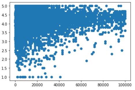
Let’s see how the scatter plot looks like for two numeric columns in the dataset “Rating” & “Size”. First, we’ll plot the graph using matplotlib after that we’ll see how it looks like in seaborn.
讓我們來看一下數據集“ Rating”和“ Size”中兩個數字列的散點圖。 首先,我們將使用matplotlib繪制圖形,之后我們將看到它在seaborn中的外觀。
Scatter Plot using matplotlib
使用matplotlib的散點圖
#import all the necessary libraries
#Plotting the scatter plotplt.scatter(pstore.Size, pstore.Rating)
plt.show()
Now, the plot looks like this
現在,情節看起來像這樣
Scatter Plot using Seaborn
使用Seaborn的散點圖
We will be using sns.joinplot() in the code for scatter plot along with the histogram.
我們將在代碼中使用sns.joinplot()和散點圖以及直方圖。
sns.scatterplot() in the code for only scatter plots.
代碼中的sns.scatterplot()僅用于散點圖。
The Scatter plot for the above code looks like,
以上代碼的散點圖如下所示:
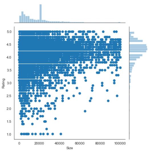
The main advantage of using a scatter plot in seaborn is, we’ll get both the scatter plot and the histograms in the graph.
在seaborn中使用散點圖的主要優點是,我們將在圖中同時獲得散點圖和直方圖。
If we want to see only the scatter plot instead of “jointplot” in the code, just change it with “scatterplot”
如果我們希望看到只有散點圖,而不是在代碼“jointplot”,只是“ 散點 ”更改
Regression Plot
回歸圖
Regression plots create a regression line between 2 numerical parameters in the jointplot(scatterplot) and help to visualize their linear relationships.
回歸圖可在jointplot(scatterplot)中的2個數字參數之間創建回歸線,并有助于可視化它們的線性關系。
The graph looks like the following,
該圖如下所示,
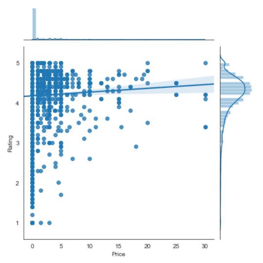
From the above graph, we can infer that there is a steady increase in the Rating if the Price of the apps increases.
從上圖可以看出,如果應用程序的價格提高,則評級會穩定增長。
4.配對圖 (4. Pair Plots)
Pair Plots are used when we want to see the relationship pattern among more than 3 different numeric variables. For example, let’s say we want to see how a company’s sales are affected by three different factors, in that case, pair plots will be very helpful.
當我們想查看三個以上不同數值變量之間的關系模式時,使用對圖。 例如,假設我們想了解公司的銷售受到三個不同因素的影響,在這種情況下,配對圖將非常有用。
Let’s create a pair plot for Reviews, Size, Price, and Rating columns from of dataset.
讓我們為數據集中的評論,尺寸,價格和評分列創建一個配對圖。
We will be using sns.pairplot() in the code to plot multiple scatter plots at a time.
我們將在代碼中使用sns.pairplot()一次繪制多個散點圖。
The output graph for the above graphs looks like this,
以上圖表的輸出圖表如下所示:
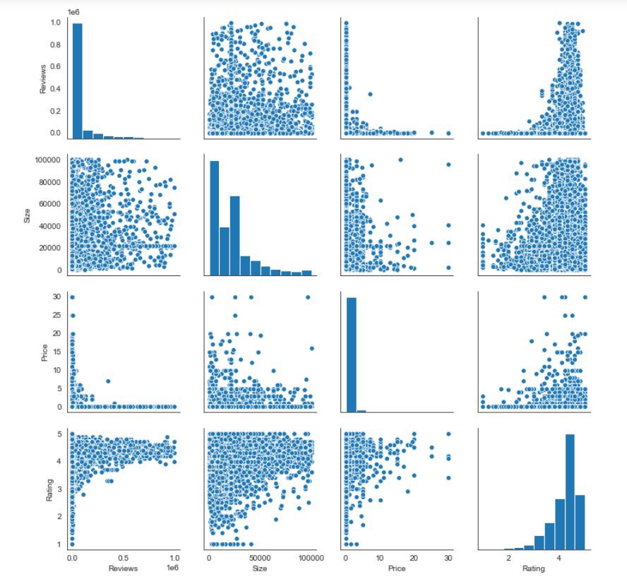
For the non-diagonal views, the graph will be a scatter plot between 2 numeric variables
對于非對角線視圖,圖形將是2個數字變量之間的散點圖
For the diagonal views, it plots a histogram since both the axis(x,y) is the same.
對于對角線視圖,由于兩個軸(x,y)相同,因此它繪制了直方圖 。
5.熱圖 (5. Heatmaps)
The heatmap represents the data in a 2-dimensional form. The ultimate goal of the heatmap is to show the summary of information in a colored graph. It utilizes the concept of using colors and color intensities to visualize a range of values.
熱圖以二維形式表示數據。 熱圖的最終目標是在彩色圖表中顯示信息摘要。 它利用使用顏色和顏色強度的概念來可視化一系列值。
Most of us would have seen the following type of graphics in a football match,
我們大多數人會在足球比賽中看到以下類型的圖形,
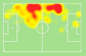
Heatmaps in Seaborn create exactly these types of graphs.
Seaborn中的熱圖正是創建了這些類型的圖。
We’ll be using sns.heatmap() to plot the visualization.
我們將使用sns.heatmap()繪制可視化效果。
When you have data as the following we can create a heatmap.
當您具有以下數據時,我們可以創建一個熱圖。
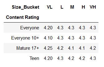
The above table is created using the Pivot table from Pandas. You can see how Pivot tables are created in my previous article Pandas.
上表是使用Pandas的數據透視表創建的。 您可以在上一篇文章Pandas中看到如何創建數據透視表。
Now, let’s see how we can create a heatmap for the above table.
現在,讓我們看看如何為上表創建一個熱圖。
In the above code, we have saved the data in the new variable “heat.”
在上面的代碼中,我們已將數據保存在新變量“ heat”中。
The heatmap looks like the following,
該熱圖如下所示,
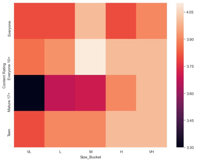
We can apply some customization to the above graph, and also can change the color gradient so that the highest value will be darker in color and the lowest value will be lighter.
我們可以對上面的圖形進行一些自定義,還可以更改顏色漸變,以使最高值的顏色更深,而最低值的顏色更淺。
The updated code will be something like this,
更新后的代碼將是這樣,
The heatmap for the above-updated code looks like this,
上面更新的代碼的熱圖看起來像這樣,
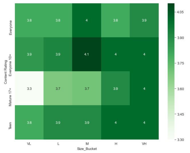
If we observe, in the code we have given “annot = True”, what this means is, when annot is true, each cell in the graph displays its value. If we haven’t mention annot in our code, then the default value it takes is False.
如果我們觀察到,在代碼中給定了“ annot = True ”,這意味著,當annot為true時 ,圖中的每個單元格都會顯示其值。 如果我們在代碼中未提及annot ,則其默認值為False。
Seaborn also supports some of the other types of graphs like Line Plots, Bar Graphs, Stacked bar charts, etc. But, they don’t offer anything different from the ones created through matplotlib.
Seaborn還支持其他一些類型的圖形,例如折線圖,條形圖,堆積條形圖等。但是,它們提供的功能與通過matplotlib創建的功能不同。
結論 (Conclusion)
So, this is how Seaborn works in Python and the different types of graphs we can create using seaborn. As I have already mentioned, Seaborn is built on top of the matplotlib library. So, if we are already familiar with the Matplotlib and its functions, we can easily build Seaborn graphs and can explore more depth concepts.
因此,這就是Seaborn在Python中的工作方式以及我們可以使用seaborn創建的不同類型的圖。 正如我已經提到的,Seaborn建立在matplotlib庫的頂部。 因此,如果我們已經熟悉Matplotlib及其功能,則可以輕松構建Seaborn圖并可以探索更多深度概念。
Thank you for reading and Happy Coding!!!
感謝您的閱讀和快樂編碼!!!
在這里查看我以前有關Python的文章 (Check out my previous articles about Python here)
Pandas: Python
熊貓:Python
Matplotlib: Python
Matplotlib:Python
NumPy: Python
NumPy:Python
Time Complexity and Its Importance in Python
時間復雜度及其在Python中的重要性
Python Recursion or Recursive Function in Python
Python中的Python遞歸或遞歸函數
Python Programs to check for Armstrong Number (n digit) and Fenced Matrix
用于檢查Armstrong編號(n位)和柵欄矩陣的Python程序
Python: Problems for Basics Reference — Swapping, Factorial, Reverse Digits, Pattern Print
Python:基本參考問題-交換,階乘,反向數字,圖案打印
翻譯自: https://towardsdatascience.com/seaborn-python-8563c3d0ad41
本文來自互聯網用戶投稿,該文觀點僅代表作者本人,不代表本站立場。本站僅提供信息存儲空間服務,不擁有所有權,不承擔相關法律責任。 如若轉載,請注明出處:http://www.pswp.cn/news/388990.shtml 繁體地址,請注明出處:http://hk.pswp.cn/news/388990.shtml 英文地址,請注明出處:http://en.pswp.cn/news/388990.shtml
如若內容造成侵權/違法違規/事實不符,請聯系多彩編程網進行投訴反饋email:809451989@qq.com,一經查實,立即刪除!相關文章


Springboot集成BeanValidation擴展一:錯誤提示信息加公共模板
)
福大軟工 · 第十次作業 - 項目測評(團隊)

銷貨清單數據_2020年8月數據科學閱讀清單

c++運行不出結果_fastjson 不出網利用總結
)
FocusBI:租房分析可視化(PowerBI網址體驗)

米其林餐廳 鹽之花_在世界范圍內探索《米其林指南》

require_once的用法

差值平方和匹配_純前端實現圖片的模板匹配

藍牙耳機音量大解決辦法_長時間使用藍牙耳機的危害這么大?我們到底該選什么藍牙耳機呢?...

JVM基礎系列第10講:垃圾回收的幾種類型


spotify 數據分析_我的Spotify流歷史分析

idea 搜索不到gsonformat_Idea中GsonFormat插件安裝

intellig idea中jsp或html數據沒有自動保存和更換字體

:從心理學到自然語言處理和應用研究)
陸濤喜歡夏琳嗎_夏琳·香布利斯(Charlene Chambliss):從心理學到自然語言處理和應用研究

【angularJS】簡介

爬取淘寶商品信息selenium+pyquery+mongodb
