Indeed, as the most popular and fundamental data visualisation library, Matplotlib is kind of confusing in some perspectives. It is usually to see that someone asking about
的確,作為最受歡迎的基礎數據可視化庫,Matplotlib在某些方面令人困惑。 通常是看到有人問
- When should I use “axes”? 我什么時候應該使用“軸”?
- Why some examples using “plt” while someone else using “ax”? 為什么有些示例使用“ plt”,而其他示例使用“ ax”?
- What’s the difference between them? 它們之間有什么區別?
It is good that there are so many examples online to show people how to use Matplotlib to draw this kind of chart or that kind of chart, but I rarely see any tutorials mentioning “why”. This may cause people who have less programming experience or switching from other languages like R becomes very confusing.
網上有這么多示例向人們展示了如何使用Matplotlib繪制這種圖表或那種圖表是很好的,但是我很少看到任何提及“為什么”的教程。 這可能會導致缺乏編程經驗或從其他語言(如R)切換的人變得非常混亂。
In this article, I won’t teach you to draw any specific charts using Matplotlib but will try to explain the basic but important regarding Matplotlib — what are the “plt” and “ax” people usually use.
在本文中,我不會教您使用Matplotlib繪制任何特定的圖表,而是將嘗試解釋有關Matplotlib的基本但重要的內容-人們通常使用的“ plt”和“ ax”是什么。
概念 (Concepts)

To clarify, when I say “plt”, it doesn’t exist in the Matplotlib library. It is called “plt” because most of Python programmers like to import Matplotlib and make an alias called “plt”, which I believe you should know, but just in case.
為了澄清,當我說“ plt”時,它在Matplotlib庫中不存在。 之所以稱為“ plt”,是因為大多數Python程序員喜歡導入Matplotlib并創建一個名為“ plt”的別名,我相信您應該知道,但以防萬一。
import matplotlib.pyplot as pltThen, come back to our main topic. Let’s draw a simple chart for demonstration purposes.
然后,回到我們的主要主題。 讓我們為演示目的繪制一個簡單的圖表。
import numpy as npplt.plot(np.random.rand(20))
plt.title('test title')
plt.show()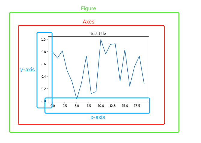
As shown in the above-annotated screenshot, when we draw a graph using plt:
如上述屏幕截圖所示,當我們使用plt繪制圖形時:
A
Figureobject is generated (shown in green)生成了
Figure對象(以綠色顯示)An
Axesobject is generated implicitly with the plotted line chart (shown in red)使用繪制的折線圖隱式生成
Axes對象(以紅色顯示)All the elements of the plot such as x and y-axis are rendered inside the
Axesobject (shown in blue)繪圖的所有元素(例如x和y軸)都呈現在
Axes對象內(以藍色顯示)
Well, if we use some kind of metaphor here:
好吧,如果我們在這里使用某種隱喻:
Figureis like a paper that you can draw anything you wantFigure就像一張紙,您可以畫任何想要的東西We have to draw a chart in a “cell”, which is
Axesin this context我們必須在“單元格”中繪制一個圖表,在這種情況下為“
Axes”If we’re drawing only one graph, we don’t have to draw a “cell” first, just simply draw on the paper anyway. So, we can use
plt.plot(...).如果僅繪制一個圖形,則不必先繪制“單元格”,無論如何只需在紙上繪制即可。 因此,我們可以使用
plt.plot(...)。
明確畫出“單元格” (Explicitly Draw the “Cell”)

Of course, we can explicitly draw a “cell” on the “paper”, to tell Matplotlib that we’re gonna draw a chart inside this cell. Then, we have the following code.
當然,我們可以在“紙上”顯式地繪制一個“單元格”,以告訴Matplotlib我們將在該單元格內繪制一個圖表。 然后,我們有以下代碼。
fig, ax = plt.subplots()
ax.plot(np.random.rand(20))
ax.set_title('test title')
plt.show()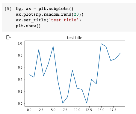
Exactly the same results. The only difference is that we explicitly draw the “cell” so that we are able to get the Figure and Axes object.
完全一樣的結果。 唯一的區別是,我們顯式繪制了“單元格”,以便能夠獲得Figure and Axes對象。
Indeed, when we just want to plot one graph, it is not necessary to “draw” this cell. However, you must be noticed that we have to do this when we want to draw multiple graphs in one plot. In other words, the subplots.
確實,當我們只想繪制一個圖形時,不必“繪制”該單元格。 但是,必須注意,當我們要在一個圖中繪制多個圖形時,必須這樣做。 換句話說,子圖。
n_rows = 2
n_cols = 2fig, axes = plt.subplots(n_rows, n_cols)
for row_num in range(n_rows):
    for col_num in range(n_cols):
        ax = axes[row_num][col_num]
        ax.plot(np.random.rand(20))
        ax.set_title(f'Plot ({row_num+1}, {col_num+1})')fig.suptitle('Main title')
fig.tight_layout()
plt.show()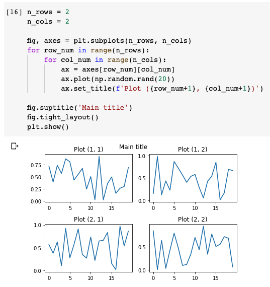
In this code snippet, we firstly declared how many rows and columns we want to “draw”. 2 by 2 means that we want to draw 4 “cells”.
在此代碼段中,我們首先聲明了要“繪制”多少行和多少列。 2 by 2表示我們要繪制4個“像元”。
Then, in each cell, we plot a random line chart and assign a title based on its row number and column number. Please note that we’re using Axes instances.
然后,在每個單元格中,繪制一個隨機折線圖,并根據其行號和列號分配標題。 請注意,我們正在使用Axes實例。
After that, we define a “Main title” on the “paper”, which is the Figure instance. So, we have this supertitle that does not belong to any “cell”, but on the paper.
之后,我們在“紙”上定義一個“主要標題”,即Figure實例。 因此,我們擁有這個不屬于任何“單元”的標題,而是在紙上。
Finally, before calling the show() method, we need to ask the “paper” — Figure instance — to automatically give enough padding between the cells by calling its tight_layout() method. Otherwise,
最后,在調用show()方法之前,我們需要讓“紙張”( Figure實例tight_layout()通過調用其tight_layout()方法自動在單元格之間提供足夠的填充。 除此以外,
摘要 (Summary)

Hopefully, now you understand better what are plt and ax people are using exactly.
我們希望,現在你更好地了解什么是plt和ax的人都使用完全相同。
Basically, the plt is a common alias of matplotlib.pyplot used by most people. When we plot something using plt such as plt.line(...), we implicitly created a Figure instance and an Axes inside the Figure object. This is totally fine and very convenient when we just want to draw a single graph.
基本上, plt是大多數人使用的matplotlib.pyplot的通用別名。 當我們使用諸如plt.line(...) plt繪制東西時,我們在Figure對象內隱式創建了Figure實例和Axes 。 當我們只想繪制一個圖形時,這是非常好的,非常方便。
However, we can explicitly call plt.subplots() to get the Figure object and Axes object, in order to do more things on them. When we want to draw multiple subplots on a Figure, it is usually required to use this approach.
但是,我們可以顯式調用plt.subplots()來獲取Figure對象和Axes對象,以便對它們執行更多操作。 當我們想在一個Figure上繪制多個子Figure ,通常需要使用此方法。
Also, here are the Matplotlib official API reference for the Figure and Axes classes. It is highly recommended to check them out and try some methods yourselves to make sure you understand even deeper.
另外,這里是Figure和Axes類的Matplotlib官方API參考。 強烈建議您檢查一下并嘗試一些方法,以確保您了解得更深入。
翻譯自: https://towardsdatascience.com/what-are-the-plt-and-ax-in-matplotlib-exactly-d2cf4bf164a9
本文來自互聯網用戶投稿,該文觀點僅代表作者本人,不代表本站立場。本站僅提供信息存儲空間服務,不擁有所有權,不承擔相關法律責任。 如若轉載,請注明出處:http://www.pswp.cn/news/388778.shtml 繁體地址,請注明出處:http://hk.pswp.cn/news/388778.shtml 英文地址,請注明出處:http://en.pswp.cn/news/388778.shtml
如若內容造成侵權/違法違規/事實不符,請聯系多彩編程網進行投訴反饋email:809451989@qq.com,一經查實,立即刪除!相關文章

【數據庫的備份與還原】 .


java 控制jsp_JSP學習之Java Web中的安全控制實例詳解

PHP 基礎 自動類型轉換之比較運算符

java的多線程訪問共享變量_java多線程通信之共享變量

2018年阿里云NoSQL數據庫大事盤點

cayenne:用于隨機模擬的Python包

java 如何將word 轉換為ftl_使用 freemarker導出word文檔

DotNetBar office2007效果

Spring boot 中pom.xml 各個節點詳解

spotify 數據分析_沒有數據? 沒問題! 如何從Wikipedia和Spotify收集重金屬數據

stack 的一些用法

IS環境下配置PHP5+MySql+PHPMyAdmin


input在iOS里的兼容性

kaggle數據集_Kaggle上有170萬份ArXiv文章的數據集
![java用接口實例化對象_[求助]迷茫中,接口可以直接實例化對象嗎?](http://pic.xiahunao.cn/java用接口實例化對象_[求助]迷茫中,接口可以直接實例化對象嗎?)
java用接口實例化對象_[求助]迷茫中,接口可以直接實例化對象嗎?
)
異常作業2(2018.08.22)

深度學習數據集中數據差異大_使用差異隱私來利用大數據并保留隱私
)