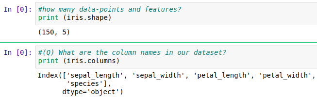
iris數據集 測試集
Let’s explore one of the simplest datasets, The IRIS Dataset which basically is a data about three species of a Flower type in form of its sepal length, sepal width, petal length, and petal width. The data set consists of 50 samples from each of the three species of Iris (Iris setosa, Iris virginica, and Iris versicolor). Four features were measured from each sample: the length and the width of the sepals and petals, in centimeters. Our objective is to classify a new flower as belonging to one of the 3 classes given the 4 features.
讓我們探索最簡單的數據集之一,IRIS數據集,該數據集基本上是有關花類型的三種物種的數據,其形式為萼片長度,萼片寬度,花瓣長度和花瓣寬度。 所述數據集包括從每三個物種鳶尾的50個樣品( 山鳶尾 , 虹膜錦葵 ,和變色鳶尾 )。 從每個樣品中測量出四個特征: 萼片和花瓣的長度和寬度,以厘米為單位。 我們的目標是根據4個特征將新花歸為3類之一。
Download IRIS data from here.
從此處下載IRIS數據。
Here I'm importing the libraries in ipython notebook using Anaconda Navigator(download: https://www.anaconda.com/products/individual). which can be useful in our exploratory data analysis like pandas, matplotlib, numpy and seaborn.
在這里,我使用Anaconda Navigator(下載: https ://www.anaconda.com/products/individual)在ipython Notebook中導入庫。 這對我們的探索性數據分析(如熊貓 , matplotlib , numpy和seaborn)很有用 。
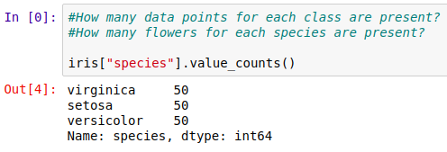
Here, IRIS is a balanced dataset because the number of data points for every class Setosa, Virginica, and Versicolor is 50. If the classes are having the different numbers of data points each then it’s an imbalanced dataset.
在這里,IRIS是一個平衡的數據集,因為Setosa,Virginica和Versicolor每個類的數據點數均為50。如果每個類的數據點數均不同,則它是一個不平衡的數據集。
2D散點圖 (2D Scatter Plot)
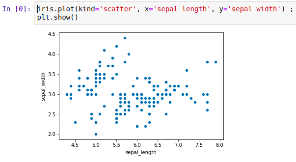
By using the pandas object we created before we can plot a simple 2D graph of the features we give as x and y parameters of the plot() method of pandas. Matplotlib method show() helps to actually plot the data.
通過使用我們創建的pandas對象,我們可以繪制簡單的二維圖形來繪制作為pandas plot()方法的x和y參數的要素。 Matplotlib方法show()有助于實際繪制數據。
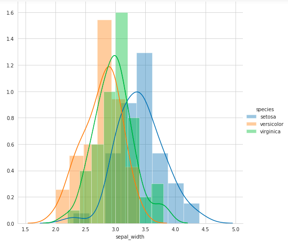
But by Seaborn we can plot a more informative graph by color-coding by each flower type.
但是通過Seaborn,我們可以通過每種花的顏色編碼來繪制更具信息量的圖。
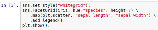
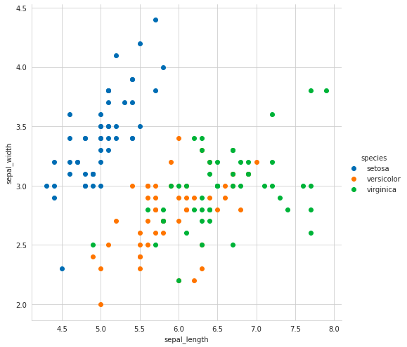
Here in the above graph notice that Blue Setosa points can be easily separated from Orange Versicolor and Green Verginica points by simply drawing a line but the Orange and Green points are still complex to be separated because they are overlapping. So by using sepal_length and sepal_width features of the data we can get this much information.
在上圖中,通過簡單畫一條線可以很容易地將Blue Setosa點與Orange Versicolor點和Green Verginica點分離,但是Orange點和Green點由于重疊而仍然很復雜,難以分離。 因此,通過使用數據的sepal_length和sepal_width功能,我們可以獲得很多信息。
2D散點圖:對圖 (2D Scatter Plot: Pair Plot)
Pair Plot by Seaborn is capable of drawing multiple 2D Scatter Plots for each possible combination of features in one go.
Seaborn的結對圖能夠一次性繪制多個2D散點圖,以用于每種可能的特征組合。
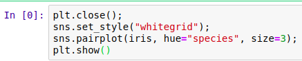
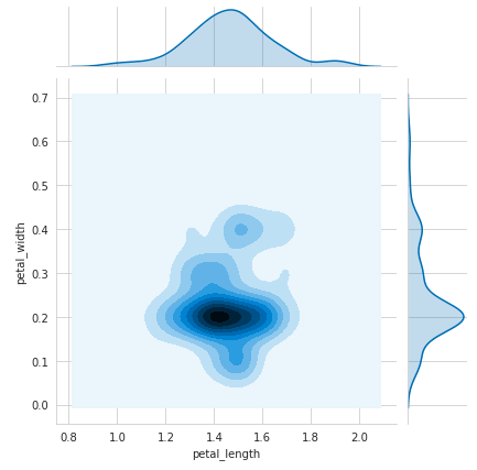
So here if we observe the pair plots then we can say petal_length and petal_width are the most essential features to identify various flower types. While Setosa can be easily linearly separable, Virnica and Versicolor have some overlap. So we can separate them by a line and some “if-else” conditions.
因此,在這里,如果我們觀察對圖,那么我們可以說花瓣長度和花瓣寬度是識別各種花朵類型的最基本特征。 雖然Setosa可以很容易地線性分離,但Virnica和Versicolor有一些重疊。 因此,我們可以通過一行和一些“ if-else”條件將它們分開。
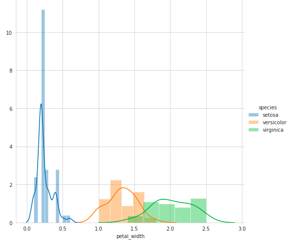
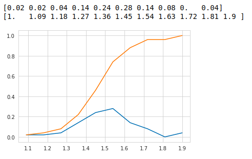
一維散點圖,直方圖,PDF和CDF (1D Scatter Plot, Histogram, PDF & CDF)
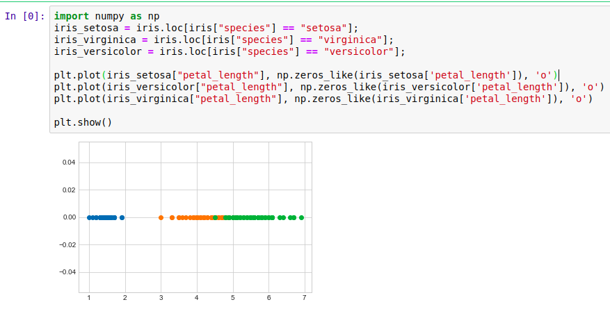
As we can observe the graph, it's very hard to make sense as points are overlapping a lot. There are better ways to visualize the scatter plots. By Seaborn, we can plot a Probability Distribution Function cum Histogram.
正如我們可以觀察到的圖形一樣,由于點重疊很多,很難理解。 有更好的方法可視化散點圖。 通過Seaborn,我們可以繪制概率分布函數和直方圖 。
Histogram : Histogram is the plot representing the frequency counts of each data window of the feature for which the plot is drawn (Bar shapes in the graph).
直方圖 :直方圖是表示繪制該圖的要素的每個數據窗口的頻率計數的圖(圖中的條形)。
PDF : Probability Density Function is basically a smoothed histogram. Every point on the PDF represents the probability for that particular value in the data (bell shaped curve in the graph). PDF gets formatted using Kernel Density Estimation. For each value of the point on x-axis, y-axis value represents its probabily of occuring in the dataset. More the y value more of that value exists in the dataset.
PDF : 概率密度函數基本上是平滑的直方圖。 PDF上的每個點都代表數據中該特定值(圖中的鐘形曲線)的概率。 使用內核密度估計來格式化PDF。 對于x軸上每個點的值,y軸值表示其在數據集中出現的概率。 y值越大,數據集中存在的值越多。
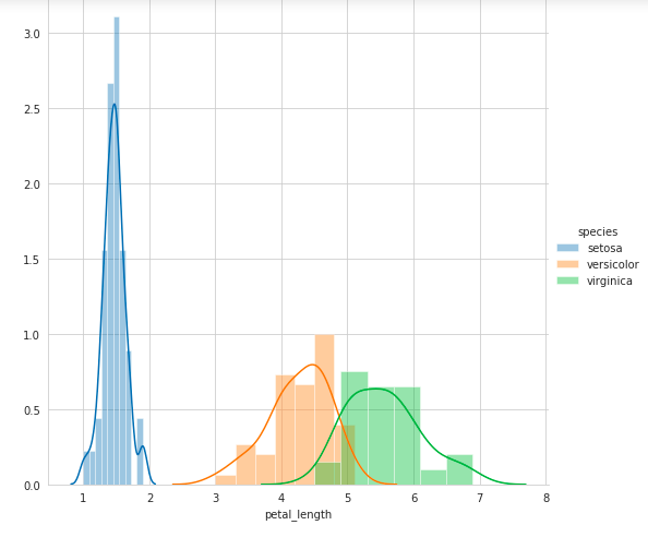

Now from these graphs, we can observe that by using just one feature a simple model can be formed by if..else condition as if(petal_length) < 2.5 then flower type is Setosa.
現在從這些圖形中,我們可以觀察到,僅使用一個功能,就可以通過if..else條件( if(petal_length)<2.5)形成簡單模型, 然后花朵類型為Setosa 。
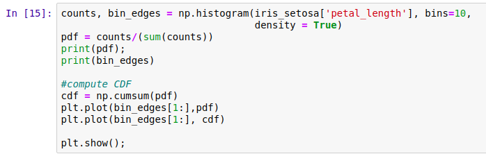
Now, what if we need the percentage of Versicolor points having a petal_length of less than 5 ? here comes CDF in our rescue!
現在,如果我們需要花瓣長度小于5的Versicolor點的百分比呢? CDF來了!
CDF: Cumulative Density Function is the cumulative sum of the PDF. Every point on the CDF curve represents integration of the PDF till that point of CDF. Below is the histogram of the Yield. Every point on the CDF represents how much percentage of the total points belong to below that point.
CDF:累積密度函數是PDF的累積和。 CDF曲線上的每個點都代表PDF到CDF為止的積分。 以下是收益的直方圖。 CDF上的每個點代表該點以下的總點數百分比。
To construct a histogram, the first step is to “bin” the range of values — that is, divide the entire range of values into a series of intervals — and then count how many values fall into each interval. The bins are usually specified as consecutive, non-overlapping intervals of a variable. The bins (intervals) must be adjacent and are often (but are not required to be) of equal size(for more information: https://www.datacamp.com/community/tutorials/histograms-matplotlib).
要構建直方圖,第一步是將值的范圍“ bin”(即,將值的整個范圍劃分為一系列間隔),然后計算每個間隔中有多少值。 通常將bin指定為變量的連續,不重疊的間隔。 垃圾箱(間隔)必須相鄰,并且經常(但不是必須)大小相等(有關更多信息,請訪問: https : //www.datacamp.com/community/tutorials/histograms-matplotlib )。
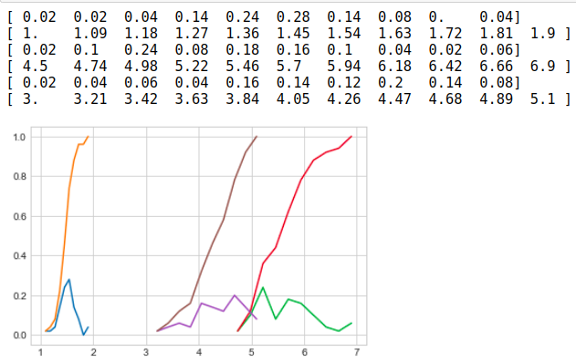
Now by plotting of CDF of petal_length for various types of flowers in a combined manner we can get an overall picture of the data.
現在,通過組合繪制各種類型花朵的petlet_length的CDF,可以得到數據的整體圖。
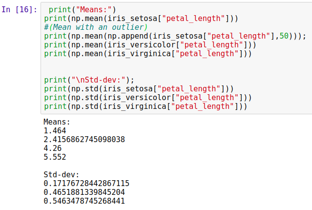
Mean, Variance and Standard Deviation
均值,方差和標準差
Mean: https://en.wikipedia.org/wiki/Mean
意思是: https : //en.wikipedia.org/wiki/Mean
Variance: https://en.wikipedia.org/wiki/Variance
差異: https : //en.wikipedia.org/wiki/Variance
Standard Deviation: https://en.wikipedia.org/wiki/Standard_deviation
標準偏差: https : //en.wikipedia.org/wiki/Standard_deviation
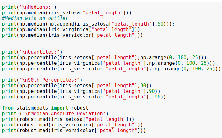
Median, Percentile, Quantile, MAD, IQR
中位數,百分位數,分位數,MAD,IQR
Median: https://en.wikipedia.org/wiki/Median
中位數: https : //en.wikipedia.org/wiki/Median
Percentile: https://en.wikipedia.org/wiki/Percentile
百分位數: https : //en.wikipedia.org/wiki/Percentile
Quantile: https://en.wikipedia.org/wiki/Quantile
分位數: https : //en.wikipedia.org/wiki/Quantile
MAD: Median Absolute Deviation: https://en.wikipedia.org/wiki/Median_absolute_deviation
MAD:中位數絕對偏差: https : //en.wikipedia.org/wiki/Median_absolute_deviation
IQR: Interquantile Range: https://en.wikipedia.org/wiki/Interquartile_range
IQR:分位數范圍: https ://en.wikipedia.org/wiki/Interquartile_range
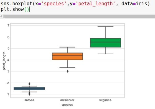
箱形圖 (Box Plots)
Box plots with whiskers is another method for visualizing the 1D Scatter Plot more intuitively. The boxes in the graph represent Interquantile Range as the first horizontal line from the bottom of the box represents 25th percentile value, the middle line represents the 50th percentile and the top line represents the 75th percentile. The black lines outside of the boxes are called whiskers. It’s not fixed what whiskers represent but it might be the minimum value of the feature at below horizontal line and maximum value at the top horizontal line in some cases.
帶晶須的箱形圖是另一種更直觀地可視化1D散布圖的方法。 圖中的框代表分位數范圍,因為從框底部開始的第一條水平線代表第25個百分位數,中線代表第50個百分位數,頂線代表第75個百分位數。 盒子外面的黑線稱為晶須。 晶須代表什么并不確定,但在某些情況下可能是特征在水平線以下的最小值和在水平線頂部的最大值。
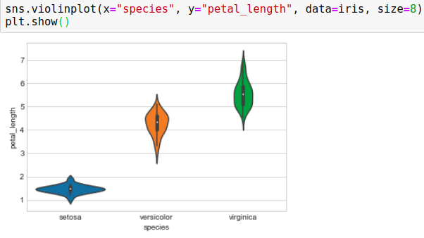
小提琴圖 (Violin Plots)
Violin plot by Seaborn combine PDF and Box-Plot. As in the below plot, on all three colors, PDFs of petal_length are on the sides of the shape, and in the center in black, there is a representation of Box-Plots.
Seaborn的小提琴圖結合了PDF和Box-Plot。 如下圖所示,在所有三種顏色上,petlet_length的PDF都位于形狀的側面,而黑色的中心則是Box-Plots的表示形式。
多元概率密度:輪廓圖 (Multivariate Probability Density: Contour Plot)
Seaborn provides jointplot() method for contours. The name is “jointplot” because it represents Contours as well as PDFs on the edges. More the darker the region the more the probability of occurring that value of features for which the graph is plotted.
Seaborn提供了用于輪廓的jointplot()方法。 名稱為“ jointplot”,因為它表示輪廓以及邊緣的PDF 。 區域越黑,繪制該圖的要素的值出現的可能性就越大。

翻譯自: https://medium.com/swlh/exploratory-data-analysis-of-iris-dataset-2ab58e1a5dc6
iris數據集 測試集
本文來自互聯網用戶投稿,該文觀點僅代表作者本人,不代表本站立場。本站僅提供信息存儲空間服務,不擁有所有權,不承擔相關法律責任。 如若轉載,請注明出處:http://www.pswp.cn/news/388039.shtml 繁體地址,請注明出處:http://hk.pswp.cn/news/388039.shtml 英文地址,請注明出處:http://en.pswp.cn/news/388039.shtml
如若內容造成侵權/違法違規/事實不符,請聯系多彩編程網進行投訴反饋email:809451989@qq.com,一經查實,立即刪除!相關文章

Oracle 12c 安裝 Linuxx86_64


flink 檢查點_Flink檢查點和恢復

917. 僅僅反轉字母

C# socket nat 映射 網絡 代理 轉發

python初學者_初學者使用Python的完整介紹

c# nat udp轉發

【Code-Snippet】TextView

Object 的靜態方法之 defineProperties 以及數據劫持效果

Spring實現AOP的4種方式

如何使用Plotly在Python中為任何DataFrame繪制地圖的衛星視圖

Java入門系列-26-JDBC

3.19PMP試題每日一題

Can't find temporary directory:internal error

snowflake 數據庫_Snowflake數據分析教程

jeesite緩存問題

高級Python:定義類時要應用的9種最佳做法

Java 注解 攔截器

醫療大數據處理流程_我們需要數據來大規模改善醫療流程
 and detectChanges())