本內容來自《跟著迪哥學Python數據分析與機器學習實戰》,該篇博客將其內容進行了整理,加上了自己的理解,所做小筆記。若有侵權,聯系立刪。
迪哥說以下的許多函數方法都不用死記硬背,多查API多看文檔,確實,跟著迪哥混就完事了~~~
Matplotlib菜鳥教程
Matplotlib官網API
以下代碼段均在Jupyter Notebook下進行運行操作
每天過一遍,騰訊阿里明天見~
一、常規繪圖方法
導入工具包,一般用plt來當作Matplotlib的別名
import matplotlib.pyplot as plt
from mpl_toolkits.mplot3d import Axes3D
import numpy as np
import math
import random
%matplotlib inline
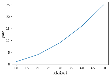
畫一個簡單的折線圖,只需要把二維數據點對應好即可
給定橫坐標[1,2,3,4,5],縱坐標[1,4,9,16,25],并且指明x軸與y軸的名稱分別為xlabel和ylabel
plt.plot([1,2,3,4,5],[1,4,9,16,25])
plt.xlabel('xlabel',fontsize=16)
plt.ylabel('ylabel')
"""
Text(0, 0.5, 'ylabel')
"""
Ⅰ,細節設置
| 字符 | 類型 |
|---|---|
| - | 實線 |
| -. | 虛點線 |
| . | 點 |
| o | 圓點 |
| ^ | 上三角點 |
| v | 下三角點 |
| < | 左三角點 |
| > | 右三角點 |
| 2 | 上三叉點 |
| 1 | 下三叉點 |
| 3 | 左三叉點 |
| 4 | 右三叉點 |
| p | 五角點 |
| h | 六邊形點1 |
| H | 六邊形點2 |
| + | 加號點 |
| D | 實心正菱形點 |
| d | 實心瘦菱形點 |
| _ | 橫線點 |
| – | 虛線 |
| : | 點線 |
| , | 像素點 |
| s | 正方點 |
| * | 星形點 |
| x | 乘號點 |
| 字符 | 顏色 | 英文全稱 |
|---|---|---|
| b | 藍色 | blue |
| g | 綠色 | green |
| r | 紅色 | red |
| c | 青色 | cyan |
| m | 品紅色 | magenta |
| y | 黃色 | yellow |
| k | 黑色 | black |
| w | 白色 | white |
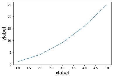
fontsize表示字體的大小
plt.plot([1,2,3,4,5],[1,4,9,16,25],'-.')plt.xlabel('xlabel',fontsize=16)
plt.ylabel('ylabel',fontsize=16)
"""
Text(0, 0.5, 'ylabel')
"""
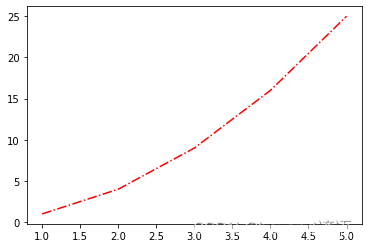
plt.plot([1,2,3,4,5],[1,4,9,16,25],'-.',color='r')
"""
[<matplotlib.lines.Line2D at 0x23bf91a4be0>]
"""
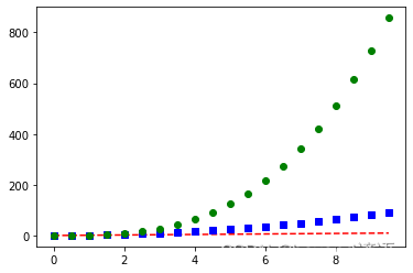
多次調用plot()函數可以加入多次繪圖的結果
顏色和線條參數也可以寫在一起,例如,“r–”表示紅色的虛線
yy = np.arange(0,10,0.5)
plt.plot(yy,yy,'r--')
plt.plot(yy,yy**2,'bs')
plt.plot(yy,yy**3,'go')
"""
[<matplotlib.lines.Line2D at 0x23bf944ffa0>]
"""
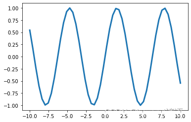
linewidth設置線條寬度
x = np.linspace(-10,10)
y = np.sin(x)plt.plot(x,y,linewidth=3.0)
"""
[<matplotlib.lines.Line2D at 0x23bfb63f9a0>]
"""
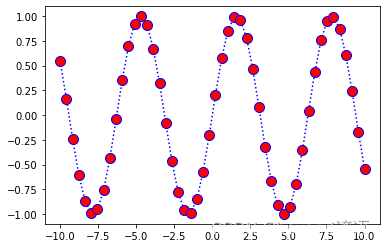
plt.plot(x,y,color='b',linestyle=':',marker='o',markerfacecolor='r',markersize=10)
"""
[<matplotlib.lines.Line2D at 0x23bfb6baa00>]
"""
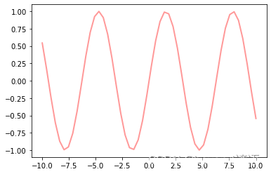
alpha表示透明程度
line = plt.plot(x,y)plt.setp(line,color='r',linewidth=2.0,alpha=0.4)
"""
[None, None, None]
"""
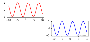
Ⅱ,子圖與標注
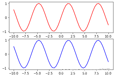
subplot(211)表示要畫的圖整體是2行1列的,一共包括兩幅子圖,最后的1表示當前繪制順序是第一幅子圖
subplot(212)表示還是這個整體,只是在順序上要畫第2個位置上的子圖
整體表現為豎著排列
plt.subplot(211)
plt.plot(x,y,color='r')
plt.subplot(212)
plt.plot(x,y,color='b')
"""
[<matplotlib.lines.Line2D at 0x23bfc84acd0>]
"""
橫著排列,那就是1行2列了
plt.subplot(121)
plt.plot(x,y,color='r')
plt.subplot(122)
plt.plot(x,y,color='b')
"""
[<matplotlib.lines.Line2D at 0x23bfc8fc1c0>]
"""

不僅可以創建一行或者一列,還可以創建多行多列
plt.subplot(321)
plt.plot(x,y,color='r')
plt.subplot(324)
plt.plot(x,y,color='b')
"""
[<matplotlib.lines.Line2D at 0x23bfca43ee0>]
"""
在圖上加一些標注
plt.plot(x,y,color='b',linestyle=':',marker='o',markerfacecolor='r',markersize=10)
plt.xlabel('x:---')
plt.ylabel('y:---')plt.title('beyondyanyu:---')#圖題plt.text(0,0,'beyondyanyu')#在指定位置添加注釋plt.grid(True)#顯示網格#添加箭頭,需要給出起始點和終止點的位置以及箭頭的各種屬性
plt.annotate('beyondyanyu',xy=(-5,0),xytext=(-2,0.3),arrowprops=dict(facecolor='red',shrink=0.05,headlength=20,headwidth=20))
"""
Text(-2, 0.3, 'beyondyanyu')
"""

有時為了整體的美感和需求也可以把網格隱藏起來,通過plt.gca()來獲得當前圖表,然后改變其屬性值
x = range(10)
y = range(10)
fig = plt.gca()
plt.plot(x,y)
fig.axes.get_xaxis().set_visible(False)
fig.axes.get_yaxis().set_visible(False)
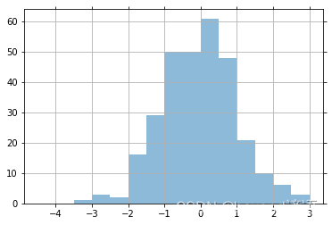
隨機創建一些數據
x = np.random.normal(loc=0.0,scale=1.0,size=300)
width = 0.5
bins = np.arange(math.floor(x.min())-width, math.ceil(x.max())+width, width)
ax = plt.subplot(111)

ax.spines['top'].set_visible(False)#去掉上方的坐標軸線
ax.spines['right'].set_visible(False)##去掉右方的坐標軸線plt.tick_params(bottom='off',top='off',left='off',right='off')#可以選擇是否隱藏坐標軸上的鋸齒線plt.grid()#加入網格plt.hist(x,alpha=0.5,bins=bins)#繪制直方圖
"""
(array([ 0.,  0.,  1.,  3.,  2., 16., 29., 50., 50., 61., 48., 21., 10.,6.,  3.]),array([-4.5, -4. , -3.5, -3. , -2.5, -2. , -1.5, -1. , -0.5,  0. ,  0.5,1. ,  1.5,  2. ,  2.5,  3. ]),<BarContainer object of 15 artists>)
"""
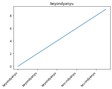
在x軸上,如果字符太多,橫著寫容易堆疊在一起了,這時可以斜著寫
x = range(10)
y = range(10)
labels = ['beyondyanyu' for i in range(10)]
fig,ax = plt.subplots()
plt.plot(x,y)
plt.title('beyondyanyu')
ax.set_xticklabels(labels,rotation=45,horizontalalignment='right')
"""
[Text(-2.0, 0, 'beyondyanyu'),Text(0.0, 0, 'beyondyanyu'),Text(2.0, 0, 'beyondyanyu'),Text(4.0, 0, 'beyondyanyu'),Text(6.0, 0, 'beyondyanyu'),Text(8.0, 0, 'beyondyanyu'),Text(10.0, 0, 'beyondyanyu')]
"""
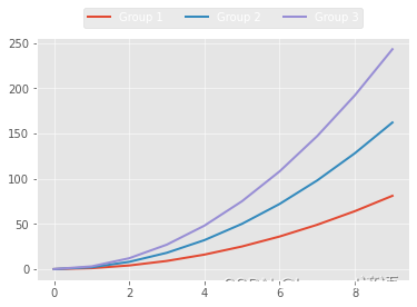
繪制多個線條或者多個類別數據,使用legend()函數給出顏色和類別的對應關系
loc='best’相當于讓工具包自己找一個合適的位置來顯示圖表中顏色所對應的類別
x = np.arange(10)
for i in range(1,4):plt.plot(x,i*x**2,label='Group %d '%i)
plt.legend(loc='best')
"""
<matplotlib.legend.Legend at 0x23b811ee3d0>
"""

help函數,可以直接打印出所有可調參數
print(help(plt.legend))
"""
Help on function legend in module matplotlib.pyplot:legend(*args, **kwargs)Place a legend on the axes.Call signatures::legend()legend(labels)legend(handles, labels)The call signatures correspond to three different ways how to usethis method.**1. Automatic detection of elements to be shown in the legend**The elements to be added to the legend are automatically determined,when you do not pass in any extra arguments.In this case, the labels are taken from the artist. You can specifythem either at artist creation or by calling the:meth:`~.Artist.set_label` method on the artist::line, = ax.plot([1, 2, 3], label='Inline label')ax.legend()or::line, = ax.plot([1, 2, 3])line.set_label('Label via method')ax.legend()Specific lines can be excluded from the automatic legend elementselection by defining a label starting with an underscore.This is default for all artists, so calling `.Axes.legend` withoutany arguments and without setting the labels manually will result inno legend being drawn.**2. Labeling existing plot elements**To make a legend for lines which already exist on the axes(via plot for instance), simply call this function with an iterableof strings, one for each legend item. For example::ax.plot([1, 2, 3])ax.legend(['A simple line'])Note: This way of using is discouraged, because the relation betweenplot elements and labels is only implicit by their order and caneasily be mixed up.**3. Explicitly defining the elements in the legend**For full control of which artists have a legend entry, it is possibleto pass an iterable of legend artists followed by an iterable oflegend labels respectively::legend((line1, line2, line3), ('label1', 'label2', 'label3'))Parameters----------handles : sequence of `.Artist`, optionalA list of Artists (lines, patches) to be added to the legend.Use this together with *labels*, if you need full control on whatis shown in the legend and the automatic mechanism described aboveis not sufficient.The length of handles and labels should be the same in thiscase. If they are not, they are truncated to the smaller length.labels : list of str, optionalA list of labels to show next to the artists.Use this together with *handles*, if you need full control on whatis shown in the legend and the automatic mechanism described aboveis not sufficient.Returns-------`~matplotlib.legend.Legend`Other Parameters----------------loc : str or pair of floats, default: :rc:`legend.loc` ('best' for axes, 'upper right' for figures)The location of the legend.The strings``'upper left', 'upper right', 'lower left', 'lower right'``place the legend at the corresponding corner of the axes/figure.The strings``'upper center', 'lower center', 'center left', 'center right'``place the legend at the center of the corresponding edge of theaxes/figure.The string ``'center'`` places the legend at the center of the axes/figure.The string ``'best'`` places the legend at the location, among the ninelocations defined so far, with the minimum overlap with other drawnartists.  This option can be quite slow for plots with large amounts ofdata; your plotting speed may benefit from providing a specific location.The location can also be a 2-tuple giving the coordinates of the lower-leftcorner of the legend in axes coordinates (in which case *bbox_to_anchor*will be ignored).For back-compatibility, ``'center right'`` (but no other location) can alsobe spelled ``'right'``, and each "string" locations can also be given as anumeric value:===============   =============Location String   Location Code===============   ============='best'            0'upper right'     1'upper left'      2'lower left'      3'lower right'     4'right'           5'center left'     6'center right'    7'lower center'    8'upper center'    9'center'          10===============   =============bbox_to_anchor : `.BboxBase`, 2-tuple, or 4-tuple of floatsBox that is used to position the legend in conjunction with *loc*.Defaults to `axes.bbox` (if called as a method to `.Axes.legend`) or`figure.bbox` (if `.Figure.legend`).  This argument allows arbitraryplacement of the legend.Bbox coordinates are interpreted in the coordinate system given by*bbox_transform*, with the default transformAxes or Figure coordinates, depending on which ``legend`` is called.If a 4-tuple or `.BboxBase` is given, then it specifies the bbox``(x, y, width, height)`` that the legend is placed in.To put the legend in the best location in the bottom rightquadrant of the axes (or figure)::loc='best', bbox_to_anchor=(0.5, 0., 0.5, 0.5)A 2-tuple ``(x, y)`` places the corner of the legend specified by *loc* atx, y.  For example, to put the legend's upper right-hand corner in thecenter of the axes (or figure) the following keywords can be used::loc='upper right', bbox_to_anchor=(0.5, 0.5)ncol : int, default: 1The number of columns that the legend has.prop : None or `matplotlib.font_manager.FontProperties` or dictThe font properties of the legend. If None (default), the current:data:`matplotlib.rcParams` will be used.fontsize : int or {'xx-small', 'x-small', 'small', 'medium', 'large', 'x-large', 'xx-large'}The font size of the legend. If the value is numeric the size will be theabsolute font size in points. String values are relative to the currentdefault font size. This argument is only used if *prop* is not specified.labelcolor : str or listSets the color of the text in the legend. Can be a valid color string(for example, 'red'), or a list of color strings. The labelcolor canalso be made to match the color of the line or marker using 'linecolor','markerfacecolor' (or 'mfc'), or 'markeredgecolor' (or 'mec').numpoints : int, default: :rc:`legend.numpoints`The number of marker points in the legend when creating a legendentry for a `.Line2D` (line).scatterpoints : int, default: :rc:`legend.scatterpoints`The number of marker points in the legend when creatinga legend entry for a `.PathCollection` (scatter plot).scatteryoffsets : iterable of floats, default: ``[0.375, 0.5, 0.3125]``The vertical offset (relative to the font size) for the markerscreated for a scatter plot legend entry. 0.0 is at the base thelegend text, and 1.0 is at the top. To draw all markers at thesame height, set to ``[0.5]``.markerscale : float, default: :rc:`legend.markerscale`The relative size of legend markers compared with the originallydrawn ones.markerfirst : bool, default: TrueIf *True*, legend marker is placed to the left of the legend label.If *False*, legend marker is placed to the right of the legend label.frameon : bool, default: :rc:`legend.frameon`Whether the legend should be drawn on a patch (frame).fancybox : bool, default: :rc:`legend.fancybox`Whether round edges should be enabled around the `~.FancyBboxPatch` whichmakes up the legend's background.shadow : bool, default: :rc:`legend.shadow`Whether to draw a shadow behind the legend.framealpha : float, default: :rc:`legend.framealpha`The alpha transparency of the legend's background.If *shadow* is activated and *framealpha* is ``None``, the default value isignored.facecolor : "inherit" or color, default: :rc:`legend.facecolor`The legend's background color.If ``"inherit"``, use :rc:`axes.facecolor`.edgecolor : "inherit" or color, default: :rc:`legend.edgecolor`The legend's background patch edge color.If ``"inherit"``, use take :rc:`axes.edgecolor`.mode : {"expand", None}If *mode* is set to ``"expand"`` the legend will be horizontallyexpanded to fill the axes area (or *bbox_to_anchor* if definesthe legend's size).bbox_transform : None or `matplotlib.transforms.Transform`The transform for the bounding box (*bbox_to_anchor*). For a valueof ``None`` (default) the Axes':data:`~matplotlib.axes.Axes.transAxes` transform will be used.title : str or NoneThe legend's title. Default is no title (``None``).title_fontsize : int or {'xx-small', 'x-small', 'small', 'medium', 'large', 'x-large', 'xx-large'}, default: :rc:`legend.title_fontsize`The font size of the legend's title.borderpad : float, default: :rc:`legend.borderpad`The fractional whitespace inside the legend border, in font-size units.labelspacing : float, default: :rc:`legend.labelspacing`The vertical space between the legend entries, in font-size units.handlelength : float, default: :rc:`legend.handlelength`The length of the legend handles, in font-size units.handletextpad : float, default: :rc:`legend.handletextpad`The pad between the legend handle and text, in font-size units.borderaxespad : float, default: :rc:`legend.borderaxespad`The pad between the axes and legend border, in font-size units.columnspacing : float, default: :rc:`legend.columnspacing`The spacing between columns, in font-size units.handler_map : dict or NoneThe custom dictionary mapping instances or types to a legendhandler. This *handler_map* updates the default handler mapfound at `matplotlib.legend.Legend.get_legend_handler_map`.Notes-----Some artists are not supported by this function.  See:doc:`/tutorials/intermediate/legend_guide` for details.Examples--------.. plot:: gallery/text_labels_and_annotations/legend.pyNone
"""
loc參數中還可以指定特殊位置
fig = plt.figure()
ax = plt.subplot(111)x = np.arange(10)
for i in range(1,4):plt.plot(x,i*x**2,label='Group %d'%i)
ax.legend(loc='upper center',bbox_to_anchor=(0.5,1.15),ncol=3)
"""
<matplotlib.legend.Legend at 0x23b8119db50>
"""
Ⅲ,風格設置
查看一下Matplotlib有哪些能調用的風格
plt.style.available
"""
['Solarize_Light2','_classic_test_patch','bmh','classic','dark_background','fast','fivethirtyeight','ggplot','grayscale','seaborn','seaborn-bright','seaborn-colorblind','seaborn-dark','seaborn-dark-palette','seaborn-darkgrid','seaborn-deep','seaborn-muted','seaborn-notebook','seaborn-paper','seaborn-pastel','seaborn-poster','seaborn-talk','seaborn-ticks','seaborn-white','seaborn-whitegrid','tableau-colorblind10']
"""
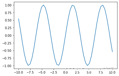
默認的風格代碼
x = np.linspace(-10,10)
y = np.sin(x)
plt.plot(x,y)
"""
[<matplotlib.lines.Line2D at 0x23bfce29b80>]
"""
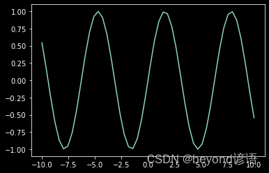
可以通過plt.style.use()函數來改變當前風格
plt.style.use('dark_background')
plt.plot(x,y)
"""
[<matplotlib.lines.Line2D at 0x23bfcf07fd0>]
"""
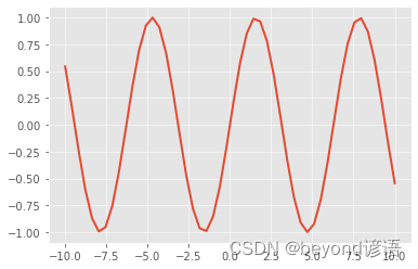
plt.style.use('bmh')
plt.plot(x,y)
"""
[<matplotlib.lines.Line2D at 0x23bfceca550>]
"""

plt.style.use('ggplot')
plt.plot(x,y)
"""
[<matplotlib.lines.Line2D at 0x23bfcfc5f10>]
"""
二、常規圖表繪制
Ⅰ,條形圖
np.random.seed(0)
x = np.arange(5)
y = np.random.randint(-5,5,5)#隨機創建一些數據
fig,axes = plt.subplots(ncols=2)
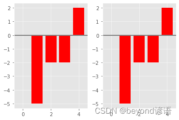
v_bars = axes[0].bar(x,y,color='red')#條形圖
h_bars = axes[1].bar(x,y,color='red')#橫著畫#通過子圖索引分別設置各種細節
axes[0].axhline(0,color='gray',linewidth=2)
axes[1].axhline(0,color='gray',linewidth=2)plt.show()
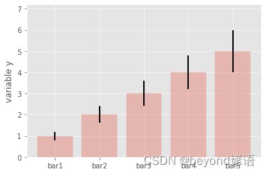
在繪圖過程中,有時需要考慮誤差棒,以表示數據或者實驗的偏離情況,做法也很簡單,在bar()函數中,已經有現成的yerr和xerr參數,直接賦值即可:
mean_values = [1,2,3,4,5]#數值
variance = [0.2,0.4,0.6,0.8,1.0]#誤差棒
bar_label = ['bar1','bar2','bar3','bar4','bar5']#名字
x_pos = list(range(len(bar_label)))#指定位置plt.bar(x_pos,mean_values,yerr=variance,alpha=0.3)#帶有誤差棒的條形圖
max_y = max(zip(mean_values,variance))#可以自己設置x軸和y軸的取值范圍
plt.ylim([0,(max_y[0]+max_y[1])*1.2])plt.ylabel('variable y')#y軸標簽
plt.xticks(x_pos,bar_label)#x軸標簽plt.show()
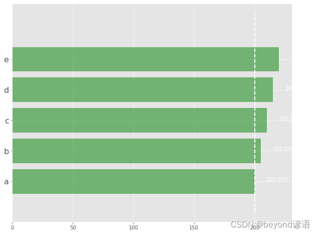
可以加入更多對比細節,先把條形圖繪制出來,細節都可以慢慢添加:
data = range(200,225,5)#數據
bar_labels = ['a','b','c','d','e']#要對比的類型名稱
fig = plt.figure(figsize=(10,8))#指定畫圖區域的大小
y_pos = np.arange(len(data))#一會兒要橫著畫圖,所以要在y軸上找每個起始位置
plt.yticks(y_pos,bar_labels,fontsize=16)#在y軸寫上各個類別名稱
bars = plt.barh(y_pos,data,alpha=0.5,color='g')#繪制條形圖,指定顏色和透明度
plt.vlines(min(data),-1,len(data)+0.5,linestyles='dashed')#畫一條豎線,至少需要3個參數,即x軸位置
for b,d in zip(bars,data):#在對應位置寫上注釋,這里寫了隨意計算的結果plt.text(b.get_width()+b.get_width()*0.05,b.get_y()+b.get_height()/2,'{0:.2%}'.format(d/min(data)))plt.show()
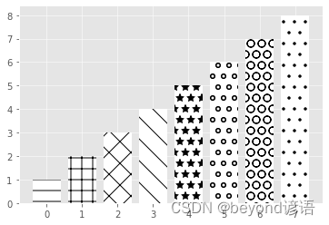
把條形圖畫得更個性一些,也可以讓各種線條看起來不同
patterns = ('-','+','x','\\','*','o','O','.')#這些圖形對應這些繪圖結果
mean_value = range(1,len(patterns)+1)#讓條形圖數值遞增,看起來舒服點
x_pos = list(range(len(mean_value)))#豎著畫,得有每一個線條的位置
bars = plt.bar(x_pos,mean_value,color='white')#把條形圖畫出來
for bar,pattern in zip(bars,patterns):#通過參數設置條的樣式bar.set_hatch(pattern)plt.show()
Ⅱ,盒裝圖
盒圖(boxplot)主要由最小值(min)、下四分位數(Q1)、中位數(median)、上四分位數(Q3)、最大值(max)五部分組成
在每一個小盒圖中,從下到上就分別對應之前說的5個組成部分,計算方法如下:
IQR=Q3–Q1,即上四分位數與下四分位數之間的差
min=Q1–1.5×IQR,正常范圍的下限
max=Q3+1.5×IQR,正常范圍的上限
方塊代表異常點或者離群點,離群點就是超出上限或下限的數據點
boxplot()函數就是主要繪圖部分
sym參數用來展示異常點的符號,可以用正方形,也可以用加號
vert參數表示是否要豎著畫,它與條形圖一樣,也可以橫著畫
yy_data = [np.random.normal(0,std,100) for std in range(1,4)]
fig = plt.figure(figsize=(8,6))
plt.boxplot(yy_data,sym='s',vert=True)
plt.xticks([y+1 for y in range(len(yy_data))],['x1','x2','x3'])
plt.xlabel('x')
plt.title('box plot')
"""
Text(0.5, 1.0, 'box plot')
"""

boxplot()函數就是主要繪圖部分,查看完整的參數,最直接的辦法看幫助文檔
| 參數 | 功能 |
|---|---|
| x | 指定要繪制箱線圖的數據 |
| notch | 是否以凹口的形式展現箱線圖,默認非凹口 |
| sym | 指定異常點的形狀,默認為+號顯示 |
| vert | 是否需要將箱線圖垂直擺放,默認垂直擺放 |
| positions | 指定箱線圖的位置,默認為[0,1,2…] |
| widths | 指定箱線圖的寬度,默認為0.5 |
| patch_artist | 是否填充箱體的顏色 |
| meanline | 是否用線的形式表示均值,默認用點來表示 |
| showmeans | 是否顯示均值,默認不顯示 |
| showcaps | 是否顯示箱線圖頂端和末端的兩條線,默認顯示 |
| showbox | 是否顯示箱線圖的箱體,默認顯示 |
| showfliers | 是否顯示異常值,默認顯示 |
| boxprops | 設置箱體的屬性,如邊框色、填充色等 |
| labels | 為箱線圖添加標簽,類似于圖例的作用 |
| filerprops | 設置異常值的屬性,如異常點的形狀、大小、填充色等 |
| medianprops | 設置中位數的屬性,如線的類型、粗細等 |
| meanprops | 設置均值的屬性,如點的大小、顏色等 |
| capprops | 設置箱線圖頂端和末端線條的屬性,如顏色、粗細等 |
print(help(plt.boxplot))
"""
Help on function boxplot in module matplotlib.pyplot:boxplot(x, notch=None, sym=None, vert=None, whis=None, positions=None, widths=None, patch_artist=None, bootstrap=None, usermedians=None, conf_intervals=None, meanline=None, showmeans=None, showcaps=None, showbox=None, showfliers=None, boxprops=None, labels=None, flierprops=None, medianprops=None, meanprops=None, capprops=None, whiskerprops=None, manage_ticks=True, autorange=False, zorder=None, *, data=None)Make a box and whisker plot.Make a box and whisker plot for each column of *x* or eachvector in sequence *x*.  The box extends from the lower toupper quartile values of the data, with a line at the median.The whiskers extend from the box to show the range of thedata.  Flier points are those past the end of the whiskers.Parameters----------x : Array or a sequence of vectors.The input data.notch : bool, default: FalseWhether to draw a noteched box plot (`True`), or a rectangular boxplot (`False`).  The notches represent the confidence interval (CI)around the median.  The documentation for *bootstrap* describes howthe locations of the notches are computed... note::In cases where the values of the CI are less than thelower quartile or greater than the upper quartile, thenotches will extend beyond the box, giving it adistinctive "flipped" appearance. This is expectedbehavior and consistent with other statisticalvisualization packages.sym : str, optionalThe default symbol for flier points.  An empty string ('') hidesthe fliers.  If `None`, then the fliers default to 'b+'.  Morecontrol is provided by the *flierprops* parameter.vert : bool, default: TrueIf `True`, draws vertical boxes.If `False`, draw horizontal boxes.whis : float or (float, float), default: 1.5The position of the whiskers.If a float, the lower whisker is at the lowest datum above``Q1 - whis*(Q3-Q1)``, and the upper whisker at the highest datumbelow ``Q3 + whis*(Q3-Q1)``, where Q1 and Q3 are the first andthird quartiles.  The default value of ``whis = 1.5`` correspondsto Tukey's original definition of boxplots.If a pair of floats, they indicate the percentiles at which todraw the whiskers (e.g., (5, 95)).  In particular, setting this to(0, 100) results in whiskers covering the whole range of the data."range" is a deprecated synonym for (0, 100).In the edge case where ``Q1 == Q3``, *whis* is automatically setto (0, 100) (cover the whole range of the data) if *autorange* isTrue.Beyond the whiskers, data are considered outliers and are plottedas individual points.bootstrap : int, optionalSpecifies whether to bootstrap the confidence intervalsaround the median for notched boxplots. If *bootstrap* isNone, no bootstrapping is performed, and notches arecalculated using a Gaussian-based asymptotic approximation(see McGill, R., Tukey, J.W., and Larsen, W.A., 1978, andKendall and Stuart, 1967). Otherwise, bootstrap specifiesthe number of times to bootstrap the median to determine its95% confidence intervals. Values between 1000 and 10000 arerecommended.usermedians : array-like, optionalA 1D array-like of length ``len(x)``.  Each entry that is not`None` forces the value of the median for the correspondingdataset.  For entries that are `None`, the medians are computedby Matplotlib as normal.conf_intervals : array-like, optionalA 2D array-like of shape ``(len(x), 2)``.  Each entry that is notNone forces the location of the corresponding notch (which isonly drawn if *notch* is `True`).  For entries that are `None`,the notches are computed by the method specified by the otherparameters (e.g., *bootstrap*).positions : array-like, optionalSets the positions of the boxes. The ticks and limits areautomatically set to match the positions. Defaults to``range(1, N+1)`` where N is the number of boxes to be drawn.widths : float or array-likeSets the width of each box either with a scalar or asequence. The default is 0.5, or ``0.15*(distance betweenextreme positions)``, if that is smaller.patch_artist : bool, default: FalseIf `False` produces boxes with the Line2D artist. Otherwise,boxes and drawn with Patch artists.labels : sequence, optionalLabels for each dataset (one per dataset).manage_ticks : bool, default: TrueIf True, the tick locations and labels will be adjusted to matchthe boxplot positions.autorange : bool, default: FalseWhen `True` and the data are distributed such that the 25th and75th percentiles are equal, *whis* is set to (0, 100) suchthat the whisker ends are at the minimum and maximum of the data.meanline : bool, default: FalseIf `True` (and *showmeans* is `True`), will try to render themean as a line spanning the full width of the box according to*meanprops* (see below).  Not recommended if *shownotches* is alsoTrue.  Otherwise, means will be shown as points.zorder : float, default: ``Line2D.zorder = 2``Sets the zorder of the boxplot.Returns-------dictA dictionary mapping each component of the boxplot to a listof the `.Line2D` instances created. That dictionary has thefollowing keys (assuming vertical boxplots):- ``boxes``: the main body of the boxplot showing thequartiles and the median's confidence intervals ifenabled.- ``medians``: horizontal lines at the median of each box.- ``whiskers``: the vertical lines extending to the mostextreme, non-outlier data points.- ``caps``: the horizontal lines at the ends of thewhiskers.- ``fliers``: points representing data that extend beyondthe whiskers (fliers).- ``means``: points or lines representing the means.Other Parameters----------------showcaps : bool, default: TrueShow the caps on the ends of whiskers.showbox : bool, default: TrueShow the central box.showfliers : bool, default: TrueShow the outliers beyond the caps.showmeans : bool, default: FalseShow the arithmetic means.capprops : dict, default: NoneThe style of the caps.boxprops : dict, default: NoneThe style of the box.whiskerprops : dict, default: NoneThe style of the whiskers.flierprops : dict, default: NoneThe style of the fliers.medianprops : dict, default: NoneThe style of the median.meanprops : dict, default: NoneThe style of the mean.Notes-----.. note::In addition to the above described arguments, this function can takea *data* keyword argument. If such a *data* argument is given,every other argument can also be string ``s``, which isinterpreted as ``data[s]`` (unless this raises an exception).Objects passed as **data** must support item access (``data[s]``) andmembership test (``s in data``).None
"""
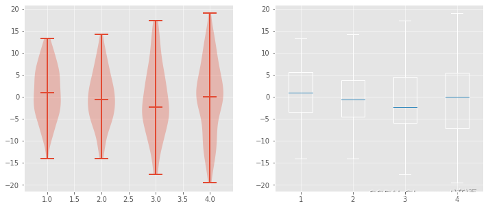
還有一種圖形與盒圖長得有點相似,叫作小提琴圖(violinplot)
小提琴圖給人以“胖瘦”的感覺,越“胖”表示當前位置的數據點分布越密集,越“瘦”則表示此處數據點比較稀疏。
小提琴圖沒有展示出離群點,而是從數據的最小值、最大值開始展示
fig,axes = plt.subplots(nrows=1,ncols=2,figsize=(12,5))
yy_data = [np.random.normal(0,std,100) for std in range(6,10)]
axes[0].violinplot(yy_data,showmeans=False,showmedians=True)
axes[0].set_title('violin plot')#設置圖題axes[1].boxplot(yy_data)#右邊畫盒圖
axes[1].set_title('box plot')#設置圖題for ax in axes:#為了對比更清晰一些,把網格畫出來ax.yaxis.grid(True)
ax.set_xticks([y+1 for y in range(len(yy_data))])#指定x軸畫的位置
ax.set_xticklabels(['x1','x2','x3','x4'])#設置x軸指定的名稱
"""
[Text(1, 0, 'x1'), Text(2, 0, 'x2'), Text(3, 0, 'x3'), Text(4, 0, 'x4')]
"""
Ⅲ,直方圖與散點圖
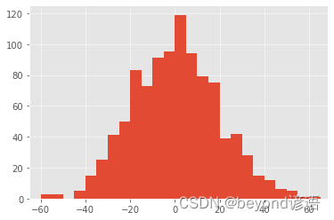
直方圖(Histogram)可以更清晰地表示數據的分布情況
畫直方圖的時候,需要指定一個bins,也就是按照什么區間來劃分
例如:np.arange(?10,10,5)=array([?10,?5,0,5])
data = np.random.normal(0,20,1000)
bins = np.arange(-100,100,5)
plt.hist(data,bins=bins)
plt.xlim([min(data)-5,max(data)+5])
plt.show()
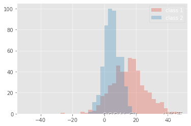
同時展示不同類別數據的分布情況,也可以分別繪制,但是要更透明一些,否則就會堆疊在一起
data1 = [random.gauss(15,10) for i in range(500)]#隨機構造些數據
data2 = [random.gauss(5,5) for i in range(500)]#兩個類別進行對比
bins = np.arange(-50,50,2.5)#指定區間
plt.hist(data1,bins=bins,label='class 1',alpha=0.3)#分別繪制,都透明一點,alpha控制透明度,設置小點
plt.hist(data2,bins=bins,label='class 2',alpha=0.3)
plt.legend(loc='best')#用不同顏色表示不同的類別
plt.show()
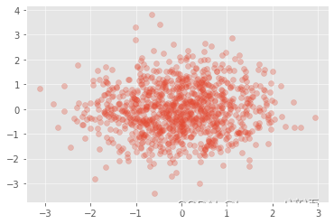
通常散點圖可以來表示特征之間的相關性,調用 scatter()函數即可
N = 1000
x = np.random.randn(N)
y = np.random.randn(N)
plt.scatter(x,y,alpha=0.3)
plt.grid(True)
plt.show()
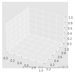
Ⅳ,3D圖
展示三維數據需要用到3D圖
fig = plt.figure()
ax = fig.add_subplot(111,projection='3d')#繪制空白3D圖
plt.show()
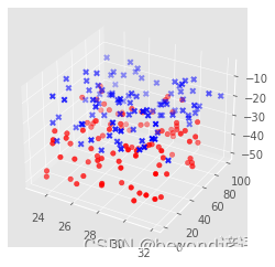
往空白3D圖中填充數據
以不同的視角觀察結果,只需在最后加入ax.view_init()函數,并在其中設置旋轉的角度即可
np.random.seed(1)#設置隨機種子,使得結果一致def randrange(n,vmin,vmax):#隨機創建數據方法return (vmax-vmin)*np.random.rand(n)+vminfig = plt.figure()ax = fig.add_subplot(111,projection='3d')#繪制3D圖
n = 100for c,m,zlow,zhigh in [('r','o',-50,-25),('b','x','-30','-5')]:#設置顏色的標記以及取值范圍xs = randrange(n,23,32)ys = randrange(n,0,100)zs = randrange(n,int(zlow),int(zhigh))ax.scatter(xs,ys,zs,c=c,marker=m)#三個軸的數據都需要傳入
plt.show()
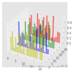
其他圖表的3D圖繪制方法相同,只需要調用各自的繪圖函數即可
fig = plt.figure()
ax = fig.add_subplot(111,projection='3d')
for c,z in zip(['r','g','b','y'],[30,20,10,0]):xs = np.arange(20)ys = np.random.rand(20)cs = [c]*len(xs)ax.bar(xs,ys,zs=z,zdir='y',color=cs,alpha=0.5)
plt.show()
Ⅴ,布局設置
ax1 = plt.subplot2grid((3,3),(0,0))#3×3的布局,第一個子圖ax2 = plt.subplot2grid((3,3),(1,0))#布局大小都是3×3,但是各自位置不同ax3 = plt.subplot2grid((3,3),(0,2),rowspan=3)#一個頂3個ax4 = plt.subplot2grid((3,3),(2,0),colspan=2)#一個頂2個ax5 = plt.subplot2grid((3,3),(0,1),rowspan=2)#一個頂2個
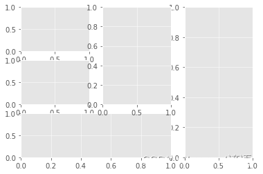
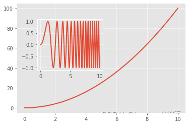
不同子圖的規模不同,在布局時,也可以在圖表中再嵌套子圖
x = np.linspace(0,10,1000)
y2 = np.sin(x**2)
y1 = x**2
fig,ax1 = plt.subplots()
設置嵌套圖的參數含義如下:
left:繪制區左側邊緣線與Figure畫布左側邊緣線距離
bottom:繪圖區底部邊緣線與Figure畫布底部邊緣線的距離
width:繪圖區的寬度
height:繪圖區的高度
x = np.linspace(0,10,1000)#隨便創建數據
y2 = np.sin(x**2)#因為要創建兩個圖,需要準備兩份數據
y1 = x**2
fig,ax1 = plt.subplots()
left,bottom,width,height = [0.22,0.42,0.3,0.35]#設置嵌套圖的位置
ax2 = fig.add_axes([left,bottom,width,height])
ax1.plot(x,y1)
ax2.plot(x,y2)
"""
[<matplotlib.lines.Line2D at 0x23b8297c940>]
"""


方法與示例)


)


 - TLang(多語言切換的實現))
