擁有和諧的色彩系統的好處 (The benefits of having a harmonious color system)
- Consistent branding express across all platform 在所有平臺上表達一致的品牌
- The consistent interface creates a better user experience 一致的界面創建了更好的用戶體驗
- More productive on designers and developers daily work 提高設計師和開發人員的日常工作效率
這是我創建色彩系統的5個步驟: (Here are my 5 steps of creating a color system:)
- Set Brightness System 設置亮度系統
- Define Hues 定義色調
- Apply brightness system to Hues 將亮度系統應用于色相
- Select Major Color under each Hue 在每個色相下選擇主要顏色
- Apply to Design 申請設計
步驟1:設定亮度系統 (Step 1: Set brightness system)
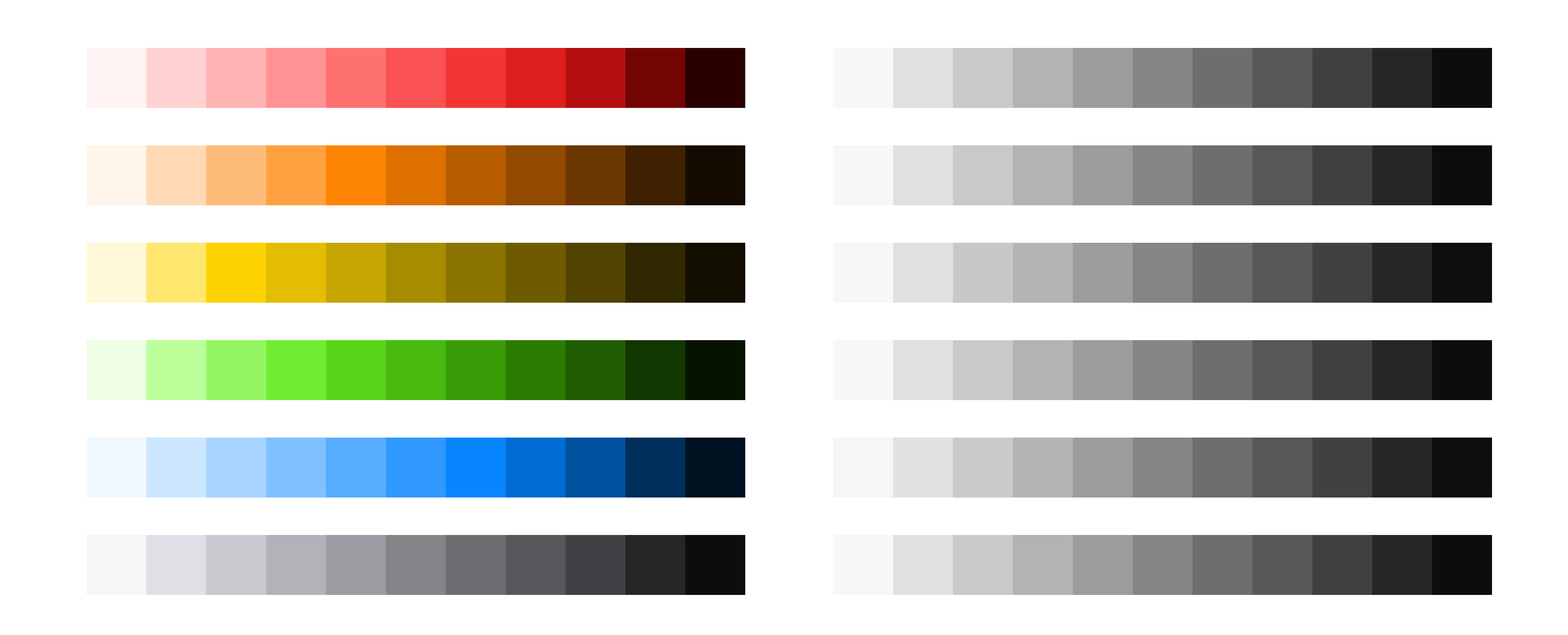
Choose the number of brightness levels that you need, there are 10 levels in the Google Material Design color system.
選擇所需的亮度級別數, Google Material Design顏色系統中有10個級別。
I usually choose 12 levels of brightness as my system including white and also I added a darker brightness level (Brightness=5) it’s needed in our new iOS dark mode.
我通常選擇12種亮度級別作為我的系統(包括白色),并且還添加了較暗的亮度級別(亮度= 5),這是我們新的iOS暗模式所需的。
12 levels also can be easily divided by 2, 3 or 4, which means I can create different rhythm by skip through several levels.
12個級別也可以輕松地除以2、3或4,這意味著我可以跳過幾個級別來創建不同的節奏。
First, choose the highest and lowest brightness level that you need, Please note that for White’ brightness is 100, Black is 0.
首先,選擇所需的最高和最低亮度級別。請注意,對于白色,亮度為100,黑色為0。
In this example below I choose 97 as the highest brightness (excluding white) and 5 as the lowest.
在下面的示例中,我選擇97作為最高亮度(不包括白色),選擇5作為最低亮度。
Assume number between different 2 brightness level is “a”
假設兩個不同亮度等級之間的數字為“ a”
97–10a = 5
97–10a = 5
92/10= a
92/10 =一個
a ≈ 9
≈9
After applying this formula, I can get the number of brightness below, for the last 2 levels I choose to -10 to get a darker color.
應用此公式后,我可以得到下面的亮度數量,對于最后兩個級別,我選擇-10以得到較暗的顏色。

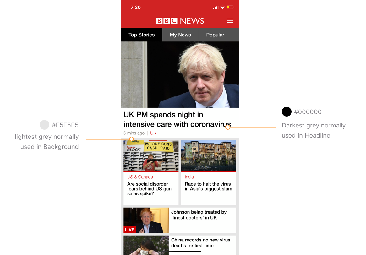
提示:如何定義顏色系統中最亮和最暗的顏色? (Tips: How to define the lightest and darkest colors in a color system?)
Check the lightest grey used in your product (eg. background) and darkest grey in your design (eg. text), here is an example:
檢查產品中使用的最淺灰色(例如背景)和設計中最深色(例如文本),下面是一個示例:
步驟2:定義色相 (Step 2: Define Hue)
💡提示:使用persona關鍵字定義您的主要色相 (💡Tips: Use persona keyword to define your major Hue)
The major reflects the branding and personality of the product. Normally the first step would be defining the keywords describing the brand, and then use these keywords to find a suitable color.
專業反映了產品的品牌和個性。 通常,第一步是定義描述品牌的關鍵字,然后使用這些關鍵字找到合適的顏色。
However in my case, Wego.com is a matured product, we got lots of users and there is no plan to totally change our brand color yet, so all the Hues should be similar to current existing colors in our product.
但是就我而言,Wego.com是一個成熟的產品,我們有很多用戶,并且還沒有計劃完全改變我們的品牌顏色,因此所有的色相都應該與我們產品中現有的顏色相似。
The old branding color was Green (Hue=86), But there are some problems with the current green.
舊品牌顏色為綠色(色相= 86) ,但是當前的綠色存在一些問題。
It’s a green close to yellow, this color will maintain a clean and clear feeling only when its saturation and brightness are both high.
這是一種接近黃色的綠色,只有在飽和度和亮度都很高的情況下,這種顏色才能保持干凈清晰的感覺。
In the Wego UI however, this makes it not practical, as the text applied on this color is normally white, both the saturation and brightness need to be tuned down to ensure the readability, and this makes the green rapidly fading into a dim and dirty color.
但是,在Wego用戶界面中,這是不切實際的,因為應用于此顏色的文本通常為白色,因此飽和度和亮度都需要調低以確保可讀性,并且這會使綠色Swift褪色為暗淡和臟污顏色。
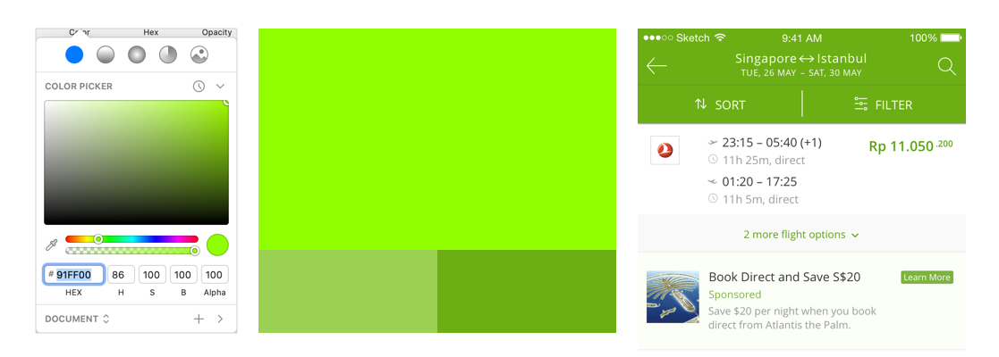
So I try to change the tune of the green, to understand the colors that you want to use, you can start by creating a color persona.
因此,我嘗試更改綠色的色調,以了解您要使用的顏色,可以從創建顏色角色開始。
Here are some persona keywords that I got from colleagues at Wego:
以下是我從Wego同事那里獲得的一些角色關鍵字:
Trust worthy, Expert, Efficient, Travel, Convenient, Friendly, Easy, Empowering, Smart
值得信賴,專家,高效,出差,便捷,友善,輕松,賦權,聰明
And based on these keywords I found some image and use a color palette generator to make it more intuitive.
根據這些關鍵字,我找到了一些圖像,并使用調色板生成器使其更加直觀。
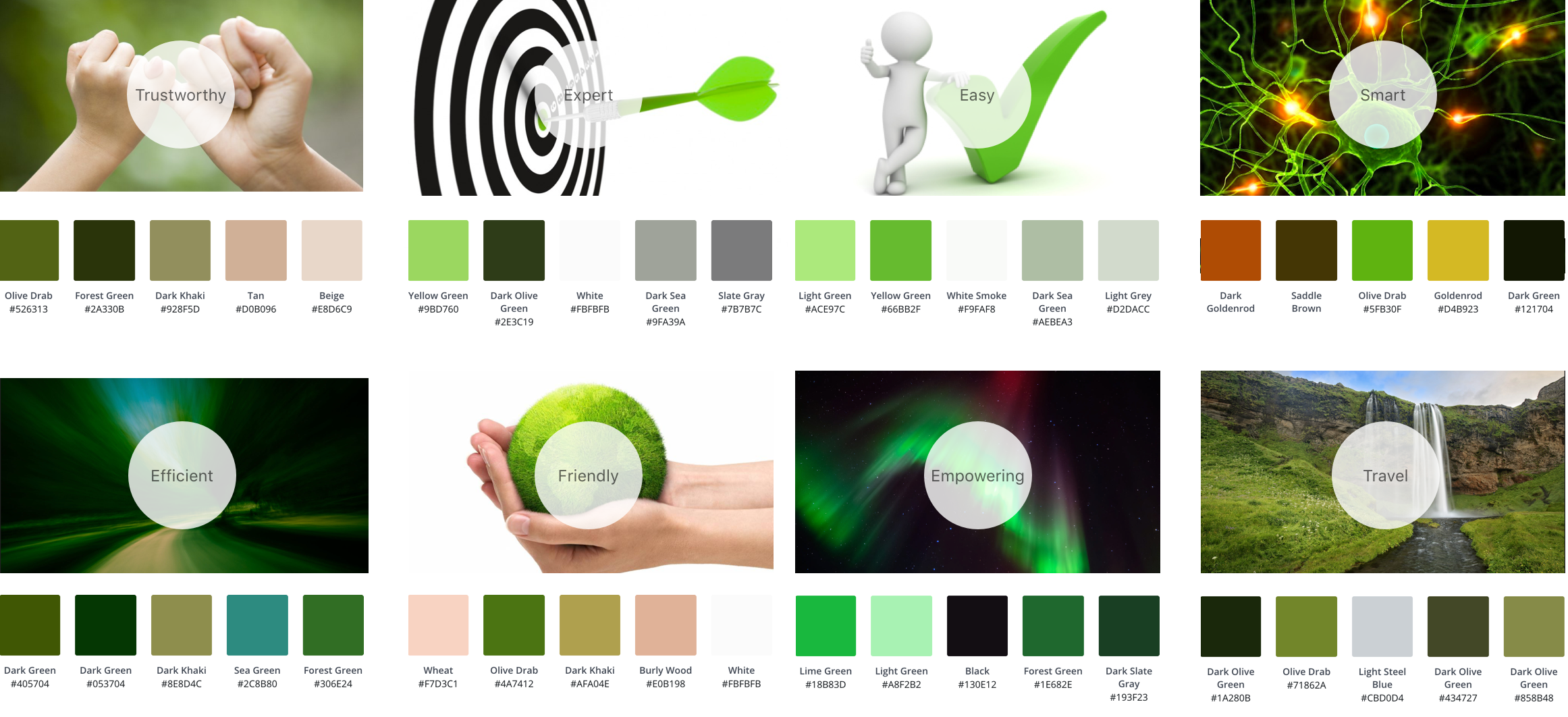
In the end, I choose Hue=100, because:
最后,我選擇Hue = 100,因為:
- All the persona image shares a green which between green and close to yellow 所有角色圖像都共享綠色,介于綠色和接近黃色之間
- Also, it’s close to original Wego branding green 而且,它接近原始的Wego品牌綠色
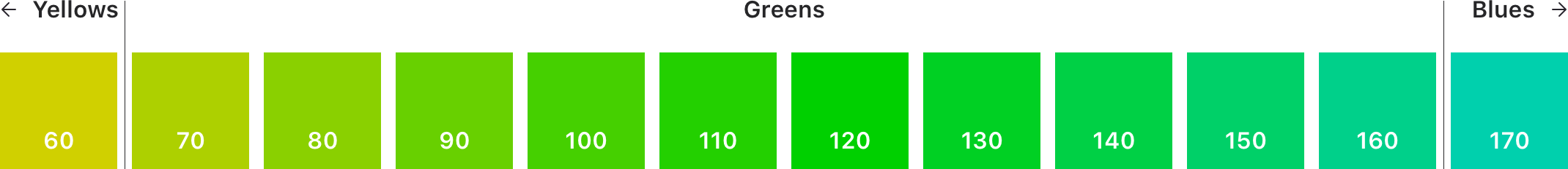
On our product, Green is primarily color and Orange is secondary, I picked 6 hues for the system:
在我們的產品上, 綠色是主要顏色, 橙色是次要顏色,我為系統選擇了6種色調 :
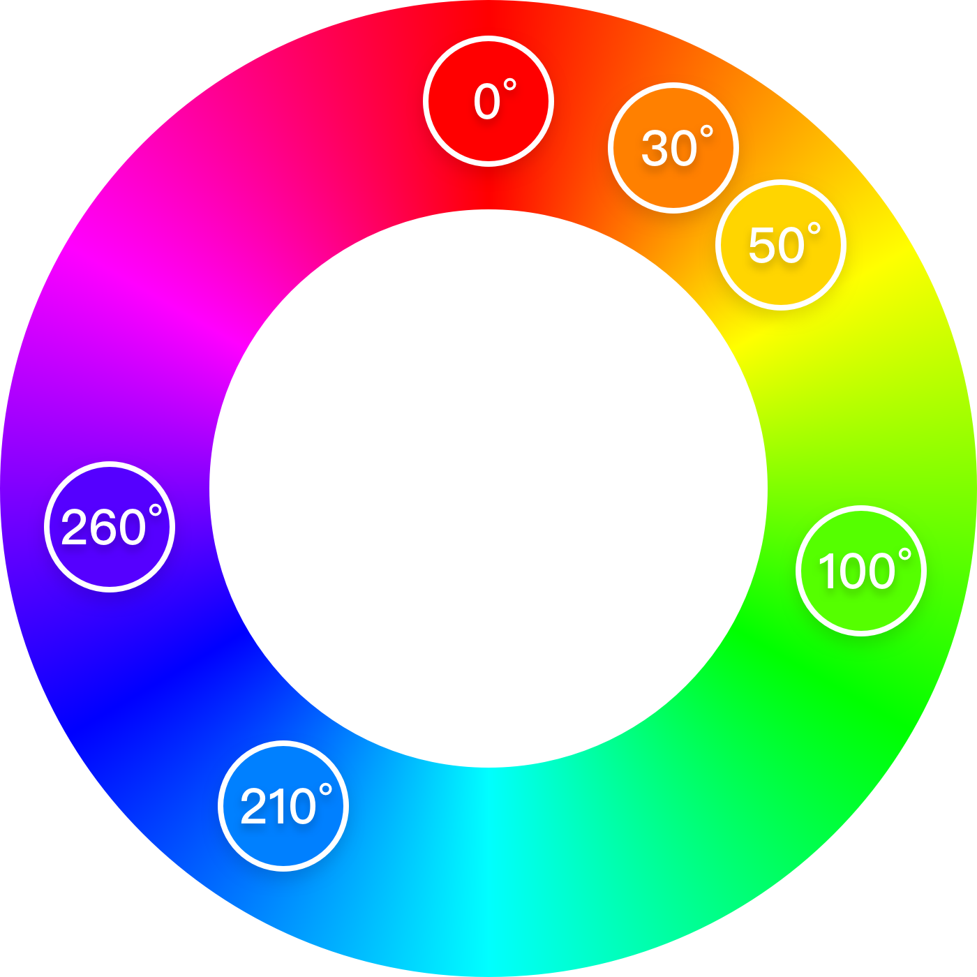
Red (0o/360o), Orange (30o), Yellow (50o), Green (100o), Blue (210o) and Purple (260o)
紅色 (0o/360o), 橙色 (30o), 黃色 (50o), 綠色 (100o), 藍色 (210o)和紫色 (260o)
Orange and Green, are the existing color in the product, Rest of the colors I choose base on normal usage:
橙色和綠色是產品中現有的顏色,我根據正常使用情況選擇其他顏色:
Blue usually used for a text link, Red for promotions, Yellow for warnings. Both colors are linked to Orange color and are adjusted based on color differences (colors in the range of red to orange are less recognizable comparing to colors in the range of orange to yellow).
藍色通常用于文本鏈接, 紅色通常用于促銷, 黃色通常用于警告。 兩種顏色都鏈接到橙色,并根據色差進行調整(與橙色到黃色范圍內的顏色相比,紅色到橙色范圍內的顏色難以識別)。
Purple is a hue for grey because purple is the complementary color of green, grey with a light tone makes the product look more harmonious and related to all the other colors.
紫色是灰色的色調,因為紫色是綠色的互補色,帶有淺色調的灰色使產品看起來更加和諧,并且與所有其他顏色相關。
步驟3:將亮度系統應用于色相 (Step 3: Apply the brightness system to Hues)
Each color will have the same brightness level as the one defined in Step 1.
每種顏色將具有與步驟1中定義的相同的亮度級別。
- Draw a square, turn opacity to luminosity mode 畫一個正方形,將不透明度轉到亮度模式
- Choose a middle level of brightness to start, apply hue. 選擇一個中等亮度等級開始,應用色調。
- Use color picker in the sketch to adjust the RGB value, make it match with the brightness level 在草圖中使用顏色選擇器調整RGB值,使其與亮度級別匹配
- Turn opacity back to normal mode and review 將不透明度恢復為正常模式并查看
以下是將亮度系統應用于色相的一些技巧: (Here are some tips to apply brightness system to hues:)
- The final color system in luminosity mode, the brightness level should be all the same 最終的色彩系統在發光模式下,亮度等級應全部相同
- One set of color should be in the same hue with a smooth curve 一組顏色應具有相同的色調和平滑的曲線
- Pay attention to some color’ situation, like orange and yellow are easily get dim 注意某些顏色的情況,例如橙色和黃色容易變暗
Here is an example of my green system overview, it’s on a smooth curve, which makes the system harmonious.
這是我的綠色系統概述的一個示例,它的曲線很平滑,使系統和諧。
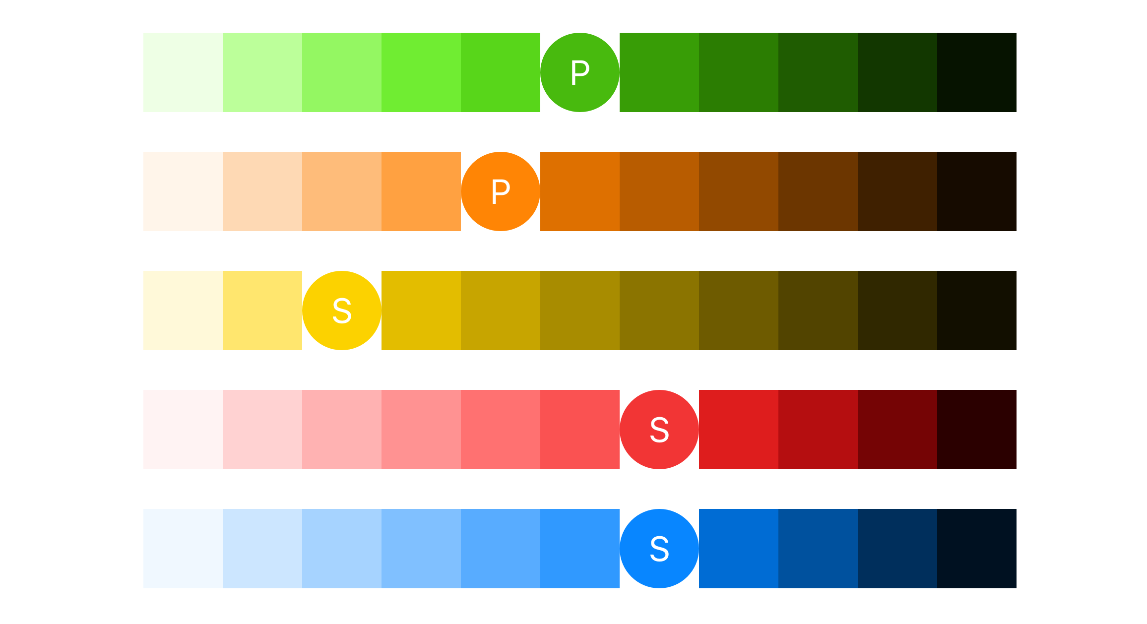
4.在每個色相下選擇主要顏色 (4. Select Major Color under each Hue)
Pick the most frequently use color under each hue
在每種色調下選擇最常用的顏色
提示:在不同的亮度級別設置不同的主要顏色 (Tips: Set the different major colors in different brightness level)
By doing this, even the user not able to read color at all, they still able to sense different colors by brightness.
通過這樣做,即使用戶根本無法讀取顏色,他們仍然能夠通過亮度感測不同的顏色。
5.申請設計 (5. Apply to design)
Apply selected colors to your design, you will need some rules for the color of the header, CTA, icons, badges, etc.
將選定的顏色應用于您的設計,您將需要一些用于標題,CTA,圖標,徽章等顏色的規則。
Here are some UI result of my design
這是我設計的一些UI結果
App design, the color system has been used across light mode and dark mode
應用程序設計,色彩系統已在亮模式和暗模式下使用
Desktop Web
桌面網站

The way I create a color system might not perfect, but I hope this article can give you a piece of inspiration to explore more possibilities in colors.
我創建色彩系統的方式可能并不完美,但是我希望本文能給您啟發,探索更多色彩可能性。
Thank you so much for reading! Happy designing!
非常感謝您的閱讀! 設計愉快!
👉 Check out another article from me: How to Create a Harmonious Typography System on Web
👉查看我的另一篇文章: 如何在Web上創建和諧的排版系統
🙏 Thanks to Brian and Blizzard who gave me feedback on this article.
🙏感謝Brian和Blizzard ,他們為我提供了有關本文的反饋。
翻譯自: https://uxdesign.cc/how-to-create-a-harmonious-color-system-901c7f790389
本文來自互聯網用戶投稿,該文觀點僅代表作者本人,不代表本站立場。本站僅提供信息存儲空間服務,不擁有所有權,不承擔相關法律責任。 如若轉載,請注明出處:http://www.pswp.cn/news/275724.shtml 繁體地址,請注明出處:http://hk.pswp.cn/news/275724.shtml 英文地址,請注明出處:http://en.pswp.cn/news/275724.shtml
如若內容造成侵權/違法違規/事實不符,請聯系多彩編程網進行投訴反饋email:809451989@qq.com,一經查實,立即刪除!相關文章

java restful接口測試_詳解SpringBoot restful api的單元測試

老姚淺談:怎么學JavaScript?

JavaScript 如何使用閉包

ai中導入sketch_在Sketch中營造深度感
用法及代碼示例)
java byte轉bigdecimal_Java BigDecimal byteValueExact()用法及代碼示例

Python3+PyCharm+selenium3 環境搭建

2021 年最值得了解的 Node.js 工具

DOMContentLoaded與interactive

figma下載_何時在Figma中使用組或框架

java標記錯誤_標記電子郵件Java時出錯
)
邁入現代 Web 開發(GMTC 2021 演講全文)

Laravel 測試: PHPUnit 入門教程

Brad Wilson寫的 ASP.NET MVC 3 Service Location 系列文章索引

注釋標記的原則_它關系到平臺如何標記操縱的媒體。 這是設計師應遵循的12條原則。

saltapi java_搭建基于Jenkins salt-api的運維工具

他開發了redux,昨晚字節一面卻掛了?

Onew積極開拓國際市場,為全球用戶提供全方位金融服務

高通董事長:努力降低智能手機價格

mysql數據庫的新特性_【數據庫】MySQL新特性歸檔介紹
