頁面滾動時觸發圖片逐幀播放
A step by step guide on how to create that dynamic image background you see everywhere.
有關如何創建隨處可見的動態圖像背景的逐步指南。
內容 (Content)
- Introduction 介紹
- Result demo 結果演示
- Prerequisite 先決條件
- Step by step guide 逐步指南
- Next step 下一步
介紹 (Introduction)
Moving an image on scroll is the new parallax for the frontend. In the old days, parallax was everywhere. But it rarer for new websites. Instead, we see a lot of moving image by scrolling pattern — for example, apple new iPhone SE website:
滾動移動圖像是前端的新視差。 在過去,視差無處不在。 但這對于新網站來說很少見。 取而代之的是,我們通過滾動模式看到了很多動態圖像,例如,蘋果新的iPhone SE網站:

As you can see, the iPhone rotates frame by frame as you scroll down. In this tutorial, I will share my approach for reproducing such pattern.
如您所見,iPhone在向下滾動時會逐幀旋轉。 在本教程中,我將分享重現這種模式的方法。
結果演示 (Result demo)
Codepen: https://codepen.io/josephwong2004/pen/wvKPGEO
Codepen: https ://codepen.io/josephwong2004/pen/wvKPGEO
先決條件 (Prerequisite)
Just basic knowledge in CSS and JS
只是CSS和JS的基礎知識
逐步指南 (Step by step guide)
Step 1: Get some images
第1步:獲取一些圖片
Okay, I guess you already figured it out. The “Moving image” is actually just a bunch of images with small differences, and played frame by frame like an animation. By mapping the scroll position to a corresponding image, we get an illusion of the object in the images itself is moving or rotating.
好的,我想您已經知道了。 “運動圖像”實際上只是一堆差異很小的圖像,并且像動畫一樣逐幀播放。 通過將滾動位置映射到相應的圖像,我們得到圖像本身在運動或旋轉中的幻覺。
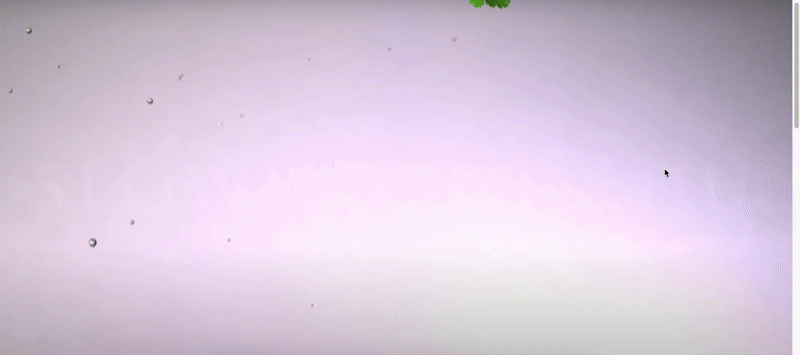
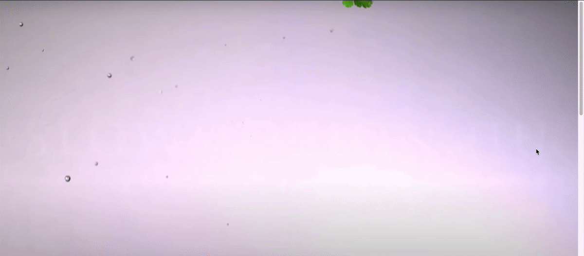
As you can see from the demo, I get some images for vegetable falling down (20 in total).
從演示中可以看到,我得到了一些蔬菜掉落的圖像(總共20個)。
The images I am using is from this youtube video, I don’t own the images, only using it for tutorial purpose. Source:
我使用的圖片來自此youtube視頻,我不擁有圖片,僅將其用于教學目的。 資源:
https://www.youtube.com/watch?v=8DsDH3JQ384
https://www.youtube.com/watch?v=8DsDH3JQ384
Step 2: Setup the basic
步驟2:設定基本
Let start building our “moving image” effect. The html is very simple:
讓我們開始構建我們的“運動圖像”效果。 html非常簡單:
<div class='container'>
  <div class='image-container'></div>
</div>
We will put the image in the ‘image-container’ class. For CSS:
我們將圖像放在“圖像容器”類中。 對于CSS:
body {
  margin: 0;
  font-family: 'Permanent Marker', cursive;
}.container {
  position: relative;
  width: 100%;
  height: 1500px;.image-container {
    width: 100%;
    height: 0;
    padding-top: 45.347%;
    position: sticky;
    top: 0;
    background-size: cover;
    background-image: url('https://drive.google.com/uc?id=1vtaubItASKilyvb5sgQO7D7gjAQ7xo0i');
  }
}
Now, most things there is pretty standard. I added a font for the overlay text later. For the image-container itself, we want it to be as large as the page width, and have a dynamic height. Unfortunately, we cannot do height: auto here, as our image-container doesn’t have any content, and the background-image doesn’t count. The container will always be 0px in height.
現在,大多數事情都是相當標準的。 稍后,我為疊加文字添加了一種字體。 對于圖像容器本身,我們希望它與頁面寬度一樣大,并具有動態高度。 不幸的是,我們不能做height: auto這里height: auto ,因為我們的圖像容器沒有任何內容,并且背景圖像也不計數。 容器的高度始終為0px。
In order to compensate that, instead, we use a padding-top with percentage. This percentage is not random, but the image height to width ratio (height /width * 100%). With that and background-size: cover, we have container that fill up the whole page.
為了補償這一點,我們使用帶有百分比的padding-top。 該百分比不是隨機的,而是圖像的高寬比(高/寬* 100%)。 通過那和background-size: cover ,我們有一個容器可以填滿整個頁面。
Step 3: Add scrolling effect
步驟3:添加滾動效果
With the background image set, let’s add some JS to our code to make it “move”.
設置好背景圖像后,讓我們在代碼中添加一些JS,使其“移動”。
I have uploaded 20 images to google drive, and stored their links like so:
我已將20張圖片上傳到Google驅動器,并按以下方式存儲了它們的鏈接:
// Images asset
const fruitImages = {
    1:'https://drive.google.com/uc?id=1vtaubItASKilyvb5sgQO7D7gjAQ7xo0i',
    2:'https://drive.google.com/uc?id=1FJNbSIMKRPBnGPienoYK1Qf8wIwQSdpR',
    3:'https://drive.google.com/uc?id=1TODQyZgnCjDX2Slr0ll8g-ymIV8Yizkh',
    ....... (I am not going to copy everything here)
    20:'https://drive.google.com/uc?id=1D7PBddCxxb6aRk43maJ_BXgQD-PRS6R7',
}
Tips:
提示:
The default google drive share link is something like:https://drive.google.com/open?id=1vtaubItASKilyvb5sgQO7D7gjAQ7xo0i
默認的Google驅動器共享鏈接類似于: https : //drive.google.com/open?id=1vtaubItASKilyvb5sgQO7D7gjAQ7xo0i
To use it in code, you need to replace the /open? with /uc?
要在代碼中使用它,您需要替換/ open? / uc?
Each key represent one “frame” in our scroll animation. Next, let add our scrolling function:
每個鍵代表我們滾動動畫中的一個“幀”。 接下來,讓我們添加滾動功能:
// Global variable to control the scrolling behavior
const step = 30; // For each 30px, change an imagefunction trackScrollPosition() {
  const y = window.scrollY;
  const label = Math.min(Math.floor(y/30) + 1, 20);
  const imageToUse = fruitImages[label];
  // Change the background image
  $('.image-container').css('background-image', `url('${imageToUse}')`);}$(document).ready(()=>{
  $(window).scroll(()=>{
    trackScrollPosition();
  })
})
I am using jquery here just for convenience. The logic is very simple, we are creating a keyframe animation, but instead of time, we use pixel as our basic unit to calculate when should the next frame appear.
我在這里使用jquery只是為了方便。 邏輯很簡單,我們正在創建關鍵幀動畫,但是我們使用像素作為基本單位來計算下一幀的顯示時間,而不是時間。
We are interested in the current scrollY value, which indicate how far the user has scrolled. We also create a step variable for the min and max bound of each frame to display on screen. With step set to 30, assuming the user keep scrolling, each image will display for “30px” worth of scroll time.
我們對當前的scrollY值感興趣,該值指示用戶滾動了多遠。 我們還為要在屏幕上顯示的每幀的最小和最大范圍創建一個step變量。 將step設置為30,假設用戶繼續滾動,則每個圖像將顯示“ 30px”的滾動時間。
Our onScroll function calculate which image to use for the current scrollY position, and then set the .image-container background-image property.
我們的onScroll函數計算要用于當前scrollY位置的圖像,然后設置.image-container background-image屬性。

Let have a look as our result:
讓我們看一下結果:
Pretty nice! Now let add the text as well.
挺棒的! 現在,還要添加文本。
Step 4: Add floating text
步驟4:添加浮動文本
In addition to the moving background, we also want some text floating on top of the image to convey our message.
除了運動的背景之外,我們還希望一些浮在圖像上方的文本來傳達我們的信息。
My approach for adding the text is also very simple (a.k.a. stupid). Since I have 20 “frames” for my image, I simply create another array to store the corresponding style of the text in each “frame”. (Using the same array would be better, but for tutorial purpose, I use a new array here)
我添加文本的方法也非常簡單(又稱愚蠢)。 由于我的圖像有20個“框架”,因此我只需創建另一個數組即可在每個“框架”中存儲文本的相應樣式。 (使用相同的數組會更好,但是出于教學目的,我在這里使用了一個新數組)
But first thing first, let add some html and css first:
但是首先,讓我們先添加一些html和CSS:
html:
HTML:
<div class='container'>
  <div class='image-container'></div>
  <div class='text-container'>
    <div class='subtitle' id='line1'>These lines float in one by one</div>
    <div class='title' id='line2'>How to make</div>
    <div class='title' id='line3'>Moving background</div>
    <div class='subtitle' id='line4'>Disappear again when scroll top</div>
  </div>
</div>
css:
CSS:
.text-container {
    width: 100%;
    height: 100%;
    position: fixed;
    display: flex;
    flex-direction: column;
    justify-content: center;
    align-items: center;
    top: 0;
    color: white;
    .subtitle {
      opacity: 0;
      font-size: 30px;
    }
    .title {
      opacity: 0;
      font-size: 80px; margin: -20px 0;
    }
  }
Now, let add the keyframe for the text style in an array:
現在,讓我們在數組中添加文本樣式的關鍵幀:
const textStyle = {
  1: {opacity: 0, transform: '0px'},
  2: {opacity: 0, transform: '0px'},
  3: {opacity: 0, transform: '0px'},
  4: {opacity: 0, transform: '0px'},
  5: {opacity: .25, transform: '15px'},
  6: {opacity: .5, transform: '10px'},
  7: {opacity: .75, transform: '5px'},
  8: {opacity: 1, transform: '0px'},
  ... 9 - 19are the same with 8
  20: {opacity: 1, transform: '0px'}
]
Each text has 5 states:
每個文本有5種狀態:
- Invisible, no transformation 隱形,不變形
- 25% visible, transform down 15px 可見25%,向下轉換15像素
- 50% visible, transform down 10px 可見50%,向下轉換10像素
- 75% visible, transform down 5px 可見75%,向下變換5像素
- Full visible, no transformation 完全可見,無需變換
You can see for 1 to 4 frames, the text is invisible, and for 8–20 frames, the text is always visible. So our text stay there after scrolling certain amount.
您可以看到1到4幀,該文本是不可見的,而對于8–20幀,該文本始終是可見的。 因此,在滾動一定數量后,我們的文本會停留在該位置。
Let modify our trackScrollPosition function to update the text style as well:
讓我們修改trackScrollPosition函數來更新文本樣式:
function trackScrollPosition() {
  const y = window.scrollY;
  const label = Math.min(Math.floor(y/30) + 1, 20);
  const imageToUse = fruitImages[label];
  // Change the background image
  $('.image-container').css('background-image', `url('${imageToUse}')`);
  // Change the text style
  const textStep = 2;
  const textStyleToUseLine1 = textStyle[label];
  const textStyleToUseLine2 = textStyle[Math.min(Math.max(label - textStep, 1), 20)];
  const textStyleToUseLine3 = textStyle[Math.min(Math.max(label - textStep * 2, 1),20)];
  const textStyleToUseLine4 = textStyle[Math.min(Math.max(label - textStep * 3, 1),20)];
  $('#line1').css({'opacity': textStyleToUseLine1.opacity, 'transform': `translateY(${textStyleToUseLine1.transform})`});
  $('#line2').css({'opacity': textStyleToUseLine2.opacity, 'transform': `translateY(${textStyleToUseLine2.transform})`});
  $('#line3').css({'opacity': textStyleToUseLine3.opacity, 'transform': `translateY(${textStyleToUseLine3.transform})`});
  $('#line4').css({'opacity': textStyleToUseLine4.opacity, 'transform': `translateY(${textStyleToUseLine4.transform})`});}
We have 4 lines of text, and we want them to display one by one. Their style is basically the same. So we simply use a textStep to add some “delay” for each line.
我們有4行文字,我們希望它們一一顯示。 他們的風格基本相同。 因此,我們只需使用textStep為每行添加一些“延遲”。
This bring you back to our starting demo:
這使您回到我們的初始演示:
And that’s it! If you like you can go further and create even more “frame”, but the concept is the same.
就是這樣! 如果愿意,可以走得更遠,創建更多的“框架”,但是概念是相同的。
下一步 (Next step)
Obviously, the hardest thing here is getting the images you need, not the coding part. Unlike parallax, not every image work. And your result depends highly on the quality of your image.
顯然,這里最難的是獲取所需圖像,而不是編碼部分。 與視差不同,并非每個圖像都能工作。 而您的結果在很大程度上取決于圖像的質量。
I guess one thing to remember is the image also take time to load, in real life application, you probably want to wait for all the image to load first, or else when you scroll, the image is still loading and there will be white area below your “half-loaded” image.
我想要記住的一件事是圖像也需要花費一些時間才能加載,在現實生活中,您可能要等待所有圖像都首先加載,否則在滾動時圖像仍會加載并且會有白色區域在“半載”圖片下方。
And make no mistake, this tutorial is not meant to be the “best” solution for this problem, just my solution to it. If you have a better way to do so, feel free to leave a comment!
毫無疑問,本教程并不意味著是該問題的“最佳”解決方案,而僅僅是我的解決方案。 如果您有更好的方法,請隨時發表評論!
翻譯自: https://levelup.gitconnected.com/how-to-create-frame-by-frame-moving-image-on-scroll-effect-30ce577c63c2
頁面滾動時觸發圖片逐幀播放
本文來自互聯網用戶投稿,該文觀點僅代表作者本人,不代表本站立場。本站僅提供信息存儲空間服務,不擁有所有權,不承擔相關法律責任。 如若轉載,請注明出處:http://www.pswp.cn/news/274642.shtml 繁體地址,請注明出處:http://hk.pswp.cn/news/274642.shtml 英文地址,請注明出處:http://en.pswp.cn/news/274642.shtml
如若內容造成侵權/違法違規/事實不符,請聯系多彩編程網進行投訴反饋email:809451989@qq.com,一經查實,立即刪除!相關文章
)
hdu 4391 Paint The Wall 線段樹 +優化 2012 Multi-University Training Contest 10 )

前端監控的搭建步驟,別再一頭霧水了!

1812:網格_指導設計:網格的歷史
)
HDU ACM 1728 逃離迷宮 (廣搜BFS)

Element使用的async-validator表單校驗庫源碼超詳細解析

從零手寫 Vue 之響應式系統

WPF 分頁控件應用

李寧品牌重塑_邁伊多品牌重塑的幕后

搭建前端監控,如何采集異常數據?

產品經理如何提高創造力_如何提高產品設計師的創造力

Github上8個很棒的Vue項目

域名解析文件hosts文件是什么?如何修改hosts文件?

python 投資組合_成功投資組合的提示

Github上8個很棒的React項目


屏幕廣播系統_如何設計系統,而不是屏幕


Win32匯編--加載菜單資源

Futura:從納粹主義到月球-甚至更遠
