文章目錄
- 前言
- 一、Icon 圖標
- 1.1 作用
- 1.2 使用方法
- 1.3 圖標集合
- 二、Button 按鈕
- 2.1 基礎用法
- 2.2 禁用狀態
- 2.3 文字按鈕
- 2.4 圖標按鈕
- 2.5 按鈕組
- 2.6 加載中
- 2.7 不同尺寸
- 總結
前言
在前端開發中,界面的設計和交互是至關重要的一部分。一個直觀、易用的界面往往離不開各種組件的運用。本文將聚焦于Element-ui中的兩個常用組件——Icon圖標和Button按鈕,分別介紹它們的基本用法和一些實用技巧。Icon圖標為界面添加了更多的元素,而Button按鈕則是用戶與頁面進行交互的重要媒介,通過深入理解它們,我們可以更好地打造出美觀、實用的前端界面。
一、Icon 圖標
1.1 作用
提供了一套常用的圖標集合。
1.2 使用方法
直接通過設置類名為 el-icon-iconName 來使用即可。例如:
<i class="el-icon-edit"></i>
<i class="el-icon-share"></i>
<i class="el-icon-delete"></i>
<el-button type="primary" icon="el-icon-search">搜索</el-button>

我們只需要使用i標簽class為圖標名稱即可.如果你使用的是i標簽
如果是其他,則使用icon屬性
1.3 圖標集合
圖標集合如下:
el-icon-platform-eleme
el-icon-eleme
el-icon-delete-solid
el-icon-delete
el-icon-s-tools
el-icon-setting
el-icon-user-solid
el-icon-user
el-icon-phone
el-icon-phone-outline
el-icon-more
el-icon-more-outline
el-icon-star-on
el-icon-star-off
el-icon-s-goods
el-icon-goods
el-icon-warning
el-icon-warning-outline
el-icon-question
el-icon-info
el-icon-remove
el-icon-circle-plus
el-icon-success
el-icon-error
el-icon-zoom-in
el-icon-zoom-out
el-icon-remove-outline
el-icon-circle-plus-outline
el-icon-circle-check
el-icon-circle-close
el-icon-s-help
el-icon-help
el-icon-minus
el-icon-plus
el-icon-check
el-icon-close
el-icon-picture
el-icon-picture-outline
el-icon-picture-outline-round
el-icon-upload
el-icon-upload2
el-icon-download
el-icon-camera-solid
el-icon-camera
el-icon-video-camera-solid
el-icon-video-camera
el-icon-message-solid
el-icon-bell
el-icon-s-cooperation
el-icon-s-order
el-icon-s-platform
el-icon-s-fold
el-icon-s-unfold
el-icon-s-operation
el-icon-s-promotion
el-icon-s-home
el-icon-s-release
el-icon-s-ticket
el-icon-s-management
el-icon-s-open
el-icon-s-shop
el-icon-s-marketing
el-icon-s-flag
el-icon-s-comment
el-icon-s-finance
el-icon-s-claim
el-icon-s-custom
el-icon-s-opportunity
el-icon-s-data
el-icon-s-check
el-icon-s-grid
el-icon-menu
el-icon-share
el-icon-d-caret
el-icon-caret-left
el-icon-caret-right
el-icon-caret-bottom
el-icon-caret-top
el-icon-bottom-left
el-icon-bottom-right
el-icon-back
el-icon-right
el-icon-bottom
el-icon-top
el-icon-top-left
el-icon-top-right
el-icon-arrow-left
el-icon-arrow-right
el-icon-arrow-down
el-icon-arrow-up
el-icon-d-arrow-left
el-icon-d-arrow-right
el-icon-video-pause
el-icon-video-play
el-icon-refresh
el-icon-refresh-right
el-icon-refresh-left
el-icon-finished
el-icon-sort
el-icon-sort-up
el-icon-sort-down
el-icon-rank
el-icon-loading
el-icon-view
el-icon-c-scale-to-original
el-icon-date
el-icon-edit
el-icon-edit-outline
el-icon-folder
el-icon-folder-opened
el-icon-folder-add
el-icon-folder-remove
el-icon-folder-delete
el-icon-folder-checked
el-icon-tickets
el-icon-document-remove
el-icon-document-delete
el-icon-document-copy
el-icon-document-checked
el-icon-document
el-icon-document-add
el-icon-printer
el-icon-paperclip
el-icon-takeaway-box
el-icon-search
el-icon-monitor
el-icon-attract
el-icon-mobile
el-icon-scissors
el-icon-umbrella
el-icon-headset
el-icon-brush
el-icon-mouse
el-icon-coordinate
el-icon-magic-stick
el-icon-reading
el-icon-data-line
el-icon-data-board
el-icon-pie-chart
el-icon-data-analysis
el-icon-collection-tag
el-icon-film
el-icon-suitcase
el-icon-suitcase-1
el-icon-receiving
el-icon-collection
el-icon-files
el-icon-notebook-1
el-icon-notebook-2
el-icon-toilet-paper
el-icon-office-building
el-icon-school
el-icon-table-lamp
el-icon-house
el-icon-no-smoking
el-icon-smoking
el-icon-shopping-cart-full
el-icon-shopping-cart-1
el-icon-shopping-cart-2
el-icon-shopping-bag-1
el-icon-shopping-bag-2
el-icon-sold-out
el-icon-sell
el-icon-present
el-icon-box
el-icon-bank-card
el-icon-money
el-icon-coin
el-icon-wallet
el-icon-discount
el-icon-price-tag
el-icon-news
el-icon-guide
el-icon-male
el-icon-female
el-icon-thumb
el-icon-cpu
el-icon-link
el-icon-connection
el-icon-open
el-icon-turn-off
el-icon-set-up
el-icon-chat-round
el-icon-chat-line-round
el-icon-chat-square
el-icon-chat-dot-round
el-icon-chat-dot-square
el-icon-chat-line-square
el-icon-message
el-icon-postcard
el-icon-position
el-icon-turn-off-microphone
el-icon-microphone
el-icon-close-notification
el-icon-bangzhu
el-icon-time
el-icon-odometer
el-icon-crop
el-icon-aim
el-icon-switch-button
el-icon-full-screen
el-icon-copy-document
el-icon-mic
el-icon-stopwatch
el-icon-medal-1
el-icon-medal
el-icon-trophy
el-icon-trophy-1
el-icon-first-aid-kit
el-icon-discover
el-icon-place
el-icon-location
el-icon-location-outline
el-icon-location-information
el-icon-add-location
el-icon-delete-location
el-icon-map-location
el-icon-alarm-clock
el-icon-timer
el-icon-watch-1
el-icon-watch
el-icon-lock
el-icon-unlock
el-icon-key
el-icon-service
el-icon-mobile-phone
el-icon-bicycle
el-icon-truck
el-icon-ship
el-icon-basketball
el-icon-football
el-icon-soccer
el-icon-baseball
el-icon-wind-power
el-icon-light-rain
el-icon-lightning
el-icon-heavy-rain
el-icon-sunrise
el-icon-sunrise-1
el-icon-sunset
el-icon-sunny
el-icon-cloudy
el-icon-partly-cloudy
el-icon-cloudy-and-sunny
el-icon-moon
el-icon-moon-night
el-icon-dish
el-icon-dish-1
el-icon-food
el-icon-chicken
el-icon-fork-spoon
el-icon-knife-fork
el-icon-burger
el-icon-tableware
el-icon-sugar
el-icon-dessert
el-icon-ice-cream
el-icon-hot-water
el-icon-water-cup
el-icon-coffee-cup
el-icon-cold-drink
el-icon-goblet
el-icon-goblet-full
el-icon-goblet-square
el-icon-goblet-square-full
el-icon-refrigerator
el-icon-grape
el-icon-watermelon
el-icon-cherry
el-icon-apple
el-icon-pear
el-icon-orange
el-icon-coffee
el-icon-ice-tea
el-icon-ice-drink
el-icon-milk-tea
el-icon-potato-strips
el-icon-lollipop
el-icon-ice-cream-square
el-icon-ice-cream-round
其效果如下:

二、Button 按鈕
常用的操作按鈕。
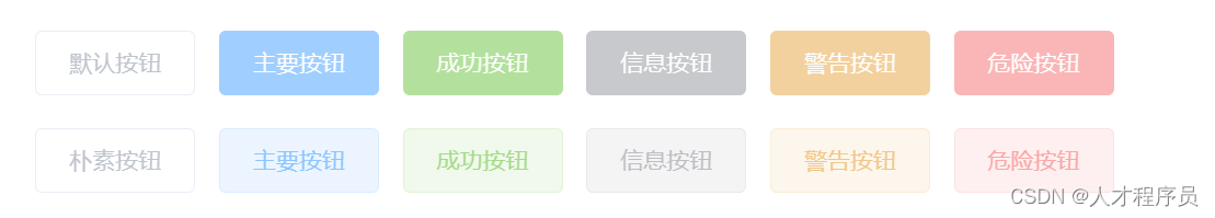
2.1 基礎用法
基礎的按鈕用法。
使用type、plain、round和circle屬性來定義 Button 的樣式。
這些屬性的意義如下:
參數 說明 類型 可選值 默認值
type 類型 string primary / success / warning / danger / info / text —
plain 是否樸素按鈕 boolean — false
round 是否圓角按鈕 boolean — false
circle 是否圓形按鈕 boolean — false
<el-row><el-button>默認按鈕</el-button><el-button type="primary">主要按鈕</el-button><el-button type="success">成功按鈕</el-button><el-button type="info">信息按鈕</el-button><el-button type="warning">警告按鈕</el-button><el-button type="danger">危險按鈕</el-button>
</el-row><el-row><el-button plain>樸素按鈕</el-button><el-button type="primary" plain>主要按鈕</el-button><el-button type="success" plain>成功按鈕</el-button><el-button type="info" plain>信息按鈕</el-button><el-button type="warning" plain>警告按鈕</el-button><el-button type="danger" plain>危險按鈕</el-button>
</el-row><el-row><el-button round>圓角按鈕</el-button><el-button type="primary" round>主要按鈕</el-button><el-button type="success" round>成功按鈕</el-button><el-button type="info" round>信息按鈕</el-button><el-button type="warning" round>警告按鈕</el-button><el-button type="danger" round>危險按鈕</el-button>
</el-row><el-row><el-button icon="el-icon-search" circle></el-button><el-button type="primary" icon="el-icon-edit" circle></el-button><el-button type="success" icon="el-icon-check" circle></el-button><el-button type="info" icon="el-icon-message" circle></el-button><el-button type="warning" icon="el-icon-star-off" circle></el-button><el-button type="danger" icon="el-icon-delete" circle></el-button>
</el-row>
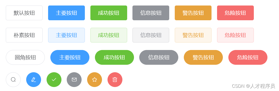
2.2 禁用狀態
按鈕不可用狀態。
<el-row><el-button disabled>默認按鈕</el-button><el-button type="primary" disabled>主要按鈕</el-button><el-button type="success" disabled>成功按鈕</el-button><el-button type="info" disabled>信息按鈕</el-button><el-button type="warning" disabled>警告按鈕</el-button><el-button type="danger" disabled>危險按鈕</el-button>
</el-row><el-row><el-button plain disabled>樸素按鈕</el-button><el-button type="primary" plain disabled>主要按鈕</el-button><el-button type="success" plain disabled>成功按鈕</el-button><el-button type="info" plain disabled>信息按鈕</el-button><el-button type="warning" plain disabled>警告按鈕</el-button><el-button type="danger" plain disabled>危險按鈕</el-button>
</el-row>
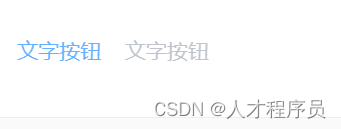
2.3 文字按鈕
沒有邊框和背景色的按鈕。
<el-button type="text">文字按鈕</el-button>
<el-button type="text" disabled>文字按鈕</el-button>
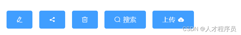
2.4 圖標按鈕
帶圖標的按鈕可增強辨識度(有文字)或節省空間(無文字)。
設置icon屬性即可,icon 的列表可以參考 Element 的 icon 組件,也可以設置在文字右邊的 icon ,只要使用i標簽即可,可以使用自定義圖標。
<el-button type="primary" icon="el-icon-edit"></el-button>
<el-button type="primary" icon="el-icon-share"></el-button>
<el-button type="primary" icon="el-icon-delete"></el-button>
<el-button type="primary" icon="el-icon-search">搜索</el-button>
<el-button type="primary">上傳<i class="el-icon-upload el-icon--right"></i></el-button>
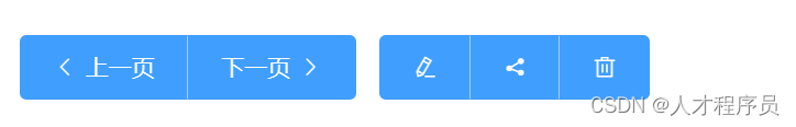
2.5 按鈕組
以按鈕組的方式出現,常用于多項類似操作。
使用<el-button-group>標簽來嵌套你的按鈕。
<el-button-group><el-button type="primary" icon="el-icon-arrow-left">上一頁</el-button><el-button type="primary">下一頁<i class="el-icon-arrow-right el-icon--right"></i></el-button>
</el-button-group>
<el-button-group><el-button type="primary" icon="el-icon-edit"></el-button><el-button type="primary" icon="el-icon-share"></el-button><el-button type="primary" icon="el-icon-delete"></el-button>
</el-button-group>
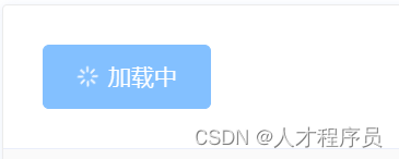
2.6 加載中
點擊按鈕后進行數據加載操作,在按鈕上顯示加載狀態。
要設置為 loading 狀態,只要設置loading屬性為true即可。
<el-button type="primary" :loading="true">加載中</el-button>
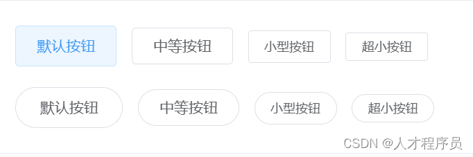
2.7 不同尺寸
Button 組件提供除了默認值以外的三種尺寸,可以在不同場景下選擇合適的按鈕尺寸。
額外的尺寸:medium、small、mini,通過設置size屬性來配置它們。
<el-row><el-button>默認按鈕</el-button><el-button size="medium">中等按鈕</el-button><el-button size="small">小型按鈕</el-button><el-button size="mini">超小按鈕</el-button>
</el-row>
<el-row><el-button round>默認按鈕</el-button><el-button size="medium" round>中等按鈕</el-button><el-button size="small" round>小型按鈕</el-button><el-button size="mini" round>超小按鈕</el-button>
</el-row>
總結
在本文中,我們深入了解了Element-ui中的Icon圖標和Button按鈕的基本用法和實用技巧。Icon圖標為頁面添加了更多的視覺元素,使得界面更加生動;而Button按鈕則是用戶與頁面互動的紐帶,通過豐富的配置選項,我們能夠定制出符合項目需求的按鈕樣式。在實際項目中,熟練掌握這兩個組件的用法,將有助于提升前端界面的設計水平,為用戶提供更好的使用體驗。希望本文能夠為你在Element-ui的使用過程中提供一些有益的參考。


