1. 什么是浮動(Float)?
浮動元素會脫離正常的文檔流(Document Flow),并向左或向右移動,直到碰到父元素的邊緣或另一個浮動元素。
基本語法
.float-left {float: left;
}.float-right {float: right;
}.no-float {float: none; /* 默認值 */
}
2. 浮動的常見應用場景
(1) 文字環繞圖片
<div class="container"><img src="example.jpg" class="float-left" alt="示例圖片"><p>這里是環繞的文字內容……</p>
</div>
效果:圖片浮動在左側,文字自動環繞在其右側。 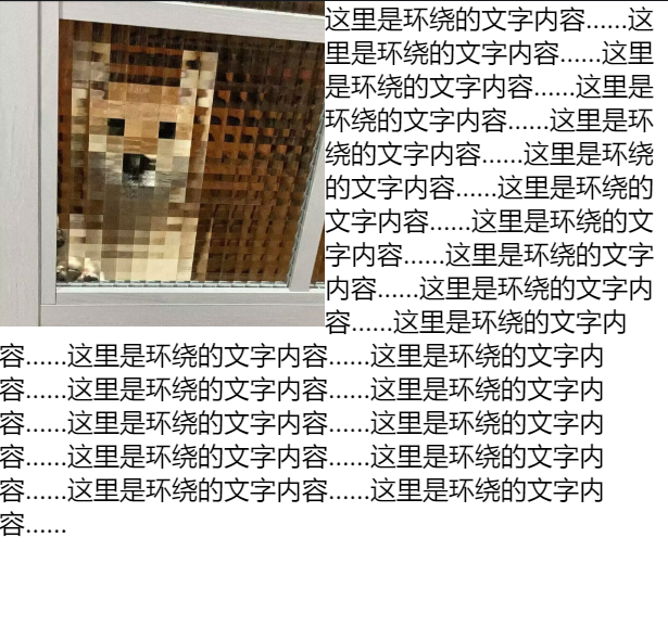
(2) 多列布局(傳統方式)
在 Flexbox 和 Grid 流行之前,浮動是創建多列布局的主要方式。
.father {border: black solid;width: 1250px;margin: 20px;background-color: #f5f5f5;}.left,.right {float: left;margin-left: 10px;}.left {height: 410px;width: 200px;background-color: black;}.right {height: 410px;width: 950px;background-color: blue;}.grandson {height: 188px;width: 200px;background-color: yellow;float: left;margin-left: 30px;margin-top: 10px;}
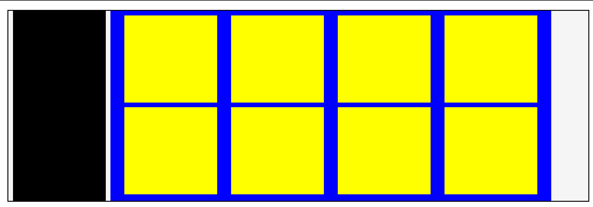
最外黑框線父元素father為文檔流,其所有孩子都為浮動流,黑色區塊left為一列,藍色區塊right為一列。藍色區塊內又有黃色浮動流grandson。
3. 浮動帶來的問題及解決方案
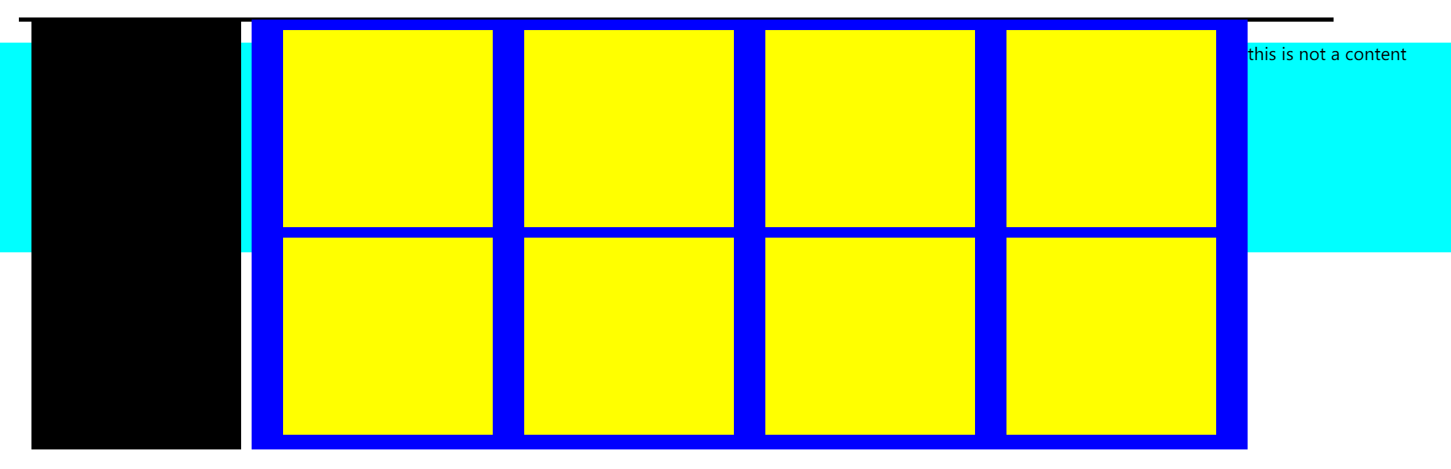
(1) 父元素高度塌陷(Collapsing Parent)
問題:當子元素浮動后,父元素無法自動計算高度,導致布局錯亂。
<body><div class="father"><div class="left"></div><div class="right"><div class="grandson"></div><div class="grandson"></div><div class="grandson"></div><div class="grandson"></div><div class="grandson"></div><div class="grandson"></div><div class="grandson"></div><div class="grandson"></div></div><div class="clear"></div></div><div class="no">this is not a content</div>
</body>
顯示為:
發現父元素高度發生塌陷,后一位文檔流頂了上來。
解決方案:
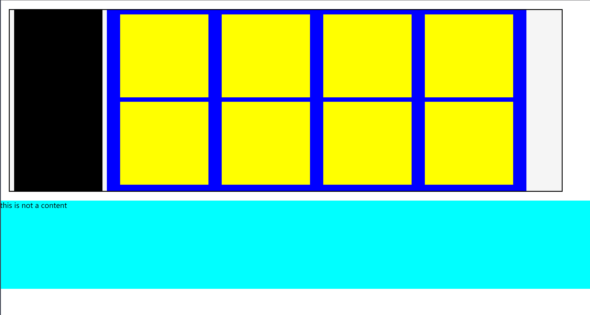
- 方法1:使用
clearfix技巧(推薦).clearfix:after {content: "";display: block;height: 0;clear: both;visibility: hidden;}.clearfix {/* IE6、7 專有 */*zoom: 1;}
成功解決:<div class="father clearfix">
- 方法2:使用額外標簽
============style============
.clear{
clear:both;
}
=============body============
<div class="clear"></div>>
(2) 浮動元素之間的間隙問題
問題:多個浮動元素之間可能出現意外的空白間隙。
原因:HTML 換行符被解析為空格,或 margin 未正確設置。
解決方案:
- 移除 HTML 換行(不推薦)
<div class="float-left"></div><div class="float-left"></div> - 使用
margin調整間距.float-item {float: left;margin-right: 10px; } - 改用 Flexbox 或 Grid(現代布局方案)

------架構概述)

SpringBoot整合Kafka之消費者Consumer)


)


動態API)

)
)


