知識點
1.plot():用于繪制線圖和    散點圖scatter() 函數:plot() 函數可以接受許多可選參數,用于控制圖形的外觀,例如:顏色: color='blue' 控制線條的顏色。線型: linestyle='--' 控制線條的樣式,例如虛線。標記: marker='o' 控制數據點的標記樣式。標記大小: markersize=5 控制標記的大小。標簽: label='sin(x)' 給線條添加一個標簽,用于圖例顯示。  2.scatter():用于繪制散點圖plt.plot(t, s,label='正弦','b--',color='#096')# 繪圖     'b--' 指的是繪制一條藍色的虛線。  -表示實線plt.xlabel('x-變量',fontproperties='STKAITI',fontsize=10)plt.ylabel('y-正弦余弦函數值',fontproperties='STKAITI',fontsize=10)plt.title('sin-cos 函數圖像',fontproperties='STKAITI',fontsize=10)plt.legend(prop=myfont)  #圖例plt.xticks(np.arange(0, 11, step=2))  # 設置 x 軸刻度為 0 到 10,步長為 2plt.yticks([-1, 0, 1])  # 設置 y 軸刻度為 -1, 0, 1scatter()x, y:數據點的 x 和 y 坐標。s:散點的大小,可以是一個標量,也可以是一個數組,用來指定每個散點的大小。默認為 20。c:散點的顏色,可以是單個顏色,也可以是與 x 和 y 具有相同長度的顏色序列。默認為 None,表示使用默認的顏色。marker:散點的標記樣式,如 'o' 表示圓形,'^' 表示三角形,'s' 表示正方形等。默認為 'o'。cmap:指定顏色映射,僅當 c 是一個浮點數數組時才有用。可以是一個 Colormap 對象或者 Colormap 名稱的字符串。默認為 None
3.bar():用于繪制垂直條形圖和水平條形圖
4.hist():用于繪制直方圖 histogram
5.pie():用于繪制餅圖    ax.pie(np.random.random(4),explode=explode,labels=labels,colors=colors,autopct='%1.1f%%',shadow=True,startangle=90,radius=0.25,center=(0,0))
6.imshow():用于繪制圖像
7.subplots():用于創建子圖 nrows:整數,表示子圖網格的行數。ncols:整數,表示子圖網格的列數。index:整數,表示當前激活的子圖的位置編號,編號從1開始,從左到右、從上到下遞增。8.plt.figure()   是 Matplotlib 中用于創建新圖形的函數。它的作用是創建一個新的圖形窗口,以便在其中繪制圖表   plt.figure(figsize=(8, 6), facecolor='lightblue')# 獲取當前圖形的當前軸對象ax = fig.gca()# 在軸對象上進行操作,例如繪制圖形ax.plot([1, 2, 3, 4], [1, 4, 9, 16])ax.set_xlabel(), ax.set_ylabel() 等方法設置軸的標簽。set_xlim(xmin, xmax) 方法用于設置x軸的最小值和最大值ax.set_aspect('equal')      #ax.set_aspect('equal') 確保了坐標軸在水平方向和垂直方向上的比例是相同的,即每個單位長度的像素數量是相等的。
案例:
案例一: 繪制折線圖
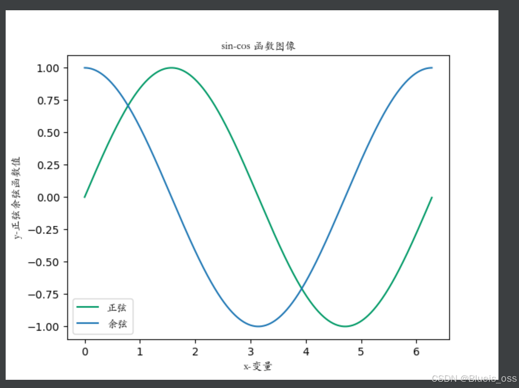
myfont=fm.FontProperties(fname=r'C:\Windows\Fonts\STKAITI.ttf')  #設置字體
t=np.arange(0,2.0*np.pi,0.01)
s=np.sin(t)
z=np.cos(t)xpoints = np.array([0, 5])
ypoints = np.array([0, 100])plt.plot(t, s,label='正弦',color='#096')# 繪圖
plt.plot(t,z,label='余弦')plt.xlabel('x-變量',fontproperties='STKAITI',fontsize=10)
plt.ylabel('y-正弦余弦函數值',fontproperties='STKAITI',fontsize=10)
plt.title('sin-cos 函數圖像',fontproperties='STKAITI',fontsize=10)plt.legend(prop=myfont)  #圖例
plt.show()
案例二:繪制散點圖
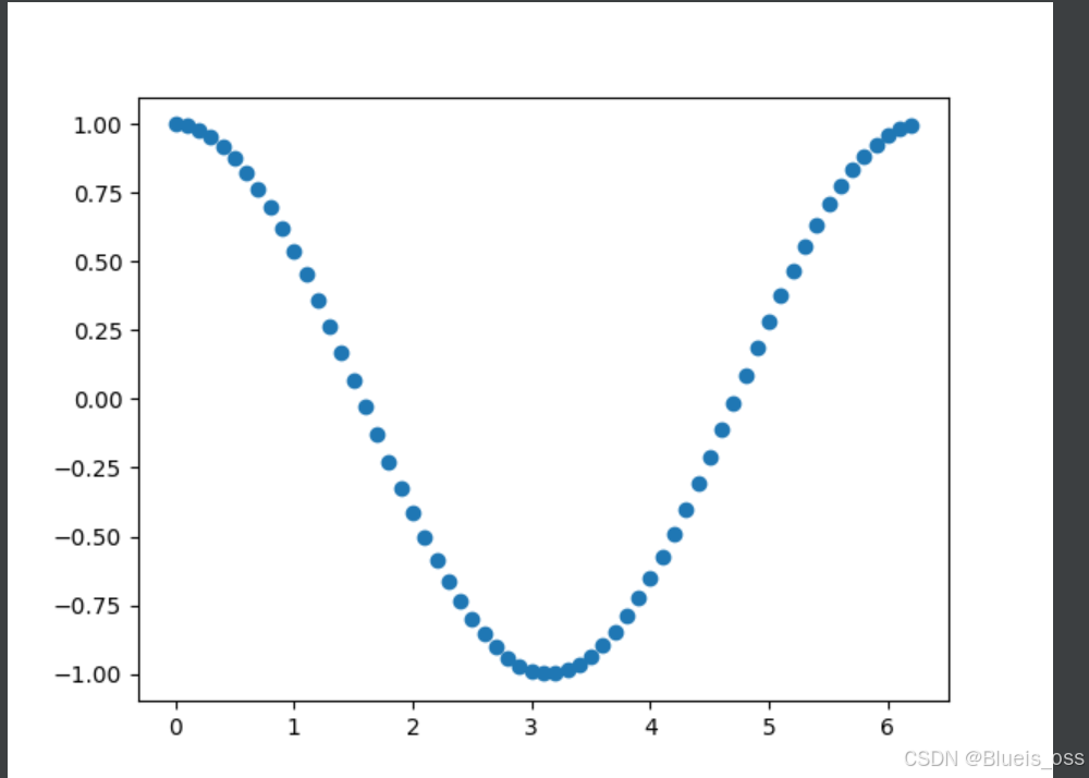
a=np.arange(0,2*np.pi,0.1)
b=np.cos(a)
plt.scatter(a,b)
plt.show()
案例三:繪制星型散點圖
x=np.random.random(100)
y=np.random.random(100)plt.figure()
plt.scatter(x,y,s=x*500,marker='*')
plt.show()
案例四:繪制餅狀圖
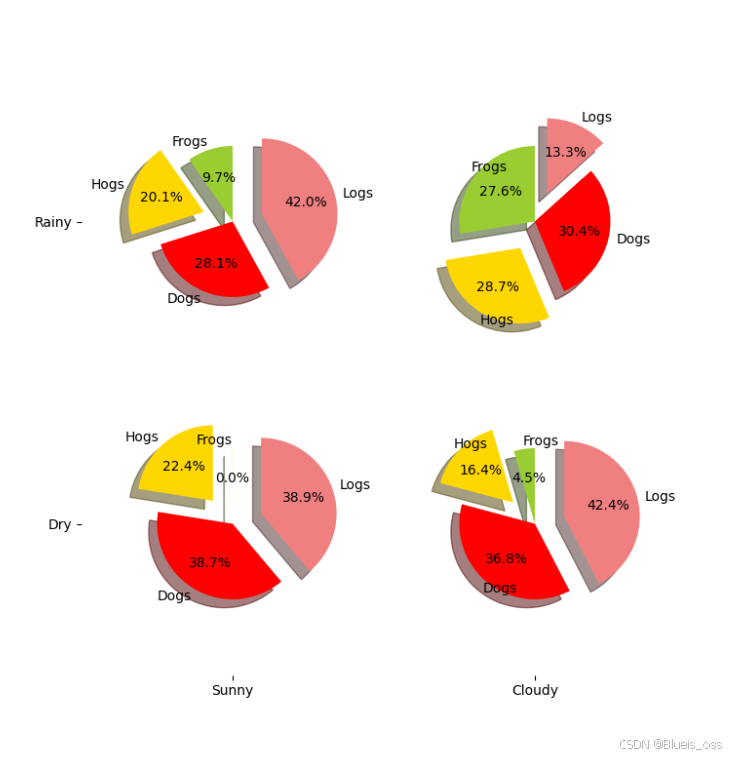
labels='Frogs','Hogs','Dogs','Logs'  #標簽,逆時針繪制扇形圖
sizes=[15,30,45,10]
colors=['yellowgreen','gold','#FF0000','lightcoral']
explode=(0,0.1,0,0.1)fig=plt.figure(figsize=(8,9))
ax=fig.gca()     #獲取軸域ax.pie(np.random.random(4),explode=explode,labels=labels,colors=colors,autopct='%1.1f%%',shadow=True,startangle=90,radius=0.25,center=(0,0))
ax.pie(np.random.random(4),explode=explode,labels=labels,colors=colors,autopct='%1.1f%%',shadow=True,startangle=90,radius=0.25,center=(1,1))
ax.pie(np.random.random(4),explode=explode,labels=labels,colors=colors,autopct='%1.1f%%',shadow=True,startangle=90,radius=0.25,center=(0,1))
ax.pie(np.random.random(4),explode=explode,labels=labels,colors=colors,autopct='%1.1f%%',shadow=True,startangle=90,radius=0.25,center=(1,0))ax.set_xticks([0,1])  #設置顯示刻度的位置
ax.set_yticks([0,1])ax.set_xticklabels(["Sunny","Cloudy"])  #設置刻度上顯示的文本
ax.set_yticklabels(["Dry","Rainy"])
ax.set_xlim((-0.5,1.5))
ax.set_ylim((-0.5,1.5))
ax.set_aspect('equal')      #ax.set_aspect('equal') 確保了坐標軸在水平方向和垂直方向上的比例是相同的,即每個單位長度的像素數量是相等的。plt.show()
案例五:在圖例中顯示公式
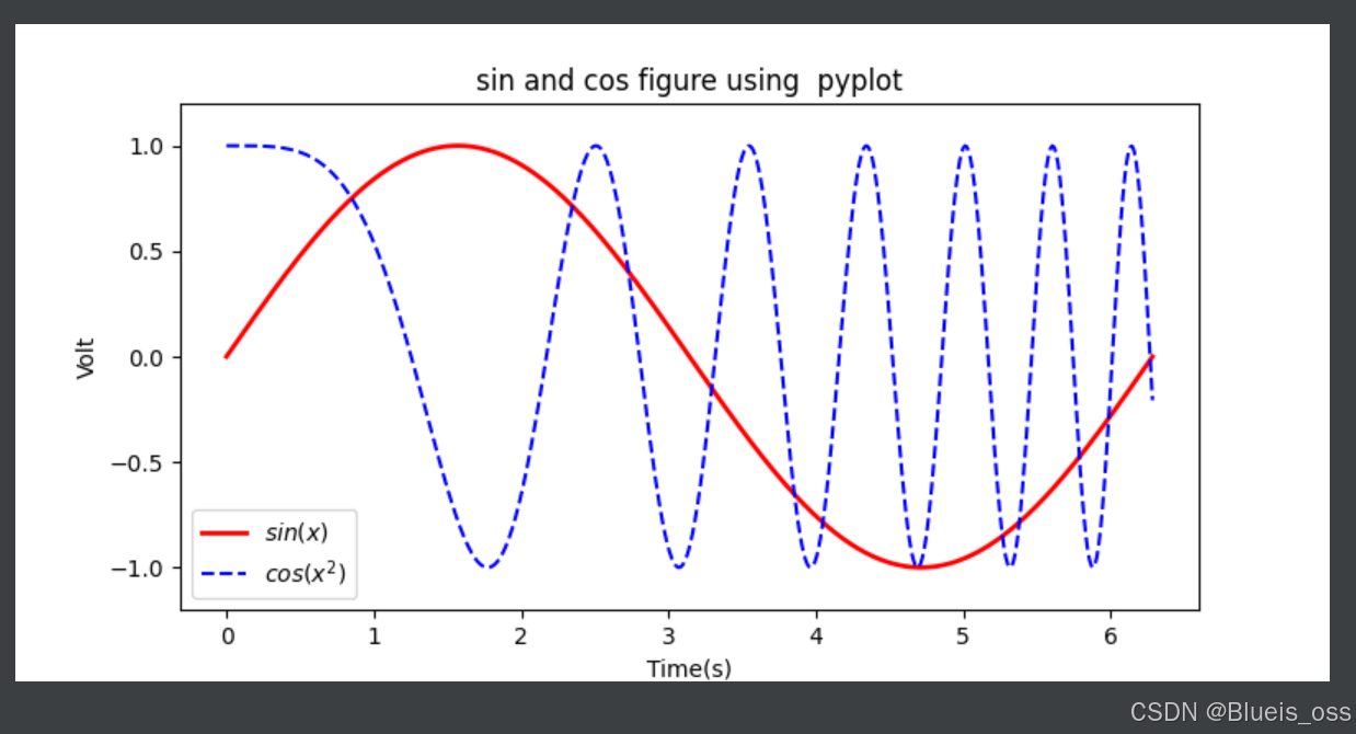
在圖例中顯示公式
x=np.linspace(0,2*np.pi,500)
y=np.sin(x)
z=np.cos(x*x)
plt.figure(figsize=(8,4))plt.plot(x,y,label='$sin(x)$',color='red',linewidth=2)    #紅色  2像素寬
#$ 將其顯示為公式 $
plt.plot(x,z,'b--',label='$cos(x^2)$')                    #藍色  虛線plt.xlabel('Time(s)')
plt.ylabel('Volt')plt.title('sin and cos figure using  pyplot')plt.ylim(-1.2,1.2)
plt.legend()       #顯示圖示plt.show()
案例六:生成子圖
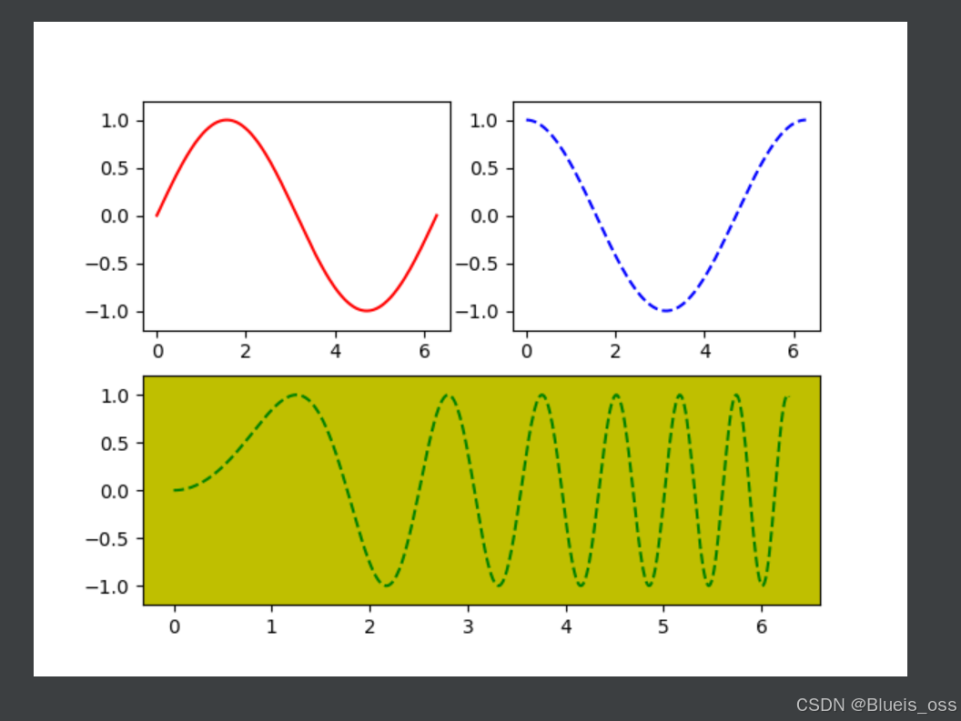
x=np.linspace(0,2*np.pi,500)
y1=np.sin(x)
y2=np.cos(x)
y3=np.sin(x*x)
plt.figure(1)
ax1=plt.subplot(2,2,1)
ax2=plt.subplot(2,2,2)
ax3=plt.subplot(212,facecolor='y')plt.sca(ax1)  #選擇ax1
plt.plot(x,y1,color='red')#繪制紅色曲線
plt.ylim(-1.2,1.2)plt.sca(ax2)
plt.plot(x,y2,'b--') #繪制藍色曲線
plt.ylim(-1.2,1.2)plt.sca(ax3)
plt.plot(x,y3,'g--')
plt.ylim(-1.2,1.2)plt.show()
)


及Python和MATLAB實現)


)

)


