aspect 相關樣式類
基礎樣式
| Class | Properties |
|---|---|
| aspect-auto | aspect-ratio: auto; |
| aspect-square | aspect-ratio: 1 / 1; |
| aspect-video | aspect-ratio: 16 / 9; |
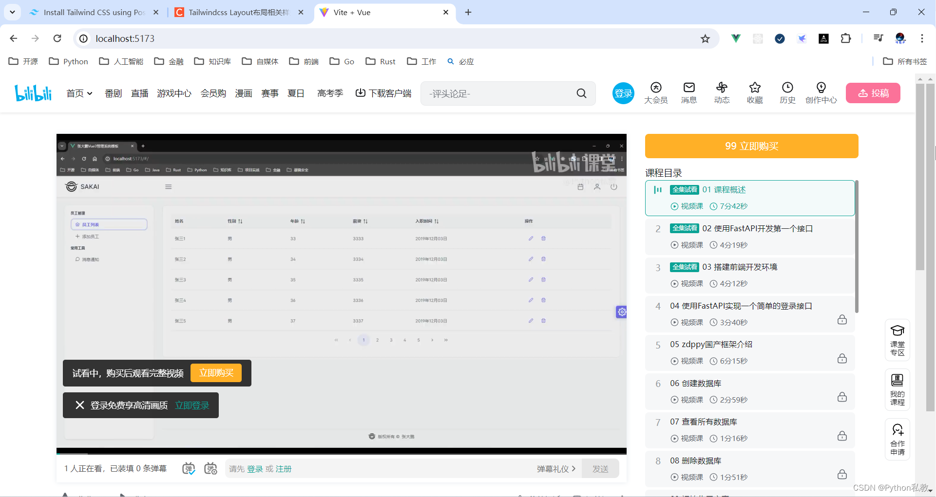
案例:引入B站視頻
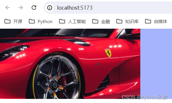
Use the aspect-* utilities to set the desired aspect ratio of an element.
使用’ aspect-* '實用工具來設置元素所需的長寬比。
<script setup>
</script><template><iframe class="w-full aspect-video" src="https://www.bilibili.com/video/av478818261?t=5.4"></iframe>
</template><style scoped>
</style>
Tailwind doesn’t include a large set of aspect ratio values out of the box since it’s easier to just use arbitrary values. See the arbitrary values section for more information.
Tailwind不包含大量的寬高比值,因為使用任意值更容易。更多信息請參見任意值一節。
The aspect-* utilities use the native aspect-ratio CSS property, which was not supported in Safari until version 15. Until Safari 15 is popularized, Tailwind’s aspect-ratio plugin is a good alternative.
“aspect-*”實用程序使用原生的“aspect-ratio”CSS屬性,該屬性在Safari版本15之前不支持。在Safari 15普及之前,Tailwind的長寬比插件是一個不錯的選擇。
container 樣式類
A component for fixing an element’s width to the current breakpoint.
用于將元素的寬度固定到當前斷點的組件。
基礎樣式
| Class | Breakpoint | Properties |
|---|---|---|
| container | None | width: 100%; |
| sm (640px) | max-width: 640px; | |
| md (768px) | max-width: 768px; | |
| lg (1024px) | max-width: 1024px; | |
| xl (1280px) | max-width: 1280px; | |
| 2xl (1536px) | max-width: 1536px; |
The container class sets the max-width of an element to match the min-width of the current breakpoint. This is useful if you’d prefer to design for a fixed set of screen sizes instead of trying to accommodate a fully fluid viewport.
’ container ‘類設置元素的’ max-width ‘以匹配當前斷點的’ min-width '。如果你更愿意設計一組固定的屏幕尺寸,而不是嘗試適應一個完全流動的視口,這是很有用的。
Note that unlike containers you might have used in other frameworks, Tailwind’s container does not center itself automatically and does not have any built-in horizontal padding.
請注意,與您可能在其他框架中使用的容器不同,Tailwind的容器不會自動居中,也沒有任何內置的水平填充
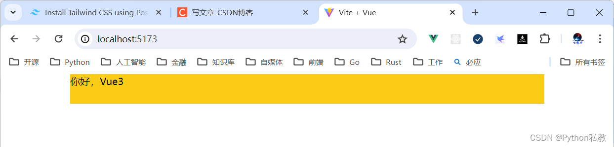
案例:水平居中的容器
To center a container, use the mx-auto utility:
要居中一個容器,使用’ mx-auto '工具:
<template><div><div class="container h-12 bg-yellow-400 mx-auto"><h1>你好,Vue3</h1></div></div>
</template>
代碼解釋:
- container:設置div為容器
- h-12:設置高度
- bg-yellow-400:設置背景色
- mx-auto:自動計算水平外邊距,能夠實現居中效果
案例:添加水平內邊距
To add horizontal padding, use the px-{size} utilities:
要添加水平邊距,使用’ px-{size} '實用程序:
<div class="container mx-auto px-4"><!-- ... -->
</div>
vue3實戰案例:
<template><div class="container mx-auto bg-indigo-500 px-3"><div class="text-3xl bg-purple-500 text-white">這是子元素</div></div>
</template>
Columns 樣式類
Utilities for controlling the number of columns within an element.
用于控制元素內列數的實用程序。
基礎樣式
| Class | Properties |
|---|---|
| columns-1 | columns: 1; |
| columns-2 | columns: 2; |
| columns-3 | columns: 3; |
| columns-4 | columns: 4; |
| columns-5 | columns: 5; |
| columns-6 | columns: 6; |
| columns-7 | columns: 7; |
| columns-8 | columns: 8; |
| columns-9 | columns: 9; |
| columns-10 | columns: 10; |
| columns-11 | columns: 11; |
| columns-12 | columns: 12; |
| columns-auto | columns: auto; |
| columns-3xs | columns: 16rem; /* 256px */ |
| columns-2xs | columns: 18rem; /* 288px */ |
| columns-xs | columns: 20rem; /* 320px */ |
| columns-sm | columns: 24rem; /* 384px */ |
| columns-md | columns: 28rem; /* 448px */ |
| columns-lg | columns: 32rem; /* 512px */ |
| columns-xl | columns: 36rem; /* 576px */ |
| columns-2xl | columns: 42rem; /* 672px */ |
| columns-3xl | columns: 48rem; /* 768px */ |
| columns-4xl | columns: 56rem; /* 896px */ |
| columns-5xl | columns: 64rem; /* 1024px */ |
| columns-6xl | columns: 72rem; /* 1152px */ |
| columns-7xl | columns: 80rem; /* 1280px */ |
基礎樣式總結
columns-1 到 columns-12,設置列數分別為1到12列。
columns-xl 到 columns-7xl,設置每列的寬度,數字越大,寬度越大。
columns-3xs columns-2xs colums-xs columns-sm columns-md columns-lg 自動根據屏幕大小設置列數。
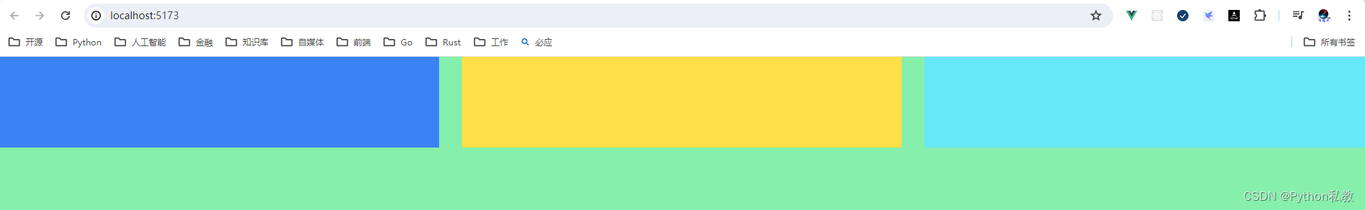
案例:一行三列的布局
代碼解析:
columns-3:一行三列的布局gap-8:每一列的間隙,值越大,間隙越大h-screen:占滿屏幕高度w-full:占滿父容器寬度
<script setup>
</script><template><div class="columns-3 gap-8 bg-green-300 h-screen"><div class="w-full h-32 bg-blue-500"></div><div class="w-full h-32 bg-yellow-300"></div><div class="w-full h-32 bg-cyan-300"></div></div>
</template><style scoped>
</style>
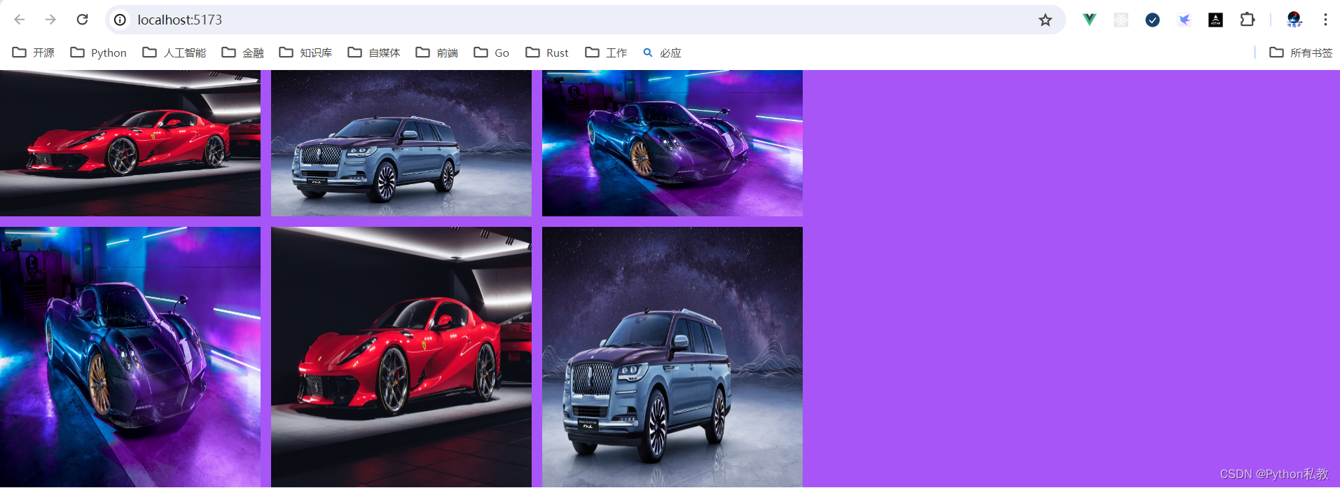
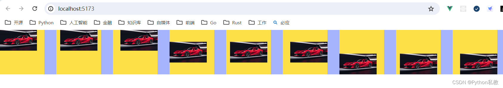
案例:瀑布流圖片
Use the columns-{count} utilities to set the number of columns that should be created for the content within an element. The column width will be automatically adjusted to accommodate that number.
使用“columns-{count}”實用程序設置應為元素內的內容創建的列數。列寬度將自動調整以適應該數字。
vue3實戰案例:
- columns-3:將內容自動拆分成3列,不需要自己手動管理,CSS會對內容自動劃分為3列
- gap-3:設置每列的間距,數字越大,間距越大
- aspect-video:符合視頻長寬比的一種長方形結構
- aspect-square:一種偏向于正方形的結構
<template><div class="columns-3 gap-3"><!--columns-3:將內容自動拆分成3列,不需要自己手動管理,CSS會對內容自動劃分為3列aspect-video:符合視頻長寬比的一種長方形結構aspect-square:一種偏向于正方形的結構--><img class="w-full aspect-video mb-3" src="/1.jpg" /><img class="w-full aspect-square mb-3" src="/2.jpg" /><img class="w-full aspect-video mb-3" src="/3.jpg" /><img class="w-full aspect-square mb-3" src="/1.jpg" /><img class="w-full aspect-video mb-3" src="/2.jpg" /><img class="w-full aspect-square mb-3" src="/3.jpg" /></div>
</template>

案例:通過寬度設置瀑瀑布流圖片
Use the columns-{width} utilities to set the ideal column width for the content within an element, with the number of columns (the count) automatically adjusting to accommodate that value.
使用’ columns-{width} '實用程序為元素內的內容設置理想的列寬度,列數(計數)會自動調整以適應該值。
This “t-shirt” scale is the same as the max-width scale, with the addition of 2xs and 3xs, since smaller columns may be desirable.
這種“t恤”比例與max-width比例相同,增加了“2xs”和“3xs”,因為可能需要更小的列。
vue3示例:
<template><div class="columns-3xs gap-3 bg-purple-500"><!--columns-3xs:columns: 16rem; /* 256px */。即就是說,1列的寬度是256px。aspect-video:符合視頻長寬比的一種長方形結構aspect-square:一種偏向于正方形的結構--><img class="w-full aspect-video mb-3" src="/1.jpg" /><img class="w-full aspect-square mb-3" src="/2.jpg" /><img class="w-full aspect-video mb-3" src="/3.jpg" /><img class="w-full aspect-square mb-3" src="/1.jpg" /><img class="w-full aspect-video mb-3" src="/2.jpg" /><img class="w-full aspect-square mb-3" src="/3.jpg" /></div>
</template>
從結果我們可以發現,父元素是占滿了整個屏幕的。不過,分出來的列沒有將整個屏幕均分以后再換到新的列。
這里看上去就像是固定3列一樣。
break-after 樣式類
Utilities for controlling how a column or page should break after an element.
用于控制列或頁面在元素之后如何中斷的實用程序。
基礎樣式
| Class | Properties |
|---|---|
| break-after-auto | break-after: auto; |
| break-after-avoid | break-after: avoid; |
| break-after-all | break-after: all; |
| break-after-avoid-page | break-after: avoid-page; |
| break-after-page | break-after: page; |
| break-after-left | break-after: left; |
| break-after-right | break-after: right; |
| break-after-column | break-after: column; |
案例:break-after-column自動切換列
Use the break-after-{value} utilities to control how a column or page break should behave after an element. For example, use the break-after-column utility to force a column break after an element.
使用“break-after-{value}”實用程序來控制列或頁分隔符在元素之后的行為。例如,使用’ break-after-column '實用程序強制在元素之后進行列分隔。
vue3示例:
<template><div class="columns-2"><p>第一行</p><p class="break-after-column">加了break-after-column的行</p><p>會從break-after-column的元素自動切換到第二列</p><p>第二列的第二行</p></div>
</template>
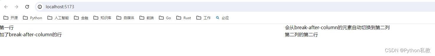
從結果可以觀察到,列會從 break-after-column 修飾的元素之后開始斷開,切換到新的列。
break-before 樣式類
Utilities for controlling how a column or page should break before an element.
用于控制列或頁在元素之前如何中斷的實用程序。
基礎樣式
| Class | Properties |
|---|---|
| break-before-auto | break-before: auto; |
| break-before-avoid | break-before: avoid; |
| break-before-all | break-before: all; |
| break-before-avoid-page | break-before: avoid-page; |
| break-before-page | break-before: page; |
| break-before-left | break-before: left; |
| break-before-right | break-before: right; |
| break-before-column | break-before: column; |
案例:break-before-column自動切換列
Use the break-before-{value} utilities to control how a column or page break should behave before an element. For example, use the break-before-column utility to force a column break before an element.
使用’ break-before-{value} ‘實用程序來控制列或頁分隔符在元素之前的行為。例如,使用’ break-before-column '實用程序強制在元素之前進行列分隔。
vue3示例:
<template><div class="columns-2"><p>第一行</p><p class="break-before-column">加了break-before-column的行</p><p>會從break-before-column元素自動切換到第二列</p><p>第二列的第二行</p></div>
</template>
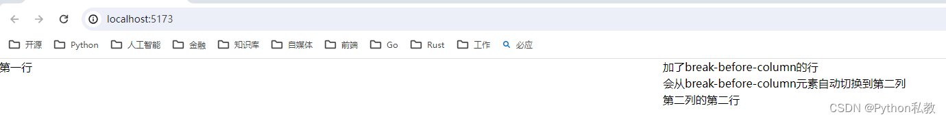
從結果可以看到,列會從 break-before-column 修飾的元素之前自動切換到新的列。
break-inside 樣式類
Utilities for controlling how a column or page should break within an element.
用于控制列或頁面在元素中如何斷開的實用程序。
基礎樣式
| Class | Properties |
|---|---|
| break-inside-auto | break-inside: auto; |
| break-inside-avoid | break-inside: avoid; |
| break-inside-avoid-page | break-inside: avoid-page; |
| break-inside-avoid-column | break-inside: avoid-column; |
案例:break-inside-avoid-column自動切換列
Use the break-inside-{value} utilities to control how a column or page break should behave within an element. For example, use the break-inside-avoid-column utility to avoid a column break within an element.
使用“break-inside-{value}”實用程序來控制列或頁分隔符在元素中的行為。例如,使用’ break-inside-avoid-column '實用工具來避免元素中的列分隔符。
vue3示例:
<template><div class="columns-2"><p>第一行</p><p class="break-inside-avoid-column">加了break-inside-avoid-column的行</p><p>會從break-inside-avoid-column元素自動切換到第二列</p><p>第二列的第二行</p></div>
</template>
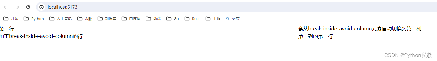
從結果可以看到,會從 break-inside-avoid-column 修飾的元素之后自動切換到新的列。這點和 break-after 類似。
box-decoration 樣式類
Utilities for controlling how element fragments should be rendered across multiple lines, columns, or pages.
用于控制如何跨多行、多列或多頁呈現元素片段的實用程序。
基礎樣式
| Class | Properties |
|---|---|
| box-decoration-clone | box-decoration-break: clone; |
| box-decoration-slice | box-decoration-break: slice; |
案例:文字換行后的漸變方式
Use the box-decoration-slice and box-decoration-clone utilities to control whether properties like background, border, border-image, box-shadow, clip-path, margin, and padding should be rendered as if the element were one continuous fragment, or distinct blocks.
使用“box-decoration-slice”和“box-decoration-clone”實用工具來控制諸如背景、邊框、邊框圖像、box-shadow、clip-path、margin和padding等屬性是否應該呈現為元素是一個連續的片段還是不同的塊。
vue3示例:
<template><span class="box-decoration-slice bg-gradient-to-r from-indigo-600 to-pink-500 text-white px-2">hello,<br/>word</span><span class="box-decoration-clone bg-gradient-to-r from-indigo-600 to-pink-500 text-white px-2">hello,<br/>word</span>
</template>
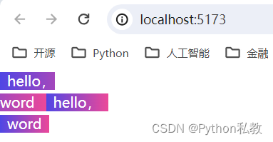
從結果我們可以觀察到:
- box-decoration-slice:換行以后,整體還是一個區域,整體是一個漸變顏色
- box-decoration-clone:換行以后,整體是多個區域,每個區域都有自己獨立的漸變顏色
box 樣式類
Utilities for controlling how the browser should calculate an element’s total size.
用于控制瀏覽器如何計算元素的總大小的實用程序。
基礎樣式
| Class | Properties |
|---|---|
| box-border | box-sizing: border-box; |
| box-content | box-sizing: content-box; |
案例:包含邊框和內邊距
Use box-border to set an element’s box-sizing to border-box, telling the browser to include the element’s borders and padding when you give it a height or width.
使用’ box-border ‘將元素的’ box-sizing ‘設置為’ border-box ',告訴瀏覽器當你設置元素的高度或寬度時,會包含元素的邊框和內邊距。
This means a 100px × 100px element with a 2px border and 4px of padding on all sides will be rendered as 100px × 100px, with an internal content area of 88px × 88px.
這意味著一個100px × 100px的元素,邊框為2px,四周填充為4px,將被渲染為100px × 100px,內部內容區域為88px × 88px。
vue3示例:
<template><div class="box-border h-32 w-32 p-4 border-4 bg-indigo-500"><!-- ... --></div>
</template>
案例:不包含邊框和內邊距
Use box-content to set an element’s box-sizing to content-box, telling the browser to add borders and padding on top of the element’s specified width or height.
使用’ box-content ‘將元素的’ box-sizing ‘設置為’ content-box ',告訴瀏覽器在元素指定的寬度或高度之上添加邊框和填充。
This means a 100px × 100px element with a 2px border and 4px of padding on all sides will actually be rendered as 112px × 112px, with an internal content area of 100px × 100px.
這意味著一個100px × 100px的元素,邊框為2px,四周填充為4px,實際上渲染為112px × 112px,內部內容區域為100px × 100px。
vue3示例:
<template><div class="box-border h-32 w-32 p-4 border-4 bg-indigo-500"><!-- ... --></div><hr><div class="box-content h-32 w-32 p-4 border-4 bg-indigo-500"><!-- ... --></div>
</template>

從結果可以看出來,box-content的盒子明顯比box-border的盒子要大一點。
在實際開發中,建議將盒模型統一轉換為box-border盒模型,這樣能夠避免一些不必要的布局錯誤。
display 樣式類
Utilities for controlling the display box type of an element.
用于控制元素的顯示框類型的實用程序。
基礎樣式類
| Class | Properties |
|---|---|
| block | display: block; |
| inline-block | display: inline-block; |
| inline | display: inline; |
| flex | display: flex; |
| inline-flex | display: inline-flex; |
| table | display: table; |
| inline-table | display: inline-table; |
| table-caption | display: table-caption; |
| table-cell | display: table-cell; |
| table-column | display: table-column; |
| table-column-group | display: table-column-group; |
| table-footer-group | display: table-footer-group; |
| table-header-group | display: table-header-group; |
| table-row-group | display: table-row-group; |
| table-row | display: table-row; |
| flow-root | display: flow-root; |
| grid | display: grid; |
| inline-grid | display: inline-grid; |
| contents | display: contents; |
| list-item | display: list-item; |
| hidden | display: none; |
案例:塊元素和行內元素
Use inline, inline-block, and block to control the flow of text and elements.
使用inline、inline-block和block來控制文本和元素的流動。
vue3示例:
<template><!--inline:將元素設置為行內元素inline-block:將元素設置為行內塊元素block:將元素設置為塊元素--><div>正常是塊級元素<span class="inline bg-blue-500">display: inline 能夠在一行內顯示,不能設置寬高</span><span class="inline-block h-32 bg-red-300">display: inline-block 能夠在一行內顯示且可以設置寬高</span><span class="block w-32 h-32 bg-yellow-300">display: block 會獨占一行</span>其他內容。。。</div>
</template>

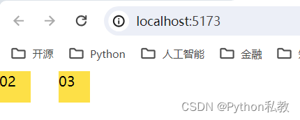
案例:contents內容
使用contents創建一個“幻影”容器,其子容器的行為類似于父容器的直接子容器。
<script setup>
</script><template><div class="flex gap-8"><div class="flex-1 bg-yellow-300">01</div><div class="contents"><div class="flex-1 bg-yellow-300">02</div><div class="flex-1 bg-yellow-300">03</div></div><div class="flex-1 bg-yellow-300">04</div></div>
</template><style scoped>
</style>

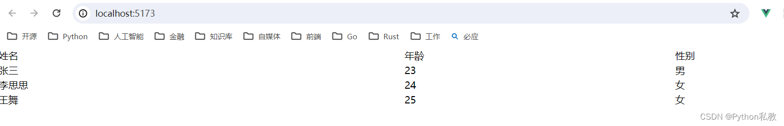
案例:table表格布局
使用table、table-row、table-cell、table- title、table-column、table-column-group、table-header-group、table-row-group和table-foot -group實用工具創建行為類似于各自表元素的元素。
<script setup>
</script><template><!--表格--><div class="table w-full"><!--表頭--><div class="table-header-group"><div class="table-row"><div class="table-cell text-left">姓名</div><div class="table-cell text-left">年齡</div><div class="table-cell text-left">性別</div></div></div><div class="table-row-group"><!--一行--><div class="table-row"><div class="table-cell">張三</div><div class="table-cell">23</div><div class="table-cell">男</div></div><div class="table-row"><div class="table-cell">李思思</div><div class="table-cell">24</div><div class="table-cell">女</div></div><div class="table-row"><div class="table-cell">王舞</div><div class="table-cell">25</div><div class="table-cell">女</div></div></div></div>
</template><style scoped>
</style>
案例:hidden隱藏元素
使用hidden將元素設置為display: none,并將其從頁面布局中移除。
<script setup>
</script><template><div class="flex gap-8"><div class="hidden">01</div><div class="w-9 h-9 bg-yellow-300">02</div><div class="w-9 h-9 bg-yellow-300">03</div></div>
</template><style scoped>
</style>
float 樣式類
Utilities for controlling the wrapping of content around an element.
用于控制圍繞元素的內容包裝的實用程序。
基礎樣式
| Class | Properties |
|---|---|
| float-start | float: inline-start; |
| float-end | float: inline-end; |
| float-right | float: right; |
| float-left | float: left; |
| float-none | float: none; |
案例:float-right 右側浮動
Use float-right to float an element to the right of its container.
使用float-right將元素浮動到其容器的右側。
vue3示例:
<script setup>
import zdpjs_rand from "../zdpjs/zdpjs_rand/index.js";
</script><template><div class="w-3/12 h-32 bg-blue-500"><img class="float-right w-9 h-9 bg-yellow-300"><p>{{ zdpjs_rand.randCaiing()}}</p></div>
</template>
案例:float-left 左側浮動
Use float-left to float an element to the left of its container.
使用float-left將元素浮動到其容器的左側。
vue3示例:
<script setup>
import zdpjs_rand from "../zdpjs/zdpjs_rand/index.js";
</script><template><div class="w-3/12 h-32 bg-blue-500"><img class="float-left w-9 h-9 bg-yellow-300"><p>{{ zdpjs_rand.randCaiing()}}</p></div>
</template>
案例:float-none 禁用浮動
Use float-none to reset any floats that are applied to an element. This is the default value for the float property.
使用float-none重置任何應用于元素的浮動。這是float屬性的默認值。
vue3示例:
<script setup>
import zdpjs_rand from "../zdpjs/zdpjs_rand/index.js";
</script><template><div class="w-3/12 h-32 bg-blue-500"><img class="float-none w-9 h-9 bg-yellow-300"><p>{{ zdpjs_rand.randCaiing()}}</p></div>
</template>
clear 樣式類
Utilities for controlling the wrapping of content around an element.
用于控制圍繞元素的內容包裝的實用程序。
基礎樣式
| Class | Properties |
|---|---|
| clear-start | clear: inline-start; |
| clear-end | clear: inline-end; |
| clear-left | clear: left; |
| clear-right | clear: right; |
| clear-both | clear: both; |
| clear-none | clear: none; |
案例:clear 清除左邊浮動
Use clear-left to position an element below any preceding left-floated elements.
使用’ clear-left '將一個元素定位在前面的左浮動元素的下面。
vue3示例:
<script setup>
import zdpjs_rand from "../zdpjs/zdpjs_rand/index.js";
</script><template><div class="w-3/12 h-32 bg-blue-500"><img class="float-left w-9 h-9 bg-yellow-300"><img class="float-right w-9 h-9 bg-yellow-300"><p class="clear-left">{{ zdpjs_rand.randCaiing()}}</p></div>
</template>
案例:清除右邊浮動
Use clear-right to position an element below any preceding right-floated elements.
使用clear-right將元素定位在前面任何右浮動元素的下方。
vue3示例:
<template><article><img class="float-left w-32" src="/1.jpg"><img class="float-right w-32" src="/2.jpg"><p class="clear-right">{{ zdpjs_rand.randCaiing()}}</p></article>
</template>
<script setup>
import zdpjs_rand from "../zdpjs/zdpjs_rand/index.js";
</script>

案例:清除所有浮動
Use clear-both to position an element below all preceding floated elements.
使用’ clear-both '將元素定位在前面所有浮動元素的下方。
vue3示例:
<template><article><img class="float-left w-32" src="/1.jpg"><img class="float-right w-32" src="/2.jpg"><p class="clear-both">{{ zdpjs_rand.randCaiing()}}</p></article>
</template>
<script setup>
import zdpjs_rand from "../zdpjs/zdpjs_rand/index.js";
</script>
isolation 樣式類
Utilities for controlling whether an element should explicitly create a new stacking context.
用于控制元素是否應該顯式地創建新的堆疊上下文的實用程序。
基礎樣式
| Class | Properties |
|---|---|
| isolate | isolation: isolate; |
| isolation-auto | isolation: auto; |
基本用法
Use the isolate and isolation-auto utilities to control whether an element should explicitly create a new stacking context.
使用isolate和isolation-auto實用程序來控制元素是否應該顯式地創建一個新的堆疊上下文。
<div class="isolate ..."><!-- ... -->
</div>
object-fit 樣式類
Utilities for controlling how a replaced element’s content should be resized.
用于控制如何調整已替換元素的內容大小的實用程序。
基礎樣式
| Class | Properties |
|---|---|
| object-contain | object-fit: contain; |
| object-cover | object-fit: cover; |
| object-fill | object-fit: fill; |
| object-none | object-fit: none; |
| object-scale-down | object-fit: scale-down; |
基本用法
Resize an element’s content to cover its container using object-cover.
使用object-cover調整元素的內容大小以覆蓋其容器。
<div class="bg-indigo-300 ..."><img class="object-cover h-48 w-96 ...">
</div>
案例:覆蓋容器
<template><div class="bg-indigo-300"><img class="object-cover h-48 w-96" src="/1.jpg"></div>
</template>

案例:contain包含圖片
Resize an element’s content to stay contained within its container using object-contain.
使用object-contain調整元素內容的大小,使其保持在其容器內。
<template><div class="bg-indigo-300"><img class="object-contain h-48 w-96" src="/1.jpg"></div>
</template>

案例:fill 填充圖片
Stretch an element’s content to fit its container using object-fill.
使用object-fill拉伸元素的內容以適合其容器。
<template><div class="bg-indigo-300"><img class="object-fill h-48 w-96" src="/1.jpg"></div>
</template>

案例:scale 縮放圖片
Display an element’s content at its original size but scale it down to fit its container if necessary using object-scale-down.
以元素的原始大小顯示元素的內容,但在必要時使用object-scale-down將其縮小以適合其容器。
<template><div class="bg-indigo-300"><img class="object-scale-down h-48 w-96" src="/1.jpg"></div>
</template>

案例:none 使用原始圖片
Display an element’s content at its original size ignoring the container size using object-none.
使用object-none以原始大小顯示元素的內容,忽略容器大小。
<template><div class="bg-indigo-300"><img class="object-none h-48 w-96" src="/1.jpg"></div>
</template>
object-position 樣式類
Utilities for controlling how a replaced element’s content should be positioned within its container.
用于控制已替換元素的內容如何在其容器中定位的實用程序。
基礎樣式
| Class | Properties |
|---|---|
| object-bottom | object-position: bottom; |
| object-center | object-position: center; |
| object-left | object-position: left; |
| object-left-bottom | object-position: left bottom; |
| object-left-top | object-position: left top; |
| object-right | object-position: right; |
| object-right-bottom | object-position: right bottom; |
| object-right-top | object-position: right top; |
| object-top | object-position: top; |
案例:圖片位置
Use the object-{side} utilities to specify how a replaced element’s content should be positioned within its container.
使用object-{side}實用程序來指定被替換元素的內容應該如何在其容器中定位。
<template><div class="bg-indigo-300 flex gap-8"><img class="object-none object-left-top bg-yellow-300  w-[120px] h-[120px] /1-sm.jpg" src="/1-sm.jpg"><img class="object-none object-top bg-yellow-300   w-[120px] h-[120px] /1-sm.jpg" src="/1-sm.jpg"><img class="object-none object-right-top bg-yellow-300   w-[120px] h-[120px] /1-sm.jpg" src="/1-sm.jpg"><img class="object-none object-left bg-yellow-300   w-[120px] h-[120px] /1-sm.jpg" src="/1-sm.jpg"><img class="object-none object-center bg-yellow-300   w-[120px] h-[120px] /1-sm.jpg" src="/1-sm.jpg"><img class="object-none object-right bg-yellow-300   w-[120px] h-[120px] /1-sm.jpg" src="/1-sm.jpg"><img class="object-none object-left-bottom bg-yellow-300   w-[120px] h-[120px] /1-sm.jpg" src="/1-sm.jpg"><img class="object-none object-bottom bg-yellow-300   w-[120px] h-[120px] /1-sm.jpg" src="/1-sm.jpg"><img class="object-none object-right-bottom bg-yellow-300   w-[120px] h-[120px] /1-sm.jpg" src="/1-sm.jpg"></div>
</template>
overflow 樣式類
Utilities for controlling how an element handles content that is too large for the container.
用于控制元素如何處理對容器來說太大的內容的實用程序。
基礎樣式
| Class | Properties |
|---|---|
| overflow-auto | overflow: auto; |
| overflow-hidden | overflow: hidden; |
| overflow-clip | overflow: clip; |
| overflow-visible | overflow: visible; |
| overflow-scroll | overflow: scroll; |
| overflow-x-auto | overflow-x: auto; |
| overflow-y-auto | overflow-y: auto; |
| overflow-x-hidden | overflow-x: hidden; |
| overflow-y-hidden | overflow-y: hidden; |
| overflow-x-clip | overflow-x: clip; |
| overflow-y-clip | overflow-y: clip; |
| overflow-x-visible | overflow-x: visible; |
| overflow-y-visible | overflow-y: visible; |
| overflow-x-scroll | overflow-x: scroll; |
| overflow-y-scroll | overflow-y: scroll; |
案例:超出容器顯示
Use overflow-visible to prevent content within an element from being clipped. Note that any content that overflows the bounds of the element will then be visible.
使用overflow-visible來防止元素中的內容被剪切。注意,任何超出元素邊界的內容都是可見的。
vue3示例:
<script setup>
import zdpjs_rand from "../zdpjs/zdpjs_rand/index.js";
</script><template><div class="w-32 h-12 bg-indigo-500 overflow-visible">{{ zdpjs_rand.randCaiJing() }}</div>
</template>
案例:超出容器隱藏
Use overflow-hidden to clip any content within an element that overflows the bounds of that element.
使用overflow-hidden來截取元素中超出該元素邊界的任何內容。
vue3示例:
<script setup>
import zdpjs_rand from "../zdpjs/zdpjs_rand/index.js";
</script><template><div class="w-32 h-12 bg-indigo-500 overflow-hidden">{{ zdpjs_rand.randCaiJing() }}</div>
</template>
案例:超出容器滾動
Use overflow-auto to add scrollbars to an element in the event that its content overflows the bounds of that element. Unlike overflow-scroll, which always shows scrollbars, this utility will only show them if scrolling is necessary.
使用overflow-auto在元素的內容超出元素邊界的情況下為元素添加滾動條。與總是顯示滾動條的overflow-scroll不同,此實用程序僅在需要滾動時顯示滾動條。
vue3示例:
<script setup>
import zdpjs_rand from "../zdpjs/zdpjs_rand/index.js";
</script><template><div class="w-32 h-12 bg-indigo-500 overflow-auto">{{ zdpjs_rand.randCaiJing() }}</div>
</template>
overscroll-behavior 樣式類
Utilities for controlling how the browser behaves when reaching the boundary of a scrolling area.
用于控制到達滾動區域邊界時瀏覽器行為的實用程序。
基礎樣式
| Class | Properties |
|---|---|
| overscroll-auto | overscroll-behavior: auto; |
| overscroll-contain | overscroll-behavior: contain; |
| overscroll-none | overscroll-behavior: none; |
| overscroll-y-auto | overscroll-behavior-y: auto; |
| overscroll-y-contain | overscroll-behavior-y: contain; |
| overscroll-y-none | overscroll-behavior-y: none; |
| overscroll-x-auto | overscroll-behavior-x: auto; |
| overscroll-x-contain | overscroll-behavior-x: contain; |
| overscroll-x-none | overscroll-behavior-x: none; |
案例:滾動包含
Use overscroll-contain to prevent scrolling in the target area from triggering scrolling in the parent element, but preserve “bounce” effects when scrolling past the end of the container in operating systems that support it.
使用overscroll-contain可以防止目標區域中的滾動觸發父元素中的滾動,但在支持該操作系統的操作系統中,當滾動超過容器的末端時保留“彈跳”效果。
vue3示例:
<script setup>
import zdpjs_rand from "../zdpjs/zdpjs_rand/index.js";
</script><template><div class="w-1/2 h-12 bg-indigo-500 overflow-auto overscroll-contain">{{ zdpjs_rand.randCaiJing() }}</div>
</template>

案例:防止父元素滾動
Use overscroll-none to prevent scrolling in the target area from triggering scrolling in the parent element, and also prevent “bounce” effects when scrolling past the end of the container.
使用overscroll-none可以防止目標區域的滾動觸發父元素的滾動,也可以防止滾動超過容器末端時出現“彈跳”效果。
vue3示例:
<script setup>
import zdpjs_rand from "../zdpjs/zdpjs_rand/index.js";
</script><template><div class="w-1/2 h-12 bg-indigo-500 overflow-auto">{{ zdpjs_rand.randCaiJing() }}<div class="w-1/2 h-12 bg-indigo-500 overflow-auto overscroll-none">{{ zdpjs_rand.randCaiJing() }}</div></div>
</template>
position 樣式類
Utilities for controlling how an element is positioned in the DOM.
用于控制元素在DOM中如何定位的實用程序。
基礎樣式
| Class | Properties |
|---|---|
| static | position: static; |
| fixed | position: fixed; |
| absolute | position: absolute; |
| relative | position: relative; |
| sticky | position: sticky; |
案例:靜態定位和絕對定位
Use static to position an element according to the normal flow of the document.
使用static根據文檔的正常流程來定位元素。
Any offsets will be ignored and the element will not act as a position reference for absolutely positioned children.
任何偏移將被忽略,該元素不會作為絕對定位子元素的位置參考。
如果父元素是靜態定位,則子元素會相對于body元素進行絕對定位。
<script setup>
import zdpjs_rand from "../zdpjs/zdpjs_rand/index.js";
</script><template><div class="static bg-red-300 w-screen h-[300px]"><p>{{ zdpjs_rand.randCaiJing() }}</p><div class="absolute bottom-0 left-0 bg-blue-500"><p>{{ zdpjs_rand.randCaiJing() }}</p></div></div>
</template>
樣式類分析:
- bottom-0:距離底部的距離
- left-0:距離左邊的距離
案例:相對定位和絕對定位
Use relative to position an element according to the normal flow of the document.
使用相對來根據文檔的正常流程定位元素。
Any offsets are calculated relative to the element’s normal position and the element will act as a position reference for absolutely positioned children.
任何偏移量都是相對于元素的正常位置計算的,元素將作為絕對定位子元素的位置參考。
如果父元素是相對定位,則子元素會相對于父元素進行絕對定位。
<script setup>
import zdpjs_rand from "../zdpjs/zdpjs_rand/index.js";
</script><template><div class="relative bg-red-300 w-screen h-[300px]"><p>{{ zdpjs_rand.randCaiJing() }}</p><div class="absolute bottom-0 left-0 bg-blue-500"><p>{{ zdpjs_rand.randCaiJing() }}</p></div></div>
</template>
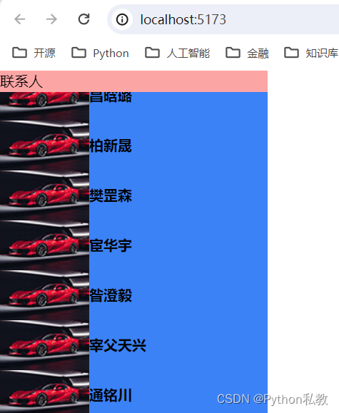
案例:固定定位
Use fixed to position an element relative to the browser window.
使用fixed來定位元素相對于瀏覽器窗口的位置。
<script setup>
import zdpjs_rand from "../zdpjs/zdpjs_rand/index.js";
</script><template><div class="relative bg-blue-500 w-[300px]"><div class="fixed top-0 left-0 right-0 bg-red-300 w-[300px]">聯系人</div><div class="flex flex-col gap-1" v-for="k in 100"><div class="flex items-center" :key="k"><img src="/1-sm.jpg" /><strong>{{zdpjs_rand.randName()}}</strong></div></div></div>
</template>
offset 偏移樣式類
Utilities for controlling the placement of positioned elements.
用于控制已定位元素位置的實用程序。
基礎樣式
| Class | Properties |
|---|---|
| inset-0 | inset: 0px; |
| inset-x-0 | left: 0px; right: 0px; |
| inset-y-0 | top: 0px; bottom: 0px; |
| start-0 | inset-inline-start: 0px; |
| end-0 | inset-inline-end: 0px; |
| top-0 | top: 0px; |
| right-0 | right: 0px; |
| bottom-0 | bottom: 0px; |
| left-0 | left: 0px; |
| inset-px | inset: 1px; |
| inset-x-px | left: 1px; right: 1px; |
| inset-y-px | top: 1px; bottom: 1px; |
| start-px | inset-inline-start: 1px; |
| end-px | inset-inline-end: 1px; |
| top-px | top: 1px; |
| right-px | right: 1px; |
| bottom-px | bottom: 1px; |
| left-px | left: 1px; |
| inset-0.5 | inset: 0.125rem; /* 2px */ |
| inset-x-0.5 | left: 0.125rem; /* 2px / right: 0.125rem; / 2px */ |
| inset-y-0.5 | top: 0.125rem; /* 2px / bottom: 0.125rem; / 2px */ |
| start-0.5 | inset-inline-start: 0.125rem; /* 2px */ |
| end-0.5 | inset-inline-end: 0.125rem; /* 2px */ |
| top-0.5 | top: 0.125rem; /* 2px */ |
| right-0.5 | right: 0.125rem; /* 2px */ |
| bottom-0.5 | bottom: 0.125rem; /* 2px */ |
| left-0.5 | left: 0.125rem; /* 2px */ |
| inset-1 | inset: 0.25rem; /* 4px */ |
| inset-x-1 | left: 0.25rem; /* 4px / right: 0.25rem; / 4px */ |
| inset-y-1 | top: 0.25rem; /* 4px / bottom: 0.25rem; / 4px */ |
| start-1 | inset-inline-start: 0.25rem; /* 4px */ |
| end-1 | inset-inline-end: 0.25rem; /* 4px */ |
| top-1 | top: 0.25rem; /* 4px */ |
| right-1 | right: 0.25rem; /* 4px */ |
| bottom-1 | bottom: 0.25rem; /* 4px */ |
| left-1 | left: 0.25rem; /* 4px */ |
| inset-1.5 | inset: 0.375rem; /* 6px */ |
| inset-x-1.5 | left: 0.375rem; /* 6px / right: 0.375rem; / 6px */ |
| inset-y-1.5 | top: 0.375rem; /* 6px / bottom: 0.375rem; / 6px */ |
| start-1.5 | inset-inline-start: 0.375rem; /* 6px */ |
| end-1.5 | inset-inline-end: 0.375rem; /* 6px */ |
| top-1.5 | top: 0.375rem; /* 6px */ |
| right-1.5 | right: 0.375rem; /* 6px */ |
| bottom-1.5 | bottom: 0.375rem; /* 6px */ |
| left-1.5 | left: 0.375rem; /* 6px */ |
| inset-2 | inset: 0.5rem; /* 8px */ |
| inset-x-2 | left: 0.5rem; /* 8px / right: 0.5rem; / 8px */ |
| inset-y-2 | top: 0.5rem; /* 8px / bottom: 0.5rem; / 8px */ |
| start-2 | inset-inline-start: 0.5rem; /* 8px */ |
| end-2 | inset-inline-end: 0.5rem; /* 8px */ |
| top-2 | top: 0.5rem; /* 8px */ |
| right-2 | right: 0.5rem; /* 8px */ |
| bottom-2 | bottom: 0.5rem; /* 8px */ |
| left-2 | left: 0.5rem; /* 8px */ |
| inset-2.5 | inset: 0.625rem; /* 10px */ |
| inset-x-2.5 | left: 0.625rem; /* 10px / right: 0.625rem; / 10px */ |
| inset-y-2.5 | top: 0.625rem; /* 10px / bottom: 0.625rem; / 10px */ |
| start-2.5 | inset-inline-start: 0.625rem; /* 10px */ |
| end-2.5 | inset-inline-end: 0.625rem; /* 10px */ |
| top-2.5 | top: 0.625rem; /* 10px */ |
| right-2.5 | right: 0.625rem; /* 10px */ |
| bottom-2.5 | bottom: 0.625rem; /* 10px */ |
| left-2.5 | left: 0.625rem; /* 10px */ |
| inset-3 | inset: 0.75rem; /* 12px */ |
| inset-x-3 | left: 0.75rem; /* 12px / right: 0.75rem; / 12px */ |
| inset-y-3 | top: 0.75rem; /* 12px / bottom: 0.75rem; / 12px */ |
| start-3 | inset-inline-start: 0.75rem; /* 12px */ |
| end-3 | inset-inline-end: 0.75rem; /* 12px */ |
| top-3 | top: 0.75rem; /* 12px */ |
| right-3 | right: 0.75rem; /* 12px */ |
| bottom-3 | bottom: 0.75rem; /* 12px */ |
| left-3 | left: 0.75rem; /* 12px */ |
| inset-3.5 | inset: 0.875rem; /* 14px */ |
| inset-x-3.5 | left: 0.875rem; /* 14px / right: 0.875rem; / 14px */ |
| inset-y-3.5 | top: 0.875rem; /* 14px / bottom: 0.875rem; / 14px */ |
| start-3.5 | inset-inline-start: 0.875rem; /* 14px */ |
| end-3.5 | inset-inline-end: 0.875rem; /* 14px */ |
| top-3.5 | top: 0.875rem; /* 14px */ |
| right-3.5 | right: 0.875rem; /* 14px */ |
| bottom-3.5 | bottom: 0.875rem; /* 14px */ |
| left-3.5 | left: 0.875rem; /* 14px */ |
| inset-4 | inset: 1rem; /* 16px */ |
| inset-x-4 | left: 1rem; /* 16px / right: 1rem; / 16px */ |
| inset-y-4 | top: 1rem; /* 16px / bottom: 1rem; / 16px */ |
| start-4 | inset-inline-start: 1rem; /* 16px */ |
| end-4 | inset-inline-end: 1rem; /* 16px */ |
| top-4 | top: 1rem; /* 16px */ |
| right-4 | right: 1rem; /* 16px */ |
| bottom-4 | bottom: 1rem; /* 16px */ |
| left-4 | left: 1rem; /* 16px */ |
| inset-5 | inset: 1.25rem; /* 20px */ |
| inset-x-5 | left: 1.25rem; /* 20px / right: 1.25rem; / 20px */ |
| inset-y-5 | top: 1.25rem; /* 20px / bottom: 1.25rem; / 20px */ |
| start-5 | inset-inline-start: 1.25rem; /* 20px */ |
| end-5 | inset-inline-end: 1.25rem; /* 20px */ |
| top-5 | top: 1.25rem; /* 20px */ |
| right-5 | right: 1.25rem; /* 20px */ |
| bottom-5 | bottom: 1.25rem; /* 20px */ |
| left-5 | left: 1.25rem; /* 20px */ |
| inset-6 | inset: 1.5rem; /* 24px */ |
| inset-x-6 | left: 1.5rem; /* 24px / right: 1.5rem; / 24px */ |
| inset-y-6 | top: 1.5rem; /* 24px / bottom: 1.5rem; / 24px */ |
| start-6 | inset-inline-start: 1.5rem; /* 24px */ |
| end-6 | inset-inline-end: 1.5rem; /* 24px */ |
| top-6 | top: 1.5rem; /* 24px */ |
| right-6 | right: 1.5rem; /* 24px */ |
| bottom-6 | bottom: 1.5rem; /* 24px */ |
| left-6 | left: 1.5rem; /* 24px */ |
| inset-7 | inset: 1.75rem; /* 28px */ |
| inset-x-7 | left: 1.75rem; /* 28px / right: 1.75rem; / 28px */ |
| inset-y-7 | top: 1.75rem; /* 28px / bottom: 1.75rem; / 28px */ |
| start-7 | inset-inline-start: 1.75rem; /* 28px */ |
| end-7 | inset-inline-end: 1.75rem; /* 28px */ |
| top-7 | top: 1.75rem; /* 28px */ |
| right-7 | right: 1.75rem; /* 28px */ |
| bottom-7 | bottom: 1.75rem; /* 28px */ |
| left-7 | left: 1.75rem; /* 28px */ |
| inset-8 | inset: 2rem; /* 32px */ |
| inset-x-8 | left: 2rem; /* 32px / right: 2rem; / 32px */ |
| inset-y-8 | top: 2rem; /* 32px / bottom: 2rem; / 32px */ |
| start-8 | inset-inline-start: 2rem; /* 32px */ |
| end-8 | inset-inline-end: 2rem; /* 32px */ |
| top-8 | top: 2rem; /* 32px */ |
| right-8 | right: 2rem; /* 32px */ |
| bottom-8 | bottom: 2rem; /* 32px */ |
| left-8 | left: 2rem; /* 32px */ |
| inset-9 | inset: 2.25rem; /* 36px */ |
| inset-x-9 | left: 2.25rem; /* 36px / right: 2.25rem; / 36px */ |
| inset-y-9 | top: 2.25rem; /* 36px / bottom: 2.25rem; / 36px */ |
| start-9 | inset-inline-start: 2.25rem; /* 36px */ |
| end-9 | inset-inline-end: 2.25rem; /* 36px */ |
| top-9 | top: 2.25rem; /* 36px */ |
| right-9 | right: 2.25rem; /* 36px */ |
| bottom-9 | bottom: 2.25rem; /* 36px */ |
| left-9 | left: 2.25rem; /* 36px */ |
| inset-10 | inset: 2.5rem; /* 40px */ |
| inset-x-10 | left: 2.5rem; /* 40px / right: 2.5rem; / 40px */ |
| inset-y-10 | top: 2.5rem; /* 40px / bottom: 2.5rem; / 40px */ |
| start-10 | inset-inline-start: 2.5rem; /* 40px */ |
| end-10 | inset-inline-end: 2.5rem; /* 40px */ |
| top-10 | top: 2.5rem; /* 40px */ |
| right-10 | right: 2.5rem; /* 40px */ |
| bottom-10 | bottom: 2.5rem; /* 40px */ |
| left-10 | left: 2.5rem; /* 40px */ |
| inset-11 | inset: 2.75rem; /* 44px */ |
| inset-x-11 | left: 2.75rem; /* 44px / right: 2.75rem; / 44px */ |
| inset-y-11 | top: 2.75rem; /* 44px / bottom: 2.75rem; / 44px */ |
| start-11 | inset-inline-start: 2.75rem; /* 44px */ |
| end-11 | inset-inline-end: 2.75rem; /* 44px */ |
| top-11 | top: 2.75rem; /* 44px */ |
| right-11 | right: 2.75rem; /* 44px */ |
| bottom-11 | bottom: 2.75rem; /* 44px */ |
| left-11 | left: 2.75rem; /* 44px */ |
| inset-12 | inset: 3rem; /* 48px */ |
| inset-x-12 | left: 3rem; /* 48px / right: 3rem; / 48px */ |
| inset-y-12 | top: 3rem; /* 48px / bottom: 3rem; / 48px */ |
| start-12 | inset-inline-start: 3rem; /* 48px */ |
| end-12 | inset-inline-end: 3rem; /* 48px */ |
| top-12 | top: 3rem; /* 48px */ |
| right-12 | right: 3rem; /* 48px */ |
| bottom-12 | bottom: 3rem; /* 48px */ |
| left-12 | left: 3rem; /* 48px */ |
| inset-14 | inset: 3.5rem; /* 56px */ |
| inset-x-14 | left: 3.5rem; /* 56px / right: 3.5rem; / 56px */ |
| inset-y-14 | top: 3.5rem; /* 56px / bottom: 3.5rem; / 56px */ |
| start-14 | inset-inline-start: 3.5rem; /* 56px */ |
| end-14 | inset-inline-end: 3.5rem; /* 56px */ |
| top-14 | top: 3.5rem; /* 56px */ |
| right-14 | right: 3.5rem; /* 56px */ |
| bottom-14 | bottom: 3.5rem; /* 56px */ |
| left-14 | left: 3.5rem; /* 56px */ |
| inset-16 | inset: 4rem; /* 64px */ |
| inset-x-16 | left: 4rem; /* 64px / right: 4rem; / 64px */ |
| inset-y-16 | top: 4rem; /* 64px / bottom: 4rem; / 64px */ |
| start-16 | inset-inline-start: 4rem; /* 64px */ |
| end-16 | inset-inline-end: 4rem; /* 64px */ |
| top-16 | top: 4rem; /* 64px */ |
| right-16 | right: 4rem; /* 64px */ |
| bottom-16 | bottom: 4rem; /* 64px */ |
| left-16 | left: 4rem; /* 64px */ |
| inset-20 | inset: 5rem; /* 80px */ |
| inset-x-20 | left: 5rem; /* 80px / right: 5rem; / 80px */ |
| inset-y-20 | top: 5rem; /* 80px / bottom: 5rem; / 80px */ |
| start-20 | inset-inline-start: 5rem; /* 80px */ |
| end-20 | inset-inline-end: 5rem; /* 80px */ |
| top-20 | top: 5rem; /* 80px */ |
| right-20 | right: 5rem; /* 80px */ |
| bottom-20 | bottom: 5rem; /* 80px */ |
| left-20 | left: 5rem; /* 80px */ |
| inset-24 | inset: 6rem; /* 96px */ |
| inset-x-24 | left: 6rem; /* 96px / right: 6rem; / 96px */ |
| inset-y-24 | top: 6rem; /* 96px / bottom: 6rem; / 96px */ |
| start-24 | inset-inline-start: 6rem; /* 96px */ |
| end-24 | inset-inline-end: 6rem; /* 96px */ |
| top-24 | top: 6rem; /* 96px */ |
| right-24 | right: 6rem; /* 96px */ |
| bottom-24 | bottom: 6rem; /* 96px */ |
| left-24 | left: 6rem; /* 96px */ |
| inset-28 | inset: 7rem; /* 112px */ |
| inset-x-28 | left: 7rem; /* 112px / right: 7rem; / 112px */ |
| inset-y-28 | top: 7rem; /* 112px / bottom: 7rem; / 112px */ |
| start-28 | inset-inline-start: 7rem; /* 112px */ |
| end-28 | inset-inline-end: 7rem; /* 112px */ |
| top-28 | top: 7rem; /* 112px */ |
| right-28 | right: 7rem; /* 112px */ |
| bottom-28 | bottom: 7rem; /* 112px */ |
| left-28 | left: 7rem; /* 112px */ |
| inset-32 | inset: 8rem; /* 128px */ |
| inset-x-32 | left: 8rem; /* 128px / right: 8rem; / 128px */ |
| inset-y-32 | top: 8rem; /* 128px / bottom: 8rem; / 128px */ |
| start-32 | inset-inline-start: 8rem; /* 128px */ |
| end-32 | inset-inline-end: 8rem; /* 128px */ |
| top-32 | top: 8rem; /* 128px */ |
| right-32 | right: 8rem; /* 128px */ |
| bottom-32 | bottom: 8rem; /* 128px */ |
| left-32 | left: 8rem; /* 128px */ |
| inset-36 | inset: 9rem; /* 144px */ |
| inset-x-36 | left: 9rem; /* 144px / right: 9rem; / 144px */ |
| inset-y-36 | top: 9rem; /* 144px / bottom: 9rem; / 144px */ |
| start-36 | inset-inline-start: 9rem; /* 144px */ |
| end-36 | inset-inline-end: 9rem; /* 144px */ |
| top-36 | top: 9rem; /* 144px */ |
| right-36 | right: 9rem; /* 144px */ |
| bottom-36 | bottom: 9rem; /* 144px */ |
| left-36 | left: 9rem; /* 144px */ |
| inset-40 | inset: 10rem; /* 160px */ |
| inset-x-40 | left: 10rem; /* 160px / right: 10rem; / 160px */ |
| inset-y-40 | top: 10rem; /* 160px / bottom: 10rem; / 160px */ |
| start-40 | inset-inline-start: 10rem; /* 160px */ |
| end-40 | inset-inline-end: 10rem; /* 160px */ |
| top-40 | top: 10rem; /* 160px */ |
| right-40 | right: 10rem; /* 160px */ |
| bottom-40 | bottom: 10rem; /* 160px */ |
| left-40 | left: 10rem; /* 160px */ |
| inset-44 | inset: 11rem; /* 176px */ |
| inset-x-44 | left: 11rem; /* 176px / right: 11rem; / 176px */ |
| inset-y-44 | top: 11rem; /* 176px / bottom: 11rem; / 176px */ |
| start-44 | inset-inline-start: 11rem; /* 176px */ |
| end-44 | inset-inline-end: 11rem; /* 176px */ |
| top-44 | top: 11rem; /* 176px */ |
| right-44 | right: 11rem; /* 176px */ |
| bottom-44 | bottom: 11rem; /* 176px */ |
| left-44 | left: 11rem; /* 176px */ |
| inset-48 | inset: 12rem; /* 192px */ |
| inset-x-48 | left: 12rem; /* 192px / right: 12rem; / 192px */ |
| inset-y-48 | top: 12rem; /* 192px / bottom: 12rem; / 192px */ |
| start-48 | inset-inline-start: 12rem; /* 192px */ |
| end-48 | inset-inline-end: 12rem; /* 192px */ |
| top-48 | top: 12rem; /* 192px */ |
| right-48 | right: 12rem; /* 192px */ |
| bottom-48 | bottom: 12rem; /* 192px */ |
| left-48 | left: 12rem; /* 192px */ |
| inset-52 | inset: 13rem; /* 208px */ |
| inset-x-52 | left: 13rem; /* 208px / right: 13rem; / 208px */ |
| inset-y-52 | top: 13rem; /* 208px / bottom: 13rem; / 208px */ |
| start-52 | inset-inline-start: 13rem; /* 208px */ |
| end-52 | inset-inline-end: 13rem; /* 208px */ |
| top-52 | top: 13rem; /* 208px */ |
| right-52 | right: 13rem; /* 208px */ |
| bottom-52 | bottom: 13rem; /* 208px */ |
| left-52 | left: 13rem; /* 208px */ |
| inset-56 | inset: 14rem; /* 224px */ |
| inset-x-56 | left: 14rem; /* 224px / right: 14rem; / 224px */ |
| inset-y-56 | top: 14rem; /* 224px / bottom: 14rem; / 224px */ |
| start-56 | inset-inline-start: 14rem; /* 224px */ |
| end-56 | inset-inline-end: 14rem; /* 224px */ |
| top-56 | top: 14rem; /* 224px */ |
| right-56 | right: 14rem; /* 224px */ |
| bottom-56 | bottom: 14rem; /* 224px */ |
| left-56 | left: 14rem; /* 224px */ |
| inset-60 | inset: 15rem; /* 240px */ |
| inset-x-60 | left: 15rem; /* 240px / right: 15rem; / 240px */ |
| inset-y-60 | top: 15rem; /* 240px / bottom: 15rem; / 240px */ |
| start-60 | inset-inline-start: 15rem; /* 240px */ |
| end-60 | inset-inline-end: 15rem; /* 240px */ |
| top-60 | top: 15rem; /* 240px */ |
| right-60 | right: 15rem; /* 240px */ |
| bottom-60 | bottom: 15rem; /* 240px */ |
| left-60 | left: 15rem; /* 240px */ |
| inset-64 | inset: 16rem; /* 256px */ |
| inset-x-64 | left: 16rem; /* 256px / right: 16rem; / 256px */ |
| inset-y-64 | top: 16rem; /* 256px / bottom: 16rem; / 256px */ |
| start-64 | inset-inline-start: 16rem; /* 256px */ |
| end-64 | inset-inline-end: 16rem; /* 256px */ |
| top-64 | top: 16rem; /* 256px */ |
| right-64 | right: 16rem; /* 256px */ |
| bottom-64 | bottom: 16rem; /* 256px */ |
| left-64 | left: 16rem; /* 256px */ |
| inset-72 | inset: 18rem; /* 288px */ |
| inset-x-72 | left: 18rem; /* 288px / right: 18rem; / 288px */ |
| inset-y-72 | top: 18rem; /* 288px / bottom: 18rem; / 288px */ |
| start-72 | inset-inline-start: 18rem; /* 288px */ |
| end-72 | inset-inline-end: 18rem; /* 288px */ |
| top-72 | top: 18rem; /* 288px */ |
| right-72 | right: 18rem; /* 288px */ |
| bottom-72 | bottom: 18rem; /* 288px */ |
| left-72 | left: 18rem; /* 288px */ |
| inset-80 | inset: 20rem; /* 320px */ |
| inset-x-80 | left: 20rem; /* 320px / right: 20rem; / 320px */ |
| inset-y-80 | top: 20rem; /* 320px / bottom: 20rem; / 320px */ |
| start-80 | inset-inline-start: 20rem; /* 320px */ |
| end-80 | inset-inline-end: 20rem; /* 320px */ |
| top-80 | top: 20rem; /* 320px */ |
| right-80 | right: 20rem; /* 320px */ |
| bottom-80 | bottom: 20rem; /* 320px */ |
| left-80 | left: 20rem; /* 320px */ |
| inset-96 | inset: 24rem; /* 384px */ |
| inset-x-96 | left: 24rem; /* 384px / right: 24rem; / 384px */ |
| inset-y-96 | top: 24rem; /* 384px / bottom: 24rem; / 384px */ |
| start-96 | inset-inline-start: 24rem; /* 384px */ |
| end-96 | inset-inline-end: 24rem; /* 384px */ |
| top-96 | top: 24rem; /* 384px */ |
| right-96 | right: 24rem; /* 384px */ |
| bottom-96 | bottom: 24rem; /* 384px */ |
| left-96 | left: 24rem; /* 384px */ |
| inset-auto | inset: auto; |
| inset-1/2 | inset: 50%; |
| inset-1/3 | inset: 33.333333%; |
| inset-2/3 | inset: 66.666667%; |
| inset-1/4 | inset: 25%; |
| inset-2/4 | inset: 50%; |
| inset-3/4 | inset: 75%; |
| inset-full | inset: 100%; |
| inset-x-auto | left: auto; right: auto; |
| inset-x-1/2 | left: 50%; right: 50%; |
| inset-x-1/3 | left: 33.333333%; right: 33.333333%; |
| inset-x-2/3 | left: 66.666667%; right: 66.666667%; |
| inset-x-1/4 | left: 25%; right: 25%; |
| inset-x-2/4 | left: 50%; right: 50%; |
| inset-x-3/4 | left: 75%; right: 75%; |
| inset-x-full | left: 100%; right: 100%; |
| inset-y-auto | top: auto; bottom: auto; |
| inset-y-1/2 | top: 50%; bottom: 50%; |
| inset-y-1/3 | top: 33.333333%; bottom: 33.333333%; |
| inset-y-2/3 | top: 66.666667%; bottom: 66.666667%; |
| inset-y-1/4 | top: 25%; bottom: 25%; |
| inset-y-2/4 | top: 50%; bottom: 50%; |
| inset-y-3/4 | top: 75%; bottom: 75%; |
| inset-y-full | top: 100%; bottom: 100%; |
| start-auto | inset-inline-start: auto; |
| start-1/2 | inset-inline-start: 50%; |
| start-1/3 | inset-inline-start: 33.333333%; |
| start-2/3 | inset-inline-start: 66.666667%; |
| start-1/4 | inset-inline-start: 25%; |
| start-2/4 | inset-inline-start: 50%; |
| start-3/4 | inset-inline-start: 75%; |
| start-full | inset-inline-start: 100%; |
| end-auto | inset-inline-end: auto; |
| end-1/2 | inset-inline-end: 50%; |
| end-1/3 | inset-inline-end: 33.333333%; |
| end-2/3 | inset-inline-end: 66.666667%; |
| end-1/4 | inset-inline-end: 25%; |
| end-2/4 | inset-inline-end: 50%; |
| end-3/4 | inset-inline-end: 75%; |
| end-full | inset-inline-end: 100%; |
| top-auto | top: auto; |
| top-1/2 | top: 50%; |
| top-1/3 | top: 33.333333%; |
| top-2/3 | top: 66.666667%; |
| top-1/4 | top: 25%; |
| top-2/4 | top: 50%; |
| top-3/4 | top: 75%; |
| top-full | top: 100%; |
| right-auto | right: auto; |
| right-1/2 | right: 50%; |
| right-1/3 | right: 33.333333%; |
| right-2/3 | right: 66.666667%; |
| right-1/4 | right: 25%; |
| right-2/4 | right: 50%; |
| right-3/4 | right: 75%; |
| right-full | right: 100%; |
| bottom-auto | bottom: auto; |
| bottom-1/2 | bottom: 50%; |
| bottom-1/3 | bottom: 33.333333%; |
| bottom-2/3 | bottom: 66.666667%; |
| bottom-1/4 | bottom: 25%; |
| bottom-2/4 | bottom: 50%; |
| bottom-3/4 | bottom: 75%; |
| bottom-full | bottom: 100%; |
| left-auto | left: auto; |
| left-1/2 | left: 50%; |
| left-1/3 | left: 33.333333%; |
| left-2/3 | left: 66.666667%; |
| left-1/4 | left: 25%; |
| left-2/4 | left: 50%; |
| left-3/4 | left: 75%; |
| left-full | left: 100%; |
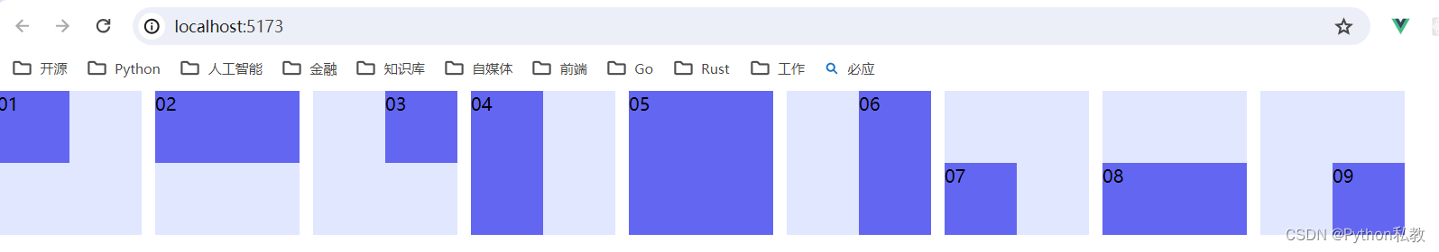
案例:偏移綜合案例
Use the {top|right|bottom|left|inset}-{size} utilities to set the horizontal or vertical position of a positioned element.
使用’ {top|right|bottom|left|inset}-{size} '實用程序來設置[定位元素]的水平或垂直位置(https://www.tailwindcss.cn/docs/position)。
<template><div class="flex gap-3"><!-- Pin to top left corner --><div class="relative h-32 w-32 bg-indigo-100"><div class="absolute left-0 top-0 h-16 w-16 bg-indigo-500">01</div></div><!-- Span top edge --><div class="relative h-32 w-32 bg-indigo-100"><div class="absolute inset-x-0 top-0 h-16 bg-indigo-500">02</div></div><!-- Pin to top right corner --><div class="relative h-32 w-32 bg-indigo-100"><div class="absolute top-0 right-0 h-16 w-16 bg-indigo-500">03</div></div><!-- Span left edge --><div class="relative h-32 w-32 bg-indigo-100"><div class="absolute inset-y-0 left-0 w-16 bg-indigo-500">04</div></div><!-- Fill entire parent --><div class="relative h-32 w-32 bg-indigo-100"><div class="absolute inset-0 bg-indigo-500">05</div></div><!-- Span right edge --><div class="relative h-32 w-32 bg-indigo-100"><div class="absolute inset-y-0 right-0 w-16 bg-indigo-500">06</div></div><!-- Pin to bottom left corner --><div class="relative h-32 w-32 bg-indigo-100"><div class="absolute bottom-0 left-0 h-16 w-16 bg-indigo-500">07</div></div><!-- Span bottom edge --><div class="relative h-32 w-32 bg-indigo-100"><div class="absolute inset-x-0 bottom-0 h-16 bg-indigo-500">08</div></div><!-- Pin to bottom right corner --><div class="relative h-32 w-32 bg-indigo-100"><div class="absolute bottom-0 right-0 h-16 w-16 bg-indigo-500">09</div></div></div>
</template>
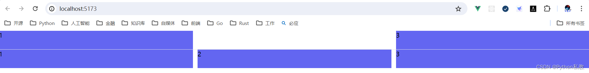
visibility 樣式類
Utilities for controlling the visibility of an element.
用于控制元素可見性的實用程序。
基礎樣式
| Class | Properties |
|---|---|
| visible | visibility: visible; |
| invisible | visibility: hidden; |
| collapse | visibility: collapse; |
案例:隱藏元素
Use invisible to hide an element, but still maintain its place in the DOM, affecting the layout of other elements (compare with hidden from the display documentation).
使用不可見來隱藏元素,但仍然保持其在DOM中的位置,影響其他元素的布局(與顯示文檔中的隱藏相比)。
vue3示例:
<template><div class="grid grid-cols-3 gap-3"><div class="h-12 bg-indigo-500">1</div><div class="h-12 bg-indigo-500 invisible">2</div><div class="h-12 bg-indigo-500">3</div></div><hr><div class="grid grid-cols-3 gap-3"><div class="h-12 bg-indigo-500">1</div><div class="h-12 bg-indigo-500 visible">2</div><div class="h-12 bg-indigo-500">3</div></div>
</template>
z-index 樣式類
Utilities for controlling the stack order of an element.
用于控制元素的堆棧順序的實用程序。
基礎樣式
| Class | Properties |
|---|---|
| z-0 | z-index: 0; |
| z-10 | z-index: 10; |
| z-20 | z-index: 20; |
| z-30 | z-index: 30; |
| z-40 | z-index: 40; |
| z-50 | z-index: 50; |
| z-auto | z-index: auto; |


——體系:數據采集——概述、關注焦點)


![[數據集][目標檢測]水下管道泄漏破損檢測數據集VOC+YOLO格式2069張2類別](http://pic.xiahunao.cn/[數據集][目標檢測]水下管道泄漏破損檢測數據集VOC+YOLO格式2069張2類別)
《必備資料(13) - 論文串講-干系人管理》)

)


《必備資料(12) - 論文串講-溝通管理》)


