
摘要:
今天寫樣式遇到一個東西,就是需要表單居右顯示的,但是作用了彈性布局,其他的都不行的,一開始使用了浮動,但是使用了浮動后盒子就不繼承父盒子的寬度了,移動端還行,自動回到100%狀態,但是pc端寬屏的時候就被吃掉了一截!
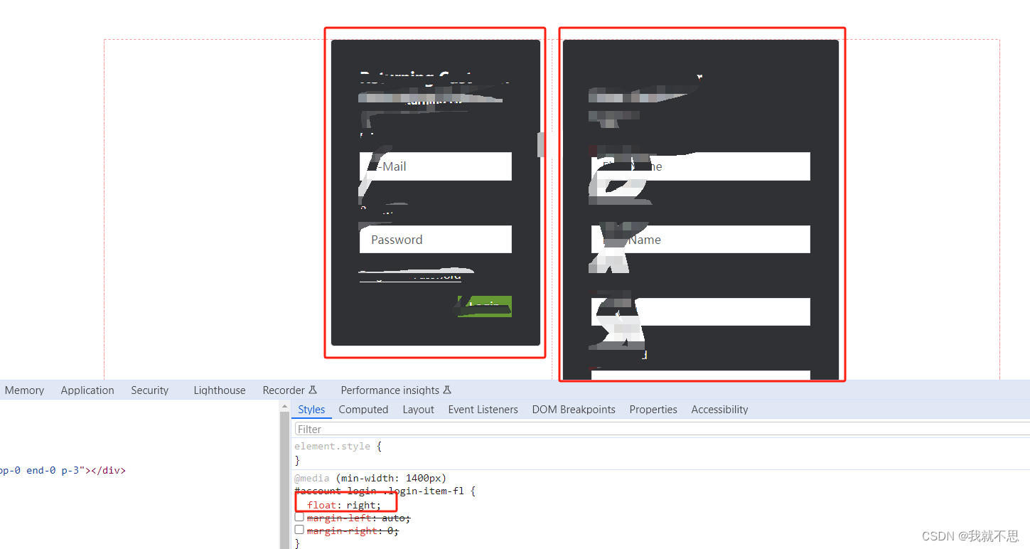
解決方案:
@media (min-width: 1400px){#account-login .login-item-fl {margin-left: auto;margin-right: 0;}
}
理解:
The following constraints must hold among the used values of the other properties:
‘margin-left’ + ‘border-left-width’ + ‘padding-left’ + ‘width’ + ‘padding-right’ +‘border-right-width’ + ‘margin-right’ = width of containing block
也就是在上述等式中,只有你設置的margin-left: auto,那么margin-left將會被設置為滿足上述等式,而等式的右邊是容器盒子寬度,等式中的其它值(除過width)都為0,因此
margin-left = width of containing block - width(div)
margin: auto 水平居中的原理:
If both 'margin-left' and 'margin-right' are 'auto',
their used values are equal.
This horizontally centers the element with respect to the edges of the containing block.


)


)


![14-云原生監控體系-Redis_exporter 監控 MySQL[部署Dashborad告警規則實戰]](http://pic.xiahunao.cn/14-云原生監控體系-Redis_exporter 監控 MySQL[部署Dashborad告警規則實戰])