1、概 述
針對常見的開發場景,ArkUI開發框架提供了非常多的自適應布局能力,這些布局可以獨立使用,也可多種布局疊加使用。本文針對ArkUI提供的拉伸能力做簡單討論。
拉伸能力是指容器組件尺寸發生變化時,增加或減小的空間全部分配給容器組件內指定區域。效果類似如下:
做過前端開發的朋友應該使用過Flex布局,這是一個非常常用的布局方式,類似的,ArkUI也提供了Flex布局,我們在ArkUI中,可以借助flexGrow和flexShrink屬性可以方便地實現自適應拉伸能力。
2、Flex布局實現拉伸能力
拉伸能力通常通過Flex布局中的flexGrow和flexShrink屬性實現,flexGrow和flexShrink屬性常與flexBasis屬性搭配使用,這三個屬性介紹如下:
| 屬性 | 類型 | 描述 |
| flexGrow | number | 默認為:0 僅當父容器寬度大于所有子組件寬度的總和時,該屬性生效。配置了此屬性的子組件,按照比例拉伸,分配父容器的多余空間。 |
| flexShrink | number | 默認為:1 僅當父容器寬度小于所有子組件寬度的總和時,該屬性生效。配置了此屬性的子組件,按照比例收縮,分配父容器的不足空間。 |
| flexBasis | 'auto' | Length | 默認為:'auto' 設置組件在Flex容器中主軸方向上基準尺寸。 'auto'意味著使用組件原始的尺寸,不做修改。flexBasis屬性不是必須的,通過width或height也可以達到同樣的效果。當flexBasis屬性與width或height發生沖突時,以flexBasis屬性為準。 |
3、案 例
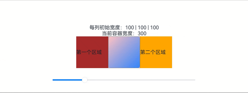
本示例中的頁面由中間的內容區(包含一張圖片)以及兩側的留白區組成,各區域的屬性配置如下。
-
中間內容區的寬度設置為100vp,同時將flexGrow屬性設置為1,flexShrink屬性設置為0。
-
兩側留白區的寬度設置為100vp,同時將flexGrow屬性設置為0,flexShrink屬性設置為1。
由上可知,父容器的基準尺寸是300vp(100vp+100vp+100vp)。我們可以通過拖動底部的滑動條改變父容器的尺寸,查看布局變化。
-
當父容器的尺寸大于300vp時,父容器中多余的空間全部分配給中間內容區。
-
當父容器的尺寸小于300vp時,左右兩側的留白區按照“1:1”的比例收縮(即平均分配父容器的不足空間)。
效果如下:
代碼如下(25、30、34行代碼):
@Entry@Componentstruct FlexibleCapabilitySample1 {? @State containerWidth: number =?300? // 底部滑塊,可以通過拖拽滑塊改變容器尺寸。? @Builder slider() {? ? Slider({ value: this.containerWidth, min:?100, max:?1000, style: SliderStyle.OutSet })? ? ? .blockColor(Color.White)? ? ? .width('60%')? ? ? .onChange((value: number) => {? ? ? ? this.containerWidth = value;? ? ? })? ? ? .position({?x:?'20%',?y:?'80%'?})? }? build() {? ? Column() {? ? ? Text(`每列初始寬度:100 | 100 | 100`)? ? ? Text(`當前容器寬度:${this.containerWidth}`)? ? ? Column() {? ? ? ? Row() {? ? ? ? ? // 通過flexGrow和flexShrink屬性,將多余的空間全部分配給圖片,將不足的空間全部分配給兩側空白區域。? ? ? ? ? Row(){? ? ? ? ? ? Text('第一個區域')? ? ? ? ? }.width(100).height(100).backgroundColor(Color.Brown)? ? ? ? ? ? .flexGrow(0).flexShrink(1)? ? ? ? ? Image($r("app.media.background")).width(100).height(100)? ? ? ? ? ? .objectFit(ImageFit.Contain)? ? ? ? ? ? .backgroundColor(Color.Pink)? ? ? ? ? ? .border({width:?1, color: Color.Gray})? ? ? ? ? ? .flexGrow(1).flexShrink(0)? ? ? ? ? Row(){? ? ? ? ? ? Text('第二個區域')? ? ? ? ? }.width(100).height(100).backgroundColor(Color.Orange)? ? ? ? ? ? .flexGrow(0).flexShrink(1)? ? ? ? }? ? ? ? .width(this.containerWidth)? ? ? ? .justifyContent(FlexAlign.Center)? ? ? ? .alignItems(VerticalAlign.Center)? ? ? }? ? ? this.slider()? ? }? ? .width('100%')? ? .height('100%')? ? .border({? ? ? width:?1,? ? ? color: Color.Gray? ? })? ? .justifyContent(FlexAlign.Center)? ? .alignItems(HorizontalAlign.Center)? }}
4、one more thing..
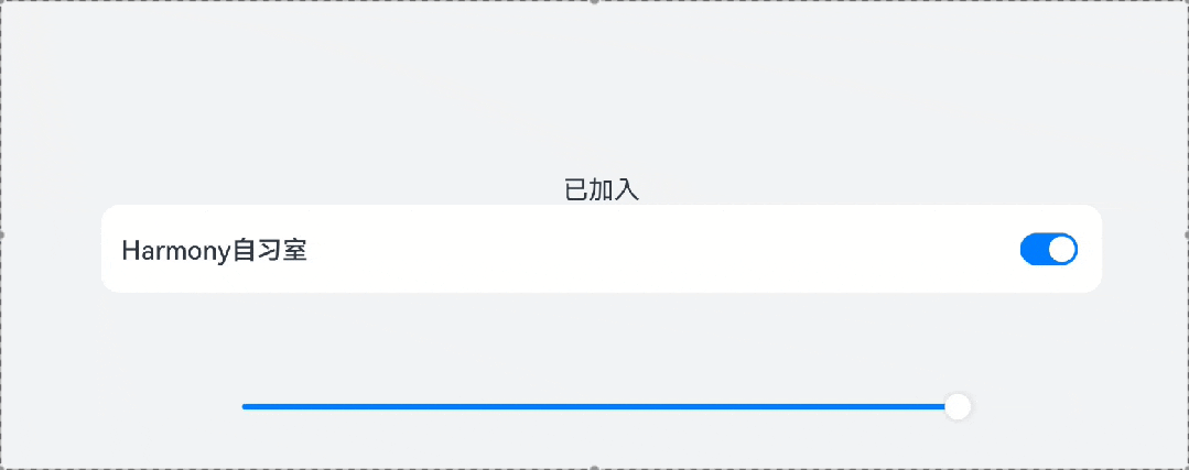
如果我們期望將父容器的剩余空間全部分配給某空白區域時,也可以通過Blank組件實現。
📢📢注意:
當僅當父組件為Row\Column\Flex組件時,Blank組件才會生效。
一個通過Blank實現拉伸效果的示例如下:
代碼如下(27行代碼):???????
@Entry@Componentstruct FlexibleCapabilitySample2 {? @State rate: number =?0.8? @State value: boolean = true;? // 底部滑塊,可以通過拖拽滑塊改變容器尺寸? @Builder slider() {? ? Slider({ value: this.rate *?100, min:?30, max:?80, style: SliderStyle.OutSet })? ? ? .blockColor(Color.White)? ? ? .width('60%')? ? ? .onChange((value: number) => {? ? ? ? this.rate = value /?100;? ? ? })? ? ? .position({?x:?'20%',?y:?'80%'?})? }? build() {? ? Column() {? ? ? Column() {? ? ? ? Text(`${this.value ? '已加入' : '待加入'}`)? ? ? ? Row() {? ? ? ? ? Text('Harmony自習室')? ? ? ? ? ? .fontSize(16)? ? ? ? ? ? .width(140)? ? ? ? ? ? .height(22)? ? ? ? ? ? .fontWeight(FontWeight.Medium)? ? ? ? ? ? .lineHeight(22)? ? ? ? ? Blank() ? ? ?// 通過Blank組件實現拉伸能力? ? ? ? ? Toggle({ type: ToggleType.Switch, isOn: $$this.value })? ? ? ? ? ? .width(36)? ? ? ? ? ? .height(20)? ? ? ? }? ? ? ? .height(55)? ? ? ? .borderRadius(12)? ? ? ? .padding({ left:?13, right:?13?})? ? ? ? .backgroundColor('#FFFFFF')? ? ? ? .width(this.rate *?100?+?'%')? ? ? }? ? ? this.slider()? ? }? ? .width('100%')? ? .height('100%')? ? .backgroundColor('#F1F3F5')? ? .justifyContent(FlexAlign.Center)? ? .alignItems(HorizontalAlign.Center)? }}

)


![[Go] Option選項設計模式 — — 編程方式基礎入門](http://pic.xiahunao.cn/[Go] Option選項設計模式 — — 編程方式基礎入門)

)


--Java版)


rpmyum)
![[git]忽略.gitignore文件](http://pic.xiahunao.cn/[git]忽略.gitignore文件)

)


人臉識別(python實現))