matlab 環形單層柱狀圖
matlab 環形單層柱狀圖
matlab 環形單層柱狀圖
圖片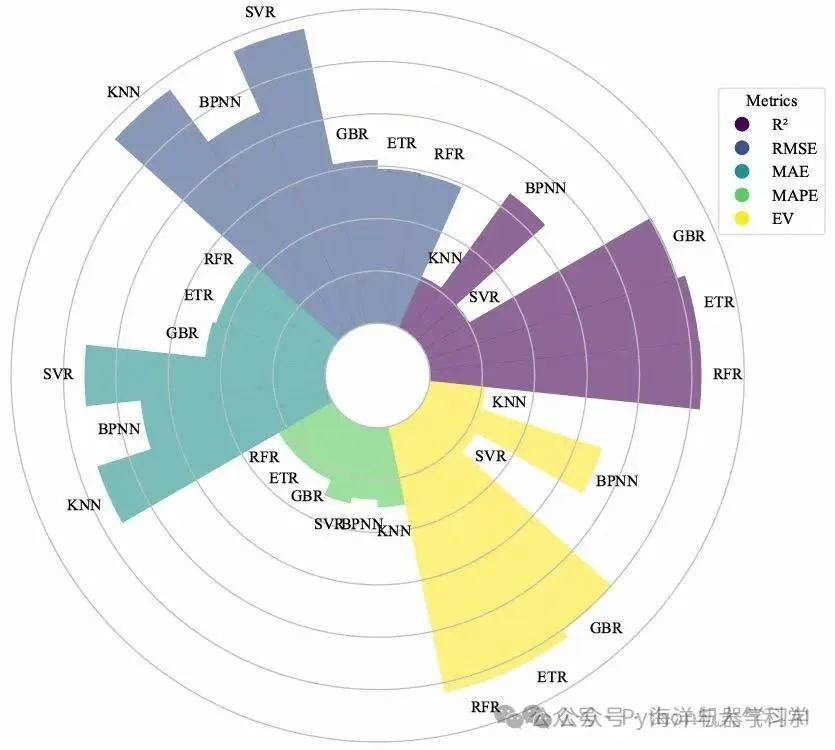
圖片
【圖片來源粉絲】
我給他的思路是:直接使用風玫瑰圖可以畫出。
rose_bar
本次我的更新和這個有些不同!是環形柱狀圖,可調節細節多;
只需要函數:可實現各個方面:
歡迎持續投稿,宣傳自己的工作(不限代碼論文等方面)!
rose_bar
使用簡單:
輸入數據和參數
[ph,fs] =rose_bar(datax,datay,r,R,bw1,xtickvalue);
% note: datax is x;
% datay is y;
% r is inner circle
% R is circle
% bw1 is width of bar,from 2 to inf; 2 is full; increase then thin bar;    %
% ph can control line of circle;;
% fs can control line and face color of bar
先看些結果:在解釋如何做出:
默認圖,所有顏色一致:
圖片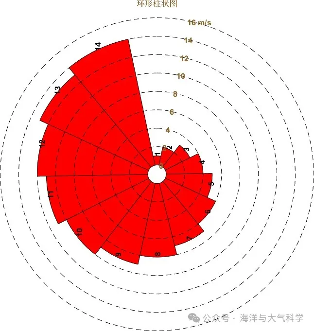
可使用代碼調節某一個柱狀圖的顏色:
例如第十四(14)個為藍色:
set(fs(14),‘FaceColor’,‘b’,‘EdgeColor’,‘b’)
圖片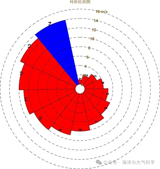
可調節每一個顏色都不同:
圖片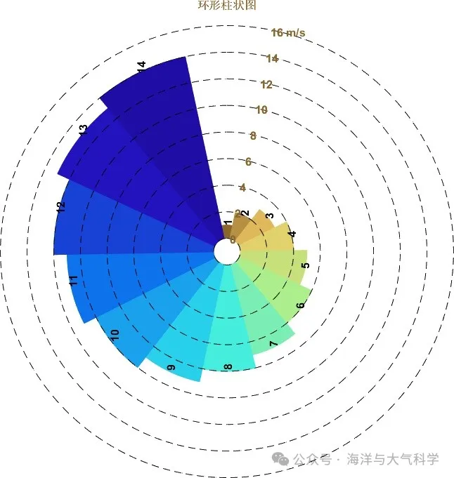
可控制中心?的大小
?為零: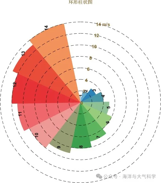
圖片
?為大:
圖片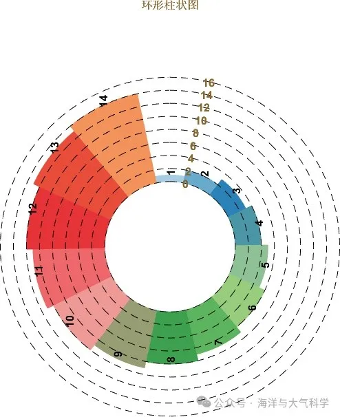
可以加單位:一個或多個或全部
圖片
可以什么都不要
圖片在這里插入圖片描述
可以更改xtick
圖片
總而言之,挺強的!
主程序:
.rtcContent { padding: 30px; } .lineNode {font-size: 12pt; font-family: "Times New Roman", Menlo, Monaco, Consolas, "Courier New", monospace; font-style: normal; font-weight: normal; }
clear;clc;close all;
% 構造數據
year = 1:14;
windspeed = 1:14;
yeartick = 2001:2014;
% yeartick = 1:14;
%
close all;
figure
set(gcf,'position',[50 50 850 850 ],'color','w')
% 使用函數
datax = year;
datay = windspeed;
r = 1;
R = 2;
bw1 = 2;
xtickvalue = yeartick;
[ph,fs] =rose_bar(datax,datay,r,R,bw1,xtickvalue);
% set(fs(14),'FaceColor','b','EdgeColor','b')
% 顏色包
load('GMT_drywet.mat')
cmap =GMT_drywet(1:floor(59/length(windspeed)):end,:);
cmap = load('colormore_21.txt');
cmap = cmap(1:20:end,:);
for i = 1:length(fs)set(fs(i),'FaceColor',cmap(i,:),'EdgeColor',cmap(i,:));
end
% note: datax is x;
% datay is y;
% r is inner circle
% R is circle
% bw1 is width of bar,from 2 to inf; 2 is full; increase then thin bar;    %
% ph can control line of circle;;
% fs can control line and face color of bar
title('環形柱狀圖','FontSize',12,'FontWeight','bold','FontName','time News roman','color',[0.54588199	0.40039200	0.17607801]);
export_fig('環形柱狀圖.jpg')函數:
.rtcContent { padding: 30px; } .lineNode {font-size: 12pt; font-family: "Times New Roman", Menlo, Monaco, Consolas, "Courier New", monospace; font-style: normal; font-weight: normal; }
function [ph,fs] = rose_bar(datax,datay,r,R,bw1,xtickvalue)
% note: datax is x;
% datay is y;
% r is inner circle
% R is circle
% bw1 is width of bar
% 數據傳入
year = datax;
windspeed = datay;
R = R;
bw1 = bw1;% bw1 最小值 min value is 2; max is not limit;
r = r;
t = 0:0.01:2*pi;
windspeed = windspeed+r;
% 基底
% h(1)=plot(r*sin(t),r*cos(t),'color','k');
if R>=rxlim([-(max(windspeed)+R) max(windspeed)+R])ylim([-(max(windspeed)+R) max(windspeed)+R])
elsexlim([-(max(windspeed)+r) max(windspeed)+r])ylim([-(max(windspeed)+r) max(windspeed)+r])
end
axis equal
axis off
hold on
t1 = 0:2*pi/(length(year)):2*pi;
% scatter(r*sin(t1),r*cos(t1))
bw = 2*pi/(length(year)-1)/bw1;
for i = 1:length(t1)-1t2 = t1(i)-bw:0.01:t1(i)+bw;% plot(r*sin(t2),r*cos(t2))% hold on% plot(windspeed(i)*sin(t2),windspeed(i)*cos(t2))% hold onX = [r*sin(t2) flip((windspeed(i))*sin(t2)) ];Y = [r*cos(t2) flip((windspeed(i))*cos(t2)) ];fs(i)= fill(X,Y,'r');clear X Yhold onX= mean((windspeed(i))*sin(t2));Y = mean((windspeed(i))*cos(t2));text(X,Y,num2str(xtickvalue(i)),'FontSize',12,'FontWeight','bold','FontName','time News roman','Rotation',90,'color','b')clear X Y
end
hold on
T = 0:0.01:pi/8;% 控制標簽的擺放位置
for ii = 1:R:max(windspeed)+Rif (r+ii-1)<=(max(windspeed)+R)ph(ii)=plot((r+(ii-1))*sin(t),(r+(ii-1))*cos(t),'LineStyle','--','Color','k');X = mean((r+(ii-1))*sin(T));Y = mean((r+(ii-1))*cos(T));text(X,Y,num2str(ii-1),'FontSize',12,'FontWeight','bold','FontName','time News roman','color',[0.54588199	0.40039200	0.17607801]);hold onif ii == (r+ii-1)%max(1:R:max(windspeed)+R)text(X,Y,[num2str(ii-1),' m/s'],'FontSize',12,'FontWeight','bold','FontName','time News roman','color',[0.54588199	0.40039200	0.17607801]);elsetext(X,Y,[num2str(ii-1)],'FontSize',12,'FontWeight','bold','FontName','time News roman','color',[0.54588199	0.40039200	0.17607801]);endend
end
贊賞直接公益捐贈!
圖片
點分享圖片
點收藏圖片
點在看圖片
點點贊


,源碼可白嫖!)


)
)

)
)

:子游戲集成與服務器調度機制全解)

(算法競賽進階指南學習筆記))


:性能優化基礎與性能分析工具)