🔥 本文由 程序喵正在路上 原創,CSDN首發!
💖 系列專欄:Flutter學習
🌠 首發時間:2024年5月26日
🦋 歡迎關注🖱點贊👍收藏🌟留言🐾
目錄
- 有狀態組件StatefulWidget
- 實現計數器功能
- 實現動態列表
- Scaffold屬性:BottomNavigationBar
- 組件介紹
- 自定義底部導航
- 底部菜單選中
- 自定義底部導航實現頁面切換
- Scaffold屬性:FloatingActionButton
- FloatingActionButton詳解
- 實現類似閑魚App底部導航凸起按鈕
- Scaffold屬性:抽屜菜單Drawer
- DrawerHeader
- UserAccountsDrawerHeader
有狀態組件StatefulWidget
在 Flutter 中自定義組件其實就是一個類,這個類需要繼承 StatelessWidget / StatefulWidget。
StatelessWidget是無狀態組件,狀態不可變的 widgetStatefulWidget是有狀態組件,持有的狀態可能在 widget 生命周期改變- 通俗的講:如果我們想改變頁面中的數據的話,這個時候就需要用到
StatefulWidget
實現計數器功能
import 'package:flutter/material.dart';void main() {runApp(const MyApp());
}class MyApp extends StatelessWidget {const MyApp({super.key});Widget build(BuildContext context) {return MaterialApp(title: 'Flutter Demo',theme: ThemeData(primarySwatch: Colors.blue,),home: const HomePage(),);}
}class HomePage extends StatefulWidget {const HomePage({super.key});State<HomePage> createState() => _HomePageState();
}class _HomePageState extends State<HomePage> {int _numCount = 0; //計數Widget build(BuildContext context) {return Scaffold(appBar: AppBar(title: const Text("flutter App"),),body: Center(child: Column(mainAxisAlignment: MainAxisAlignment.center,children: [Text("$_numCount",style: Theme.of(context).textTheme.headlineMedium,),const SizedBox(height: 60),ElevatedButton(onPressed: () {setState(() {_numCount++;});},child: const Text("增加"))],),),//Scaffold組件中自帶的浮動按鈕floatingActionButton: FloatingActionButton(onPressed: () {setState(() {_numCount++;});},child: const Icon(Icons.add),),);}
}
在使用 StatefulWidget 后,建議我們代碼的框架寫成上面這樣,將 Scaffold 組件寫到自定義組件中,這樣我們可以使用其在有狀態組件中的一些屬性

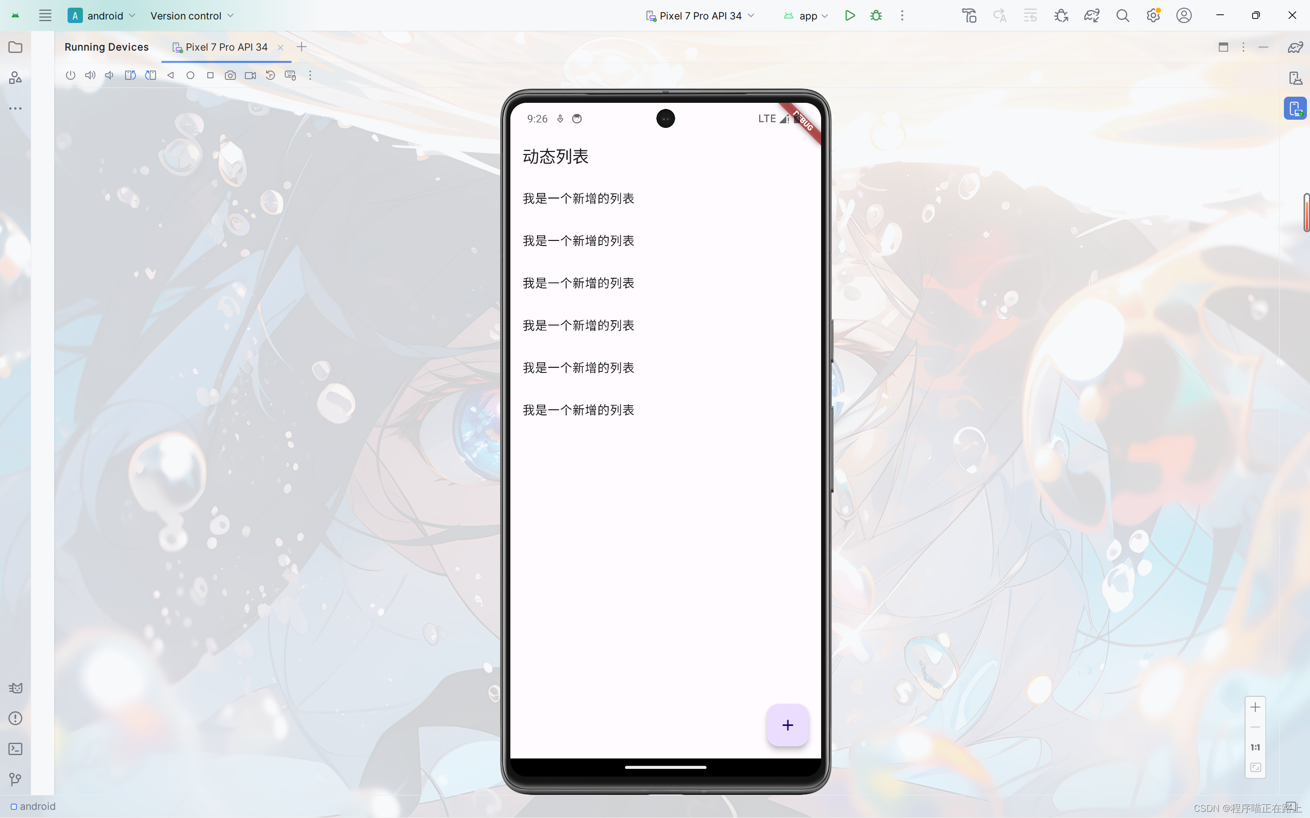
實現動態列表
需求:實現通過點擊按鈕就能添加列表項的效果
class _HomePageState extends State<HomePage> {final List<String> _list = []; //final修飾的列表可以增加元素Widget build(BuildContext context) {return Scaffold(appBar: AppBar(title: const Text("動態列表"),),floatingActionButton: FloatingActionButton(onPressed: () {setState(() {_list.add("我是一個新增的列表");});},child: const Icon(Icons.add),),body: ListView(children: _list.map((e) {return ListTile(title: Text(e),);}).toList(),),);}
}
Scaffold屬性:BottomNavigationBar
組件介紹
BottomNavigationBar 是底部導航條,可以讓我們定義底部 Tab 切換,bottomNavigationBar 是 Scaffold 組件的參數。
BottomNavigationBar 常見的屬性
| 屬性名 | 說明 |
|---|---|
| items | List 底部導航條按鈕集合 |
| iconSize | icon |
| currentIndex | 默認選中第幾個 |
| onTap | 選中變化回調函數 |
| fixedColor | 選中的顏色 |
| type | 底部超過4個菜單必須配置這個屬性:ButtomNavigationBarType.fixed、ButtomNavigationBarType.shifting |
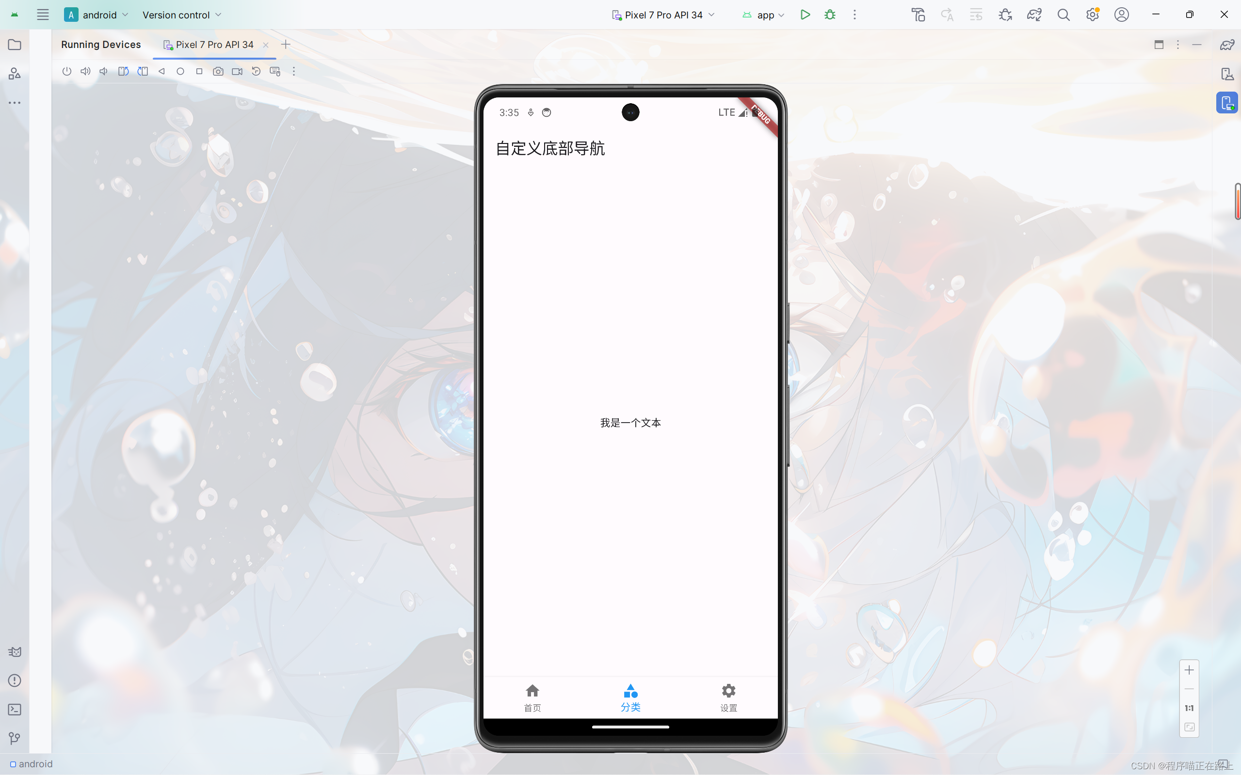
自定義底部導航
實現如下效果:

class _HomePageState extends State<HomePage> {Widget build(BuildContext context) {return Scaffold(appBar: AppBar(title: const Text("自定義底部導航"),),body: const Center(child: Text("我是一個文本")),bottomNavigationBar: BottomNavigationBar(items: const [BottomNavigationBarItem(icon: Icon(Icons.home), label: "首頁"),BottomNavigationBarItem(icon: Icon(Icons.category), label: "分類"),BottomNavigationBarItem(icon: Icon(Icons.settings), label: "設置"),],),);}
}
底部菜單選中
前面自定義的底部導航還沒有完整實現,一般要求我們點擊哪個菜單,哪個菜單就會顯示選中的效果,下面我們來實現這個效果
class _HomePageState extends State<HomePage> {int _currentIndex = 0; //當前選中索引Widget build(BuildContext context) {return Scaffold(appBar: AppBar(title: const Text("自定義底部導航"),),body: const Center(child: Text("我是一個文本")),bottomNavigationBar: BottomNavigationBar(currentIndex: _currentIndex,fixedColor: Colors.blue,onTap: (value) {setState(() {_currentIndex = value;});},items: const [BottomNavigationBarItem(icon: Icon(Icons.home), label: "首頁"),BottomNavigationBarItem(icon: Icon(Icons.category), label: "分類"),BottomNavigationBarItem(icon: Icon(Icons.settings), label: "設置"),],),);}
}
自定義底部導航實現頁面切換
為了讓代碼條理更加清晰,我們將每個頁面分文件寫。
在 lib 目錄下新建目錄 pages,在 pages 下新建文件 tabs.dart 和文件夾 tabs,在 tabs 下新建 3 個頁面對應的文件:
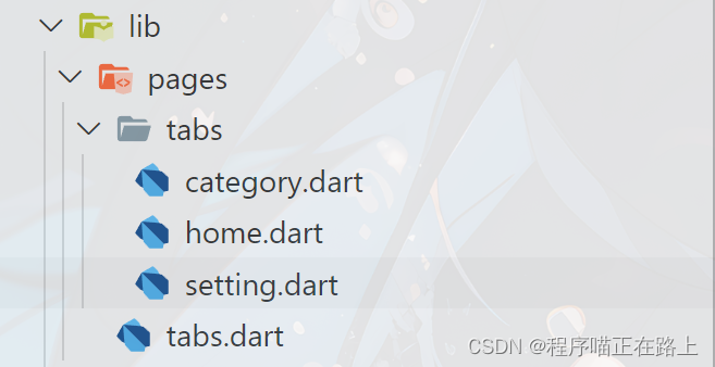
home.dart
import 'package:flutter/material.dart';class HomePage extends StatefulWidget {const HomePage({super.key});State<HomePage> createState() => _HomePageState();
}class _HomePageState extends State<HomePage> {Widget build(BuildContext context) {return const Center(child: Text("首頁"),);}
}
category.dart
import 'package:flutter/material.dart';class CategoryPage extends StatefulWidget {const CategoryPage({super.key});State<CategoryPage> createState() => _CategoryPageState();
}class _CategoryPageState extends State<CategoryPage> {Widget build(BuildContext context) {return const Center(child: Text("分類"),);}
}
setting.dart
import 'package:flutter/material.dart';class SettingPage extends StatefulWidget {const SettingPage({super.key});State<SettingPage> createState() => _SettingPageState();
}class _SettingPageState extends State<SettingPage> {Widget build(BuildContext context) {return const Center(child: Text("系統設置"),);}
}
tabs.dart:前面頁面切換的代碼
import 'package:flutter/material.dart';
import './tabs/home.dart';
import './tabs/category.dart';
import './tabs/setting.dart';class Tabs extends StatefulWidget {const Tabs({super.key});State<Tabs> createState() => _TabsState();
}class _TabsState extends State<Tabs> {int _currentIndex = 0; //當前選中索引final List<Widget> _pages = const [HomePage(),CategoryPage(),SettingPage(),];Widget build(BuildContext context) {return Scaffold(appBar: AppBar(title: const Text("自定義底部導航"),),body: _pages[_currentIndex], //自動切換頁面bottomNavigationBar: BottomNavigationBar(currentIndex: _currentIndex,fixedColor: Colors.blue,onTap: (value) {setState(() {_currentIndex = value;});},items: const [BottomNavigationBarItem(icon: Icon(Icons.home), label: "首頁"),BottomNavigationBarItem(icon: Icon(Icons.category), label: "分類"),BottomNavigationBarItem(icon: Icon(Icons.settings), label: "設置"),],),);}
}
main.dart
import 'package:flutter/material.dart';
import 'pages/tabs.dart';void main() {runApp(const MyApp());
}class MyApp extends StatelessWidget {const MyApp({super.key});Widget build(BuildContext context) {return MaterialApp(title: 'Flutter Demo',theme: ThemeData(primarySwatch: Colors.blue,),debugShowCheckedModeBanner: false,home: const Tabs(),);}
}

Scaffold屬性:FloatingActionButton
FloatingActionButton詳解
FloatingActionButton 簡稱 FAB ,可以實現浮動按鈕,也可以實現類似閑魚app的底部凸起導航
| 屬性名稱 | 屬性值 |
|---|---|
| child | 子視圖,一般為 Icon,不推薦使用文字 |
| tooltip | FAB被長按時顯示,也是無障礙功能 |
| backgroundColor | 背景顏色 |
| elevation | 未點擊時的陰影 |
| highlightElevation | 點擊時陰影值,默認12 |
| onPressed | 點擊事件回調 |
| shape | 可以定義FAB的形狀等 |
| mini | 是否為 mini 類型,默認為 false |
實現類似閑魚App底部導航凸起按鈕
我們在前面自定義底部導航的代碼稍加修改,再添加一個浮動按鈕即可實現類似閑魚底部導航效果:
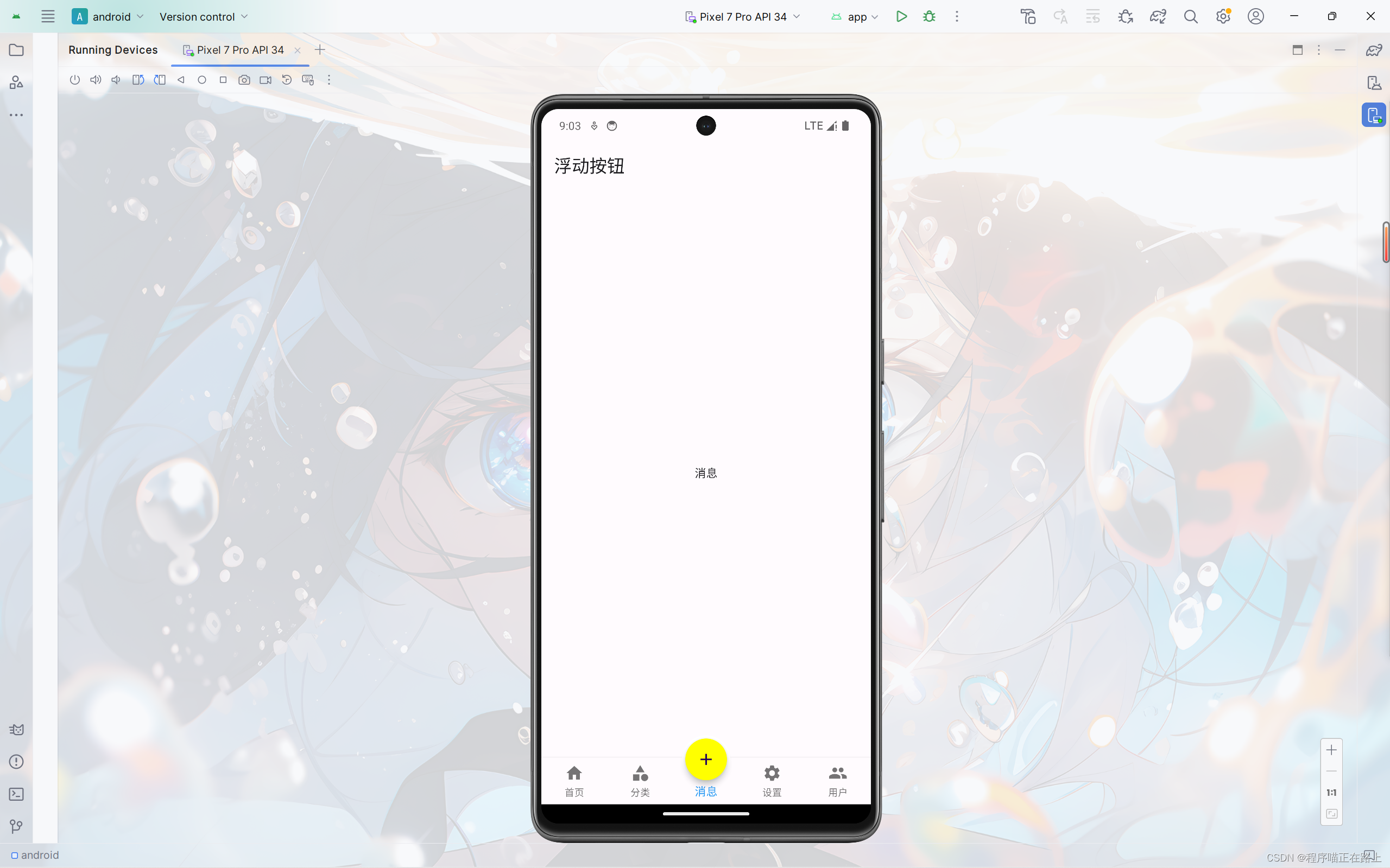
這里給出 tabs.dart 的代碼,其中 message.dart 和 user.dart 兩個頁面內容和其他頁面類似
import 'package:flutter/material.dart';
import './tabs/home.dart';
import './tabs/category.dart';
import './tabs/setting.dart';
import './tabs/message.dart';
import './tabs/user.dart';class Tabs extends StatefulWidget {const Tabs({super.key});State<Tabs> createState() => _TabsState();
}class _TabsState extends State<Tabs> {int _currentIndex = 0; //當前選中索引final List<Widget> _pages = const [HomePage(),CategoryPage(),MessagePage(),SettingPage(),UserPage(),];Widget build(BuildContext context) {return Scaffold(appBar: AppBar(title: const Text("浮動按鈕"),),body: _pages[_currentIndex], //自動切換頁面bottomNavigationBar: BottomNavigationBar(type: BottomNavigationBarType.fixed,currentIndex: _currentIndex,fixedColor: Colors.blue,onTap: (value) {setState(() {_currentIndex = value;});},items: const [BottomNavigationBarItem(icon: Icon(Icons.home), label: "首頁"),BottomNavigationBarItem(icon: Icon(Icons.category), label: "分類"),BottomNavigationBarItem(icon: Icon(Icons.message), label: "消息"),BottomNavigationBarItem(icon: Icon(Icons.settings), label: "設置"),BottomNavigationBarItem(icon: Icon(Icons.people), label: "用戶")],),floatingActionButton: Container(height: 60,width: 60,padding: const EdgeInsets.all(4),margin: const EdgeInsets.only(top: 4),decoration: BoxDecoration(color: Colors.white, borderRadius: BorderRadius.circular(30)),child: FloatingActionButton(shape: const CircleBorder(),backgroundColor:_currentIndex == 2 ? Colors.yellowAccent : Colors.blueAccent,onPressed: () {setState(() {_currentIndex = 2;});},child: const Icon(Icons.add),),),floatingActionButtonLocation:FloatingActionButtonLocation.centerDocked, //浮動按鈕位置);}
}
Scaffold屬性:抽屜菜單Drawer
在 Scaffold 組件里面傳入 drawer 參數可以定義左側邊欄,傳入 endDrawer 可以定義右側邊欄。側邊欄默認是隱藏的,我們可以通過手指滑動顯示側邊欄,也可以通過點擊按鈕顯示側邊欄。
DrawerHeader
DrawerHeader 是側邊欄的頭部,常見屬性如下:
| 屬性 | 描述 |
|---|---|
| decoration | 設置頂部背景顏色 |
| child | 配置子元素 |
| padding | 內邊距 |
| margin | 外邊距 |
在上一節代碼 tabs.dart 的基礎上,我們來給頁面添加側邊欄
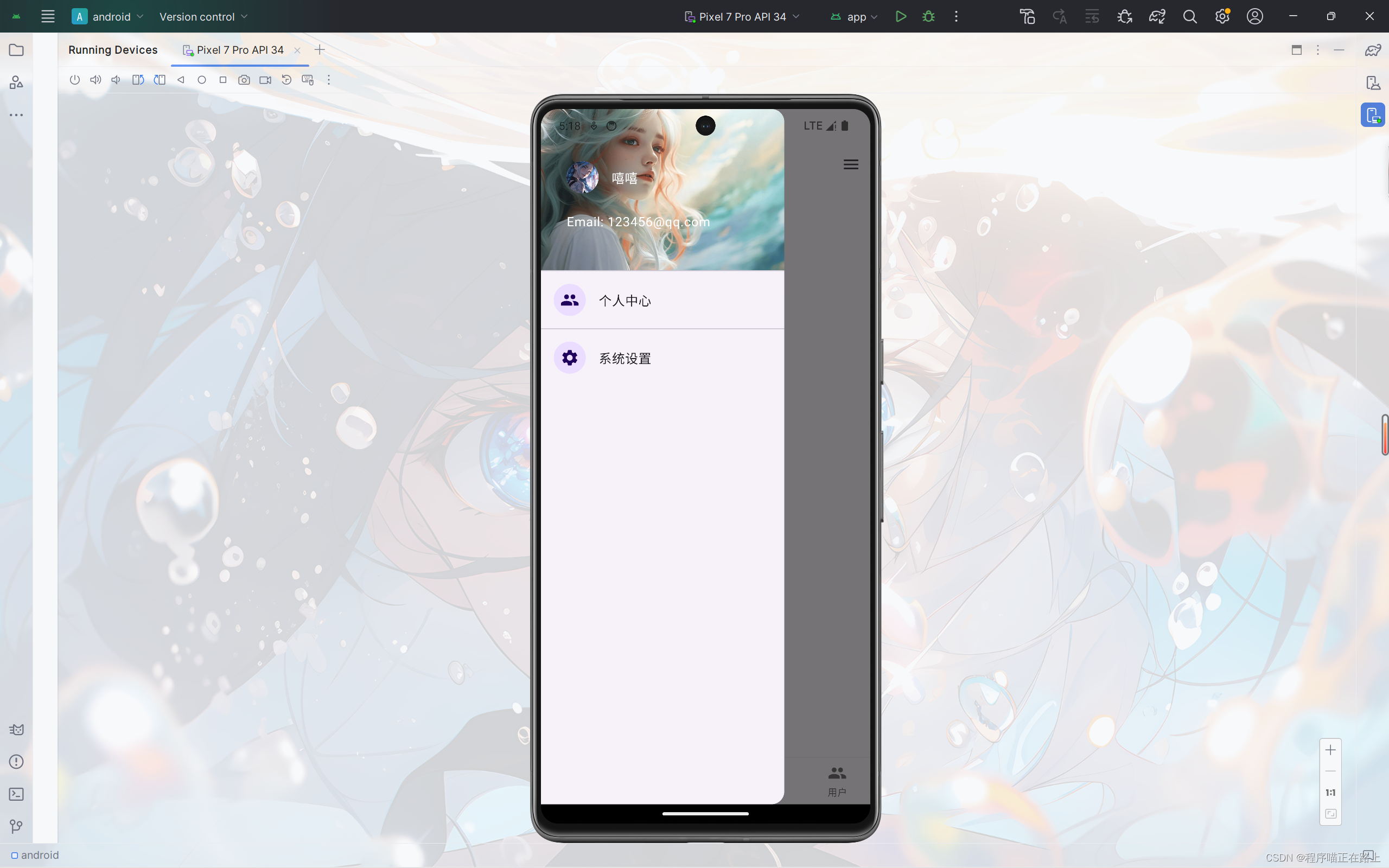
class _TabsState extends State<Tabs> {int _currentIndex = 0; //當前選中索引final List<Widget> _pages = const [HomePage(),CategoryPage(),MessagePage(),SettingPage(),UserPage(),];Widget build(BuildContext context) {return Scaffold(appBar: AppBar(title: const Text("浮動按鈕"),),//左側邊欄drawer: Drawer(child: Column(children: [DrawerHeader(decoration: const BoxDecoration(color: Colors.blueAccent,image: DecorationImage(image: NetworkImage("https://xixi-web-tlias.oss-cn-guangzhou.aliyuncs.com/1.jpg"),fit: BoxFit.cover)),child: ListView(children: const [ListTile(leading: CircleAvatar(backgroundImage: NetworkImage("https://xixi-web-tlias.oss-cn-guangzhou.aliyuncs.com/2.jpg"),),title: Text("嘻嘻",style: TextStyle(color: Colors.white,),),),ListTile(title: Text("Email: 123456@qq.com",style: TextStyle(color: Colors.white,),),),],),),const ListTile(leading: CircleAvatar(child: Icon(Icons.people)),title: Text("個人中心"),),const Divider(),const ListTile(leading: CircleAvatar(child: Icon(Icons.settings)),title: Text("系統設置"),)],),),//右側側邊欄endDrawer: Drawer(child: Column(children: [DrawerHeader(decoration: const BoxDecoration(color: Colors.blueAccent,image: DecorationImage(image: NetworkImage("https://xixi-web-tlias.oss-cn-guangzhou.aliyuncs.com/3.jpg"),fit: BoxFit.cover)),child: ListView(children: const [ListTile(leading: CircleAvatar(backgroundImage: NetworkImage("https://xixi-web-tlias.oss-cn-guangzhou.aliyuncs.com/4.jpg"),),title: Text("嘻嘻",style: TextStyle(color: Colors.white,),),),ListTile(title: Text("Email: 123456@qq.com",style: TextStyle(color: Colors.white,),),),],),),const ListTile(leading: CircleAvatar(child: Icon(Icons.people)),title: Text("個人中心"),),const Divider(),const ListTile(leading: CircleAvatar(child: Icon(Icons.settings)),title: Text("系統設置"),)],),),body: _pages[_currentIndex], //自動切換頁面bottomNavigationBar: BottomNavigationBar(type: BottomNavigationBarType.fixed,currentIndex: _currentIndex,fixedColor: Colors.blue,onTap: (value) {setState(() {_currentIndex = value;});},items: const [BottomNavigationBarItem(icon: Icon(Icons.home), label: "首頁"),BottomNavigationBarItem(icon: Icon(Icons.category), label: "分類"),BottomNavigationBarItem(icon: Icon(Icons.message), label: "消息"),BottomNavigationBarItem(icon: Icon(Icons.settings), label: "設置"),BottomNavigationBarItem(icon: Icon(Icons.people), label: "用戶")],),floatingActionButton: Container(height: 60,width: 60,padding: const EdgeInsets.all(4),margin: const EdgeInsets.only(top: 4),decoration: BoxDecoration(color: Colors.white, borderRadius: BorderRadius.circular(30)),child: FloatingActionButton(shape: const CircleBorder(),backgroundColor:_currentIndex == 2 ? Colors.yellowAccent : Colors.blueAccent,onPressed: () {setState(() {_currentIndex = 2;});},child: const Icon(Icons.add),),),floatingActionButtonLocation:FloatingActionButtonLocation.centerDocked, //浮動按鈕位置);}
}
左右側邊欄只是名稱不同,其他組件的使用都是一致的

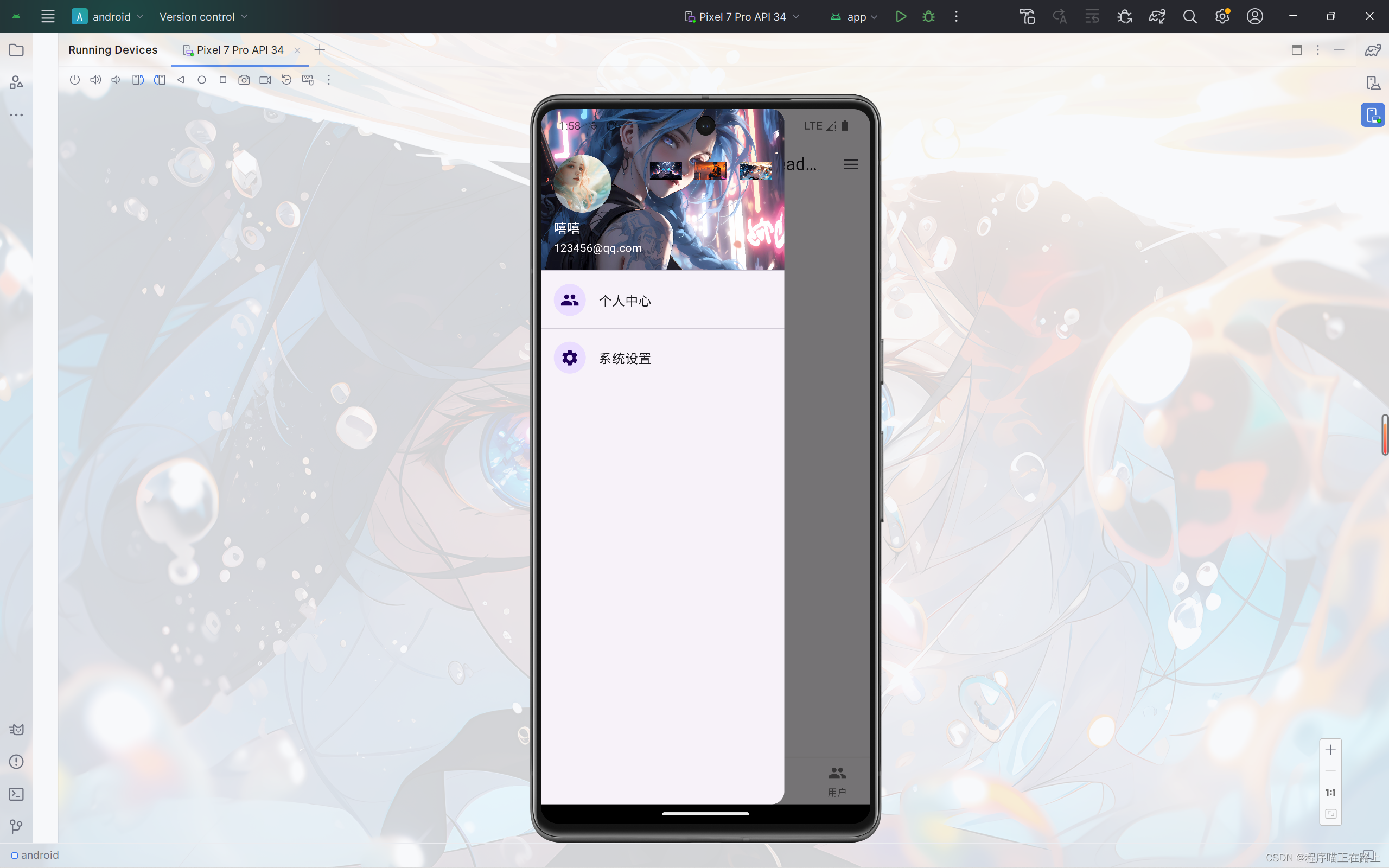
UserAccountsDrawerHeader
像前面這樣我們自己寫側邊欄的頭部內容,還是比較麻煩的,而且樣式也不好調整,為此 flutter 給我們提供了 UserAccountsDrawerHeader 組件,其常用屬性如下:
| 屬性 | 描述 |
|---|---|
| decoration | 設置頂部背景顏色 |
| accountName | 賬戶名稱 |
| accountEmail | 賬戶郵箱 |
| currentAccountPicture | 用戶頭像 |
| otherAccountsPictures | 用來設置當前賬戶其他賬戶頭像 |
| margin | 外邊距 |
接下來,我們用 來寫一個側邊欄
//左側邊欄
drawer: Drawer(child: Column(children: [UserAccountsDrawerHeader(accountName: const Text("嘻嘻"),accountEmail: const Text("123456@qq.com"),currentAccountPicture: const CircleAvatar(backgroundImage: NetworkImage("https://xixi-web-tlias.oss-cn-guangzhou.aliyuncs.com/1.jpg"),),decoration: const BoxDecoration(color: Colors.blue,image: DecorationImage(image: NetworkImage("https://xixi-web-tlias.oss-cn-guangzhou.aliyuncs.com/2.jpg"),fit: BoxFit.cover),),otherAccountsPictures: [Image.network("https://xixi-web-tlias.oss-cn-guangzhou.aliyuncs.com/3.jpg"),Image.network("https://xixi-web-tlias.oss-cn-guangzhou.aliyuncs.com/4.jpg"),Image.network("https://xixi-web-tlias.oss-cn-guangzhou.aliyuncs.com/5.jpg"),],),const ListTile(leading: CircleAvatar(child: Icon(Icons.people)),title: Text("個人中心"),),const Divider(),const ListTile(leading: CircleAvatar(child: Icon(Icons.settings)),title: Text("系統設置"),)],),
),


)


