回顧
寬度設置的基本總結
w-full:表示widtdh:100%;占滿父容器的寬度。
w-screen:表示占滿整個屏幕的寬度。
w-1到w-12,是按百分比劃分寬度,數字越大,占據的比例就越大。
w-1rem到w-30rem,固定寬度,rem是一種尺寸,數字越大,表示寬度越大。
primeflex 設置外邊距總結
自動外邊距
mt-auto:自動計算并設置上外邊距
mr-auto:自動計算并設置右邊距
mb-auto:自動計算并設置下外邊距
ml-auto:自動計算并設置左外邊距
mx-auto:自動計算并設置左右兩個方向的外邊距
my-auto:自動計算并設置上下兩個方向的外邊距
m-auto:自動計算并設置四個方向的外邊距
同時設置四個方向的外邊距
m-0到m-8,數字越大,外邊距越大
上外邊距:
mt-0到mt-8,數字越大,上外邊距越大
-mt-0 到 -mt-8,數字越大,上外邊距越小。因為是負數,所以距離應該是反方向的。
下外邊距:
mb-0到mb-8,數字越大,下外邊距越大
-mb-0 到 -mb-8,數字越大,下外邊距越小。因為是負數,所以距離應該是反方向的。
左外邊距:
ml-0到ml-8,數字越大,左外邊距越大
-ml-0 到 -ml-8,數字越大,左外邊距越小。因為是負數,所以距離應該是反方向的。
右外邊距:
mr-0到mr-8,數字越大,右外邊距越大
-mr-0 到 -mr-8,數字越大,右外邊距越小。因為是負數,所以距離應該是反方向的。
左右外邊距:
mx-0到mx-8,數字越大,左右外邊距越大
-mx-0 到 -mx-8,數字越大,左右外邊距越小。因為是負數,所以距離應該是反方向的。
上下外邊距:
my-0到my-8,數字越大,上下外邊距越大
-my-0 到 -my-8,數字越大,上下外邊距越小。因為是負數,所以距離應該是反方向的。
primeflex 設置高度總結
h-full:百分百占據父容器高度。
h-scrren:占據整個屏幕的高度。
h-1rem 到 h-30rem:固定尺寸高度,數字越大高度越高。
primeflex 設置背景顏色總結
藍色:bg-blue-50 到 bg-blue-900,數字越大,顏色越深。
綠色:bg-green-50 到 bg-green-900,數字越大顏色越深
黃色:bg-yellow-50 到 bg-yellow-900,數字越大顏色越深
青色:bg-cyan-50 到 bg-cyan-900,數字越大顏色越深
粉色:bg-pink-50 到 bg-pink-900,數字越大顏色越深
靛藍色:bg-indigo-50 到 bg-indigo-900,數字越大顏色越深
藍綠色:bg-teal-50 到 bg-teal-900,數字越大顏色越深
橙色:bg-orange-50 到 bg-orange-900,數字越大顏色越深
藍灰色:bg-bluegray-50 到 bg-bluegray-900,數字越大顏色越深
紫色:bg-purple-50 到 bg-purple-900,數字越大顏色越深
灰色:bg-gray-50 到 bg-gray-900,數字越大顏色越深
紅色:bg-red-50 到 bg-red-900,數字越大顏色越深
重要色(藍綠):bg-primary-50 到 bg-primary-900,數字越大顏色越深
透明白色:bg-white-alpha-50 到 bg-white-alpha-900,數字越大顏色越深
透明黑色:bg-black-alpha-50 到 bg-black-alpha-900,數字越大顏色越深
練習
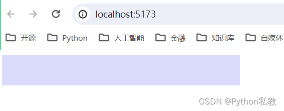
畫一個盒子:
- 寬度:w-3
- 高度:h-3rem
- 背景顏色:靛藍色
示例代碼:
<script setup>
</script><template><div><div class="w-3 h-3rem bg-indigo-100"></div></div>
</template>
效果預覽:
案例1:畫三個盒子
需求:在一行畫三個盒子,第一個盒子的文本內容是1,第二個是2,第三個是3。三個盒子根據序號從小到大,盒子的大小也越來越大,且顏色不同。
示例代碼:
<template><div class="flex"><div class="w-1 h-1rem bg-indigo-100">1</div><div class="w-2 h-2rem bg-blue-100">2</div><div class="w-3 h-3rem bg-green-100">3</div></div>
</template>
效果預覽:
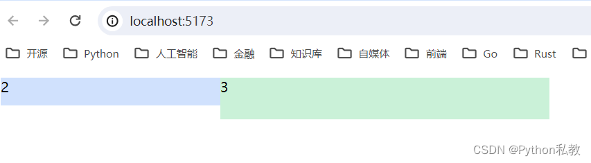
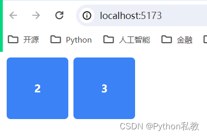
案例2:隱藏第一個盒子
需求:在案例1的基礎上,將第一個盒子隱藏。
示例代碼:
<template><div class="flex"><div class="hidden w-1 h-1rem bg-indigo-100">1</div><div class="w-2 h-2rem bg-blue-100">2</div><div class="w-3 h-3rem bg-green-100">3</div></div>
</template>
效果預覽:
案例3:文本居中
需求:如圖
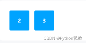
讓三個盒子,每個盒子都變成如上圖所示。要讓字體變成白色,加粗,且居中。讓盒子的角變成圓角。
參考代碼:
<div class="w-4rem h-4rem bg-primary font-bold flex align-items-center justify-content-center p-4 border-round">3</div>
font-bold讓字體加粗flex一種布局方式align-items-center在flex布局中,讓元素垂直居中justify-content-center在flex布局中,讓元素水平居中border-round讓盒子的角變成圓角
示例代碼:
<template><div class="flex"><div class="hidden w-6rem h-6rem bg-blue-500 border-round mx-1">1</div><div class="w-6rem h-6rem bg-blue-500 border-round mx-1 text-white font-bold flex align-items-center justify-content-center">2</div><div class="w-6rem h-6rem bg-blue-500 border-round mx-1 text-white font-bold flex align-items-center justify-content-center">3</div></div>
</template>
效果預覽:
案例4:垂直排列
需求:
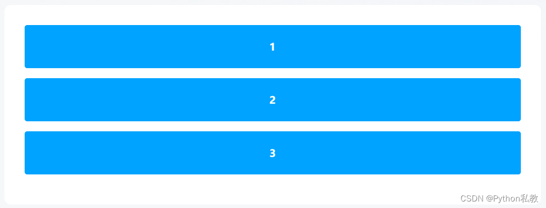
編寫代碼,構造如上圖所示的頁面。block 可以讓元素變成塊級元素。塊級元素會獨占一行。
示例代碼:
<template><div><div class="block bg-blue-500 h-6rem border-round my-1 text-white font-bold flex align-items-center justify-content-center">1</div><div class="block bg-blue-500 h-6rem border-round my-1 text-white font-bold flex align-items-center justify-content-center">2</div><div class="block bg-blue-500 h-6rem border-round my-1 text-white font-bold flex align-items-center justify-content-center">3</div></div>
</template>
效果預覽:
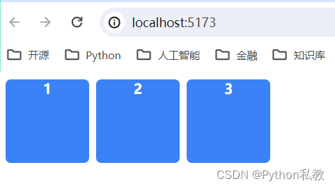
案例5:水平排列
<template><div><div class="inline-block bg-blue-500 w-6rem h-6rem border-round mx-1 text-white font-bold text-center">1</div><div class="inline-block bg-blue-500 w-6rem h-6rem border-round mx-1 text-white font-bold text-center">2</div><div class="inline-block bg-blue-500 w-6rem h-6rem border-round mx-1 text-white font-bold text-center">3</div></div>
</template>
效果預覽:
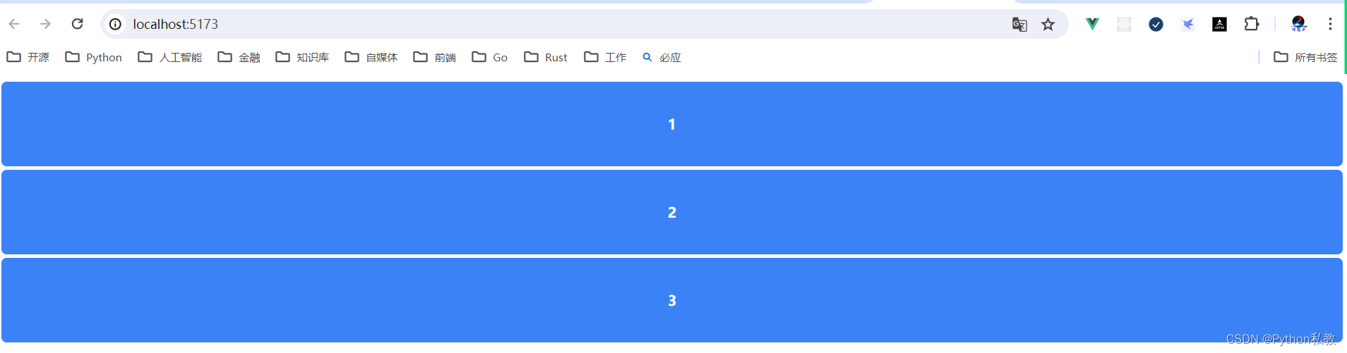
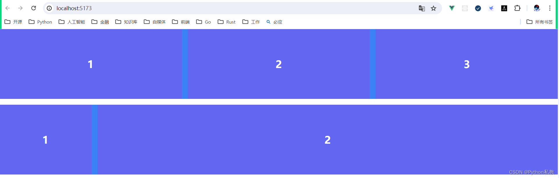
案例6:綜合練習
需求:根據學過的東西,制作類似如下畫面。顏色,邊距可以自己定義。

示例代碼:
<template><div><div class="w-screen h-12rem bg-primary mb-3 flex"><div class="flex justify-content-center align-items-center font-bold text-3xl bg-indigo-500 flex-1">1</div><div class="flex justify-content-center align-items-center font-bold text-3xl bg-indigo-500 flex-1 mx-3">2</div><div class="flex justify-content-center align-items-center font-bold text-3xl bg-indigo-500 flex-1">3</div></div><div class="w-screen h-12rem bg-primary flex"><div class="flex justify-content-center align-items-center font-bold text-3xl bg-indigo-500 w-2">1</div><div class="flex justify-content-center align-items-center font-bold text-3xl bg-indigo-500 w-10 ml-3">2</div></div></div>
</template>
<style>
* {margin: 0;padding: 0;
}
</style>
效果預覽:


:SpringMVC基本介紹)
)


)


