1、精靈圖
1)原理
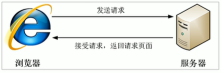
????????核心原理:將網頁中的一些小背景圖像整合到一張大圖中,這樣服務器只需要一次請求就可以了。
????????精靈技術的目的:為了有效減少服務器接收和發送請求的次數,提高頁面的加載速度。
2)使用
使用精靈圖核心:
1.精靈技術主要針對于背景圖片使用。就是把多個小背景圖片整合到一張大圖中。
2.這個大圖片也稱為sprites精靈圖或者雪碧圖
3.移動背景圖片位置,此時可以使用background-position。
4.移動的距離就是這個目標圖片的x和y坐標。注意網頁中的左邊有所不同。
5.一般情況下往上往左移動,數值是負值。(一般情況下,都是負值)
6.使用精靈圖的時候需要精確測量,每個小背景圖片的大小和位置。
<style>.box1 {width: 60px;height: 60px;margin: 100px auto;background: url(images/sprites.png) no-repeat;background-position: -182px 0;}.box2 {width: 27px;height: 25px;margin: 200px;background: url(images/sprites.png) no-repeat;background-position: -155px -106px;}</style>
<body><div class="box1"></div><div class="box2"></div>
</body>
2、字體圖標
????????字體圖標展示的是圖標,但是本質上是字體,具有字體的屬性。
字體圖標優點:
字體圖標下載
下載網站:
icomoon字庫 http://icomoon.io
阿里iconfont字庫 http://www.iconfont.cn/
阿里的字體圖標使用方法:
https://www.iconfont.cn/help/detail?spm=a313x.7781069.1998910419.d8cf4382a&helptype=code
3、CSS三角
由下面代碼可知,制作一個三角可以讓其他三個三角是透明的即可。
<style>.box1 {width: 0;height: 0;border-top: 10px solid skyblue;border-right: 10px solid rgb(92, 221, 116);border-bottom: 10px solid rgb(226, 235, 148);border-left: 10px solid rgb(245, 155, 210);}</style>
<body><div class="box1"></div>
</body>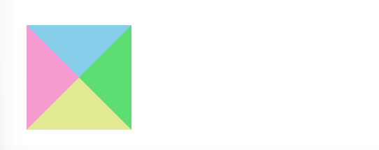
<style>.box2 {width: 0;height: 0;/* 為了照顧兼容性 */line-height: 0;font-size: 0;border: 10px solid transparent;border-top-color: skyblue;}</style>
<body><div class="box2"></div>
</body>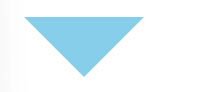
3、用戶界面樣式
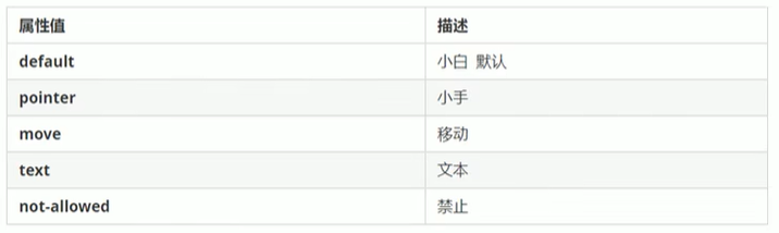
1)更改用戶的鼠標樣式
語法:li { cursor: pointer;?}
2)表單輪廓線
????????給表單添加outline:0;或者outline:none;樣式之后,就可以去掉默認的藍色邊框。
3)防止表單域拖拽
語法:textarea{ resize: none; }
4、vertical-align屬性應用
1)對齊方式
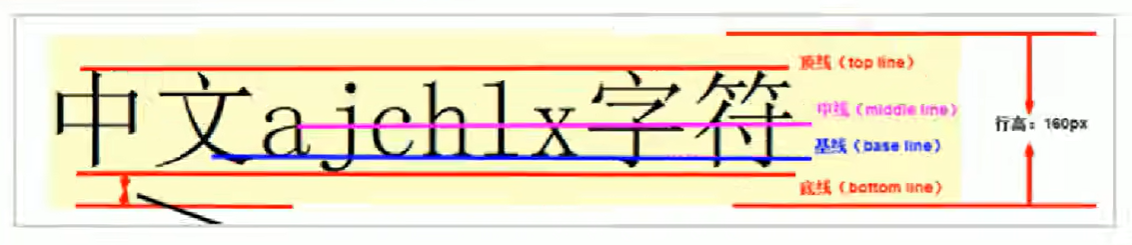
????????vertical-align屬性應用場景:用于設置圖片或者表單(行內塊元素)和文字垂直對齊。
但是它只針對于行內元素或者行內塊元素有效。
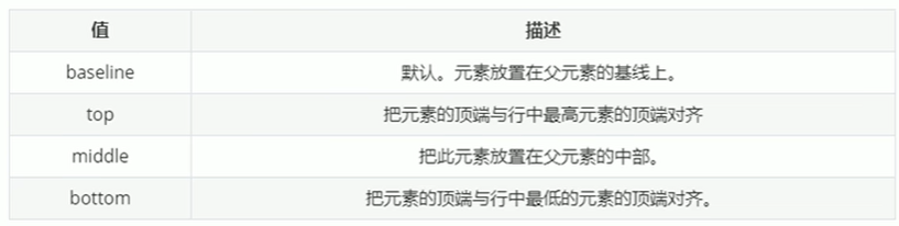
語法(默認和基線對齊):
vertical-align : baseline | top | middle | bottom
2)圖片底側空白縫隙問題
????????由于圖片默認和文字是基線對齊,所以圖片底側會出現空白縫隙。
解決方法:
1.給圖片添加vertical-align : ?top | middle | bottom
2.把圖片轉換為塊級元素display:block;
5、溢出的文字省略號顯示
1)單行文本溢出顯示省略號
必須滿足三步:
1.先強制一行內顯示文本
nowrap不換行,默認normal自動換行
white-space: nowrap;
2.超出部分隱藏
overflow: hidden;
3.文字用省略號替代超出的部分
text-overflow: ellipsis;
2)多行文本溢出顯示省略號
????????多行文本溢出顯示省略號,有較大兼容性問題, 適合于webKit瀏覽器或移動端(移動端大部分是webkit內 核)。
overflow: hidden;
text-overflow: ellipsis;
/* 彈性伸縮盒子模型顯示 */
display: -webkit-box;
/* 限制在一個塊元素顯示的文本的行數 */
-webkit-line-clamp: 2;
/* 設置或檢索伸縮盒對象的子元素的排列方式 */
-webkit-box-orient: vertical;
6、常見布局技巧
1)margin負值的運用
<style>ul li {float: left;list-style: none;width: 150px;height: 200px;border: 1px solid skyblue;margin-left: -1px;}ul li:hover {border: 1px solid red;}</style>
<body><ul><li>1</li><li>2</li><li>3</li><li>4</li><li>5</li></ul>
</body>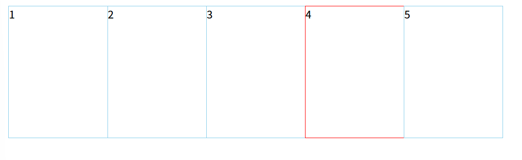
由此,我們發現第四個盒子的右邊框被壓到了,此時只需要當前的盒子添加position: relative;因為相對定位會壓住其他標準流的盒子。
<style>ul li {float: left;list-style: none;width: 150px;height: 200px;border: 1px solid skyblue;margin-left: -1px;}ul li:hover {position: relative;border: 1px solid red;}</style>注意:如果盒子都有定位,則加z-index。
2)文字圍繞浮動元素
? ? ? ? ---運用浮動元素不會壓住文字的技巧
<style>* {margin: 0;padding: 0;}.box {float: left;width: 250px;height: 100px;background-color: skyblue;margin: 0 auto;padding: 5px}.photo {float: left;width: 180px;height: 80px;margin-right: 5px;}.photo img {width: 100%;}</style>
<body><div class="box"><div class="photo"><img src="images/jianlai.jpg" alt=""></div><p>歲歲平,歲歲安,歲歲平安</p></div>
</body>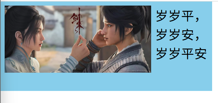
3)行內塊巧妙運用
<style>* {margin: 0;padding: 0;}.box {text-align: center;}.box a {display: inline-block;width: 36px;height: 36px;background-color: #f7f7f7;border: 1px solid #ccc;line-height: 36px;text-decoration: none;color: #333;font-size: 14px;}.box .prev,.box .next {width: 85px;}.box .now,.box .will {background-color: #fff;border: none;}.box input {height: 36px;width: 45px;border: 1px solid #ccc;outline: none}.box button {width: 60px;height: 36px;background-color: #f7f7f7;border: 1px solid #ccc;}</style>
<body><div class="box"><a href="#" class="prev"><<上一頁</a><a href="#" class="now">2</a><a href="#">3</a><a href="#">4</a><a href="#">5</a><a href="#">6</a><a href="#" class="will">...</a><a href="#" class="next">>>下一頁</a>到第<input type="text">頁<button>確定</button></div>
</body>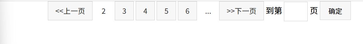
4)CSS三角強化
<style>* {margin: 0;padding: 0;}.box1 {width: 0;height: 0;/* border-top: 20px solid transparent;border-right: 10px solid skyblue;border-bottom: 0px solid rgb(226, 235, 148);border-left: 0px solid rgb(245, 155, 210); */border-color: transparent skyblue transparent transparent;border-style: solid;border-width: 20px 10px 0 0;}</style>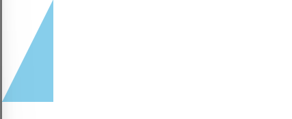
<style>* {margin: 0;padding: 0;}.box1 {margin: 30px 0;}.price {width: 160px;height: 24px;line-height: 24px;border: 1px solid red;margin: 0 auto;color: #fff;font-weight: 700px;}.ms {position: relative;float: left;width: 90px;height: 100%;background-color: red;text-align: center;}.ms i {position: absolute;right: 0;top: 0;width: 0;height: 0;border-color: transparent #fff transparent transparent;border-style: solid;border-width: 24px 12px 0 0;}.ori {font-size: 12px;color: gray;text-decoration: line-through;}</style>
<body><div class="box1"></div><div class="price"><span class="ms">¥1650<i></i></span><span class="ori">¥5650</span></div>
</body>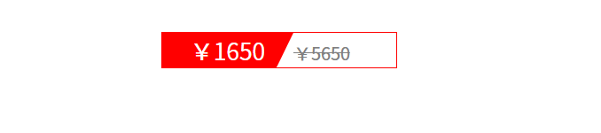
7、CSS初始化
每個網頁都必須首先進行CSS初始化。

——Mysql邏輯架構)


)


)


)


