目錄
視頻播放 (Video)
創建視頻組件
加載視頻資源
加載本地視頻
加載沙箱路徑視頻
加載網絡視頻
添加屬性
事件調用
Video控制器使用
其他說明
示例代碼
進度條 (Progress)
創建進度條
設置進度條樣式
場景示例
視頻播放 (Video)
Video組件用于播放視頻文件并控制其播放狀態,常用于短視頻和應用內部視頻的列表頁面。當視頻完整出現時會自動播放,用戶點擊視頻區域則會暫停播放,同時顯示播放進度條,通過拖動播放進度條指定視頻播放到具體位置。
創建視頻組件
Video通過調用接口來創建,接口調用形式如下:
Video(value: VideoOptions)
加載視頻資源
Video組件支持加載本地視頻和網絡視頻。具體的數據源配置請參考VideoOptions對象說明。
加載本地視頻
-
普通本地視頻。
加載本地視頻時,首先在本地rawfile目錄指定對應的文件,如下圖所示。
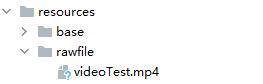
再使用資源訪問符$rawfile()引用視頻資源。
// xxx.ets @Component export struct VideoPlayer {private controller: VideoController = new VideoController()private previewUris: Resource = $r('app.media.preview')private innerResource: Resource = $rawfile('videoTest.mp4')build() {Column() {Video({src: this.innerResource, // 設置視頻源previewUri: this.previewUris, // 設置預覽圖controller: this.controller //設置視頻控制器,可以控制視頻的播放狀態})}} } -
Data Ability提供的視頻路徑帶有dataability://前綴,使用時確保對應視頻資源存在。
// xxx.ets
@Component
export struct VideoPlayer {private controller: VideoController = new VideoController()private previewUris: Resource = $r('app.media.preview')private videoSrc: string = 'dataability://device_id/com.domainname.dataability.videodata/video/10'build() {Column() {Video({src: this.videoSrc,previewUri: this.previewUris,controller: this.controller})}}
}
加載沙箱路徑視頻
支持file://路徑前綴的字符串,用于讀取應用沙箱路徑內的資源,需要確保應用沙箱目錄路徑下的文件存在并且有可讀權限。
// xxx.ets
@Component
export struct VideoPlayer {private controller: VideoController = new VideoController()private videoSrc: string = 'file:///data/storage/el2/base/haps/entry/files/show.mp4'build() {Column() {Video({src: this.videoSrc,controller: this.controller})}}
}
加載網絡視頻
加載網絡視頻時,需要申請ohos.permission.INTERNET權限,具體申請方式請參考聲明權限。此時,Video的src屬性為網絡視頻的鏈接。
// xxx.ets
@Component
export struct VideoPlayer {private controller: VideoController = new VideoController()private previewUris: Resource = $r('app.media.preview')private videoSrc: string = 'https://www.example.com/example.mp4' // 使用時請替換為實際視頻加載網址build() {Column() {Video({src: this.videoSrc,previewUri: this.previewUris,controller: this.controller})}}
}
添加屬性
Video組件屬性主要用于設置視頻的播放形式。例如設置視頻播放是否靜音、播放是否顯示控制條等。
// xxx.ets
@Component
export struct VideoPlayer {private controller: VideoController = new VideoController()build() {Column() {Video({controller: this.controller}).muted(false) // 設置是否靜音.controls(false) // 設置是否顯示默認控制條.autoPlay(false) // 設置是否自動播放.loop(false) // 設置是否循環播放.objectFit(ImageFit.Contain) // 設置視頻填充模式}}
}
事件調用
Video組件回調事件主要包括播放開始、播放暫停、播放結束、播放失敗、播放停止、視頻準備和操作進度條等事件,除此之外,Video組件也支持通用事件的調用,如點擊、觸摸等事件的調用。
// xxx.ets
@Entry
@Component
struct VideoPlayer {private controller: VideoController = new VideoController()private previewUris: Resource = $r('app.media.preview')private innerResource: Resource = $rawfile('videoTest.mp4')build() {Column() {Video({src: this.innerResource,previewUri: this.previewUris,controller: this.controller}).onUpdate((event) => { // 更新事件回調console.info("Video update.");}).onPrepared((event) => { // 準備事件回調console.info("Video prepared.");}).onError(() => { // 失敗事件回調console.error("Video error.");}).onStop(() => { // 停止事件回調console.info("Video stopped.");})}}
}
Video控制器使用
Video控制器主要用于控制視頻的狀態,包括播放、暫停、停止以及設置進度等,詳細使用請參考VideoController使用說明。
-
默認控制器
默認的控制器支持視頻的開始、暫停、進度調整、全屏顯示四項基本功能。
// xxx.ets @Entry @Component struct VideoGuide {@State videoSrc: Resource = $rawfile('videoTest.mp4')@State previewUri: string = 'common/videoIcon.png'@State curRate: PlaybackSpeed = PlaybackSpeed.Speed_Forward_1_00_Xbuild() {Row() {Column() {Video({src: this.videoSrc,previewUri: this.previewUri,currentProgressRate: this.curRate // 設置視頻播放倍速})}.width('100%')}.height('100%')} } -
自定義控制器
使用自定義的控制器,先關閉默認控制器,然后使用button以及slider等組件進行自定義的控制與顯示,適合自定義較強的場景下使用。
// xxx.ets
@Entry
@Component
struct VideoGuide {@State videoSrc: Resource = $rawfile('videoTest.mp4')@State previewUri: string = 'common/videoIcon.png'@State curRate: PlaybackSpeed = PlaybackSpeed.Speed_Forward_1_00_X@State currentTime: number = 0@State durationTime: number = 0controller: VideoController = new VideoController()build() {Row() {Column() {Video({src: this.videoSrc,previewUri: this.previewUri,currentProgressRate: this.curRate,controller: this.controller}).controls(false).autoPlay(true).onPrepared((event) => {if (event) {this.durationTime = event.duration}}).onUpdate((event) => {if (event) {this.currentTime = event.time}})Row() {Text(JSON.stringify(this.currentTime) + 's')Slider({value: this.currentTime,min: 0,max: this.durationTime}).onChange((value: number, mode: SliderChangeMode) => {this.controller.setCurrentTime(value); // 設置視頻播放的進度跳轉到value處}).width("90%")Text(JSON.stringify(this.durationTime) + 's')}.opacity(0.8).width("100%")}.width('100%')}.height('40%')}
}
其他說明
Video組件已經封裝好了視頻播放的基礎能力,開發者無需進行視頻實例的創建,視頻信息的設置獲取,只需要設置數據源以及基礎信息即可播放視頻,相對擴展能力較弱。如果開發者想自定義視頻播放,請參考視頻播放。
示例代碼
- 媒體庫視頻
進度條 (Progress)
Progress是進度條顯示組件,顯示內容通常為目標操作的當前進度。
創建進度條
Progress通過調用接口來創建,接口調用形式如下:
Progress(options: {value: number, total?: number, type?: ProgressType})其中,value用于設置初始進度值,total用于設置進度總長度,type用于設置Progress樣式。
Progress({ value: 24, total: 100, type: ProgressType.Linear }) // 創建一個進度總長為100,初始進度值為24的線性進度條
設置進度條樣式
Progress有5種可選類型,通過ProgressType可以設置進度條樣式。ProgressType類型包括:ProgressType.Linear(線性樣式)、 ProgressType.Ring(環形無刻度樣式)、ProgressType.ScaleRing(環形有刻度樣式)、ProgressType.Eclipse(圓形樣式)和ProgressType.Capsule(膠囊樣式)。
-
線性樣式進度條(默認類型)
從API version 9開始,組件高度大于寬度時,自適應垂直顯示;組件高度等于寬度時,保持水平顯示。
Progress({ value: 20, total: 100, type: ProgressType.Linear }).width(200).height(50)
Progress({ value: 20, total: 100, type: ProgressType.Linear }).width(50).height(200)
- 環形無刻度樣式進度條?
// 從左往右,1號環形進度條,默認前景色為藍色漸變,默認strokeWidth進度條寬度為2.0vp
Progress({ value: 40, total: 150, type: ProgressType.Ring }).width(100).height(100)
// 從左往右,2號環形進度條
Progress({ value: 40, total: 150, type: ProgressType.Ring }).width(100).height(100).color(Color.Grey)    // 進度條前景色為灰色.style({ strokeWidth: 15})    // 設置strokeWidth進度條寬度為15.0vp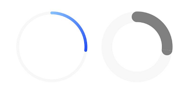
- 環形有刻度樣式進度條
Progress({ value: 20, total: 150, type: ProgressType.ScaleRing }).width(100).height(100).backgroundColor(Color.Black).style({ scaleCount: 20, scaleWidth: 5 })    // 設置環形有刻度進度條總刻度數為20,刻度寬度為5vp
Progress({ value: 20, total: 150, type: ProgressType.ScaleRing }).width(100).height(100).backgroundColor(Color.Black).style({ strokeWidth: 15, scaleCount: 20, scaleWidth: 5 })    // 設置環形有刻度進度條寬度15,總刻度數為20,刻度寬度為5vp
Progress({ value: 20, total: 150, type: ProgressType.ScaleRing }).width(100).height(100).backgroundColor(Color.Black).style({ strokeWidth: 15, scaleCount: 20, scaleWidth: 3 })    // 設置環形有刻度進度條寬度15,總刻度數為20,刻度寬度為3vp
- 圓形樣式進度條
// 從左往右,1號圓形進度條,默認前景色為藍色
Progress({ value: 10, total: 150, type: ProgressType.Eclipse }).width(100).height(100)
// 從左往右,2號圓形進度條,指定前景色為灰色
Progress({ value: 20, total: 150, type: ProgressType.Eclipse }).color(Color.Grey).width(100).height(100)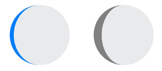
- 膠囊樣式進度條
Progress({ value: 10, total: 150, type: ProgressType.Capsule }).width(100).height(50)
Progress({ value: 20, total: 150, type: ProgressType.Capsule }).width(50).height(100).color(Color.Grey)
Progress({ value: 50, total: 150, type: ProgressType.Capsule }).width(50).height(100).color(Color.Blue).backgroundColor(Color.Black)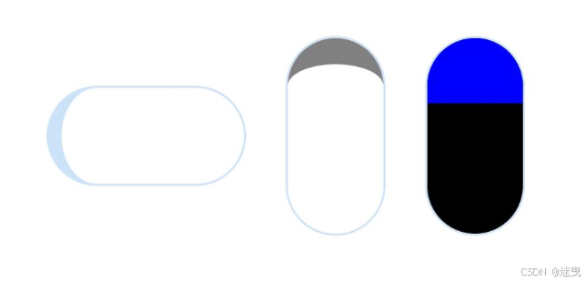
頭尾兩端圓弧處的進度展示效果與ProgressType.Eclipse樣式一致。
中段處的進度展示效果為矩形狀長條,與ProgressType.Linear線性樣式相似。
組件高度大于寬度時,自適應垂直顯示。
場景示例
更新當前進度值,如應用安裝進度條,可通過點擊Button增加progressValue,value屬性將progressValue設置給Progress組件,進度條組件即會觸發刷新,更新當前進度。
@Entry
@Component
struct ProgressCase1 { @State progressValue: number = 0;    // 設置進度條初始值為0build() {Column() {Column() {Progress({value:0, total:100, type:ProgressType.Capsule}).width(200).height(50).value(this.progressValue)Row().width('100%').height(5)Button("進度條+5").onClick(()=>{this.progressValue += 5;if (this.progressValue > 100){this.progressValue = 0;}})}}.width('100%').height('100%')}
}

:docker-compose.yml (ThinkPHP))


的完整說明)


