本系列可作為前端學習系列的筆記,代碼的運行環境是在HBuilder中,小編會將代碼復制下來,大家復制下來就可以練習了,方便大家學習。
HTML系列文章?已經收錄在前端專欄,有需要的寶寶們可以點擊前端專欄查看!
點贊關注不迷路!您的點贊、關注和收藏是對小編最大的支持和鼓勵!
系列文章目錄
CSS- 1.1 css選擇器
CSS- 2.1 實戰之圖文混排、表格、表單、學校官網一級導航欄
CSS- 3.1 盒子模型-塊級元素、行內元素、行內塊級元素和display屬性
CSS- 4.1 浮動(Float)
CSS- 4.2 相對定位(position: relative)
CSS- 4.3 絕對定位(position: absolute)&學校官網導航欄實例
CSS- 4.4 固定定位(fixed)& 咖啡售賣官網實例
CSS- 4.5 css + div 布局 & 簡易網易云音樂 官網布置實例?
CSS- 4.6 radiu、shadow、animation動畫
CSS-5.1 Transition 過渡?
目錄
系列文章目錄
前言
一、CSS 高級特性:圓角、陰影與動畫
1.圓角 (border-radius)
基本語法
特殊值
示例
2.陰影 (box-shadow & text-shadow)
盒子陰影 (box-shadow)
文本陰影 (text-shadow)
示例
3.動畫 (animation)
關鍵概念
基本語法
簡寫屬性
常用動畫屬性值
示例
結合使用示例
二、代碼實例
1.? radiu+shadow代碼實例如下:
2. animation動畫 代碼如下:
總結
前言
小編作為新晉碼農一枚,會定期整理一些寫的比較好的代碼,作為自己的學習筆記,會試著做一下批注和補充,如轉載或者參考他人文獻會標明出處,非商用,如有侵權會刪改!歡迎大家斧正和討論!
一、CSS 高級特性:圓角、陰影與動畫
1.圓角 (border-radius)
border-radius?屬性用于為元素添加圓角效果,可以創建從輕微圓角到完全圓形的各種效果。
基本語法
css
.element {border-radius: 10px; /* 四個角相同 */border-radius: 10px 20px; /* 左上右下/右上左下 */border-radius: 10px 20px 30px 40px; /* 左上 右上 右下 左下 */
}
特殊值
50%:創建圓形(當元素是正方形時)100%:創建橢圓形
示例
css
.button {border-radius: 25px; /* 輕微圓角按鈕 */
}.circle {width: 100px;height: 100px;border-radius: 50%; /* 圓形 */
}
2.陰影 (box-shadow & text-shadow)
盒子陰影 (box-shadow)
為元素添加陰影效果,增強立體感。
css
.element {box-shadow: h-offset v-offset blur spread color inset;
}h-offset:水平偏移(必需)v-offset:垂直偏移(必需)blur:模糊半徑(可選)spread:陰影擴展(可選)color:陰影顏色(可選)inset:內部陰影(可選)
文本陰影 (text-shadow)
為文本添加陰影效果。
css
.text {text-shadow: h-offset v-offset blur color;
}
示例
css
.card {box-shadow: 0 4px 8px rgba(0,0,0,0.1); /* 輕微浮動效果 */
}.highlight {text-shadow: 2px 2px 4px #000000; /* 文字突出效果 */
}.inset-shadow {box-shadow: inset 0 0 10px rgba(0,0,0,0.2); /* 內部凹陷效果 */
}
3.動畫 (animation)
CSS 動畫允許在不使用 JavaScript 的情況下創建復雜的動畫效果。
關鍵概念
- @keyframes:定義動畫序列
- animation-name:指定 @keyframes 名稱
- animation-duration:動畫持續時間
- animation-timing-function:速度曲線
- animation-delay:動畫開始前的延遲
- animation-iteration-count:播放次數
- animation-direction:播放方向
- animation-fill-mode:動畫前后樣式
- animation-play-state:播放狀態
基本語法
css
@keyframes slidein {from {transform: translateX(0%);}to {transform: translateX(100%);}
}.element {animation-name: slidein;animation-duration: 3s;animation-timing-function: ease-in-out;animation-delay: 1s;animation-iteration-count: infinite;animation-direction: alternate;
}
簡寫屬性
css
.element {animation: slidein 3s ease-in-out 1s infinite alternate;
}
常用動畫屬性值
- timing-function:
ease(默認)linearease-inease-outease-in-outcubic-bezier(n,n,n,n)
- direction:
normal(默認)reversealternatealternate-reverse
示例
css
/* 淡入效果 */
@keyframes fadeIn {from { opacity: 0; }to { opacity: 1; }
}.fade-in {animation: fadeIn 1s ease-in;
}/* 旋轉動畫 */
@keyframes spin {from { transform: rotate(0deg); }to { transform: rotate(360deg); }
}.spinner {animation: spin 2s linear infinite;
}/* 彈跳球 */
@keyframes bounce {0%, 100% { transform: translateY(0); }50% { transform: translateY(-20px); }
}.ball {animation: bounce 1s ease infinite;
}
結合使用示例
css
.fancy-button {border-radius: 25px;box-shadow: 0 4px 6px rgba(0, 0, 0, 0.1);animation: pulse 2s infinite;
}@keyframes pulse {0% {box-shadow: 0 0 0 0 rgba(0, 123, 255, 0.4);}70% {box-shadow: 0 0 0 10px rgba(0, 123, 255, 0);}100% {box-shadow: 0 0 0 0 rgba(0, 123, 255, 0);}
}
這些 CSS 特性可以單獨使用,也可以組合使用,為網頁元素添加豐富的視覺效果和交互體驗。
二、代碼實例
1.? radiu+shadow代碼實例如下:
<!DOCTYPE html>
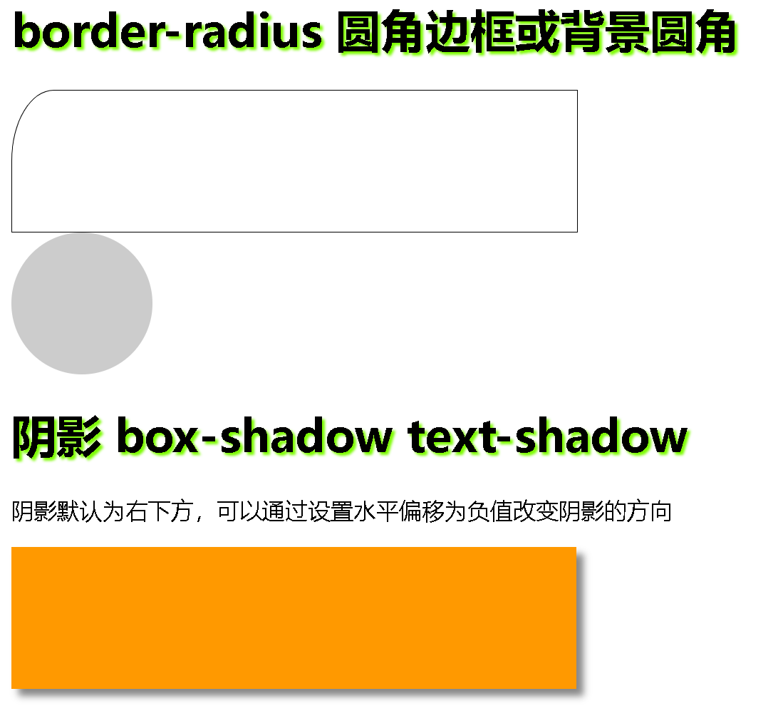
<html><head><meta charset="utf-8"><title>css3-radiu+shadow</title><style type="text/css">.div1 {width: 400px;height: 100px;border: 1px solid black;/* 取一個值為四個角為30px半徑的圓 *//* 取兩個值第一個值為左上右下的半徑值 右上左下的半徑值 *//* border-radius: 30px; *//* 某一個角的時候 第一個值代表水平半徑 第二個值為垂直半徑 */border-top-left-radius: 30px 50px;}.div2 {width: 100px;height: 100px;background-color: #CCCCCC;border-radius: 50px;}.div3 {width: 400px;height: 100px;background-color: #f90;box-shadow: 5px 5px 5px #868686;}h1 {text-shadow: 2px 2px 2px lawngreen;}</style></head><body><h1>border-radius 圓角邊框或背景圓角</h1><div class="div1"></div><div class="div2"></div><h1>陰影 box-shadow text-shadow</h1><p>陰影默認為右下方,可以通過設置水平偏移為負值改變陰影的方向</p><div class="div3"></div></body>
</html>
代碼運行:
2. animation動畫 代碼如下:
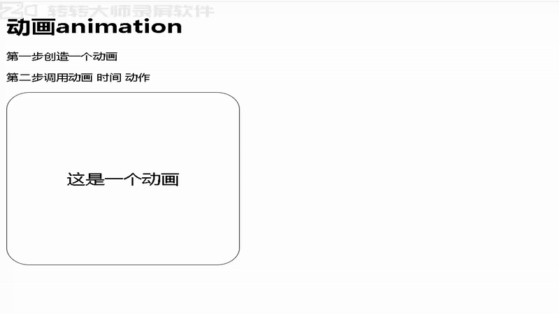
<!DOCTYPE html>
<html><head><meta charset="utf-8"><title>css3-animation動畫</title><style type="text/css">div {position: absolute;width: 300px;height: 300px;border: 1px solid black;border-radius: 30px;text-align: center;line-height: 300px;font-size: 24px;}@keyframes donghua1 {10% {background-color: red;left: 0px;}30% {background-color: yellow;font-size: 40px;}60% {background-color: green;color: white;}90% {background-color: blue;left: 300px;}}div:hover {animation: donghua1 5s infinite;}</style></head><body><h1>動畫animation</h1><p>第一步創造一個動畫</p><p>第二步調用動畫 時間 動作</p><div>這是一個動畫</div></body>
</html>
動畫變化如下:
總結
以上就是今天要講的內容,本文簡單記錄了radiu、shadow、animation動畫,僅作為一份簡單的筆記使用,大家根據注釋理解


前端頁面性能檢測)

)


)
碩士招生宣講會——深圳大學)
的性能優化策略)


![機器學習第十五講:決策樹全面講解:像玩“20個問題“游戲猜身份[特殊字符]](http://pic.xiahunao.cn/機器學習第十五講:決策樹全面講解:像玩“20個問題“游戲猜身份[特殊字符])
