一.考核內容
Web組大一下考核之HTML、CSS
1.為什么要清除浮動(4),清除浮動的方法有哪些?(6)(至少兩種)
2.怎么實現左邊左邊寬度固定右邊寬度自適應的布局?(10)
3.講講flex:1;(10)
4.怎么實現移動端適配不同設備?(10)
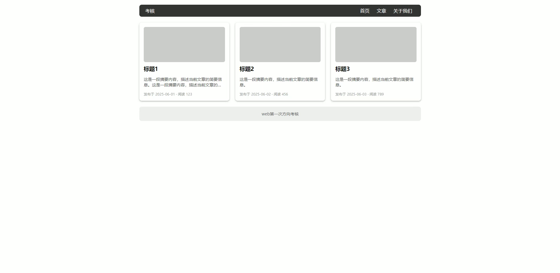
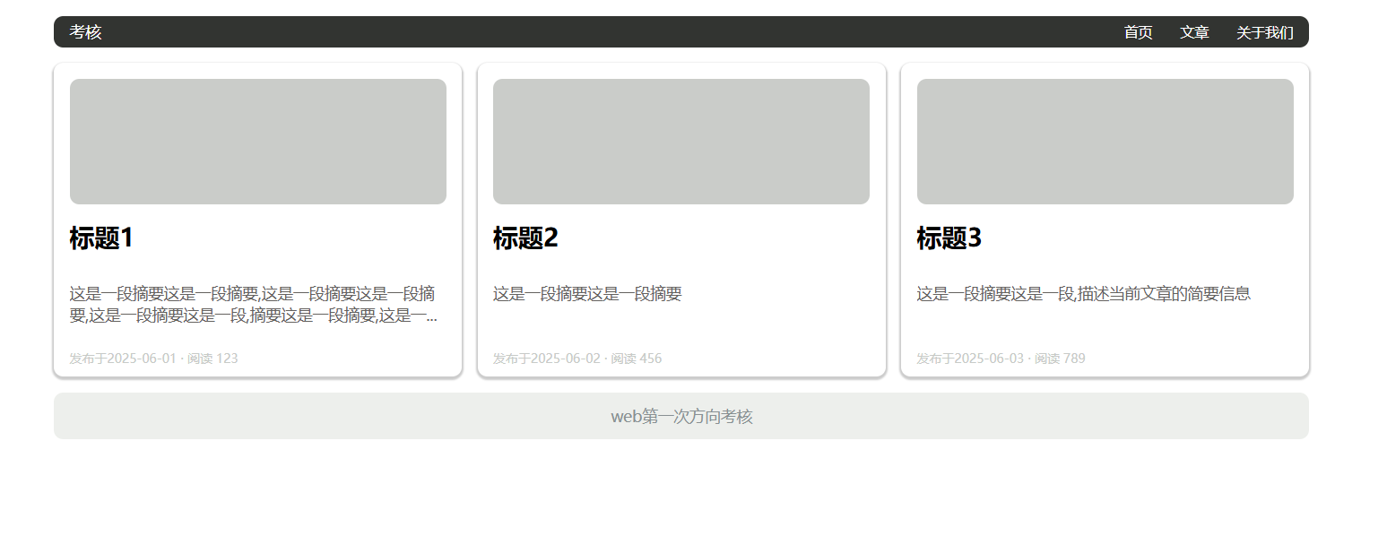
5.制作頁面
6.
7.
8.
二. 考核后的總結
1.
在網頁的布局里,浮動常常使用,當父元素不直接設置高度,需要里面的子元素撐開時,子元素都設置了浮動脫離了標準流,會導致父元素沒有高度,使得之后的標準流盒子影響整體的布局。
清除浮動的方法:
- 最常用的方法是使用偽元素清除浮動,思想就是設置一個正常流的盒子,讓該正常流的盒子撐開父盒子,避免之后的正常流盒子影響布局。
clearfix清除浮動
.clearfix:after{content:"";display:“block";height: 0px;clear:both;visibility: hidden;
}
- 父元素觸發 BFC:通過設置 overflow: hidden 或 overflow: auto 讓父元素形成 BFC(塊級格式化上下文),從而包裹浮動元素。有哪些屬性可以激活bfc:浮動元素,定位元素(除了absolute,fixed),display:inline-block,overflow:hidden(只要不是visible)
2.
- 使用flex布局,假設左右兩個盒子排在一行,左邊固定,右邊的盒子給他添加flex:1屬性,實現自適應的效果。
- 使用overflow:hidden,給右邊的盒子添加這一屬性,讓該盒子自己處于獨立的渲染模式下(不設置寬度),左邊的盒子設置了固定的寬度。
- 使用margin-left:左邊的盒子寬度,給右盒子添加浮動屬性,使他們一行排列,則可以實現右邊寬度自適應的效果。
相應的dom結構
<div class="box1"></div>
<div class="box2"></div>
.box1 {float: left;width: 200px;height: 200px;background-color: pink;}.box2 {margin-left: 200px;height: 200px;background-color: purple;}
3.
flex:1是flex布局中的一個屬性設置,如果大容器的每一個盒子都設置了這一個屬性,則每一個盒子會平均分配大盒子的剩余寬度。
.container {
display: flex;
}
.item {
/* 所有子元素平分容器寬度 */
flex: 1;
}
4.
- REM 適配
通過媒體查詢動態設置根字體大小(基于設計稿寬度,如 750px),引入flexible.js外部文件,動態處理rem的大小。
- Flexible 布局 + 媒體查詢
使用 Flexbox 實現彈性布局。
針對不同屏幕尺寸設置媒體查詢調整樣式:
css
@media (max-width: 600px) {
body { font-size: 14px; }
}
- VW/VH 單位
直接使用視口單位(1vw = 1% 視口寬度,也可以用vmin以視口寬高較小的一個為準)
- 也可以使用bootstrap框架,柵欄式布局在四種屏幕寬度條件下搭配上媒體查詢在屏幕縮放的過程中改變頁面布局。
5.
- 頁面分為頭部,內容,尾部,頭部和內容都可以使用flex布局,頭部設置justify-content:space-between屬性占據左右兩部分。
- 內容可以給中間的盒子設置margin值,給每一個子盒子設置flex:1實現三欄布局。
6.
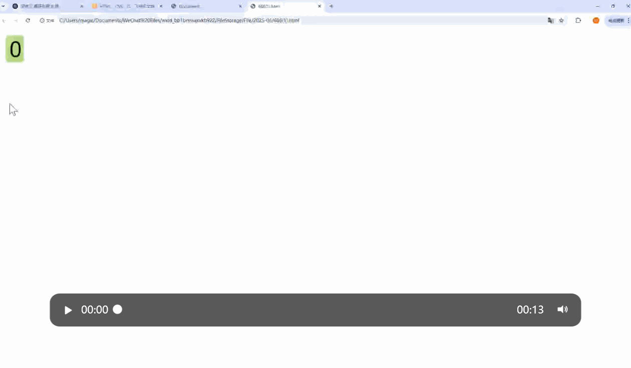
- 這個要注意的是設置一個只能顯示一個數字大小的外部盒子,套一個大的子盒子,根據子絕父相定位子盒子,設置一個動畫改變它的top值。
<div class="box"><div class="contain"><div>0</div><div>1</div><div>2</div><div>3</div><div>4</div><div>5</div><div>6</div><div>7</div><div>8</div><div>9</div></div></div>
* {box-sizing: border-box;}.box {position: relative;display: inline-block;width: 30px;height: 50px;background-color: green;border-radius: 5px;overflow: hidden;}@keyframes move {from {top: 0;}to {top: -460px;}}.contain {position: absolute;top: 0;left: 0;width: 30px;height: 500px;margin: 0 auto;border-radius: 5px;font-size: 16px;text-wrap: wrap;text-align: center;animation: move 4s ease-in-out infinite alternate backwards;}.contain div {width: 100%;height: 50px;line-height: 50px;}.contain div:last-child {width: 100%;height: 25px;}
7.
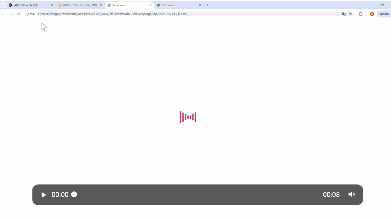
這里的動畫設置分為三部分,也就是三個關鍵幀,設置scaleY屬性實現豎直方向的伸縮。
<div class="radio"><span></span><span></span><span></span><span></span><span></span><span></span><span></span> </div>
.radio {position: absolute;top: 0px;bottom: 0px;left: 0px;right: 0px;margin: auto;width: 175px;height: 100px;}.radio span {display: block;background: orange;width: 7px;height: 100%;border-radius: 14px;margin-right: 5px;float: left;}.radio span:nth-child(1) {animation: load 2.5s 1.4s infinite linear;}.radio span:nth-child(2) {animation: load 2.5s 1.2s infinite linear;}.radio span:nth-child(3) {animation: load 2.5s 1s infinite linear;}.radio span:nth-child(4) {animation: load 2.5s 0.8s infinite linear;}.radio span:nth-child(5) {animation: load 2.5s 0.6s infinite linear;}.radio span:nth-child(6) {animation: load 2.5s 0.4s infinite linear;}.radio span:nth-child(7) {animation: load 2.5s 0.2s infinite linear;}@keyframes load {0% {transform: scaleY(1);}50% {transform: scaleY(0.08);}100% {transform: scaleY(1);}}
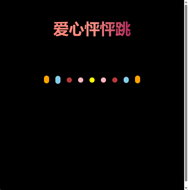
8.
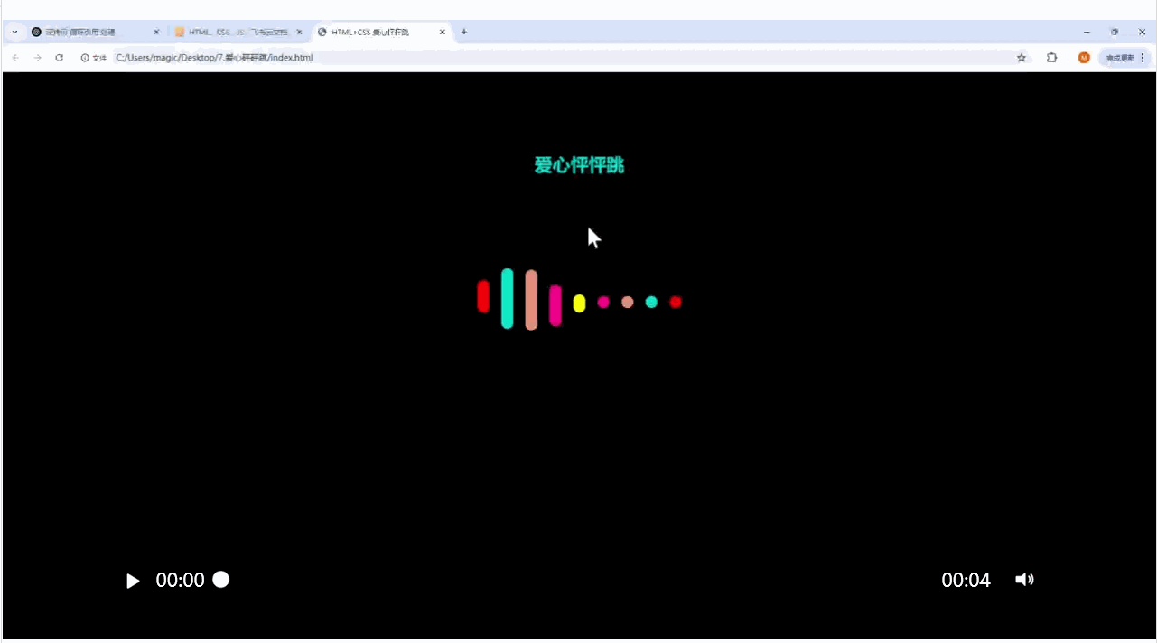
愛心怦怦跳
這個愛心的實現中每個線條是依次變長的,因此線條的開始的時間是不同的要設置延遲屬性,這個愛心是對稱形狀的,因此對稱線條的動畫是相同的,只需要設置5個動畫。
這里動畫設置的點是關鍵幀可以簡寫,確保動畫變完之后可以維持一段時間的狀態等待之后的線條變化。
<div class="rad">愛心怦怦跳</div><div class="contain"><div class="space"></div><div class="space"></div><div class="space"></div><div class="space"></div><div class="space"></div><div class="space"></div><div class="space"></div><div class="space"></div><div class="space"></div></div>
body {height: 100vh;display: flex;justify-content: center;align-items: center;background-color: #000;}.rad {position: absolute;top: 60px;left: 50%;transform: translate(-50%, 0);text-align: center;line-height: 100px;font-weight: 600;font-size: 60px;color: transparent;background-clip: text;background-image: linear-gradient(to right, #ff8177 0%, #ff867a 0%, #ff8c7f 21%, #f99185 52%, #cf556c 78%, #b12a5b 100%);}.contain {position: absolute;top: 300px;display: flex;height: 200px;}.contain .space {flex: 1;margin: 0 12px;width: 20px;height: 20px;border-radius: 10px;}.contain .space:nth-child(1) {background-color: orange;animation: move1 5s infinite 0s linear;}.contain .space:nth-child(2) {background-color: skyblue;animation: move2 5s infinite .2s linear;}.contain .space:nth-child(3) {background-color: #bc3a3a;animation: move3 5s infinite .4s linear;}.contain .space:nth-child(4) {background-color: lightpink;animation: move4 5s infinite .6s linear;}.contain .space:nth-child(5) {background-color: yellow;animation: move5 5s infinite .8s linear;}.contain .space:nth-child(6) {background-color: lightpink;animation: move4 5s infinite 1.0s linear;}.contain .space:nth-child(7) {background-color: #bc3a3a;animation: move3 5s infinite 1.2s linear;}.contain .space:nth-child(8) {background-color: skyblue;animation: move2 5s infinite 1.4s linear;}.contain .space:nth-child(9) {background-color: orange;animation: move1 5s infinite 1.6s linear;}@keyframes move1 {30%,60% {height: 60px;transform: translateY(-30px);}80%,100% {height: 20px;transform: translateY(0);}}@keyframes move2 {30%,60% {height: 125px;transform: translateY(-60px);}80%,100% {height: 20px;transform: translateY(0);}}@keyframes move3 {30%,60% {height: 160px;transform: translateY(-75px);}80%,100% {height: 20px;transform: translateY(0);}}@keyframes move4 {30%,60% {height: 180px;transform: translateY(-60px);}80%,100% {height: 20px;transform: translateY(0);}}@keyframes move5 {30%,60% {height: 200px;transform: translateY(-45px);}80%,100% {height: 20px;transform: translateY(0);}}相應的渲染效果


)


)


