文章目錄
- 前言
- 簡介
- 有哪些類型
- 拉出來溜溜
- Text + Span
- StyledString
- 其他
- CustomSpan
- 先看一下構造函數
- onMeasure(measureInfo: CustomSpanMeasureInfo): CustomSpanMetrics
- onDraw(context: DrawContext, drawInfo: CustomSpanDrawInfo)
- 遺留問題
前言
在開發中,經常會遇到一段文字中需要設置不同的字體樣式和點擊事件,最常見的就是在"我已仔細閱讀并同意《隱私政策》和《用戶協議》"這種情況,需要將書名號中的文字高亮,并且在點擊的時候需要跳轉到不同頁面。一般我們可以使用Text+Span來實現,但我們還有另外一種方法:屬性字符串
簡介
方便靈活應用文本樣式的對象,可通過TextController中的setStyledString方法與Text組件綁定,可通過RichEditorStyledStringController中的setStyledString方法與RichEditor組件綁定。
但需要注意以下幾點:
- 當組件樣式和屬性字符串中的樣式沖突時,沖突部分以屬性字符串設置的樣式為準,未沖突部分則生效組件的樣式。
- 當屬性字符串和Text子組件沖突時,屬性字符串優先級高,即當Text組件中綁定了屬性字符串,忽略Text組件下包含Span等子組件的情況。
- 不支持@State修飾。
- 建議將StyledString定義為成員變量,從而避免應用退后臺后被銷毀。
- 目前不支持在worker線程中使用。
最重要的一點,文檔上沒提到的:在aboutToAppear生命周期中調用textController.setStyledString()是沒有效果的的。
著也是為什么文檔中的示例將該方法的調用放在onPageShow方法的原因。
當然也可以在組件的onAppear方法中調用
有哪些類型
一般情況下,MutableStyledString使用的多一些。該類繼承自StyledString,其構造方法如下
constructor(value: string | ImageAttachment | CustomSpan , styles?: Array<StyleOptions>)
一般情況下我們是這么使用的
//創建無樣式屬性的字符串,然后調用該對象的 appendStyledString insertStyledString 等方法設置各種屬性
let mutableStyledString:MutableStyledString = new MutableStyledString("字符串")//直接添加各種樣式屬性
let mutableStyledString:MutableStyledString = new MutableStyledString("字符串",[{start:2,length:2,styledKey:StyledStringKey.DECORATION,styledValue:new DecorationStyle({color:Color.Red,type:TextDecorationType.LineThrough,style:TextDecorationStyle.WAVY})}])
這里的styledKey和styledValue是需要一一對應的,當這兩個值不匹配時不生效。
比如:
StyledStringKey.FONT <-> TextStyle
StyledStringKey.DECORATION <-> DecorationStyle
StyledStringKey.BASELINE_OFFSET <-> BaselineOffsetStyle
StyledStringKey.LETTER_SPACING <-> LetterSpacingStyle
StyledStringKey.TEXT_SHADOW <-> TextShadowStyle
StyledStringKey.LINE_HEIGHT <-> LineHeightStyle
StyledStringKey.BACKGROUND_COLOR <-> BackgroundColorStyle
StyledStringKey.URL <-> UrlStyle
StyledStringKey.GESTURE <-> GestureStyle
StyledStringKey.PARAGRAPH_STYLE <-> ParagraphStyle
StyledStringKey.USER_DATA <-> extends UserDataSpan
還有兩個比較特殊的:StyledStringKey.CUSTOM_SPAN 和 StyledStringKey.IMAGE,這兩個用的比較少。
拉出來溜溜
來看下如何實現一開始說的那個例子
Text + Span
Text(){Span("我已仔細閱讀并同意").fontColor("#333333").fontSize(16)Span("《用戶協議》").fontColor("#39d175").fontSize(16).onClick((_)=>{promptAction.showToast({message:"打開用戶協議頁面"})})Span("和").fontColor("#333333").fontSize(16)Span("《隱私協議》").fontColor("#39d175").fontSize(16).onClick((_)=>{promptAction.showToast({message:"打開隱私協議頁面"})})
}
StyledString
Text(undefined,{controller:this.protocolTextController}).onAppear(()=>{let protocolStyledString : MutableStyledString = new MutableStyledString("我已仔細閱讀并同意《用戶協議》和《隱私協議》",[{start: 9,length: 6,styledKey: StyledStringKey.FONT,styledValue: new TextStyle({fontColor:"#39d175",fontSize:LengthMetrics.fp(16),})},{start: 9,length: 6,styledKey: StyledStringKey.GESTURE,styledValue: new GestureStyle({onClick:(event:ClickEvent)=>{promptAction.showToast({message:"打開用戶協議頁面"})},onLongPress:(event:GestureEvent)=>{}})},{start: 16,length: 6,styledKey: StyledStringKey.FONT,styledValue: new TextStyle({fontColor:"#39d175",fontSize:LengthMetrics.fp(16),})},{start: 16,length: 6,styledKey: StyledStringKey.GESTURE,styledValue: new GestureStyle({onClick:(event:ClickEvent)=>{promptAction.showToast({message:"打開隱私協議頁面"})},onLongPress:(event:GestureEvent)=>{}})}])this.protocolTextController.setStyledString(protocolStyledString)})
當然這么比較起來還是Text+Span比較簡潔。但當遇到Span不支持的屬性的時候,還是得用StyledString,比如設置背景色、下劃線、刪除線、偏移、字間距等等
其他
整個全乎的看下效果
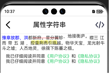
this.mutableStyledString = new MutableStyledString("豫章故郡,洪都新府。星分翼軫,地接衡廬。襟三江而帶五湖,控蠻荊而引甌越。物華天寶,龍光射牛斗之墟;人杰地靈,徐孺下陳蕃之榻。", [{start: 0,length: 6,styledKey: StyledStringKey.FONT,styledValue: new TextStyle({ fontColor: Color.Blue })}, {start: 7,length: 6,styledKey: StyledStringKey.DECORATION,styledValue: new DecorationStyle({color: Color.Red,type: TextDecorationType.LineThrough,style: TextDecorationStyle.WAVY})}, {start: 14,length: 6,styledKey: StyledStringKey.BASELINE_OFFSET,styledValue: new BaselineOffsetStyle(new LengthMetrics(6, LengthUnit.VP))}, {start: 21,length: 6,styledKey: StyledStringKey.LETTER_SPACING,styledValue: new LetterSpacingStyle(new LengthMetrics(6, LengthUnit.VP))}, {start: 28,length: 6,styledKey: StyledStringKey.TEXT_SHADOW,styledValue: new TextShadowStyle({radius: 5,type: ShadowType.COLOR,color: Color.Yellow,offsetX: 10,offsetY: -10})}, {start: 35,length: 6,styledKey: StyledStringKey.LINE_HEIGHT,styledValue: new LineHeightStyle(LengthMetrics.fp(20))}// , {// start: 42,// length: 6,// styledKey: StyledStringKey.BACKGROUND_COLOR,// styledValue: new BackgroundColorStyle({// color: Color.Pink,// radius: 6// })// }// , {// start: 49,// length: 6,// styledKey: StyledStringKey.URL,// styledValue: new UrlStyle("https://www.example.com")// }, {start: 56,length: 6,styledKey: StyledStringKey.PARAGRAPH_STYLE,styledValue:new ParagraphStyle({ textAlign: TextAlign.End, maxLines: 1, wordBreak: WordBreak.BREAK_ALL, overflow: TextOverflow.Ellipsis})}]);
注意:BackgroundColorStyle和UrlStyle是api14開始支持的
CustomSpan
我們需要繼承CustomSpan并重寫onMeasure(measureInfo: CustomSpanMeasureInfo): CustomSpanMetrics來完成測量,重寫onDraw(context: DrawContext, options: CustomSpanDrawInfo)來完成繪制,這和自定義組件的自定義布局中重寫onMeasureSize和onPlaceChildren差不多。
先看一下構造函數
CustomSpan對象只有一個無參構造函數,但一般情況下我們需要在構造函數中傳入我們需要的參數,大多數情況我們需要傳入要繪制的內容,這里簡單的以繪制字符串為例。還需要一個UIContext的上下文對象,用于獲取各種工具。
另外我們還需要根據需求,定義一些變量,來保存我們需要使用的參數。這里我們需要保存字體大小。
class MyCustomSpan extends CustomSpan {constructor(text: string, uiContext: UIContext) {super();this.text = text;this.uiContext = uiContext}text: stringuiContext: UIContextfontSizeFp:number =0}
onMeasure(measureInfo: CustomSpanMeasureInfo): CustomSpanMetrics
這個方法中,我們可以獲取到文字大小,需要返回一個CustomSpanMetrics對象,表示自定義繪制Span的尺寸。
onMeasure(measureInfo: CustomSpanMeasureInfo): CustomSpanMetrics {// measureInfo.fontSize單位為fpthis.fontSizeFp = measureInfo.fontSize// 傳入的fontSize單位為fp,返回文本所占布局寬度和高度單位均為px。let size =this.uiContext.getMeasureUtils().measureTextSize({ textContent: this.text, fontSize: measureInfo.fontSize })//customSpanMetrics的width和height 單位為vpthis.customSpanMetrics = { width: px2vp(size.width as number), height: px2vp(size.height as number) };return this.customSpanMetrics}這樣我們就獲取到了Span的尺寸信息
onDraw(context: DrawContext, drawInfo: CustomSpanDrawInfo)
DrawContext的實例對象context中的size屬性保存的畫布的寬高,canvas屬性保存了畫布對象;這里需要注意的是:獲取的畫布是Text組件的畫布,繪制時不會超出Text組件的范圍。這里就先認為是屬性的,戳進去看源碼就是定義的get方法:get canvas(): drawing.Canvas;
而CustomSpanDrawInfo的實例對象drawInfo則保存了自定義繪制Span的繪制信息。比如屬性x是自定義繪制Span相對于掛載組件的偏移、
lineTop是自定義繪制Span相對于Text組件的上邊距、 lineBottom是自定義繪制Span相對于Text組件的下邊距。baseline是自定義繪制Span的所在行的基線偏移量,它們的單位是都px。
onDraw(context: DrawContext, drawInfo: CustomSpanDrawInfo): void {console.error(`onDraw drawInfo x:${drawInfo.x} lineTop:${drawInfo.lineTop} lineBottom:${drawInfo.lineBottom} baseline:${drawInfo.baseline}`)console.error(`onDraw context ${vp2px(context.size.width)} ${vp2px(context.size.height)}`)let canvas = context.canvas;const font = new drawing.Font();font.setSize(vp2px(this.fontSizeFp));const brush = new drawing.Brush();brush.setColor({alpha: 255,red: 0,green: 74,blue: 175});canvas.attachBrush(brush)const textBlob = drawing.TextBlob.makeFromString(this.text, font, drawing.TextEncoding.TEXT_ENCODING_UTF8);canvas.drawTextBlob(textBlob, drawInfo.x, drawInfo.baseline);canvas.detachBrush()}
這樣我們就完成了一個簡單的自繪制的Span。
遺留問題
但是這里有個很大的問題:當繪制的文字多的時候,文字并不會換行。因為我們測量出來文字是按一行計算的,高度也是一行文字的高度。
想要計算需要幾行,就需要知道Text組件的寬度。這里可以從構造函數中傳進來。
那么問題就變成了如何獲取Text組件的寬度?可以從onAreaChange回調中獲取,但這個函數并不可靠,有時候一步小心使用屬性字符串時返回的寬度就是0。
另外一個問題就是,我們如何知道組件的寬度可以放下幾個字?假如一行可以放下5.4個字,那實際結果肯定是一行只繪制5個字。
我們可以根據這個方法來計算需要多大的高度。
還有一個問題就是在onDraw方法中drawInfo.baseLine屬性,目前來看就是最后一行文字的baseLine,如果有多行文字,還需要我們自己計算每一行的baseLine
哈哈,遺留的問題有時間再說吧,這個自定義繪制Span用的機會應該不大。
)


