css實現子盒子在父級盒子中上下左右居中
幾種常用的上下左右居中方式
HTML代碼部分
<div class="box"><img src="./img/77.jpeg" alt="" class="img">
</div>
css部分
方式一
利用子絕父相和margin:auto實現
<style>body{margin: 0;}.box{height: 100vh;background-color: hotpink;position: relative;}.img{position: absolute;top: 0;left: 0;bottom: 0;right: 0;margin: auto;}
</style>
方式二
利用子絕父相和css3的transform屬性實現
<style>body {margin: 0;}.box {height: 100vh;background-color: hotpink;position: relative;}.img {position: absolute;top: 50%;left: 50%;transform: translate(-50%, -50%);}
</style>
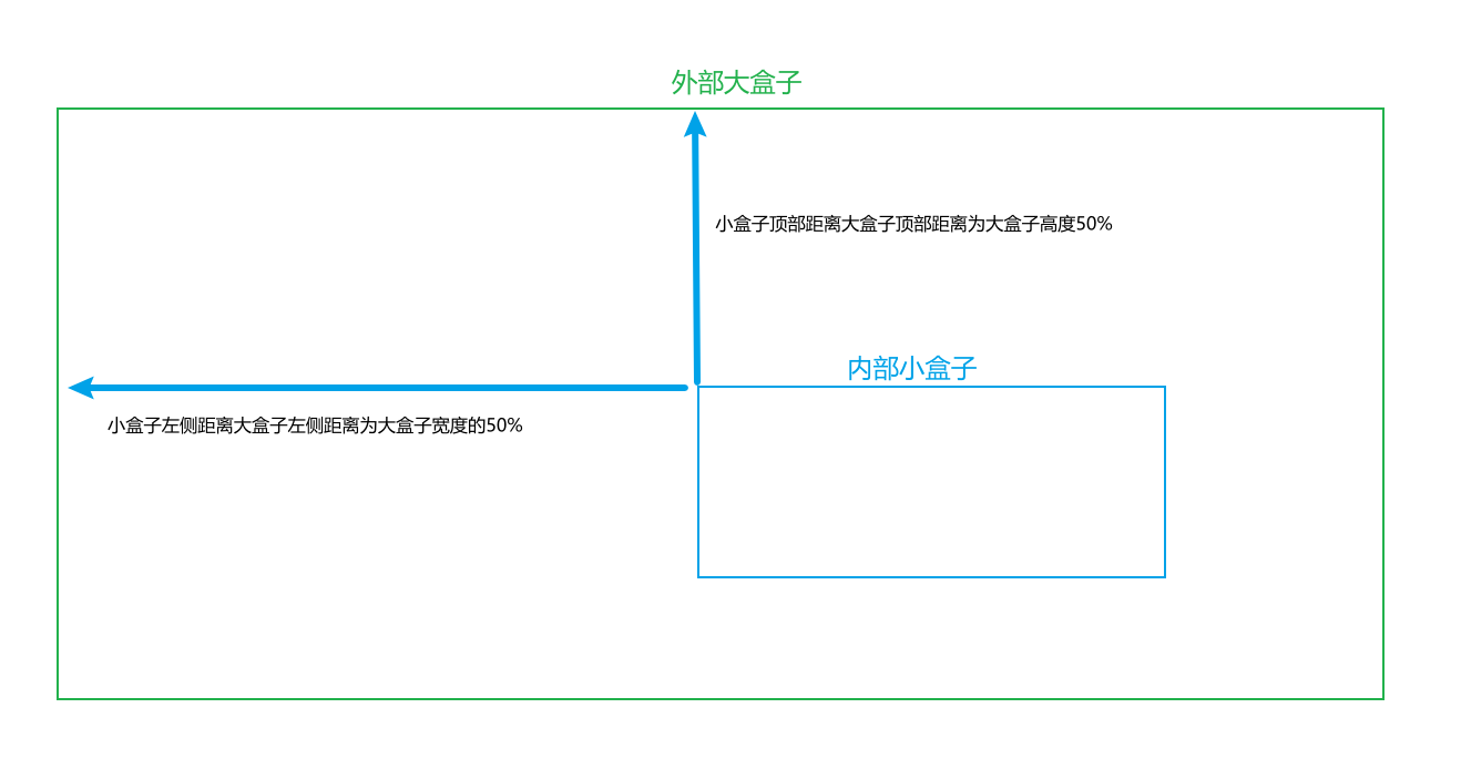
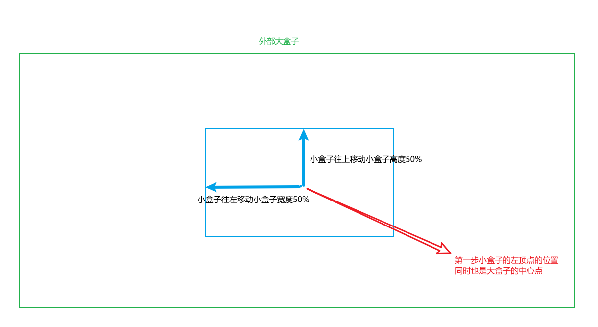
首先把內部盒子的位置設置為頂部和左側距離大盒子頂部和左側都是大盒子高度和寬度的50%;然后再把小盒子的頂部和左側的位置都回退內部小盒子高度和寬度的50%;這樣就剛好實現小盒子上下左右都居中在大盒子內部
圖示:第一步
第二步:
方式三
利用flex布局實現(彈性盒子)
<style>body {margin: 0;}.box {height: 100vh;background-color: hotpink;/* 對box大盒子啟用flex(彈性盒子)布局 */display: flex;/* 定義box中的項目(對于啟用flex布局的元素(父元素,也稱之為容器),其內部的子元素統一的稱之為項目)在交叉軸(flex布局中的定義:垂直方向上的軸線,水平的軸線稱之為主軸)上的對齊方式: 上下居中 */align-items: center;/* 定義項目在主軸上的對齊方式:左右居中;圖片高度會撐滿 */justify-content: center;}
</style>
方式四
利用grid布局實現(網格布局)
<style>body {margin: 0;}.box {height: 100vh;background-color: hotpink;/*  在父元素上開啟網格布局,采用網格布局的父元素被稱之為容器(container),內部采用網格定位的子元素,稱為"項目"(item)  */display: grid;}.img {display: inline-block;/* align-content屬性是整個內容區域的垂直位置(上中下) */align-self: center;/* justify-content屬性是整個內容區域在容器里面的水平位置 */justify-self: center;}
</style>
方式五
利用display: flex和margin: auto實現
<style>body {margin: 0;}.box {width: 100vw;height: 100vh;background-color: hotpink;display: flex;}.img {/*上下左右都居中*/margin: auto;}</style>
方式六
待更新…


》)

 - onnx 注冊自定義算子 - 學習記錄)
——服務器三次注冊限制以及數據庫化角色信息1--數據流程)


)
)


)

