🏆作者簡介:|康有為| ,大四在讀,目前在小米安卓實習,畢業入職
🏆本文收錄于?安卓學習大全持續更新中,歡迎關注
🏆安卓學習資料推薦:
? ? ? ? 視頻:b站搜動腦學院 視頻鏈接 (他們的視頻后面一部分沒再更新,看看前面也挺好的)
? ? ? ? 書籍:《第一行代碼》(第3版) by 郭霖 (z-lib.org)
? ? ? ? 思維導圖: https://www.processon.com/view/link/62427cb2e0b34d0730e20e00(來自動腦學院)
目錄
一、圖形定制
圖形Drawable
形狀圖形Shape
以下是一些關鍵屬性:
案例示范
九宮格圖片(.9.png)
狀態列表圖形
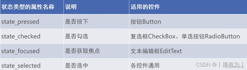
?狀態類型的取值說明
?案例示范
selector中嵌套Shape
二、選擇按鈕
復選框CheckBox
開關按鈕Switch
單選按鈕Radio Button
三、文本輸入和監聽
編輯框EditText
焦點變更監聽器
文本變化監聽器
四、對話框
提醒對話框AlertDialog
日期對話框DatePickerDiaglog
時間對話框TimePickerDialog
一、圖形定制
圖形Drawable
在 Android 中,drawable 是一個資源文件夾,用于存放與圖形相關的資源。這些資源可以是圖像、形狀、顏色等,用于構建應用的用戶界面。drawable 目錄下的資源可以通過資源 ID 在代碼中或 XML 文件中引用。
Drawable類型表達了各種各樣的圖形,包括圖片、色塊、畫板、背景等
包含圖片在內的圖形文件放在res目錄的各個drawable目錄下,其中drawable目錄一般保存描述性的XML文件,而圖片文件一般放在具體分辨率的drawable目錄下。
各視圖的background屬性、ImageView 和ImageButton的src屬性、TextView和Button四個方向的drawable***系列屬性都可以引用圖形文件。
13中Drawable的使用方法
詳解Android 13種 Drawable的使用方法
談談Android的中的Drawable
形狀圖形Shape
在安卓中,通過XML定義的Shape Drawable,可以創建各種形狀的圖形,如矩形、圓角矩形、橢圓等。這些圖形可以用作View的背景或作為其他Drawable的一部分。
這些是Shape Drawable中常見的一些屬性,通過組合和調整這些屬性,可以創建各種形狀的Drawable。這些Drawable可以用作View的背景,也可以在其他地方使用,例如作為ImageView的源圖像。
以下是一些關鍵屬性:
1.形狀(Shape):
<shape>元素定義了圖形的類型。可以是"rectangle"(矩形)、"oval"(橢圓)、"line"(線)、"ring"(環)等。具體形狀類型決定了其他屬性的適用性。
<shape xmlns:android="http://schemas.android.com/apk/res/android"android:shape="rectangle"><!-- 其他屬性 -->
</shape>
2.大小和尺寸(Size):
android:width和android:height屬性定義了矩形或橢圓的寬度和高度,單位可以是像素(px)或者是尺寸單位(dp)。
<shape xmlns:android="http://schemas.android.com/apk/res/android"android:shape="rectangle"><sizeandroid:width="100dp"android:height="50dp"/>
</shape>
3.邊框(Stroke):
android:width定義邊框的寬度,android:color定義邊框的顏色。
<shape xmlns:android="http://schemas.android.com/apk/res/android"android:shape="rectangle"><strokeandroid:width="2dp"android:color="#FF0000"/>
</shape>
4.圓角(Corners):
對于矩形,通過<corners>元素可以定義圓角。android:radius屬性定義了圓角的半徑。
<shape xmlns:android="http://schemas.android.com/apk/res/android"android:shape="rectangle"><corners android:radius="8dp"/>
</shape>
5.橢圓的寬高比(Gradient Ratio for Oval):
對于橢圓,可以通過<size>元素的android:aspectRatio屬性定義寬高比。
<shape xmlns:android="http://schemas.android.com/apk/res/android"android:shape="oval"><sizeandroid:width="100dp"android:height="50dp"android:aspectRatio="1"/>
</shape>
6.填充(Solid)
可以填充內部的顏色
<shape xmlns:android="http://schemas.android.com/apk/res/android"android:shape="rectangle"><solid android:color="#FF0000"/>
</shape>
7.還有 間隔(padding)、漸變(gradient)、縮放(Scale)、旋轉(Rotate)、形狀重復(Gradient Radius)、形狀顏色深度(Color Depth)等其他屬性,這里不一一列舉,用的時候可以自行搜索。
案例示范
需求:做一個頁面,兩個按鈕能切換背景的圖形。
|
|
|
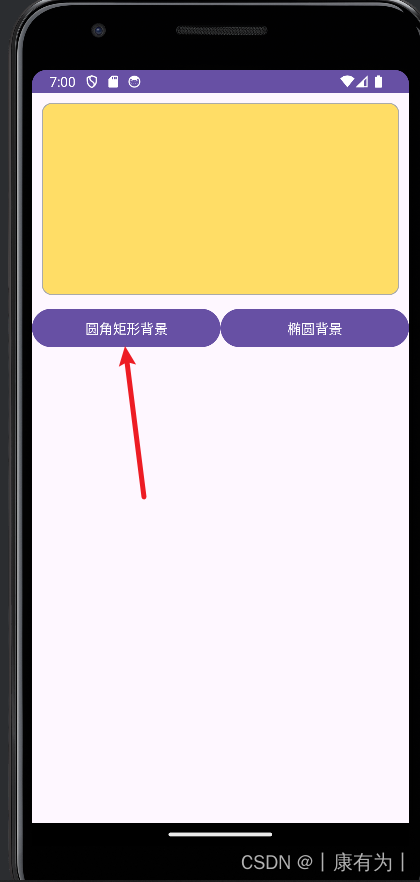
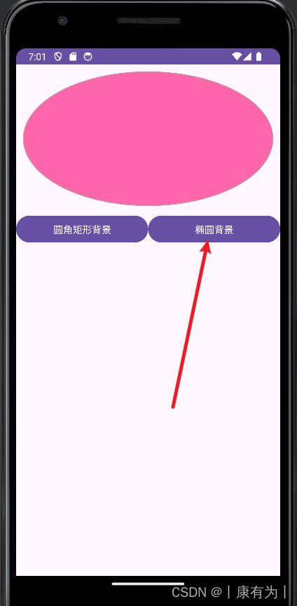
?
1.創建一個Activity,并寫好布局文件
<?xml version="1.0" encoding="utf-8"?>
<LinearLayout xmlns:android="http://schemas.android.com/apk/res/android"android:layout_width="match_parent"android:layout_height="match_parent"android:orientation="vertical"><Viewandroid:id="@+id/v_content"android:layout_width="match_parent"android:layout_height="200dp"android:layout_margin="10dp" /><LinearLayoutandroid:layout_width="match_parent"android:layout_height="wrap_content"android:orientation="horizontal"><Buttonandroid:id="@+id/btn_rect"android:layout_width="0dp"android:layout_height="wrap_content"android:layout_weight="1"android:text="圓角矩形背景" /><Buttonandroid:id="@+id/btn_oval"android:layout_width="0dp"android:layout_height="wrap_content"android:layout_weight="1"android:text="橢圓背景" /></LinearLayout></LinearLayout>
2.在res/drawable里面創建 一個圓角矩形的形狀
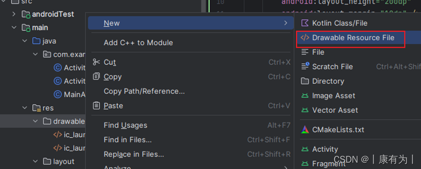
設定名字,并把根節點設置為shape
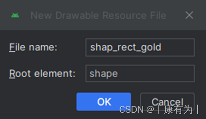
并設定好形狀的信息,也能在旁邊預覽
<?xml version="1.0" encoding="utf-8"?>
<shape xmlns:android="http://schemas.android.com/apk/res/android"><!-- 指定了形狀內部的填充顏色 --><solid android:color="#ffdd66" /><!-- 指定了形狀輪廓的粗細與顏色 --><strokeandroid:width="1dp"android:color="#aaaaaa" /><!-- 指定了形狀四個圓角的半徑 --><corners android:radius="10dp" /></shape>
3.同樣的方法,創建一個橢圓
名字可以設為:shape_oval_rose
<?xml version="1.0" encoding="utf-8"?>
<shape xmlns:android="http://schemas.android.com/apk/res/android"android:shape="oval"><!-- 指定了形狀內部的填充顏色 --><solid android:color="#ff66aa" /><!-- 指定了形狀輪廓的粗細與顏色 --><strokeandroid:width="1dp"android:color="#aaaaaa" /></shape>
4.現在我們想把這兩個形狀當成View的背景來用,并且點擊按鈕切換背景圖片,就寫Activity的java代碼
public class ActivityA extends AppCompatActivity implements View.OnClickListener {private View v_content;@Overrideprotected void onCreate(Bundle savedInstanceState) {super.onCreate(savedInstanceState);setContentView(R.layout.activity_a);//用v_content綁定view背景v_content = findViewById(R.id.v_content);findViewById(R.id.btn_rect).setOnClickListener(this);findViewById(R.id.btn_oval).setOnClickListener(this);// v_content的背景默認設置為圓角矩形v_content.setBackgroundResource(R.drawable.shape_rect_gold);}//處理點擊事件:哪個按鈕點擊了,就切換成對應得到形狀@Overridepublic void onClick(View v) {int id = v.getId();if (id == R.id.btn_rect){v_content.setBackgroundResource(R.drawable.shape_rect_gold);return;}if (id == R.id.btn_oval){v_content.setBackgroundResource(R.drawable.shape_oval_rose);return;}}
}
九宮格圖片(.9.png)
在安卓開發中,九宮格圖片通常用于實現可伸縮的圖形,以適應不同尺寸的屏幕或控件。這在處理圖形元素,尤其是背景圖或圖標時非常有用。下面讓我解釋一下如何實現安卓中的九宮格圖片:
NinePatch 圖片:
- 九宮格圖片是通過 NinePatch(.9.png) 圖片格式來實現的。NinePatch 圖片是一種特殊的 PNG 圖片,它包含了額外的信息,指定了圖片中哪些區域是可拉伸的,哪些區域是固定的。
工具:
- Android 提供了工具,如 draw9patch 工具,用于創建 NinePatch 圖片。這個工具允許你在圖像的邊緣繪制黑色線條,以指示哪些區域是可伸縮的。
.9.png 圖片結構:
- 一個 NinePatch 圖片通常有一個可拉伸的中間區域,以及一些指示內容區域的黑線。這樣,即使圖片被拉伸,黑線的位置和大小也不會變化,保持了固定的區域。黑線的位置和大小可以通過 NinePatch 圖片的文件名來指定。
使用 NinePatch 圖片:
- 在布局文件中,你可以使用 <ImageView> 元素來顯示 NinePatch 圖片。將 NinePatch 圖片放在 res/drawable 目錄中,并使用 @drawable/your_ninepatch_image 引用它。
-
<ImageViewandroid:layout_width="wrap_content"android:layout_height="wrap_content"android:src="@drawable/your_ninepatch_image"/>統將根據屏幕尺寸和布局要求,自動拉伸和縮放 NinePatch 圖片。
相關內容可以看
博客: Android 中關于九宮格圖片的那些事
視頻:2022 最新 Android 基礎教程,從開發入門到項目實戰,看它就夠了,更新中 p49
狀態列表圖形
Button按鈕的背景在正常情況下是凸起的,在按下時是凹陷的,從按下到彈起的過程,用戶便能知道點擊了這個按鈕。
在安卓開發中,狀態列表(State List)是一種定義不同狀態下顯示的圖形資源的方式。狀態列表圖形通常用于按鈕、選擇器等 UI 元素,以根據不同的用戶操作狀態顯示不同的圖形。
一個狀態列表可以包含以下不同的狀態:
普通狀態(state_enabled="true"):
????????默認狀態,當用戶沒有與 UI 元素進行交互時顯示的圖形。
按下狀態(state_pressed="true"):
????????當用戶按下按鈕時顯示的圖形。
選中狀態(state_selected="true"):
????????當 UI 元素被選中時顯示的圖形,例如用于底部導航欄的圖標。
焦點狀態(state_focused="true"):
????????當 UI 元素獲得焦點時顯示的圖形。
不可用狀態(state_enabled="false"):
????????當 UI 元素不可用時顯示的圖形。
在定義狀態列表時,你可以使用 <selector> 元素,其中包含了上述不同狀態下的圖形資源。以下是一個簡單的例子:
<selector xmlns:android="http://schemas.android.com/apk/res/android"><!-- 按下狀態:就用圖片@drawable/button_pressed --><item android:state_pressed="true" android:drawable="@drawable/button_pressed"/><!-- 選中狀態 --><item android:state_selected="true" android:drawable="@drawable/button_selected"/><!-- 不可用狀態 --><item android:state_enabled="false" android:drawable="@drawable/button_disabled"/><!-- 默認狀態,必須放在最后 --><item android:drawable="@drawable/button_normal"/>
</selector>
?然后在按鈕中綁定這個背景xml即可
<Buttonandroid:layout_width="wrap_content"android:layout_height="wrap_content"android:background="@drawable/button_state_list"/>
?狀態類型的取值說明
狀態列表圖形不僅用于按鈕控件,還可用于其他擁有多種狀態的控件。
?案例示范
1.準備兩個按鈕圖片,一個是沒點擊狀態的按鈕,一個是按下狀態的按鈕,將下面兩個按鈕png圖片放到
2.在res/drawable里面創建xml文件,也是選擇New Drawable Resource File,根要選擇selector,名字可以起button_state_list
<?xml version="1.0" encoding="utf-8"?>
<selector xmlns:android="http://schemas.android.com/apk/res/android"><!-- 按下狀態:就用圖片@drawable/button_pressed --><item android:state_pressed="true" android:drawable="@drawable/pressed"/><!-- 默認狀態,必須放在最后 --><item android:drawable="@drawable/normal"/>
</selector>
3.創建一個Activity,在布局里面寫上按鈕,然后在按鈕中綁定這個背景xml即可
<Buttonandroid:layout_width="wrap_content"android:layout_height="wrap_content"android:background="@drawable/button_state_list"/>
selector中嵌套Shape
<!-- res/drawable/edit_text_background.xml --><selector xmlns:android="http://schemas.android.com/apk/res/android"><!-- 默認狀態 --><item android:state_focused="false"><shape android:shape="rectangle"><solid android:color="#CCCCCC" /> <!-- 灰色 --><corners android:radius="8dp" /> <!-- 圓角半徑 --></shape></item><!-- 聚焦狀態 --><item android:state_focused="true"><shape android:shape="oval"><solid android:color="#2196F3" /> <!-- 藍色 --><!-- 高圓角值,使其成為橢圓形 --><corners android:radius="50dp" /></shape></item></selector>
相關文章:
Selector中嵌套Shape
二、選擇按鈕
復選框CheckBox
在 Android 中,復選框是一種常見的用戶界面元素,允許用戶選擇或取消選擇一個或多個選項。以下是使用復選框的基本概念和示例:
基本結構:
在 Android 中,使用 <CheckBox> 元素來創建復選框。以下是一個簡單的示例:
<CheckBoxandroid:id="@+id/checkBox"android:layout_width="wrap_content"android:layout_height="wrap_content"android:text="選項"/>上述代碼創建了一個標準的復選框,其中 android:text 屬性定義了顯示在復選框旁邊的文本。
復選框監聽事件:
你可以為復選框設置監聽器,以便在用戶更改選擇狀態時執行某些操作。例如:
JavaCheckBox checkBox = findViewById(R.id.checkBox);checkBox.setOnCheckedChangeListener(new CompoundButton.OnCheckedChangeListener() {@Overridepublic void onCheckedChanged(CompoundButton buttonView, boolean isChecked) {if (isChecked) {// 復選框被選中時的操作} else {// 復選框取消選中時的操作}}
});
獲取和設置狀態:
你可以通過 isChecked() 方法來獲取復選框的當前狀態,并使用 setChecked() 方法來設置復選框的狀態。例如:
CheckBox checkBox = findViewById(R.id.checkBox);// 獲取狀態
boolean isChecked = checkBox.isChecked();// 設置狀態
checkBox.setChecked(true);  // 選中
checkBox.setChecked(false); // 取消選中
多選:
如果你希望用戶能夠選擇多個選項,可以使用 android:checkable 屬性或者在代碼中設置 setCheckable(true)。
<CheckBoxandroid:id="@+id/checkbox1"android:layout_width="wrap_content"android:layout_height="wrap_content"android:text="選項1"android:checkable="true"/>或者在代碼中:
CheckBox checkBox = findViewById(R.id.checkbox1);
checkBox.setCheckable(true);
使用復選框的場景:
- 多選設置: 允許用戶在一組選項中進行多選。
- 接受條款和條件: 例如,在注冊或登錄界面中,用戶需要勾選復選框以接受服務條款。
- 篩選: 在某些應用中,用戶可以使用復選框來篩選或過濾數據。
復選框是 Android 用戶界面設計中的常見元素,可以通過簡單的 XML 屬性或者在代碼中進行設置,以適應不同的需求。
開關按鈕Switch
Switch是安卓界面中常見的用戶界面元素之一,用于在兩種狀態(開和關)之間切換。以下是一些關于安卓開發中Switch控件的基本信息:
XML布局中的使用: 在XML布局文件中,你可以使用<Switch>標簽定義Switch控件。例如:
<Switchandroid:id="@+id/switchButton"android:layout_width="wrap_content"android:layout_height="wrap_content"android:text="Switch"android:checked="true" />在Java代碼中的操作: 在Java代碼中,你可以通過找到Switch控件的引用,然后設置監聽器或直接操作狀態來響應用戶的操作。例如:
Switch switchButton = findViewById(R.id.switchButton);switchButton.setOnCheckedChangeListener(new CompoundButton.OnCheckedChangeListener() {@Overridepublic void onCheckedChanged(CompoundButton buttonView, boolean isChecked) {// 處理Switch狀態變化if (isChecked) {// Switch打開} else {// Switch關閉}}
});
- 自定義樣式和屬性: Switch控件支持自定義樣式和屬性,你可以通過設置不同的屬性來調整Switch的外觀和行為,如顏色、大小、文字等。
- 狀態切換動畫: Switch控件在狀態切換時可以顯示平滑的過渡動畫,提升用戶體驗。
- 使用場景: Switch控件通常用于需要在兩種狀態之間切換的設置項,比如開啟或關閉某個功能、選中或取消選中某個選項等。
在安卓開發中,Switch控件是一種簡單而強大的用戶界面元素,方便開發者實現各種切換功能的交互效果。
單選按鈕Radio Button
在安卓開發中,單選按鈕(Radio Button)是一種常見的用戶界面元素,用于允許用戶從一組互斥的選項中選擇一個。以下是有關安卓中單選按鈕的基本信息:
XML布局中的使用: 在XML布局文件中,你可以使用<RadioButton>標簽定義單選按鈕。通常,單選按鈕會與RadioGroup組合使用,確保在同一組中只有一個按鈕被選中。RadioGroup 中也能規定RadioButton 的布局是豎直還是水平。 例如:
<RadioGroupandroid:id="@+id/radioGroup"android:layout_width="wrap_content"android:layout_height="wrap_content"android:orientation="horizontal"><RadioButtonandroid:id="@+id/radioButton1"android:layout_width="wrap_content"android:layout_height="wrap_content"android:text="男性" /><RadioButtonandroid:id="@+id/radioButton2"android:layout_width="wrap_content"android:layout_height="wrap_content"android:text="女性" /><!-- 可以添加更多的RadioButton --></RadioGroup>
在Java代碼中的操作: 通過在Java代碼中找到RadioGroup的引用,你可以監聽單選按鈕的選擇事件,并根據需要執行相應的操作。例如:
RadioGroup radioGroup = findViewById(R.id.radioGroup);radioGroup.setOnCheckedChangeListener(new RadioGroup.OnCheckedChangeListener() {@Overridepublic void onCheckedChanged(RadioGroup group, int checkedId) {// 獲取選中的RadioButton的IDRadioButton selectedRadioButton = findViewById(checkedId);// 處理選中的RadioButtonString selectedText = selectedRadioButton.getText().toString();// 可以根據選中的單選按鈕執行相應的邏輯if ("男性".equals(selectedText)) {//...} else if ("女性".equals(selectedText)) {//...}// 也可以使用 switch 語句進行處理/*switch (selectedText) {case "Option 1":// 執行與"Option 1"相關的邏輯break;case "Option 2":// 執行與"Option 2"相關的邏輯break;}*/// 也可以根據選中的單選按鈕的ID執行相應的邏輯/*if (checkedId == R.id.radioButton1) {} else if (checkedId == R.id.radioButton2) {} else {}*/}
});
- 屬性設置: 單選按鈕支持一系列的屬性設置,包括文本、顏色、樣式等。你可以在XML布局文件或通過Java代碼設置這些屬性,以滿足設計和功能的需求。
- 組合使用: 單選按鈕通常會和其他視圖組合使用,比如在表單中,用戶需要從多個選項中選擇一個。在這種情況下,將多個單選按鈕放在同一組(同一個RadioGroup)中可以確保它們是互斥的。
- 樣式和主題: 單選按鈕的外觀可以通過樣式和主題進行自定義,以適應應用程序的整體風格。
- java代碼中常用的方法
-
下面是RadioGroup在Java代碼中的3個常用方法。
- check:選中指定資源編號的單選按鈕。
- getCheckedRadioButtonld:獲取已選中單選按鈕的資源編號。
- setOnCheckedChangeListener:設置單選按鈕勾選變化的監聽器。
-
?
三、文本輸入和監聽
編輯框EditText
EditText 是 Android 開發中常用的用戶界面元素之一,它用于允許用戶在應用程序中輸入文本。以下是一些關于 EditText 的基本信息:
1.XML 布局中的使用: 在 XML 布局文件中,你可以使用 <EditText> 標簽定義 EditText。以下是一個簡單的示例:
<EditTextandroid:id="@+id/editText"android:layout_width="match_parent"android:layout_height="wrap_content"android:hint="請輸入文本"android:inputType="text" />- android:id:指定 EditText 的唯一標識符。
- android:layout_width 和 android:layout_height:指定寬度和高度。
- android:hint:設置在用戶未輸入文本時顯示的提示信息。
- android:inputType:指定輸入類型,例如 text, number, email 等。
2.在 Java 代碼中的操作: 通過在 Java 代碼中找到 EditText 的引用,你可以對其進行各種操作,如獲取用戶輸入、設置文本、監聽文本變化等。以下是一個簡單的例子:
EditText editText = findViewById(R.id.editText);// 獲取用戶輸入的文本
String userInput = editText.getText().toString();// 設置文本
editText.setText("新的文本");// 監聽文本變化
editText.addTextChangedListener(new TextWatcher() {@Overridepublic void beforeTextChanged(CharSequence charSequence, int start, int before, int count) {// 在文本變化之前的操作}@Overridepublic void onTextChanged(CharSequence charSequence, int start, int before, int count) {// 在文本變化時的操作}@Overridepublic void afterTextChanged(Editable editable) {// 在文本變化之后的操作}
});
3.屬性和方法: EditText 具有豐富的屬性和方法,允許你自定義其外觀和行為。例如,你可以使用 android:maxLength 屬性限制用戶輸入的字符數,或者使用 setInputType() 方法指定輸入類型。
4.輸入類型(InputType): 通過設置 android:inputType 或 setInputType(),你可以指定輸入類型,例如文本、數字、密碼等。這有助于限制用戶輸入的內容。
<EditTextandroid:id="@+id/passwordEditText"android:layout_width="match_parent"android:layout_height="wrap_content"android:hint="請輸入密碼"android:inputType="textPassword" />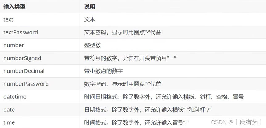
?
5.樣式和主題: EditText 可以通過應用樣式和主題來自定義其外觀。你可以使用 XML 的樣式屬性或在代碼中動態設置樣式。
總體而言,EditText 是 Android 開發中用于接受用戶輸入文本的重要控件。通過合理設置屬性和監聽器,你可以實現各種用戶輸入場景的處理
焦點變更監聽器
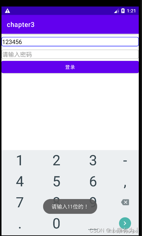
調用編輯框對象的setOnFocusChangeListener方法,即可在光標切換時觸發焦點變更事件。
使用場景如:手機號碼未輸滿11位,就點擊密碼框,此時校驗不通過,一邊彈出提示文字,一邊把焦點拉回手機框。
例:當手機號碼不足11位時點擊密碼框會出現提示。
注意:不可采取這樣的方式:為密碼框綁定點擊事件,當點擊密碼框時檢測是否通過。
原因:編輯框點擊兩次后才會觸發點擊事件,第一次點擊只觸發焦點變更事件,第二次點擊才觸發點擊事件。
Xml
<LinearLayout xmlns:android="http://schemas.android.com/apk/res/android"android:layout_width="match_parent"android:layout_height="match_parent"android:orientation="vertical"><EditTextandroid:id="@+id/et_phone"android:layout_width="match_parent"android:layout_height="wrap_content"android:background="@drawable/edit_text"android:layout_marginTop="10dp"android:hint="請輸入11位手機號碼"android:inputType="number"android:maxLength="11"/><EditTextandroid:id="@+id/et_password"android:layout_width="match_parent"android:layout_height="wrap_content"android:background="@drawable/edit_text"android:layout_marginTop="10dp"android:hint="請輸入密碼"android:inputType="numberPassword"android:maxLength="11"/><Buttonandroid:id="@+id/btn_login"android:layout_width="match_parent"android:layout_height="wrap_content"android:text="登錄"/></LinearLayout>
Java
public class EditFocusActivity extends AppCompatActivity implements View.OnFocusChangeListener {private EditText et_phone;@Overrideprotected void onCreate(Bundle savedInstanceState) {super.onCreate(savedInstanceState);setContentView(R.layout.activity_edit_focus);et_phone = findViewById(R.id.et_phone);EditText et_password = findViewById(R.id.et_password);et_password.setOnFocusChangeListener(this);}@Overridepublic void onFocusChange(View view, boolean hasFocus) {if(hasFocus){String phone = et_phone.getText().toString();//如果手機號碼不足11位或為空if(TextUtils.isEmpty(phone)||phone.length()<11){//手機號碼編輯框請求焦點,把光標移回手機號碼編輯框et_phone.requestFocus();Toast.makeText(this,"請輸入11位的!",Toast.LENGTH_SHORT).show();}}}
}
文本變化監聽器
需求:輸入11位號碼后,自動把鍵盤收起來
這個就需要監聽文本的變化
方法:在文本變化時,監聽它長度有沒有11位
在 Java 代碼中的操作: 通過在 Java 代碼中找到 EditText 的引用,你可以對其進行各種操作,如獲取用戶輸入、設置文本、監聽文本變化等。以下是一個簡單的例子:
public class ActivityA extends AppCompatActivity {private EditText editText;@Overrideprotected void onCreate(Bundle savedInstanceState) {super.onCreate(savedInstanceState);setContentView(R.layout.activity_a);editText = findViewById(R.id.editText);editText.addTextChangedListener(new TextWatcher() {@Overridepublic void beforeTextChanged(CharSequence charSequence, int i, int i1, int i2) {// 在文本變化前的操作}@Overridepublic void onTextChanged(CharSequence charSequence, int i, int i1, int i2) {// 在文本變化時的操作String input = charSequence.toString().trim();if (input.length() == 11) {// 輸入11位時,隱藏鍵盤hideKeyboard();}}@Overridepublic void afterTextChanged(Editable editable) {// 在文本變化后的操作}});}// 隱藏鍵盤的方法private void hideKeyboard() {InputMethodManager imm = (InputMethodManager) getSystemService(Context.INPUT_METHOD_SERVICE);imm.hideSoftInputFromWindow(editText.getWindowToken(), 0);}
}
四、對話框
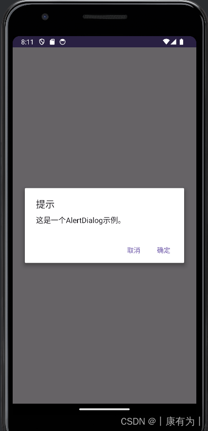
提醒對話框AlertDialog
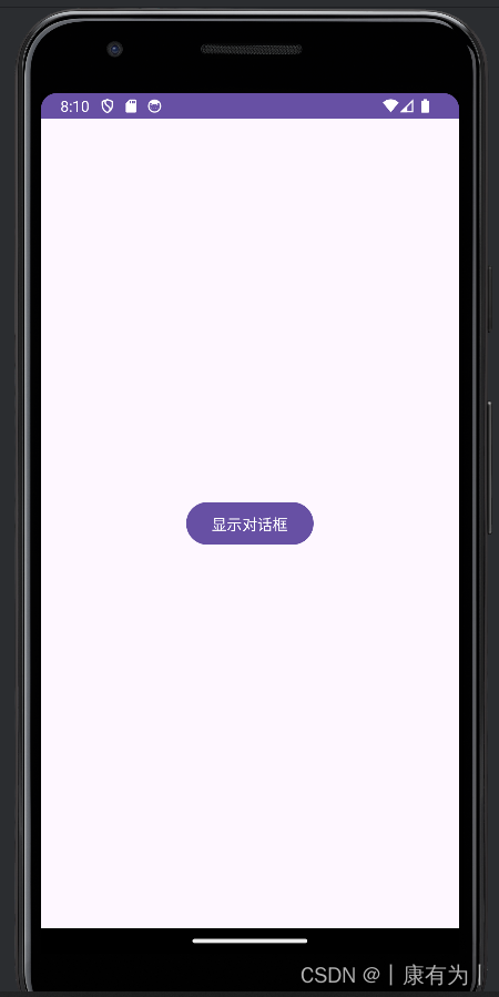
AlertDialog 是 Android 中常用的對話框(Dialog)之一,用于顯示一些消息、接受用戶輸入或確認用戶的操作。
以下是一個簡單的示例,演示如何創建一個簡單的 AlertDialog:
<?xml version="1.0" encoding="utf-8"?>
<RelativeLayout xmlns:android="http://schemas.android.com/apk/res/android"xmlns:tools="http://schemas.android.com/tools"android:layout_width="match_parent"android:layout_height="match_parent"tools:context=".MainActivity"><Buttonandroid:id="@+id/showAlertButton"android:layout_width="wrap_content"android:layout_height="wrap_content"android:text="顯示對話框"android:layout_centerInParent="true" /></RelativeLayout>
import android.app.AlertDialog;
import android.content.DialogInterface;
import android.os.Bundle;
import android.view.View;
import android.widget.Button;import androidx.appcompat.app.AppCompatActivity;public class MainActivity extends AppCompatActivity {@Overrideprotected void onCreate(Bundle savedInstanceState) {super.onCreate(savedInstanceState);setContentView(R.layout.activity_main);Button showAlertButton = findViewById(R.id.showAlertButton);showAlertButton.setOnClickListener(new View.OnClickListener() {@Overridepublic void onClick(View view) {showAlertDialog();}});}private void showAlertDialog() {AlertDialog.Builder builder = new AlertDialog.Builder(this);// 設置對話框標題builder.setTitle("提示");// 設置對話框消息builder.setMessage("這是一個AlertDialog示例。");// 設置對話框按鈕builder.setPositiveButton("確定", new DialogInterface.OnClickListener() {@Overridepublic void onClick(DialogInterface dialogInterface, int i) {// 用戶點擊確定按鈕后的操作}});// 設置對話框取消按鈕builder.setNegativeButton("取消", new DialogInterface.OnClickListener() {@Overridepublic void onClick(DialogInterface dialogInterface, int i) {// 用戶點擊取消按鈕后的操作}});// 創建并顯示對話框AlertDialog alertDialog = builder.create();alertDialog.show();}
}|
|
|
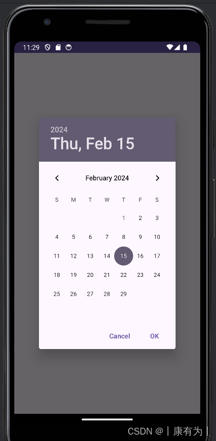
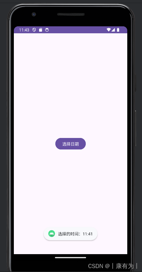
日期對話框DatePickerDiaglog
DatePickerDialog 是 Android 中用于選擇日期的對話框。以下是一個簡單的示例,演示如何在 Android 中使用 DatePickerDialog:
?
<?xml version="1.0" encoding="utf-8"?>
<RelativeLayout xmlns:android="http://schemas.android.com/apk/res/android"xmlns:tools="http://schemas.android.com/tools"android:layout_width="match_parent"android:layout_height="match_parent"tools:context=".MainActivity"><Buttonandroid:id="@+id/showDatePickerButton"android:layout_width="wrap_content"android:layout_height="wrap_content"android:text="選擇日期"android:layout_centerInParent="true" /></RelativeLayout>
import android.app.DatePickerDialog;
import android.os.Bundle;
import android.view.View;
import android.widget.Button;
import android.widget.DatePicker;
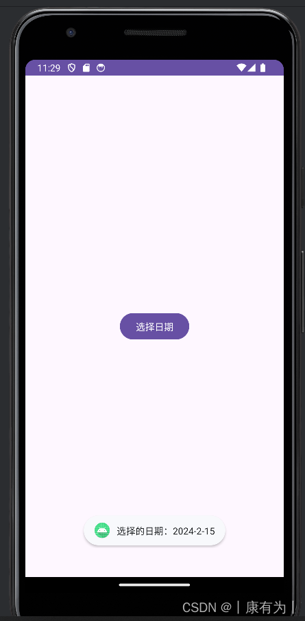
import android.widget.Toast;import androidx.appcompat.app.AppCompatActivity;import java.util.Calendar;public class MainActivity extends AppCompatActivity {@Overrideprotected void onCreate(Bundle savedInstanceState) {super.onCreate(savedInstanceState);setContentView(R.layout.activity_main);Button showDatePickerButton = findViewById(R.id.showDatePickerButton);showDatePickerButton.setOnClickListener(new View.OnClickListener() {@Overridepublic void onClick(View view) {showDatePicker();}});}private void showDatePicker() {// 獲取當前日期final Calendar calendar = Calendar.getInstance();int year = calendar.get(Calendar.YEAR);int month = calendar.get(Calendar.MONTH);int day = calendar.get(Calendar.DAY_OF_MONTH);// 創建 DatePickerDialog 對象DatePickerDialog datePickerDialog = new DatePickerDialog(this,new DatePickerDialog.OnDateSetListener() {@Overridepublic void onDateSet(DatePicker view, int selectedYear, int selectedMonth, int selectedDay) {// 用戶選擇日期后的操作String selectedDate = selectedYear + "-" + (selectedMonth + 1) + "-" + selectedDay;Toast.makeText(MainActivity.this, "選擇的日期:" + selectedDate, Toast.LENGTH_SHORT).show();}},year,month,day);// 顯示 DatePickerDialogdatePickerDialog.show();}
}在這個示例中,activity_main.xml 包含一個按鈕,點擊該按鈕會觸發 showDatePicker 方法,顯示一個包含當前日期的 DatePickerDialog。用戶選擇日期后,通過 OnDateSetListener 監聽器獲取用戶選擇的日期并顯示在 Toast 中。
注意:月份那里要加1,它這里是0-11,我們用的月份是1-12月,所以:selectedMonth + 1
你可以根據需要調整日期選擇的初始值、監聽器的邏輯等。這只是一個簡單的示例,供你了解如何使用 DatePickerDialog。
|
|
|
?
在 Android 12 及更高版本,DatePicker 也引入了 datePickerMode 屬性,用于切換日期選擇的模式。這個屬性可以設置為 "calendar" 表示日歷模式,或 "spinner" 表示下拉框模式。
以下是一個使用 XML 設置 DatePicker 樣式的示例:
<?xml version="1.0" encoding="utf-8"?>
<RelativeLayout xmlns:android="http://schemas.android.com/apk/res/android"xmlns:tools="http://schemas.android.com/tools"android:layout_width="match_parent"android:layout_height="match_parent"tools:context=".MainActivity"><DatePickerandroid:id="@+id/datePicker"android:layout_width="wrap_content"android:layout_height="wrap_content"android:layout_centerInParent="true"android:datePickerMode="calendar" /><Buttonandroid:id="@+id/showDateButton"android:layout_width="wrap_content"android:layout_height="wrap_content"android:text="顯示日期"android:layout_below="@id/datePicker"android:layout_centerHorizontal="true"android:layout_marginTop="16dp" /></RelativeLayout>
import android.os.Build;
import android.os.Bundle;
import android.view.View;
import android.widget.Button;
import android.widget.DatePicker;
import android.widget.Toast;import androidx.annotation.RequiresApi;
import androidx.appcompat.app.AppCompatActivity;public class MainActivity extends AppCompatActivity {@Overrideprotected void onCreate(Bundle savedInstanceState) {super.onCreate(savedInstanceState);setContentView(R.layout.activity_main);Button showDateButton = findViewById(R.id.showDateButton);showDateButton.setOnClickListener(new View.OnClickListener() {@Overridepublic void onClick(View view) {showSelectedDate();}});}@RequiresApi(api = Build.VERSION_CODES.O)private void showSelectedDate() {DatePicker datePicker = findViewById(R.id.datePicker);int year, month, dayOfMonth;if (Build.VERSION.SDK_INT >= Build.VERSION_CODES.O) {year = datePicker.getYear();month = datePicker.getMonth();dayOfMonth = datePicker.getDayOfMonth();} else {// 在 Android 12 以下版本,沒有直接提供獲取日期的方法,可以通過反射獲取// 這里僅為演示,實際使用時請注意處理兼容性問題try {java.lang.reflect.Field field = datePicker.getClass().getDeclaredField("mYearSpinner");field.setAccessible(true);year = (int) field.get(datePicker);field = datePicker.getClass().getDeclaredField("mMonthSpinner");field.setAccessible(true);month = (int) field.get(datePicker);field = datePicker.getClass().getDeclaredField("mDaySpinner");field.setAccessible(true);dayOfMonth = (int) field.get(datePicker);} catch (Exception e) {e.printStackTrace();return;}}String selectedDate = year + "-" + (month + 1) + "-" + dayOfMonth;Toast.makeText(this, "選擇的日期:" + selectedDate, Toast.LENGTH_SHORT).show();}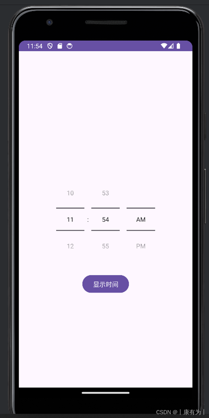
}時間對話框TimePickerDialog
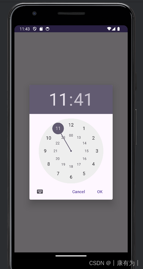
如果你想要實現時間選擇對話框,你可以使用 TimePickerDialog。以下是一個簡單的示例代碼,演示如何在 Android 中使用 TimePickerDialog:
<?xml version="1.0" encoding="utf-8"?>
<RelativeLayout xmlns:android="http://schemas.android.com/apk/res/android"xmlns:tools="http://schemas.android.com/tools"android:layout_width="match_parent"android:layout_height="match_parent"tools:context=".MainActivity"><Buttonandroid:id="@+id/showTimePickerButton"android:layout_width="wrap_content"android:layout_height="wrap_content"android:text="選擇時間"android:layout_centerInParent="true" /></RelativeLayout>
import android.app.TimePickerDialog;
import android.os.Bundle;
import android.view.View;
import android.widget.Button;
import android.widget.TimePicker;
import android.widget.Toast;import androidx.appcompat.app.AppCompatActivity;import java.util.Calendar;public class MainActivity extends AppCompatActivity {@Overrideprotected void onCreate(Bundle savedInstanceState) {super.onCreate(savedInstanceState);setContentView(R.layout.activity_main);Button showTimePickerButton = findViewById(R.id.showTimePickerButton);showTimePickerButton.setOnClickListener(new View.OnClickListener() {@Overridepublic void onClick(View view) {showTimePicker();}});}private void showTimePicker() {// 獲取當前時間final Calendar calendar = Calendar.getInstance();int hour = calendar.get(Calendar.HOUR_OF_DAY);int minute = calendar.get(Calendar.MINUTE);// 創建 TimePickerDialog 對象TimePickerDialog timePickerDialog = new TimePickerDialog(this,new TimePickerDialog.OnTimeSetListener() {@Overridepublic void onTimeSet(TimePicker timePicker, int selectedHour, int selectedMinute) {// 用戶選擇時間后的操作String selectedTime = selectedHour + ":" + selectedMinute;Toast.makeText(MainActivity.this, "選擇的時間:" + selectedTime, Toast.LENGTH_SHORT).show();}},hour,minute,true // 是否顯示 24 小時制);// 顯示 TimePickerDialogtimePickerDialog.show();}
}在這個示例中,activity_main.xml 包含一個按鈕,點擊該按鈕會觸發 showTimePicker 方法,顯示一個包含當前時間的 TimePickerDialog。用戶選擇時間后,通過 OnTimeSetListener 監聽器獲取用戶選擇的時間并顯示在 Toast 中。
|
|
|
?
在 Android 12 及更高版本中,引入了 TimePicker 的 timePickerMode 屬性,可以用于切換時鐘模式。
在 XML 文件中直接設置 TimePicker 的樣式需要使用 android:timePickerMode 屬性。這個屬性是在 Android 12 及更高版本引入的,用于設置 TimePicker 的模式。可以設置為 "clock" 表示時鐘模式,或 "spinner" 表示下拉框模式。
以下是一個使用 XML 設置 TimePicker 樣式的示例:
<?xml version="1.0" encoding="utf-8"?>
<RelativeLayout xmlns:android="http://schemas.android.com/apk/res/android"xmlns:tools="http://schemas.android.com/tools"android:layout_width="match_parent"android:layout_height="match_parent"tools:context=".MainActivity"><TimePickerandroid:id="@+id/timePicker"android:layout_width="wrap_content"android:layout_height="wrap_content"android:layout_centerInParent="true"android:timePickerMode="clock" /><Buttonandroid:id="@+id/showTimeButton"android:layout_width="wrap_content"android:layout_height="wrap_content"android:text="顯示時間"android:layout_below="@id/timePicker"android:layout_centerHorizontal="true"android:layout_marginTop="16dp" /></RelativeLayout>
import android.os.Build;
import android.os.Bundle;
import android.view.View;
import android.widget.Button;
import android.widget.TimePicker;
import android.widget.Toast;import androidx.annotation.RequiresApi;
import androidx.appcompat.app.AppCompatActivity;public class MainActivity extends AppCompatActivity {@Overrideprotected void onCreate(Bundle savedInstanceState) {super.onCreate(savedInstanceState);setContentView(R.layout.activity_main);Button showTimeButton = findViewById(R.id.showTimeButton);showTimeButton.setOnClickListener(new View.OnClickListener() {@Overridepublic void onClick(View view) {showSelectedTime();}});}@RequiresApi(api = Build.VERSION_CODES.M)private void showSelectedTime() {TimePicker timePicker = findViewById(R.id.timePicker);int hour, minute;if (Build.VERSION.SDK_INT >= Build.VERSION_CODES.M) {hour = timePicker.getHour();minute = timePicker.getMinute();} else {hour = timePicker.getCurrentHour();minute = timePicker.getCurrentMinute();}String selectedTime = hour + ":" + minute;Toast.makeText(this, "選擇的時間:" + selectedTime, Toast.LENGTH_SHORT).show();}
}
spanner模式的


丟雞蛋問題(Egg Dropping Puzzle)的三種算法與源代碼)


)


)


![[TCP] TCP/IP 基礎知識詞典(3)](http://pic.xiahunao.cn/[TCP] TCP/IP 基礎知識詞典(3))
)

