Introduction
介紹
In the previous article, we have learned how Responsive column, Nesting Columns and offset Columns work and how to use them? I hope now, you all are comfortable with the grid system; what is it, how to use it and how we can use it for creating a responsive page. Now, in this article, we’ll see how .Jumbotron class works and what is it, and know more about .page-header class. If you have any doubt, feel free to ask in the comment section.
在上一篇文章中,我們了解了響應列,嵌套列和偏移列的工作方式以及如何使用它們 ? 我希望現在,大家都對網格系統感到滿意; 它是什么,如何使用它以及我們如何使用它來創建響應式頁面。 現在,在本文中,我們將了解.Jumbotron類的工作原理以及它的作用,并進一步了解.page-header類 。 如有任何疑問,請隨時在評論部分提問。
巨寶 (JUMBOTRON)
It is like a big grey box. we can use this .jumbotron class to highlight some special piece of information and to focus on visitor's attention; where the content size of heading increases and it adds a lot of margins. We can use any HTML, CSS tags, elements and any style, including bootstrap elements and classes inside it. To use .jumbotron class you have to use a <div> element with .jumbotron class.
就像一個大灰盒子。 我們可以使用這個.jumbotron類來突出顯示一些特殊的信息并吸引訪問者的注意力; 標題的內容大小增加了,并且增加了很多邊距。 我們可以使用任何HTML,CSS標簽,元素和任何樣式,包括其中的bootstrap元素和類。 要使用.jumbotron類,你必須使用一個<div>與.jumbotron類元素。
If you use .container and .container-fluid class, then you can also use .jumbotron class inside and outside the .container and .container-fluid class where .container-fluid occupies the entire horizontal space.
如果使用.container和.container-fluid類,則還可以在.container和.container-fluid類的內部和外部使用.jumbotron類,其中.container-fluid占據整個水平空間。
We can use this .jumbotron for presentation, images, Articles, blogs, New Posts etc.
我們可以使用此.jumbotron進行演示,圖像,文章,博客,新帖子等。
Example
例
<div class="container">
<div class="jumbotron">
<h1> Jumbotron Inside the .container </h1>
</div>
</div>
<div class="jumbotron">
<div class="container">
<h1> Jumbotron Outside the .container </h1>
</div>
</div>
<div class="container-fluid">
<div class="jumbotron">
<h1> Jumbotron Inside the .container-fluid </h1>
</div>
</div>
<div class="jumbotron">
<div class="container-fluid">
<h1> Jumbotron Outside the .container-fluid </h1>
</div>
</div>
Mobile and Tablet View
手機和平板電腦視圖
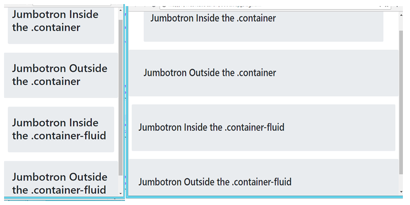
Desktop View
桌面檢視
Note:
注意:
You can also use .Jumbotron-fluid class with .container and .container-fluid for full width jumbotron. It works similarly to .container-fluid class works for full width. There is not much difference between them.
您還可以將.Jumbotron-fluid類與.container和.container-fluid一起用于全寬jumbotron 。 它的作用類似于.container-fluid類的全寬度作品。 它們之間沒有太大區別。
Syntax:
句法:
<div class="jumbotron jumbotron-fluid">
創建頁眉 (Create a Page-header)
There is also a another class .page-header class, .page-header class mainly work in bootstrap 3, not in bootstrap 4... just like .jumbotron class that creates a big grey box; same as .page-header class, add a horizontal line and add some extra spaces. It is like a section divider; Use <div> for .page-header class.
還有另一個.page-header類, .page-header類主要在bootstrap 3中工作,而不是在bootstrap 4中工作……就像.jumbotron類會創建一個大的灰色框; 與.page-header類相同,添加一條水平線并添加一些額外的空格。 它就像一個分區分隔符。 將<div>用于.page-header類。
Example: In this example, you can see that; there is no more difference between them.
示例:在此示例中,您可以看到; 他們之間沒有更多區別。
<div class="container" style="background-color:lightgrey">
<div class="page-header" >
<h1>We use page header </h1>
</div>
<p> Hello </p>
<p> You have learnt bootstrap. </p>
</div>
<div class="container-fluid" style="background-color:grey">
<div class="page-header" >
<h1>We use page header </h1>
</div>
<p> Hello </p>
<p> You have learnt bootstrap. </p>
</div>
Mobile and Tablet view
手機和平板電腦視圖
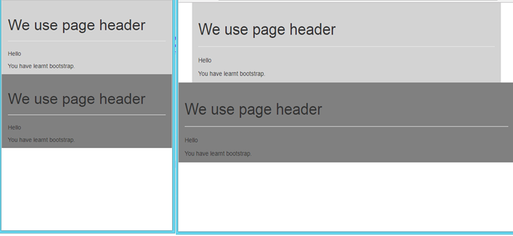
Desktop view
桌面檢視
Conclusion:
結論:
So, In this article we have learnt about .jumbotron, .jumbotron-fluid and .page-header class. In this next article, we will learn about what is typography and how it is used. See you soon in the next article! Happy Learning!
因此,在本文中,我們了解了.jumbotron , .jumbotron-fluid和.page -header類。 在下一篇文章中,我們將學習什么是排版以及如何使用它。 下篇文章很快見! 學習愉快!
翻譯自: https://www.includehelp.com/html/how-to-use-jumbotron-and-page-header-class-in-bootstrap.aspx


方法(帶示例))


)


)
![c語言中將整數轉換成字符串_在C語言中將ASCII字符串(char [])轉換為十六進制字符串(char [])...](http://pic.xiahunao.cn/c語言中將整數轉換成字符串_在C語言中將ASCII字符串(char [])轉換為十六進制字符串(char [])...)