轉載源:http://blog.csdn.net/harvic880925/article/details/41850723
一、簡單使用
剛開始,就先不講一堆標簽的意義及用法,先簡單看看shape標簽怎么用。
1、新建shape文件
首先在res/drawable文件夾下,新建一個文件,命名為:shape_radius.xml
內容是這樣的:(先不需要理解,先看shape怎么用)
- <?xml?version="1.0"?encoding="utf-8"?>??
- <shape?xmlns:android="http://schemas.android.com/apk/res/android"?>??
- ????<corners?android:radius="20dip"/>??
- ????<solid?android:color="#ff00ff"/>??
- ??
- </shape>??
2、添加到控件中
在定義好shape文件后,下一步就是將其添加到控件中,添加到控件中,一般是使用設置background屬性,將其為控件背景,下面,我們將其設置為MainActivity對應的布局中(activity_main.xml),將其設為TextView的背景,看顯示出來 是什么樣子的。
- <RelativeLayout?xmlns:android="http://schemas.android.com/apk/res/android"??
- ????xmlns:tools="http://schemas.android.com/tools"??
- ????android:layout_width="match_parent"??
- ????android:layout_height="match_parent"??
- ????tools:context="com.harvic.tryshape.MainActivity"?>??
- ??
- ????<TextView??
- ????????android:layout_width="wrap_content"??
- ????????android:layout_height="wrap_content"??
- ????????android:layout_margin="50dip"??
- ????????android:text="@string/hello_world"???
- ????????android:background="@drawable/shape_radius"/>??
- ??????
- </RelativeLayout>??
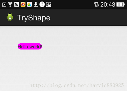
顯示出來的結果是這樣的:
二、基本屬性(corners、gradient、padding、size、solid、stroke)
上面給大家簡單的講了下shape標簽組的簡單使用方法,下面就具體講講shape標簽里所具有的幾個子標簽及所具有的屬性。
1、Corners
- <corners????//定義圓角????
- ????android:radius="dimension"??????//全部的圓角半徑????
- ????android:topLeftRadius="dimension"???//左上角的圓角半徑????
- ????android:topRightRadius="dimension"??//右上角的圓角半徑????
- ????android:bottomLeftRadius="dimension"????//左下角的圓角半徑????
- ????android:bottomRightRadius="dimension"?/>????//右下角的圓角半徑????
Corners標簽是用來字義圓角的,其中radius與其它四個并不能共同使用。
Android:radius:定義四個角的的圓角半徑。
其它四個是逐個字義每個角的圓角半徑。
使用:
控件布局:
- <RelativeLayout?xmlns:android="http://schemas.android.com/apk/res/android"??
- ????android:layout_width="match_parent"??
- ????android:layout_height="match_parent"?>??
- ??
- ????<TextView??
- ????????android:layout_width="100dp"??
- ????????android:layout_height="100dp"??
- ????????android:layout_margin="50dip"??
- ????????android:text="@string/hello_world"???
- ????????android:background="@drawable/shape_radius"/>??
- ?</RelativeLayout>??
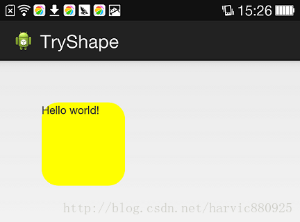
shape定義:
- <?xml?version="1.0"?encoding="utf-8"?>??
- <shape?xmlns:android="http://schemas.android.com/apk/res/android"?>??
- ????<corners?android:radius="20dip"/>??
- ????<solid?android:color="#ffff00"/>??
- </shape>??
效果:
2、solid
solid用以指定內部填充色
只有一個屬性:
- <solid??android:color="color"?/>????
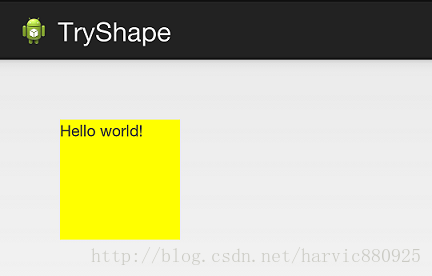
在上面的例子中,我們就將填充色指定為#ffff00了,如果我們不加圓角,只使用填充色,即將shape變成這樣子:
- <?xml?version="1.0"?encoding="utf-8"?>??
- <shape?xmlns:android="http://schemas.android.com/apk/res/android"?>??
- ????<solid?android:color="#ffff00"/>??
- </shape>??
那效果就是這樣的:
3、gradient
gradient用以定義漸變色,可以定義兩色漸變和三色漸變,及漸變樣式,它的屬性有下面幾個:
- <gradient???
- ????android:type=["linear"?|?"radial"?|?"sweep"]????//共有3中漸變類型,線性漸變(默認)/放射漸變/掃描式漸變????
- ????android:angle="integer"?????//漸變角度,必須為45的倍數,0為從左到右,90為從上到下????
- ????android:centerX="float"?????//漸變中心X的相當位置,范圍為0~1????
- ????android:centerY="float"?????//漸變中心Y的相當位置,范圍為0~1????
- ????android:startColor="color"???//漸變開始點的顏色????
- ????android:centerColor="color"??//漸變中間點的顏色,在開始與結束點之間????
- ????android:endColor="color"????//漸變結束點的顏色????
- ????android:gradientRadius="float"??//漸變的半徑,只有當漸變類型為radial時才能使用????
- ????android:useLevel=["true"?|?"false"]?/>??//使用LevelListDrawable時就要設置為true。設為false時才有漸變效果????
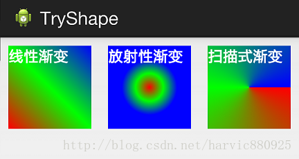
首先有三種漸變類型,分別是:linear(線性漸變)、radial(放射性漸變)、sweep(掃描式漸變)
(1)先看看這幾個屬性的使用方法:
- android:type=["linear"?|?"radial"?|?"sweep"]??
- android:startColor="color"???//漸變開始點的顏色????
- android:centerColor="color"??//漸變中間點的顏色,在開始與結束點之間????
- android:endColor="color"????//漸變結束點的顏色????
- android:gradientRadius="float"??//漸變的半徑,只有當漸變類型為radial時才能使用????
下面我們使用三色漸變來看看這三種漸變方式都是怎么顯示的:(如果不使用centerColor屬性就是雙色漸變,這個屬性是可選的)
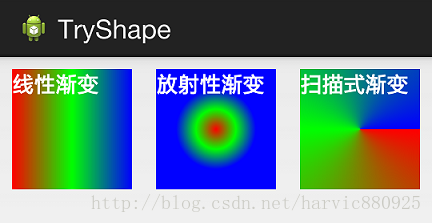
需要注意的一點是,在構造放射性漸變時,要加上android:gradientRadius屬性(漸變半徑),即必須指定漸變半徑的大小才會起作用,下面列出這三個漸變方式的shape代碼,供大家參考:
線性漸變:
- <?xml?version="1.0"?encoding="utf-8"?>??
- <shape?xmlns:android="http://schemas.android.com/apk/res/android"?>??
- ????<gradient???
- ????????android:type="linear"??
- ????????android:startColor="#ff0000"??
- ????????android:centerColor="#00ff00"??
- ????????android:endColor="#0000ff"/>??
- </shape>??
放射性漸變:
- <?xml?version="1.0"?encoding="utf-8"?>??
- <shape?xmlns:android="http://schemas.android.com/apk/res/android"?>??
- ????<gradient???
- ????????android:type="radial"??
- ????????android:startColor="#ff0000"??
- ????????android:centerColor="#00ff00"??
- ????????android:endColor="#0000ff"??
- ????????android:gradientRadius="100"/>??
- </shape>??
掃描式漸變:
- <?xml?version="1.0"?encoding="utf-8"?>??
- <shape?xmlns:android="http://schemas.android.com/apk/res/android"?>??
- ????<gradient???
- ????????android:type="sweep"??
- ????????android:startColor="#ff0000"??
- ????????android:centerColor="#00ff00"??
- ????????android:endColor="#0000ff"/>??
- </shape>??
可見放射性漸變,只是比其它兩個多了個android:gradientRadius屬性
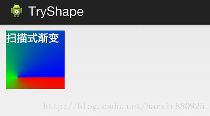
(2)、android:angle屬性(僅對線性漸變有效)
- android:angle="integer"?????//漸變角度,必須為45的倍數,0為從左到右,90為從上到下????
我們在上面的三種漸變上都加上angle屬性,看看效果如何:
能過跟上一個圖對比可以發現,angle屬性確實只對線性漸變有效,其它兩種漸變方式都沒有任何動靜,下面是此時的線性漸變shape代碼:
- <?xml?version="1.0"?encoding="utf-8"?>??
- <shape?xmlns:android="http://schemas.android.com/apk/res/android"?>??
- ????<gradient???
- ????????android:type="linear"??
- ????????android:startColor="#ff0000"??
- ????????android:centerColor="#00ff00"??
- ????????android:endColor="#0000ff"??
- ????????android:angle="45"/>??
- </shape>??
(3)、android:centerX與android:centerY
centerX、centerY兩個屬性用于設置漸變的中心點位置,僅當漸變類型為放射漸變時有效,類型為分數或小數,不接受Dimension。默認值是0.5,有效值是0.0~1.0,超出該范圍后會看不出漸變效果。centerX、centerY的取值其實是寬和高的百分比;不難理解,下面看代碼:
- <?xml?version="1.0"?encoding="utf-8"?>??
- <shape?xmlns:android="http://schemas.android.com/apk/res/android"?>??
- ????<gradient???
- ????????android:type="sweep"??
- ????????android:startColor="#ff0000"??
- ????????android:centerColor="#00ff00"??
- ????????android:endColor="#0000ff"??
- ????????android:centerX="0.2"??
- ????????android:centerY="0.8"/>??
- </shape>??
取寬度的20%和高度的80%的位置,作為新的漸變原點,效果是這樣的:
(4)android:useLevel
useLevel屬性通常不使用。該屬性用于指定是否將該shape當成一個LevelListDrawable來使用,默認值為false。
4、stroke
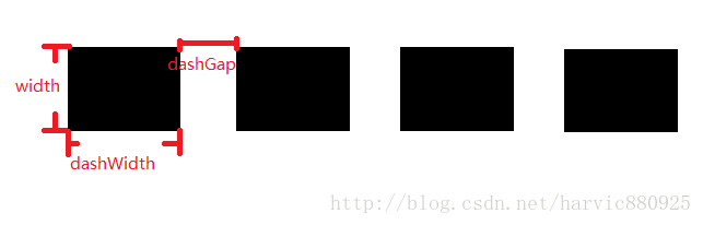
這是描邊屬性,可以定義描邊的寬度,顏色,虛實線等
- <stroke?????????
- ????android:width="dimension"???//描邊的寬度????
- ????android:color="color"???//描邊的顏色????
- ????//?以下兩個屬性設置虛線????
- ????android:dashWidth="dimension"???//虛線的寬度,值為0時是實線????
- ????android:dashGap="dimension"?/>??????//虛線的間隔???
上面各個屬性的意義如下:
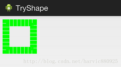
我們使用綠色虛線描邊,虛線高度是20dp,虛線寬度為10dp虛線間距為1dp:
- <?xml?version="1.0"?encoding="utf-8"?>??
- <shape?xmlns:android="http://schemas.android.com/apk/res/android"?>??
- ????<stroke???
- ????????android:width="20dp"???
- ????????android:color="#00ff00"??
- ????????android:dashWidth="10dp"??
- ????????android:dashGap="1dp"?/>??
- </shape>??
從效果圖中,我們也能清晰的看出這三個參數(width、dashwidth、dashGap)之間的區別:
5、size和padding
這兩個基本上不怎么用,因為他們所具有的功能,控件本身也能實現。
size:是用來定義圖形的大小的。
- <size????
- ????android:width="dimension"????
- ????android:height="dimension"?/>??
padding:用來定義內部邊距
- <padding?????
- ????android:left="dimension"????
- ????android:top="dimension"????
- ????android:right="dimension"????
- ????android:bottom="dimension"?/>??
?
三、Shape的屬性(rectangle、oval、line、ring)
上面我們講了Shape的子標簽的的作用,但Shape本身還沒講,Shape自已是可以定義當前Shape的形狀的,比如上面的矩形,還有橢圓形,線形和環形;這些都是通過Shape標簽的 shape屬性來定義的,Shape標簽總共有下面幾個屬性,我們一個個講:
- android:shape=["rectangle"?|?"oval"?|?"line"?|?"ring"]????
- shape的形狀,默認為矩形,可以設置為矩形(rectangle)、橢圓形(oval)、線性形狀(line)、環形(ring)????
- 下面的屬性只有在android:shape="ring時可用:????
- android:innerRadius?????????尺寸,內環的半徑。????
- android:innerRadiusRatio????浮點型,以環的寬度比率來表示內環的半徑,????
- android:thickness???????????尺寸,環的厚度????
- android:thicknessRatio??????浮點型,以環的寬度比率來表示環的厚度,例如,如果android:thicknessRatio="2",????
- android:useLevel????????????boolean值,如果當做是LevelListDrawable使用時值為true,否則為false.???
可見,只有第一個shape是可用的,其它五個都是shape等于ring時所特有的。
注意,無論這里shape取什么形狀,他的子標簽都是可用的,但有時并不會有效果,比如在shape為橢圓時,那corners標簽就不會有效果,很顯然的道理。下面一個個看看各個形狀都是怎么樣的;
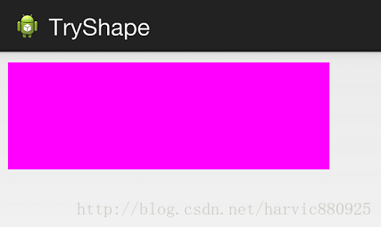
1、rectangle (矩形)
這就是上一節我們使用的形狀,當我們不指定shape屬性時,默認就是矩形的。?
控件代碼:
- <LinearLayout?xmlns:android="http://schemas.android.com/apk/res/android"??
- ????android:layout_width="match_parent"??
- ????android:layout_height="match_parent"??
- ????android:orientation="horizontal"?>??????
- ????<TextView??
- ????????android:layout_width="300dp"??
- ????????android:layout_height="100dp"??
- ????????android:layout_margin="10dp"??
- ????????android:textColor="#ffffff"??
- ????????android:textSize="18sp"??
- ????????android:textStyle="bold"??
- ????????android:background="@drawable/try_shape_3"/>??
- ?</LinearLayout>??
shape代碼:
- <?xml?version="1.0"?encoding="utf-8"?>??
- <shape?xmlns:android="http://schemas.android.com/apk/res/android"???
- ????android:shape="rectangle">??
- ????<solid?android:color="#ff00ff"/>??
- </shape>??
對應圖形:
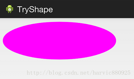
2、oval(橢圓)
控件代碼不變,下面是shape代碼:
- <?xml?version="1.0"?encoding="utf-8"?>??
- <shape?xmlns:android="http://schemas.android.com/apk/res/android"???
- ????android:shape="oval">??
- ????<solid?android:color="#ff00ff"/>??
- </shape>??
對應圖形:(控件大小的矩形所對應的橢圓)
3、line(線形)
沒覺得這個能有什么用……,也不講了,沒什么意思
4、ring(環形)
還記得他所特有的幾個屬性么:
- android:innerRadius?????????尺寸,內環的半徑。????
- android:thickness???????????尺寸,環的厚度????
- android:innerRadiusRatio????浮點型,以環的寬度比率來表示內環的半徑,????
- ??????例如,如果android:innerRadiusRatio,表示內環半徑等于環的寬度除以5,這個值是可以被覆蓋的,默認為9.????
- android:thicknessRatio??????浮點型,以環的寬度比率來表示環的厚度,例如,如果android:thicknessRatio="2",????
- ??????那么環的厚度就等于環的寬度除以2。這個值是可以被android:thickness覆蓋的,默認值是3.????
- android:useLevel????????????boolean值,如果當做是LevelListDrawable使用時值為true,否則為false.??
這么幾個屬性無外乎就是定義環形的內環尺寸和環的寬度。
舉個例子:
控件定義:
- <LinearLayout?xmlns:android="http://schemas.android.com/apk/res/android"??
- ????android:layout_width="match_parent"??
- ????android:layout_height="match_parent"??
- ????android:orientation="horizontal"?>??????
- ????<TextView??
- ????????android:layout_width="300dp"??
- ????????android:layout_height="100dp"??
- ????????android:layout_margin="10dp"??
- ????????android:textColor="#ffffff"??
- ????????android:textSize="18sp"??
- ????????android:textStyle="bold"??
- ????????android:background="@drawable/try_shape_2"/>??
- ?</LinearLayout>??
shape定義:(這里一定要要加上useLevel屬性并定義為false,不然沒有效果)
- <?xml?version="1.0"?encoding="utf-8"?>??
- <shape?xmlns:android="http://schemas.android.com/apk/res/android"???
- ????android:shape="ring"???
- ????android:innerRadius="20dp"???
- ????android:thickness="50dp"????
- ????android:useLevel="false">??
- ??????
- ????<solid?android:color="#ff00ff"/>??
- ??????
- </shape>??
效果圖:
源碼地址:http://download.csdn.net/detail/harvic880925/8249629
請大家尊重原創者版權,轉載請標時出處:http://blog.csdn.net/harvic880925/article/details/41850723?謝謝。

方法及示例)


方法及示例)

方法及示例)


方法與Ruby中的示例)


vs run()方法及示例)


方法與示例)

