導入相關包
import pandas as pd
import numpy as np
import matplotlib.pyplot as plt
from matplotlib.collections import LineCollection
import akshare as ak
from sklearn import cluster, covariance, manifold
%matplotlib inline #Jupyter Notebook顯示圖形專用
plt.rcParams['font.sans-serif']=['SimHei']
plt.rcParams['axes.unicode_minus']=False
獲取指數成分
dd=ak.index_stock_cons_sina('000300')
dd
獲取相關股票價格數據
def get_50_code():#獲取上證50成分股代碼#dd=pro.index_weight(index_code='000016.SH')dd=ak.index_stock_cons_sina('000300')#dd=dd[dd.trade_date=='20211217']codes=dd.symbol.values#獲取全市場股票基本信息#df = pro.stock_basic(exchange='', list_status='L')#df = df[df.ts_code.isin(codes50)]names=dd.name.valuesstocks=dict(zip(codes,names))#print(stocks)return stocksdef get_data(code,start='20191210',end='20220207'):df=ak.stock_zh_a_daily(symbol=code)df.index=pd.to_datetime(df.date)df=df.sort_index()#print(df)return df#將股票數據橫向拼接
codes, names = np.array(sorted(get_50_code().items())).T
data=pd.DataFrame({name:(get_data(code).close-get_data(code).open) for code,name in zip(codes,names)})
variation=data.dropna().values
#data.head()
codes, names = np.array(sorted(get_50_code().items())).T
data=pd.DataFrame({name:(get_data(code).close-get_data(code).open)?
? ? ? ? ? ? ? ? ? ?for code,name in zip(codes,names)})
variation=data.dropna().values
根據相關系數進行分組
# 相關系數
edge_model = covariance.GraphicalLassoCV()
X = variation.copy()
X /= X.std(axis=0)
edge_model.fit(X)
_, labels = cluster.affinity_propagation(edge_model.covariance_)
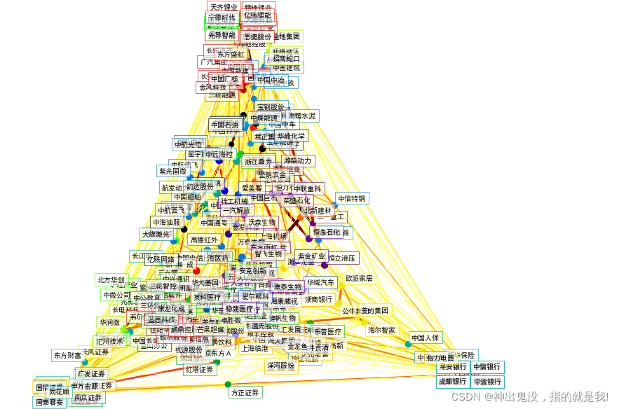
n_labels = labels.max()for i in range(n_labels + 1):print('Cluster %i: %s' % ((i + 1), ', '.join(names[labels == i])))可視化
# 數據可視化
# 為了將上述聚類分析進行可視化,需要在一個2D畫布上布置不同的股票。為此,需要使用“流形”技術來檢索二維嵌入。模型的輸出組合成一個二維圖,其中節點代表股票名稱,邊表示:
# 集群標簽用于定義節點的顏色使用稀疏協方差模型來顯示邊緣的強度二維嵌入用于在平面中定位節點
node_position_model = manifold.LocallyLinearEmbedding(n_components=2, eigen_solver='dense', n_neighbors=6)embedding = node_position_model.fit_transform(X.T).T# 可視化
plt.figure(1, facecolor='w', figsize=(10, 8))
plt.clf()
ax = plt.axes([0., 0., 1., 1.])
plt.axis('off')# 計算偏相關系數
partial_correlations = edge_model.precision_.copy()
d = 1 / np.sqrt(np.diag(partial_correlations))
partial_correlations *= d
partial_correlations *= d[:, np.newaxis]
non_zero = (np.abs(np.triu(partial_correlations, k=1)) > 0.02)# 使用嵌入的坐標繪制節點
plt.scatter(embedding[0], embedding[1], s=100 * d ** 2, c=labels,cmap=plt.cm.nipy_spectral)# 畫相互關聯的邊
start_idx, end_idx = np.where(non_zero)
segments = [[embedding[:, start], embedding[:, stop]]for start, stop in zip(start_idx, end_idx)]
values = np.abs(partial_correlations[non_zero])
lc = LineCollection(segments,zorder=0, cmap=plt.cm.hot_r,norm=plt.Normalize(0, .7 * values.max()))
lc.set_array(values)
lc.set_linewidths(15 * values)
ax.add_collection(lc)#向每個節點添加一個標簽,難點在于定位標簽,以避免與其他標簽重疊
for index, (name, label, (x, y)) in enumerate(zip(names, labels, embedding.T)):dx = x - embedding[0]dx[index] = 1dy = y - embedding[1]dy[index] = 1this_dx = dx[np.argmin(np.abs(dy))]this_dy = dy[np.argmin(np.abs(dx))]if this_dx > 0:horizontalalignment = 'left'x = x + .002else:horizontalalignment = 'right'x = x - .002if this_dy > 0:verticalalignment = 'bottom'y = y + .002else:verticalalignment = 'top'y = y - .002plt.text(x, y, name, size=10,horizontalalignment=horizontalalignment,verticalalignment=verticalalignment,bbox=dict(facecolor='w',edgecolor=plt.cm.nipy_spectral(label / float(n_labels)),alpha=.6))plt.xlim(embedding[0].min() - .15 * embedding[0].ptp(),embedding[0].max() + .10 * embedding[0].ptp(),)
plt.ylim(embedding[1].min() - .03 * embedding[1].ptp(),embedding[1].max() + .03 * embedding[1].ptp())plt.show()
效果圖
?


)

 是什么)


)


 是什么)
)


