eda可視化
Early morning, a lady comes to meet Sherlock Holmes and Watson. Even before the lady opens her mouth and starts telling the reason for her visit, Sherlock can tell a lot about a person by his sheer power of observation and deduction. Similarly, we can deduce a lot about the data and relationship among the features before complex modelling and feeding the data to algorithms.
清晨,一位女士來見福爾摩斯和沃森。 甚至在這位女士張開嘴并開始說出拜訪原因之前,Sherlock都能憑借其觀察力和推論的絕對能力來講述一個人的事。 同樣,在進行復雜建模并將數據輸入算法之前,我們可以推斷出很多數據以及要素之間的關系。
Objective
目的
In this article, I will discuss five advanced data visualisation options to perform an advanced EDA and become Sherlock Holmes of data science. The goal is to deduce most on the relationship among different data points with minimal coding and quickest built-in options available.
在本文中,我將討論五個高級數據可視化選項,以執行高級EDA并成為數據科學的Sherlock Holmes。 目的是通過最少的編碼和最快的內置選項來推斷不同數據點之間的關系。
Step 1: We will be using the seaborn package inbuilt datasets and advanced option to illustrate the advanced data visualisation.
步驟1:我們將使用seaborn軟件包內置的數據集和高級選項來說明高級數據可視化。
import seaborn as sns
import matplotlib.pyplot as plt
Step 2:Seaborn package comes with a few in-built datasets to quickly prototype a visualisation and evaluate its suitability for EDA with own data points. In the article, we will be using the seaborn “penguins” dataset. From the online seaborn repository, the dataset is loaded with load_dataset method. We can get the list of all the inbuilt Seaborn datasets with get_dataset_names() names method.
第2步: Seaborn軟件包附帶了一些內置數據集,可快速創建可視化原型并使用自己的數據點評估其對EDA的適用性。 在本文中,我們將使用原始的“企鵝”數據集。 從在線Seaborn存儲庫中,使用load_dataset方法加載數據集。 我們可以使用get_dataset_names()names方法獲取所有內置Seaborn數據集的列表。
In the below code, in FacetGrid method, dataset name i.e. “bird”, feature by which we want to organise the visualisation of the data i.e. “island”, and feature by which we want to group i.e. hue as “specifies” is mentioned as the parameter. Further, in the “map” method X and Y-axis of the scatter plot i.e. “flipper_length_mm”, and “body_mass_g” mentioned in the example below.
在下面的代碼中,在FacetGrid方法中,數據集名稱即“ bird”,我們要通過其組織數據可視化的功能(即“ island”)和我們要對其進行分組(例如“ specify”的色相)的功能如下:參數。 此外,在“映射”方法中,在以下示例中提到的散點圖的X軸和Y軸,即“ flipper_length_mm”和“ body_mass_g”。
bird= sns.load_dataset("penguins")
g = sns.FacetGrid(bird, col="island", hue="species")
g.map(plt.scatter, "flipper_length_mm", "body_mass_g", alpha=.6)
g.add_legend()
plt.show()
Data set visualisation based on the above code plots the data points organised by “island” and colour-coded by “species”.
基于以上代碼的數據集可視化將按“島嶼”組織并按“物種”按顏色編碼的數據點繪制成圖。
With one glance we can infer that “Gentoo” species are only present on the island “Biscoe”. Gentoo species is heavier and has a longer flipper length that other species. “Adelie” species is available on all three islands and “Chinstrap” is only available on the island “Dream”. You can see that with only 5 lines of code we can get so much information without any modelling.
乍一看,我們可以推斷出“ Gentoo”物種僅存在于“ Biscoe”島上。 Gentoo物種較重,并且鰭狀肢的長度比其他物種更長。 在所有三個島上都可以使用“阿德利”物種,而在“夢”島上則可以使用“ Chinstrap”物種。 您會看到,僅用5行代碼,我們無需任何建模就可以獲得大量信息。
I will encourage you to post a comment on other information we can deduce from the below visualisation.
我鼓勵您對我們可以從下面的圖表中得出的其他信息發表評論。

Step 3: We want to quickly get an idea on the range of weights of the penguins by species and islands. Also, identify the concentration of the weight range.
步驟3:我們想快速了解按物種和島嶼劃分的企鵝體重范圍。 另外,確定體重范圍的濃度。
With a strip plot, we can plot the weight of the penguins organised by species for each the islands.
通過條形圖,我們可以繪制每個島嶼按物種組織的企鵝的體重。
sns.stripplot(x="island", y="body_mass_g", hue= "species", data=bird, palette="Set1")
plt.show()
Strip plot is helpful to get an insight as long as plots are not overcrowded with densely populated data points. In the island “Dream” points are densely populated in the plot, and it is a bit difficult to get meaningful information from it.
只要圖塊不被人口稠密的數據點過度擁擠,帶狀圖就有助于獲得洞察力。 在島上,“夢”點在圖中密密麻麻地填充著,很難從中獲取有意義的信息。
Swarmplot can help to visualise the range of weight of the penguins by species in each of the islands non-overlapping points.
Swarmplot可以幫助按島上每個非重疊點的物種可視化企鵝的體重范圍。
In the below code, we mention similar information like above in strip plot.
在下面的代碼中,我們在帶狀圖中提到了類似的信息。
sns.swarmplot(x="island", y="body_mass_g", hue="species",data=bird, palette="Set1", dodge=True)
plt.show()
This improves the comprehension of the data points immensely in case of densely populated data. We can infer with a glance that “Adelie” weight ranges from approx 2500 to 4800 grams and a typical Gentoo species is heavier than Chinstrap species. I will leave you to perform other exploratory data analysis based on the below swarm plot.
在數據密集的情況下,這極大地改善了數據點的理解。 我們可以一目了然地推斷出“阿德利”的重量范圍約為2500至4800克,典型的Gentoo物種比Chinstrap物種重。 我將讓您根據以下群圖執行其他探索性數據分析。

Step 4: Next, we would like to understand the relationship between body mass and culmen length of penguins in each of the island based on their sex.
步驟4:接下來,我們想了解根據島嶼的性別,企鵝的體重與高短長度之間的關系。
In the below code, in x and y parameter features between which we are interested in identifying, the relationship is mentioned. Hue is mentioned as “sex” as we want to learn the relation for male and female penguins separately.
在下面的代碼中,在我們希望識別的x和y參數特征中,提到了這種關系。 順化被稱為“性別”,因為我們想分別學習男女企鵝的關系。
sns.lmplot(x="body_mass_g", y="culmen_length_mm", hue="sex", col="island", markers=["o", "x"],palette="Set1",data=bird)
plt.show()
We can gather that body mass and culmen length relationship in Biscoe island penguins is similar for both male and female sex. On the contrary, in the island Dream, the relationship trend is quite the opposite for male and female penguins. Are the body mass and culmen length relationship of the penguins in the island Dream is linear or not linear?
我們可以發現,在Biscoe島上,企鵝的體重和長度與男性和女性的相似。 相反,在“夢島”中,男女企鵝的關系趨勢相反。 夢島中企鵝的體重和宮長長度關系是線性的還是線性的?
We can visualise the polynomial relationship by specifying the parameter order in the lmplot method.
我們可以通過在lmplot方法中指定參數順序來可視化多項式關系。

In the case of heavily densely populated data points, we can further extend our exploratory data analysis by visualizing the body mass culmen relationship by male and female sex separately for each island.
在人口稠密的數據點的情況下,我們可以通過可視化每個島嶼分別以男性和女性性別劃分的身體標本關系來進一步擴展探索性數據分析。
Visualization is organised by the col and row parameter mentioned in the code.
可視化由代碼中提到的col和row參數組織。
sns.lmplot(x="body_mass_g", y="culmen_length_mm", hue="sex", col="island",row="sex",order=2, markers=["o", "x"],palette="Set1",data=bird)
plt.show()
Step 5: It helps to visualise a scatter plot and histogram side by side to get a holistic view of the spread of data points and also the frequency of observation at the same time. Joint plots are an efficient way to picture it. In the code below, x & y parameter is the feature between which we are trying to identify the relationship. As the data points are densely populated, hence we will plot a hexbin instead of a scatter plot. “Kind” parameter indicates the type of plot. If you want to know more about hexbin plot, then please refer my article 5 Powerful Visualisation with Pandas for Data Preprocessing.
第5步:這有助于并排可視化散點圖和直方圖,從而獲得數據點分布的整體視圖以及同時觀察的頻率。 聯合圖是描繪它的有效方法。 在下面的代碼中,x&y參數是我們試圖識別關系的功能。 由于數據點密集,因此我們將繪制六邊形而不是散點圖。 “種類”參數指示圖的類型。 如果您想了解更多關于hexbin圖的信息,請參閱我的文章5:使用Pandas進行功能強大的可視化以進行數據預處理 。
sns.set_palette("gist_rainbow_r")
sns.jointplot(x="body_mass_g", y="culmen_length_mm", kind="hex",data=bird )
plt.show()
Based on the histogram we can infer that most numbers of penguins are between 3500 and 4500 grams. Can you deduce the most frequent culmen length range of the penguins?
根據直方圖,我們可以推斷出大多數企鵝數量在3500至4500克之間。 您能推斷出企鵝最常見的莖長度范圍嗎?
We can also plot the individual data points (as shown in the right side plot) inside the hexbin plot with the code shown below.
我們還可以使用下面所示的代碼在hexbin圖內繪制各個數據點(如右側圖所示)。
g = sns.jointplot(x="body_mass_g", y="culmen_length_mm", data=bird, kind="hex", color="c")
g.plot_joint(plt.scatter, c="w", s=30, linewidth=1, marker="+")
g.set_axis_labels("Body Mass (in gram)", "Culmen Length ( in mm)")
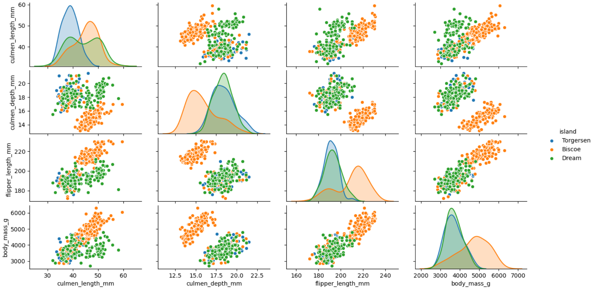
plt.show()Step 6: At last, we would like to get an overview of the spread and relationship among different features by island. Paitplots are very handy to visualise the scatter plot among different feature. The feature “island” is mentioned as the hue as we want to colour code the plot based on it.
第6步:最后,我們希望按島嶼概述不同要素之間的傳播和關系。 Paitplots非常便于查看不同特征之間的散點圖。 由于我們要根據其對地塊進行顏色編碼,因此將特征“島”稱為色相。
sns.pairplot(bird, hue="island")
plt.show()
We can see from the visualisation that in the island Biscoe most of the penguins have shallow culmen depth but are heavier than penguins in other islands. Similarly, we can conclude that flipper length is longer for most penguins in Biscoe island but have shallow culmen depth.
從可視化中我們可以看到,在比斯科島中,大多數企鵝的陰莖深度較淺,但比其他島嶼的企鵝重。 同樣,我們可以得出結論,在比斯科島上的大多數企鵝,鰭狀肢的長度更長,但洞室深度卻較淺。
I hope you will use these advanced visualisations for the exploratory data analysis and get a sense of data points relationship before embarking any complex modelling exercise. I would love to hear your favourite visualization plots for EDA and also a list of conclusions we can draw from the examples illustrated in this article.
我希望您可以在進行任何復雜的建模練習之前,將這些高級可視化用于探索性數據分析,并了解數據點之間的關系。 我很想聽聽您最喜歡的EDA可視化圖,以及我們可以從本文所示示例中得出的結論列表。
In case, you would like to learn data visualisation using pandas then please read by trending article on 5 Powerful Visualisation with Pandas for Data Preprocessing.
如果您想使用熊貓學習數據可視化,那么請閱讀趨勢文章5關于數據預處理的熊貓的強大可視化 。
If you are interested in learning different Scikit-Learn scalers then please do read my article Feature Scaling — Effect Of Different Scikit-Learn Scalers: Deep Dive
如果您有興趣學習其他Scikit-Learn潔牙機,請閱讀我的文章Feature Scaling —不同Scikit-Learn潔牙機的效果:深入研究
"""Full Code"""import seaborn as sns
import matplotlib.pyplot as pltbird= sns.load_dataset("penguins")
g = sns.FacetGrid(bird, col="island", hue="species")
g.map(plt.scatter, "flipper_length_mm", "body_mass_g", alpha=.6)
g.add_legend()
plt.show()sns.stripplot(x="island", y="body_mass_g", hue= "species", data=bird, palette="Set1")
plt.show()sns.swarmplot(x="island", y="body_mass_g", hue="species",data=bird, palette="Set1", dodge=True)
plt.show()sns.lmplot(x="body_mass_g", y="culmen_length_mm", hue="sex", col="island", markers=["o", "x"],palette="Set1",data=bird)
plt.show()sns.lmplot(x="body_mass_g", y="culmen_length_mm", hue="sex", col="island",row="sex",order=2, markers=["o", "x"],palette="Set1",data=bird)
plt.show()sns.set_palette("gist_rainbow_r")
sns.jointplot(x="body_mass_g", y="culmen_length_mm", kind="hex",data=bird )
plt.show()g = sns.jointplot(x="body_mass_g", y="culmen_length_mm", data=bird, kind="hex", color="c")
g.plot_joint(plt.scatter, c="w", s=30, linewidth=1, marker="+")
g.set_axis_labels("Body Mass (in gram)", "Culmen Length ( in mm)")
plt.show()sns.pairplot(bird, hue="island")
plt.show()
翻譯自: https://towardsdatascience.com/5-advanced-visualisation-for-exploratory-data-analysis-eda-c8eafeb0b8cb
eda可視化
本文來自互聯網用戶投稿,該文觀點僅代表作者本人,不代表本站立場。本站僅提供信息存儲空間服務,不擁有所有權,不承擔相關法律責任。 如若轉載,請注明出處:http://www.pswp.cn/news/391546.shtml 繁體地址,請注明出處:http://hk.pswp.cn/news/391546.shtml 英文地址,請注明出處:http://en.pswp.cn/news/391546.shtml
如若內容造成侵權/違法違規/事實不符,請聯系多彩編程網進行投訴反饋email:809451989@qq.com,一經查實,立即刪除!相關文章

我的AWS開發人員考試未通過。 現在怎么辦?

關系數據可視化gephi
——fabric-sdk-java應用)
Hyperledger Fabric 1.0 從零開始(十二)——fabric-sdk-java應用

css跑道_如何不超出跑道:計劃種子的簡單方法

將json 填入表格_如何將Google表格用作JSON端點

leetcode 173. 二叉搜索樹迭代器

jyputer notebook 、jypyter、IPython basics
)
cookie和session(1)

熊貓數據集_為數據科學拆箱熊貓

2018年,你想從InfoQ獲取什么內容?丨Q言Q語

特征阻抗輸入阻抗輸出阻抗_軟件阻抗說明

)
leetcode 190. 顛倒二進制位(位運算)

JAVA基礎——時間Date類型轉換

LeetCode第五天

matplotlib可視化_使用Matplotlib改善可視化設計的5個魔術技巧

adb 多點觸碰_無法觸及的神話

robot:循環遍歷數據庫查詢結果是否滿足要求
)
