In Part I, I took you through the data gathering and compilation required to rank Census tracts by the four features identified by Jane Jacobs as the foundation of a great neighborhood:
在第一部分中 ,我帶您完成了根據簡·雅各布斯(Jacobs Jacobs)所確定的作為大社區基礎的四個要素對普查區域進行排名所需的數據收集和匯總:
- Density 密度
- A mix of uses 多種用途
- A mix of building ages, types and conditions 混合建筑年齡,類型和條件
- A street network of short, connected blocks 短而相連的街區的街道網絡
Now that we have our data, we’re going to test it against some other metrics of urban quality of life and see if it is a strong predictor. I am going to test the Jane Jacobs Index and it’s component pieces against the following data:
現在我們有了數據,我們將針對城市生活質量的其他一些指標進行測試,看看它是否有力預測。 我將根據以下數據測試Jane Jacobs索引及其組成部分:
- Crime statistics from the King County Sheriff’s Department 金縣警長部門的犯罪統計
- Immunization rates at King County schools 金縣學校的免疫率
- Housing affordability 住房負擔能力
- Commute mode share 通勤模式分享
I’m going to focus on King County in this post because my Ada County dataset, while interesting, turned out to be too small to provide meaningful results.
在這篇文章中,我將重點介紹King County,因為我的Ada County數據集雖然很有趣,但由于它太小而無法提供有意義的結果。
犯罪 (Crime)
I was very curious to see the results of this one. A lot of Death and Life is focused on the right urban design to naturally prevent crime. Jacobs’ recommendations made a lot of sense in the context of the 1950s as it focused on making the streets an interesting place to be and to simply watch from apartment windows. City streets are cool and all, but more interesting than Netflix?
我很好奇看到這一結果。 許多《 生死攸關》專注于正確的城市設計,以自然地預防犯罪。 雅各布斯(Jacobs)的建議在1950年代的背景下非常有意義,因為它的重點是使街道成為有趣的地方,并且可以從公寓的窗戶直接觀看。 城市街道很酷,但是比Netflix還有趣嗎?
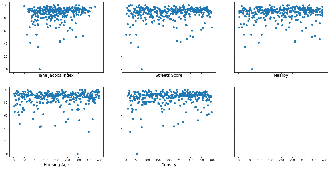
I’m going to compare the JJI to the Seattle Police Department’s publicly available crime database. I took this dataset, performed a spatial join with a Census tract shapefile, counted the incidents within each tract, then normalized it by area to get a per mile crime density. Plotting this against the Jane Jacobs Index and it’s components yields the following:
我將把JJI與西雅圖警察局的公開犯罪數據庫進行比較 。 我獲取了此數據集,使用人口普查區域圖形文件進行了空間連接,計算了每個區域內的事件,然后按區域對其進行歸一化以得到每英里犯罪密度。 根據簡·雅各布斯指數及其成分來繪制,得出以下結果:
I’m going to avoid over-statistics-ing my analysis in this post and just look at the pictures. Remember that the components of the JJI are rankings of census tracts based on their scores in the four qualities identified above, and the JJI is an average of those four rankings, so a low score is the Jacobs-y-est. Under the DaLoGAC hypothesis, we would see the lowest crime density in the tracts with the lowest JJI, and the dots moving upward from left to right. Interestingly, we see the opposite pattern emerging in all except the measure of housing age homogeneity. My theory on why: homelessness is the primary driver of crime in Seattle. Places that have been allowed to organically evolve and replace older, smaller buildings with newer, denser places are better able to naturally meet the housing demand, thus enabling people to meet their needs without resorting to criminal activity.
在這篇文章中,我將避免過度統計-我的分析只是看圖片。 請記住,JJI的組成部分是根據人口普查區域在上述四種質量中的得分來進行排名,而JJI是這四個排名的平均值,因此,Jacobs-y-est得分較低。 在DaLoGAC假設下,我們將看到JJI最低的區域中犯罪密度最低,并且點從左到右向上移動。 有趣的是,除了住房年齡同質性的衡量標準外,我們看到了相反的格局。 關于以下原因的我的理論:無家可歸是西雅圖犯罪的主要驅動因素。 被允許有機發展的地方,可以用較新的,更密集的地方代替較舊的較小建筑物,從而更自然地滿足住房需求,從而使人們能夠滿足自己的需求而無需訴諸犯罪活動。
免疫率 (Immunization Rates)
This one was more out of curiosity and because the data was there than any real hunt for urban design solutions. I am curious because trust in governments, scientific research, and similar institutions has been shown to correlate with immunization rates, and I wanted to see if there was a correlation between this trust and urban design. King County publishes immunization coverage rates by school, so I again joined that to census tract, then took an average. Here are the results:
這更多是出于好奇,因為數據在那里,而不是真正尋找城市設計解決方案的機會。 我很好奇,因為對政府,科學研究和類似機構的信任已顯示與免疫接種率相關 ,并且我想看看這種信任與城市設計之間是否存在相關性。 金縣按學校發布免疫覆蓋率 ,因此我再次將其納入普查范圍,然后取平均值。 結果如下:
No correlation. Crazy theory set aside for now…
沒有相關性。 瘋狂的理論暫時擱置了……
住房負擔能力 (Housing Affordability)
For this, I took the Census Bureau’s data on median household income and median housing cost to get a percent of income spent on housing for each census tract.
為此,我采用了人口普查局關于家庭收入中位數和住房成本中位數的數據,以獲取每個普查區在住房上花費的收入的百分比。

Some correlation, but not much. Seattle is pretty uniformly expensive, so it might not be the best place for this particular research. I suspect some Midwestern cities like Chicago where parts of the city have very high housing costs while other neighborhoods are still cheaper would yield different results.
一些相關性,但不多。 西雅圖非常昂貴,因此可能不是進行這項特定研究的最佳地點。 我懷疑像芝加哥這樣的中西部城市,其中部分城市的住房成本很高,而其他街區仍然較便宜,它們會產生不同的結果。
通勤模式分享 (Commute Mode Share)
Getting people out of their cars has been a challenge for planners for as long as there have been cars. The results of this one are cool, so I’m going to take a deeper dive into them. The Census surveys how people are getting to work in the following high-level categories:
只要有汽車,就將人們帶出汽車對計劃者一直是一個挑戰。 這個結果很酷,因此我將更深入地研究它們。 人口普查調查人們如何在以下高級類別中工作:
- Drove Alone 獨自開車
- Carpooled 拼車
- Public Transit 公共交通
- Taxicab 出租車
- Motorcycle 摩托車
- Bicycle 自行車
- Walking 步行
- Other 其他
I’m going to compare these percent of respondents who use the various modes against the JJI, as well as the pre-ranking versions of the components. First off, here’s the population density per square mile:
我將比較使用JJI的各種模式以及這些組件的預排名版本的受訪者百分比。 首先,這是每平方英里的人口密度:

A lot of stuff starts happening when you get past 10,000 people per square mile, specifically people stop driving and start walking and using transit. This really isn’t new information, but it’s still interesting to see how strong that relationship is.
每平方英里超過10,000人時,就會發生很多事情,特別是人們停止開車,開始走路和乘公交。 這確實不是新信息,但是看到這種關系有多牢固仍然很有趣。
Next, the relationship between age of construction homogeneity and transportation:
接下來,建筑同質化年齡與運輸之間的關系:

I’m not surprised that this one is scattershot.
對于這一點,我并不感到驚訝。
Next, street network design:
接下來,街道網絡設計:

There’s a lot of hockey-stick going on here. Remember that the street score is the average length of each block divided by the average number of streets at each intersection, so a low score is more Jacobs-y. Clearly people in neighborhoods with a score under 50 are much more likely to use active transportation methods. This relationship is especially strong with walking and biking.
這里有很多曲棍球棒。 請記住,街道得分是每個街區的平均長度除以每個路口的平均街道數量,因此得分較低的雅各布斯(Jacobs-y)更大。 顯然,得分低于50的社區居民更有可能使用主動交通方式。 這種關系在步行和騎自行車時尤其牢固。
Next, the percent of daily needs within one kilometer:
接下來,在一公里之內的每日需求百分比:

If your daily needs can be met by walking, you tend to walk more. Shocking!
如果步行可以滿足您的日常需求,那么您傾向于走更多的路。 令人震驚!
Finally, putting them all together, the Jane Jacobs Index:
最后,將它們放在一起,簡·雅各布斯索引:

The strong correlation continues here between Jacobs-y places and active transportation.
Jacobs-y場所與活躍交通之間的這種強相關性仍在繼續。
結論 (Conclusion)
- If you want less car dependence, build dense, mixed use neighborhoods with a short interconnected street network. 如果您希望減少對汽車的依賴性,則可以使用短而互連的街道網絡來建立密集的混合用途社區。
- If you want lower crime, support incremental development. 如果您想減少犯罪,請支持漸進式發展。
- Listening to Jane Jacobs is unlikely to have negative impacts on your community. 傾聽簡·雅各布斯的聲音不太可能對您的社區產生負面影響。
翻譯自: https://medium.com/@bcparker21/the-jane-jacobs-index-part-ii-testing-610e2e963983
本文來自互聯網用戶投稿,該文觀點僅代表作者本人,不代表本站立場。本站僅提供信息存儲空間服務,不擁有所有權,不承擔相關法律責任。 如若轉載,請注明出處:http://www.pswp.cn/news/391288.shtml 繁體地址,請注明出處:http://hk.pswp.cn/news/391288.shtml 英文地址,請注明出處:http://en.pswp.cn/news/391288.shtml
如若內容造成侵權/違法違規/事實不符,請聯系多彩編程網進行投訴反饋email:809451989@qq.com,一經查實,立即刪除!相關文章
Docke的安裝和基本配置)
Docker 入門(3)Docke的安裝和基本配置

python:單元測試框架pytest的一個簡單例子

mkdir命令使用范例

pwa 問題_您真的需要PWA嗎? 這里有四個問題可以幫助您做出決定。

利用ssh反向代理以及autossh實現從外網連接內網服務器

抑郁癥損傷神經細胞嗎_使用神經網絡探索COVID-19與抑郁癥之間的聯系
)
倦怠和枯燥_如何不斷學習(不倦怠)

Xcode 9.0 新增功能大全
鏡像與容器)
Docker 入門(4)鏡像與容器

python:pytest中的setup和teardown

如何開始使用任何類型的數據? - 第1部分

iHealth基于Docker的DevOps CI/CD實踐
)
從早期的初創企業到MongoDB的經理(播客)
)
leetcode 1011. 在 D 天內送達包裹的能力(二分法)

python:pytest優秀博客


機器學習圖像源代碼_使用帶有代碼的機器學習進行快速房地產圖像分類

leetcode 938. 二叉搜索樹的范圍和

