python pca主成分
FPCA is traditionally implemented with R but the “FDASRSF” package from J. Derek Tucker will achieve similar (and even greater) results in Python.
FPCA傳統上是使用R實現的,但是J. Derek Tucker的“ FDASRSF ”軟件包將在Python中獲得相似(甚至更高)的結果。
If you have reached this page, you are probably familiar with PCA.
如果您已到達此頁面,則可能熟悉PCA。
Principal Components Analysis is part of the Data Science exploration toolkit as it provides many benefits: reducing dimensions of a large dataset, preventing multi-collinearity, etc.
主成分分析是數據科學探索工具包的一部分,因為它具有許多優點:減少大型數據集的維數,防止多重共線性等。
There are many articles out there that explain the benefits of PCA and, if needed, I suggest you to have a look at this one which summarizes my understanding of this methodology:
那里有很多文章解釋了PCA的好處,如果需要的話,我建議您看一下這篇文章,總結一下我對這種方法的理解:
“功能性” PCA背后的直覺 (The intuition behind the “Functional” PCA)
In a standard PCA process, we define Eigenvectors to convert the original dataset into a smaller one with fewer dimensions and for which most of the initial dataset variance is preserved (usually 90 or 95%).
在標準PCA流程中,我們定義特征向量以將原始數據集轉換為尺寸較小的較小數據集,并為此保留了大部分初始數據集差異(通常為90%或95%)。

Now let’s imagine that the patterns of the time-series have more importance than their absolute variance. For example, you would like to compare physical phenomena such as signals, temperatures’ variation, production batches, etc.. Functional Principal Components Analysis will act this way by determining the corresponding underlying functions!
現在,讓我們想象一下時間序列的模式比其絕對方差更重要。 例如,您想比較諸如信號,溫度變化,生產批次等物理現象。功能主成分分析將通過確定相應的基礎功能來執行此操作!

Let’s take the example of the temperatures’ variation over a year across different locations in a four-seasons country: we can assume that there is a global trend from cold in winter to hot during summertime.
讓我們以一個四個季節的國家中不同位置一年中溫度的變化為例:我們可以假設存在從冬季寒冷到夏季炎熱的全球趨勢。
We can also assume that the regions close to the ocean will follow a different pattern than the ones close to mountains (i.e.: smoother temperature variations on the sea-side Vs extremely low temperatures during winter in the mountains).
我們還可以假設,靠近海洋的地區將遵循與靠近山脈的地區不同的模式(即:海邊的溫度變化更為平穩,而山區冬季的極端低溫則相對較低)。

We will now use this methodology to identify such differences between French regions in 2019. This example is directly inspired by the traditional “Canadian weather” FPCA example developed in R.
現在,我們將使用此方法來確定2019年法國各地區之間的差異。此示例直接受到R中開發的傳統“加拿大天氣” FPCA示例的啟發。
2019年按地區劃分的法國溫度數據集 (Dataset creation with French temperatures by regions in 2019)
We start by getting daily temperature records since 2018 in France by regions* and prepare the corresponding dataset.
我們首先獲取自2018年以來法國各地區的每日溫度記錄*,并準備相應的數據集。
(*the temperatures are recorded at the “department” level, which is a smaller scale than regions in France (96 departments Vs 13 regions). However, we rename “Department” into “Region” for an easier understanding of readers.)
(*溫度記錄在“部門”級別,該范圍比法國的區域小(96個部門對13個區域)。但是,我們將“部門”重命名為“區域”,以便于讀者理解。)
We select 7 regions spread across France that correspond to different weather patterns (they will be disclosed later on): 06, 25, 59, 62, 83, 85, 75.
我們選擇了分布在法國的7個區域,分別對應不同的天氣模式(稍后將進行披露):06、25、59、62、83、85、75。
import pandas as pd
import numpy as np# Import the CSV file with only useful columns
# source: https://www.data.gouv.fr/fr/datasets/temperature-quotidienne-departementale-depuis-janvier-2018/
df = pd.read_csv("temperature-quotidienne-departementale.csv", sep=";", usecols=[0,1,4])# Rename columns to simplify syntax
df = df.rename(columns={"Code INSEE département": "Region", "TMax (°C)": "Temp"})# Select 2019 records only
df = df[(df["Date"]>="2019-01-01") & (df["Date"]<="2019-12-31")]# Pivot table to get "Date" as index and regions as columns
df = df.pivot(index='Date', columns='Region', values='Temp')# Select a set of regions across France
df = df[["06","25","59","62","83","85","75"]]display(df)# Convert the Pandas dataframe to a Numpy array with time-series only
f = df.to_numpy().astype(float)# Create a float vector between 0 and 1 for time index
time = np.linspace(0,1,len(f))
FDASRSF軟件包在數據集上的安裝和使用 (FDASRSF package installation and use on the dataset)
To install the FDASRSF package in your current environment, you simply need to run:
要在當前環境中安裝FDASRSF軟件包,您只需要運行:
pip install fdasrsf(note: based on my experience, you might need to install manually one or two additional packages to complete the installation properly. You just need to check the anaconda logs in case of failure to identify them.)
(注意:根據我的經驗,您可能需要手動安裝一個或兩個其他軟件包才能正確完成安裝。您只需檢查anaconda日志以防無法識別它們。)
The FDASRSF package from J. Derek Tucker provides a number of interesting functions and we will use two of them: Functional Alignment and Functional Principal Components Analysis (see corresponding documentation below):
J. Derek Tucker的FDASRSF軟件包提供了許多有趣的功能,我們將使用其中兩個功能 : 功能對齊和功能主成分分析 (請參見下面的相應文檔) :
Functional Alignment will synchronize time-series in case they are not perfectly aligned. The illustration below provides a relatively simple example to understand this mechanism. The time-series are processed from both phase and amplitude’s perspectives (aka x and y axis).
如果它們未完全對齊, 功能對齊將同步時間序列。 下圖提供了一個相對簡單的示例來了解此機制。 從相位和幅度的角度(也稱為x和y軸)角度處理時間序列。

To understand more precisely the algorithms involved, I highly recommend you to have a look at “Generative models for functional data using phase and amplitude separation” from J. Derek Tucker, Wei Wu, and Anuj Srivastava.
為了更精確地理解所涉及的算法,我強烈建議您看一下J. Derek Tucker,Wei Wu和Anuj Srivastava的“ 使用相位和幅度分離的功能數據生成模型 ”。
Even though this is quite hard to notice by simply looking at the Original and Warped Data, we can observe that the Warping functions do have some small inflections (see the yellow curve slightly lagging below the x=y axis), which means than these functions have synchronized the time series when needed. (As you might have guessed, temperature records are — by design — well aligned since they are captured simultaneously.)
盡管僅通過查看原始數據和變形數據很難注意到這一點,但我們可以觀察到變形函數確實有一些小變形(請參見黃色曲線略微滯后于x = y軸),這意味著這些函數比在需要時已同步時間序列。 (您可能已經猜到,溫度記錄在設計上是一致的,因為它們是同時捕獲的。)


Functional Principal Components Analysis
功能主成分分析
Now that our dataset is “warped”, we can run a Functional Principal Components Analysis. The FDASRSF package allows horizontal, vertical, or joint analysis. We will use the vertical one and plot the corresponding functions and coefficients for PC1 & PC2.
現在我們的數據集已經“扭曲”了,我們可以運行功能主成分分析了。 FDASRSF軟件包允許進行水平,垂直或聯合分析。 我們將使用垂直的一個,并繪制PC1和PC2的相應函數和系數。
from fdasrsf import fPCA, time_warping, fdawarp, fdahpca# Functional Alignment
# Align time-series
warp_f = time_warping.fdawarp(f, time)
warp_f.srsf_align()warp_f.plot()# Functional Principal Components Analysis# Define the FPCA as a vertical analysis
fPCA_analysis = fPCA.fdavpca(warp_f)# Run the FPCA on a 3 components basis
fPCA_analysis.calc_fpca(no=3)
fPCA_analysis.plot()import plotly.graph_objects as go# Plot of the 3 functions
fig = go.Figure()# Add traces
fig.add_trace(go.Scatter(y=fPCA_analysis.f_pca[:,0,0], mode='lines', name="PC1"))
fig.add_trace(go.Scatter(y=fPCA_analysis.f_pca[:,0,1], mode='lines', name="PC2"))
fig.add_trace(go.Scatter(y=fPCA_analysis.f_pca[:,0,2], mode='lines', name="PC3"))fig.update_layout(title_text='<b>Principal Components Analysis Functions</b>', title_x=0.5,
)fig.show()# Coefficients of PCs against regions
fPCA_coef = fPCA_analysis.coef# Plot of PCs against regions
fig = go.Figure(data=go.Scatter(x=fPCA_coef[:,0], y=fPCA_coef[:,1], mode='markers+text', text=df.columns))fig.update_traces(textposition='top center')fig.update_layout(autosize=False,width=800,height=700,title_text='<b>Function Principal Components Analysis on 2018 French Temperatures</b>', title_x=0.5,xaxis_title="PC1",yaxis_title="PC2",
)
fig.show()

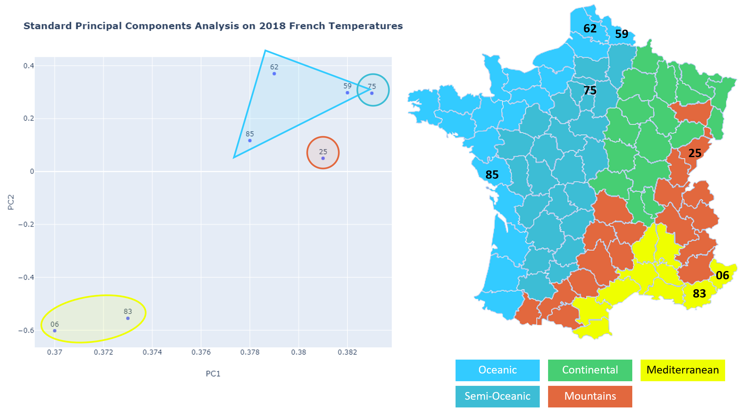
Now we can add the different weather patterns on the plot, according to the weathers observed in France:
現在,根據法國觀察到的天氣,我們可以在地塊上添加不同的天氣模式:

很容易看出聚類與法國觀測到的天氣的吻合程度。 (It is easy to see how well the clustering fits with the observed weathers in France.)
It is also important to mention that I have chosen the departments arbitrarily according to the places where I live, work and travel frequently but they have not been selected because they were providing good results for this demo. I would expect the same quality of results with other regions.
還要提一提的是,我根據我經常居住,工作和旅行的地點隨意選擇了部門,但由于他們在此演示中提供了良好的結果,因此未選擇這些部門。 我希望結果與其他地區的質量相同。
Maybe you are wondering if a standard PCA would also provide an interesting result?
也許您想知道標準PCA是否還會提供有趣的結果?
The plot here-below of standard PC1 and PC2 extracted from the original dataset shows that it is not performing as well as FPCA:
以下是從原始數據集中提取的標準PC1和PC2的圖,顯示其性能不如FPCA:
I hope this article has provided a better understanding of the Functional Principal Components Analysis to you.
希望本文為您提供了對功能主成分分析的更好理解。
I would also like to warmly thank J. Derek Tucker who has been kind enough to patiently guide me through the use of the FDASRSF package.
我還要衷心感謝J. Derek Tucker,他很友好地耐心指導我使用FDASRSF軟件包。
The complete notebook is stored here.
完整的筆記本存儲在此處 。
Here are some other articles you might like as well:
以下是您可能還會喜歡的其他一些文章:
翻譯自: https://towardsdatascience.com/beyond-classic-pca-functional-principal-components-analysis-fpca-applied-to-time-series-with-python-914c058f47a0
python pca主成分
本文來自互聯網用戶投稿,該文觀點僅代表作者本人,不代表本站立場。本站僅提供信息存儲空間服務,不擁有所有權,不承擔相關法律責任。 如若轉載,請注明出處:http://www.pswp.cn/news/391254.shtml 繁體地址,請注明出處:http://hk.pswp.cn/news/391254.shtml 英文地址,請注明出處:http://en.pswp.cn/news/391254.shtml
如若內容造成侵權/違法違規/事實不符,請聯系多彩編程網進行投訴反饋email:809451989@qq.com,一經查實,立即刪除!相關文章

blender視圖縮放_如何使用主視圖類型縮放Elm視圖
-常量和命名規范)
初探Golang(2)-常量和命名規范

函數)
sql的split()函數

大數據平臺構建_如何像產品一樣構建數據平臺
-數據類型)
初探Golang(3)-數據類型

freecodecamp_freeCodeCamp的服務器到底發生了什么?

為什么Linux下的環境變量要用大寫而不是小寫

python:連接Oracle數據庫后控制臺打印中文為??

時間序列預測 時間因果建模_時間序列建模以預測投資基金的回報
-map和流程控制語句)
初探Golang(4)-map和流程控制語句

網絡傳輸之TCP/IP協議族
PHP開發)

css flexbox模型_如何將Flexbox后備添加到CSS網格

python:封裝連接數據庫方法

貝塞爾修正_貝塞爾修正背后的推理:n-1

RESET MASTER和RESET SLAVE使用場景和說明【轉】
基本概念)
Kubernetes 入門(1)基本概念

