Scatter Plot
vizhub上實現的代碼:
https://vizhub.com/Edward-Elric233/53807a1b35d94329b3689081cd2ea945
https://vizhub.com/Edward-Elric233/b9647d50899a4a0e8e917f913cd0a53a
https://vizhub.com/Edward-Elric233/8c6b50cd81a04f048f490f48e4fe6264
由前面的柱狀圖,我們對圖形進行一定的修改就可以得到散點圖:
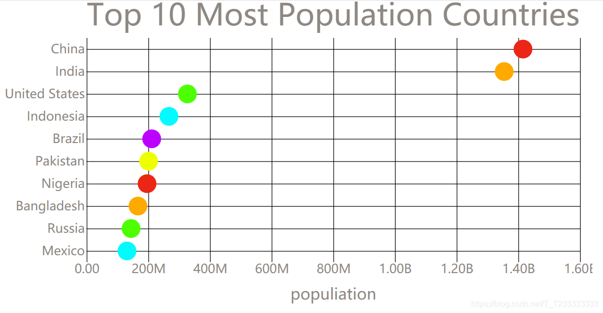 只要將綁定數據以后enter進行添加矩形的操作換成圓形就可以了,不過需要注意的是不能夠y坐標再使用
scaleBand了,而應該使用scalePoint,如果繼續使用scaleBand的話需要調整圓的坐標(y坐標是Categorical的)。注意圓形的屬性是cx,cy,r分別表示圓心的坐標和半徑。
index.html
<!DOCTYPE html>
<html><head><title>Scatter Plot</title><link rel="stylesheet" href="./styles.css"><script src="https://unpkg.com/d3@5.7.0/dist/d3.min.js"></script><!-- find D3 file on UNPKG d3.min.js-->
</head><body><svg width="960" height="500"></svg><script src="./index.js">// console.log(d3); test whether you have imported d3.js or not</script></body></html>
index.js
const svg = d3.select('svg');
// svg.style('background-color', 'red'); test
const width = +svg.attr('width');
const height = +svg.attr('height');const render = data => {const xValue = d => d.population;const yValue = d => d.country;const margin = { top: 60, right: 20, bottom: 80, left: 150 };const innerWidth = width - margin.left - margin.right;const innerHeight = height - margin.top - margin.bottom;const xScale = d3.scaleLinear().domain([0, d3.max(data, xValue)]).range([0, innerWidth]).nice(); //作用是如果值域的最大值不夠整齊可以變得整齊// const yScale = scaleBand()const yScale = d3.scalePoint().domain(data.map(yValue)).range([0, innerHeight]).padding(0.5);const xAxisTickFormat = number => d3.format('.3s')(number).replace('G', 'B');const yAxis = d3.axisLeft(yScale).tickSize(-innerWidth);;const xAxis = d3.axisBottom(xScale).tickFormat(xAxisTickFormat).tickSize(-innerHeight); //設置tick-line的長度const g = svg.append('g').attr('transform', `translate(${margin.left},${margin.top})`);//yAxis(g.append('g'));const yAxisG = g.append('g').call(yAxis).selectAll('.domain').remove();const xAxisG = g.append('g').call(xAxis).attr('transform', `translate(0,${innerHeight})`);xAxisG.selectAll('.domain').remove();xAxisG.append('text').attr('class', 'axis-label').attr('y', 60).attr('x', innerWidth / 2).attr('fill', 'black').text('populiation');let colorSet = ['#eb2617', '#ffaa00', '#4dff00', '#00fbff', '#bb00ff', '#eeff00'];const createGetColor = (idx) => {var i = idx || -1;return {get: () => { i = (i + 1) % colorSet.length; return colorSet[i]; }};};const getColor = createGetColor();g.selectAll('circle').data(data).enter().append('circle').attr('cy', d => yScale(yValue(d))).attr('cx', d => xScale(xValue(d))).attr('r', 15).attr('fill', getColor.get);g.append('text').attr('class', 'title').attr('y', -20).text('Top 10 Most Population Countries');
};d3.csv("https://gist.githubusercontent.com/Edward-Elric233/23f3024c472ffd7e34e6a5ac04bad26c/raw/6ced2249ea6f5d12f72c1eb00b8c1278d2c86e95/every%2520countries'%2520population").then(data => {data.forEach(d => {d.population = +d.population * 1000;});render(data);// console.log(data);
});
styles.css
body {margin: 0px;overflow: hidden;font-family: manosapce;
}text {font-family: sans-serif;
}.tick text {font-size: 2em;fill: #8E8883
}.axis-label {fill: #8E8883;font-size: 2.5em
}.title {font-size: 3em;fill: #8E8883
}
雖然大概實現了散點圖,但是上面的數據不適合用散點圖來進行表示。因此我們不妨更換數據,使用更適合的數據。
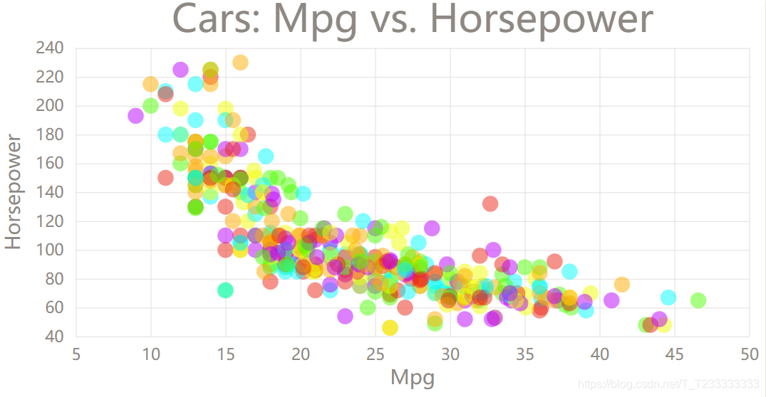 這里因為y坐標也是Quantitative的,所以應該使用
scaleLinear。畫的時候注意坐標的方向,如果方向不對應的畫可以調整scaleLinear的domain或者range(反向即可)。這里因為圓形比較密集就設置了一下圓形的透明度opacity,看起來比較好看。
index.html
<!DOCTYPE html>
<html><head><title>Cars Scatter Plot</title><link rel="stylesheet" href="./styles.css"><script src="https://unpkg.com/d3@5.7.0/dist/d3.min.js"></script><!-- find D3 file on UNPKG d3.min.js-->
</head><body><svg width="960" height="500"></svg><script src="./index.js">// console.log(d3); test whether you have imported d3.js or not</script>
</body></html>
index.js
const svg = d3.select('svg');
// svg.style('background-color', 'red'); test
const width = +svg.attr('width');
const height = +svg.attr('height');//mpg	cylinders	displacement	horsepower	weight	acceleration	year	origin	nameconst render = data => {const title = 'Cars: Mpg vs. Horsepower';const xValue = d => d.mpg;const xAxisLabel = 'Mpg';const yValue = d => d.horsepower;const yAxisLabel = 'Horsepower';const margin = { top: 60, right: 20, bottom: 80, left: 100 };const innerWidth = width - margin.left - margin.right;const innerHeight = height - margin.top - margin.bottom;const circleRadius = 10;const xScale = d3.scaleLinear()//.domain([min(data, xValue), max(data, xValue)])	//和下面的寫法等價.domain(d3.extent(data, xValue)).range([0, innerWidth]).nice(); //作用是如果值域的最大值不夠整齊可以變得整齊// const yScale = scaleBand()const yScale = d3.scaleLinear().domain([d3.max(data, yValue), d3.min(data, yValue)]).range([0, innerHeight]).nice();//const xAxisTickFormat = number => format('.3s')(number).replace('G','B');const yAxis = d3.axisLeft(yScale).tickSize(-innerWidth).tickPadding(15);const xAxis = d3.axisBottom(xScale)//.tickFormat(xAxisTickFormat).tickSize(-innerHeight) //設置tick-line的長度.tickPadding(15); //通過設置Padding讓x軸的數字離遠一點const g = svg.append('g').attr('transform', `translate(${margin.left},${margin.top})`);//yAxis(g.append('g'));const yAxisG = g.append('g').call(yAxis);yAxisG.selectAll('.domain').remove();yAxisG.append('text').attr('class', 'axis-label').attr('y', -70).attr('x', -innerHeight / 2).attr('fill', 'black').attr('transform', `rotate(-90)`).attr('text-anchor', 'middle') //設置錨點在中心.text(yAxisLabel);const xAxisG = g.append('g').call(xAxis).attr('transform', `translate(0,${innerHeight})`);xAxisG.selectAll('.domain').remove();xAxisG.append('text').attr('class', 'axis-label').attr('y', 60).attr('x', innerWidth / 2).attr('fill', 'black').text(xAxisLabel);let colorSet = ['#eb2617', '#ffaa00', '#4dff00', '#00fbff', '#bb00ff', '#eeff00'];const createGetColor = (idx) => {var i = idx || -1;return {get: () => { i = (i + 1) % colorSet.length; return colorSet[i]; }};};const getColor = createGetColor();g.selectAll('circle').data(data).enter().append('circle').attr('cy', d => yScale(yValue(d))).attr('cx', d => xScale(xValue(d))).attr('r', circleRadius).attr('fill', getColor.get);g.append('text').attr('class', 'title').attr('y', -20).attr('x', innerWidth / 2).attr('text-anchor', 'middle').text(title);
};d3.csv('https://vizhub.com/curran/datasets/auto-mpg.csv').then(data => {data.forEach(d => {//得到的數據默認每個屬性的值都是字符串,因此需要進行轉換d.mpg = +d.mpg;d.cylinders = +d.cylinders;d.displacement = +d.displacement;d.horsepower = +d.horsepower;d.weight = +d.weight;d.acceleration = +d.acceleration;d.year = +d.year;});render(data);// console.log(data);
});
styles.css
body {margin: 0px;overflow:hidden;font-family: manosapce;}circle {opacity : 0.5;}text {font-family : sans-serif;}.tick text {font-size : 2em;fill : #8E8883}.tick line {stroke : #E5E2E0}.axis-label {fill : #8E8883;font-size: 2.5em}.title {font-size : 3em;fill : #8E8883}
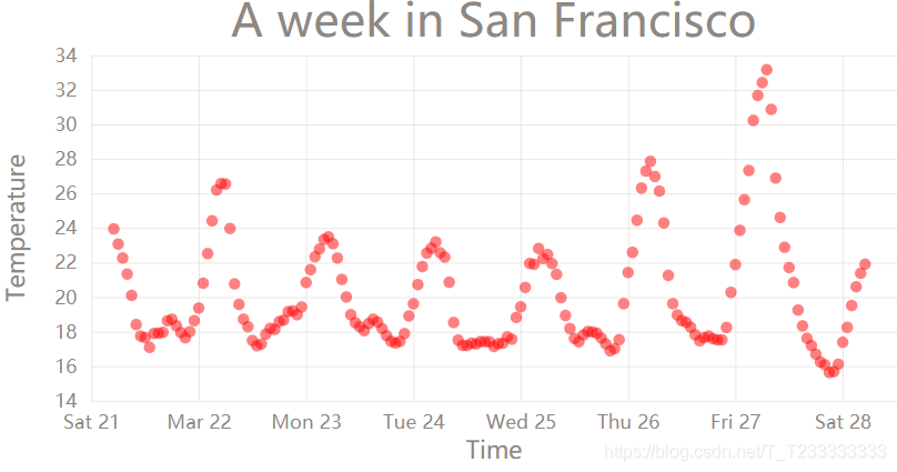
對于時間軸的處理可以使用scaleTime
index.html
<!DOCTYPE html>
<html><head><title>Temperature in San Francisc Scatter Plot</title><link rel="stylesheet" href="./styles.css"><script src="https://unpkg.com/d3@5.7.0/dist/d3.min.js"></script><!-- find D3 file on UNPKG d3.min.js-->
</head><body><svg width="960" height="500"></svg><script src="./index.js">// console.log(d3); test whether you have imported d3.js or not</script></body></html>
html.js
const svg = d3.select('svg');
// svg.style('background-color', 'red'); test
const width = +svg.attr('width');
const height = +svg.attr('height');const render = data => {const title = 'A week in San Francisco';const xValue = d => d.timestamp;const xAxisLabel = 'Time';const yValue = d => d.temperature;const yAxisLabel = 'Temperature';const margin = { top: 60, right: 20, bottom: 80, left: 100 };const innerWidth = width - margin.left - margin.right;const innerHeight = height - margin.top - margin.bottom;const circleRadius = 6;const xScale = d3.scaleTime()//.domain([min(data, xValue), max(data, xValue)])	//和下面的寫法等價.domain(d3.extent(data, xValue)).range([0, innerWidth]).nice(); //作用是如果值域的最大值不夠整齊可以變得整齊// const yScale = scaleBand()const yScale = d3.scaleLinear().domain([d3.max(data, yValue), d3.min(data, yValue)]).range([0, innerHeight]).nice();//const xAxisTickFormat = number => format('.3s')(number).replace('G','B');const yAxis = d3.axisLeft(yScale).tickSize(-innerWidth).tickPadding(15);const xAxis = d3.axisBottom(xScale)//.tickFormat(xAxisTickFormat).tickSize(-innerHeight) //設置tick-line的長度.tickPadding(15); //通過設置Padding讓x軸的數字離遠一點const g = svg.append('g').attr('transform', `translate(${margin.left},${margin.top})`);//yAxis(g.append('g'));const yAxisG = g.append('g').call(yAxis);yAxisG.selectAll('.domain').remove();yAxisG.append('text').attr('class', 'axis-label').attr('y', -70).attr('x', -innerHeight / 2).attr('fill', 'black').attr('transform', `rotate(-90)`).attr('text-anchor', 'middle') //設置錨點在中心.text(yAxisLabel);const xAxisG = g.append('g').call(xAxis).attr('transform', `translate(0,${innerHeight})`);xAxisG.selectAll('.domain').remove();xAxisG.append('text').attr('class', 'axis-label').attr('y', 60).attr('x', innerWidth / 2).attr('fill', 'black').text(xAxisLabel);let colorSet = ['#eb2617', '#ffaa00', '#4dff00', '#00fbff', '#bb00ff', '#eeff00'];const createGetColor = (idx) => {var i = idx || -1;return {get: () => { i = (i + 1) % colorSet.length; return colorSet[i]; }};};const getColor = createGetColor();g.selectAll('circle').data(data).enter().append('circle').attr('cy', d => yScale(yValue(d))).attr('cx', d => xScale(xValue(d))).attr('r', circleRadius).attr('fill', 'red');g.append('text').attr('class', 'title').attr('y', -20).attr('x', innerWidth / 2).attr('text-anchor', 'middle').text(title);
};d3.csv('https://vizhub.com/curran/datasets/temperature-in-san-francisco.csv').then(data => {// console.log(data);data.forEach(d => {//得到的數據默認每個屬性的值都是字符串,因此需要進行轉換d.temperature = +d.temperature;d.timestamp = new Date(d.timestamp);});render(data);
});
styles.css
body {margin: 0px;overflow: hidden;font-family: manosapce;
}circle {opacity: 0.5;
}text {font-family: sans-serif;
}.tick text {font-size: 2em;fill: #8E8883
}.tick line {stroke: #E5E2E0
}.axis-label {fill: #8E8883;font-size: 2.5em
}.title {font-size: 3em;fill: #8E8883
}


