bootstrap網格系統
In the last article, we learned how to create a simple page of Bootstrap? Now, we will learn what is "Grid System" in Bootstrap and how we can use or implement it in our bootstrap page? As you know bootstrap is a mobile-friendly framework. So, we design our responsive page for 'mobile first fluid grid system' and it automatically, adjust its view in every system. Now, we move further and know more about this. If you have any doubt, ask in the comment section.
在上一篇文章中,我們學習了如何創建Bootstrap的簡單頁面 ? 現在,我們將學習Bootstrap中的“網格系統”以及如何在Bootstrap頁面中使用或實現它 ? 如您所知,bootstrap是一個對移動設備友好的框架。 因此,我們為“移動優先流體網格系統”設計了響應頁面,并自動在每個系統中調整其視圖。 現在,我們將進一步了解這一點。 如有任何疑問,請在評論部分提出。
Now, first we will see what is Grid?
現在,首先我們將看到什么是網格?
A grid is a 2-D structure where rows and columns are used to structure the content. It is widely used to create a structure and for layout use HTML and CSS which make it easy to use, scan and to reduce the comprehension load on users.
網格是一種二維結構,其中使用行和列來構造內容。 它被廣泛用于創建結構并使用HTML和CSS進行布局,從而使其易于使用,掃描并減少用戶的理解負擔。
網格系統 (Grid System)
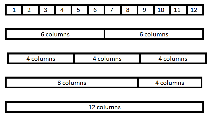
In Bootstrap Grid System it scales up to 12 columns as the device or viewport size increases. It includes predefined classes for easy layout. Basically, Grid systems are used for creating page layouts through a series of rows and columns. It’s up to you how many columns individually you want to use in your page and how many columns group you want.
在Bootstrap Grid System中 ,隨著設備或視口大小的增加,它最多可擴展至 12列。 它包括預定義的類,以簡化布局。 基本上,網格系統用于通過一系列行和列來創建頁面布局。 由您決定要在頁面中分別使用多少列以及要多少列組。
Example:
例:
網格系統的工作 (Working of Grid System)
We use .container class (for fixed width) and .container-fluid class (for full width: 100%) to place the rows.
我們使用.container類(用于固定寬度)和.container-fluid類(用于全寬度:100%)放置行。
There are .row and col-*-* pre-defined classes are available for layout. It will automatically set the width from the small breakpoint.
有.row和col-*-*個預定義的類可用于布局。 它將自動從小斷點開始設置寬度。
Note: Here, Astric ( * ) is for xs (for extra small device phone, <576px) , sm (for small device tablet, >= 768px), md (for desktop, >= 992px) , lg (for larger desktops, >= 1200px) and for the number of columns you want like: col-sm-4.
注意:此處,Astric( * )用于xs (對于超小型設備電話,<576px), sm (對于小型設備平板電腦,> = 768px), md (對于臺式機,> = 992px), lg (對于大型臺式機, > = 1200px),并指定所需的列數: col-sm-4 。
Use row for a group of columns because .row is a pre-defined wrapper class for col-*-*.
將row用于一組列,因為.row是col-*-*的預定義包裝器類。
Each .row and .col-*-* has horizontal padding for controlling the space between them called Gutters. That padding is offset in rows for the first and the last column via negative margin on .rows.
每個.row和.col-*-*都有水平填充,用于控制它們之間的間隔,稱為Gutters 。 該填充通過.rows上的負邊距在第一列和最后一列的行中偏移。
網格選項 (Grid Options)
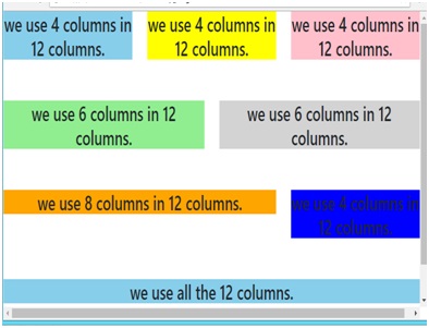
Example (Code):
示例(代碼):
<body>
<!---------- First type of grid ---------->
<div class="container">
<div class="row">
<div class="col-sm-4">
<h3 style="background-color:skyblue;text-align:center;">we use 4 columns in 12 columns.</h3>
</div>
<div class="col-sm-4">
<h3 style="background-color:yellow;text-align:center;">we use 4 columns in 12 columns.</h3>
</div>
<div class="col-sm-4">
<h3 style="background-color:pink;text-align:center;">we use 4 columns in 12 columns.</h3>
</div>
</div>
</div>
<br /><br />
<!----------- Second grid type --------------->
<div class="container">
<div class="row">
<div class="col-sm-6">
<h3 style="background-color:lightgreen; text-align:center;">we use 6 columns in 12 columns.</h3>
</div>
<div class="col-sm-6">
<h3 style="background-color:lightgrey;text-align:center;">we use 6 columns in 12 columns.</h3>
</div>
</div>
</div>
<br /><br />
<!----------- Third grid type --------------->
<div class="container">
<div class="row">
<div class="col-sm-8">
<h3 style="background-color:orange;text-align:center;">we use 8 columns in 12 columns.</h3>
</div>
<div class="col-sm-4">
<h3 style="background-color:blue;text-align:center;">we use 4 columns in 12 columns.</h3>
</div>
</div>
</div>
<br /><br />
<!----------- Fourth grid type --------------->
<div class="container">
<div class="row">
<div class="col-sm-12">
<h3 style="background-color:skyblue;text-align:center;">we use all the 12 columns.</h3>
</div>
</div>
</div>
<br /><br />
</body>
Mobile View
流動檢視
Tablet View
平板電腦視圖
Desktop View
桌面檢視
翻譯自: https://www.includehelp.com/html/how-to-use-bootstrap-grid-system.aspx
bootstrap網格系統


及封裝dll實例)


和FixedUpdate())
)


