在CSS3中新增了一個很有意思的東西,那就是動畫,有了動畫我們可以做很多的事情,讓我為大家介紹一下動畫吧!
本篇文章關于介紹動畫,利用小球移動為你們介紹一下動畫
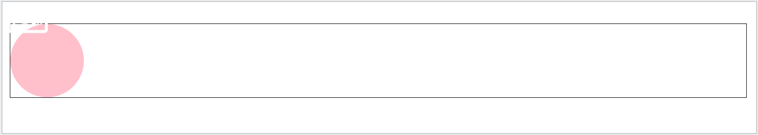
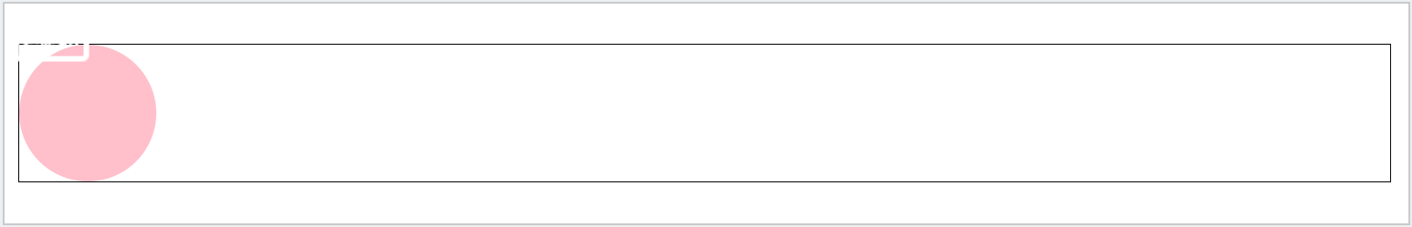
默認樣式:
<!DOCTYPE html>
<html lang="en">
<head><meta charset="UTF-8"><title>動畫</title><style>* {margin: 0;padding: 0;}.box {/* 絕對定位,子絕父相 */position: relative;width: 1000px;height: 100px;border: 1px solid black;margin: 100px auto;}.ball {width: 100px;height: 100px;border-radius: 50%;background-color: pink;/* 絕對定位,接下來用定位來實現移動 */position: absolute;top: 0;left: 0;}</style>
</head>
<body><div class="box"><!-- 小球 --><div class="ball"></div></div>
</body>
</html>
在我們使用動畫前,我們需要定義關鍵幀,使用的語法:
@keyframes 名稱 { }
/* 定義關鍵幀 */@keyframes move {/* 第一種方法,from to *//* from {left:0;}to {left: 900px;} *//* 第二種方法,百分比的形式 *//* 0% {left:0;}100%{left: 900px;} */}
動畫的使用語法與含義:
| 語法 | 含義 |
|---|---|
| animation-name | 指定要綁定到選擇器的關鍵幀的名稱 |
| animation-duration | 動畫指定需要多少秒或毫秒完成 |
| animation-timing-function | 設置動畫將如何完成一個周期 |
| animation-delay | 設置動畫在啟動前的延遲間隔 |
| animation-iteration-count | 定義動畫的播放次數 |
| animation-direction | 指定是否應該輪流反向播放動畫 |
| animation-fill-mode | 規定當動畫不播放時(當動畫完成時,或當動畫有一個延遲未開始播放時),要應用到元素的樣式 |
| animation-play-state | 指定動畫是否正在運行或已暫停 |
使用動畫讓小球動起來
/* 給小球定義關鍵幀 */@keyframes move {0% {left:0;}100%{left: 900px;}}
跟著這一步步來自己動手試試吧,看只能看的懂理論,還是得要實踐
一、animation-name
我們把名稱給到我們小球的選擇器當中
animation-name: move;
定義了動畫名稱還是做不出效果的所以我們用到了animation-duration
二、 animation-duration
動畫指定需要多少秒或毫秒完成
單位使用s(秒)
animation-duration: 2s;

這樣我們的小球就移動起來了,不過會有一個問題,但我們打開頁面或者刷新頁面的時候,動畫就已經執行起來了,會閃現一段路程,所以我們要使用到延遲時間animation-delay
三、animation-delay
我們給小球添加延遲時間
/* 延遲2秒開始,單位用s */
animation-delay: 2s;
這樣就解決了當我們頁面還沒加載完就開始執行了動畫
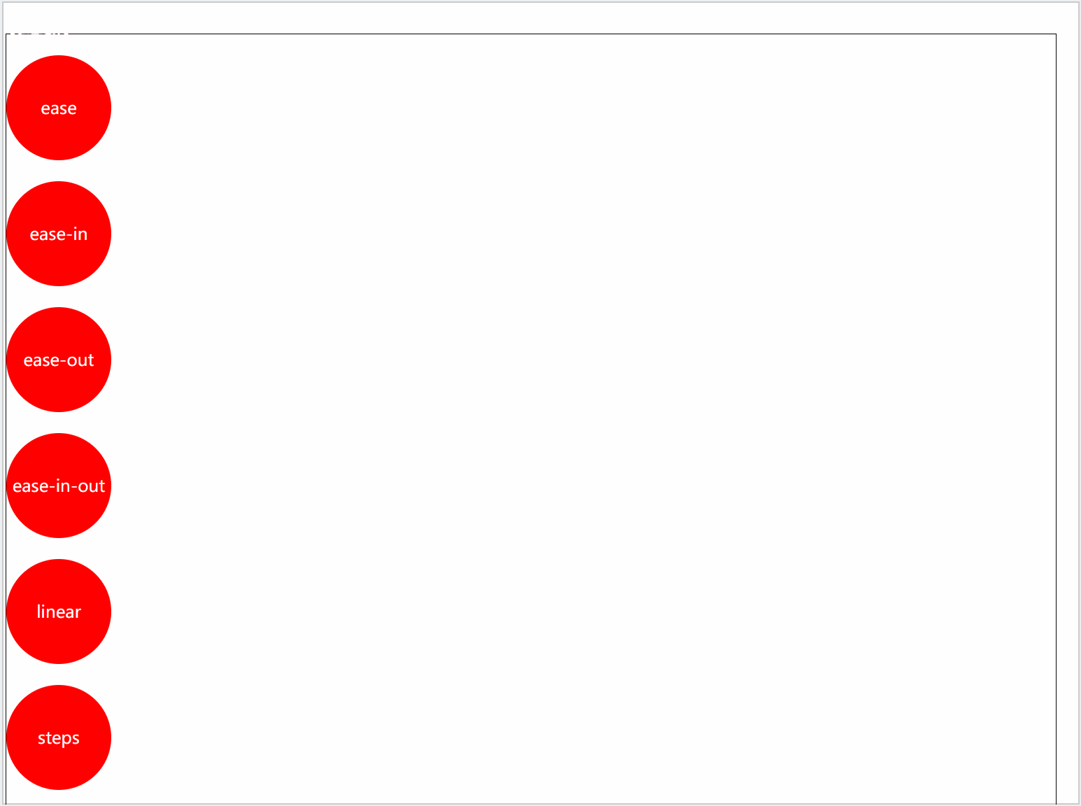
四、animation-timing-function
是不是在嘗試的過程中感覺小球滾動的速度有點奇特,一下慢一下快又一下慢的,這是animation-timing-function的屬性值導致的,默認值是ease
| 屬性值 | 簡述 |
|---|---|
| ease 默認 | 動畫以低速開始,然后加快,在結束前變慢 |
| ease-in | 動畫以低速開始 |
| ease-out | 動畫以低速結束 |
| ease-in-out | 動畫以低速開始和結束 |
| linear(常用) | 動畫從頭到尾的速度是相同的(勻速) |
| steps | 指定了時間函數中的間隔數量( 步長 ) |
演示效果:
我們把小球的速度改成勻速
animation-timing-function: linear;

五、animation-iteration-count
定義動畫播放的次數
可以使用number數字
我們想讓動畫執行2次
animation-iteration-count: 2;
在這當中我們有一個十分常用的屬性
infinite(無限的)
這個屬性可以反復執行動畫
animation-iteration-count: infinite;
六、animation-direction
動畫播放的方向
| 屬性值 | 簡述 |
|---|---|
| normal 默認值 | 動畫按正常播放 |
| reverse | 動畫反向播放 |
| alternate | 動畫在奇數次(1、3、5…)正向播放,在偶數次(2、4、6…)反向播放 |
| alternate-reverse | 動畫在奇數次(1、3、5…)反向播放,在偶數次(2、4、6…)正向播放 |
在使用alternate與alternate-reverse之前,我們需要讓動畫無限的播放或者是播放2次以上
animation-direction:alternate;
七、animation-fill-mode
| 屬性 | 簡述 |
|---|---|
| backwards | 動畫執行完畢后回到最初的位置 |
| forwards | 動畫執行完畢后停在最后一幀不動 |
animation-fill-mode: forwards;

八、animation-play-state
指定動畫是否正在運行或已暫停
我用:hover為大家演示一下,不和其他屬性一樣寫在一起
.ball:hover {animation-play-state: paused;
}
注意看鼠標

代碼總結:
<!DOCTYPE html>
<html lang="en">
<head><meta charset="UTF-8"><title>動畫</title><style>* {margin: 0;padding: 0;}.box {/* 絕對定位,子絕父相 */position: relative;width: 1000px;height: 100px;border: 1px solid black;margin: 100px auto;}.ball {/* 絕對定位,接下來用定位來實現移動 */position: absolute;top: 0;left: 0;width: 100px;height: 100px;border-radius: 50%;background-color: pink;/* 動畫名稱 */animation-name: move;/* 所需時間 */animation-duration: 2s;/* 延遲時間 */animation-delay: 2s;/* 運動曲線 */animation-timing-function: linear;/* 定義動畫播放的次數 */animation-iteration-count: infinite;/* 動畫播放方向 *//* animation-direction:alternate; *//* 最后一幀停止不動 *//* animation-fill-mode: forwards; */}/* 鼠標經過小球停止,移出繼續動 */.ball:hover {animation-play-state: paused;}/* 給小球定義關鍵幀 */@keyframes move {0% {left: 0;}100% {left: 900px;}}</style>
</head>
<body><div class="box"><!-- 小球 --><div class="ball"></div></div>
</body>
</html>
九、復合屬性(常用)
我們可以直接使用animation
animation: 動畫的名稱 時間 運動曲線 開始時間 播放次數 是否反向播放 是否運用結束的樣式 動畫是否運行或暫停;
復合屬性簡寫:
/* 要使用到forwards需要不無限循環 */
animation: move 2s 2s linear infinite alternate;
感謝大家的閱讀,本人文筆有限,如有錯誤的地方,可以向我指出,感謝大家!
)
期末復習)

)


![跳躍游戲[中等]](http://pic.xiahunao.cn/跳躍游戲[中等])


