目錄
一、引言
二、基本用法
代碼解析
三、主要屬性
3.1 TabBar
3.2 TabBarView
四、進階定制:突破默認樣式
4.1 視覺樣式深度定制
4.2 自定義指示器與標簽
4.3 動態標簽管理
五、工程實踐關鍵技巧
5.1?性能優化方案
5.2?復雜手勢處理
5.3?響應式布局適配
六、常見問題排查指南
6.1 頁面滑動卡頓
6.2 動態標簽內容不同步
6.3 指示器位置異常
七、最佳實踐建議
7.1 架構設計原則
7.2 交互優化方案
7.3 跨平臺適配策略
八、總結
相關推薦
一、引言
????????在 Flutter 中,TabBar 和 TabBarView 組件用于實現多個頁面的標簽導航,類似于 Android 的 ViewPager + TabLayout。TabBar 用于顯示標簽頁,TabBarView 用于切換不同的頁面內容。它們通常與 DefaultTabController 結合使用,實現流暢的頁面切換效果。
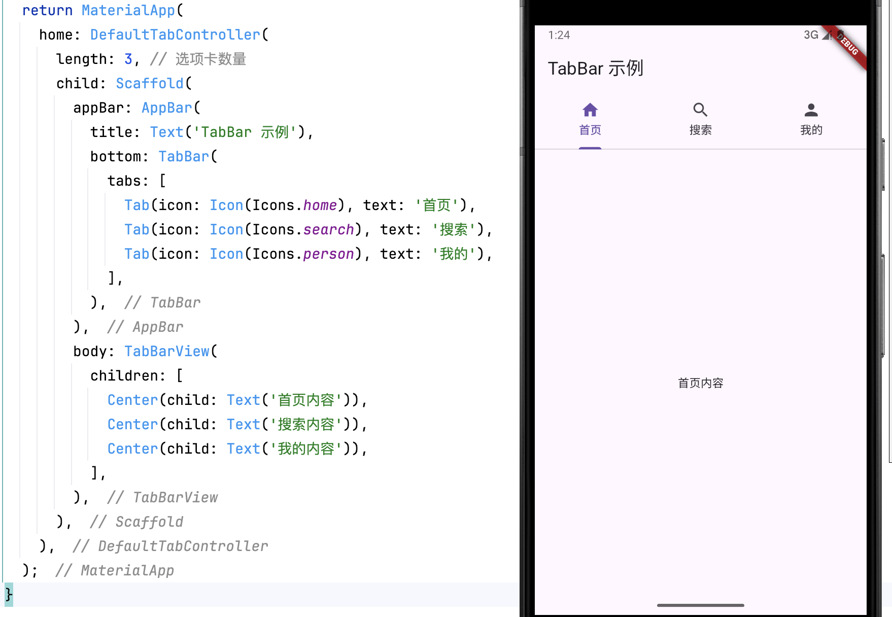
二、基本用法
return MaterialApp(home: DefaultTabController(length: 3, // 選項卡數量child: Scaffold(appBar: AppBar(title: Text('TabBar 示例'),bottom: TabBar(tabs: [Tab(icon: Icon(Icons.home), text: '首頁'),Tab(icon: Icon(Icons.search), text: '搜索'),Tab(icon: Icon(Icons.person), text: '我的'),],),),body: TabBarView(children: [Center(child: Text('首頁內容')),Center(child: Text('搜索內容')),Center(child: Text('我的內容')),],),),),);代碼解析
DefaultTabController(length: 3, child: ...):定義標簽頁的數量。TabBar:定義標簽,支持文本和圖標。TabBarView:對應的內容頁,順序與TabBar一致。Scaffold.appBar:包含TabBar,用于展示選項卡。
三、主要屬性
3.1 TabBar
| 屬性 | 說明 |
|---|---|
tabs | 選項卡列表,支持 Tab() 組件 |
isScrollable | 是否允許滑動 |
indicatorColor | 選中指示器顏色 |
indicatorSize | 選中指示器的大小(tab / label) |
labelColor | 選中項文字顏色 |
unselectedLabelColor | 未選中項文字顏色 |
示例:
TabBar(isScrollable: true,indicatorColor: Colors.red,labelColor: Colors.blue,unselectedLabelColor: Colors.grey,tabs: [...],
)
3.2 TabBarView
| 屬性 | 說明 |
|---|---|
children | 選項卡對應的頁面內容 |
physics | 允許或禁止滑動 (NeverScrollableScrollPhysics() 可禁用) |
示例(禁止滑動):
TabBarView(physics: NeverScrollableScrollPhysics(),children: [...],
)
四、進階定制:突破默認樣式
4.1 視覺樣式深度定制
????????通過參數全面修改 TabBar 外觀:
TabBar(indicator: BoxDecoration(borderRadius: BorderRadius.circular(8),color: Colors.deepPurple.withOpacity(0.2),),indicatorSize: TabBarIndicatorSize.label,indicatorPadding: EdgeInsets.symmetric(vertical: 6),labelColor: Colors.deepPurple,unselectedLabelColor: Colors.grey,labelStyle: TextStyle(fontWeight: FontWeight.bold,fontSize: 16,shadows: [Shadow(color: Colors.black38, offset: Offset(1,1))]),tabs: [...],
);
4.2 自定義指示器與標簽
????????完全自定義指示器組件:
TabBar(indicator: _CustomIndicator(),tabs: [Tab(child: _CustomTabItem('動態', Icons.update)),Tab(child: _CustomTabItem('消息', Icons.forum)),],
);class _CustomIndicator extends Decoration {@overrideBoxPainter createBoxPainter([VoidCallback? onChanged]) {return _IndicatorPainter();}
}class _IndicatorPainter extends BoxPainter {@overridevoid paint(Canvas canvas, Offset offset, ImageConfiguration cfg) {final paint = Paint()..color = Colors.amber..style = PaintingStyle.fill;canvas.drawRRect(RRect.fromRectAndRadius(Rect.fromCenter(center: offset + Offset(cfg.size!.width/2, cfg.size!.height - 6),width: 28,height: 4,),Radius.circular(2),),paint);}
}
4.3 動態標簽管理
????????實現動態增刪標簽功能:
List<String> categories = ['推薦', '本地', '體育'];void _addTab() {setState(() {categories.add('新增 ${categories.length}');});
}TabBar(isScrollable: true,tabs: categories.map((text) => Tab(text: text)).toList(),
),TabBarView(children: categories.map((_) => NewsFeed()).toList(),
)
五、工程實踐關鍵技巧
5.1?性能優化方案
????????解決頁面狀態保持問題:
TabBarView(children: [KeepAliveWrapper(child: Page1()), // 自定義保持狀態組件AutomaticKeepAliveClientMixin(wantKeepAlive: true,child: Page2(),),],
)// KeepAliveWrapper 實現
class KeepAliveWrapper extends StatefulWidget {final Widget child;const KeepAliveWrapper({Key? key, required this.child}) : super(key: key);@override_KeepAliveWrapperState createState() => _KeepAliveWrapperState();
}class _KeepAliveWrapperState extends State<KeepAliveWrapper> with AutomaticKeepAliveClientMixin {@overridebool get wantKeepAlive => true;@overrideWidget build(BuildContext context) {super.build(context);return widget.child;}
}5.2?復雜手勢處理
????????與 PageView 嵌套時的滑動沖突解決方案:
PageView(physics: ClampingScrollPhysics(), // 禁用頁面滑動controller: _pageController,children: [TabBarViewWrapper( // 自定義嵌套容器tabController: _tabController,child: TabBarView(...),),],
)class TabBarViewWrapper extends StatelessWidget {final TabController tabController;final Widget child;const TabBarViewWrapper({required this.tabController, required this.child});@overrideWidget build(BuildContext context) {return NotificationListener<ScrollNotification>(onNotification: (notification) {if (notification is ScrollUpdateNotification) {// 處理橫向滑動邏輯tabController.animateTo(tabController.offset - notification.scrollDelta! / context.size!.width);}return true;},child: child,);}
}5.3?響應式布局適配
????????多設備尺寸下的顯示優化:
LayoutBuilder(builder: (context, constraints) {if (constraints.maxWidth > 600) {// 平板端橫向布局return Row(children: [SizedBox(width: 200,child: TabBar(isScrollable: true,labelColor: Colors.blue,unselectedLabelColor: Colors.grey,tabs: categories.map((text) => Tab(text: text)).toList(),controller: _tabController,orientation: VerticalTabOrientation(),),),Expanded(child: TabBarView(controller: _tabController,children: [...],),),],);} else {// 手機端標準布局return DefaultTabController(...);}},
)
六、常見問題排查指南
6.1 頁面滑動卡頓
解決方案:
-
對復雜子頁面使用?
RepaintBoundary?和?Opacity?進行渲染優化 -
避免在?
build?方法中執行耗時操作 -
使用?
PageView?替代?TabBarView?實現懶加載
6.2 動態標簽內容不同步
解決方案:
-
使用?
GlobalKey?刷新特定頁面 -
結合?
StreamBuilder?實現數據驅動更新 -
通過?
IndexedStack?保持頁面狀態
6.3 指示器位置異常
解決方案:
-
檢查?
TabBar?的?indicatorSize?設置 -
確認父容器的布局約束
-
使用?
PreferredSizeWidget?包裝自定義組件
七、最佳實踐建議
7.1 架構設計原則
-
采用 BLoC 或 Provider 進行狀態管理
-
將 Tab 配置數據與業務邏輯分離
-
對復雜頁面實現按需加載(Lazy Loading)
7.2 交互優化方案
-
添加滑動過渡動畫(使用?
AnimatedSwitcher) -
實現標簽拖拽排序功能
-
支持標簽頁的快捷操作菜單
7.3 跨平臺適配策略
-
iOS 風格適配:使用?
CupertinoSlidingSegmentedControl -
Web 端優化:支持鼠標懸停效果
-
桌面端增強:添加鍵盤導航支持
八、總結
? ? Flutter 的 TabBar 體系為開發者提供了從簡單到復雜場景的完整解決方案。通過深度定制化能力與靈活的控制器機制,開發者可以打造出既符合 Material Design 規范又能滿足個性需求的分頁導航系統。在實際項目中,應重點關注性能優化與狀態管理,結合響應式設計原則,確保在不同平臺和設備上都能提供流暢的用戶體驗。
相關推薦
Flutter AppBar 詳解-CSDN博客文章瀏覽閱讀906次,點贊34次,收藏36次。AppBar 是 Flutter 提供的頂欄組件,通常用于應用的導航欄,包含標題、返回按鈕、菜單等功能。AppBar 結合 Scaffold 使用,能夠增強用戶體驗,提供一致的導航交互。本文將介紹 AppBar 的基本用法、主要屬性及自定義方式。https://shuaici.blog.csdn.net/article/details/146070214Flutter BottomNavigationBar 詳解-CSDN博客文章瀏覽閱讀1.3k次,點贊39次,收藏49次。BottomNavigationBar 是用于實現底部導航欄的組件,適用于具有多個頁面或功能的應用,例如社交媒體、購物應用等。用戶可以通過底部導航快速切換不同的頁面或視圖。本文將介紹 BottomNavigationBar 的基本用法、主要屬性以及自定義樣式。
https://shuaici.blog.csdn.net/article/details/146070241


和value(受 React 狀態控制))

![wrod生成pdf。[特殊字符]改背景](http://pic.xiahunao.cn/wrod生成pdf。[特殊字符]改背景)


初階數據結構完)

![海外短劇H5系統開發:技術架構、SEO優化與全球市場突圍策略 [2025版]](http://pic.xiahunao.cn/海外短劇H5系統開發:技術架構、SEO優化與全球市場突圍策略 [2025版])

)


)