參考:
Bootstrap5 教程 | 菜鳥教程
https://www.runoob.com/bootstrap5/bootstrap5-tutorial.html
Spacing · Bootstrap v5 中文文檔 v5.3 | Bootstrap 中文網
https://v5.bootcss.com/docs/utilities/spacing/
之前用bootstrap2和3比較多,最近用到了5,發現好多地方不一樣了,所以學習一下。主要寫沒用過的特性,隨緣更新。
目錄
- 容器
- 屬性
- 布局
- 規則
- 按鈕
- 屬性
- 按鈕組
- 工具Utilities
- spacing
- 浮動
- border
- 寬度與高度
容器
Bootstrap 5 需要一個容器元素來包裹網站的內容。
.container類用于固定寬度并支持響應式布局的容器。.container-fluid 類用于 100% 寬度,占據全部視口(viewport)的容器。
container 的行為復雜一些:
- 寬度 (max-width) 會根據屏幕寬度同比例放大或縮小。超級小屏幕(<576px)是100%,然后每種范圍有一個固定寬度。超級大屏幕 (≥1400px) 是 Bootstrap 5 新增加的, Bootstrap 4 最大的是特大屏幕 (≥1200px)
- margin-left, margin-right 都為 auto,保持 container 容器居中。
container-fluid 的行為就簡單:
- margin:0 寬度:100%
屬性
-
容器內邊距
默認情況下,容器都填充左右內邊距,頂部和底部不填充。Bootstrap 提供了一些間距類用于填充邊距。 比如.pt-5就是用于填充頂部內邊距(記為padding-top,5在下面有解釋)。 -
邊框和顏色
bg-dark就是背景色為深色,text-white是文本為白色。這種屬性也可以用在其他標簽里,比如<p>、<a>等。類似還有bg-primary|bg-success|bg-info|bg-warning|bg-danger|bg-secondary(中灰色)|bg-light(淺灰色)。至于字體的顏色,如下圖所示:
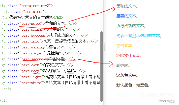
后面跟數字表示顏色的透明度,如.text-black-50就是透明度為50的黑色文本<div class="container p-5 my-5 border"><h1>我的第一個 Bootstrap 頁面</h1><p>這個容器有一個邊框和一些邊距。</p> </div> <div class="container p-5 my-5 bg-dark text-white"><h1>我的第一個 Bootstrap 頁面</h1><p>這個容器具有深色背景色和白色文本,以及一些額外的邊距。</p> </div> <div class="container p-5 my-5 bg-primary text-white"><h1>我的第一個 Bootstrap 頁面</h1><p>這個容器具有藍色背景色和白色文本,以及一些額外的邊距。</p> </div>背景色可以加漸變,只要后面跟一個
bg-gradient即可。 -
響應式容器
可以使用.container-sm|md|lg|xl。max-witdth會隨之變化
布局
規則
- 系統最多分為12列
.col-針對所有設備,.col-sm-平板,.col-md-桌面顯示器,.col-lg-大桌面顯示器,.col-xl-特大桌面顯示器,.col-xxl-超大桌面顯示器- 網格每一行需要放在容器中
- Bootstrap 5 和 Bootstrap 4 使用 flexbox(彈性盒子) 而不是浮動。 Flexbox 的一大優勢是,沒有指定寬度的網格列將自動設置為等寬與等高列
.row表示行,下面如果只用.col,不指定設備和列數的話,會均分行- 偏移列:使用
.offset-設備-偏移列數<div class="row"><div class="col-md-4 p-3 bg-primary text-white">.col-md-4</div><div class="col-md-4 offset-md-4 bg-dark text-white">.col-md-4 .offset-md-4</div> </div>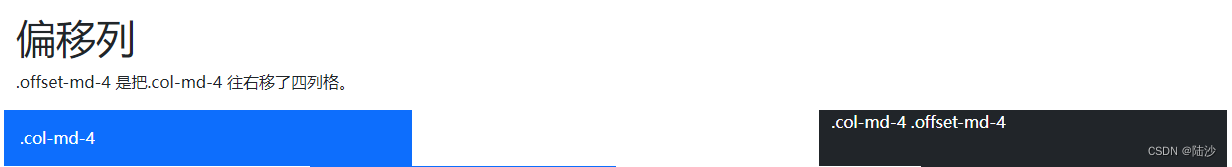
按鈕
屬性
-
顏色:
class="btn"是無框黑字白底按鈕 -
邊框:加outline 關鍵詞,如
class="btn btn-outline-primary"就是一個藍色邊框、白色背景、藍色字體的按鈕 -
大小:
btn-lg|btn-sm -
塊級:
btn-block。如果有多個塊級,可以使用gap-數字設置。<div class="d-grid gap-3"><button type="button" class="btn btn-primary btn-block">100% 寬度的按鈕</button><button type="button" class="btn btn-primary btn-block">100% 寬度的按鈕</button><button type="button" class="btn btn-primary btn-block">100% 寬度的按鈕</button> </div>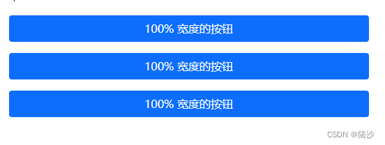
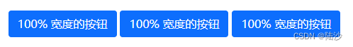
.d-grid是指在父級元素是成塊的,如果去掉會變成:
-
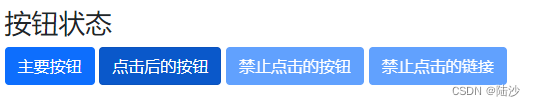
按鈕狀態
<div class="container mt-3"><h2>按鈕狀態</h2><button type="button" class="btn btn-primary">主要按鈕</button><button type="button" class="btn btn-primary active">點擊后的按鈕</button><button type="button" class="btn btn-primary" disabled>禁止點擊的按鈕</button><a href="#" class="btn btn-primary disabled">禁止點擊的鏈接</a> </div><a>里要把 disabled 寫在 class 里,可以理解為是套用的button格式
-
加載中的按鈕
<!-- 一個旋轉的圓弧。還可以換成spinner-grow spinner-grow-sm --><button class="btn btn-primary" disabled><span class="spinner-border spinner-border-sm"></span>Loading..</button>
按鈕組
- 水平按鈕組
在外層<div>上添加.btn-group,控制大小是另外加.btn-group-lg或者.btn-group-sm<div class="btn-group btn-group-sm"><button type="button" class="btn btn-primary">Apple</button><button type="button" class="btn btn-primary">Samsung</button><button type="button" class="btn btn-primary">Sony</button> </div> - 垂直按鈕組
使用.btn-group-vertical - 帶下拉菜單的按鈕
<!-- 注意 btn外層的div class="btn-group" -->
<div class="btn-group"><button type="button" class="btn btn-primary dropdown-toggle" data-bs-toggle="dropdown">Sony</button><ul class="dropdown-menu"><li><a class="dropdown-item" href="#">Tablet</a></li><li><a class="dropdown-item" href="#">Smartphone</a></li></ul>
</div>
工具Utilities
這里包含的是包括背景、顏色、邊框等一堆亂七八糟的東西,這些可以用在很多元素上,屬于一些公共的特性。
spacing
前面一些 class 里寫了諸如 p-5, my-5, mt-3 這樣的數字,其實是控制邊距的。說明:
格式是:{property}{sides}-{size} for xs and {property}{sides}-{breakpoint}-{size} for sm, md, lg, xl, and xxl.
- property 里m 表示 margin(外邊距),p 表示padding(內邊距)
- sides 表示方向,或者說是哪一邊
- t 表示top,b 表示bottom,x 表示水平方向(左右),y 表示垂直方向(上下),s 表示LTR時左邊和RTL的右邊,e 則相反。如果不寫 sides 表示四面都設置
- size 包括 [0, 5] 和 auto。其中 0 表示真的設為0,3 表示將 margin 或者 padding 設置為
$spacer,1~5分別表示設為$spacer的0.25,0.5,1.5 和 3.5倍。
水平居中:如果指定了 width ,并且 display:block,那么可以使用.mx-auto,使元素在水平方向上居中
浮動
.clearfix是清除浮動,start和end表示向左向右。
<div class="clearfix"><span class="float-start">Float left</span><span class="float-end">Float right</span></div>
也可以根據尺寸設置浮動效果,像.float-md-end
不浮動:.float-none
border
使用.border。
<div class="container mt-3"><span class="border"></span> <!-- 默認,全邊框 --><span class="border border-0"></span> <!-- 無邊框 --><span class="border border-top-0"></span> <!-- 只去掉頂部邊框 --><span class="border border-end-0"></span> <!-- 只去掉右邊(LTR,所以右邊是end)邊框 --><span class="border border-bottom-0"></span><span class="border border-start-0"></span><br><!-- 以下是保留xx位置的border --><span class="border-top"></span> <!-- 只保留頂部邊框 --><span class="border-end"></span><span class="border-bottom"></span><span class="border-start"></span>
</div>
- 調節linewidth使用
.border-數字,其中數字取 [0, 5] - 邊框顏色使用
.border-顏色,顏色可以是primary, success, info, dark white什么的 - 圓角邊框使用
.rounded[-位置/形狀],位置的話top/bottom/start/end就是字面意思,circle表示邊框是圓形,pill表示是膠囊型 - 圓角的大小可以用
.rounded-數字,數字取值[0, 3]
寬度與高度
.w-數字表示寬度為百分之多少(eg:25/50/75/100),也可以用auto。.mw-100表示最大寬度為100
.h-數字表示高度為百分之多少,跟寬度一樣的。


)
)


)

參數分析與純算法還原(含算法源碼))

 | 錯誤與異常處理)

:從初識堆到堆排序的實現)

包含了this指針、構造函數、析構函數、拷貝構造等)

