重要提示:數據和代碼獲取:請查看主頁個人信息!!!
載入R包
rm(list=ls())
pacman::p_load(tidyverse,assertthat,igraph,purrr,ggraph,ggmap)
網絡節點和邊數據
nodes <- read.csv('nodes.csv', row.names = 1)
edges <- read.csv('edges.csv', row.names = 1)
節點數據權重計算
g <- graph_from_data_frame(edges, directed = FALSE, vertices = nodes)
nodes_for_plot <- nodes %>% mutate(weight = degree(g))
網絡邊和地圖經緯度數據整理
edges_for_plot <- edges %>%inner_join(nodes %>% select(id, lon, lat), by = c('from' = 'id')) %>%rename(x = lon, y = lat) %>%inner_join(nodes %>% select(id, lon, lat), by = c('to' = 'id')) %>%rename(xend = lon, yend = lat) %>% mutate(category = as.factor(category))
edges_for_plot <- edges %>%
這行代碼開始了一個管道操作,將
edges數據框作為輸入。edges數據框應該包含圖中的邊的信息,例如每條邊的起點和終點。
inner_join(nodes %>% select(id, lon, lat), by = c('from' = 'id'))
nodes %>% select(id, lon, lat)首先從nodes數據框中選擇id(節點標識符)、lon(經度)、lat(緯度)這三列。
inner_join函數將edges數據框與上述選擇的節點數據進行內連接。連接的依據是edges中的from列與nodes中的id列相匹配,這樣每條邊的起點都會被賦予對應節點的經緯度信息。
rename(x = lon, y = lat)
這行代碼將連接后得到的
lon和lat列重命名為x和y,這通常是為了繪圖方便或符合后續處理的習慣。
inner_join(nodes %>% select(id, lon, lat), by = c('to' = 'id'))
類似于前面的操作,這次是將修改過的
edges數據框再次與節點的經緯度信息進行內連接,但這次連接依據是edges中的to列與nodes中的id列。這樣每條邊的終點也被賦予對應節點的經緯度信息。
rename(xend = lon, yend = lat)
將第二次連接后得到的
lon和lat列重命名為xend和yend,為繪制起點到終點的直線做準備。
mutate(category = as.factor(category))
這行代碼使用
mutate函數將category列轉換為因子(factor)類型。因子類型在 R 中用于表示分類變量,這可能是為了在繪圖或分析時處理邊的類別。
ggplot2出圖
ggplot(nodes_for_plot) + geom_polygon(aes(x = long, y = lat, group = group),data = map_data('world'),fill = "#CECECE", color = "#515151",size = 0.15) +geom_curve(data = edges_for_plot, aes(x = x, y = y, xend = xend, yend = yend, # draw edges as arcscolor = category, size = weight),curvature = 0.33,alpha = 0.5) +scale_size_continuous(guide = FALSE, range = c(0.25, 2)) + # scale for edge widthsgeom_point(aes(x = lon, y = lat, size = weight), ? ? ? ? ? # draw nodesshape = 21, fill = 'white',color = 'black', stroke = 0.5) +scale_size_continuous(guide = FALSE, range = c(1, 6)) + ? # scale for node sizegeom_text(aes(x = lon, y = lat, label = name), ? ? ? ? ? ? # draw text labelshjust = 0, nudge_x = 1, nudge_y = 4,size = 3, color = "white", fontface = "bold") +coord_fixed()
?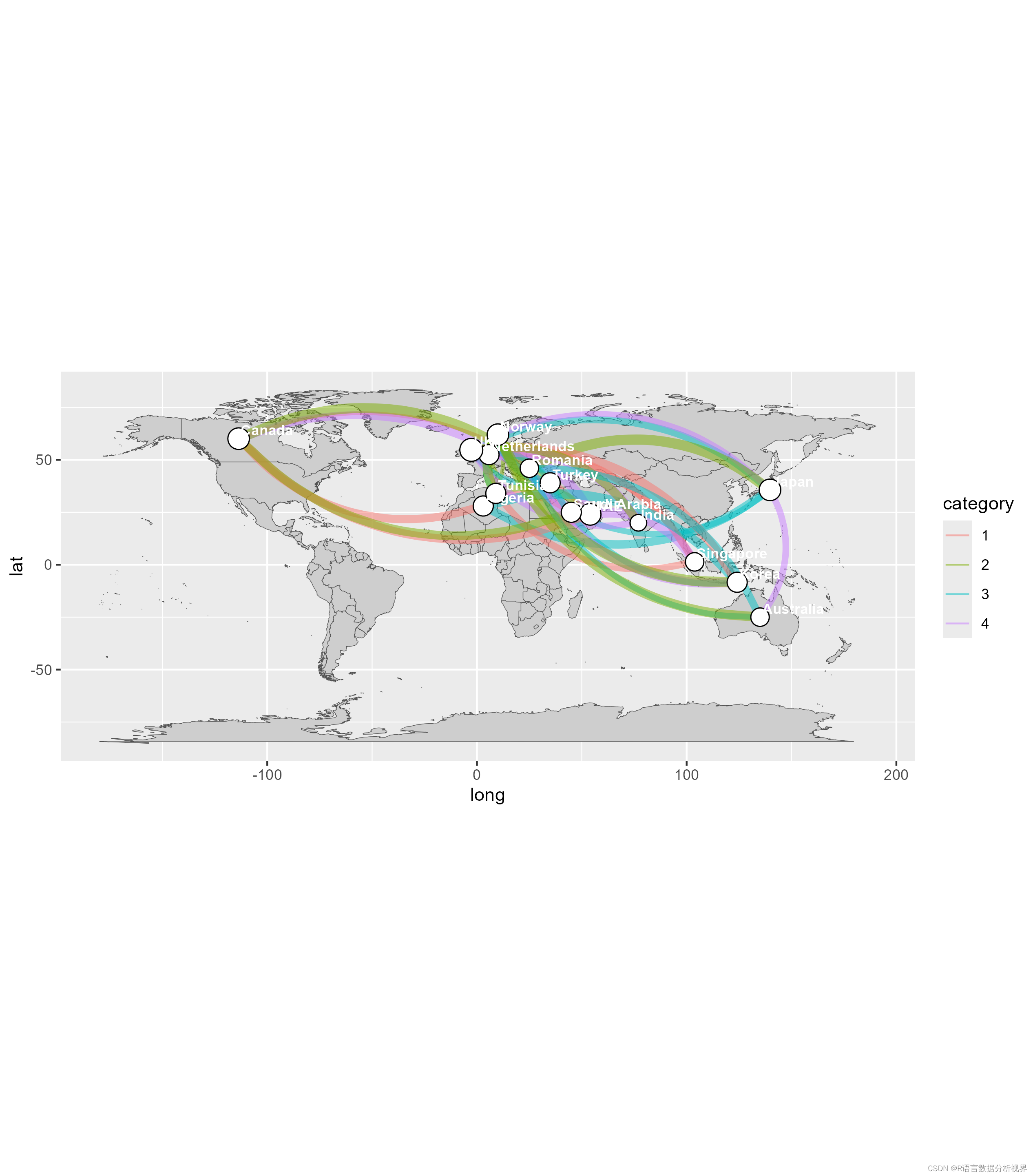
基礎圖層:
ggplot(nodes_for_plot): 初始化一個ggplot對象,可能包含一些特定點的節點數據。
geom_polygon(...): 添加一個多邊形層,這里是使用了世界地圖的數據。aes(x = long, y = lat, group = group)設置了多邊形的坐標和分組。填充顏色設為灰色#CECECE,邊界顏色設為深灰#515151,邊界寬度為0.15。曲線層:
geom_curve(...): 添加曲線層,用于繪制邊緣或連接線,具體數據來自edges_for_plot。這里曲線的顏色和寬度通過aes(...)映射到category和weight字段。曲線的彎曲度為0.33,透明度為0.5。邊緣寬度的比例尺:
scale_size_continuous(guide = FALSE, range = c(0.25, 2)): 設置曲線寬度的連續比例尺,范圍從0.25到2,不顯示圖例。點層:
geom_point(...): 添加點層,用于繪制節點。節點位置通過aes(x = lon, y = lat)設置,大小通過weight控制。點的形狀設為21(帶邊框的圓形),填充顏色為白色,邊框顏色為黑色,邊框寬度為0.5。節點大小的比例尺:
scale_size_continuous(guide = FALSE, range = c(1, 6)): 設置節點大小的連續比例尺,范圍從1到6,不顯示圖例。文本層:
geom_text(...): 添加文本層,用于繪制節點旁的文本標簽。文本位置通過微調nudge_x和nudge_y設置,水平對齊hjust = 0(左對齊)。文本大小為3,顏色為白色,字體加粗。坐標系:
coord_fixed(): 設置一個固定比例的坐標系,確保緯度和經度的比例一致,通常用于地圖數據以保持比例正確。這段代碼的整體作用是在世界地圖上繪制節點和節點間的連接線,并且附加文本標簽,適用于展示網絡、路徑或者其他地理相關的數據。
映射顏色
ggplot(nodes_for_plot) + geom_polygon(aes(x = long, y = lat, group = group, fill = region), show.legend = F,data = map_data('world'),color = "black",size = 0.15) +geom_curve(data = edges_for_plot, aes(x = x, y = y, xend = xend, yend = yend, # draw edges as arcssize = weight),color = 'black', curvature = 0.33,alpha = 0.5) +scale_size_continuous(guide = FALSE, range = c(0.25, 2)) + # scale for edge widthsgeom_point(aes(x = lon, y = lat, size = weight), ? ? ? ? ? # draw nodesshape = 21, fill = 'white',color = 'black', stroke = 0.5) +scale_size_continuous(guide = FALSE, range = c(1, 6)) + ? # scale for node sizegeom_text(aes(x = lon, y = lat, label = name), ? ? ? ? ? ? # draw text labelshjust = 0, nudge_x = 1, nudge_y = 4,size = 3, color = "white", fontface = "bold") +coord_fixed(xlim = c(-150, 180), ylim = c(-55, 80)) + theme(panel.grid = element_blank()) +theme(axis.text = element_blank()) +theme(axis.ticks = element_blank()) +theme(axis.title = element_blank()) +theme(legend.position = "right") +theme(panel.grid = element_blank()) +theme(panel.background = element_rect(fill = "#596673")) +theme(plot.margin = unit(c(0, 0, 0.5, 0), 'cm'))

這段代碼相較于前一段代碼有以下幾個主要修改和增加:
多邊形層 (
geom_polygon):
增加了
fill = region屬性到aes函數中,這表示多邊形的填充顏色現在是基于region字段動態變化的,而不是固定的灰色。修改了邊框顏色為黑色。
增加了
show.legend = F,這表示不顯示圖例,之前的代碼中默認可能顯示圖例。曲線層 (
geom_curve):
去除了曲線的顏色通過
aes動態映射,而是設置成了統一的黑色。去除了曲線寬度的動態映射,只保留了基于
weight的大小映射。坐標系 (
coord_fixed):
增加了
xlim和ylim參數,這用于設置X軸和Y軸的顯示范圍,可以用于聚焦到地圖的特定部分。主題設置 (
theme):
新增多個
theme函數調用,用于定制圖表的美觀性和可讀性:
panel.grid = element_blank():去除背景的網格線。
axis.text = element_blank()和其他相關axis設置:去除坐標軸的文本、刻度、標題等元素,使圖表更為簡潔。
legend.position = "right":設置圖例位置在右側。
panel.background = element_rect(fill = "#596673"):設置面板背景顏色為深灰藍色。
plot.margin = unit(c(0, 0, 0.5, 0), 'cm'):調整圖表的邊緣空白。


)


)


![[AI Google] 三種新方法利用 Gemini 提高 Google Workspace 的生產力](http://pic.xiahunao.cn/[AI Google] 三種新方法利用 Gemini 提高 Google Workspace 的生產力)


