目錄
一、vue2掛載
二、柱狀圖
2.1、基礎柱狀圖介紹
2.2、標記:最大值\最小值(markPoint)、平均值(markLine)
2.3、顯示:數值顯示(label)、柱子寬度(barWidth)、橫向柱狀圖
三、折線圖
3.1、標記:最大值\最小值(markPoint)、平均值(markLine)、標注區間(markArea)
3.2、線條控制:平滑(smooth)、風格(lineStyle)
3.3、填充風格(areaStyle)
3.4、緊挨邊緣(boundaryGap)、縮放(scale)
3.5、堆疊圖(stack)
四、散點圖
4.1、氣泡圖:散點大小(symbolSize)、散點顏色(itemStyle.color)效果
4.2、漣漪動畫(type:effectScatter)效果
五、直角坐標系常用配置
5.1、網格:grid
5.2、坐標軸:axis
5.3、區域縮放:dataZoom
六、餅圖
6.1、顯示數值(label.formatter)
6.2、圓環(radius)
6.3、南丁格爾圖(roseType)、選中效果(selectedMode)
?七、雷達圖
7.1、顯示數值(label)、區域面積(areaStyle)
7.2、繪制類型(shape)
八、儀表盤圖
8.1、數值范圍、多個指針、顏色
九、通用配置
9.1、標題:title
9.1、提示:tooltip
9.1、工具按鈕:toolbox
9.1、圖例:legend
十、基礎小結
一、vue2掛載
(1)、npm i?echarts成功后,在項目的package.json文件里可以看到版本號: "echarts": "^4.9.0"。
(2)、在項目的main.js中
import echarts from "echarts"
Vue.prototype.$echarts = echarts;//掛載到原型,可以在全局使用
(3)、官網:快速上手 - 使用手冊 - Apache ECharts
(4)、每個圖的具體信息配置項:Documentation - Apache ECharts
二、柱狀圖
2.1、基礎柱狀圖介紹

<template><div><el-card><divref="echartsMain"style="width: 60%; height: 500px"id="main1"></div></el-card></div>
</template>
<script>
export default {data() {return {list: [{ time: "一班", value: 110 },{ time: "二班", value: 90 },{ time: "三班", value: 190 },{ time: "四班", value: 70 },{ time: "五班", value: 300 },],};},mounted() {this.getData();},methods: {getData() {// this.$nextTick(() => {});//解決掛載時拿不到this.$refs.echartsMain的bug// let myChart = this.$echarts.init(this.$refs.echartsMain);//這樣寫也行let myChart = this.$echarts.init(document.getElementById("main1"));myChart.setOption({title: {text: "基礎柱狀圖顯示",},xAxis: {//xAxis:直角坐標系中的X軸type: "category",data: this.list.map((d) => d.time),axisLabel: {//傾斜展示角度rotate: 60,// 垂直顯示// formatter: function (value) {//   return value.split("").join("\n");// },},},yAxis: {//yAxis:直角坐標系中的Y軸type:'value',//數值軸},series: [//series:系列列表{barWidth:30,name: "日期",type: "bar",//決定圖標類型(bar、line、pie)data: this.list.map((d) => d.value),},],});},},
};
</script>
常見效果如下:
2.2、標記:最大值\最小值(markPoint)、平均值(markLine)
series: [{......markPoint: {data: [{type: "max",name: "最大值",},{type: "min",name: "最小值",},],},markLine: {data: [{type: "average",name: "平均值",},],},},],2.3、顯示:數值顯示(label)、柱子寬度(barWidth)、橫向柱狀圖
series: [{...... barWidth: "30%",label: {show: true,rotate: 60,position: "top",},},],橫向展示:只需將xAxis和yAxis的值或者type的值互換即可
xAxis: {// type: "category", // data: this.list.map((d) => d.time),type: "value",},yAxis: {// type: "value",type: "category", data: this.list.map((d) => d.time),},三、折線圖
將series中?type的值設置為"line"即可!一般用于分析數據隨著時間的變化趨勢!

常見效果如下:
3.1、標記:最大值\最小值(markPoint)、平均值(markLine)、標注區間(markArea)
series: [{......markPoint: {data: [{type: "max",},{type: "min",},],},markLine: {data: [{type: "average",},],},markArea: {data: [[{ xAxis: "1月" }, { xAxis: "2月" }],[{ xAxis: "6月" }, { xAxis: "7月" }],],},},],
3.2、線條控制:平滑(smooth)、風格(lineStyle)
series: [{......smooth: true,lineStyle: {color: "green",type: "dotted",//solid、dotted、dashed},},],3.3、填充風格(areaStyle)
series: [{......areaStyle: { color: "skyblue" },},],3.4、緊挨邊緣(boundaryGap)、縮放(scale)

xAxis: {type: "category",data: xDataArr,boundaryGap: false,//緊挨邊緣},
yAxis: {type: "value",scale:true,//脫離0值比例(縮放)},
3.5、堆疊圖(stack)
一組數據基于另一組數據進行累加后展示,防止相近數據交叉,顯得‘雜亂無章’

series: [{name: "銷量",type: "line",data: yDataArr,stack: "all",areaStyle: {},},{name: "other",type: "line",data: yDataArr2,stack: "all",areaStyle: {},},],四、散點圖
將series中?type的值設置為"scatter",xAxis和yAxis的type都設置為"value"!
一般用于推斷變量間的(正)相關性(eg:身高和體重的關系),也可以用在地圖標注上!

<script>    var datas = [{ gender: "male", height: 164.2, weight: 55.5 },{ gender: "male", height: 167.5, weight: 59 },{ gender: "male", height: 170.2, weight: 62.3 },{ gender: "male", height: 176.6, weight: 76.3 },{ gender: "male", height: 179.1, weight: 79.1 },{ gender: "male", height: 177.8, weight: 84.1 },{ gender: "male", height: 180.3, weight: 83.2 },{ gender: "male", height: 180.3, weight: 83.2 },{ gender: "male", height: 183, weight: 90.9 },];var axisData = [];for (var i = 0; i < datas.length; i++) {var height = datas[i].height;var weight = datas[i].weight;var newArr = [height, weight];axisData.push(newArr);}let myChart = this.$echarts.init(document.getElementById("main1"));myChart.setOption({xAxis: {type: "value",scale: true,},yAxis: {type: "value",scale: true,},series: [{type: "scatter",data: axisData,//二維數組},],});
</script>
4.1、氣泡圖:散點大小(symbolSize)、散點顏色(itemStyle.color)效果

series: [{type: "scatter",data: axisData, //二維數組showEffectOn:'emphasis',rippleEffect:{scale:10},symbolSize: function (arg) {// BMI=體重(kg)/(身高m*身高m) >28即為肥胖 >23.9即為超重var height = arg[0] / 100;var weight = arg[1];var Bmi = weight / (height * height);if (Bmi > 24) {return 24;}return 10;},itemStyle: {color: function (arg) {var height = arg.data[0] / 100;var weight = arg.data[1];var Bmi = weight / (height * height);if (Bmi > 24) {return "red";}return "green";},},},],4.2、漣漪動畫(type:effectScatter)效果
1、將type原本的值“scatter”設置為“effectScatter”,每個散點會由內而外像水波一樣蕩漾開來!
2、想要鼠標劃到對應散點上再出現水波紋:在type同級添加showEffectOn:'emphasis';
3、想要水波紋范圍擴大:在type同級添加rippleEffect:{scale:10}
五、直角坐標系常用配置
直角坐標系圖表:柱狀圖、折線圖、散點圖
5.1、網格:grid
作用:控制直角坐標系的布局和大小

grid: {show: true,borderWidth: 10,borderColor: "gold",left: 20,top: 20,width: 300,height: 150,},xAxis: {.....},yAxis: {.....},5.2、坐標軸:axis
(1)、類型type:
value:數值軸,會自動從目標數據中讀取數據
category:類目軸,通過data設置類目數據
(2)、顯示位置position
xAxis:可取值為top或者bottom
yAxis:可取值為left或者right
5.3、區域縮放:dataZoom
(1)、類型type:
slider:滑塊滾動
inside:鼠標滾動
(2)、指明產生作用的軸
xAxisIndex:控制哪個x軸,值為數字
yAxisIndex:控制哪個y軸,值為數字
(3)、指明初始狀態的縮放情況
start:起始百分比
end:結束百分比
dataZoom: [{type: "slider",// type: "inside",//滾動條不顯示,直接鼠標滾動xAxisIndex: 0,},{type: "slider",yAxisIndex: 0,start: 0,end: 80,},],xAxis: {.....},yAxis: {.....},六、餅圖

將series中?type的值設置為"pie"即可!一般用于反映模塊的占比情況!
6.1、顯示數值(label.formatter)
myChart.setOption({series: [{type: "pie",data: this.list,label: {show: true,formatter: function (arg) {return (arg.name + "平臺" + arg.value + "元\n" + arg.percent + "%");},},},],});6.2、圓環(radius)
label: {......},
radius:['50%','75%']//[內圓半徑,外圓半徑]
6.3、南丁格爾圖(roseType)、選中效果(selectedMode)
label: {......},
roseType:'radius',//餅圖的每個區域的半徑和模塊占比相關,
selectedMode:'multiple',//single:單個區域偏離原點、multiple:多個區域偏離原點
七、雷達圖
七、雷達圖
將series中?type的值設置為"radar"即可!一般用于分析多個維度數據與標準數據的比對情況!

7.1、顯示數值(label)、區域面積(areaStyle)
let myChart = this.$echarts.init(document.getElementById("main1"));var dataMax = [{ name: "易用性", max: 100 },{ name: "功能", max: 100 },{ name: "拍照", max: 100 },{ name: "跑分", max: 100 },{ name: "續航", max: 100 },];myChart.setOption({radar: {indicator: dataMax, //配置各個維度的最大值,},series: [{type: "radar",label: {show: true,},areaStyle: {}, //給每個對象添加陰影區域data: [{name: "華為手機",value: [80, 90, 80, 82, 90],},{name: "中興手機",value: [70, 82, 75, 70, 78],},],},],});7.2、繪制類型(shape)
radar: {indicator: dataMax, //配置各個維度的最大值,shape:'polygon',//polygon:多邊形 circle:圓形},series: [......],八、儀表盤圖
將series中?type的值設置為"gauge"即可!一般用于分析進度把控以及數據范圍的監測!
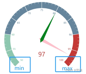
myChart.setOption({series: [{type: "gauge",data: [{value: 97,itemStyle: {color: "pink",},}, //每一個對象就代表一個指針{value: 80,itemStyle: {color: "green",},},],min:50 //min max 儀表盤數值范圍},],});8.1、數值范圍、多個指針、顏色
數值范圍:min、max;
多個指針:增加data中的數組元素;
顏色:(itemStyle.color)
九、通用配置
9.1、標題:title
(1)、文字樣式:textStyle
(2)、標題邊框:borderWidth、borderColor、borderRadius
(3)、標題位置:top、left、right、bottom
title: {text: "基礎柱狀圖顯示",textStyle: {color: "red",},borderWidth: 5,borderColor: "blue",borderRadius: 5,top: 10,left: 100,},
xAxis: {......},
yAxis: {......},
9.1、提示:tooltip
(1)、觸發類型(trigger):item、axis
(2)、觸發時機(triggerOn):mouseover、click
(3)、格式化(formatter):字符串模板、回調函數
title: {......},
tooltip: {trigger: "axis",triggerOn: "click",// formatter: "{b} 的成績是 {c}",formatter: function(msg){console.log(msg[0]);return msg[0].name+'分數為'+msg[0].data},},
xAxis: {......},
9.1、工具按鈕:toolbox
內置有導出圖片、數據視圖、動態類型切換、數據區域縮放、數據重置5個工具

title: {......},
toolbox: {feature: {saveAsImage: {},//導出圖片dataView: {},//更改圖表數據restore: {},//將更改的數據還原dataZoom: {},//框選指定區域“放大”(單獨展示)magicType: {//類型切換:可以將原數據切換為不同類型的圖表不同再畫一個了type: ["bar", "line", "stack"],},},},
xAxis: {......},
9.1、圖例:legend
legend用于篩選系列:它里面的data的值需要和series數組中該組數據的name值完全一致,否則無法顯示。點擊上面任意一個系列框框,下面就會留下對應的數據。
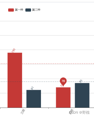
legend: {data: ["第一種", "第二種"],},
series: [{name: "第一種",type: "bar",data: this.list.map((d) => d.value),},{name: "第二種",type: "bar",data: yData2,},],備注:也可以用echarts實現矢量地圖(type:'map'),不過一般都用百度地圖(需要ak)
十、基礎小結
| name | type | use |
|---|---|---|
| 柱狀圖 | bar | ? ? ? ? ? ? ? ? ? 比較不同類別之間的數據差異 |
| 折線圖 | line | ? ? ? ? ? ? ? ? ? 分析數據隨著時間的變化趨勢 |
| 散點圖 | scatter/effectScatter | ? ? ? ? ? ? ? ? ? 推斷變量間的(正)相關性 |
| 餅圖 | pie | ? ? ? ? ? ? ? ? ? 反映模塊的占比情況 |
| 雷達圖 | radar | ? ? ? ? ? ? ? ? ? 分析多個維度數據與標準數據的比對情況 |
| 儀表盤圖 | gauge | ? ? ? ? ? ? ? ? ? 分析進度把控以及數據范圍的監測 |


 函數)


