Matplotlib多子圖布局實戰
學習目標
通過本課程的學習,學員將掌握如何在Matplotlib中創建和管理多個子圖,了解子圖布局的基本原理和調整方法,能夠有效地展示多個數據集,提升數據可視化的效果。
相關知識點
- Matplotlib子圖
學習內容
1 Matplotlib子圖
1.1 創建子圖
在數據可視化中,經常需要在一個畫布上展示多個數據集,這時就需要使用到子圖。Matplotlib提供了多種創建子圖的方法,其中最常用的是plt.subplots()函數。這個函數可以一次性創建一個畫布和多個子圖,并返回一個包含所有子圖的數組,使得管理和操作子圖變得非常方便。
1.1.1理論知識
plt.subplots()函數的基本語法如下:
%pip install matplotlib
%pip install mplcursors
fig, axs = plt.subplots(nrows, ncols, sharex=False, sharey=False, figsize=(8, 6))
nrows和ncols分別指定了子圖的行數和列數。sharex和sharey參數用于控制子圖之間是否共享x軸或y軸,這對于需要比較不同數據集的圖表非常有用。figsize參數用于設置整個畫布的大小,單位為英寸。
1.1.2 實踐代碼
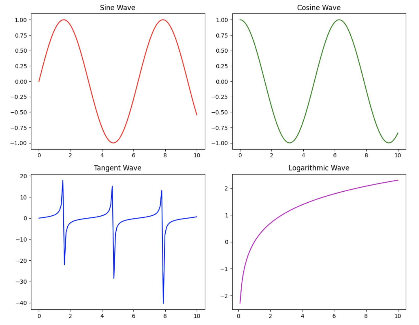
下面的代碼示例展示了如何使用plt.subplots()創建一個2x2的子圖布局,并在每個子圖中繪制不同的數據。
import matplotlib.pyplot as plt
import numpy as np# 創建數據
x = np.linspace(0, 10, 100)
y1 = np.sin(x)
y2 = np.cos(x)
y3 = np.tan(x)
y4 = np.log(x)# 創建2x2的子圖布局
fig, axs = plt.subplots(2, 2, figsize=(10, 8))# 繪制子圖
axs[0, 0].plot(x, y1, 'r')  # 第一個子圖
axs[0, 0].set_title('Sine Wave')
axs[0, 1].plot(x, y2, 'g')  # 第二個子圖
axs[0, 1].set_title('Cosine Wave')
axs[1, 0].plot(x, y3, 'b')  # 第三個子圖
axs[1, 0].set_title('Tangent Wave')
axs[1, 1].plot(x, y4, 'm')  # 第四個子圖
axs[1, 1].set_title('Logarithmic Wave')# 調整布局
plt.tight_layout()# 顯示圖表
plt.show()
1.2 子圖布局調整
雖然plt.subplots()函數提供了一個方便的默認布局,但在實際應用中,可能需要對子圖的布局進行更精細的調整,以適應不同的數據展示需求。Matplotlib提供了多種方法來調整子圖的布局,包括使用plt.subplots_adjust()函數和GridSpec對象。
1.2.1理論知識
plt.subplots_adjust()函數允許手動調整子圖之間的間距,包括左、右、上、下邊距以及子圖之間的水平和垂直間距。GridSpec對象提供了一種更靈活的方式來定義子圖的布局,可以指定每個子圖在畫布上的具體位置和大小。
1.2.2 實踐代碼
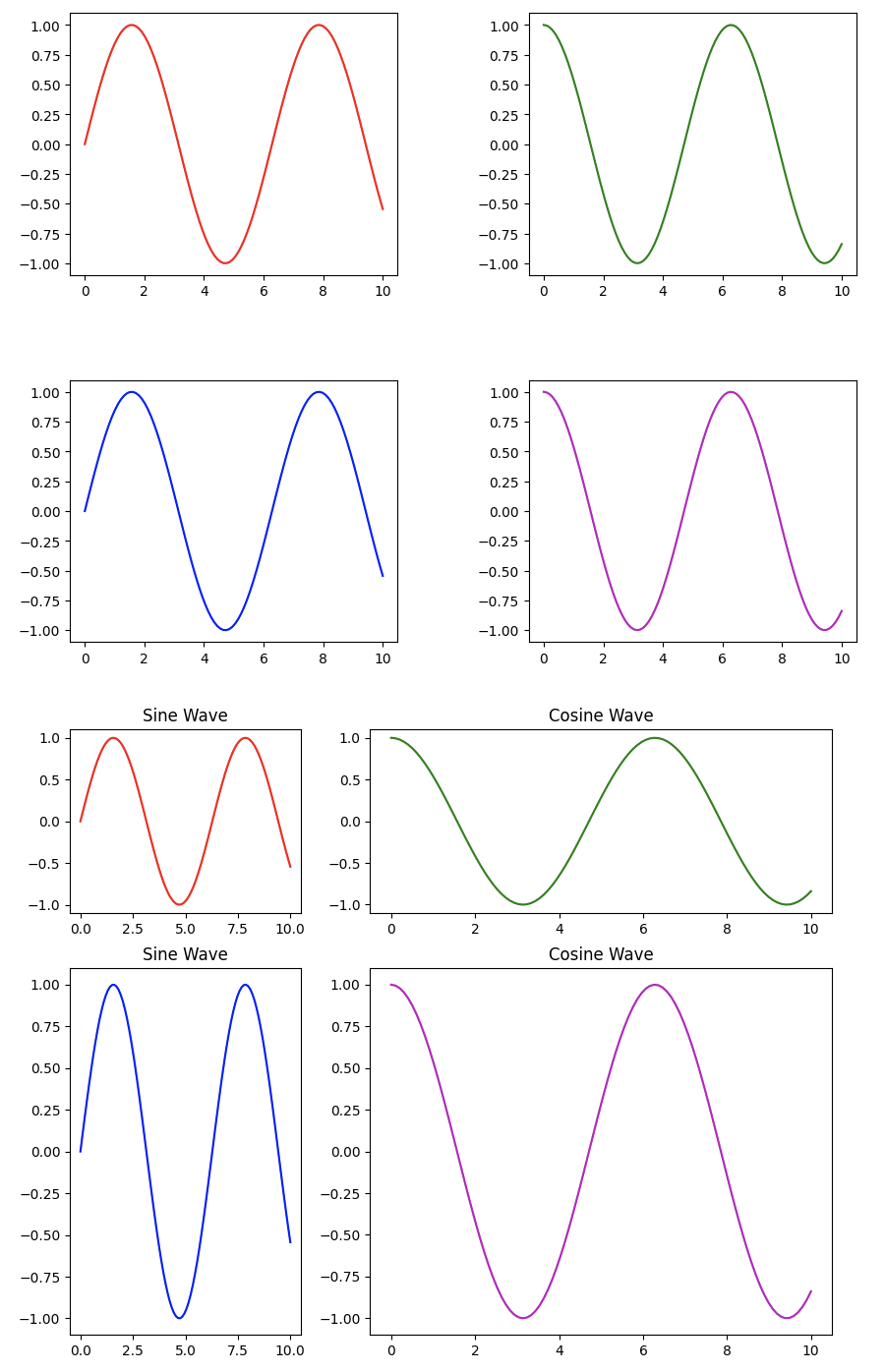
下面的代碼示例展示了如何使用plt.subplots_adjust()和GridSpec來調整子圖的布局。
import matplotlib.pyplot as plt
import matplotlib.gridspec as gridspec
import numpy as np# 創建數據
x = np.linspace(0, 10, 100)
y1 = np.sin(x)
y2 = np.cos(x)# 使用plt.subplots_adjust()調整布局
fig, axs = plt.subplots(2, 2, figsize=(10, 8))
axs[0, 0].plot(x, y1, 'r')
axs[0, 1].plot(x, y2, 'g')
axs[1, 0].plot(x, y1, 'b')
axs[1, 1].plot(x, y2, 'm')# 調整子圖間距
plt.subplots_adjust(left=0.1, right=0.9, top=0.9, bottom=0.1, wspace=0.4, hspace=0.4)# 使用GridSpec調整布局
fig = plt.figure(figsize=(10, 8))
gs = gridspec.GridSpec(2, 2, width_ratios=[1, 2], height_ratios=[1, 2])ax1 = plt.subplot(gs[0, 0])
ax1.plot(x, y1, 'r')
ax1.set_title('Sine Wave')ax2 = plt.subplot(gs[0, 1])
ax2.plot(x, y2, 'g')
ax2.set_title('Cosine Wave')ax3 = plt.subplot(gs[1, 0])
ax3.plot(x, y1, 'b')
ax3.set_title('Sine Wave')ax4 = plt.subplot(gs[1, 1])
ax4.plot(x, y2, 'm')
ax4.set_title('Cosine Wave')# 顯示圖表
plt.show()
1.3 子圖間的交互
在某些情況下,可能需要在多個子圖之間實現交互,例如,當鼠標懸停在一個子圖上的某個數據點時,其他子圖中的相應數據點也會高亮顯示。Matplotlib提供了mplcursors庫來實現這種交互效果。
1.3.1理論知識
mplcursors庫是一個第三方庫,可以與Matplotlib結合使用,實現圖表的交互功能。通過mplcursors.cursor()函數,可以為圖表添加交互式注釋,當鼠標懸停在數據點上時,會顯示該點的詳細信息。
1.3.2 實踐代碼
下面的代碼示例展示了如何使用mplcursors庫在多個子圖之間實現交互。
import matplotlib.pyplot as plt
import numpy as np
import mplcursors# 創建數據
x = np.linspace(0, 10, 100)
y1 = np.sin(x)
y2 = np.cos(x)# 創建2x2子圖
fig, axs = plt.subplots(2, 2, figsize=(10, 8))
lines = []# 繪制各子圖
lines.append(axs[0, 0].plot(x, y1, 'r.-', label='Sine Wave 1')[0])
lines.append(axs[0, 1].plot(x, y2, 'g.-', label='Cosine Wave 1')[0])
lines.append(axs[1, 0].plot(x, y1, 'b.-', label='Sine Wave 2')[0])
lines.append(axs[1, 1].plot(x, y2, 'm.-', label='Cosine Wave 2')[0])# 設置標題和圖例
axs[0, 0].set_title('Sine Wave 1')
axs[0, 0].legend()
axs[0, 1].set_title('Cosine Wave 1')
axs[0, 1].legend()
axs[1, 0].set_title('Sine Wave 2')
axs[1, 0].legend()
axs[1, 1].set_title('Cosine Wave 2')
axs[1, 1].legend()fig.tight_layout()# 創建交互光標
cursor = mplcursors.cursor(lines, hover=True)@cursor.connect("add")
def on_add(sel):# 獲取懸停點的x坐標并找到對應的數據索引hover_x_coord = sel.target[0]actual_data_index = np.argmin(np.abs(x - hover_x_coord))# 設置注釋文本current_y_value = sel.artist.get_ydata()[actual_data_index]text_content = (f'{sel.artist.get_label()}\n'f'x = {x[actual_data_index]:.2f}\n'f'y = {current_y_value:.2f}')sel.annotation.set_text(text_content)# 在所有子圖中高亮對應點for ax_plot in axs.flat:if ax_plot.lines:line_in_ax = ax_plot.lines[0]line_in_ax.set_marker('o')line_in_ax.set_markersize(12)line_in_ax.set_markevery([actual_data_index])fig.canvas.draw_idle()plt.show()

文件--二進制文件查看編輯)


)

)
)

)


)
)


來控制電腦(版本1))