一、position屬性
| 屬性值? | ?描述? | ?應用場景? |
|---|---|---|
static | 默認定位方式,元素遵循文檔流正常排列,top/right/bottom/left?屬性無效?。 | 普通文檔流布局,默認布局,無需特殊定位。 |
relative | 相對定位,相對于元素原本位置進行偏移,但仍保留原空間?。 | 微調元素位置,或作為子元素絕對定位的基準(父元素設為?relative)?。 |
absolute | 絕對定位,相對于最近的非?static?祖先元素定位,脫離文檔流?。 | 創建浮動菜單、對話框,或重構頁面布局(需配合父級?relative?使用)?。 |
fixed | 固定定位,相對于視口定位,不隨頁面滾動改變位置?。 | 固定導航欄、回到頂部按鈕等需要始終可見的元素?。 |
sticky | 粘性定位,在特定滾動閾值前表現為?relative,超過后變為?fixed?。 | 實現滾動時固定表頭、側邊導航欄等效果?。 |
二、定位的應用
1、static 默認定位
<!DOCTYPE html>
<html lang="zh-cn">
<head><meta charset="UTF-8"><meta name="viewport" content="width=device-width, initial-scale=1.0"><title>默認定位示例</title><style>/* 父容器樣式 */.container {width: 300px;height: auto;background-color: #f0f8ff; /* 淺藍色背景 */border: 2px solid #ddd;margin: 20px auto;padding: 10px; /* 內邊距 */}/* 第一個盒子:默認定位 */.box1 {width: 100px;height: 100px;background-color: #4CAF50; /* 綠色背景 */margin-bottom: 10px; /* 下方間距 */}/* 第二個盒子:默認定位 */.box2 {width: 100px;height: 100px;background-color: #FF5722; /* 橙色背景 */margin-bottom: 10px; /* 下方間距 */}/* 第三個盒子:默認定位 */.box3 {width: 100px;height: 100px;background-color: #2196F3; /* 藍色背景 */}</style>
</head>
<body><div class="container"><div class="box1">默認定位1</div><div class="box2">默認定位2</div><div class="box3">默認定位3</div></div>
</body>
</html>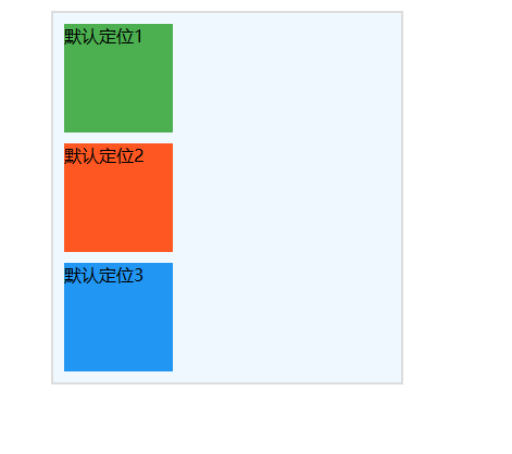
排列方式:
- 三個盒子按照正常的文檔流從上到下排列。
- 每個盒子之間有一定的間距(通過?
margin-bottom?設置)。布局特點:
- 沒有使用任何定位屬性,盒子不會發生重疊,也不會偏移。
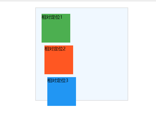
2、relative相對定位
<!DOCTYPE html>
<html lang="zh-cn">
<head><meta charset="UTF-8"><meta name="viewport" content="width=device-width, initial-scale=1.0"><title>相對定位示例</title><style>/* 父容器樣式 */.container {position: relative; /* 父容器設置為相對定位 */width: 300px;height: auto;background-color: #f0f8ff; /* 淺藍色背景 */border: 2px solid #ddd;margin: 20px auto;padding: 10px; /* 內邊距 */}/* 第一個盒子:相對定位 */.box1 {position: relative;width: 100px;height: 100px;background-color: #4CAF50; /* 綠色背景 */top: 10px; /* 向下偏移 10px */left: 10px; /* 向右偏移 10px */}/* 第二個盒子:相對定位 */.box2 {position: relative;width: 100px;height: 100px;background-color: #FF5722; /* 橙色背景 */top: 20px; /* 向下偏移 20px */left: 20px; /* 向右偏移 20px */}/* 第三個盒子:相對定位 */.box3 {position: relative;width: 100px;height: 100px;background-color: #2196F3; /* 藍色背景 */top: 30px; /* 向下偏移 30px */left: 30px; /* 向右偏移 30px */}</style>
</head>
<body><div class="container"><div class="box1">相對定位1</div><div class="box2">相對定位2</div><div class="box3">相對定位3</div></div>
</body>
</html>
第一個盒子(綠色):
? ? 相對于自身默認位置向下偏移 10px,向右偏移 10px。第二個盒子(橙色):
? ? 相對于自身默認位置向下偏移 20px,向右偏移 20px。第三個盒子(藍色):
? ? 相對于自身默認位置向下偏移 30px,向右偏移 30px。
注意事項
相對定位的特點:
- 元素仍然保留在文檔流中,偏移后不會影響其他元素的布局。
- 偏移的效果僅影響元素的視覺位置。
重疊問題:
- 如果偏移量較大,可能會導致元素之間發生重疊。
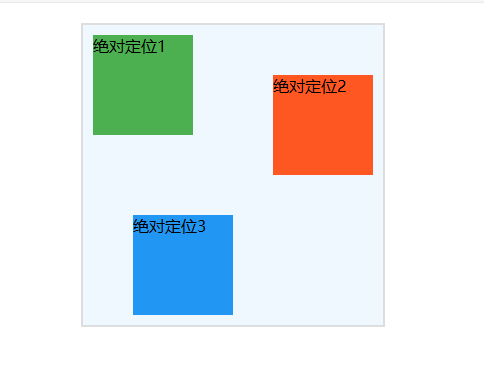
3、absolute絕對定位
<!DOCTYPE html>
<html lang="zh-cn">
<head><meta charset="UTF-8"><meta name="viewport" content="width=device-width, initial-scale=1.0"><title>絕對定位示例</title><style>/* 父容器樣式 */.container {position: relative; /* 父容器設置為相對定位,作為子元素的定位參考點 */width: 300px;height: 300px;background-color: #f0f8ff; /* 淺藍色背景 */border: 2px solid #ddd;margin: 20px auto;}/* 第一個盒子:絕對定位 */.box1 {position: absolute;width: 100px;height: 100px;background-color: #4CAF50; /* 綠色背景 */top: 10px; /* 距離父容器頂部 10px */left: 10px; /* 距離父容器左側 10px */}/* 第二個盒子:絕對定位 */.box2 {position: absolute;width: 100px;height: 100px;background-color: #FF5722; /* 橙色背景 */top: 50px; /* 距離父容器頂部 50px */right: 10px; /* 距離父容器右側 10px */}/* 第三個盒子:絕對定位 */.box3 {position: absolute;width: 100px;height: 100px;background-color: #2196F3; /* 藍色背景 */bottom: 10px; /* 距離父容器底部 10px */left: 50px; /* 距離父容器左側 50px */}</style>
</head>
<body><div class="container"><div class="box1">絕對定位1</div><div class="box2">絕對定位2</div><div class="box3">絕對定位3</div></div>
</body>
</html>
第一個盒子(綠色):
? ? ?位于父容器的左上角,距離頂部 10px,左側 10px。第二個盒子(橙色):
? ? ?位于父容器的右上角,距離頂部 50px,右側 10px。第三個盒子(藍色):
? ? ?位于父容器的左下角,距離底部 10px,左側 50px。
注意事項
定位參考點:
- 絕對定位的元素會相對于最近的定位祖先(
position: relative、absolute?或?fixed?的父級元素)進行定位。- 如果沒有定位祖先,則相對于?
html(視口)進行定位。脫離文檔流:
絕對定位的元素不會占據文檔流中的空間,因此可能會與其他元素重疊。靈活布局:
絕對定位適合用于彈窗、工具提示、精確布局等場景。
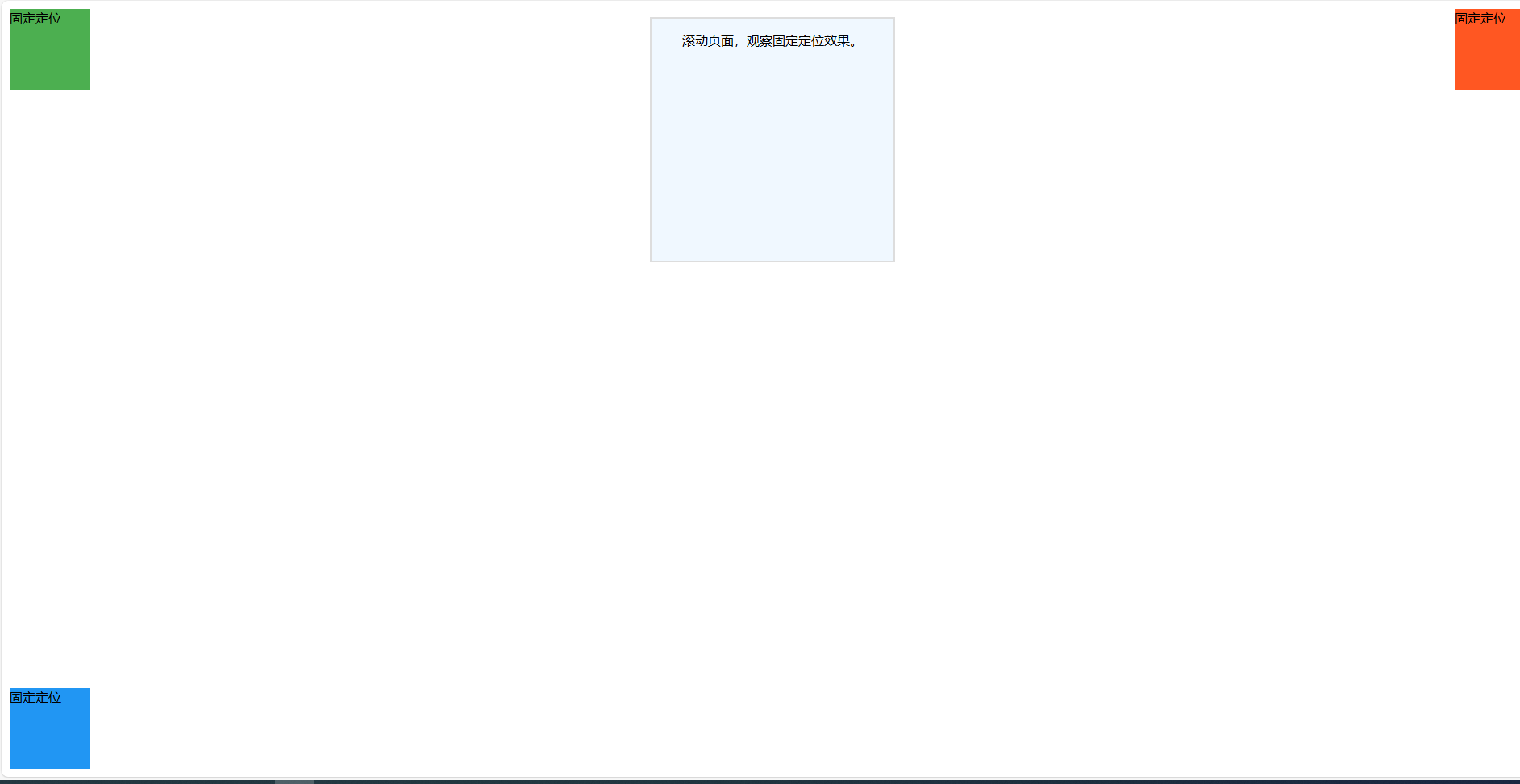
4、fix固定定位
<!DOCTYPE html>
<html lang="zh-cn">
<head><meta charset="UTF-8"><meta name="viewport" content="width=device-width, initial-scale=1.0"><title>固定定位示例</title><style>/* 父容器樣式 */.container {width: 300px;height: 300px;background-color: #f0f8ff; /* 淺藍色背景 */border: 2px solid #ddd;margin: 20px auto;text-align: center;}/* 第一個盒子:固定定位 */.box1 {position: fixed;width: 100px;height: 100px;background-color: #4CAF50; /* 綠色背景 */top: 10px; /* 距離視口頂部 10px */left: 10px; /* 距離視口左側 10px */}/* 第二個盒子:固定定位 */.box2 {position: fixed;width: 100px;height: 100px;background-color: #FF5722; /* 橙色背景 */top: 10px; /* 距離視口頂部 10px */right: 10px; /* 距離視口右側 10px */}/* 第三個盒子:固定定位 */.box3 {position: fixed;width: 100px;height: 100px;background-color: #2196F3; /* 藍色背景 */bottom: 10px; /* 距離視口底部 10px */left: 10px; /* 距離視口左側 10px */}</style>
</head>
<body><div class="container"><p>滾動頁面,觀察固定定位效果。</p></div><div class="box1">固定定位</div><div class="box2">固定定位</div><div class="box3">固定定位</div>
</body>
</html>
第一個盒子(綠色):
????固定在視口的左上角,距離頂部 10px,左側 10px。第二個盒子(橙色):
? ? ?固定在視口的右上角,距離頂部 10px,右側 10px。第三個盒子(藍色):
? ? ? 固定在視口的左下角,距離底部 10px,左側 10px。?
注意事項
固定定位的特點:
- 元素相對于視口定位,不受父容器的影響。
- 頁面滾動時,固定定位的元素始終保持在指定位置。
適用場景:
- 固定導航欄。
- 返回頂部按鈕。
- 固定廣告或提示框。
重疊問題:
- 如果多個固定定位的元素位置重疊,可以通過?
z-index?屬性控制它們的層級。
5、sticky粘性定位
<!DOCTYPE html>
<html lang="zh-cn">
<head><meta charset="UTF-8"><meta name="viewport" content="width=device-width, initial-scale=1.0"><title>粘性定位示例</title><style>/* 父容器樣式 */.container {width: 300px;height: auto;background-color: #f0f8ff; /* 淺藍色背景 */border: 2px solid #ddd;margin: 20px auto;padding: 10px; /* 內邊距 */}/* 通用盒子樣式 */.box {width: 100%;height: 100px;background-color: #4CAF50; /* 默認綠色背景 */margin-bottom: 20px; /* 下方間距 */text-align: center;line-height: 100px; /* 垂直居中 */color: #fff;font-size: 16px;}/* 第一個盒子:粘性定位 */.box1 {position: sticky;top: 0; /* 滾動到視口頂部時固定 */background-color: #4CAF50; /* 綠色背景 */}/* 第二個盒子:粘性定位 */.box2 {position: sticky;top: 50px; /* 滾動到距離視口頂部 50px 時固定 */background-color: #FF5722; /* 橙色背景 */}/* 第三個盒子:粘性定位 */.box3 {position: sticky;top: 100px; /* 滾動到距離視口頂部 100px 時固定 */background-color: #2196F3; /* 藍色背景 */}</style>
</head>
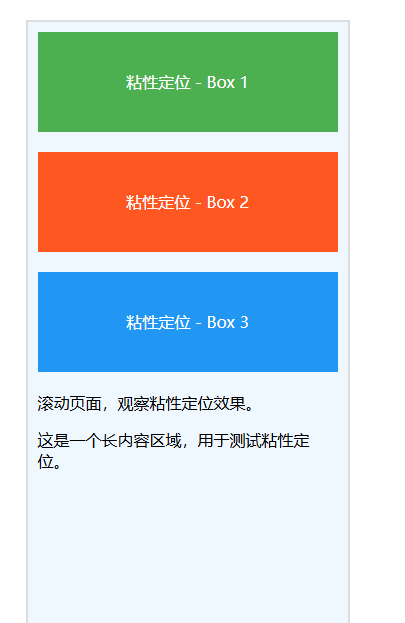
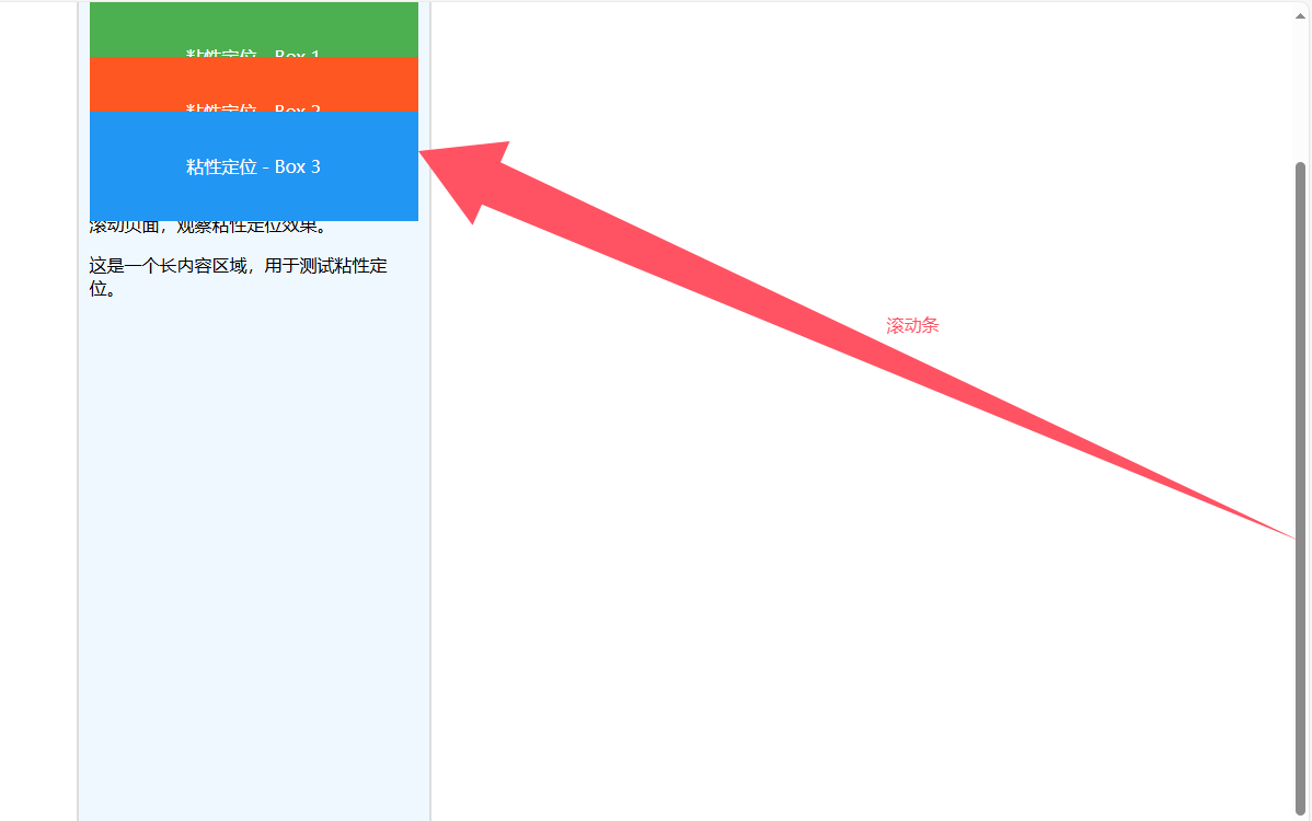
<body><div class="container"><div class="box box1">粘性定位 - Box 1</div><div class="box box2">粘性定位 - Box 2</div><div class="box box3">粘性定位 - Box 3</div><p>滾動頁面,觀察粘性定位效果。</p><p style="height: 1000px;">這是一個長內容區域,用于測試粘性定位。</p></div>
</body>
</html>
第一個盒子(綠色):
? ? 滾動到視口頂部時固定,直到父容器的內容滾動結束。第二個盒子(橙色):
? ? 滾動到距離視口頂部 50px 時固定,直到父容器的內容滾動結束。第三個盒子(藍色):
? ? ?滾動到距離視口頂部 100px 時固定,直到父容器的內容滾動結束。
注意事項
粘性定位的特點:
position: sticky;?是相對定位和固定定位的結合。- 元素在滾動到指定位置時變為固定定位,但超出父容器范圍后恢復正常流。
父容器的限制:
- 粘性定位的元素必須在一個有滾動內容的父容器中才能生效。
- 如果父容器沒有足夠的高度,粘性定位可能無法觸發。
瀏覽器支持:
position: sticky;?在現代瀏覽器中支持良好,但在舊版 IE 中不支持。
三、綜合應用
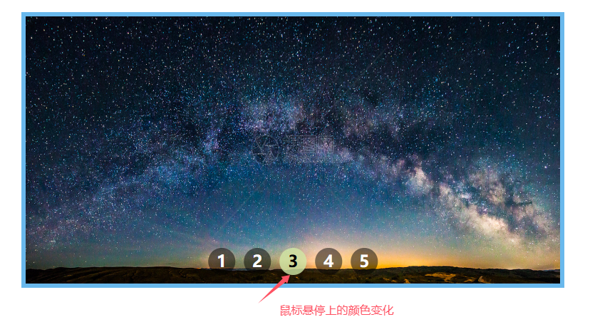
?1、數字定位在圖片上
<!DOCTYPE html>
<html lang="zh-cn">
<head><meta charset="UTF-8"><meta name="viewport" content="width=device-width, initial-scale=1.0"><title>數字定位在圖片底部</title><style>/* 容器樣式 */.image-container {position: relative; /* 設置父容器為相對定位 */width: 600px;height: 300px;margin: 20px auto;border:5px solid #69b8ec; /* 邊框 */}/* 圖片樣式 */.image-container img {width: 100%;height: 100%;display: block;}/* 數字容器樣式 */.number-container {position: absolute; /* 絕對定位 */bottom: 10px; /* 距離圖片底部 10px */left: 50%; /* 水平居中 */transform: translateX(-50%); /* 水平居中對齊 */display: flex; /* 使用 flexbox 布局 */gap: 10px; /* 數字之間的間距 */}/* 數字樣式 */.number {color: #fff; /* 白色字體 */font-size: 18px; /* 字體大小 */font-weight: bold; /* 加粗字體 */background-color: rgba(0, 0, 0, 0.5); /* 半透明黑色背景 */border-radius: 50%; /* 圓形背景 */width: 30px;height: 30px;line-height: 30px; /* 垂直居中 */text-align: center; /* 水平居中 */text-decoration: none; /* 去掉超鏈接下劃線 */}/* 數字懸停效果 */.number:hover {background-color: rgba(209, 231, 166, 0.8); /* 背景變為白色 */color: #000; /* 字體變為黑色 */}</style>
</head>
<body><div class="image-container"><img src="https://imgs.699pic.com/images/500/363/911.jpg!seo.v1" alt="圖片"><div class="number-container"><a href="#link1" class="number">1</a><a href="#link2" class="number">2</a><a href="#link3" class="number">3</a><a href="#link4" class="number">4</a><a href="#link5" class="number">5</a></div></div>
</body>
</html>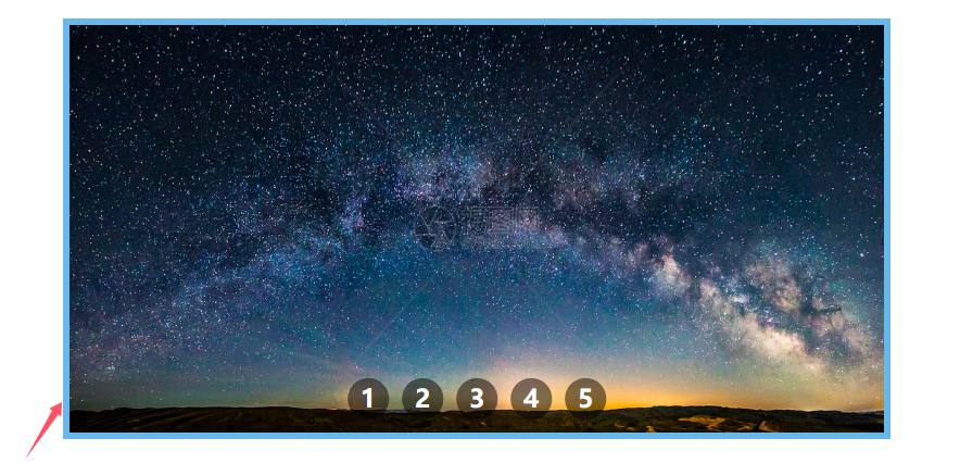 ?
?
2、窗口兩側固定廣告
<!DOCTYPE html>
<html lang="zh-cn">
<head><meta charset="UTF-8"><meta name="viewport" content="width=device-width, initial-scale=1.0"><title>窗口兩側固定廣告</title><style>/* 左側廣告樣式 */.ad-left {position: fixed; /* 固定定位 */top: 50%; /* 垂直居中 */left: 0; /* 靠左 */transform: translateY(-50%); /* 垂直居中對齊 */width: 120px; /* 廣告寬度 */height: 300px; /* 廣告高度 */background-color: #4CAF50; /* 綠色背景 */color: #fff; /* 白色文字 */text-align: center; /* 水平居中 */line-height: 300px; /* 垂直居中 */font-size: 16px; /* 字體大小 */box-shadow: 2px 2px 5px rgba(0, 0, 0, 0.3); /* 陰影效果 */}/* 右側廣告樣式 */.ad-right {position: fixed; /* 固定定位 */top: 50%; /* 垂直居中 */right: 0; /* 靠右 */transform: translateY(-50%); /* 垂直居中對齊 */width: 120px; /* 廣告寬度 */height: 300px; /* 廣告高度 */background-color: #FF5722; /* 橙色背景 */color: #fff; /* 白色文字 */text-align: center; /* 水平居中 */line-height: 300px; /* 垂直居中 */font-size: 16px; /* 字體大小 */box-shadow: -2px 2px 5px rgba(0, 0, 0, 0.3); /* 陰影效果 */}/* 頁面內容樣式 */.content {width: 80%;margin: 50px auto;font-size: 18px;line-height: 1.6;text-align: justify;}</style>
</head>
<body><!-- 左側廣告 --><div class="ad-left">左側廣告</div><!-- 右側廣告 --><div class="ad-right">右側廣告</div><!-- 頁面內容 --><div class="content"><h1>content內容</h1><p>這是一個頁面,展示如何在窗口的左右兩邊添加固定廣告。無論頁面如何滾動,廣告始終保持在視口的兩側。</p><p>通過使用 CSS 的固定定位(`position: fixed`),可以輕松實現這種效果。固定定位的元素相對于視口進行定位,不會隨頁面滾動而移動。</p><p>這種布局常用于廣告、導航欄或其他需要始終可見的元素。</p><p style="height: 2000px;">滾動頁面,觀察廣告始終固定在窗口兩側的效果。</p></div>
</body>
</html>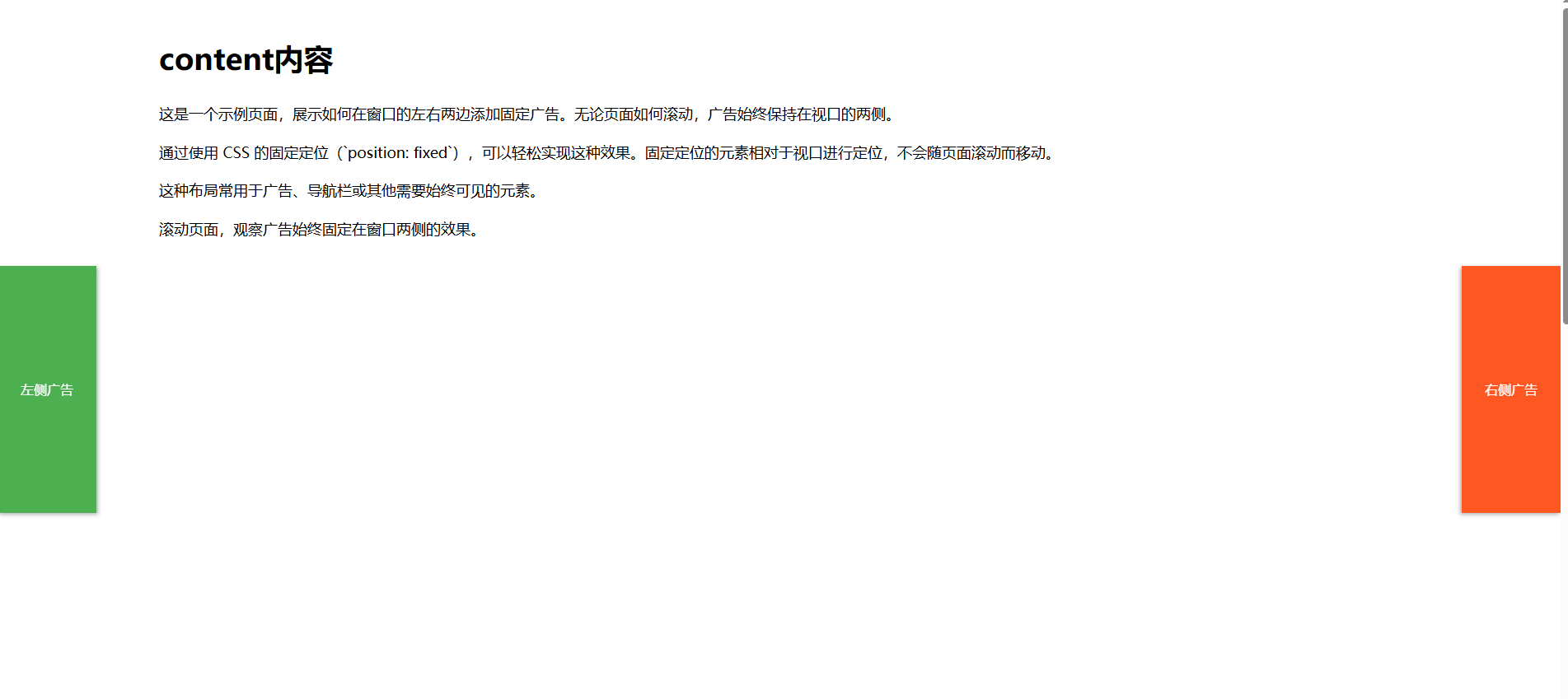
- 左側廣告始終固定在視口的左側,垂直居中。
- 右側廣告始終固定在視口的右側,垂直居中。
- 頁面滾動時,廣告不會移動,始終保持在窗口兩側。
四、總結
相對定位:一般情況下很少自己單獨使用,都是配合絕對定位使用,為絕對定位創造定位父級而又不設置偏移量?。
絕對定位:一般用在下拉菜單、焦點圖輪播、彈出數字氣泡、特別花邊等場景。
固定定位:一般在網頁中被用在窗口左右兩邊的固定廣告、返回頂部圖標、吸頂導航欄等


)
(ArkTs))
(lv_label,lv_btn))
)

)

![[創業之路-377]:企業法務 - 有限責任公司與股份有限公司的優缺點對比](http://pic.xiahunao.cn/[創業之路-377]:企業法務 - 有限責任公司與股份有限公司的優缺點對比)