文章目錄
- 1. 行內和塊級元素自身相對父控件居中
- 1.1. 塊級元素相對父控件居中
- 1.2. 行內元素相對于父控件居中
- 2. 實現單行文字垂直居中
- 3. 子絕父相實現子元素的水平垂直居中
- 3.1. 方案一
- 3.1.1. 示例
- 3.2. 方案二
- 3.2.1. 示例
- 3.3. 方案三(推薦)
- 3.3.1. 示例
- 3.4. 方案四(了解一下)
- 4. flex 實現水平垂直居中
- 4.1. 方法一
- 4.2. 方法二
1. 行內和塊級元素自身相對父控件居中
給行內和塊級元素設置寬高,出現的現象:
- 設置寬高對行內元素沒有效果
- 設置寬度對塊級元素有效果
span {width: 100px;height: 100px;text-align: center;background-color: skyblue;
}
div {width: 100px;height: 100px;background-color: pink;
}
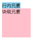
原因是因為行內元素的寬高是由內容決定的。
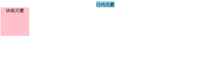
1.1. 塊級元素相對父控件居中
只能通過盒子模型的外邊距實現,這個屬性寫在元素本身上面。
div {width: 100px;height: 100px;background-color: pink;margin: 0 auto;
}
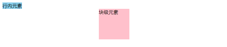
如果是沒有設置寬高的話,可以通過父控件的
text-align實現,但是不能用margin: 0 auto實現。
1.2. 行內元素相對于父控件居中
只能通過父控件的text-align實現。
body {text-align: center;
}
span {width: 100px;height: 100px;background-color: skyblue;
}
2. 實現單行文字垂直居中
對于單行文字:可以實現文字垂直居中(height 等于 line-height)。
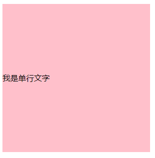
div {width: 300px;height: 300px;background-color: pink;line-height: 300px;
}
<div>我是單行文字</div>
由于字體設計原因,靠上述辦法實現的居中,并不是絕對的垂直居中,但如果一行中都是文字,不會太影響觀感。
3. 子絕父相實現子元素的水平垂直居中
前提:定位的元素必須設置寬和高!!!
這里我們創建父元素和子元素,并設置樣式。
.father {width: 600px;height: 600px;background: pink;
}
.son {width: 300px;height: 300px;background: #95a299;
}
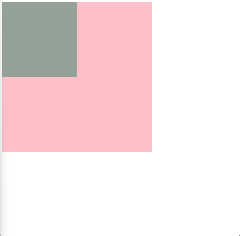
3.1. 方案一
直接計算移動的需要距離。
left: 父子元素高度差的一半;
top: 父子元素寬度差的一半;
3.1.1. 示例
子元素 y 軸移動的距離是父子元素高度差的一半,
子元素 x 軸移動的距離是父子元素寬度差的一半。
.father {width: 600px;height: 600px;background: pink;position: relative;
}.son {width: 300px;height: 300px;background: #95a299;position: absolute;top: 150px;left: 150px;
}
弊端:偏移值left和top是寫死的,如果父元素的寬度發生改變,子元素就無法水平居中了。
3.2. 方案二
這里的left和top我們可以用百分比來表示,子元素相對父元素移動 50%的距離后,再根據子元素的外邊距進行調整。
left: 50%;
top: 50%;
margin-left: 自身寬度的一半;
margin-top: 自身高度的一半;
3.2.1. 示例
.son {width: 300px;height: 300px;background: #95a299;position: absolute;top: 50%;left: 50%;margin-left: -150px; /* 向左移動自身寬度的一半 */margin-top: -150px; /* 向上移動自身寬度的一半 */
}
弊端:由于margin-left和margin-top值是寫死的,如果 son 的寬度發生改變,子元素也無法水平居中。
3.3. 方案三(推薦)
子元素相對父元素移動 50%的距離后,使用transform調整子元素的位置。
3.3.1. 示例
width: 300px;
height: 300px;
background: #95a299;
position: absolute;
top: 50%;
left: 50%;
transform: translate(-50%, -50%);
優勢:不用計算調整子元素移動移動的距離,用百分比表示即可。
3.4. 方案四(了解一下)
子絕父相,子元素設置以下屬性,也能進行水平垂直居中。
簡單理解:四個方向有相同的力在拉這個盒子,margin:auto是讓這個盒子的位置保持中立,來達到盒子處于正中心。
left: 0;right: 0;top: 0;bottom: 0;margin: auto;
4. flex 實現水平垂直居中
4.1. 方法一
父元素開啟 flex 布局,隨后使用 justify-content 和 align-items 實現水平垂直居中。
display: flex;
/* 設置子元素水平居中 */
justify-content: center;
/* 設置子元素垂直居中 */
align-items: center;
<!DOCTYPE html>
<html lang="en"><head><meta charset="UTF-8" /><meta name="viewport" content="width=device-width, initial-scale=1.0" /><title>12-flex布局-實現子元素水平垂直居中</title><style>.father {background: pink;height: 300px;display: flex;/* 設置子元素水平居中 */justify-content: center;/* 設置子元素垂直居中 */align-items: center;}.son {width: 100px;height: 100px;background: #a5ccaf;}</style></head><body><div class="father"><div class="son"></div></div></body>
</html>
4.2. 方法二
父容器開啟 flex 布局,隨后子元素 margin: auto。
.father {background: pink;height: 300px;display: flex;
}
.son {width: 100px;height: 100px;background: #a5ccaf;margin: auto;
}


之層次分析法)


